Hello again. Today was the day of the Concord & 9th ‘In The Classroom – Spring Edition‘ and I watched the videos of the class – but went my own way with the products from the first class. Here is what I created:
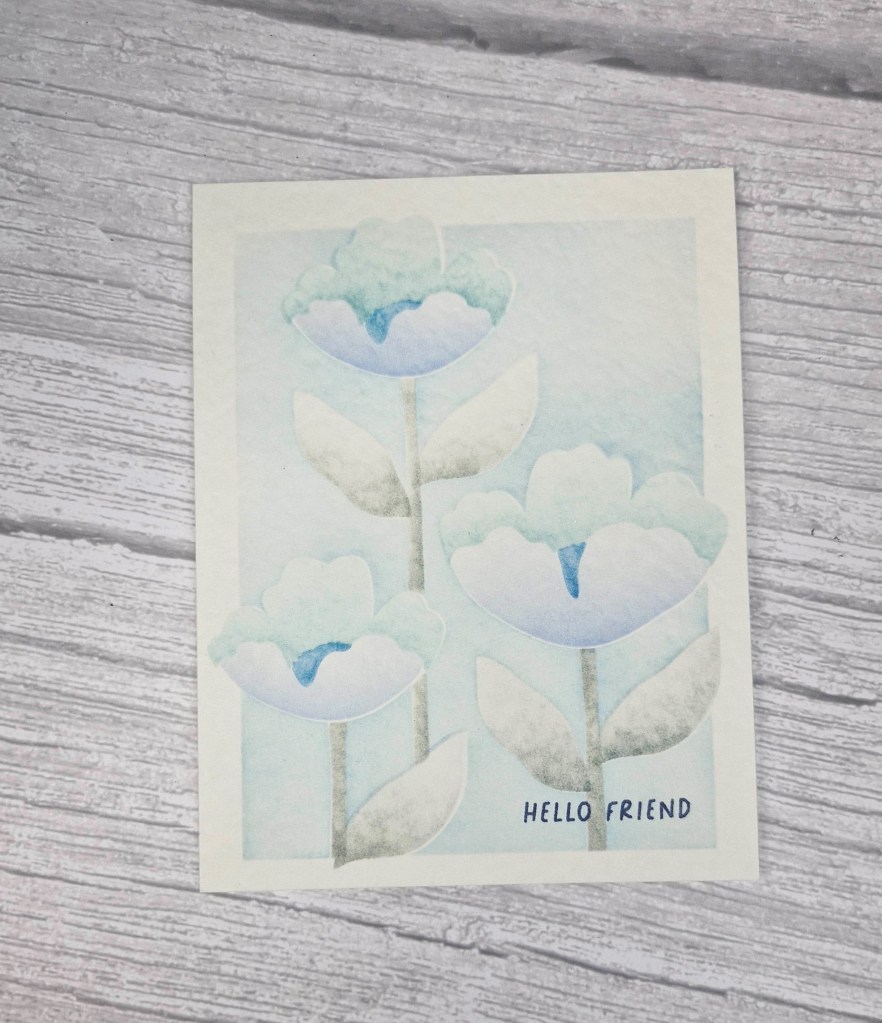
For a change, I went for a simple one layer card, and used the colours from the Color Hues Challenge.
The card panel is a cream hammered card – I thought this would give some interesting texture to the ink blending.
Onto that panel, and using each of the four layers of the stencil, I went in with blue inks from Pinkfresh Studio, and tried to concentrate the colour towards the bottom of each image – the petals and the leaves – to create a little more dimension. I used a grey ink for the leaves and stems, also trying to create some shading.
I feel the outcome looks a little like water-colouring, so I didn’t go in with the stamps to match the image. There are outline stamps, and detail stamps for the leaves and flowers – I like the soft look.
I then stamped the sentiment, and added the panel to a card base.
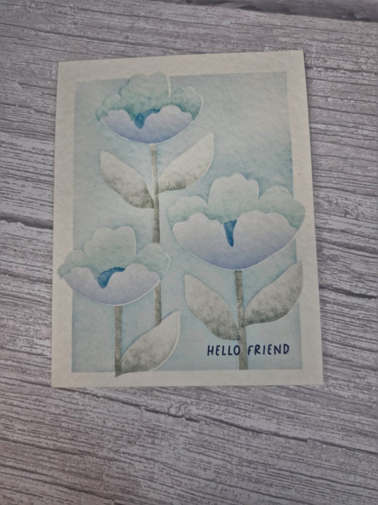
Here is a picture I have darkened to try and show the texture of the hammered cream card:
I’ll be playing with the products from this event over the coming days, and you may see further creations….
I shall be entering the following challenges:
Try It On Tuesday – use a stencil
Lil Red Wagon – florals
Color Hues – cream and blue
Here Is A Place To Start – anything goes
Stencil Fun – anything goes with a stencil
Ally’s Angels – anything goes

A lovely card, gorgeous subtle shaede flowers.
Thanks for sharing with us at Try it on Tuesday.
Avril x
LikeLiked by 1 person
This is such a beautiful flower! Thanks so much for joining us at the Color Hues!
LikeLiked by 1 person
Pretty stenciled flowers. So soft looking. Thank you for joining us at a Place to Start this month. Judy DT https://hereisaplacetostart.blogspot.com/
LikeLiked by 1 person
Beautiful card in soft tones! Thank you so much for entering our challenge at Try it on Tuesday. Looking forward to see you again next challenge.
Regards,
Mia
Designer for Try it on Tuesday
craftartista.blogspot.com {My Blog}
LikeLiked by 1 person
How gorgeous! I so love the soft look you achieved with the stenciling and that paper was definitely an inspired choice, the texture looks wonderful. It is a dreamy vision without the outlines. Beautiful! Thank you so much for sharing with us at Color Hues!
LikeLiked by 1 person
This is a beautiful one-layer design. The ink blending with the stencil is so soft and lovely! Thanks for sharing with us at Color Hues!
LikeLiked by 1 person
So soft and very beautiful,,
Thank you so much for joining in with our challenge at Little Red Wagon, hope you will play again..
Luv CHRISSYxx
LikeLiked by 1 person
Just beautiful and cool technique! Love it! Thanks so much for joining in the fun at our STENCIL FUN challenge! Good Luck and we hope you’ll come back often.
Darlene
<a href=http://www.darscraftycreations.blogspot.com/>DAR’S CRAFTY CREATIONS</a>
Co-Owner … <a href=https://cyhtp.blogspot.com/>Can You Handle the Pressure</a>, <a href=https://daranddiane.blogspot.com/>Double D</a>, <a href= https://thefourseasonschallenge.blogspot.com/>Four Seasons</a>, <a href=https://peaceonearthchristmas.blogspot.com/>Peace On Earth</a>,<a href=https://stencilfun.blogspot.com/>Stencil Fun</a>, <a href= https://scscards.blogspot.com/>Simply Clean & Simple</a>, <a href=https://twooldbatshalloweenchallenge.blogspot.com/>Two Old Bats</a>, <a href=https://dd-tripleb.blogspot.com/>Triple B</a>, <a href=https://wordpowerchallenge.blogspot.com/>Word Power</a>
LikeLiked by 1 person
That’s so very lovely! The soft tones are beautiful!
LikeLiked by 1 person
Thanks Deborah xx
LikeLiked by 1 person