Kibble Kits

Good day everyone. I have quite cute for this card – very unlike me! I saw some challenges out there and took the opportunity to combine some with the same card.

I stamped the IndigoBlu ‘Kibble Kits’ stamp in Versafine black onyx, then cut this down with my wonky rectangles. This was stuck onto a panel I had created using Lawn Fawn ‘Stitched Woodgrain Backdrop’, then onto a base card using a lighter blue.

The circle was die cut using Stampin Up stitched circles, and the banner cut using the smaller wonky rectangles again. (I don’t seem to be able to resist using these rectangles)

The small blue cat is actually a button, as you can see from the little collection I have there. Bought at a craft show somewhere, I have never used any of them. This was attached to the circle with Pinflair 3D glue.

The sentiment is from Altenew ‘Painted Greetings’.

This card was actually quite simple to make, and came together quite quickly, once I had decided on the colours and layout. Even that was easier than normal as I was guided by the sketch challenge and by the colour challenge.

It may be a little too busy for the Less is More challenge, but as that particular challenge gave me the inspiration to use my cat button, I will enter anyway………..

Less Is Moreuse a real object

CAS(E) this sketchsketch

Dragonfly Dreamsanimals

Cardz 4 Galzcats/kittens or both

Shopping Our Stashwood or wood grain


Sprinkle Turnabout

20170826_180246

Hello there. I hope you’re having a good weekend. It’s Bank Holiday weekend here in the UK, so three days off.

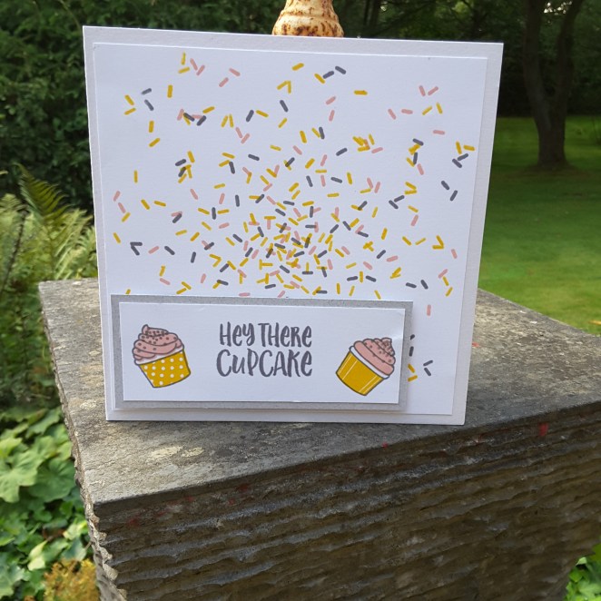
I have been trying my hand at the Concord and 9th Turnabout stamps again. This one is the ‘Sprinkles Turnabout’, and I am liking the effect the stamp gives. I also like the fact that the sprinkles are more concentrated in the centre, and less so on the outside – but it does create a challenge when thinking about where to place a sentiment……I went with the bottom, and also went off to one side, as I don’t tend to do symmetry!

The colours I have chosen are from the Color Throwdown challenge for this week – pink, yellow, and grey – and I think they all work very well together.

All of the stamps used on this card are from that stamp set – the background, cupcakes, the matching layers, and the sentiment. All stamped sticking to the three colours. I used Stampin Up colours – Daffodil Delight, Basic Grey, and Powder Pink. Once I had decided to use this set, I have made a batch of them in the same colours, and will be trying different colours, utilising the different sentiments at some point.

I shall also be entering this card into the challenge from The House that Stamps Built, with the theme of ‘anything goes’.

Altenew Blissful Bud

Hello everyone. I’m back home in UK, and I’m struggling a little with the time difference coming this way. Very unusual. I usually struggle going the other way….it’s taken me a couple of days to get my crafting head back on. I really enjoyed searching through my sister’s stash, so many things I haven’t got, but now I am back I can concentrate on my own things.

These cards are mainly from Altenew ‘Blissful Bud’, and I haven’t had time to play with them until today. It just happens I am playing with them when the cue card from CASology this week is:

So, out came my Altenew inks, and I set to playing. I used the blues and yellows, as I know that I can layer them well, but with some other colours I still struggle. I played with the position of the bud itself, putting it in different areas of the card, and even angled the stem in different ways so it wasn’t straight all the time.

The sentiments from that stamp set are also lovely, and I chose the ‘warm hello’ to enter the card challenge, but used a few others, too. I used my wonky rectangles to cut the main piece of card out, then added different colour card bases for some variety.

I also played with the Stampin Up ‘Tranquil Tulips’ stamp set, which had been waiting for me when I got home from Canada. A hostess stamp set, which was a lovely surprise from my chosen demonstrator. (Shell Bower)

This set has images which give a water-colour effect when stamped, and has a few flower images as well as tulips. You can see one example in the photos above – the Happy Birthday card – but I also played with the layout of another one I stamped:

I stamped the tulip, then die cut that piece of card using Reverse Confetti ‘Vertical Stripes Cover Panel’, stuck down the surrounding part of the die cut flat, then raised each individual stripe with 3D foam………I may be trying that with some of my other cover plate dies, as I like the effect.

As well as the CASology challenge, I shall also be entering the ‘best bud’ card into the current challenge from Addicted to CAS, with the theme of ‘friends’.

Guest Designer Sketch (no 2)

unnamed

Hello there everyone. I am back in the UK, arrived Heathrow at 07.30 this morning, and home by 11 am………..feeling pretty good so far. I am sure it will be a little like hell this evening, but I will get there!

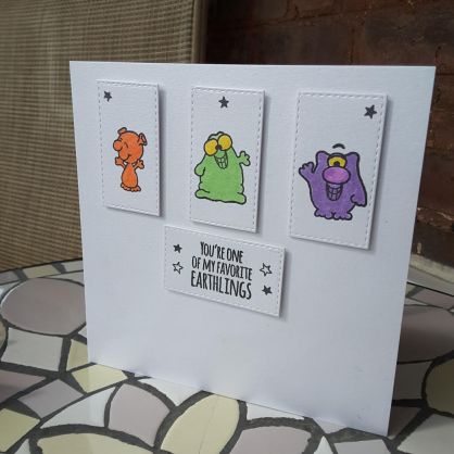
This is my fourth and final card as Guest Designer for CAS Colours and Sketches, and I made this card at the weekend at my sister’s. I must say it took a little organising and thinking. I wanted to stay away from flowers this time, so I searched my sister’s stash (again) and found these little aliens. I don’t have anything like them myself, and always struggle with cute cards, but played a little with them – mainly the colours – and came up with this card.

The stamp set is from Gerda Steiner Designs ‘Alien Invasion’, and stamped with Versafine Black Onyx, coloured with Zigs. Nothing fancy, no shading of the colours. I did try shading them, but the images are quite small, and I thought the shading got lost a little, so I stuck with block colours. The thing with Zigs is that there are so many colours, aren’t there? Which to use, in what order on the card? Blimey. I must have shuffled these three little aliens around so many times before settling on this layout.

The sentiment is from the same stamp set, and I also stamped a few little stars around for a little added detail.

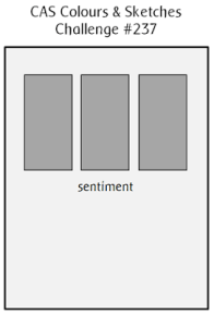
I hope you can play along with this sketch challenge, and I look forward to seeing your creations.

I shall also be entering this card into the following challenges:

Simon Says Stamp Wednesday Challengeadd a sentiment

Crafty Gals Corneradd a star

Imagination Crafts Poppy

20170819_155417

Hello again, everyone. This is my last full day in Quebec, and I will be travelling home to UK tomorrow evening, arriving early hours Tuesday morning. I have had a great time here with my sister and her husband, lots of chilling, good food, getting out and about a little, but also some card making. My idea of a relaxing holiday if not going to the beach.

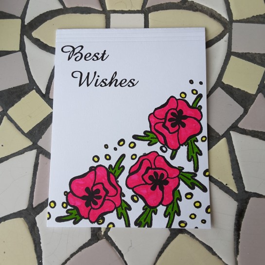
This card is for the Color Throwdown Challenge, to use the colours hot pink, yellow, and lime green. I love to make cards with flowers – can you tell? – and found this stamp set from Imagination Crafts in my sister’s stash. I don’t have any of their stamps, and was immediately taken by the design and outline of the flowers. I stamped them several times, in different layouts, and played with colours and layouts.

This card is one I made where I stamped the flower outlines then masked them off, stamped the leaves and then the dots, and coloured them in the challenge colours. I didn’t go for any fancy colouring or shading, as I think these stamps lend themselves to a more solid colour. Having seen the Herge (creator of Tintin) exhibition in Quebec earlier this week, I thought I would take a leaf out of his very experienced book!! Apparently, he rarely did any shading, and used block colours most of the time. We learn something new every day………..

Once I had coloured the flowers, I added three lines at the top of the card using my score board – an little extra but plain interest – and stamped a sentiment in Versafine black onyx ink.

I may have time to create another card to post tomorrow before I leave Canada, but if not it will be Tuesday when I post my fourth and final card as Guest Designer for CAS Colours and Sketches.


Altenew August Challenge

Hi everyone. My sister have been playing at making cards together for a change! We decided to pick a challenge, and both have a go at it, and we chose the Altenew August Challenge posted by Erum Tasneem.

For this card, I stamped and embossed the background in clear embossing powder using the Hero Arts ‘Woodgrain Bold Print’. I chose clear embossing on the white card, as I wanted the background to be quite muted, and not be too busy for the flower images. Brown Brusho was used to colour the background and when the base card was still wet, I added some of the same powder directly to it, leaving the multi-coloured background you can see – and of course the embossing resisted the ink.

The flowers and leaves are from Altenew ‘Hennah Elements’, stamped and embossed in Ranger ‘Princess Gold’ embossing powder, then die cut with the matching dies. Four of the bigger leaves were coloured with Brusho ‘Emerald Green’, the flowers and the rest of the leaves and flourishes left un-coloured. I did toy with the idea of colouring the flowers, but decided to leave them plain white, as I think it makes them stand out more.

The flowers were stuck down with Pinflair 3D glue gel, so I could have a little height to put the leaves and flourishes underneath, and also a little ‘wriggle’ room for placement. The leaves and flourishes were stuck flat with Cosmic Shimmer glue.

A brown background card, a sentiment from the same stamp set, again embossed with the Princess Gold embossing powder, and the card was completed.

Here is the post from my sister: Blue Butterfly Cards


Wave

20170816_174148

Hi everyone. I’m still in Quebec, and still using my sister’s stash for creating cards. All this whilst she is preparing for going back to work next week – a teacher – and me playing. Well, we did go and see the Tintin exhibition in Quebec Museum of Civilisation yesterday. I saw the poster advertising the exhibition and just had to go. I still hear the voice-over from my school years, saying – Herge’s adventures of Tintin – in a very resounding and booming voice. Does anyone else remember that?

Whilst there, we also took in the ‘Mad about brains’ exhibition. As a nurse in our local neurosurgery regional centre, it would have been rude not to. Very interesting, and looking at the anatomy and the fascinating facts about the brain……a bus-man’s holiday, really. A good exhibition for people not in ‘the industry’…..

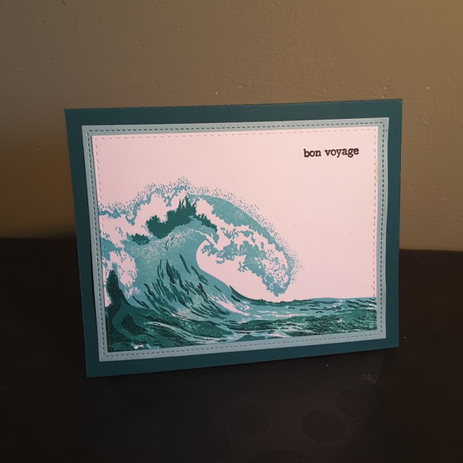
Back to the card now. The stamp is from The Ton, and I used a Tim Holtz Distress Oxide for the base colour,as these stamps have a lot of area to cover. The Distress Oxide covered it perfectly. I then layered with two Hero Arts colours, in a teal/green effect. I also tried using blues, but I didn’t think it looked as good as the greens….

I attached this to the base card with layers of toning colours. The sentiment is from Altenew, stamped in Versafine black onyx.

I shall be entering this card into the Inkspirational challenge, theme of ‘wave’.


Water colour and salt


Hello everyone. I tried a different technique for this card. The challenge is from CAS Water-colour Card challenge, with the challenge being to use salt with your water-colour. I’ve never tried this before, so I thought I would give it a go.

I used a stamp from Hero Arts ‘wildflower garden’ and stamped this image on water colour paper in Versamark, heat embossing with white embossing powder.  I then spritzed the paper quite liberally and added my Brusho colour ‘purple’. I think I also added a little red, but not quite sure. When I am crafting I do tend to forget what I have used sometimes – so in the zone!

Whilst still wet, I added some rock salt (my sister’s cupboard!) and let the whole thing dry. I didn’t do any moving around of the colours – just let it lie there drying.

Once dry, I scraped off the salt and was left with this piece of card. I love the way the salt has concentrated and repelled the colour at the same time, and the colour also being resisted by the embossing of the flower image.

I then took an A4 piece of white card, folded in half, and die cut a rectangular opening the size I wanted to catch all of the flower and colours in it, and then embossed another rectangular die around that. I used Simon Says Stamp and Lawn Fawn stitched rectangles, as they are slightly different sizes, and give a border/frame effect when worked together.

I then stuck the water-colour paper behind it, and covered the back of it to make it neater.

The sentiment is from an Altenew stamp set, and die cut and embossed using the same technique of using a die cut, added to the image with some foam.

Now, my sister and I had a ‘discussion’ about the size of the card. She wanted me to cut the length down more as she felt it was too big, whereas I left it the A4 size completely, to give more open and white space…………Perhaps I could have some opinions as to what you might think? (As long as you agree with me!!!!)

Anyway, I shall be entering this card into the following challenges:

CAS Watercolour Card Challengeuse salt

Prickly

20170816_055603

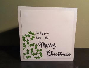
Hi everyone. Another Christmas card for today. I saw the cue card from CASology initially thought of a cactus, then thought of a prickly rose, but was looking through my sister’s stash (yes, still in Quebec) and saw this cute little stamp set from Technique Tuesday  “Twinkle On”,  and the little holly stamps, so I went with that one.

I stamped the holly using a green from Stampin Up, concentrating on one corner, then used a sentiment cobbled together from Hero Arts ”Christmas Trimmings stamp and cut”.

The base card has a little shimmer to it, and I cut the main piece down slightly to leave a little border around it.

I’m now off to google an exhibition currently going on in Quebec, all about Tintin…….and there is also an exhibition on about the Brain…..what a mixture of a day that will be when we go there!


Guest Designer Colours (V2)


20170812_215745

Hi everyone. This is my third card as guest designer for CAS Colors and Sketches, and the second colour themed card. The challenge is to make a card using the colours Crushed Curry, Bermuda Bay, and Calypso Coral. As you know, I am currently away in Quebec City visiting my sister, and I don’t have the exact colours to hand.

After a little look through her crafting goodies, I found some Distress Oxides which seem to run a good match. I used Fossilized Amber, Worn Lipstick, and Cracked Pistachio. I haven’t tried the distress oxides before, but I am loving them. So good at blending, so good at using as a water colour – will definitely invest when I get back to UK.

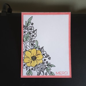
I started this card using  a stamp from Penny Black – ‘Flower Cascade’. A gorgeous stamp which I stamped in Versafine Black Onyx, then heat embossed with clear embossing powder. I then coloured using the Distress Oxides.

To use them as a water colouring effect, I smudged each colour onto an acrylic block, then used a water brush to colour in the yellow flower, and the Cracked Pistachio. I didn’t want too much colour on the card, trying to keep it clean and simple, so I decided not colour any more than the main flower and some of the leaves.

I used the Worn Lipstick pad and ran it around the edge of a white base card – fabulous coverage again – then attached the stamped part flat.

The sentiment stamp reflected I am currently completely out of my comfort zone in Quebec – a please and thank you are basically the limits of my foreign language attempts – and stamped ‘Merci’ in Worn Lipstick, a small stamp from Lawn Fawn.

I hope you like my take on the colour scheme, with an addition of some muted colours, and look forward to seeing what you create to play along.

I shall be entering this card into the following challenges:

Tuesday Throwdownanything goes

Try it on Tuesdayin my garden

Through the Craft Room Dooranything goes