More swans….

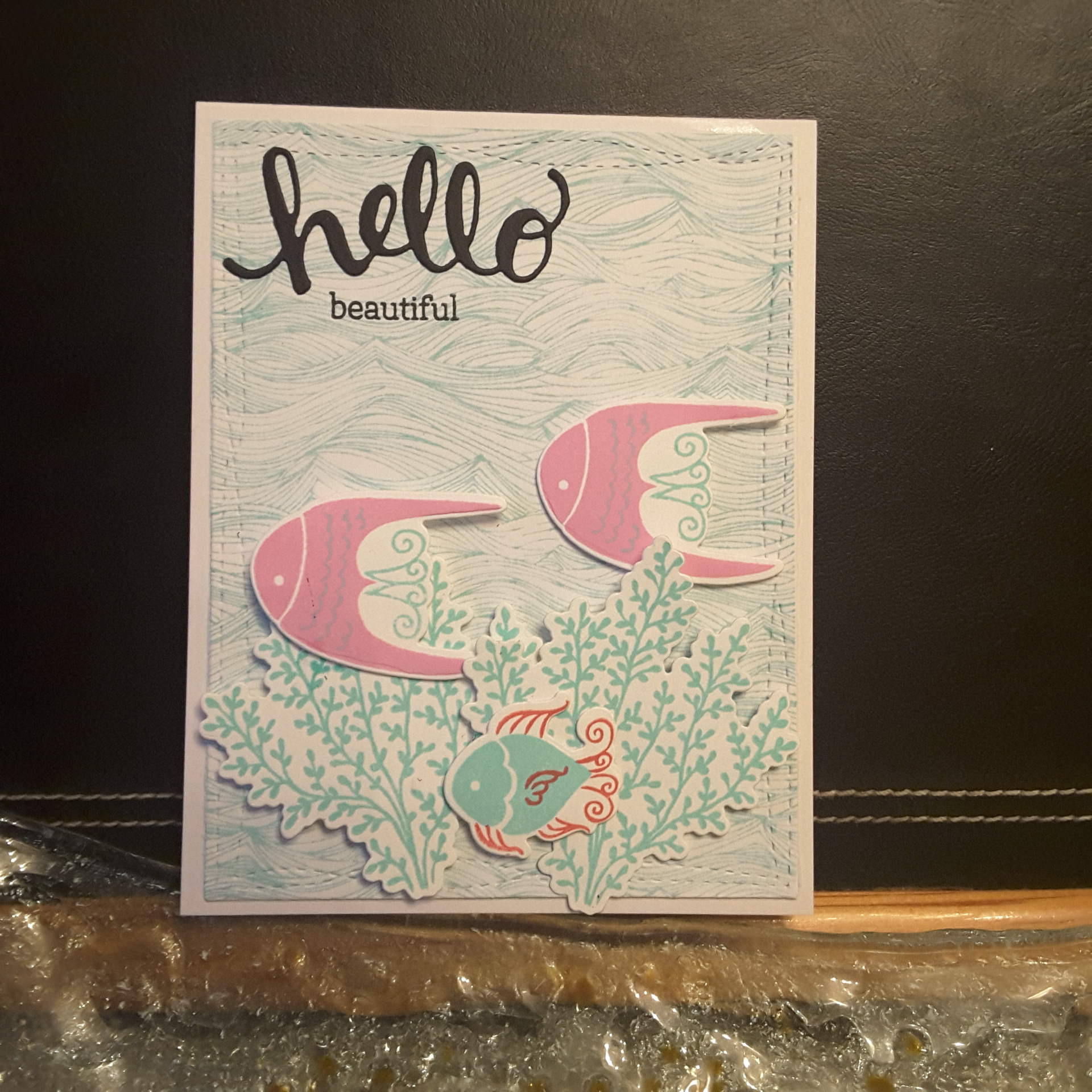
I am hosting the new challenge at The Alphabet Challenge. The theme was chosen by another team member who has since left the team, but we are staying with the theme chosen – ‘Water’. There are a lot of possible choices – as you can see from the Design Team inspiration makes. Here is what I have gone with:

This card took a little planning, a little frustration – but I believe the outcome was worth it. I actually gave this card to my mum-in-law for her birthday.

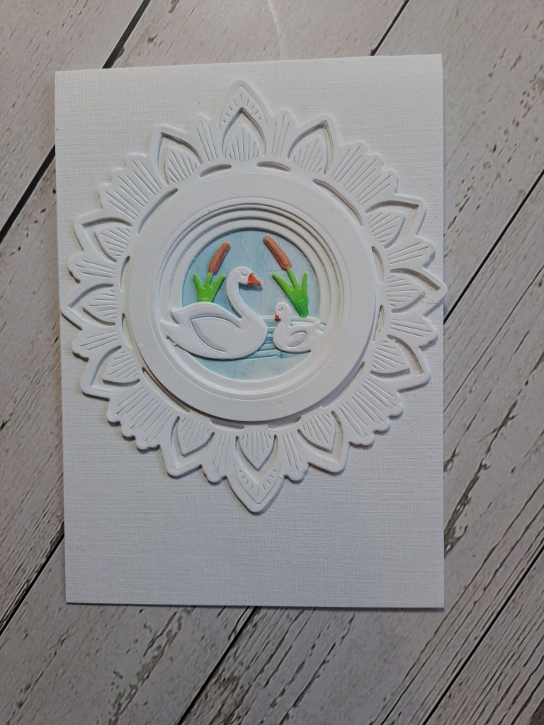
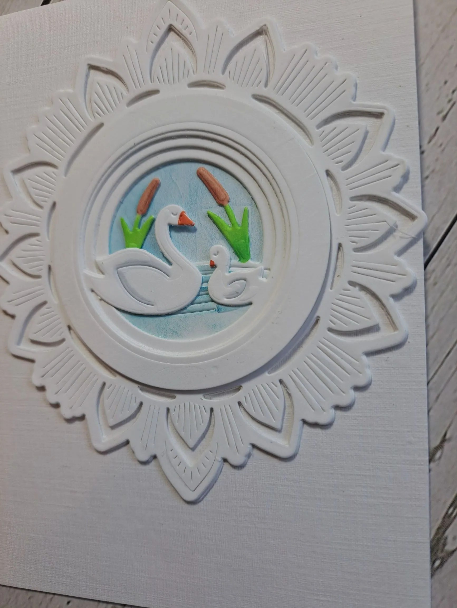
The swans are from Hero Arts, one of their ‘Looking Glass’ collection of dies. I love to use these sets of dies to create a scene – but I find them difficult – despite watching the YouTube videos – over and over again…….my brain just doesn’t want to take it in….

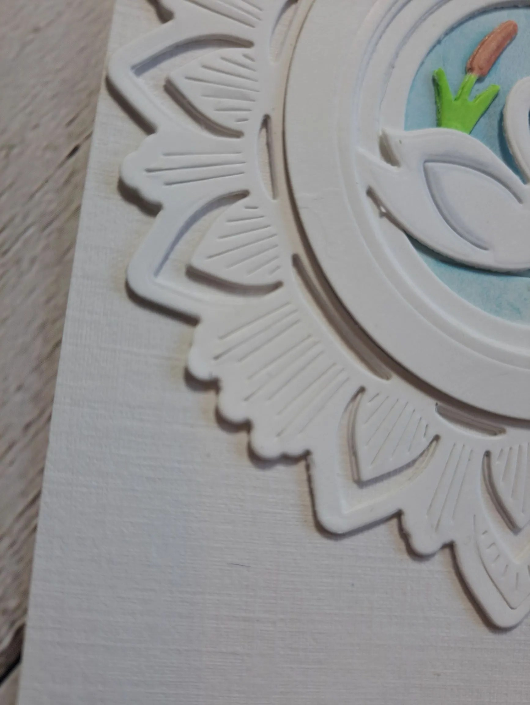
I added circle frames, and added a decorative die cut from a Pinkfresh Studio die set.

The layers of the swan scene were coloured – the sky and water were ink blended with a Distress Ink, the reeds and swans coloured with Copics.

I hope you can come and join us with your ‘water’ themed creations – either making a water scene, using water-colours…….I;m looking forward to seeing a variety in our gallery. xx

I shall be entering the following challenges:

Allsorts Challengeanything goes with option ‘I Love’……(Hero Arts Looking Glass dies)

Simon Says Stamp Wednesday Challenge fun with dies

Lil Patch Of Crafty Friends anything goes

2 Crafty Critter Craziesanything goes with critter as main focus

Crafty Animals anything goes with an animal

Ellibelle’s Corner anything goes

Crafts Galore anything goes

Take Time To Smell The Flowers

Hello. I have a card to share in which a water-coloured the main floral image – something I haven’t done for absolutely ages:

The flower is from a collaboration stamp set with Altenew and Hero Arts. I stamped the flower and the two leaves onto a piece of white water-colour card, then heat embossed in white.

I then sprayed water onto the images and used Distress Inks to colour – well – I dabbed the colour onto my glass mat, picked it up with my wet brush and kinda just let it go and flow……I ‘helped’ the flow a little to reach the ends of the petals and leaves, but generally let the water and the inks do their thing…..my idea of water-colouring!

Once dry, I fussy-cut – my least favourite crafty job – and I think the white heat embossing helped cover a few little flaws with the scissors – but it also helped to guide the scissors somewhat.

I found some matching lilac/purple card stock, and then layered the WPlus9 trellis onto the top. I did have to cut the trellis twice and layer it to make it longer, trimming off the bottom of one and the top of the other – the flower and leaves cover the join quite nicely.

I placed the flower and leaves as you see, and then the sentiment, all added to the card with 3D foam.

I added some clear cabochons, and as I had stamped the sentiment in black I also added some black gems too.

I shall be entering the following challenges:

Crafty Catz anything goes – option to say it with flowers

Allsortsflora or fauna or anything goes

The Paper Playersgreen thumbs – plants/flowers/foliage

Colour Crazyweek 26 – anything goes with colouring (any medium)

Lil Patch Of Crafty Friendsanything goes

Exquisite Ocean

20180405_195618

Hello again. I have a card to share with you today after having a delivery from Bumbleberry Paper craft store. It was waiting for me when I got home, so I couldn’t resist playing with it. The stamp and die set is from MFT, and called Exquisite Ocean.

I took inspiration from several challenges – the colours of pink, red, and mint from Color Throwdown, a trio of something (fishes) from the current Simon Says Stamp Monday challenge, and anything feminine from Watercooler Challenges.

The background ‘Waves’ stamp is from Hero Arts, and I used the Merman ink from Lawn Fawn. I die cut that with the wonky rectangles from MFT, as I think the wonkyness (a new word!) adds to the ocean effect.

Once I had stamped and layered the little fishes, I used the matching dies and then set to arranging them on the background. I stuck them down using 3D glue, as it gives some dimension, and also gives some wiggle time if I didn’t like how I placed them.

One thing I generally do now – I create two backgrounds. On one of them I arrange the die-cuts until I like it, then remove them one at a time, and stick them down on the second background. That way the position tends to remain the same. I have tried taking a photo for the placement, but I find this way so much easier.

These are such cute little fishies, and I stamped quite a few of them so I could make several cards, and will vary the sentiment on each of them.

The sentiment is from Hero Arts, and I die cut the ‘hello‘ from black card with a double sided sticky sheet on the back of it to make sticking it down so much easier, and then stamped the word ‘beautiful‘ directly onto the card. I know – stamped with my heart in my mouth as I did it the last of all – very brave of me! I didn’t even use my Misti as I didn’t want the fishes and weedy things to squash down!


Backgrounds and colours

Hi everyone. I have had  a little break from posting on here, but not from crafting. I have been asked by my work colleagues to make some simple Christmas cards for them, so I have been doping that for the past couple of days.

Today I wanted to make anything other than Christmas cards, so took inspiration from several challenges – all listed below.

The first card is using the colours Tranquil Tide, Dapper Denim, and instead of Perfect Plum, I had to use Sweet Sugarplum. The background is stamped using Waffle Flower ‘Layering Marble’…which took me ages to decide where to stamp the layers….then decided it actually didn’t matter that much! I did have a look on their web site, and the instructions are there – but went my own way in the end.

I only stamped two layers of the marble, using Sweet Sugarplum and Tranquil Tide, with Dapper Denim being used for the sentiment, stamped in that colour, then stamped again with perfect medium and heat embossed with clear powder. I obviously used my Misti so I could stamp twice – once with the colour, and once with the perfect medium.

The sentiment is from Stamps By Me, a current favourite of mine, and I think it is a lovely sentiment which can be used for masculine and feminine cards.

As I loved those three colours so much, I stamped another background with the ‘Waves’ background stamp from Hero Arts, in Sweet Sugarplum, again with Ranger Perfect Medium to heat emboss, and added the sentiment in Dapper Denim, the base card being tranquil tide (I think!).

The colour combination came from CAS Colours and Sketches this week, and it was only after I had finished the card that I realised it may not be as clean and simple as they would like…..but…..as their colours gave me inspiration, I am entering the challenge anyway:

Oh – an update on the gorgeous oak tree: Boo Hoo! 😦


CAS Colours and SketchesTranquil Tide, Perfect Plum, Dapper Denim

QKR Stampede – embossing or anything goes

Addicted To Stampsstamp a background

Double D challengesfocus on sentiments or quotes

House Of cards add text and/or colours


Happy Bee – day

Hi everyone. We had a little windy episode here in Derbyshire the other night, certainly nothing in comparison with the USA at the moment, but nevertheless, it led to one of our oak trees losing some branches onto a power line near our house. Thankfully, it didn’t cause the wires to touch, but our electricity provider was called, who said it needed sorting out then and there, which meant a tree surgeon has had to come and make the area safe – but cutting down most of the beautiful oak tree!

It’s not nice seeing all the branches on the ground, and the trunk bald and bare……and they are coming back to cut it down to ground level later in the week. I can’t believe how emotional I got seeing that poor tree……

20170916_165718

To take my mind off it, I escaped to my craft room, and made quite a few cards. Enough to enter a few challenges over the coming days. I was thinking of posting a few of them today, but decided to do quick posts each day, so there wasn’t too much to read at one go, and not too many pictures to download, either. If you are like me, we have quite a low internet speed, so some pictures take forever!

This card was inspired by the challenge from AAA Cards, Addicted to Stamps and More, and Less Is More.

I have used this stamp set from Hero Arts once before, and remembered how cute the little bees were, so had a little fun playing with the CAS look. I also had a delivery of a box of ready made and scored cards, varying sizes, and thought this smaller 4 inch square card suits this little bee and little sentiment.

I used Versafine black onyx again, and used my Misti, as I made several of each design, ready for little note cards. I only used a yellow colour on the bee, and no other colour at all. Zip. Zilch. Nada. (See how multi-lingual I am)

No smudges either, which is what I usually do when I do a one layer card, with a clean and simple design. Maybe it’s because I didn’t play around with the design too much, and not too many colours and different inks – who knows!

Challenges entered:

AAA CardsCreatures Great and Small

Addicted to Stamps and More Clean and Simple

Less is MoreTake flight


Altenew August Challenge

Hi everyone. My sister have been playing at making cards together for a change! We decided to pick a challenge, and both have a go at it, and we chose the Altenew August Challenge posted by Erum Tasneem.

For this card, I stamped and embossed the background in clear embossing powder using the Hero Arts ‘Woodgrain Bold Print’. I chose clear embossing on the white card, as I wanted the background to be quite muted, and not be too busy for the flower images. Brown Brusho was used to colour the background and when the base card was still wet, I added some of the same powder directly to it, leaving the multi-coloured background you can see – and of course the embossing resisted the ink.

The flowers and leaves are from Altenew ‘Hennah Elements’, stamped and embossed in Ranger ‘Princess Gold’ embossing powder, then die cut with the matching dies. Four of the bigger leaves were coloured with Brusho ‘Emerald Green’, the flowers and the rest of the leaves and flourishes left un-coloured. I did toy with the idea of colouring the flowers, but decided to leave them plain white, as I think it makes them stand out more.

The flowers were stuck down with Pinflair 3D glue gel, so I could have a little height to put the leaves and flourishes underneath, and also a little ‘wriggle’ room for placement. The leaves and flourishes were stuck flat with Cosmic Shimmer glue.

A brown background card, a sentiment from the same stamp set, again embossed with the Princess Gold embossing powder, and the card was completed.

Here is the post from my sister: Blue Butterfly Cards


Wave

20170816_174148

Hi everyone. I’m still in Quebec, and still using my sister’s stash for creating cards. All this whilst she is preparing for going back to work next week – a teacher – and me playing. Well, we did go and see the Tintin exhibition in Quebec Museum of Civilisation yesterday. I saw the poster advertising the exhibition and just had to go. I still hear the voice-over from my school years, saying – Herge’s adventures of Tintin – in a very resounding and booming voice. Does anyone else remember that?

Whilst there, we also took in the ‘Mad about brains’ exhibition. As a nurse in our local neurosurgery regional centre, it would have been rude not to. Very interesting, and looking at the anatomy and the fascinating facts about the brain……a bus-man’s holiday, really. A good exhibition for people not in ‘the industry’…..

Back to the card now. The stamp is from The Ton, and I used a Tim Holtz Distress Oxide for the base colour,as these stamps have a lot of area to cover. The Distress Oxide covered it perfectly. I then layered with two Hero Arts colours, in a teal/green effect. I also tried using blues, but I didn’t think it looked as good as the greens….

I attached this to the base card with layers of toning colours. The sentiment is from Altenew, stamped in Versafine black onyx.

I shall be entering this card into the Inkspirational challenge, theme of ‘wave’.


Water colour and salt


Hello everyone. I tried a different technique for this card. The challenge is from CAS Water-colour Card challenge, with the challenge being to use salt with your water-colour. I’ve never tried this before, so I thought I would give it a go.

I used a stamp from Hero Arts ‘wildflower garden’ and stamped this image on water colour paper in Versamark, heat embossing with white embossing powder.  I then spritzed the paper quite liberally and added my Brusho colour ‘purple’. I think I also added a little red, but not quite sure. When I am crafting I do tend to forget what I have used sometimes – so in the zone!

Whilst still wet, I added some rock salt (my sister’s cupboard!) and let the whole thing dry. I didn’t do any moving around of the colours – just let it lie there drying.

Once dry, I scraped off the salt and was left with this piece of card. I love the way the salt has concentrated and repelled the colour at the same time, and the colour also being resisted by the embossing of the flower image.

I then took an A4 piece of white card, folded in half, and die cut a rectangular opening the size I wanted to catch all of the flower and colours in it, and then embossed another rectangular die around that. I used Simon Says Stamp and Lawn Fawn stitched rectangles, as they are slightly different sizes, and give a border/frame effect when worked together.

I then stuck the water-colour paper behind it, and covered the back of it to make it neater.

The sentiment is from an Altenew stamp set, and die cut and embossed using the same technique of using a die cut, added to the image with some foam.

Now, my sister and I had a ‘discussion’ about the size of the card. She wanted me to cut the length down more as she felt it was too big, whereas I left it the A4 size completely, to give more open and white space…………Perhaps I could have some opinions as to what you might think? (As long as you agree with me!!!!)

Anyway, I shall be entering this card into the following challenges:

CAS Watercolour Card Challengeuse salt

Prickly

20170816_055603

Hi everyone. Another Christmas card for today. I saw the cue card from CASology initially thought of a cactus, then thought of a prickly rose, but was looking through my sister’s stash (yes, still in Quebec) and saw this cute little stamp set from Technique Tuesday  “Twinkle On”,  and the little holly stamps, so I went with that one.

I stamped the holly using a green from Stampin Up, concentrating on one corner, then used a sentiment cobbled together from Hero Arts ”Christmas Trimmings stamp and cut”.

The base card has a little shimmer to it, and I cut the main piece down slightly to leave a little border around it.

I’m now off to google an exhibition currently going on in Quebec, all about Tintin…….and there is also an exhibition on about the Brain…..what a mixture of a day that will be when we go there!


Watery sketch

Hi there. I’ve been playing a little this evening, and have been inspired by a couple of challenges for this card. I have been thinking about the sketch from Less is More and the theme of any form of water from Crazy 4 challenges and came up with this card. Well, two cards actually, as I didn’t want to waste any of the blue stamped part.

I knew I wanted the waves background stamp from Hero Arts to be the focus of the water, and used my new Catherine Pooler ink and my Misti – just in case. I needn’t have worried – those inks stamp well first time on a brand new stamp. Amazing inks!

Once I had stamped it, I then looked to create the curved part of the sketch, and found my Avery Elle ‘Snow Caps’ die set. In this set comes with a nicely curved edge, which I used to cut into the blue stamped background, then cut again nearer the bottom. This way, I ended up with three pieces of card.

Two of them I attached to a white base card and left a white strip in the middle, the other piece I also attached to a white base card, but attached somewhere in the middle. Again – waste not, want not!

I then grabbed my Color Layering Goldfish, used Altenew inks ‘Coffee Break’ set, and stamped the fish directly onto the card. Without my Misti! Brave of me, don’t you think? It turned out very well, if I must say – but do you think he’s upside down? Is there a right and wrong way?

I did stamp another fish, and fussy cut it out, ready to add to the other card, but decided to leave him off that card, and felt only a sentiment looked better. The sentiment from the same goldfish stamp set, in the same blue as the waves background stamp. On one card on a separate piece and attached with foam pads, the other card stamped directly onto the card base!!! Again – without my Misti! (I think I’m getting braver and braver in my old age!

I shall be entering this card into the challenges named above, and hope you find the time to play too.