Brusho leaves

20171024_212553 v2

Hi again. I have a simple card for you today. I was inspired by several challenges to use Autumn and Fall colours, and a clean and simple design, as well as using water-colours.

I started by using three of my Brushos to create a background on water-colour card. First I sprayed the card with water, then dropped on the orange, brown, and gamboge colours from Brusho. I moved the card around a little to create a mix of the colours, then let the piece dry a little, but then became impatient so took my heat gun to it!

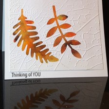
I then die cut two leaves from an X-Cut set I have had for absolutely ages, and then embossed that with a Crafters Companion embossing folder with a leaf print on it.

The embossed piece was stuck down onto the Brusho card, then cut down to slightly smaller than the base card, and adhered with double sided tape.

The sentiment is from the Altenew Pattern Play Circles – yes, still on my craft table for further playing – and stamped directly onto the card base, using Versafine black onyx. (Brave of me, don’t you think?) I didn’t want a large sentiment, as I didn’t want any of the embossing or colour detail to be lost.

I shall be entering the following challenges:

CAS Watercolour Card ChallengeFall Leaves

Time Out Challengesphoto inspiration (used orange and white)

Inspired By All The Little Thingsphoto inspiration (used orange and white)

Double D Challengesuse leaves on your project


Simple and Autumnal

Hi everyone. Another playtime today, and I created a couple of cards for challenges which are ending today. Please forgive another ‘twofer’ but I haven’t had time to play much the past couple of days, and I really wanted to put my ideas for these cards out there.

The first card is a simple geometric design, using the Altenew ‘Simple Shapes’ stamp set, stamped in Versafine black onyx. I used my Misti as I felt I may have to stamp them a couple of times, as it is such a solid shape. Then I used Catherine Pooler ‘Rockin’ Red’, stamping a sentiment from Stamps By Me into the red shape. This card is going to be entered into the following challenges:

Dragonfly JourneysHip hexagons

4 Crafty Chicksblack, white and one other colour

Addicted to Stamps and Moreanything goes

Moving along with the timesGeometric shapes

The second card took a little more playing!

For the autumn colours, I used some Brusho’s on a white piece of card, let that dry, and die cut the sentiment from a Stamps By Me set. I also die cut ‘H’ and ‘I’ from the Altenew ‘Bold Alphabet’ out of the same card.

The background is a stencil from Catherine Pooler, using three colours of distress oxide, purposely leaving the bottom white to show the word ‘beautiful’ off better. Once I had stuck the word and letters down onto the stencilled card, I added some Nuvo drops.

I haven’t really used Nuvo drops before, but I must say I like the way they hold a rounded shape, and how solid they feel when they have dried. I purchased quite a few from Hochanda when they had a ‘mix and match’ deal going on – I am glad I did.

This card will be entered into the following challenges:

AAA Cards colours of Autumn

The Paper Girls Challengeharvest/autumn colours

Make My Monday challengeAutumn colours

Pause Dream Enjoy challengesfall colours


Altenew August Challenge

Hi everyone. My sister have been playing at making cards together for a change! We decided to pick a challenge, and both have a go at it, and we chose the Altenew August Challenge posted by Erum Tasneem.

For this card, I stamped and embossed the background in clear embossing powder using the Hero Arts ‘Woodgrain Bold Print’. I chose clear embossing on the white card, as I wanted the background to be quite muted, and not be too busy for the flower images. Brown Brusho was used to colour the background and when the base card was still wet, I added some of the same powder directly to it, leaving the multi-coloured background you can see – and of course the embossing resisted the ink.

The flowers and leaves are from Altenew ‘Hennah Elements’, stamped and embossed in Ranger ‘Princess Gold’ embossing powder, then die cut with the matching dies. Four of the bigger leaves were coloured with Brusho ‘Emerald Green’, the flowers and the rest of the leaves and flourishes left un-coloured. I did toy with the idea of colouring the flowers, but decided to leave them plain white, as I think it makes them stand out more.

The flowers were stuck down with Pinflair 3D glue gel, so I could have a little height to put the leaves and flourishes underneath, and also a little ‘wriggle’ room for placement. The leaves and flourishes were stuck flat with Cosmic Shimmer glue.

A brown background card, a sentiment from the same stamp set, again embossed with the Princess Gold embossing powder, and the card was completed.

Here is the post from my sister: Blue Butterfly Cards


Water colour and salt


Hello everyone. I tried a different technique for this card. The challenge is from CAS Water-colour Card challenge, with the challenge being to use salt with your water-colour. I’ve never tried this before, so I thought I would give it a go.

I used a stamp from Hero Arts ‘wildflower garden’ and stamped this image on water colour paper in Versamark, heat embossing with white embossing powder.  I then spritzed the paper quite liberally and added my Brusho colour ‘purple’. I think I also added a little red, but not quite sure. When I am crafting I do tend to forget what I have used sometimes – so in the zone!

Whilst still wet, I added some rock salt (my sister’s cupboard!) and let the whole thing dry. I didn’t do any moving around of the colours – just let it lie there drying.

Once dry, I scraped off the salt and was left with this piece of card. I love the way the salt has concentrated and repelled the colour at the same time, and the colour also being resisted by the embossing of the flower image.

I then took an A4 piece of white card, folded in half, and die cut a rectangular opening the size I wanted to catch all of the flower and colours in it, and then embossed another rectangular die around that. I used Simon Says Stamp and Lawn Fawn stitched rectangles, as they are slightly different sizes, and give a border/frame effect when worked together.

I then stuck the water-colour paper behind it, and covered the back of it to make it neater.

The sentiment is from an Altenew stamp set, and die cut and embossed using the same technique of using a die cut, added to the image with some foam.

Now, my sister and I had a ‘discussion’ about the size of the card. She wanted me to cut the length down more as she felt it was too big, whereas I left it the A4 size completely, to give more open and white space…………Perhaps I could have some opinions as to what you might think? (As long as you agree with me!!!!)

Anyway, I shall be entering this card into the following challenges:

CAS Watercolour Card Challengeuse salt

clean and simple butterfly

Hello everyone. Sunday here is turning out to be a glorious warm and sunny day – and yet I have been making this card. Well, with my wedding anniversary today, and hubby off golfing – what’s a girl to do?

This card was inspired initially by the current Casology challenge – the cue card being ‘fly’. So, how many items do I have that could be used for this card? I am sure we all have butterflies, and birds, and feathers, and loads more stuff. I initially thought about the Tim Holtz ‘crazy birds’, then went to my Altenew ‘feathers’, then went to some butterfly stamps – then – found this Brusho piece of card from when I was playing with my new colours a few weeks ago. Just laying there on my desk, calling me, asking me to use it for this card………..

Immediately, I went to my butterfly die from Sue Wilson – ‘Majestic Monarch’. This is such a gorgeous die, very delicate, so it wouldn’t take over too much from the background, but quite large. Therefore, I went to a 6 inch square card as a base.

I placed my die cut butterfly on the card, and tried several positions until I was happy, then looked for a sentiment. This sentiment actually comes from the Altenew ‘Faithful Feather’ stamp set, and I love the script, and also that it fit just perfectly rightly in the bottom right of the card.

I used my Misti to stamp the sentiment a couple of times with my Versafine Black Onyx, then stuck down the butterfly using the body only, as I wanted the wings to move around a little, to give some movement to the card.

I hope you are all having a fabulous day, and will be crafting at some point……

I shall be entering this card into the following challenges:

Casologyfly

Simon Says Stamp Wednesday challengeanything goes

Crafting with Dragonfliespunches or dies

Colour Crazy Craft Challengeanything goes

Two-fer

Morning all. Today I shall be posting two cards, as I am not sure if I can post anything else during the week. I have a few days in London on business, but it is up-in-the-air how many days, and how long for. That’s the way the cookie crumbles, sometimes.

This first card is obviously monochrome, and in my favourite colours. Black is a colour, right? Whether it is for the stamping, or for the sentiment, I do like using black on my cards somewhere – unless the card is sweet and cute – then I have to resist the instinct! However, I can still stamp the outline in black, can’t I?

I used the Birch press layering dies again, cut all three layers in black, with a white base card. The sentiment is a stamp from an Altenew stamp set, cut out with the Lawn Fawn wonky rectangles die set.

This second card is using my Brushos – I bought some new colours last week – and a stamp from Visible Image. I stamped and embossed the face and whiskers and heat set with black, then used the resist technique and my Brushos. Can you believe this Brusho is the black. Only the black. No other colour added………what a true burst of colour in what is called ‘black’. How amazing is that?

I then added some green to the eyes, and went over some of the white areas in the eyes with a white gel pen to bring a little more life to them.

I shall be entering the black and white card into the following challenges:

Creatalicious challengesfavourite colour

Allsorts Challengeuse two or more dies (used 4)

I shall be entering the cat card into the following challenges:

Just Us Girlsuse powdered dyes


Colourful inspiration

Good evening all. For today’s card I have been playing with loads and loads of inks. Can you tell? I have been ink blending and creating Brusho backgrounds, and die cutting. Quite a bit of playing and fun I had.

For the base card, I used a piece of Crafters Companion water-colour card, and blended colours from Lawn Fawn. These inks are wonderful and blend very, very nicely. I will definitely use them again for this technique. I also did some water splashes to create some added interest to the background.

I actually tried to emulate the colours from the Daring Cardmakers challenge with the middle bottom image being of what I saw as sea and sun-setting sky.

You had to use three elements from these pictures, so I continued to create another ink-blending background, from which I cut small strips – to match the top middle picture, and laid those down in a criss-cross pattern just off to one side.

The third element I used were the flowers. Well, I couldn’t just put one or two on, could I? I started by creating a Brusho background with one of the blue colours, added some yellow, added some purple. I just kept adding until I liked the colours.

I then stamped the flowers from the Altenew ‘Adore You’ stamp set onto that background with Versafine Black Onyx and die cut them with the matching stamp set.

I glued everything down flat, and I used a glue I haven’t used before but bought at Doncaster Dome craft show this past weekend – Tombow multipurpose liquid glue. My goodness that stuff is strong, isn’t it? It may take over from my usual favourite glue from Creative Expressions – Cosmic Shimmer. I really like the Tombow….

I will be entering this card into the following challenges:

Daring CardmakersJune Elemental challenge

Crazy 4 Challenges – at least three of something (strips, flowers)


Fantasy Fairies


I have been playing with my Brusho’s again……I seem to create quite a mess – on the card and off of it! I was inspired by three challenges today – Cards In Envy, Fab N Funky Challenges, and Stamp with Sarah Kay. The first two challenges were to create fantasy cards, and the third challenge was for a water-colour background.

I started to get my Crafters Companion water-colour card – I had used the last of it! Now what do I do? How can I do a water-colour background without water-colour card? It won’t flow as well. I was in crisis mode! Luckily, their Chesterfield store is a mere 10 minutes drive away…………on with the make-up, did my hair, got in my car – and was back home within the hour. Of course, one has to look around the shop whilst there, doesn’t one? Guess what I found? These lovely, adorable fairies from Lavinia Stamps…..ideal for what I wanted to create. They are quite solid, but adorable. Out with the old idea, in with the new!

So – water-colour card cut square to fit my 7 inch square white card base. I used my Misti to stamp my two images facing each other, one higher, in Ranger Perfect medium. Misti because with the textured card I usually need to stamp twice. Added white embossing powder and heat set it. Then to the background. I thought the white embossing would resist the colours, so I just went on in there.

I wet down the card – both sides – taped it down, and sprinkled my chosen Brusho colours onto it. Turquoise at the top, Crimson in the middle, Lime Green at the bottom. A sort of sky and sunset and grass thingy going on here. Until they ran together! Blinking tape didn’t keep it flat! I mopped up extra colours, tried to stop the red running into the green, then the blue ran down – muddy colour in the middle! Wet it down again, kitchen towel to mop-up some colour, added one colour at a time, dried it, added the others. Don’t you just love kitchen towel??!!

I then used black Versafine to stamp some floral elements from Stampin Up ‘Flowering Fields’ stamp set. An older stamp set, but I like the little images – very versatile. I think it looks like the fairies are playing in a fantasy sunset field, dancing on the flowers – well – that was the look I was going for, anyway.

Attached the watercolour card to black, then added to base card. Of course, I added some glitter, and I think I’ve managed to catch this in the photo – Spectrum Noir clear sparkle pen. Pushed a little extra out and just flicked it onto the card.

I think I’m getting the hang of Brusho’s – I mean, you actually can’t plan very much where they are going to spread to. There may be a knack to them – but I’m enjoying exploring their capabilities…….