Love is all around

I’ve gone all ‘lovey dovey’ with this card, haven’t I? The inspirations for this card was from Just Us Girls challenge, and Cardz 4 Galz. I tried to emulate the hearts design, and whilst I was looking at that I was singing (in my head, don’t worry about it raining all day tomorrow!) ‘Love is all around’ by Wet, Wet, Wet. Even now, I know all the words. I have just done a quick Google – and it was released in 1995! 1995! Good grief. 22 years ago. Doesn’t time fly?

For this card, I used Centura Pearl card stock for all the die-cutting, as well as the base card. The embossed layer is a Spellbinders M-Bossability folder ‘Hearts’ I have had for many years, and is a go-to folder for the more romantic cards make – weddings etc. On one side you can emboss the smaller hearts background, and the other side is the dotty hearts background. A very versatile and useful folder.

The hearts are from a Sue Wilson fillables collection, a range of three heart dies and inners – ‘Jewelled,’ ‘Laced’, and ‘Fluttering’. I have mixed and matched all three of them to create each of the hearts.

I attached the three hearts with some Pinflair glue Gel, as I like to move it around when I have it on the card, and attached the single heart with some foam pads, as I knew exactly where I wanted that to be.

I will be entering one of these cards into the following challenges:

Just Us Girlsphoto inspiration

Cardz 4 Galzinspired by a song

Die Cuttin Divasanything goes

Watercooler Wednesday challenges anything goes


Shiny Christmas

It’s a cooler day here in Chesterfield UK, so I’ve decided to do a Christmas card. I have no idea where the logic came from in that sentence. It just seemed to fit. There are a few challenges out there with the theme of Christmas, so I’ve been playing with some of my crafty goodies.

I have also tried another way of taking a photo. What do you think? My sister sent me a link to a blog by Yana Smakula – I think she is bored with my previous background!! – and I’ve had a play with out house wall and a stool outside…….do you think it works better?

It actually took me a good couple of hours to conceptualise (what a word!) and come up with this. I wanted to do snowflakes, and I wanted them laying over the edge of the main piece of card, but other than that I just played.

I started by die cutting all five of the snowflakes from Sizzix/Tim Holtz ‘Paper Snowflakes’ – randomly – from a piece of white card.  After die-cutting the snowflakes, I then stuck a piece of double-sided sticky sheet on the back, which meant I could add some gilding flakes to the apertures left by the die cuts. (I’ll be using those on another project)

I applied IndigoBlu ‘Yorkshire Dales’ gilding flakes as I liked the multi-coloured effect these created. After adding the flakes, I smooshed them down and then embossed the sheet with a Sue Wilson 8 inch square embossing folder called ‘Snowflake Mosaic’. Then I decided what size I wanted the actual card to be – 8.25 inches by 6 inches. (Pre-bought card bases)

To follow the sketch from Atlantic Hearts Sketch Challenge, I then cut some circles from the MFT ‘Stitched Circle Frames’ out of the same ‘greeny’ card I used on my jungle themed challenge. I just love this colour – kinda shimmery, olive/greeny/browny.

I attached the circles to the bottom left of the card, leaving one of the smaller circles out for added interest so the circles weren’t so boring, and die cut one of the snowflakes out of Stampin Up glimmer paper, sticking that down with one of their dimensionals.

I cut the circles and snowflake to match the edge of the card, then peeled off the other side of the double-sided sticky sheet (already on my white card if you remember – and stuck that down to yet another layer of the greeny card, then onto white base card.

The sentiment is an X-Cut die, which I cut out three times from card with double-sided sticky sheet on each layer to make it easier to stick one on top of the other, then added to the card.

From the front, the sentiment isn’t quite that obvious – which I wanted – and doesn’t detract from the snowflakes, but turn it to the side and get the shine from the gilding flakes – I think it works well.

I shall be entering this card into the following challenges:

Altantic Hearts Sketch Challengesketch

Watercooler Wednesday challengeChristmas

Addicted to Stamps challenge Holiday

Mix it up challenge anything goes option embossing

Christmas Cards all year roundprecipitation (snowflakes)


Sparkly Dragonfly


Hi there, I have been playing again. I actually haven’t stamped very much on this card, as I just felt the need to die cut and emboss. I took the opportunity to use the Detailed Dragon fly Thinlits from Stampin Up. I also have the matching stamp set, but today just used the die.

I started with the sketch inspiration from Mojo Monday, as I liked the clean-ness of this sketch, leaving a lot open to interpretation. I also had some of the Lawn Fawn ‘Narwhal’ card left over from the previous blog post. I think this grey card is a really nice colour, and decided to emboss a grey panel with the Sue Wilson ‘Climbing Vines’ embossing folder, to go on top of an embossed white panel. I embossed them both together, so the pattern flowed across both the colours.

After sticking that down to a white card base, I die cut the large dragonfly out of white glimmer paper from Stampin Up, and decided not to add any other layers to it, as I think this glimmer paper is gorgeous enough on it’s own.

The three strips I cut down and stamped with a line of hearts in white ink, layering them down as per the sketch.

The main shape is also from Sue Wilson ‘Porto’ die set, which I cut out of white and then in grey, off-setting them so you could see the white on the grey background, and grey on the white background. The embossed detail is from the same die set – just embossed and not cut, to add some detail to an otherwise blank tag.

I used Collall silicone glue to the back of the tag, as I could then insert the strips and play around with the positioning before it set solid. I often do the when I want to add items underneath another item, as it gives you plenty of time to position.

The dragonfly I stuck down with Cosmic Shimmer glue – my favourite go-to glue of all time – but only stuck down the centre body, bending the wings slightly for more dimension.

I shall be entering the following challenges:

Mojo Monday Sketch

A Bit More Time to Craftanything goes

Crafty Catzanything goes

Colour Crazy Craft Challengeanything goes

Monochrome Magicanything goes monochrome


Three colours

20170525_181722

Hi there, despite it being 27 degrees today when I got home, I went to craft. I have a portable air-con unit which was ideal for this gorgeous weather! Cool as a cucumber – until I made some mistakes in this card. Took me several attempts for such a simple card, but here you go.

The colours I used are from the Colour Throwdown challenge, which I incorporated into a sketch from Clean and Simple Colours and Sketches. The colours were green, grey, and white.

I used a 6 inch square base card, to which I added a green strip embossed with a strip folder from Tattered Lace. The sentiment is from Concord and 9th, so is the ‘YOU’ part. They were obviously cut out of grey, and it was a Lawn Fawn Narwhal card I used for that.

The heart is from Stampin Up, a die set called ‘Sunshine wishes’.

What were the mistakes? Well – I forgot to cut the intricate dies with double sided sticky sheet on the back for one. So cut them again – and cut them the wrong way round, so when I came to stick them down – they were upside down. Start again.

I cut the ‘YOU’ letters, and put them into the middle of the heart in the wrong order! I spelt ‘YUO’. It took me a few minutes to realise what was wrong. I knew something was – but it took a while to realise.

Then – as I had stuck them down already, I had to cut another heart from another white piece of card, which I then inserted into the middle of the heart. Good grief! What a challenge! It was good that the air-con unit was working well.

Anyway, I will be entering this card into the following challenges:

CAS Colours and SketchesSketch

Color Throwdown green, grey, white

Tuesday Throwdownanything goes

The House That Stamps Builtanything goes

Orange Monochrome

For today’s card I have gone to one of my favourite ways of doing cards – monochrome. It doesn’t really matter what colour I use, but I tend to go for white with one other colour. It could be black, it could be green, and this time I have gone with orange. Orange? Yes – orange.

I decided to go with this as inspiration from Time Out Challenges had a CASE this card challenge, and to me the overall colours on the card were white and orange. I don’t really tend to do ink blending backgrounds, though I have tried in the past, and prefer to go with embossing.

And – a recent delivery from three of my current favourite companies – Lawn Fawn, Concord and 9th, and Altenew. I have just received my Altenew ‘Super Script’ stamp and die set, and Lawn Fawn ‘Stitched Windy Backdrop’ , and Concord and 9th ‘Say Hello’ stamps and dies.

I started with a white 6 x 6 inches base card, and added the stitched windy backdrop, also in white. I didn’t want the backdrop to be the whole of the base of the card, which is why I chose a 6 inch square – just slightly bigger. The die is quite big, measuring at 5.5 x 4.25 inches.

I then cut out the big orange ‘hello’ and left it bubble, with no added detail. The ‘friend’ part is using the matching stamp and white heat embossing it, then cutting it out with the matching die set. I only glued the top half of the die-cut leaving the bottom half hanging off the stitched backdrop.

I think this card is bright cheerful, but I still decided to add a little orange enamel dot in the bottom corner. This is from We R Memory Keepers, and matches the orange perfectly.

I shall be entering this card into the following challenges:

Time Out Challenges – Case this card (orange and white)

Daring Cardmakers – use two colours

Dragonfly Dreams – Monochrome

Cards in Envy – favourite colour combo (white and one other colour)

Monochrome Magic – anything goes monochrome


Altenew Cover Die

There seems to be a theme running through my cards at the moment – Altenew. I am playing with their dies as well as stamps, and recently bought this die set – ‘Layered Floral Cover Die’. I shall be returning to the Triangle Turnabout stamp at some point this week……

For this die set, I decided to go with blue and white, but mixed it up. I had some Tonic blue card in matching tones of blue, and used a dark blue and a turquoise blue as well as white. As you can see, it makes very different cards depending on whether the background is light or dark – and I can’t decide which one I like best.

I even hesitated about using a sentiment, but tried one sentiment on one of the cards. I didn’t want a die cut, I didn’t really want a sentiment which took away from the design – just to add a little something……

I went with the sentiments from an old stamp set I have from Craftwork Cards. I bought the set at a local craft show, and have never used it. Again – found when tidying my room up and trying to organise it. I actually may try to organise my room several times a year, as it is amazing what you find!

I shall be entering one of these cards into he following challenges:

Always Fun Challenges anything goes

Inspiration Destination Challenge – anything goes

Createalicious Challenges – anything goes

A Bit More Time To Craft – anything goes


Still Triangle Turnabout

20170521_183003

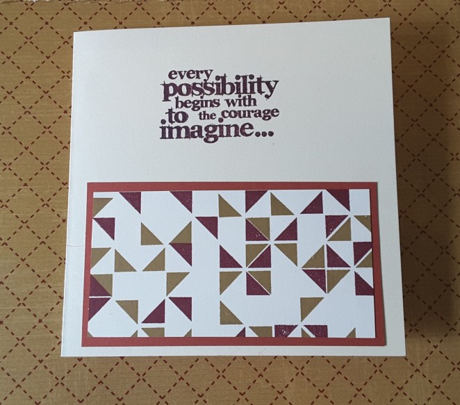
This is the first attempt at using the Concord and 9th Triangle Turnabout stamp which turned out OK. For two of the layers, anyway. I don’t think you can imagine how long it has taken me to produce this little snippet of coloured card….I must have spent close to two hours yesterday trying to get it to work for me. I looked at half a dozen YouTube videos, created a template – or four – as recommended by them. It all went well for the first stamp and the first turn, and the next stamp – then all went to pot! I haven’t got a clue what happened. It all seemed to line up before I inked it, then it just didn’t work……

The small example above is just two stamps, with one turn. I was very tempted to try another turn, but decided I liked the look of it as it was, and I didn’t want to get it wrong yet again that same day.

Anyhoo, the card is made with the colours from CAS Colours and Sketches. The challenge was to use Rich Razzleberry, Sahara Sand, and Sweet Sugarplum. I only have the Rich Razzleberry ink, so used Crumb Cake instead of Sahara Sand, and used a piece of card which was Sweet Sugarplum.

As I was a little frustrated- just a little – I saw this sentiment from Tim Holtz and Stampers Anonymous (Phrases 2) and thought it certainly matched the kind of mood I was in. It actually uplifted me. I certainly have the courage to imagine……..I just couldn’t execute the idea. Don’t worry, I’ll keep trying until I do succeed. I am not a ‘giver upper’!

I shall be entering this card into the following challenges:

CAS Colours and Sketchescolour challenge

The House That Stamps Built –  colour palette

QKR Stampedeanything goes

Aud Sentiments challengeanything goes and a sentiment


3 colour triangle turnabout

I’m still playing with the Concord and 9th ‘Triangle Turnabout’, which is why I’ve posted again today – very excited I managed to get that far…… This time I managed to do three layers in the colours set out in the current Just Us Girls challenge – lime green, turquoise and navy. I did the design of the card to match the challenge from Freshly Made Sketches and the Fab ‘n’ Funky challenge for creating a background.

I must say, doing three of the four layers for this stamp was a little easier than before, but I did make sure my stamp was cleaned well between the colours so I could double-check before stamping.

The Navy and Turquoise are from Stampin Up, and the lime green is from Catherine Pooler ‘Lime Rickey’. I think the colours work well together, and I loved the combination. To match the sketch challenge, I cut a thin sliver out and separated the two, adding thinner foam pads to raise only slightly. I always add a little glue to each pad, as I find it then gives me some ‘wiggle time’ to make sure it is centred correctly.

The sentiment is from Altenew ‘Painted Inspiration’, which is a great stamp set with some lovely sayings on it. Quite motivational, which I think is the point of them. I used a Sue Wilson die to cut out the sentiment, and raised it with foam pads.

When I manage to get all four ‘turns’ from the stamp set – I’ll let you know.

Challenges I will be entering are:

Just Us Girlscolour challenge (lime green, navy, turquoise)

Freshly Made Sketches sketch

Fab ‘n’ Funkyuse a background stamp or create a background


Colour challenge

20170521_111935

Hi there, everyone. I hope everyone is enjoying some intermittent sunshine. It’s quite cool here is Derbyshire, UK, but at least it’s stopped raining!

I have been crafting again – already! As you can see, I have gone more simple this time round……the card inspiration from the Color Throwdown challenge site with the theme of using the four colours listed – lime green, turquoise, yellow, white.

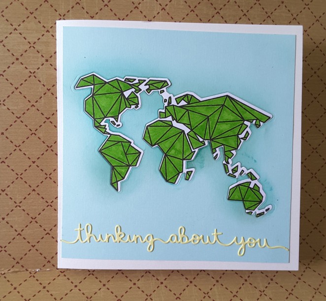
I did think of doing flowers initially, after seeing Amy Rysavy YouTube video on her take of the theme, but then I say another challenge from Simply Less is More with the theme of geometric – so I brought out my Neat and Tangled ‘Origami map’ and had a play.

Now, I have read the rules – several times – and for clean and simple cards it does say ‘lots of white/blank space’…….so I hope the blue background fits in as blank space…… I haven’t embossed it, I have left it pure and clean – well, apart from inking around the edge a little for more depth around the countries.

I started with a 6 inch square white card base, and put a slightly smaller blue layer on top, but cut out the origami map first, as I wanted the actual stamp to be paper pieced into the aperture. I didn’t want too many layers – yesterday’s card more than covered the layers side of me for a few days.

I then inked around the internal edges to make them darker – blinking difficult when there are small projections sticking out. I then used double-sided tape to stick this to the card base.

I stamped the world in Versafine black onyx, and let it dry, (not embossed that either!) then coloured with my Zigs. One colour – no water, no shading – just coloured. I love the fine tip on these pens, so you can into every nook and cranny. Once coloured, I cut it out with the matching die, and stuck it into the ready-made aperture.

The sentiment is from Lawn Fawn, and supposed to be an edger die, but I like how long the sentiment is, and covers the whole of the base of the blue card.

As a tip, I cut the sentiment out from a piece of card which had some double-sided sticky sheet on the back of it, to make it easier to stick down. If I forget to do this, then I use my Xyron machine – but I remembered this time.

These are the challenges I will entering this card into:

Color Throwdownturquoise, lime green, yellow, white

Simply Less is MoreGeometric

Artistic Inspirations – anything goes option of clean and simple

Crafting from the Heartanything goes


Jungle themed

Hi there. It’s been a few days since I last posted, due to several longer days at work, and working later, but I think I’ve made up for it with todays card. It isn’t what you would call ‘clean and simple’. It isn’t a single layered card. It looks as though I’ve chucked everything at it, doesn’t it? Let me explain…………..

I have been trying to get to grips with masculine cards, and saved a challenge theme to try from ‘Cardz 4 Guyz’ as the theme was Jungle Fun. I bought a bunch of metal stencils from Sweet Poppy at the Doncaster Racecourse craft show, which depicted wild animals, and haven’t played with them yet. This is only one of the stencils, and I am currently waiting for texture paste to dry on the others I have made.

This card is, obviously, using the Giraffe stencil. I used a Cosmic Shimmer texture paste – Chic Pumpkin – on top of black card. A base card of 7 inches square, to which I added a greeny/shimmery card slightly smaller which I had embossed with the Die’sire ‘Tumbling Leaves’ embossing folder. Once I added the giraffe, I played with the position thinking about adding more leaves, a sentiment, wondering what I would put where on the card, and decided to put things a little haphazardly on the card, slightly off kilter, giving an impression of wildness – maybe? Kinda? Sorta? That’s my thought process, anyway.

The sentiment is from Tonic, and I shadowed it with white. In hindsight – as there isn’t any other white on the card – maybe this wasn’t the right choice of colour………

The leaves added to the left of the card are from Sue Wilson – Finishing Touches – Mosaic Leaves. I use these a lot to add interest and dimension to a card, and I particularly like them when they aren’t flat. I have only glued the stems down, slightly bending the branches themselves so they don’t stick straight up, but lie along the card.

And again – away from the clean and simple – I added some bling. Who says a masculine card can’t have some bling? I added some goldy/coppery jewels as you can see. You can also see that I not knowing my colours today – goldy/coppery and greeny/shimmery. I think it’s a new trend…….

Here are the challenges I will entering this card into:

Cardz 4 Guyz – Jungle Fun

Always Fun Challenges – dry embossing (background)

Tuesday Throwdown – texture (background and texture paste)

Watercooler Wednesday – masculine/anything goes

Simon Says Stamp – bit of sparkle (gems)

Crafty Catz – more than two layers