Triangles – Cardz 4 Galz

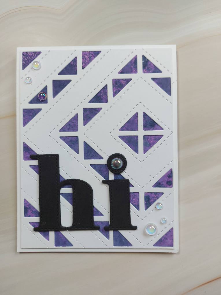
Dawn S has chosen the theme for the new challenge at Cardz 4 Galz. She wants to see ‘Triangles’. Here is my card:

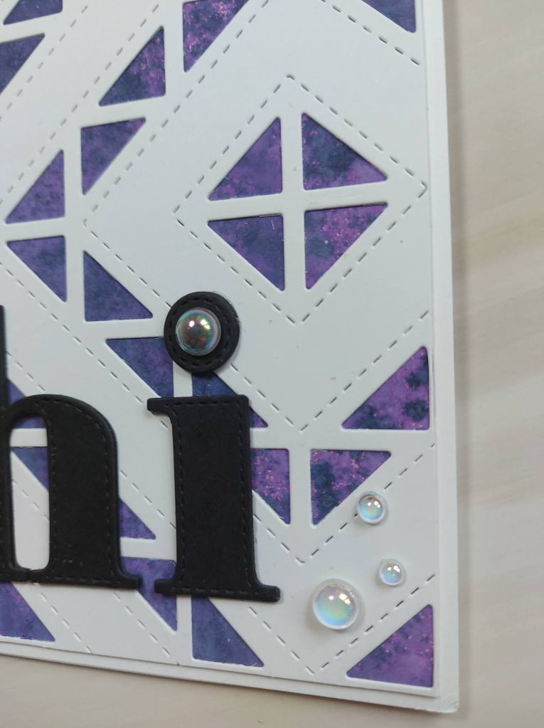
I die cut the white panel using a Catherine Pooler background panel I’ve had for absolutely ages, and then attached this to a previously created purple ink smooshed panel from my stash.

I have quite a few of these panels – I love to create a whole bunch of them ready for using – either die cutting or for backgrounds like this one.

I then die cut the ‘hi’ out of black card stock – layered 4 times for dimension – and added some clear gems as you see.

I seem to be using my little gems and accents quite a lot lately – I can’t seem to stop. At least I’m not hoarding them – though I do have a lot more to use!

I’m looking forward to seeing your creations incorporating our theme. xx

I shall be entering the following challenges:

Lil Patch of Crafty Friends anything goes

TTCRD anything goes

Simon Says Stamp Wednesday Challengeanything goes

Creative Fingers anything goes

The Sisterhood Of Craftersadd layers

colours and stencils

Hello everyone. I have two offerings to share today.

20180321_161620

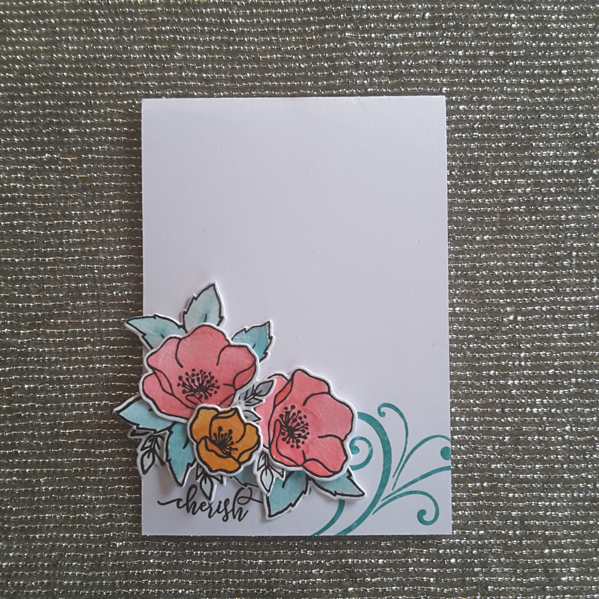
This first card is taking inspiration colours from CAS Colours and Sketches, using flowers die cut from Concord and 9th ‘Wonderful Florals‘ die and stamp set. I stamped the flowers onto water-colour card, and used the three colours from the challenge to arrange with a swirl and sentiment from Catherine Pooler.

This card will also be entered into the current challenge at CAS Water-colour Card challenge, with the theme of ‘Garden.

20180321_161554

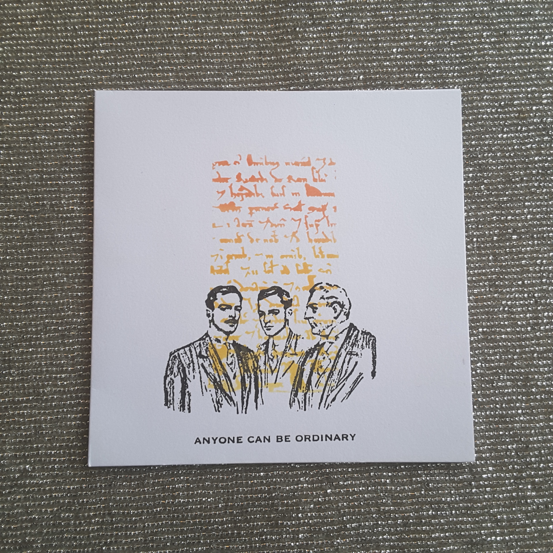
For this second card, I masked off the edges of the card with some post-it notes, and laid down a stencil from Imagination Crafts with a handwriting/script theme, and used Distress Oxides through the stencil. I then used two stamps from Studio 49 Wendy Vecchi, stamped in Versafine black onyx – using my Misti of course.

This second card is being entered into two challenges. The Watercooler Wednesday Challenge currently is for a masculine card, and Less Is More has a challenge for one layer only and using stencils.

Lilac Roses

Hello everyone. It’s been a week since I last posted, as I have been busy with family and hospital issues. I had a couple of hours this morning before going out again, so I gave myself permission to have a little crafty time.

This colours of this card were inspired by the current challenge from Color Throwdown, and I turned to a more clean and simple look.

The base card is Narwhal from Lawn Fawn, the white piece is cut with a Catherine Pooler die, and again embossed with a We R Memory Keepers embossing folder to give a really good 3D impression. The flowers are from Clearly Besotted and I used Altenew inks for each of the two layers for the roses, with a green Altenew ink for the leaves.

I die cut them, and arranged onto the white card, sticking them down with foam squares. As previously, I have not put a sentiment on it, but I may do in the future, though I quite like the look of the card as it is.

I will be entering the following challenges:

Color Throwdownlilac, green, grey, white

Addicted to Stamps and MoreCAS

Simon Says Stamp add a die cut

Clean and Simple on SundayCAS with dies


Simple sparkle

Hello again everyone. I have some time this weekend to do some crafting, and have put together these cards. I started to make these earlier in the week, and finally managed to complete them this morning.

The stamp set is from Uniko, one of their new stamp sets, and this time I have used the bud images from that set. After stamping with Versafine black onyx, I went in with my Polychromos to colour them, and even though they are quite small images, I still managed to give some dimension and blending to the flowers themselves.

I stamped the sentiment in black onyx too, as I like bold sentiments which stand out.

I then took a small piece of green glitter card from Crafters Companion, and die cut a strip from a Catherine Pooler collection I have, adding that for some added extra for a clean and simple piece of sparkle.

I am playing around with ways to photograph my cards, and these images came about as I have been putting my Christmas decorations on my table, and saw that this gorgeous plate – a Christmas present from a very dear friend – was just sat there, with some twig lights around it, looking all pretty……so I placed the cards on it.

I like how these turned out, and may have to keep the set-up for future cards.

I shall be entering the following challenges:

AAA Cards CAS sparkle

Use Your Stuffanything goes

QKR Stampede anything goes

As You Like It anything goes

Moving along with the times flowers


The blue’s and silver


20171118_171838

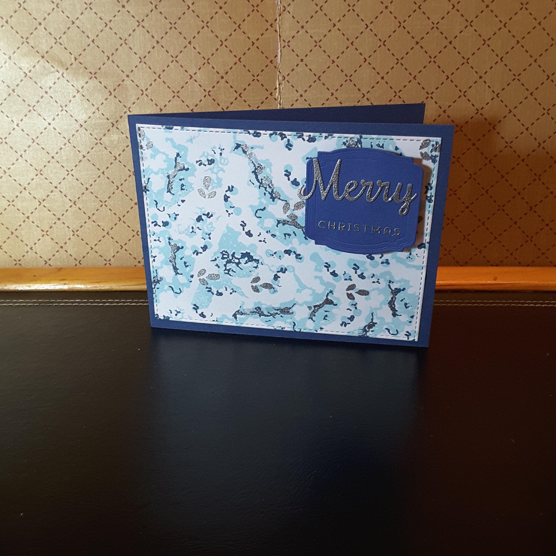
Hello again. I have been having a little more play with my marbling layering stamp set from Waffle Flower. I really like messing with the positioning of the stamps, and trying to follow the guide from their web site…….but it doesn’t really matter of you get it out of alignment. Well, I don’t think so, anyway.

I took the colour inspiration from Color Throwdown – dark blue, light blue, and silver – to create this version. I think it looks quite ‘icy’ and clean with these colours. Both of the blue colours are from Altenew, and stamped fairly neatly together, then I went in with some of the smaller stamps in the set – not the stand-alone ones, either – and filled in the gaps.

The darker blue I lined-up with their own base set, but also stamped them in the gaps left over. The silver is an embossed silver – some of them the third layer on the stamps, some stamped haphazardly on top of the dark blue, and ………even took three little leaves stamp from the Concord and 9th Blooms fill-in and stamped them in  some gaps, and on top of some of the blue. I think that if you look closely you can make them out.

Any stamp in a storm, right?

The sentiment is from Catherine Pooler. I took a piece of card, placed Be Creative double-sided sticky tape on it, added silver embossing powder, heat-set it, then die cut the ‘Merry’. I don’t think you can heat emboss many sticky tapes – but this one if ideal for things like this.

The shape of the sentiment tag is again from Catherine Pooler.

I shall be entering the following challenges:

Color Throwdown blue, light blue, silver

Crafty Hazelnut’s Christmas ChallengeChristmas with option of blue

The Holly and Ivy Christmas Challengeanything goes Christmas

Aud Sentiments Challenge Bloganything goes with a sentiment

Orange Poinsettias

20171112_141838

Hello there. Welcome. I had some good news the past couple of days – I was a winner in the Uniko challenge for October, and also a chosen winner for Happy Little Stampers October CAS challenge – one layer card. Yay! Talk about being inspired. It certainly got my creative juices flowing this weekend.

I have also been having a look through the Inkspirational challenge cards where I am still Guest designer – another few days to go still – and there are amazing creations on there. I am still going through and visiting people and looking at their cards and their process…….

Onto the card for today……I had so much fun putting this card together, and I am definitely going to make more of this style and theme. I just wanted to share with you straight away.

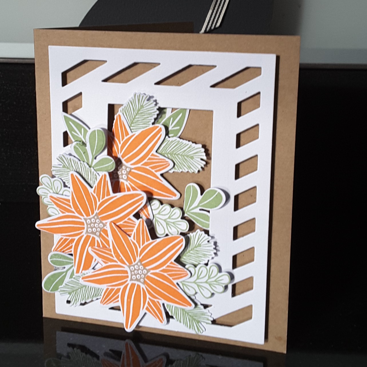
I took inspiration from several challenges, but the colours were from Color Throwdown, and the theme/topic was from The Card Concept. I knew I wanted to do a card with poinsettias on it, and decided to go with an orange poinsettia. I know there are some out there, as I did a Google search, but have never actually seen on in real life.

The base card is Kraft card, and I die cut Avery Elle ‘Diagonal Stripes’ leaving out the centre rectangle, but inserting a smaller rectangle from another die set. I wanted the Kraft card to show through the die cut so it looked almost like a trellis against wood.

I used Stampin Up adhesive strips around the edge of the die cut, and added some to the centre rectangular piece – but I didn’t take the sticky off the inner rectangle. Why not? Well, I knew I wanted to place the flowers and leaves in, under and around the white die cut, so having that inner rectangle stuck down wouldn’t work. Lateral thinking, huh?

I then stamped the poinsettia with Catherine Pooler orange ink, and the leaves with Altenew green ink. The centre of the poinsettia is where the brown comes into the card. The stamps themselves are also from Catherine Pooler. I die cut them, and then started to play with the positioning. Once I had it sorted – kinda – I then used 3D glue gel to put the flowers down first, then the leaves, as this glue gel gives me time to move things around until I am happy.

I think you can see the dimension on the die cuts from one of the photos. Sticking down the leaves half in and half on the white die cut, underneath the flowers, generally creating a positive cornucopia of foliage. 🙂

I didn’t add a sentiment, for several reasons. Firstly – I couldn’t find one which would suit or match the card, secondly I couldn’t find anywhere to put one where it wouldn’t look out of place, and thirdly – I didn’t want one!

I shall be entering the following challenges:

Color ThrowdownBrown, Orange, Green, Kraft

The Card ConceptPhoto inspirationPoinsettia and leaves

Crafty Hazelnuts Christmas Challengeanything goes (option reindeer)

Allsorts Challenge blogAutumn colours

Crafty Friends ChallengeChristmas


Hidden word

20171110_155901

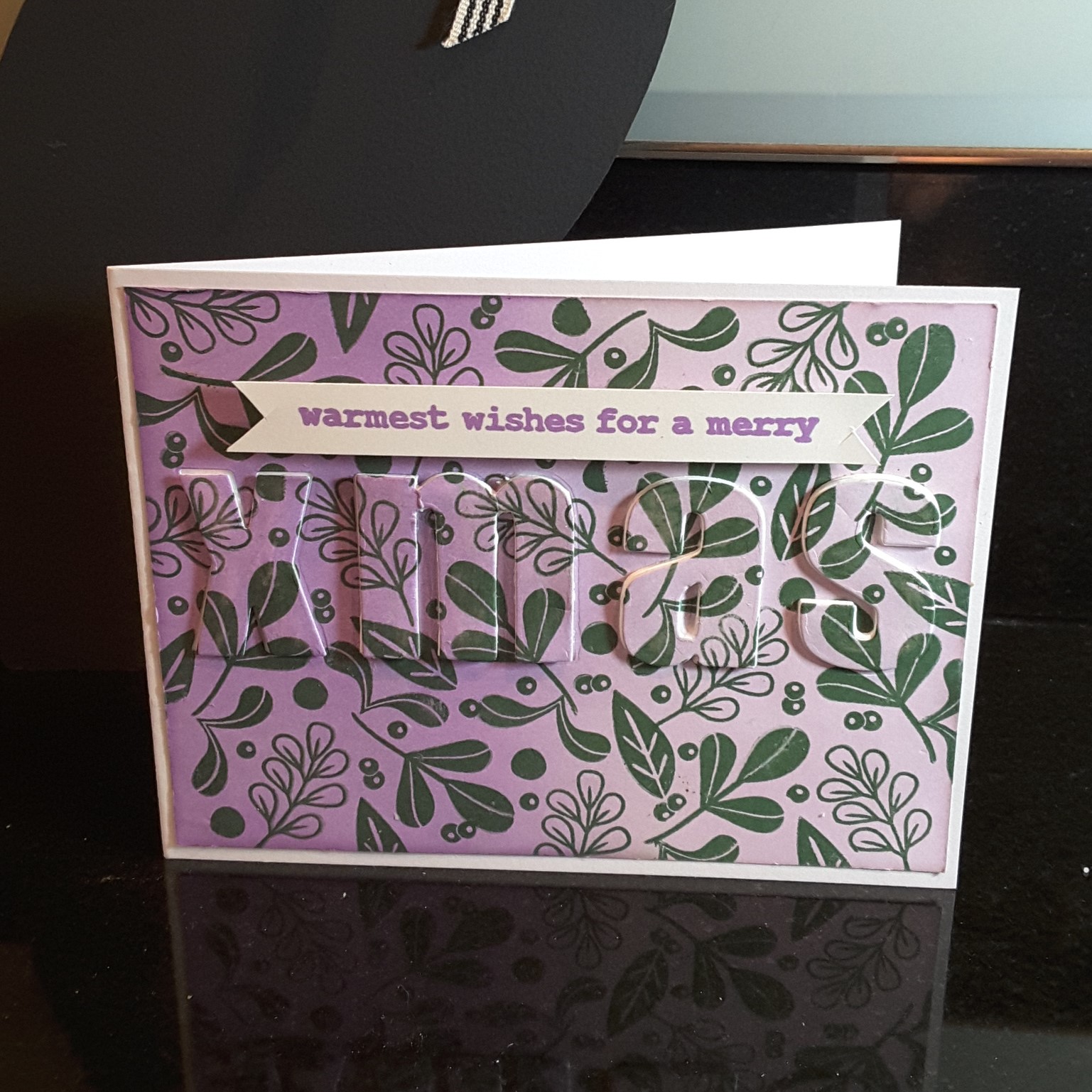
Hello everyone. I have been experimenting again. I have been playing with my Altenew alphabet dies, and also trying to do a technique – no idea what the technique is called – where the word is cut from the same background, then added back in with dimension…..can anyone help me with the name of the technique?

I used three colours only for the card – Altenew lilac and purple for the ink blended background, and Altenew dark green for the leaves that I stamped. I really like how the colours matched together.

The stamps are from Catherine Pooler, and I just let myself go with the stamping. I had no plan when I started out, and just kept adding smaller and smaller images from the same stamp set to fill in the gaps. I didn’t even use my Misti! (I know…..brave of me!)

The ink and stamps worked well together, so I just made sure before I stamped each one, that there was good coverage. I seem to be enjoying working with backgrounds at the moment, don’t I?

Once I had put the card together I added some sparkle to the ‘XMAS’ letters  as I felt that they didn’t really stand out very much – is this usual for this technique? Is my background a little too busy for this? Hubby couldn’t actually see ‘XMAS’ until I moved the card around, and said I needed to add something around the edge of each letter….hmmm – not sure about that.

I think I’ll try with the word a solid colour too, as a contrast to any background……

I shall be entering the following challenges:

AAA Cardsink blending

Cupcake Inspirationspurple, lilac, dark green

Cards in envyletters or words as focus

Sweet at Sweet Stampin’anything goes Christmas


Christmas and Pines

20171108_112321

20171108_112355

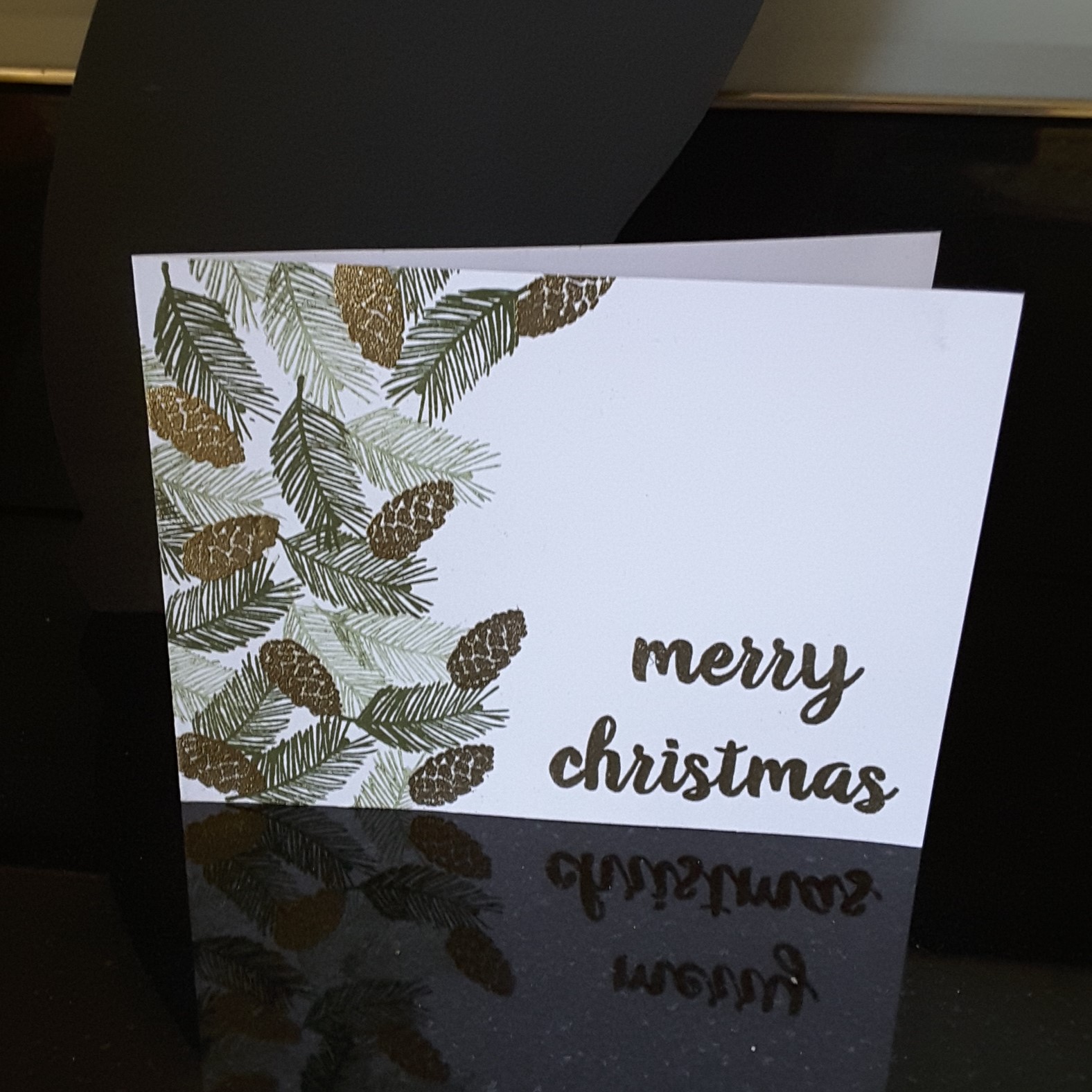
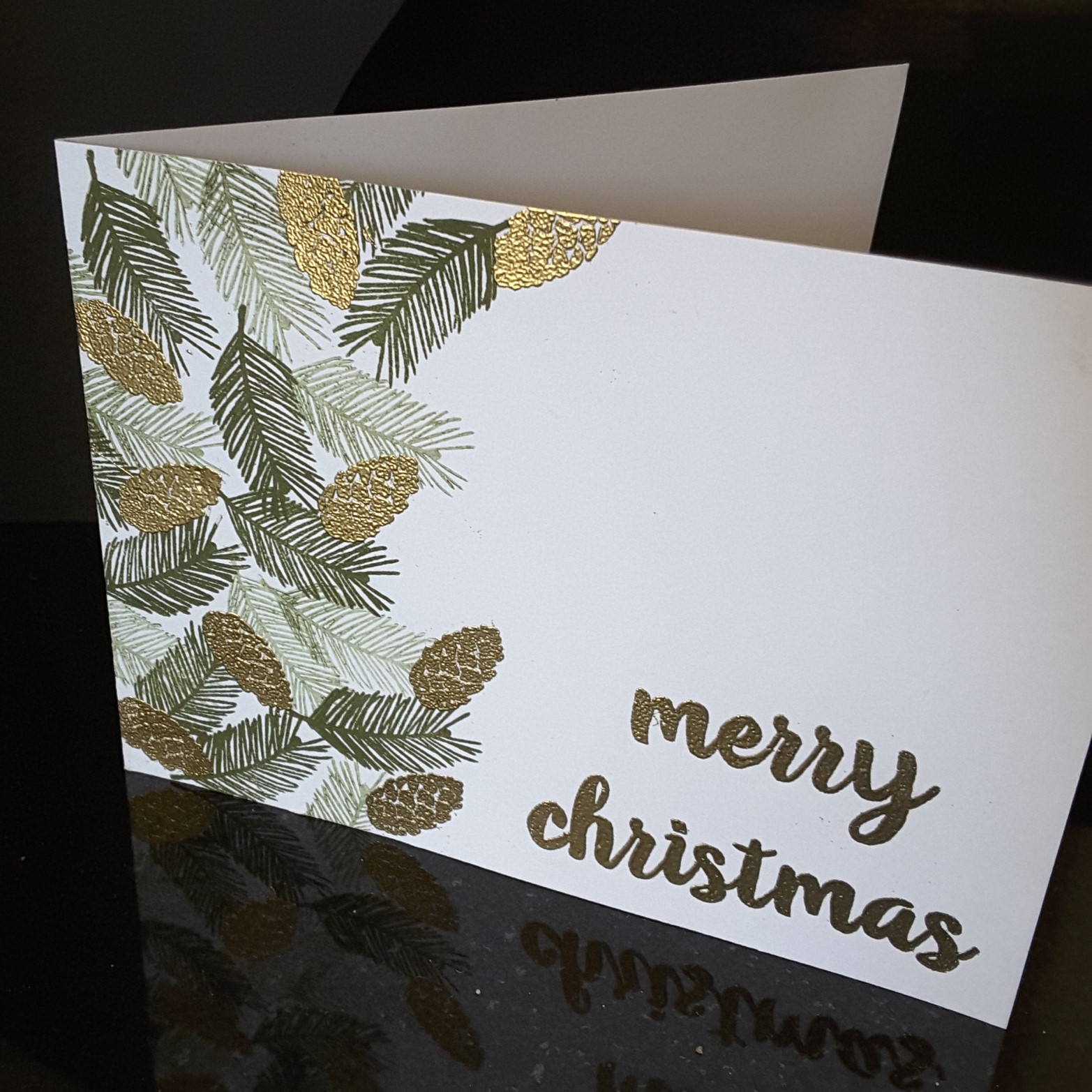
Hello everyone. A quick posting for today, as I made some Christmas cards last night. I was inspired by the Paper Players ‘Holiday Pines’ photograph, and hunted out my pine boughs and pine cone stamps.

The pine branches are from Catherine Pooler, and the pine cones are from Card-io/Majestix. I kept the feel quite vintage, and used a Stampin Up green for the branches, first and second generation stamping to create some dimension.

I then waited for the ink to dry, and stamped the pine cones in Ranger Perfect Medium, heat embossed with Creative Expressions gold embossing powder. I used the same embossing powder on the Altenew sentiment. I think I have captured some of the shine on the pine cones, but it really does look much better in ‘real life’.

I was so engrossed in making this card, and liked how it turned out, that I went on to make several of them. I may make some more changing it to silver embossing powder, but I don’t think it’ll turn out as effective – we shall see.

I shall be entering the following challenges:

The Paper Players photo inspiration Holiday Pines

Crafty Hazelnuts Christmas Challengeanything goes Christmas

The Holly and Ivy Christmas Challengeanything goes Christmas

Daring Cardmakers3 elements – foliage, green, gold

I hope you are taking part in the current Inkspirational challenge with me as Guest Designer – I look forward to seeing you there.


Simple and Autumnal

Hi everyone. Another playtime today, and I created a couple of cards for challenges which are ending today. Please forgive another ‘twofer’ but I haven’t had time to play much the past couple of days, and I really wanted to put my ideas for these cards out there.

The first card is a simple geometric design, using the Altenew ‘Simple Shapes’ stamp set, stamped in Versafine black onyx. I used my Misti as I felt I may have to stamp them a couple of times, as it is such a solid shape. Then I used Catherine Pooler ‘Rockin’ Red’, stamping a sentiment from Stamps By Me into the red shape. This card is going to be entered into the following challenges:

Dragonfly JourneysHip hexagons

4 Crafty Chicksblack, white and one other colour

Addicted to Stamps and Moreanything goes

Moving along with the timesGeometric shapes

The second card took a little more playing!

For the autumn colours, I used some Brusho’s on a white piece of card, let that dry, and die cut the sentiment from a Stamps By Me set. I also die cut ‘H’ and ‘I’ from the Altenew ‘Bold Alphabet’ out of the same card.

The background is a stencil from Catherine Pooler, using three colours of distress oxide, purposely leaving the bottom white to show the word ‘beautiful’ off better. Once I had stuck the word and letters down onto the stencilled card, I added some Nuvo drops.

I haven’t really used Nuvo drops before, but I must say I like the way they hold a rounded shape, and how solid they feel when they have dried. I purchased quite a few from Hochanda when they had a ‘mix and match’ deal going on – I am glad I did.

This card will be entered into the following challenges:

AAA Cards colours of Autumn

The Paper Girls Challengeharvest/autumn colours

Make My Monday challengeAutumn colours

Pause Dream Enjoy challengesfall colours


Block water colour stamping and more…

I have the cards above for one challenge, and a card further below for the Color Throwdown challenge this week, but I am blaming ‘Just Us Girls Challenge’ for all the cards above. It is totally their fault. I am not to blame! I mean – setting a challenge like this. Really! I just couldn’t stop myself once I had started……I just kept going and going and going. If you haven’t tried this technique yet – go for it.

The challenge was to make a card using block water colour stamping – you probably guessed – and a link to Jennifer McGuire for hints and tips. I was immediately hooked, and gathered my inks, and my water-colour card, my blocks, and my spritzer, and off I went. My only limitation when I started yesterday was space to dry them, and how many heavy objects I had around to stand on them for 5 minutes!

I used distress inks, distress oxides, Altenew inks………all worked very well with this technique. Loved playing.

You can also see I used a larger rectangular block, a small round scalloped block, and three smaller blocks. One or two of them I let stand, and one or two I hit once or twice so the ink sprayed out the sides…….Jennifer has lots of hints on the video……

Then I had to decide what stamps to emboss onto the respective pieces…..

The two smaller butterflies with the sentiment in them is from Finnabair ‘Dream on’, and the rest are from  Visible Image. I decided to emboss most of them in black, but tried a white embossing for one flower, and quite liked it. Black is still my favourite as I like bold sentiments and images which stand out.

Whilst I was waiting for some of the pieces to dry, I also managed to make a card for Color throwdown this week:

Their challenge this week was to use red, white, and black. I thought of Christmas, and used my Catherine Pooler background stripe stamp, with her ‘Rockin’ Red’ ink, die cut Leonie Pujol ‘Entwined Christmas Tree Baubles’ (supposed to be entwined with the Christmas tree but I liked the look of it alone), in black glitter card from Stampin Up, added the die cut word ‘joy’ from Catherine Pooler, some black sparkly thingies in the corners, and there we have it.

Phew, need a coffee and feet up now. All that crating has fair worn me out…….