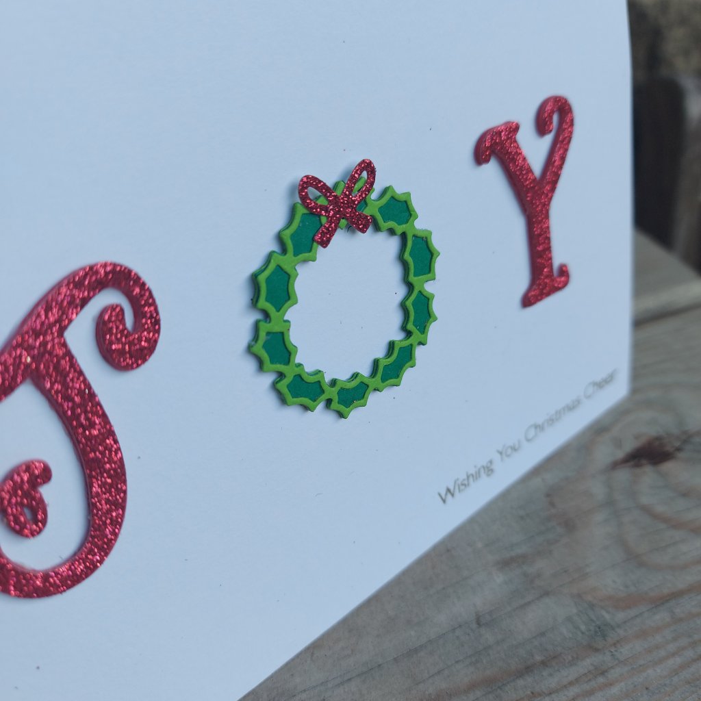
As with most of my CAS cards, it took me ages to get what I wanted. In the end I used a combination of dies from several companies, layering each of the letters and even the wreath with several layers of card stock.
I knew I wanted glittery letters, and that wreath from Sue Wilson fits in perfectly. The nit too me a little while to find a bow thw right size…..but I out the ‘bow’ word into the search part of the Color My Life app – and it came up with this Mama Elephant bow from a tag die set – the perfect size for what I wanted.
Onwards with my card making – after a lunch time MS Teams meeting.
Hello once again. A new challenge has started at The Holly and Ivy Christmas Challenge. As always, the theme is anything goes Christmas. Here is my card:
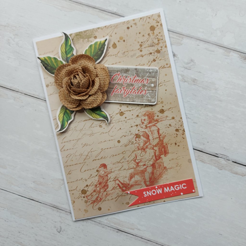
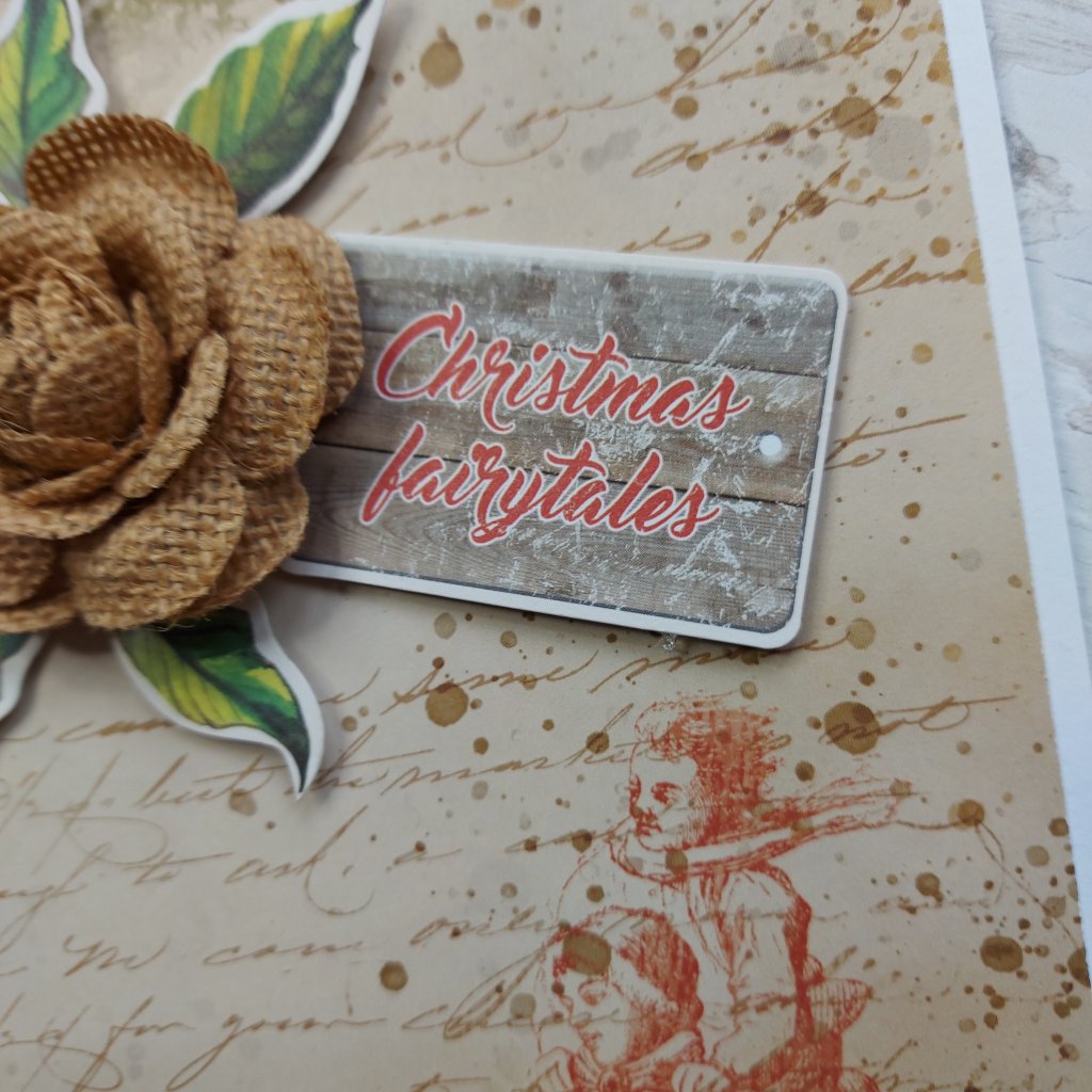
I may have mentioned previously that I have been buying a lot of Christmas ephemera packs – and not knowing what to do with them. This is a card made using several items from several packs.
The sledding paper was not altered in any way, just adhered to the card base. I didn’t think it needed anything doing to it there is vintage colours and splatters galore so I left that alone.
I added the flower, leaves, and sentiment as you see – no messing, no fuss.
I hope you can come and join us for this challenge. I look forward to seeing your creations.
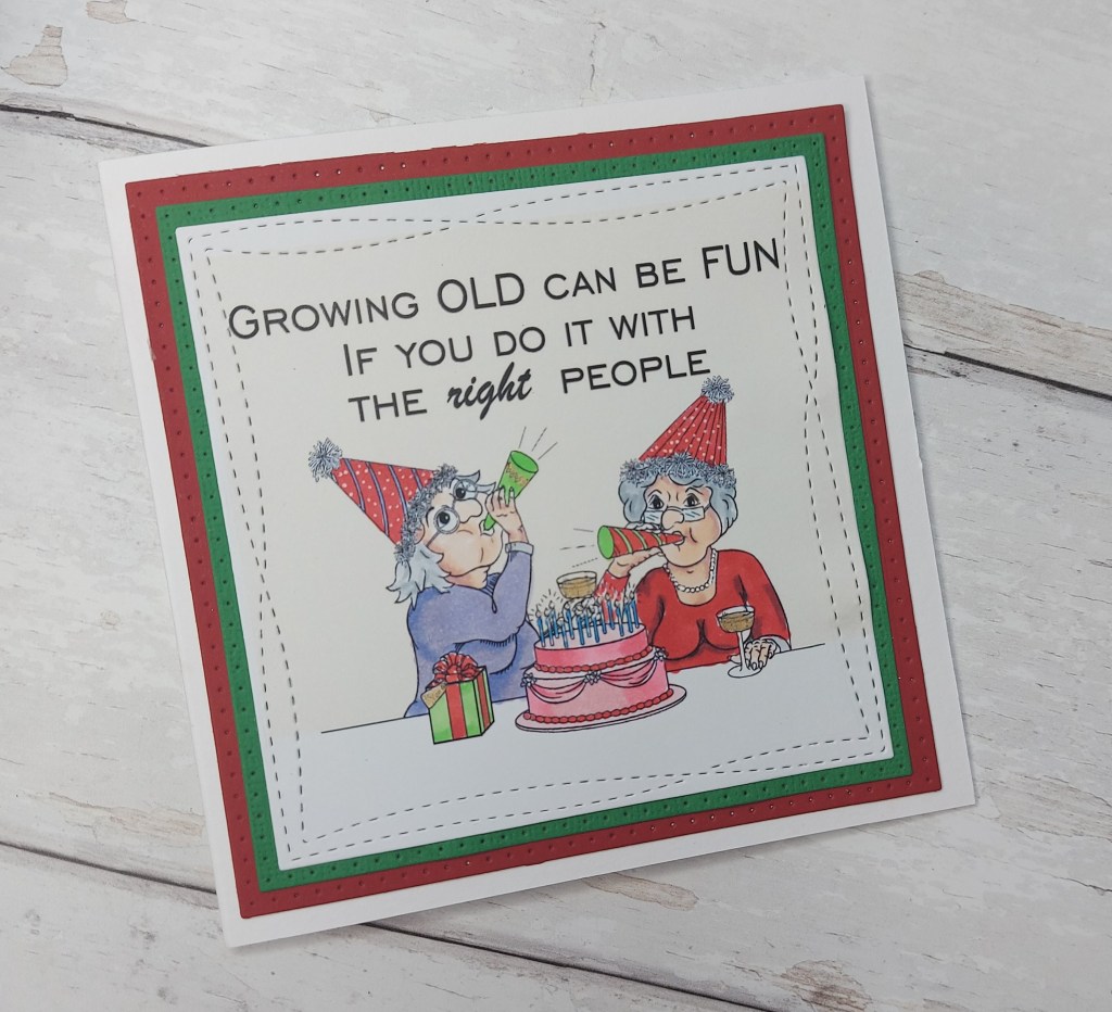
Hi there. A new challenge has begun at The Alphabet Challenge. We have reached the letter ‘O’ – and Dawn has chosen the theme of ‘Old Folk’.
Here is my card:
Aren’t these couple of ladies looking like they’re having fun? The image is from Jan’s Digis, manipulated a little in ‘Word’, adding the sentiment – playing with the layout and layering options – then printed, coloured with Copics, and die cut with MFT ‘Wonky Squares’ – just for a little more craziness…….
When I saw this digi stamp months ago, it reminded me of my bestie. We have always said we would be old and grey and still partying…..just like these two ladies here.
Just to say – we are already grey – though the hairdressers we have do a marvellous job :) :)……….and the ‘old’ bit? Well – it’s a frame of mind and not birth years I find….though sometimes I definitely feel older than my years.
Anyhoo – I hope you can come and join us for this challenge – I can hardly wait to see your creations using this theme – I am sure there are going to be some laughs along the way……………. xx
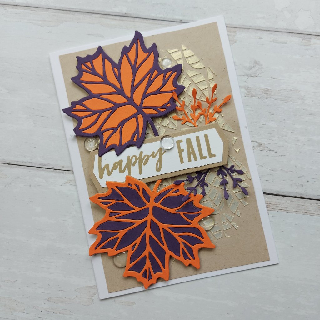
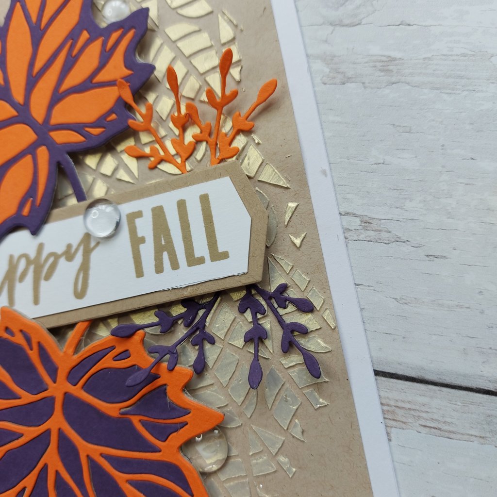
Hello. A new challenge is beginning at Cardz 4 Galz, and this time the theme is ‘Fall/Autumn‘ – but not Halloween……….!
Here is my card:
The background is embossing paste through a Catherine Pooler stencil, one I created previously – so I’m not sure which paste I used – but it does look golden and metallic!
For the the leaves, I used Concord & 9th ‘Thankful leaves‘ stamp and die set, and Concord & 9th card-stock.
The two leaves are using purple and orange, and for each leaf I inlaid the cut-out pieces to create reverse coloured leaves – if you see what I mean. Purple leaf with orange inlaid pieces, and orange leaf with purple inlaid pieces. These leaves came together quite easily, it was the placement of the leaves and sentiment which took me a little while to sort out…….
The sentiment banner is from a Concord & 9th ‘Everyday Bouquet‘ die set, and once die cut, I used my Misti ‘Cut-Align’ to just cut a tiny little piece off of each side – even the ends – so that it layered nicely.
I use the cut-align tool quite a bit when I have sentiments and die-cut banners for which I don’t have one slightly smaller – it is a great tool for that kind of thing.
Once I had placed the leaves and banner, I thought the card needed just a little more – just a little – so I die-cut the sprig from the ‘Everyday Bouquet’ die set and added as you see.
And there’s more – I added some clear cabochons. To me, these represent the rain which will fall in Autumn – well – that’s how my mind works sometimes…..
I hope you can come and join us with your fall /autumn themed cards – I look forward to seeing you in our gallery. xx
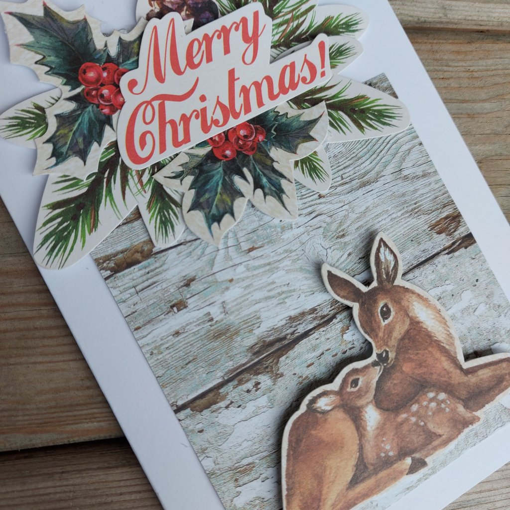
Hello once again. A new challenge has started at The Holly and Ivy Christmas Challenge. The theme is always anything goes as long as it’s Christmas. Here is my card:
This card is completely outside of my comfort zone….I have been so loving the kits and packets of die-cut Christmas ephemera from Craft Box UK and 14 Craft Bar – that I bought them without knowing what the heck I was going to do with them!
I don’t use ephemera like this, I don’t know what to layer with what – but I had a good time making this card. I just dumped the three packets in front of me and played. I actually made three cards – but this one I particularly like with the deer and her baby.
The wood effect behind the deer is actually part of the packaging for one set – I liked the neutral distressed look to highlight the two deer – and then the sentiment and branches and mistletoe and pine cones – I just had fun placing them.
I hope you can come and join us for this challenge. I can’t see to see what you create. xx
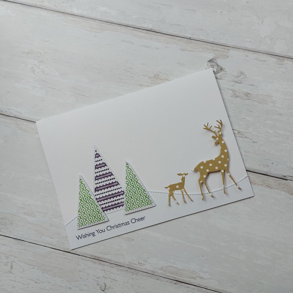
Hello there. I have a CAS card to share today utilising some new goodies. Here is my card:
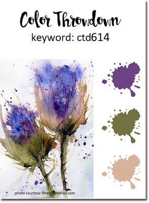
Using the colours for the current challenge at Color Throwdown, I first stamped the Stampin Up trees using Concord & 9th inks cubes, then die cut them with the matching stitched triangle dies – also from Stampin Up.
As these trees had a pattern, I die-cut the Tim Holtz deer – a new die set just released – out of dotty paper from Clearly Besotted. I die cut all the deer, but these are the two I chose for this card. The rest I put back into the packet of dies for future uese.
I placed them on the card, then decided I wanted to created a hillside, so as this card measures 7 x 5 inches – my go-to card size – I find the slimline dies more than adequately cut the length. I used the Lawn Fawn die set, decided which part of the hillside I wanted, then stuck down as you see here.
I didn’t stick the deer down fully, as well as the feet and legs being quite thin and narrow – I like to leave them and the antlers unstuck. I think it creates some movement on the card.
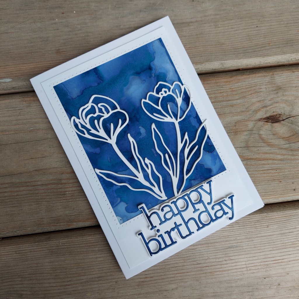
Hello there. The new challenge at The Alphabet Challenge is ‘N’ for Navy Blue – the creation must have navy blue as the dominant colour. Debbie is the host this time round. Here is my card:
I decided to play with my alcohol inks for this card and create the background panel. I don’t have much luck when I combine colours, so I thought just using the one colour – Denim – would be perfect for my limited skills.
I think I did about 4 or 5 layers to this – waiting for the drying in-between – it took me a while because I had to watch a Tim Holtz video again on the difference between using alcohol itself and blending solution – and even now I couldn’t tell you the difference – it may sink in at some point -no pun intended.
Once I ad created the background panel and it was drying, I die cut the Simon Says Stamp Crocus flowers three times for each one – then stuck them together for dimension. Three layers to each flower – which actually came together quite easily, despite the numerous gaps and holes in the die cut.
On the off-cut from the panel, I die cut the sentiment, then backed it with a white layer.
I wanted a frame around the panel, so I cut a piece of card slightly smaller than the card base, and die-cut a rectangle for the window, and assembling all as you see.
I hope you can come and join us for our ‘Navy Blue’ challenge – I look forward to seeing you there. xx
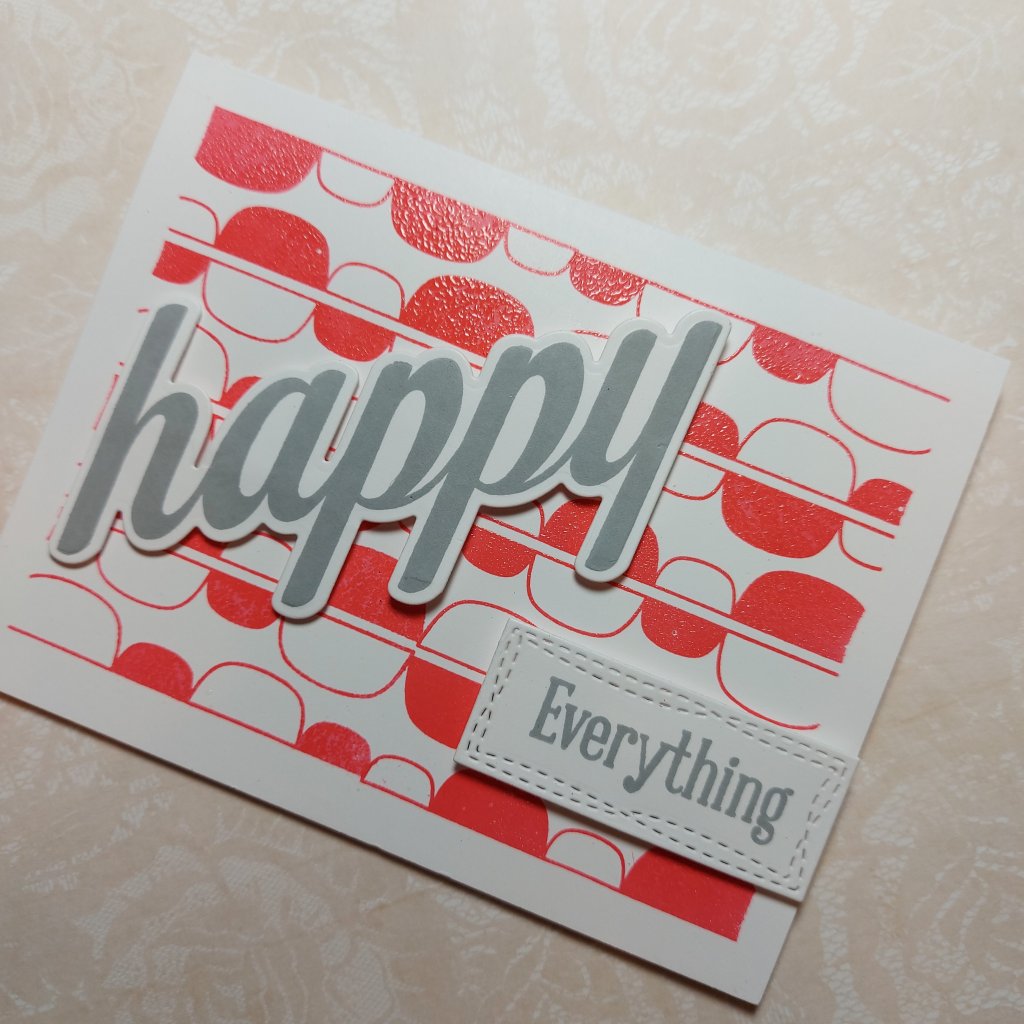
Hello once again. A new challenge has started at Cardz 4 Galz, and this time the theme – chosen by Dawn – is ‘RETRO’.
The main aim of our challenge to create cards or other paper-craft items for the girls in our lives. Some of the entries to our more recent challenges have not fulfilled this requirement – unfortunately – and we have not been able to comment on those entries. Please be sure to read the rules before entering.
Here is my card:
I should let you know – I had to contact the rest of the Design Team about this challenge – I have no idea what ‘retro’ means, especially when it comes to card making.
Here are the explanations I was given:
Retro is old but not old enough to be called vintage or antique. Think back to fashions, toys or sweets from your childhood. Or design styles and icons from the 60’s 70’s 80’s etc. Kind of a modern vintage…………
I have given it a go with this card.
The background is a Uniko stamp set called ‘Mid Century Modern 2‘ and I feel has a vibe to match in with the explanantion I was given above.
I stamped twice – side-by-side – in Concord & 9th pink ink, then clear heat embossed. I’m not sure why the embossing was uneven – maybe the powder is off or I didn;t get full coverage – but I quite like the effect actually. I little more interest.
I then used the Uniko ‘Big and Bold Happy’, stamped in grey ink, then used the matching die to cut it out, and using the saem ink of the ‘everything’ word from the same stamp set.
I like the mix of grey and pink, and think the whole card is ‘girlie’ but bold with it – maybe a little like me! :)
I hope you can come and join us with your creations – I look forward to seeing you in our gallery. xx
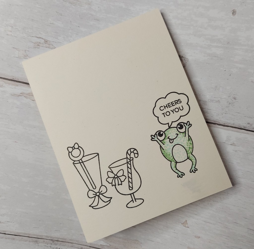
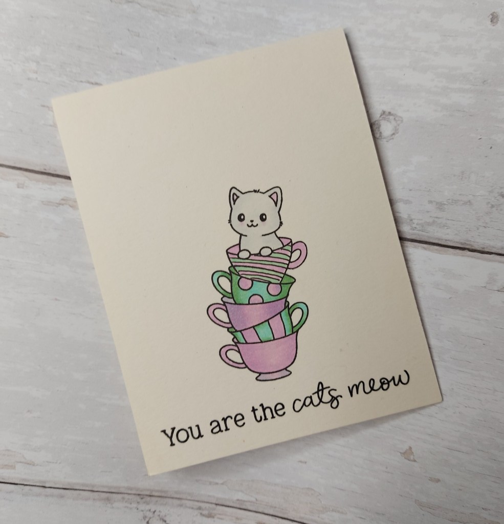
Hi there. A second posting today with a couple of CAS one layer cards. When I was typing the title – it seemed like it was the beginning of a joke – ‘A cat and a frog walked into a bar……….
Anyhoo, here are my CAS cards:
For the first card I stamped a couple of cocktail glasses onto Lawn Fawn ‘Vanilla Malt’ card stock, added the frog, speech bubble and sentiment as you see, colouring the frog in three different light green Copics – dotting instead of actual colouring, to maintain a CAS style.
For the cat card, I stamped the stack of cups from Clearly Besotted, masked the top cup, then stamped the kitten in the cup. So – the masking of the top cup – I forgot to mask off the back of the top cup – so I created stripes on that solid cup to cover the mistake……….
Coloured with Copics, just the two colours for the mugs/sups, a couple of greys for the cat, then added the Honey Bee stamps sentiment underneath.
I shall be entering the frog card into the following challenges:
Hello everyone. A new challenge has begun at ABC Christmas Challenge. Julie is the host for this month’s letters – ‘U’ for Up In The Air, and ‘V’ for Vixen. Julie has also provided a prize for the winner – so please head on over and join us.
These are my cards:
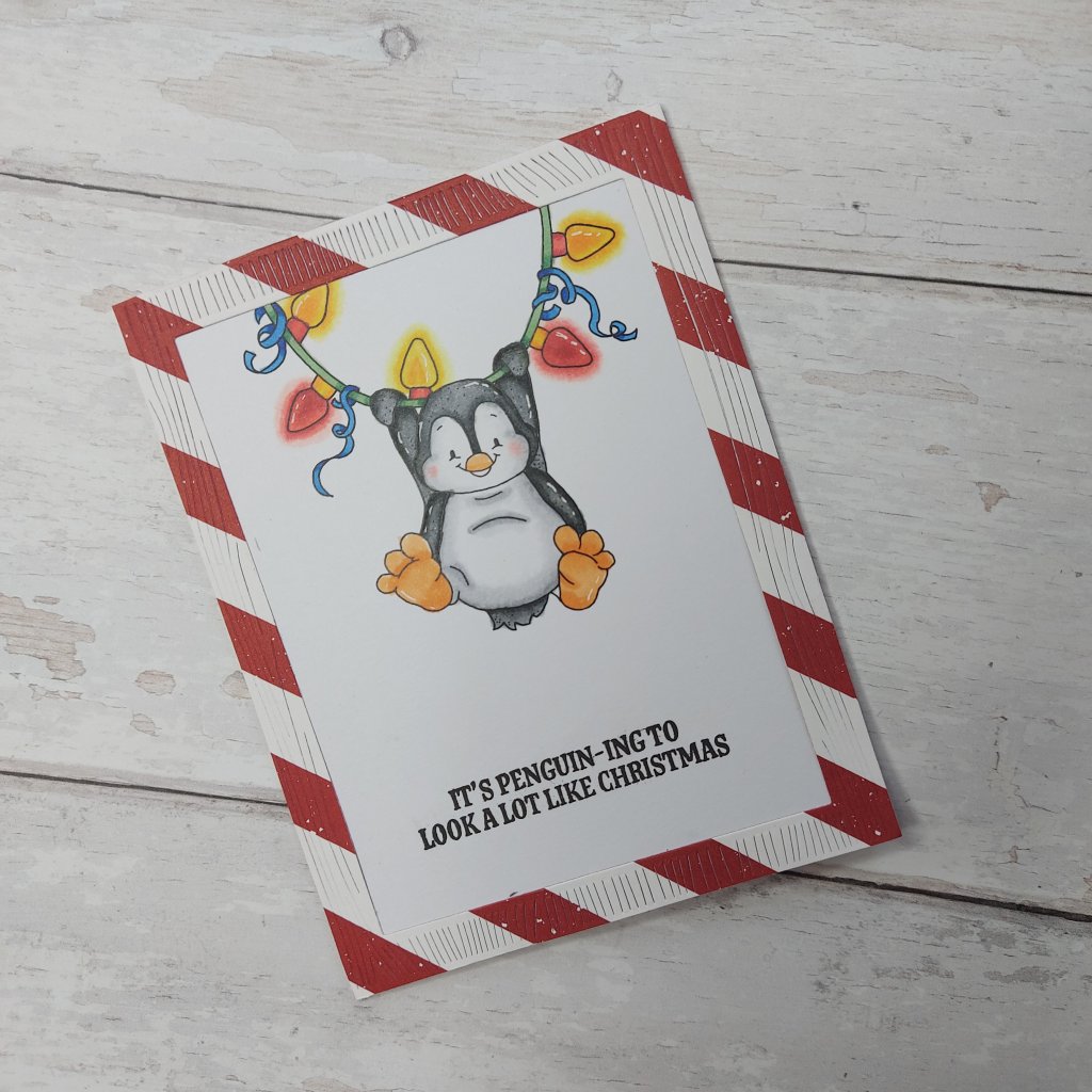
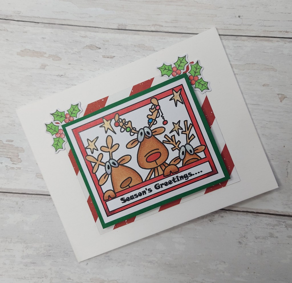
‘U’ for Up In The Air‘V’ for Vixen – other reindeer welcome
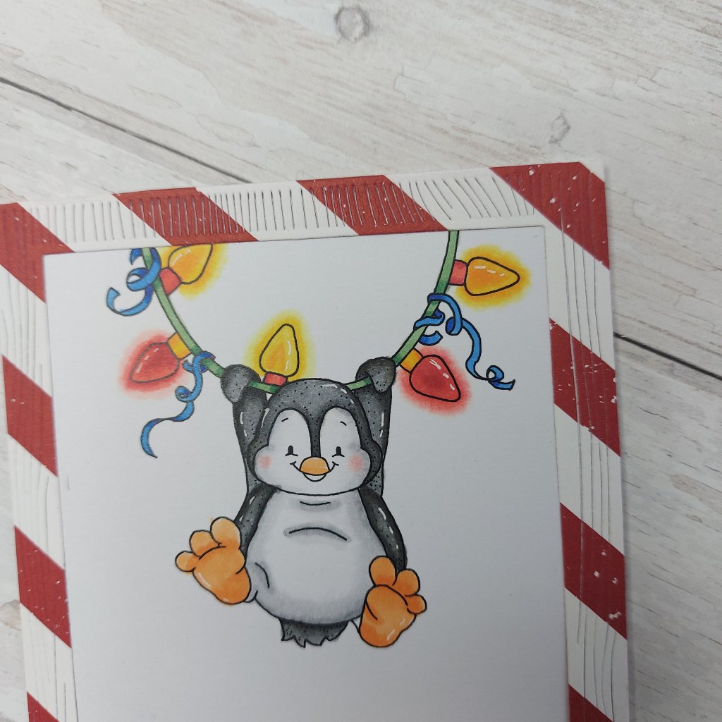
The Penguin swinging in the air on a string of lights is a digital image from Whimsy Stamps, printed, then coloured with Copics.
I had a play with using the ‘N’ greys in Copics, and had even more playtime with the lights. I had a go at trying to create a glow around the lights – following (kinda) instructions from a Kit and Clowder class last year.
I used three colours of red and three yellows – then went around the outside of the colours with the colour-less blender to give an impression of a glow:
The sentiment is from Avery Elle ‘Bring On The Joy’, the striped frame is using a Hero Arts die set, and I think the striped paper is from Stampin Up – though I may be wrong.
For the second card – the reindeer card – I used a digital stamp from Bugaboo, printed then coloured with Copics, adding glossy accents to the eyes.
Using the same striped paper, I also cut a green layer from Altenew gradient card-stock. I thought it looked a little plain, so I searched through the Color My Life app for ‘holly’ and came across a stamp set from Clearly Besotted which had this holly stamp and die.
I stamped four times, coloured with Copics, die-cut, then stuck down in the top corners as you see, also adding Spectrum Noir clear sparkle to the berries.
Two cards made using digital images – I am finding these quite easy to use, and at a fraction of the cost of polymer or rubber stamps – I tend to look for these now when a theme comes up for my DT cards and when I can’t find anything in my stash to match, or which inspires me.
I hope you can come and join us, getting your Christmas stash well on the way, maybe winning the prize from Julie – but I would also love to see your creations in our gallery. xx