Embossed Peony

I’ve been playing in my Craft Cave again, unwinding from a busy week, attempting different techniques, and trying to get-to-grips with water-colouring still. I still prefer to do embossing then water-colouring, as I find this can help stay in the lines, and I also like that some stamps do the shading for you, by having lines where the darker shading should be.

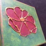
I have had this HUGE Peony stamp from IndigoBlu for ages, found when trying to find something else I wanted to stamp with. I saw this, saw how big it was – A5 rubber stamp – and thought it would be ideal to be the main and only focus on a bigger card.

I began by stamping in Ranger Perfect Medium, and embossing with black detail powder, heat setting it. I stamped it a couple of times as I wanted to try two different colours. Are Peony’s blue and purple/pink? I googled it and found that they do indeed come in a variety of colours. I didn’t need to make any excuses, then.

I took my Zigs – three or four shades of blue, and three or four shades of purple and pink, and went in there. It is a very large stamp, and I found the easiest way was to colour each petal separately. On some part of the flower I started with the lightest colour, then added the darkest and blended with a third colour. I changed tactic part-way through the flower, added water first, then added the colours. I tried to keep the darker colours near the darkest part of the embossing, but rarely strayed outside the lines of each petal. It seemed to take an age…….

I found that when I changed tactics and changed the way I water-coloured, it gave a more natural look to the flower. Even now I couldn’t tell you which part of the flower had which technique.

I then thought the flower was too stark against a white background, and had seen some videos and blogs where shadow had been added around the flower, so I thought I would give it a go. I wet around the flower, a small area at a time, added some grey Zig colour, then dragged it around with the water brush. I also tried adding the colour to the dry card, and dragging it out with the water brush too. In the end, I don’t think it made much difference which way I did it.

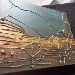
Then I had to decide what size for the card base. I went with an A4 sheet of card, folded in half for side opening, cut an inch or so off the bottom, leaving room for a sentiment separate to the flower. I didn’t want the sentiment to cover any part of the flower. I embossed this in white on black card, and stuck it to the bottom, quite liking the effect.

As I have tried for fewer embellishments on my recent cards – I decided to add some to this. Some clear drops which look like dew, I think. It’s been a while, and still like adding them.

I shall be entering the following challenges:

Make My Monday – ’embossing’

Tuesday Throwdown – ’embossing’

Colour Crazy Challenge – ‘anything goes’

Crafty Friends challenge – ‘anything goes’

Allsorts challenge – ’embossing’

Hiding in My Craft Room – ‘anything goes’

A Gem of a challenge – ’embossing wet or dry’


Just a rainbow note…..

For today’s jaunt into crafting – as I only have a limited time today – I ventured into the clean and simple genre again.

The inspiration for this card was from Addicted to CAS, with the code word of ‘rainbow’. I may have gone a little too much the other way, compared to my multi-layered and embellished cards, but I like the simplicity of the design, and thought it would be ideal if I created some little note cards, sold by the charity in a set of four, for instance. I may try other little stamps in the corner, but have used stars and hearts from the Catherine Pooler stamp set ‘For Everything’. This stamp set was part of her Stamp of Approval collection and I hadn’t had a chance to use it yet.

The actual small little set comes with many stamps, for a variety of occasions, including sentiments, strips of dots, Christmas tree, kite, stars, a mug…..a wide variety.

I also used several of her inks, as I find them very vibrant, and stamp beautifully with a full and crisp image – I didn’t even use my Misti! The base card is Stampin Up, as is the layered part, as I find this very smooth card to be ideal for stamping.

I struggle to accept a clean and simple design and technique, as I have said before, but it does mean that the cards are quicker to make – once you have decided on the design and colours. Which is the hard part. Which is why I like to get inspiration from a challenge.

I shall be adding my latest card into:

Addicted to CAS – rainbow code word

Addicted to Stamps and More – theme of Clean and Simple


Simple stripe

20170425_203413

A quick and simple posting for a clean and simple card. I have gone down the clean and simple route again as I find these are always a challenge, and I always want to add more and more. Sometimes because I just can’t stop, and sometimes I add sequins because I have smudged the base card! I keep having a go and playing.

This is a 4 inch x 5.5 inch base card, to which I stamped the ‘sweetheart’ sentiment from a Leoni Pujol stamp set, and added a red stripe of card above it. I love the font of this sentiment.

I then die cut the ‘hello’ sentiment from Hero Arts ‘Hello stamp and cut’ in red card, and then black card. I ran these die cuts through my Xyron sticker machine, and layered them together slightly off-set, as I thought just the red or even just the black sentiment would be too stark. This way a shadow is created, which brings together the two colours.

I wanted to stamp some little hearts on the red stripe – I stopped myself. I wanted to add some red and black glue dots – I stopped myself. I wanted to splash some colour on the base – you guessed it – I stopped myself…….

I am quite pleased I showed restraint whilst making this card, and have made four in total. I tend to make several cards at the same time, whilst stamping and die-cutting, so I can give more to the charity ‘Neurocare’ to sell.

I will be entering this card into the following challenges:

Less is More – theme ‘include a stripe’

Always Fun Challenges – theme ‘CAS’


Water-colour flower

Today I was in the mood for floral – stamping, embossing and water-colouring. I was inspired by several challenges today, and turned to my trusty Altenew ‘Amazing You’ stamp and die set. This set is simply draw, giving a sketchy look, and I think is ideal for water-colouring.

I stamped the images out using my Misti on Crafters Companion water-colour card, and heat embossed in black. I like using black embossing when I am water-colouring and trying to stay in the lines, as I find this easier to do with a raised edge.

Once stamped, I coloured with my Zigs. I again tried a couple of techniques for colouring. I tried wetting the area of card first, then adding the colour. I find this to give a more watered down effect, as in the pink rose card. For the red rose card I coloured with the zig then used my water brush to draw the colour out. This technique, I find, allows for a more vibrant colour. Maybe water first makes the brush nip on the zig lose the colour more? Maybe…..any hints and tips from anyone?

I waited for them to dry, then cut with the matching die set, and turned my thoughts to the background. I knew I had floral embossing folders, and found this one from Crafters Companion ‘Rambling Rose’. It is a 5 inch x 7 inch folder, and gave a lovely background to my florals.

Before attaching to my card, leaving a wider strip of blank at each side, I decided to splash some of the matching colour onto this panel. I drew some of the colour onto my acrylic block, added water from my water brush, and splashed it on. In hind-sight, perhaps too much water was added by the brush, but I still like the effect. I may try without the water brush and just use the pen itself on some future cards.

Once the back panel had dried, I added the florals with 3D foam, as I didn’t think they would lie flat on the embossed background. No sentiment – I like them as they are.

I shall be entering one of the cards into the following challenges:

CAS watercolour challenge, theme ‘green and pink’ card

Simon Says Stamp Monday challenge, theme ‘splash it on’

Shopping our stash, theme ‘A Beautiful Rose’

Watercooler Wednesday, theme ‘Spring’

Stinkin’ Inkers Challenge, theme ‘Shower of Flowers’

And one more thing: 20170423_090718

Here was my alarm clock this morning – outside our bedroom!

I managed to go downstairs and take this picture through my kitchen window.


I just need coffee….

I have gone completely different today. (you never can tell what I’m going to do) Clean and simple, mixed media, many layers, much stamping – I would not like to be predictable.

For this card, I have kept it very clean and simple, just using a sentiment – to reflect how I feel about coffee! – and a couple of images from Altenew stamp sets ‘Coffee Love’ and ‘Coffee Talk’. I like the variety of stamps you get in these sets, and are ideal for quick cards. I have previously used the stamp with the coffee beans for adding detail to the background, but this time left it as is.

I started by stamping my images onto Crafters Companion water-colour card, using my Misti, as the card is textured. I embossed with black detail embossing powder, and used my Zigs (again!) to water-colour the images. I blended the colours out, and on the coffee pots I even used two different tones of colours. I feel I’m getting there with colouring, still keep trying. I personally feel the Zigs are the best water-colouring pens for me, on this particular card stock, and as I have the 48 pen set, there are plenty of colour choices.

I cut the images out with the matching die set, on my Grand Calibur, which meant I could cut the lot of them out in one go. (Making several cards for the charity) I played with the layout a little on my white card base. I had a choice of sentiments I could have used, but went with this one. I drink quite a bit of water, and quite a bit of coffee, but the sentiment I used is for when water just won’t do……I am sure many of us have those moments.

I raised them with some dimensionals from Stampin Up. And…………..did you notice? No smudges! At all! Nowhere to be seen! So no sequins needed! Yay!

I am entering this card into the following challenges:

Crazy 4 Challenges – theme of incorporating tea or coffee

Cuttlebug Mania – theme ‘A Nice Cuppa….’

Aud Sentiments Challenge – use a sentiment


Attempts at glue gun art

I had a great playtime yesterday afternoon and evening, inspired by Maremi Small Art of YouTube. I have been subscribed to her channel for a few weeks – and what she can’t do with household stuff for creating mixed media and texture probably isn’t worth knowing! Kitchen towel, cotton wool, egg shells, tea bags – you name it, she has probably tried it. All I can do is watch and listen to her videos, and be inspired to think about doing something – well, not actually doing it. Until yesterday.

She posted a video about using a glue gun and creating a bubble technique, which really got my creative juices flowing. I have a glue gun, I have some glue re-fills, I have small and large canvases – all waiting for that special thing to make. They have been waiting for quite a while………and on one of her videos she did say we spend a lot of time looking at things for inspiration, without actually doing it. I think her phrase was something along the lines of ‘just go and do it’.

I hunted out my glue gun, plugged it in, then got my canvasses – and went for it! I tried the small 6 inch squares first – not brave enough to attempt the larger one first time.

I glued a flower shape that vaguely resembled Altenew’s stamp set ‘Adore You’ main flower shape, after coating the base with a mixture of acrylic inks I had. Let that dry, coloured the canvas with some inks, coloured the flower with a red ink, then smoothed on some gilding wax to the outline of the flower.

I then moved onto the leaf – glued the main leaf shape, and filled-in the rest of the canvas as I thought it was too plain, (I keep trying for clean and simple, honest), added ink over the whole canvas, then used different colours of gilding wax to the raised glue areas.

The largest one was a challenge. I covered the whole canvas with a mixture of three or four different colour acrylic paints, let it dry, added some straight lines at the bottom (because I could!), added some vague flower outlines in glue, then realised it almost looked like cliffs, a beach, and the sea – so I attempted an outline of those images.

I again went in with some more inks and colours, then rubbed different wax colours over the raised sections.

Oh what fun! Loved it. May not be to everyone’s taste, but I really, really, loved playing. It’s messy, too. Well, it is for me, anyway!

I am entering one of the makes into the following challenges:

Simon Says Stamp Wednesday challenge – showers and/or flowers

Altenew Inspiration Challenge – photo inspiration (inspired by Sveta’s card)

Creative Artiste Mixed Media – anything goes mixed media


Spring flowers + failed feline photo-bomb

I have been having another little play today. I wanted to do a set of cards for the charity, which were quite clean and fresh, and reflected the time of year. Flowers are flowering, trees are budding, and there are lots of inspirations out there.

I have been off work this week, but have found only a little time for crafting, so I decided to make several cards at the same time, alternating between two stamps, and trying different water-colour techniques for each one – again! Also – a little photo-bomb from one of my cats……he said I was crafting too much today. Really! He wanted some attention…..just when I was photographing the cards…..and sorting other cards to put in envelopes to take in to work next week….. You can see from the photo of the purple and blue flowers and the shadow, that he was working his way in there……I thought I’d leave them in for some fun! Here is how he finally settled down:

20170419_153024

I used water-colour card, and stamped the an image from Which Craft! set ‘Flower Art 1’ and another set which was free in Crafters Insider from Crafters Companion, in Versafine black ink. I coloured each flower with my Zigs, some I left solid, and some I used my water-brush. I actually like both effects equally. I tried different colours, but kept the green the same. I then matted with a similar colour, but found I didn’t have one to match the pink, so I coloured the edge of the white matt with the same purple zig, and then layered onto the bottom of the water-colour main image.

I thought the base card might be too plain (as I always seem to think!) so I used an embossing folder from Darice ‘mini-daisy’. It was a free gift with some other folders, and is just the right size for this card base – 4.2 x 5.7 inches. Ideal.

I then stamped a sentiment from another Which Craft! set ‘Tulip Trio’ and die cut the banner from Sue Wilson ‘Pierced Flags die set, adding that to the bottom of the card, adding a star sequin as per layout from a sketch challenge – Sketch Saturday – which I think is a great elegant layout, and suits me down to the ground today.

Oh – and one other thing – the last card – with all the sequins………yes – you guessed it – smudges. Again!! I put the card face down on the mat to put sticky tape on the back – and hadn’t cleaned it from colouring those layers with my zig……..who knew?

I shall be entering a card from this selection into the following additional challenges:

Inspirational – word prompt ‘Spring’

Daring Cardmakers – ‘Spring Garden’

Creates and Makes – ‘Anything goes/optional Spring’

Crafty Calendar Challenge – ‘April Showers or Spring’

Addicted to Stamps Challenge – ‘Not a square card’


Cityscape sketch

20170417_150230

Does any else have those days where electrical equipment around the house seem to be going wrong at the same time? Our Blu-ray DVD player stopped working a couple of days ago, so I had to go and order one on Saturday, ready for after the Bank Holiday weekend – hopefully. Then, the washing machine decided to go wrong, broke, completely, with clothes in it. It started making enough racket that I couldn’t hear myself think, and then when I got to it – in all that racket – I couldn’t remember how to turn it off. Really! Anyway, I managed, and slowly opened the door – thank goodness it wasn’t full of water. So – I had to go and order another washing machine this morning, delivered and fitted and removal of the old one by Saturday. I am waiting for the third thing now. Isn’t that what they say – comes in threes? Talk about an expensive couple of days. I just HAD to go and craft!

This card looks quite simple, but again, it was a lot of die-cutting, and piecing things together. You would think I would have learned after my butterfly card, wouldn’t you? This is a take of the sketch above from Paper Play Sketches. I rotated the sketch 90 degrees anti-clockwise, with the three buildings being the three different length strips, and the two trees and helicopter being the three circles. I was trying to find a sentiment for moving house, or welcome to the neighbourhood – but I didn’t have anything to hand. I may have a hunt around my local craft shops when I go out and buy the third electrical thing that goes wrong!

The dies used are from Tim Holtz Cityscapes collection – the buildings from ‘Metropolis’, trees from ‘Suburbia’, and helicopter from ‘Commute’. These packs of dies have a huge amount of little dies for adding elements – the chimneys, the helicopter blades, the tree trunks – all small, all fiddly, but definitely add to the look.

I cut the buildings and trees out of Kraft card, added the chimneys in a brown card, and inked around the edges with distress inks – ‘Frayed Burlap’ for the buildings, and ‘Pine Needles’ for the trees.

I did think about some background, but I quite like the clean look of the card. Simple and to the point. I wanted the buildings the same colour – I could have gone with different colours, but the simplicity of this appealed to me. Maybe I am going ‘clean and simple’….no – I don’t think so, either. Not completely.


Sketch Inspiration

20170416_162224

A quick posting for the second card I made today, inspired from the sketch from Clean and Simple Colours and Sketches. As I mentioned before, I struggle with clean and simple, but took the rules for this site to heart – I think!

Rules: “Clean and Simple” is defined as “uncluttered, with white or open space, and minimal layers and embellishments”.

I always want to add more and more, but reigned myself in and did just what was asked from the sketch. I started off with an A4 piece of card folded in half. This particular card has a linen effect which is ideal for the more clean and simple cards, as it adds to the background without being too obtrusive – just a gentle hint of a little something.

I then took my Sizzix ‘Curly 2’ 12 inch die, which I’ve had for a loooooong time, and cut from a piece of plum/deep purple card stock I had spare, running the die cut through my Xyron 1.5 inch machine to enable me to stick it down easier than adding glue to all the swirls and curls.

I then stamped using my mini Carabelle Studio stamps ‘oeil maquille d’etoiles’ (eye make-up of stars – as per Google translate! ), and ‘Art’, stamping them in my Stampin Up ‘Rich Razzleberry’ ink – which I think matched nicely. I then die cut the sentiments using Sue Wilson noble stitched squares and rectangles, adding them to the base card with foam pads.


Time (butter)flies

20170416_142437

The inspiration for this card is from Time Out Challenges. There is a gorgeous picture of a clock and butterflies, which I have been thinking of for a few days. When I was in a panic buying mode in Crafters Companion store yesterday – looking for my water-colour card – I came across this stunning die from Memory Box, and thought it would be ideal for CASEing this inspiration picture. (Copy and share everything)

I initially thought that the die would cut the butterflies out of paper stock completely, but when I cut it in white – as per photo – I realised it actually cut the rectangle out, and part-cut the butterflies, leaving them in the card, attached by their middle section. I started off by thinking I would cut the die and have red underneath showing through each butterfly shape, but this wouldn’t work with how the die actually cut.

On to my next idea – I cut the die out of red sparkly card, and then cut each individual little butterfly out, snipping with my fine decoupage scissors. Yes – more than 50 little, tiny, butterflies. Then used my Stampin Up fine tip glue, and stuck each of the 50 little butterflies individually down on the white card base. Each one. Singly. Stuck down. Definitely had my patient head on when I did that! And, you know, it’s really, really difficult to not put them in straight lines, and make them haphazard…..

The clock was die cut out of Tim Holtz/Sizzix BIGZ die ‘Clock, Ornate and hands’, then embossed with Spellbinders M-Bossability ‘numbers’. The hands cut out of the same red sparkly card I had used for the butterflies. I was going the leave the card as it was, then decided to add a sentiment from Stampin Up ‘Special Reason’ stamp set – just a little one, in the bottom corner.

Yep – good idea – then smudged it! Again! Will I never learn? So I added yet another little red butterfly……………catastrophe averted. Kinda.