White on White

I am so ready for the weekend…………It’s been a busy week at work, some later nights than expected, and now I can look forward to spending some time crafting. The joys of free time!

This card is inspired by the challenges from Cards In Envy and Addicted to CAS. Both themes are for white on white card. I have done some white on white card previously and found it quite challenging, but thought I’d have another go for these two challenges.

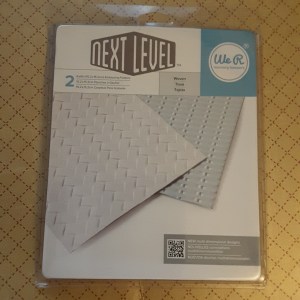
I stated with a ‘Next Level’ embossing folder from We R memory keepers. These embossing folders are the bees knees. I mean – how deep are those impressions? I shone a light at the card from above so you could see the detail which comes from this folder and just a plain piece of white card. This particular folder is called ‘woven’ and there are two folders in the package. I am sure I will be using the other folder sometime soon!

20170630_210740

After embossing the 6 inch square piece of card, I then die-cut three butterflies from Tim Holtz/Sizzix Bigz die ‘Butterfly Duo’, which also comes with a matching embossing folder. I must say, the hardest part was making sure the two die cut butterflies didn’t move when matched to the embossing folder. If you tape them, then the tape is also embossed onto the butterflies – so carefully does it. Don’t let them slip!

I added them to the base embossed card in a random fashion, as though they were climbing a trellis – again, this is ‘Loopyloo world’ so anything is possible!

The sentiment is a die cut from – I think – Hero Arts. I have lost the main package, so am not really sure. I think the detail and depth of the background also allows the sentiment to show with the shadows.

I shall also be entering this card into he following challenges:

4 Crafty Chicksanything goes

Monochrome Magicmonochrome with twist of butterflies


Watery sketch

Hi there. I’ve been playing a little this evening, and have been inspired by a couple of challenges for this card. I have been thinking about the sketch from Less is More and the theme of any form of water from Crazy 4 challenges and came up with this card. Well, two cards actually, as I didn’t want to waste any of the blue stamped part.

I knew I wanted the waves background stamp from Hero Arts to be the focus of the water, and used my new Catherine Pooler ink and my Misti – just in case. I needn’t have worried – those inks stamp well first time on a brand new stamp. Amazing inks!

Once I had stamped it, I then looked to create the curved part of the sketch, and found my Avery Elle ‘Snow Caps’ die set. In this set comes with a nicely curved edge, which I used to cut into the blue stamped background, then cut again nearer the bottom. This way, I ended up with three pieces of card.

Two of them I attached to a white base card and left a white strip in the middle, the other piece I also attached to a white base card, but attached somewhere in the middle. Again – waste not, want not!

I then grabbed my Color Layering Goldfish, used Altenew inks ‘Coffee Break’ set, and stamped the fish directly onto the card. Without my Misti! Brave of me, don’t you think? It turned out very well, if I must say – but do you think he’s upside down? Is there a right and wrong way?

I did stamp another fish, and fussy cut it out, ready to add to the other card, but decided to leave him off that card, and felt only a sentiment looked better. The sentiment from the same goldfish stamp set, in the same blue as the waves background stamp. On one card on a separate piece and attached with foam pads, the other card stamped directly onto the card base!!! Again – without my Misti! (I think I’m getting braver and braver in my old age!

I shall be entering this card into the challenges named above, and hope you find the time to play too.


Owl be seeing you

Good morning. A short but sweet posting for today.

This card’s main focus is an owl stamp from Hobby Art ‘Orla Owl’. Yes – another recent purchase from a craft show a few weeks ago, and I’ve been waiting for the opportunity to play with him. I don’t know why it’s a ‘him’, but there we are.

I decided to go with a more masculine feel for the card, and wanted the back layer to be quite dark, like the night sky, but not too plain. I embossed the black card with a Die’sire embossing folder ‘clouds’ from Crafters Companion.

The owl is stamped and embossed with a bronze mica embossing powder. I did think about doing some water colouring, but decided the image was intricate enough to withstand being just plain.

The sentiment is from another stamp set from Woodware – ‘Mosaic Owl’. I also embossed this with the same embossing powder, but this time added to a piece of white card. I rounded the edges of both the base layer and the sentiment.

So – nothing complicated or intricate, though the owl stamp makes it seem so, doesn’t it?

I shall be entering this card into the following challenges:

Watercooler Wednesdayanything goes masculine

CAS Sunday animals


weekend selection


Good morning everyone. I have a selection of cards for you today, as I have been playing with my Altenew ‘Build-a-flower: Aster’ stamp and die set. Now, I’ve had this set for quite a few weeks, ordered from Seven Hills Crafts in the middle of May. I had an initial little play with them, but I couldn’t do, I didn’t like it, I tried several times but I just couldn’t get it right. I don’t know whether it was the colours I was using, but I just didn’t like the effect of using all three layers.

Then – I watched the Altenew programme on Create and Craft yesterday, and she made it look so easy. Why on earth couldn’t I get the hang of this stamp set? So – I went and played again, chose the Sheena Douglass Stamping Card, Altenew inks, and went for it. And – you know what – I liked what I made. Mostly! I didn’t like the images with the outline, I must admit, so I only used the base and detail layer.

I made 8 flowers in total, using a variety of Altenew ink sets I had, played with the different base layer being the lightest or next to lightest colour and moved one colour up for the detail layer, and only one of the flowers didn’t really work well – you’ll see that shortly!

The two cards above will be entered into two different challenges.

The first one was made using the Altenew ‘Layered Plaid Cover Die’, which I’ll be entering into the Altenew June challenge, and Case this sketch challenge, and the second is for Freshly Made Sketches. One of them also being entered into the Allsorts Challenge for ‘Flower Power’.

I can hear you asking what I did with the six other flowers:

I made little cards with a sweet little word from Stampin Up ‘Sunshine Sayings’. Probably to be used a little gift cards, or notelets. I wanted to use them all, as otherwise they would just be left sitting there on my desk – amidst things I haven’t cleared away – yet! I won’t be entering these little cards into any challenges – they were ‘just for fun’.


Bright resist

Happy Saturday everyone. Today’s card is quite bright for me, and I have put together this card based on a sketch from Paper Craft Crew, and a technique of resist from AAA cards .

Now, I played with the resist technique a few times, before I decided on the central image above. I used the same image, from Circa Design called ‘Fuchsia’, but tried different ways of ‘resisting’. I tried using water colour card, stamping and embossing the image, then using my Zig markers to colours parts if it – turned out a mess! I then tried stamping and embossing and putting my Brushos over it – turned out another mess! I tried stamping and embossing, covering the flower part of the image in masking fluid, colouring the rest of it with green, rubbed off the masking fluid, added some pink for the flowers – yep – another mess!

So – this is my fourth attempt. I stamped and embossed the image in white, then just ran my Catherine Pooler ‘Lime Rickey’ ink pad over the whole image. Worked very well, I think. I actually then went in with my water brush and removed some of the ink from the embossing to make that clearer, and liked it even more.

I die cut the image with my Sue Wilson Noble Dies ‘Double Pierced Circles’, and moved on to the rest of the sketch.

The card base is 7 inches square, so I cut another layer slightly smaller, and used my Tim Holtz/Sizzix thinlits ‘Mixed Media’ circle die cut to cut into that second layer. I then splashed some Lime Rickey ink around that layer – I don’t have lime green dots or perfect pearls – and then turned my thoughts to the twine and washi tape.

I added a green tape, then another red (ish) tape for a little bit of a different colour, and the twine was from a selection I have from We R Memory Keepers. As I can’t tie a bow to save anyone’s life, I used my Tattered Lace ‘Bow Maker’ and stuck the bow down at the front, and the ends down at the back.

To complete the card I added the main die cut image with foam pads.

I seem to be turning to my Catherine Pooler inks more and more for my projects. I like how they can be used for almost everything. They ink stamps well, they blend well together, they water-colour well – I haven’t really found anything they won’t do when I want them to do it. They are definitely one of my most favourite buys – even with the customs and postage cost.

I shall be entering this card into the following challenges:

Paper Craft Crew challengesketch

AAA cards resist technique

QKR Stampedeanything goes


three more colours

Good evening all. I have been playing – just a little – with my new purchase from Seven Hills Crafts – Mama Elephant ‘Little Girl Agenda’. I have so many ideas on how to use this set, and this is the first one come to fruition.

This card was inspired by the colours from CAS Colours and Sketches. I don’t have the exact colours mentioned – dapper denim, metallic copper, peekaboo peach – but I raided my Stampin Up markers to see what would come nearest. I hope they are kinda the same colours.

I started with a blue base card – from Creative Expressions. I find their foundations card is lovely to work with, whether it is die-cutting or stamping. I stamped and heat embossed a little saying from an Altenew stamp set, obviously that is the copper part of the challenge. Who knew when I did my recent copper embossing card that this colour would come up again so soon? It was still sat on my craft table!

The little girl I stamped with Versafine black onyx, let it dry, then coloured with me markers, and used the matching die-set to cut her out.

Now – it was my choice to only colour the balloons. Here’s my thought process……As the card base is so dark, and I had coloured the balloons already, I wanted the little girl to stand out. If I used the same challenge colours, I think she would have ended up a lost little girl. So – kept her white, no colouring. I think she stands out more by doing this? Do you agree? Let me know, I’ll be interested in what you think…..

I did try to photograph her outside, and tried my utmost to show the embossing on the words, but it didn’t quite work out well, but it was the best I could do…..It also decided to throw some rain down. It is still very warm, but dull and quite muggy here in Chesterfield, UK. Don’t tell anyone – but I think we need a ‘right good’ storm.

On another note, I see there are people playing along with the Inkspirational Challenge, for which I was guest designer for current challenge. Head along and have a go. It’s a gorgeous colourful inspirational photo…..

Here are the challenges I will be entering with this card:

CAS Colours and Sketchesdapper denim, metallic copper, peekaboo peach 

Inspiration Destinationanything goes

Creates and Makesanything goes

A Bit More Time to Craft anything goes


Cheers to wine

Isn’t this stamp and die set gorgeous? I have had this stamp set for quite a while, from Honey Doo Crafts, and then bought the matching die several months ago – at yet another local craft show! I have played with it a little before, and have a blog posting from ages ago using this stamp, but I got the inspiration from the ‘Addicted to CAS’ challenge, with the theme of ‘cheers’.

I also have a stamp set with Prosecco and glasses and sayings, but I just love the way this came out. I first stamped the glass, bottle, and small grape bunch with Versafine black onyx, and coloured with my Stampin Up markers. I coloured them actually dotting the colour down, as I didn’t want solid colour on the grapes or leaves, as I thought small white areas within would give some impression of dimension.

I die cut the three images out after colouring them, and then placed them on several different sizes of card base. I thought a square card base would leave too little white space, so I went with this size. Then to decide where the sentiment was to go……all those choices.

I stamped it alongside the glass and bottle, as I thought elsewhere on the card would be cutting down on the white background, and in fact I am quite pleased how it all came together. The added bunch of grapes to the side of the glass just adds a little something, don’t you think?

I also photographed the card in two different areas. One outside in full summer sunshine, and one inside with natural light – but not direct sunshine. I was only experimenting, and quite like the sunshine look with a hanging basket of flowers giving some shade, and of course the card itself giving some shade and dimension.

I shall be entering this card into the following challenges:

Addicted to CAScheers

Aud sentiments challengebingo and sentiment – die cut/markers/favourite colour (black)


Copper card

Good morning all, I have another card inspired by several challenges.

I started by using a piece of Narwhal card from Lawn Fawn, and stamped some flower images from the new Catherine Pooler Stamp of Approval collection (I said I was going to play with collection this weekend). I laid them out on the card and used my Misti to pick them up, stamped with Ranger Perfect Medium, and heat embossed using Cosmic Shimmer ‘Ancient copper metallic’ embossing powder. They are quite solid images, so I thought the embossing would stand out very nicely on the grey card.

Once I had covered the piece of card in the flowers and completed heat embossing them, I added some smaller flower and leaf images from previous collections, to fill in the gaps, and added this piece to a background of orange card. I have no idea where this orange card came from, but I like the way it seems to match and enhance the copper embossing.

The sentiment is also from a Catherine Pooler Stamp of Approval box, but one I had bought previously – the Lovely Notes Collection. The ‘thank you’ stamp comes in three varying degrees of the word image, and I used the main solid image – stamped with Perfect Medium, and heat embossed with the same copper embossing powder.

I cut the sentiment out with one of my ‘Wonky rectangle’ dies from Lawn Fawn, and added it to the card with some foam pads.

I found the most difficult part of this card was where to place the sentiment. I placed it at the very bottom, near the top, off to one side…………and eventually decided to place it as you can see it, which left a lot of the copper background visible.

I shall be entering this card into the following challenges:

Just Add Inkphoto inspiration

Addicted to stampsflowers and stamping

Hand Stamped Sentiments photo inspiration


Sketch Inspiration

Hi there, everyone. Despite it being very, very hot here in Chesterfield, UK, I have been in my craft room. I am not really a sun-bathing fan, except when on holiday somewhere with a beach, pool/sea, and a bar, so I have been in my cool room playing.

This card was inspired by the sketch from CAS Colours and Sketches, and I took the opportunity to use my new Catherine Pooler Stamp of Approval stamps. There is one huge stamp set with lots of different medallions on it, which all can be used individually or that quite a few of them fit inside one another.

I also used the Catherine Pooler inks ‘Lime Rickey’ and ‘Aquatini’ – love those colours.

The two circles are two stamps from that set, and I used a circle to mask the larger image when I stamped the smaller image to give the effect of one behind the other. The three smaller flowers are also from that same stamp set, with the sentiment using two words from separate stamp sets in that collection.

As I stamped the words in black, I added a strip of black paper from Stampin Up I had laying around.

I shall be entering this card into the following challenges:

CAS Colours and Sketchessketch

Brown Sugar Challenge anything goes

Crafty Catz challengeanything goes


Inkspirational challenge

Good morning everyone. So – this is it – my first card as a guest designer. For the Inkspirational challenge. I am honoured to have been asked to do this, and hope very much you can play along.

Here is the challenge picture:

Challenge137

I decided that the settee/sofa looked very much like a window box to me, and the flowers were growing out of it. I started with a 6 inch square white card base which I splatted/sprayed some blue ink onto. I didn’t go down the Brusho route, though I did think of it, and restrained myself with just some ink splats.

I embossed the Spellbinders ‘Lene Lok’ die, not cutting it out, just embossing, making that look like cushions and buttons on upholstery, using the same blue card as the flowers as an extra layer to make the window box stand out, and raised that with foam pads only to the bottom and sides.

I die cut the flowers using Creative Expressions/Sue Wilson ‘Scribble Flowers’ and also stamped and die cut the Altenew ‘Amazing You’ flower stems to which some flower heads were added, inserting them behind the ‘sofa/window box’.

The sentiment is from The same Altenew stamp set, again with some inks splats.

Thank you for having a look, and enjoy the challenge. 🙂

I will be entering this card into the following challenges:

Simon Says Stampemboss

Dara and Diane challengesblue and white

Monochrome Magicanything goes monochrome