A Tweet note

Here I have a one layer very clean and simple card following the colours and sketch layout of a couple of challenges:

20180724_200828

I used the MFT ‘A Tweet Hello’ stamp set and three of the little birdy images, stamped directly onto the card base, and coloured with my Zigs. I don’t have the exact Stampin Up colours named on the challenge, but I tried to match as best I could. The sentiment is from the same stamp set. (And…………no smudges. Yay!)

I had this set in mind as I have a colleague going through some exam issues at the moment, and I liked the sentiments.

The colours of the birds are from the current challenge at Just Add Ink, and the layout from the current sketch challenge at CASE(E) This Sketch.

Trying to photograph this card in the fading light was a challenge, but I had a little help:

20180724_200822

20180724_200631

This is Rosie, otherwise known as Girly Girl or Fluffy One. It all depends on what we feel like calling her, and whether she is in an affectionate mood – or not! Having lost one of our two cats at 14 years of age earlier this year, we decided to obtain not one cat as companion for our main big boy – Spike – but two more cats. She has a brother Jim – …..Rosie and Jim. 12 years old from the Cat Protection League. I am sure he’ll appear in a card photo in the future……

🙂


Altenew Beautiful Heart and Leaf Frame cover die

Hello there. I have just the one card to share today. I didn’t dare venture into my craft room after work until it had cooled down a little. So I watched some You Tube instead – that Yana Smakula does great colouring…….I might have to give it another try myself.

Anyway, this card was made to enter the current challenge at Just Us Girls. The challenge is to use Aqua, pink, and white. I made two versions of the card whilst I had the inks and stamps out:

20180724_17123120180724_170142

The second card I purposely took the photo at an angle so you could see the leaves and the dimension they give.

I first die cut the Altenew ‘Leaf Frame cover die‘ from white card stock. One I stuck directly onto the card base, the other I used 3D foam pads to raise it a little.

I used Altenew inks for the pink and aqua, and you can see I used the pink to stamp the flower and the three layers, but I only used the outline stamp for the leaves, omitting the other two layers for a cleaner look.

For the sentiments, I stamped one directly onto the card, and the other I did one of my favourite techniques – die cutting several times, and layering. I coloured the top layer with the aqua ink pad I had used for the leaves.

Have a good evening, and I’ll hopefully see you again very soon. 🙂


Floral and space

Hello there. No – it isn’t a flower in space. I have two cards – one floral and one galaxy/space – to share with you today. Two completely different cards. I have been missing my florals, even though I have been having messy and Distress Oxide fun.

This first card:

20180723_12404820180723_124052

is quite a simple card – I think I might be getting there with this style – though it still scares me!

Having seen quite a few butterflies around the garden whilst I’ve off work the past few days, I took the Honey Doo ‘Butterfly Border‘ stamp and heat embossed into a piece of card using white embossing powder, then blended my Distress Oxides over it. The embossing resisted the colour. I used a couple of the orange and yellow oxides, to create a summer feel.

I then took the matching die and cut that out of a 6×6 inch piece of card, first working out where I wanted it to be, and ensuring I could match it up (!!) then adhered the stamped and inked piece behind it.

I was going to go with a coloured border around this piece, but I like just a slightly bigger white base instead, as I think more colour would detract from the main element.

The sentiment is from the Concord and 9th ‘Painted Rose’ die set. I love this font, and that the words are separate to place where ever you like. I die cut this twice in white card, then the third time was from another piece of card I used the same distress Oxides on, and layered them all together.

This card will be entered into the current challenge at The Paper Players – to use negative space on a clean and simple card, and the current challenge at Addicted to CAS – with the theme of Summertime.

This second card is completely different to enter the current challenge at Lil Red Wagon:

20180723_12403020180723_124036

The current theme is to use anything to do with space, aliens planets etc. I did a few galaxy backgrounds – getting inky and messy again – then looked for my alien stamps. I started stamping and colouring these little creatures, before my sister reminded me they were monsters and not aliens, from Hero Arts ‘Monster Greetings‘ stamp and die set.

To me they are aliens, so I used my artistic license and carried on using them. I went for strong and vibrant colours with my Zigs, so they would stand out from the background, and then stamped and embossed the greeting in white, from another stamp set – I can’t remember what the name or make of this is.


Otters and Christmas and Colours

Hello there. I am afraid I have been crafting…..and have produced several cards for several different challenges. There is a lot of inspiration out there at the moment, and whilst I have time to craft, I am enjoying using the themes and colours for these challenges.

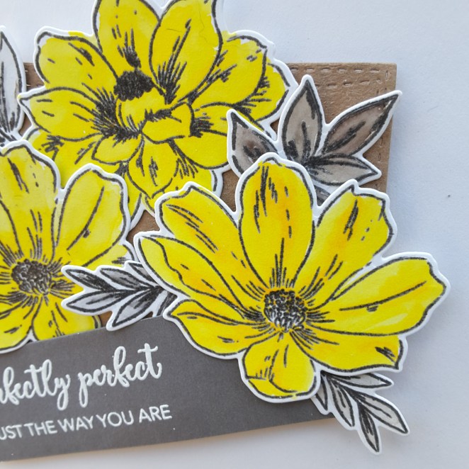
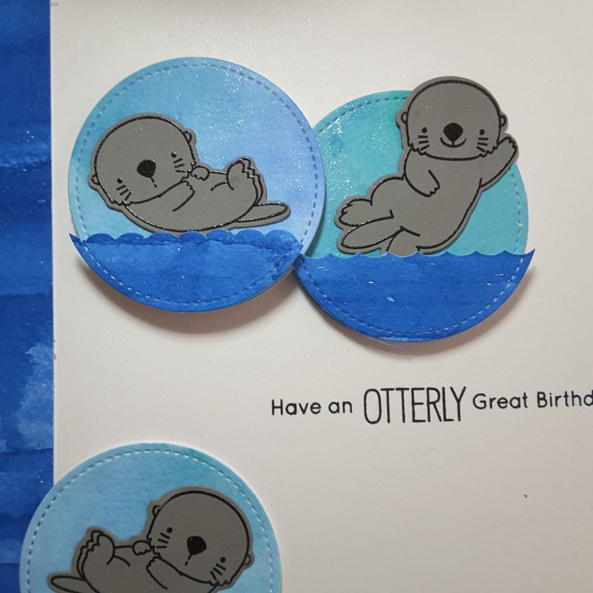
The first card is using the MFT ‘Otterly Love You‘ set – again – as it was still out on my desk, and I thought I would get inky and messy, water-colouring and distressing.

20180721_103622

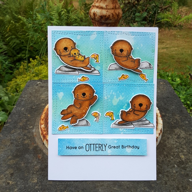
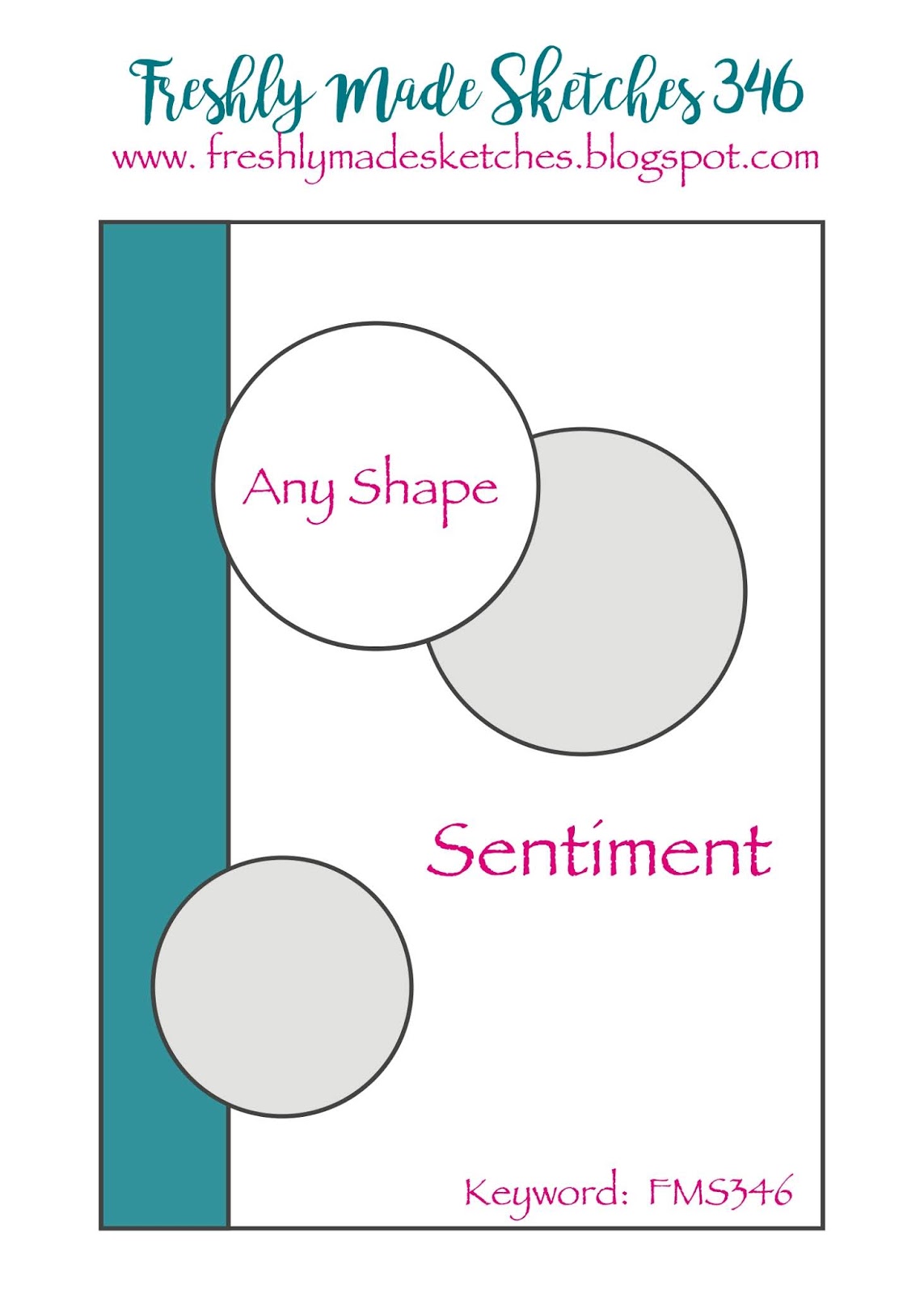
The layout is taken from the current MFT Sketch Challenge, and other than the Distress Oxides and the Zigs – a completely MFT card. I always want to do scenes but struggle with the organisation of the products, so a sketch like this is ideal – I can do little mini-scenes in each square.

20180721_103629

As you see, completely different to the card from yesterday, as I water-coloured the otters in several brown colours, then went back in with a clean water brush to remove part of the colour in the centre of each otter. The rocks and fish also come with that stamp and die set.

This card will also be entered into the current challenge at Moving Along With The Times, with the theme of wild animals.

This second card is completely different:

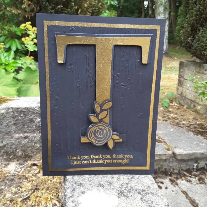
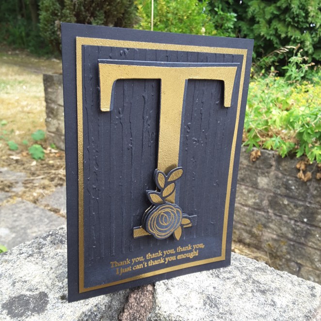
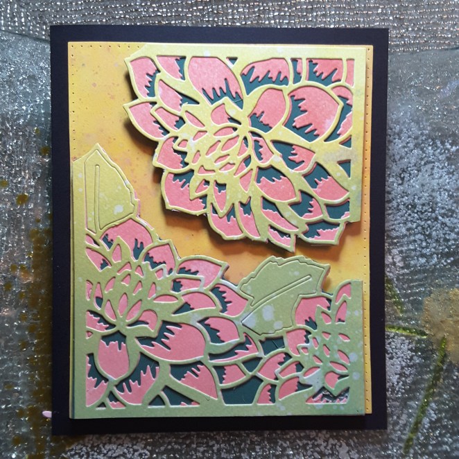
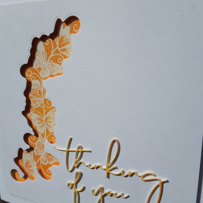
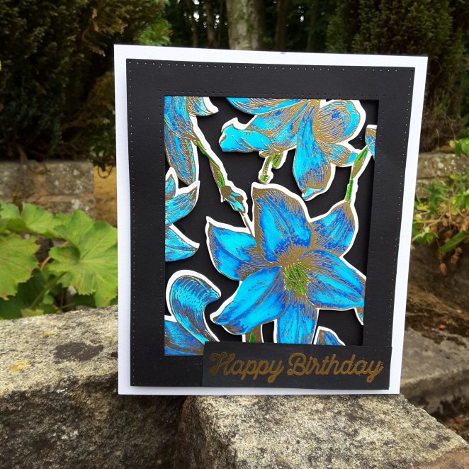
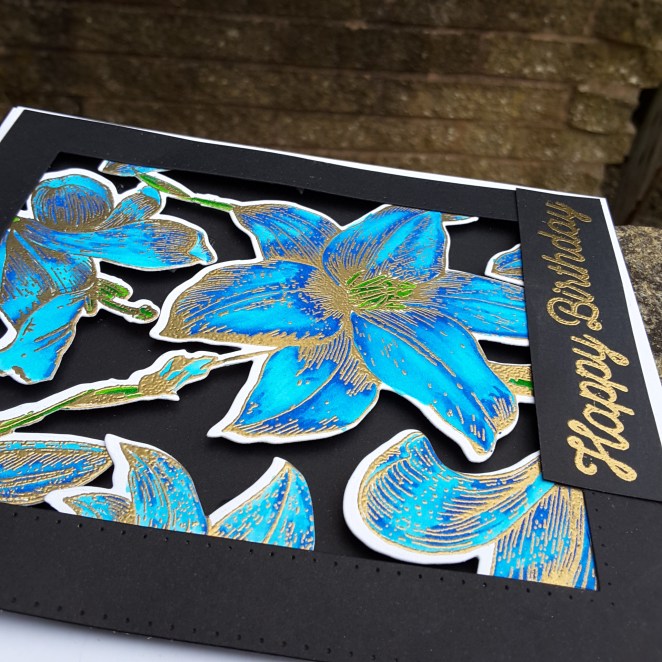
A simple card – sorry it’s black and gold again (last one, I promise) – and using the Altenew ‘Poinsettia and Pine‘ stamp and die set. The poinsettia stamped and heat embossed in gold, some gold embossing powder added to the gold layer below it to make it match, and the die cuts used were from Catherine Pooler.

This card will be entered into the current challenge at CAS Christmas Card Challenge poinsettia as a theme – and the current challenge at CAS on SundayCAS Christmas in July. 

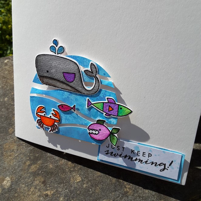
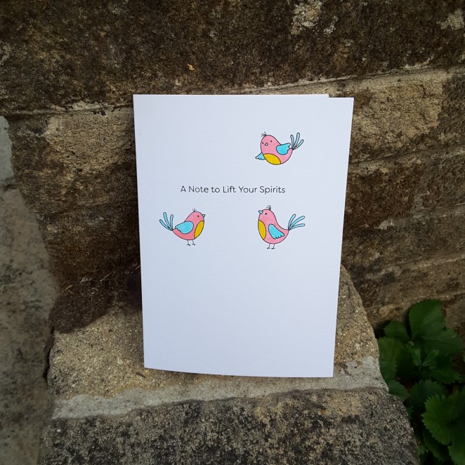
My third and final card is an homage to Bev at Uniko. She has lost a fur baby recently, so it can’t be an easy time for her and her family, so a little support is appreciated, I’m sure.

Today she is hosting her third stamping retreat – a very busy lady! I have been to the previous two retreats and not able to make this one, but as I am using the colours from CAS Colours and Sketches – Bev and Uniko came straight to mind…….

20180721_103610

I use the challenge colours of Powder Pink for the Concord and 9th Sketched Stripes Background, the Lemon Lime Twist for the little leafy stamps you see, and as I don’t have Coastal Cabana, I used the Catherine Pooler Aquatini instead.

This is another kind of card I struggle with – one layer card. Why did I test myself again? The current challenge at Less Is More is for a one layer card and using stripes……they don’t make it easy, do they? 🙂

I hope you all have a great weekend……….I feel some more crafting coming on…..I hope hubby doesn’t want any tea today………

Otterly Great Birthday

20180720_163241

Hey there. I hope you are all doing well. I have had some time to try some new products, and to put together this card.

The first product I tried were the Spectrum Noir Sparkle Glitter pens. I have seen the fabulous Sheena Douglass use them as backgrounds so I thought I’d give it a go. What fun it was. These pens are vibrant, lots of colour, lots of sparkle.

I first used them onto dry water-colour card, then used them on my Tim Holtz glass mat and ink smooshed, and also put them onto my glass mat, added water, and used a wet brush. They worked well for all of the techniques I tried, though straight onto dry water-colour card is when you tend to use a lot of ink. I cut the strip to the left of the card from that piece, as I liked the uneven outcome to represent waves – kinda – but they certainly do give an even finish if you want one.

I took two colours of blue from one of the sets, created the backgrounds, and die cut the circles, then used a die from the  MFT ‘Otterly Love You‘ matching die set to create the darker blue waves. These waves are all raised on foam pads, as I wanted the otters to poke a little underneath them.

I did try stamping the otters, pencil colouring them and water-colouring them, but I preferred the way they came out when I stamped and heat embossed in black onto grey card. I thought it looked like too much water-colouring otherwise, and they blended even more into the blue. This way I think they stand out more.

A couple of close-ups:

20180720_163416_001

Gorgeous sparkle……

20180720_163440

……in both colours. Only two colours used, but I blended them together a little more in one of the circles.

This otter stamp and die set I have had for a while, and ‘found’ again when trying to sort my craft room out, and tidy with my previous Ikea purchases. This sorting is ongoing because I keep finding things I want to play with…..

I shall be entering the following challenges:

Freshly Made Sketchessketch

Color Throwdowncobalt blue, aqua, grey, white

Watercooler challengesmasculine

Simon Says Stamp Wednesday Challengeuse a die and/or punch


Gold and Blue birthday

Hi there. I have another floral card to share to day, but as I still had some black card-stock out from the card posted yesterday, I decided to keep going with the black and gold theme – but also added a few shades of blue.

20180717_145858

I stamped a Stamps By Me floral stamp onto water-colour card, and heat embossed in gold. Using my Zigs, and very little water, I coloured as you see, keeping the colours vibrant. The gold embossing resisted the colouring, and it also let me know the main places for the darker shades of blue.

I then used the matching die – one solid die, so quite difficult to place over the image centrally – maybe I;ll die cut first next time, or even emboss around first……hmmm – I think a little playing is coming on….. and then stuck this down onto some black card.

The frame is die cut using two sizes of Sue Wilson’s stitched rectangles. The sentiment is heat embossed in gold, and is from MFT.

20180717_145909

20180717_145924I tried to get some shine coming through in the photographs, but it has been quite dull here, even though warm.

I shall be entering the following challenges:

Watercooler Challengesmasculine

Allsorts Challengeflowers

Inkspirational birthday


Just add a ‘T’….

Hello again. I have been using one of my products bought at the Doncaster show last weekend. I say one product……..there will be more coming up!

This is from a stamp and die set from Stamps By Me:

20180717_145827

A completely different card to my most recent colourful cards – I think I channeled my monochrome inner-self.

The big letter ‘T’ is die cut, then heat embossed using Creative Expressions detail gold embossing powder. I then separately die cut and stamped the leaves, then yet another layer for the flower.

These sets are made so the flowers and leaves can be stamped and added to the letter separately, probably in floral colours……..but I stuck with black and gold.

I then took a piece of black card and embossed with a folder I haven’t seen for years – until I found it when sorting my craft stash out. It looks like a distressed stripey thingy background, and actually brings to mind the Altenew die and stamps.

Another black piece of card, and I stamped around the edge using a Tonic Nuvo clear embossing pad. I needed some more Ranger Perfect Medium, but thought I would buy this Tonic Nuvo pad. I am liking it – very juicy!

Once I had stamped around the edge of the card, I used the same gold embossing powder – to keep all the gold the same colour – so that I could use it as a layer.

20180717_145844

I also found some black foam dimensionals too – no idea where I got those – so from the side it doesn’t look too white and glaring with the layers.

I shall be entering the current challenge at Just Add Ink with the theme ‘add a ‘T”……do you think this ‘T’ is big and obvious enough?!


Ocean Pals – keep swimming

Hello once again. I have been playing with the MFT ‘Ocean Pals‘ stamp and die cutting set this weekend – in between going to the Doncaster Race Course ‘Crafting Live’ event.

20180715_155325

I smooshed and ink blended a few backgrounds with several blue Distress Oxides, adding several layers, air drying between layers. I then cut out a circle – cut the bottom off to match the current CAS Colours and Sketches Challenge – then die cut that circle with the MFT Horizontal Snow Drifts.

I placed those pieces back into a circle shape using 3D foam pads, but wanted some white to show between the layers, so I off-set them. The blue circle alone was too – well – blue!

I stamped the little fishies onto water-colour card, then coloured them with my Zigs. I used 2 or 3 of each colour to get some dimension in the fishies. After adding them, I took a sentiment from Hero Arts Colour Layering Gold fish, which I stamped, layered with another piece of blue, and splattered with some to stop it being so white.

As the sun is shining again, I took a photo to show the dimension I added when putting the card together.

20180715_155338

I shall be entering this card into the following challenges:

CAS Colours and Sketchessketch

Just Us GirlsWater-colour background


Altenew Perfectly Perfect stamp set

Hello again everyone. I have been making a card to enter a colour challenge and a sketch challenge:

20180712_17290520180712_172911

I knew I wanted to use the colours from Color Throwdown and use flowers, and I knew I wanted to base the layout on the current sketch from Freshly Made Sketches – but which flower stamp set just kept me thinking and over-thinking…..I couldn’t decide.

Then – Mr Postie arrived…..with a delivery from Seven Hills Crafts…..this stamp set was inside the package……. I just had to use it straight away.

I stamped the images onto water-colour card, in a grey from Stampin Up, then stamped again with an embossing pad and heat set with clear. I then coloured with my Zigs using a couple of yellows, and a couple of greys  to tie-in with the colours from the Color Throwdown challenge.

I die-cut the rectangle out of Kraft card with my stitched wonky rectangle from MFT, stuck that onto a white card base, and glued my flowers and leaves down with 3D glue. I only put the glue in the centre of each flower, as I was playing with the sentiment and leaves to decide where I wanted them to go, so no pads near the edges gave me more lee-way. I like to put leaves and flowers on top and underneath other flowers, as I think it adds more interest and dimension.

The sentiment is from the same stamp set, white heat embossed, and glued in a jaunty angle to match the sketch. I think it’s quite ironic that the stamp set is called ‘Perfectly Perfect‘ and the sentiment is wonky. (Maybe it’s my sense of humour! 🙂

As mentioned, I shall be entering into:

Color Throwdown – grey, yellow, kraft, white

Freshly Made Sketches – sketch

water-coloured layered floral

Hello there. I have a card to share which actually took me several days to think about and put together:

20180710_212257

I took the opportunity to do some ink smooshing with my Distress Oxides, concentrating on the yellow and green colours for one sheet, and the pinks for another sheet. After splattering with water, I cut each layer of the Altenew ‘Layered Floral Cover die’s‘  into he separate colours. I layered the two together, snipped the images apart, and added to some green card, cutting around the main images.

I also paper-pieced some of the die-cut pieces from the original cards onto the leaves, as you can see.

I then took a piece of water-colour paper and ink smooshed only with the yellows, let it dry, and splattered with pinks and yellows.

The two separate pieces of the layered die were stuck down onto the yellow base, and again onto a black card base. I couldn’t find a sentiment liked to go with this card, so I left it blank.

20180710_212303

I shall be entering the following challenges:

Daring Cardmakersmood board – yellows, greens, pinks, flowers….

Crafty Cardmakers use 2 dies or punches – layered floral die x 2, Sue Wilson stitched rectangles