Hello there. I am afraid I have been crafting…..and have produced several cards for several different challenges. There is a lot of inspiration out there at the moment, and whilst I have time to craft, I am enjoying using the themes and colours for these challenges.
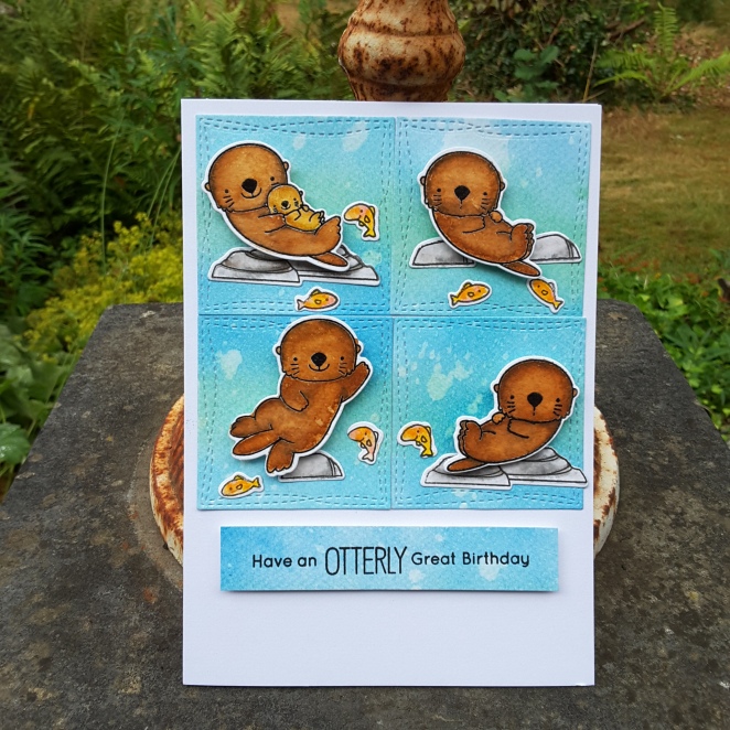
The first card is using the MFT ‘Otterly Love You‘ set – again – as it was still out on my desk, and I thought I would get inky and messy, water-colouring and distressing.

The layout is taken from the current MFT Sketch Challenge, and other than the Distress Oxides and the Zigs – a completely MFT card. I always want to do scenes but struggle with the organisation of the products, so a sketch like this is ideal – I can do little mini-scenes in each square.

As you see, completely different to the card from yesterday, as I water-coloured the otters in several brown colours, then went back in with a clean water brush to remove part of the colour in the centre of each otter. The rocks and fish also come with that stamp and die set.
This card will also be entered into the current challenge at Moving Along With The Times, with the theme of wild animals.
This second card is completely different:
A simple card – sorry it’s black and gold again (last one, I promise) – and using the Altenew ‘Poinsettia and Pine‘ stamp and die set. The poinsettia stamped and heat embossed in gold, some gold embossing powder added to the gold layer below it to make it match, and the die cuts used were from Catherine Pooler.
This card will be entered into the current challenge at CAS Christmas Card Challenge – poinsettia as a theme – and the current challenge at CAS on Sunday – CAS Christmas in July.
My third and final card is an homage to Bev at Uniko. She has lost a fur baby recently, so it can’t be an easy time for her and her family, so a little support is appreciated, I’m sure.
Today she is hosting her third stamping retreat – a very busy lady! I have been to the previous two retreats and not able to make this one, but as I am using the colours from CAS Colours and Sketches – Bev and Uniko came straight to mind…….

I use the challenge colours of Powder Pink for the Concord and 9th Sketched Stripes Background, the Lemon Lime Twist for the little leafy stamps you see, and as I don’t have Coastal Cabana, I used the Catherine Pooler Aquatini instead.
This is another kind of card I struggle with – one layer card. Why did I test myself again? The current challenge at Less Is More is for a one layer card and using stripes……they don’t make it easy, do they? :)
I hope you all have a great weekend……….I feel some more crafting coming on…..I hope hubby doesn’t want any tea today………


