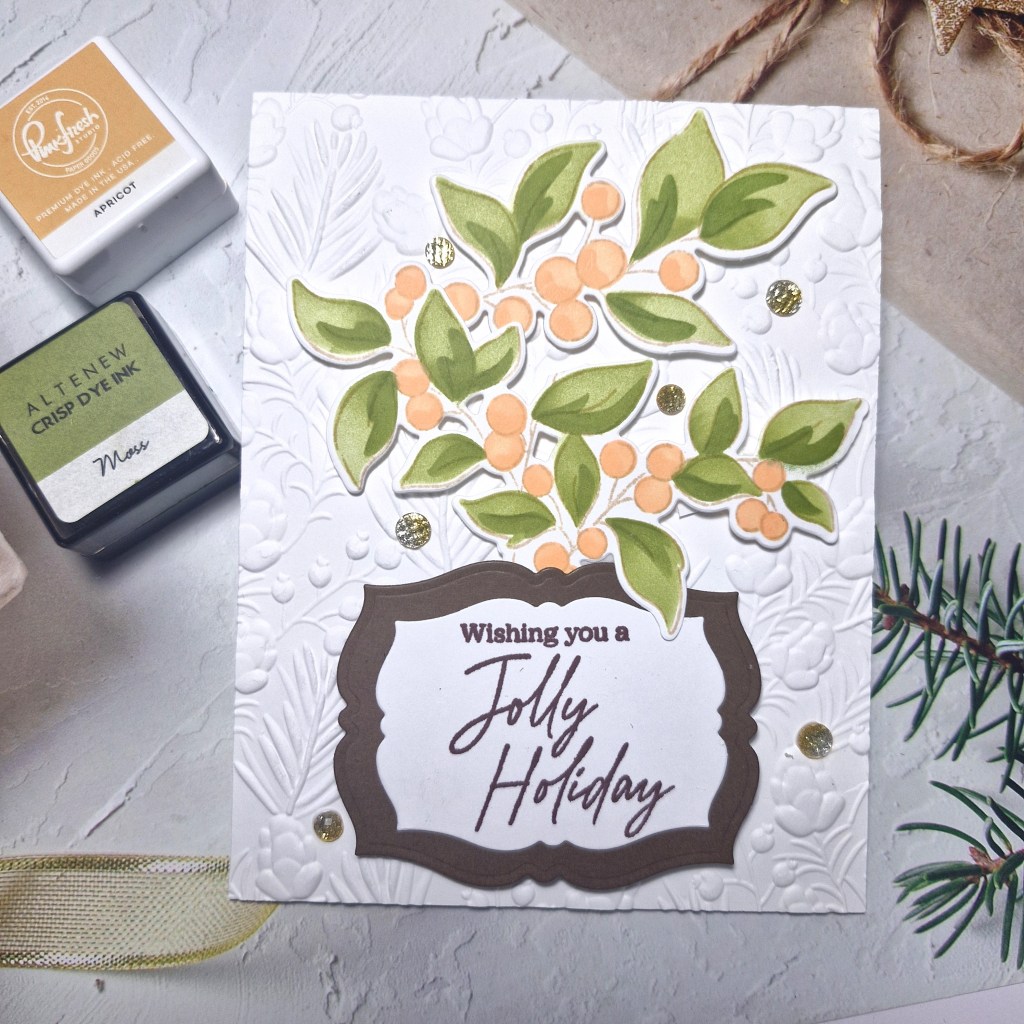
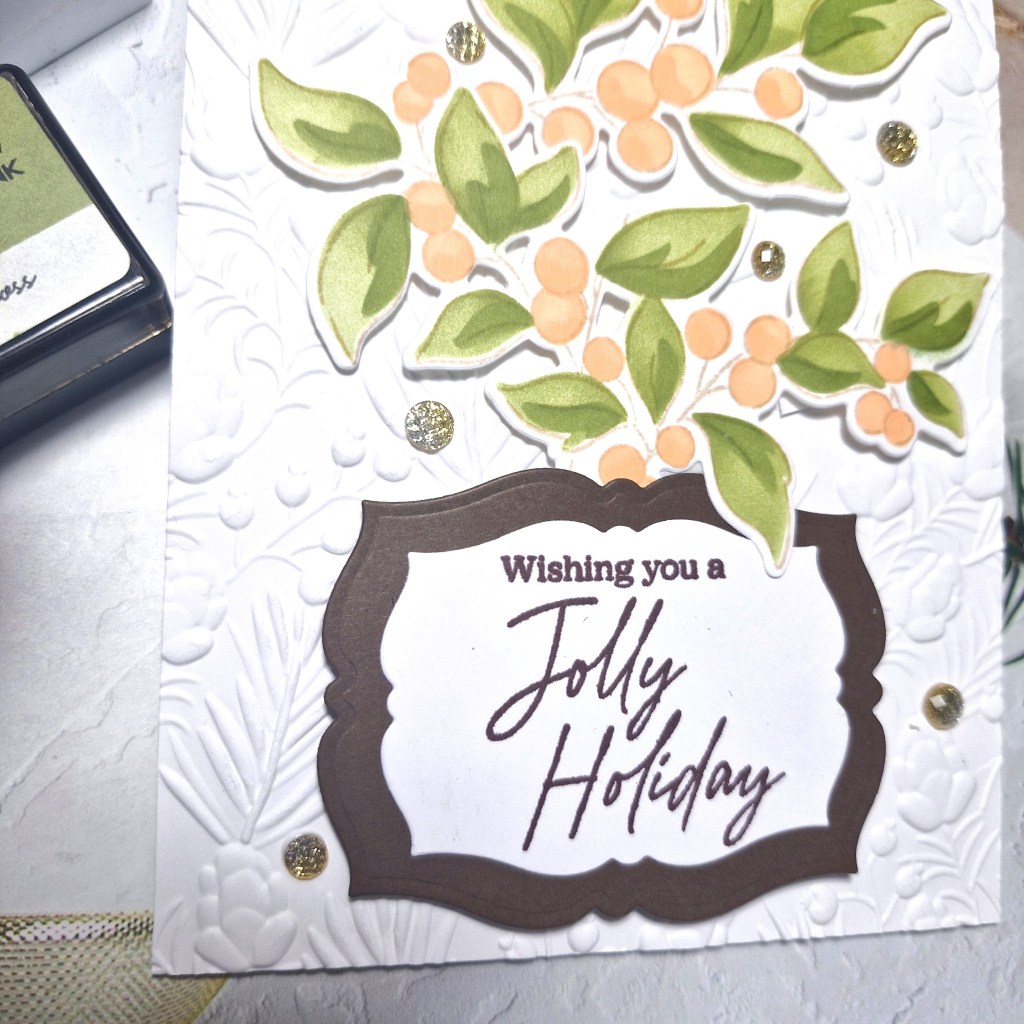
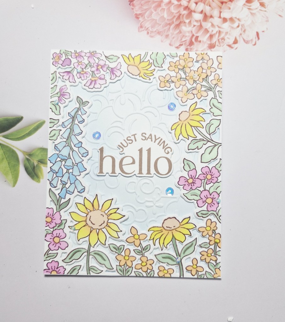
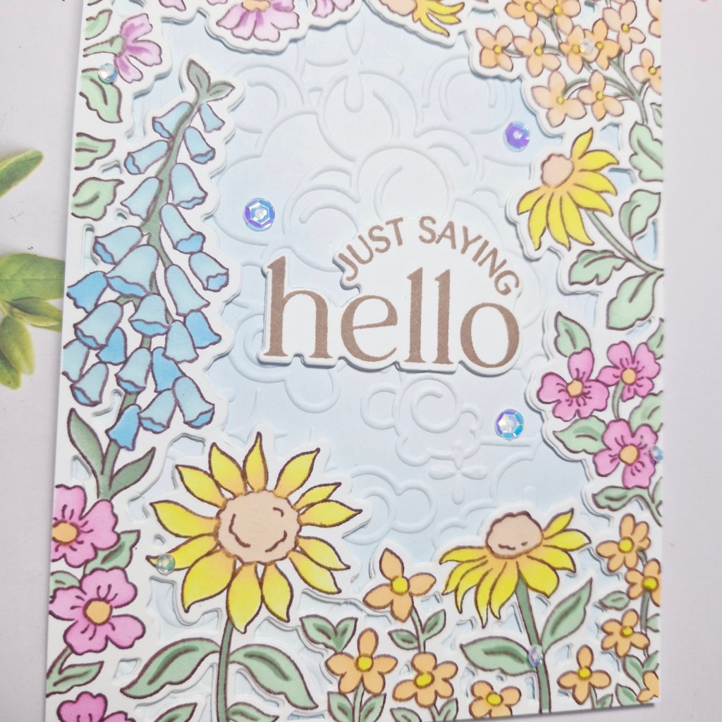
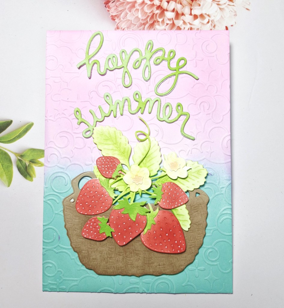
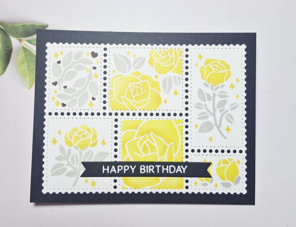
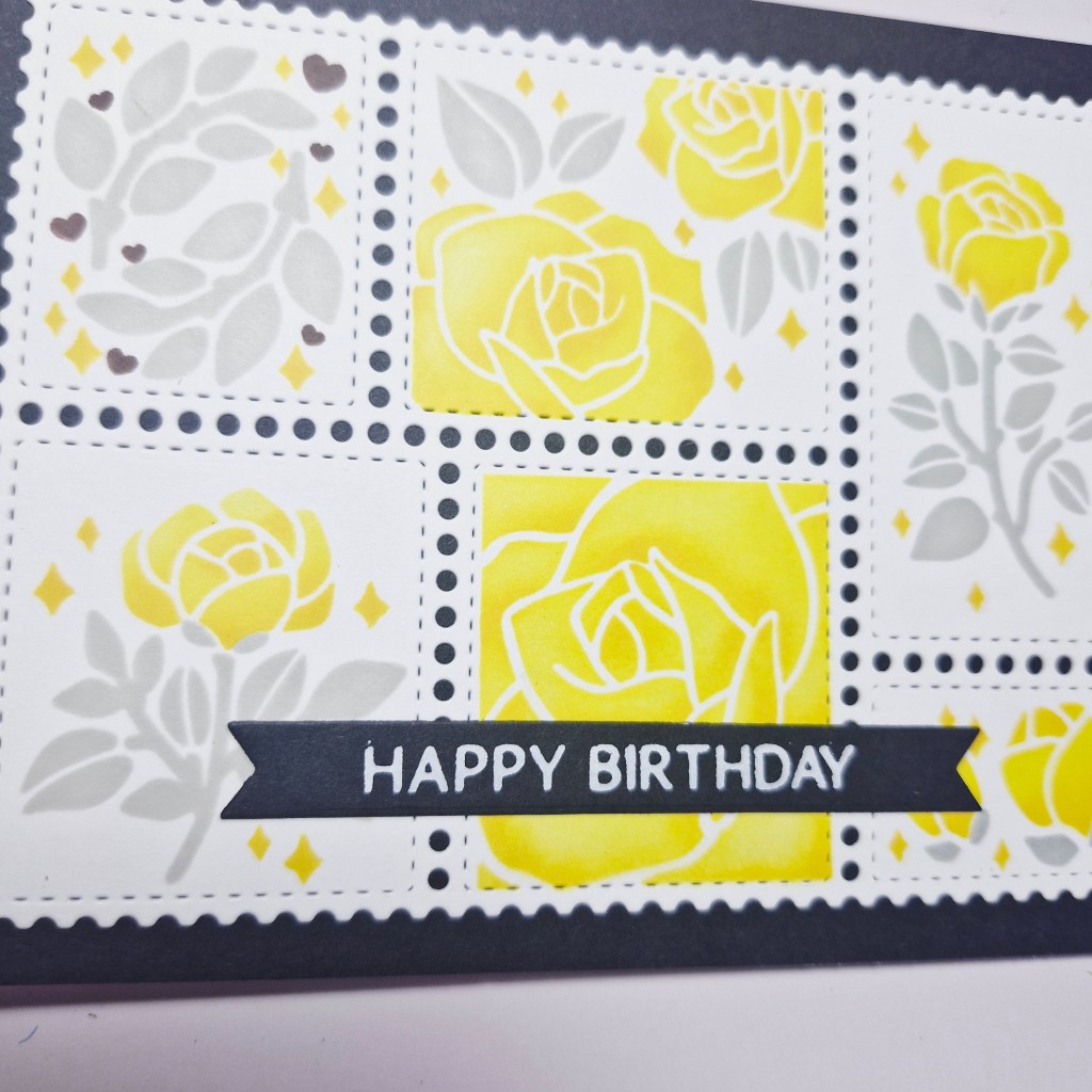
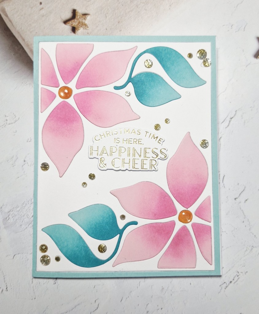
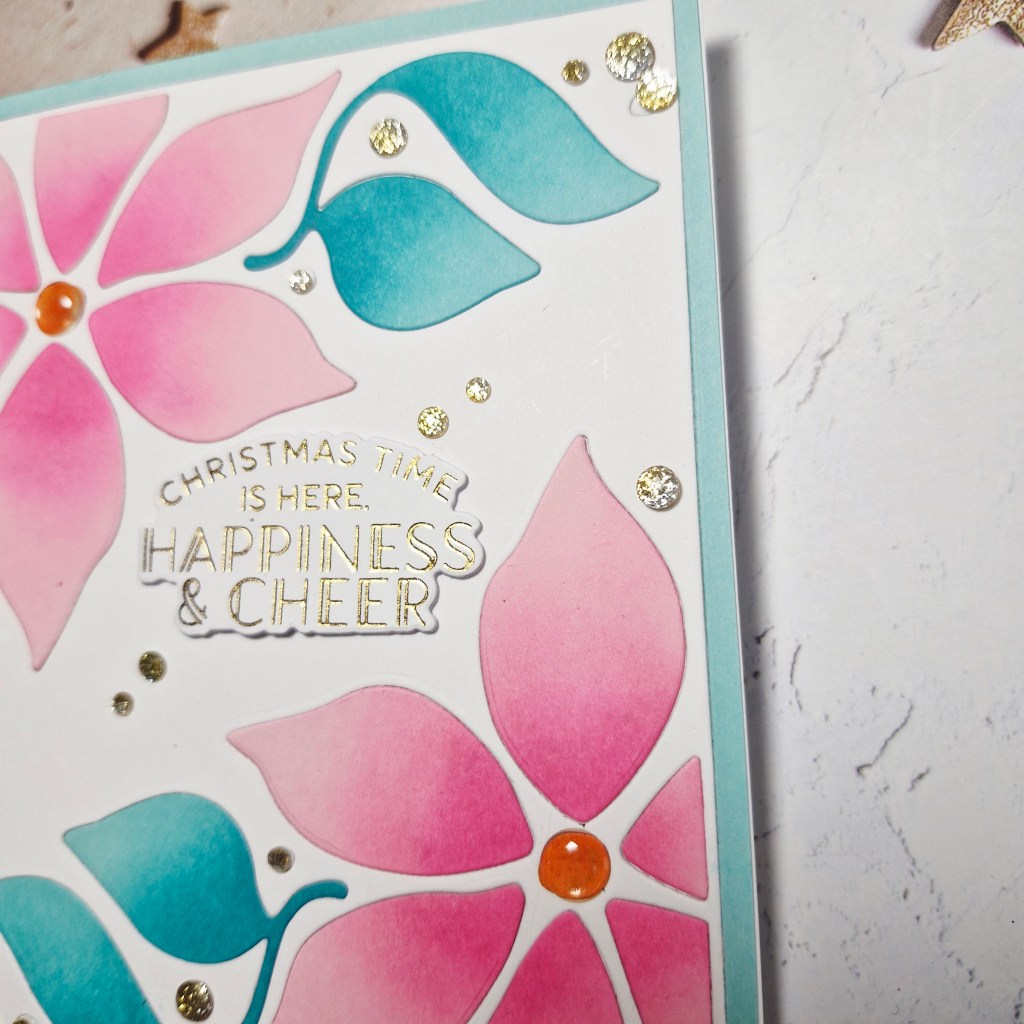
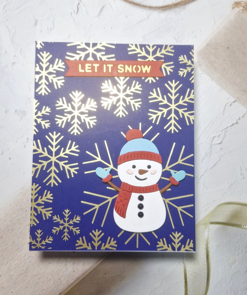
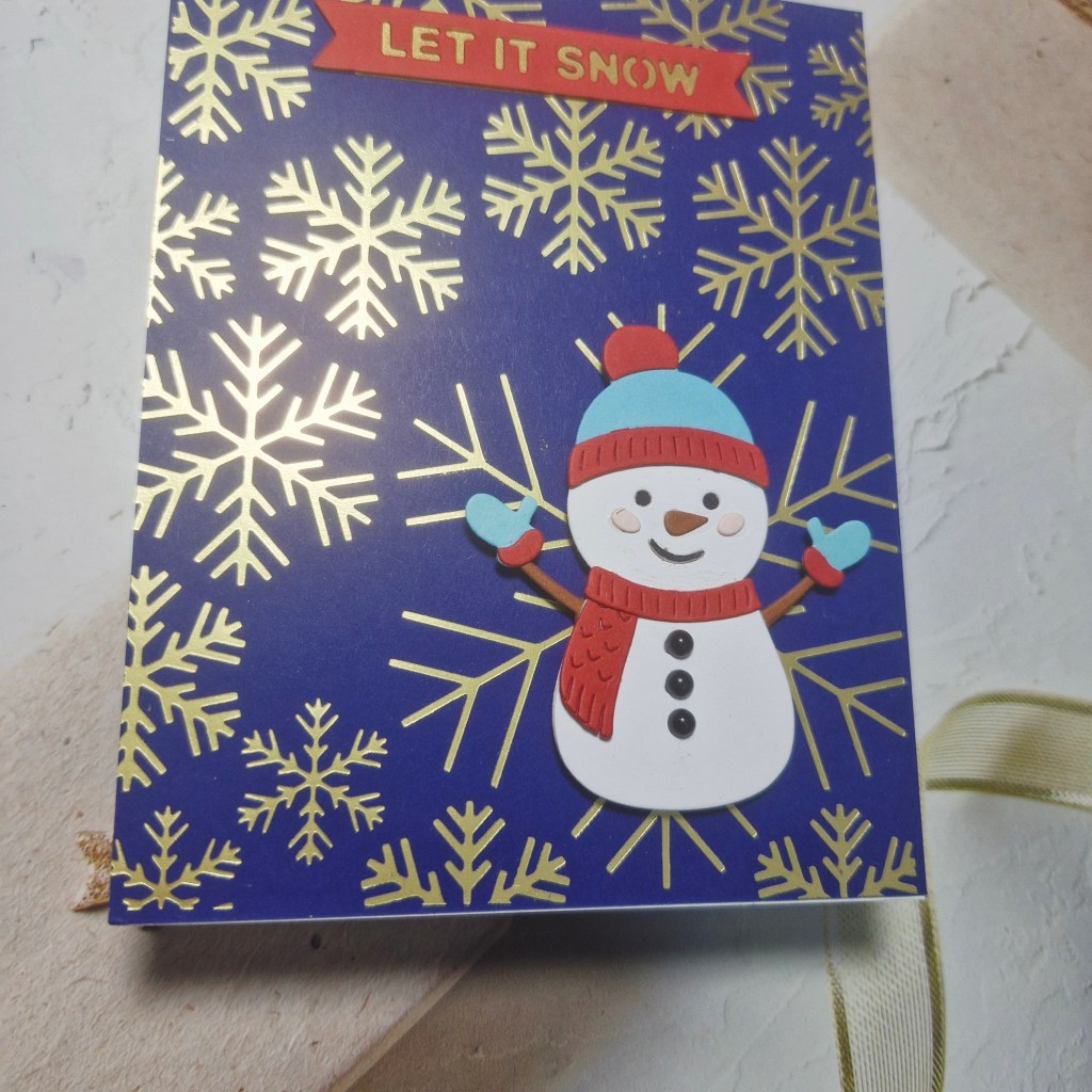
Hi there. It’s been a busy weekend, as I’ve been out to a classical Ibiza night at Chatsworth House – a fabulous night in an amazing setting, and then today I went out to a crafting event in Doncaster. I did find time to put together this card using products from Spellbinders:
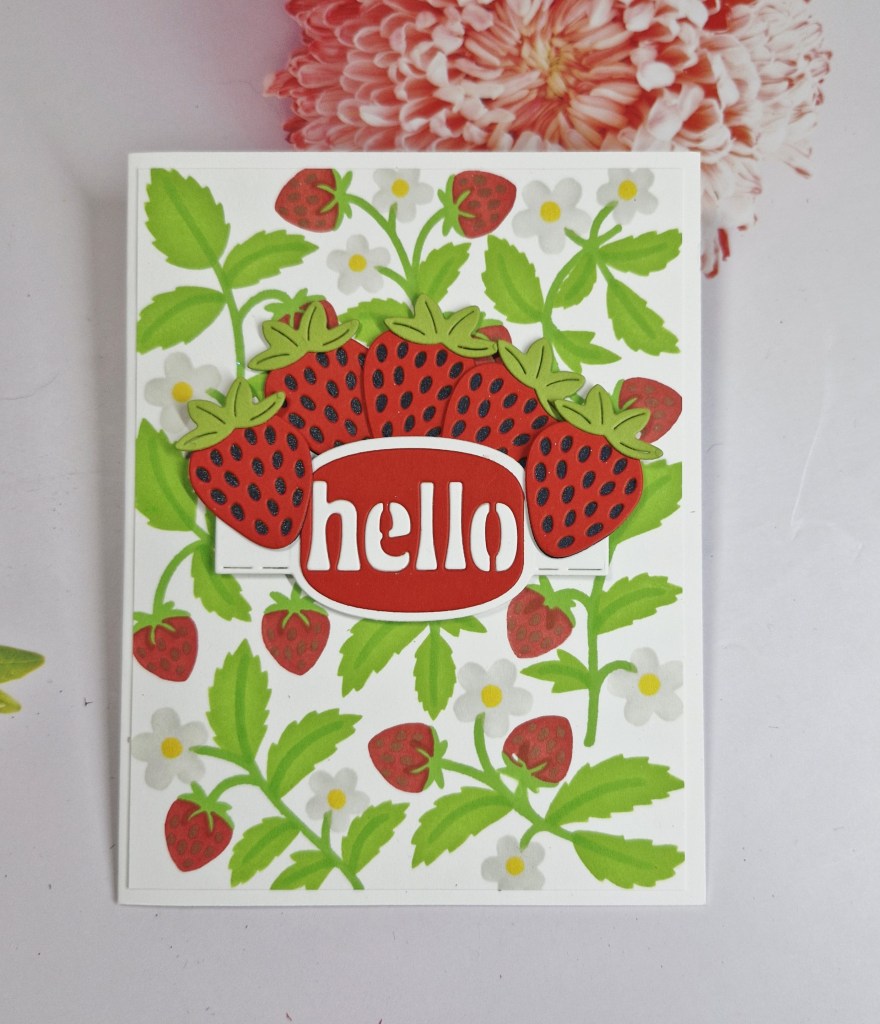
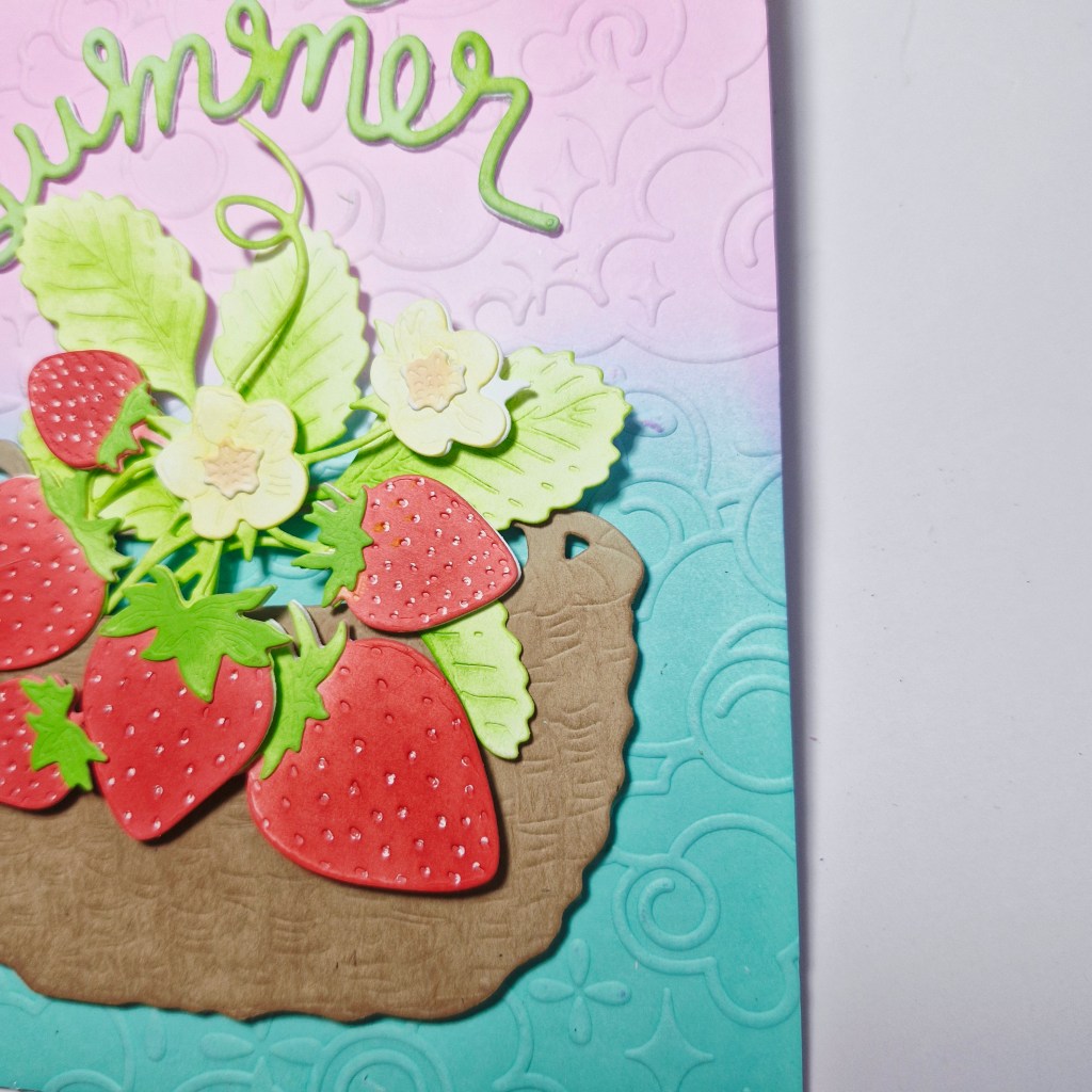
I began by creating the background, which is a set of layering stencils, using Pinkfresh Studio inks, then cut that down slightly and adhered to a card base.
The strawberries were die cut and assembled, and the centre sentiment banner also die cut – with the fall-out letters of the word inlaid back into place.
A little bit of die cutting, but most of the time was spent doing the ink blending on the background.

I shall be entering the following challenges:
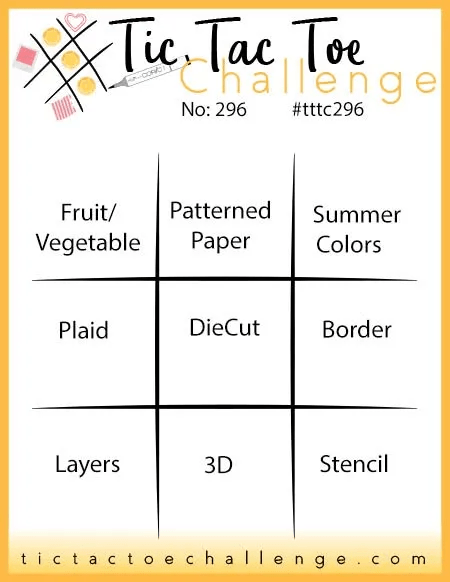
Tic Tac Toe – top left to bottom right diagonal – fruit/vegetable + die cut + stencil
Allsorts – use stencils
Cut It Up – die cuts and create your own background
Stencil Fun – use stencils – option of patterns not taken