Hello everyone. I am back from my sojourn to see my sister in Canada – fabulous to catch-up face-to-face and help sort her craft room in the new house.
It is time for the new challenge at Cardz 4 Galz, and Caz has chosen the theme of:
Blue Skies
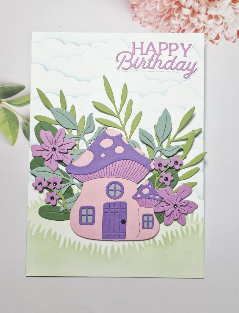
Here is my card:
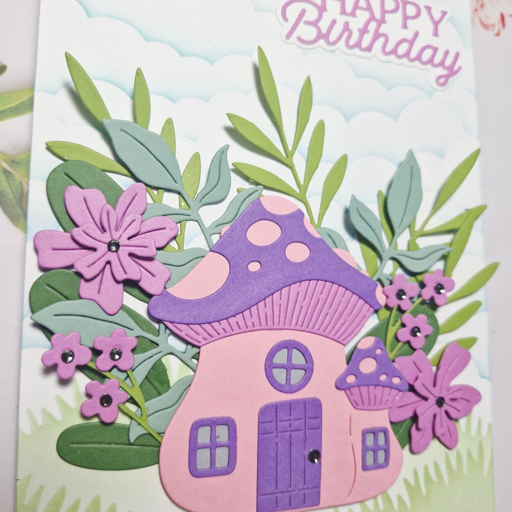
I started by creating the blue skies in the background by using an MFT stencil and Pinkfresh Studio inks. I then added a couple of layers of grass, also by using a stencil and ink blending.
The main image of the mushroom is from a Spellbinders die set ‘Mushroom Mansion‘ and die cut from Spellbinders and Concord & 9th card stock. The foliage and flowers are also from the same die set.
All the layers were glued and assembled, the layout arranged to my liking, and then the sentiment die cut and added.
A few small gems inserted to the centre of the flowers, and for the door knob on the mushroom.
I hope you can come and join us with your creation following our theme – add blue skies. xx
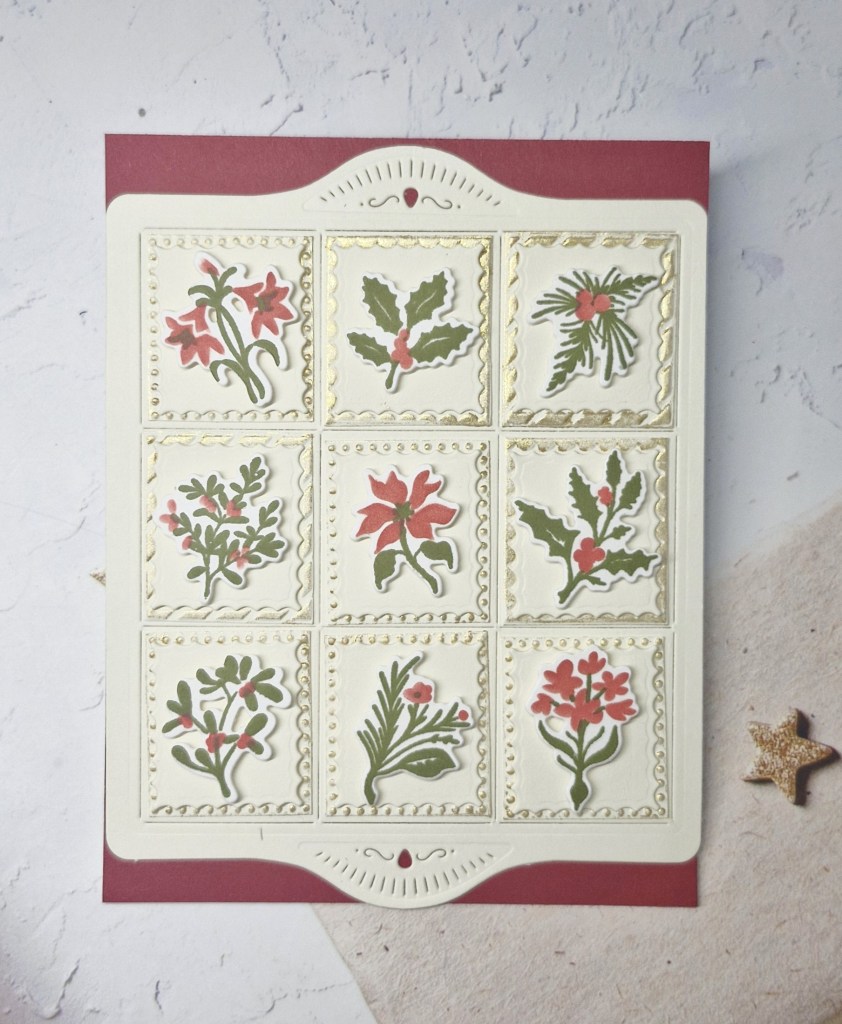
Hello again. I am jetting off to Quebec tomorrow for a 2 week visit with my sister, but I have time for one more post before I go. I do have some posts scheduled for whilst I am away, for my Design team duties, but this card was created using The Greetery products and just playing with products I had out from yesterday:
I created the foliage again using Bitty Holiday Botanicals, but this time using a different green to give a more vintage look. These were die cut and set aside.
I then found the Shortbread Shapes embossing folder and die set and played around a little. This was the most time consuming, whilst I figured out what I wanted to do, how many layers, did I want to emboss etc.
I used ‘Alabaster’ card stock from Spellbinders, and created the base shortbread shape using the die set, and then using the top and bottom detail dies.
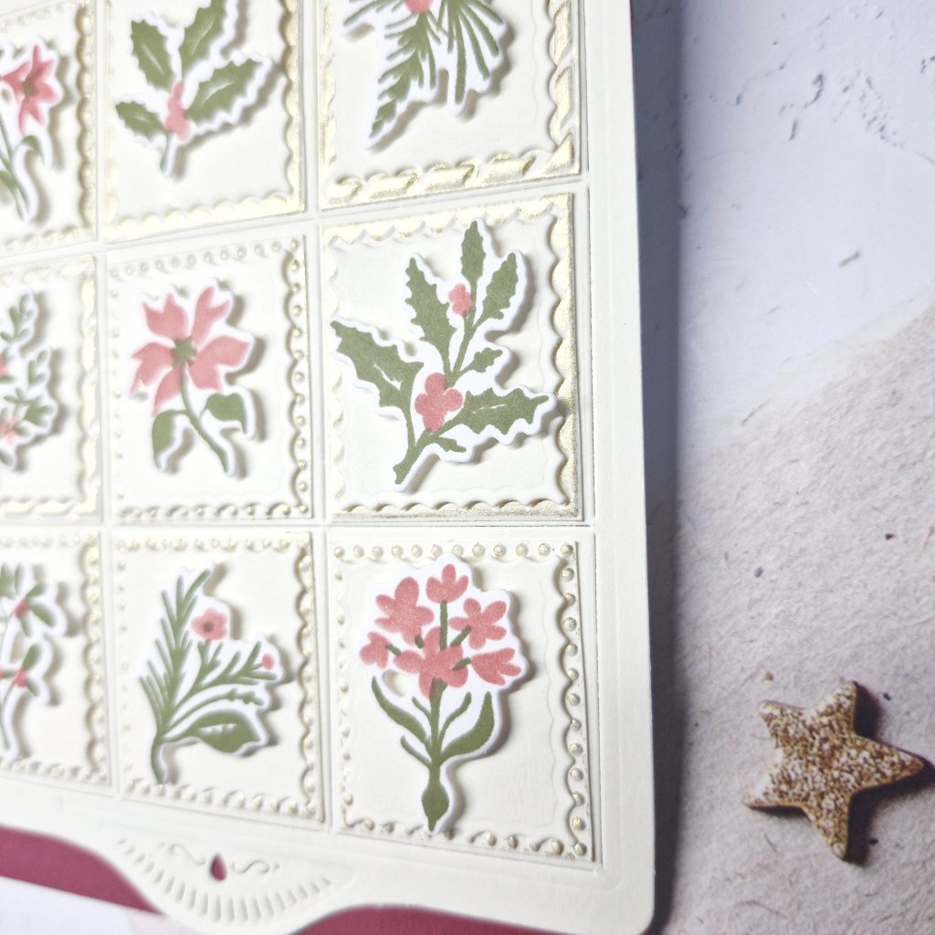
I then ran another piece through with the die, then the embossing folder. I snipped apart the rectangles, and ran some gold wax around the edges to pick up the details.
I die cut nine more rectangles with detail edges, glued them onto the gold waxed pieces – even though covering up the embossing on these squares, I wanted to use the already created foliage.
The foliage were attached with small pieces of 3D foam.
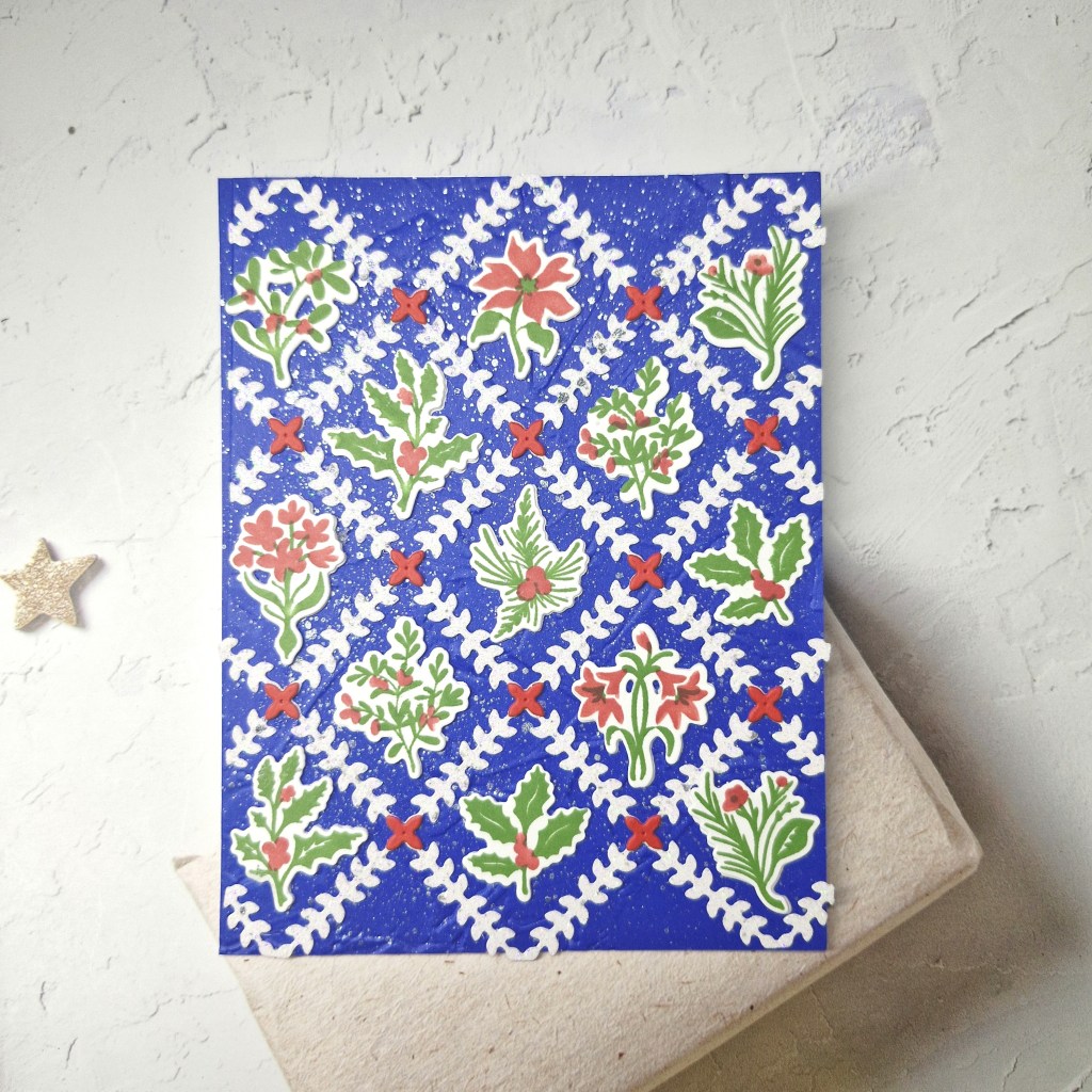
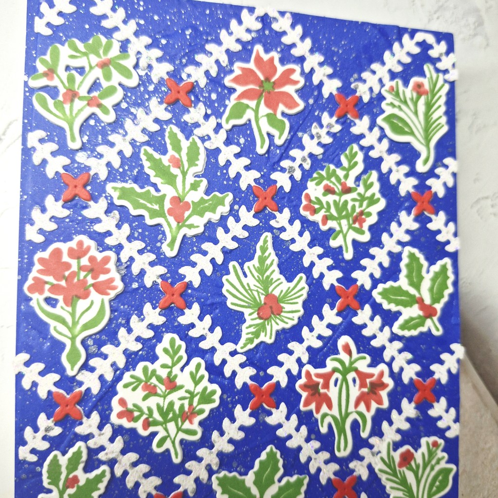
I have a Christmas card to share using products from The Greetery:
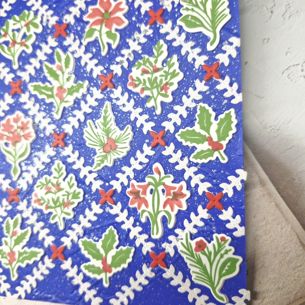
I wanted to play with the ‘Bitty Holiday Botanicals‘ so I started by stamping the green foliage, then used the matching stencil to colour it. The die was then used to cut them out.
I then used the ‘Diamond Foliage‘ die and cut this out of white glitter card stock.
I chose a dark blue card for the background, from Concord & 9th, and ran that through with an older Stampin; Up embossing folder to create a subtle texture. This panel was splattered with pewter acrylic shimmer and then – when dry – adhered to the card base, the white glitter diamond foliage piece glued down, and the the little red flowers added to each of the cross-sections of the die.
I die cut each of the images twice more and stacked them, adding as you see.
I liked the outcome so much, I didn’t think it needed a sentiment on the front.
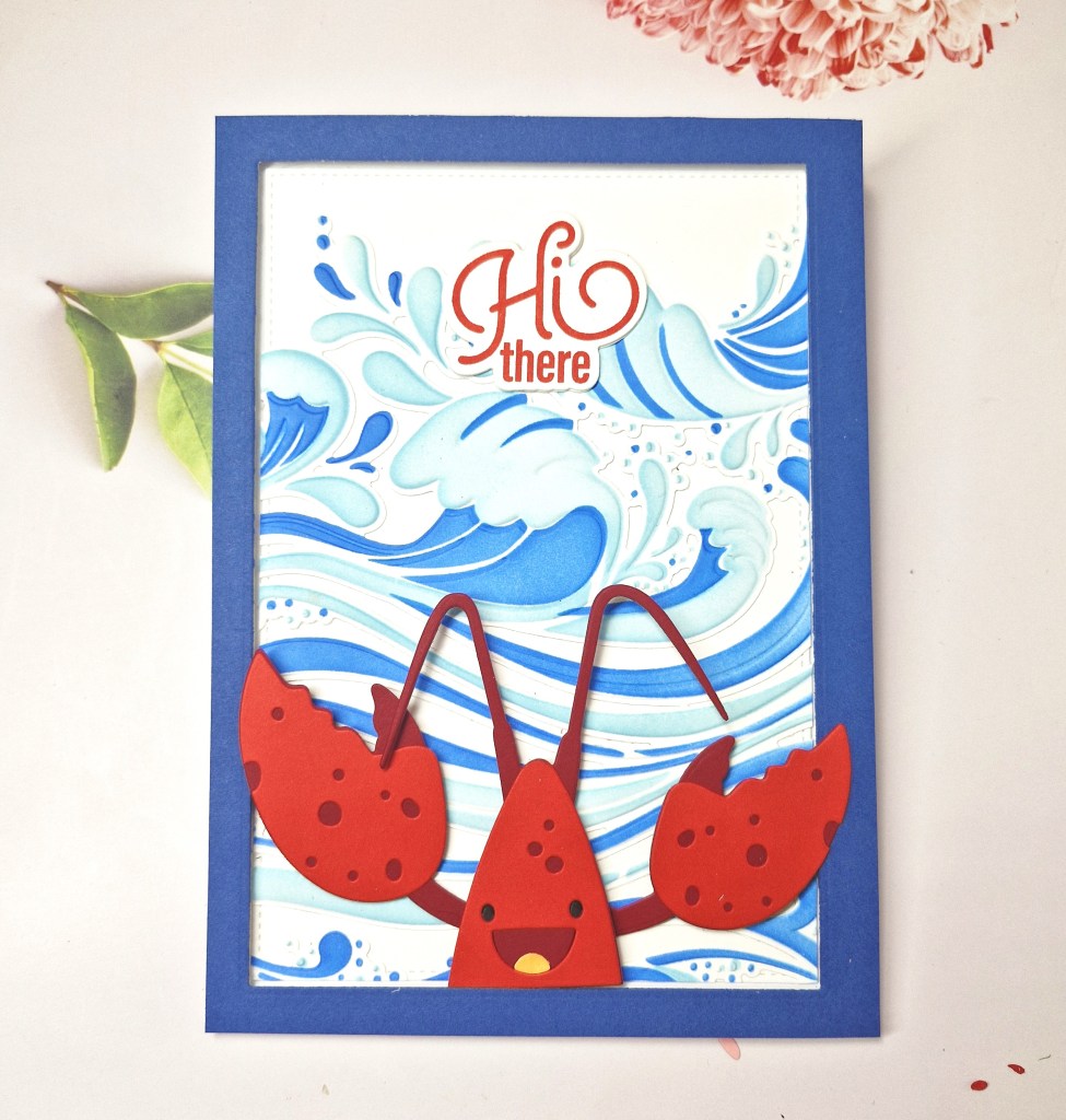
This card was inspired by the challenges which encourage you to use red, white, and blue:
I wanted to use new products from Waffle Flower and The Greetery, as I thought the colour inspiration would suit perfeclty.
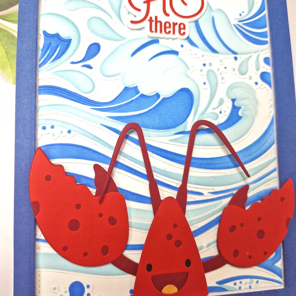
I first began by creating the Waffle Flower ‘Happy Lobster‘ using a couple of shades of red card stock from Concord & 9th. The eyes were drawn in black on the darker red before adding the top layer, and the tongue was a little light orange ink blending onto a small piece of card then die cut.
I didn’t attach the arms until I figured out the background and design – which took me more time than anything.
I knew I wanted to use the ‘Making Waves‘ embossing folder and layering stencils, and actually played around with this a few times. On one piece, I ink blended using the two layering stencils, then die cut, then used the embossing folder. On another piece I die cut, then ink blended, then used the embossing folder. On a third piece I embossed, then ink blended, and was going to cut down the panel when I knew what size of card base I wanted. Three similar but slightly different outcomes.
I chose to use the panel I had ink blended, then die cut, then embossed.
I also chose to use a 5×7 inch card base – lots of room for the images.
How to keep the edges looking neat and tidy…? I decided to add a frame. Using a 5×7 inch piece of card, I die cut the inner rectangle using a Gina K Designs Master Layouts die set in white, then another in a darker blue from Concord & 9th.
I adhered the waves to the white inner stitched panel, trimming off any over-hang, and attached to the card base. The blue frame was added with C9 3D foam strips.
The lobster was placed were I wanted him to be, but I did die cut one more layer for the piece which had his antenna on for a little more stability.
The sentiment was stamped, die cut, and two additional layers added, then glued as you see. This was from a Simon says Stamp set which came with a kit in February this year.
This was fun to make, and I’m sure I will use this background again at some point.
I’m off to visit my sister and her husband in Quebec, Canada next week for two weeks, so whilst we may spend some time crafting, there will probably only be the scheduled posts for upcoming Design Teams.
We haven’t seen each other face-to-face for 4 years, only WhatsApp video and messages, and she has just moved into a new house. Lots of things to do to sort out – especially her craft room – catch up, and generally get out-and-about in that wonderful province.
I will be taking my MetaQuest with me – I do virtual boxing and combat for a couple of hours a day – and she has borrowed an e-bike from a friend of hers, so I should be able to keep up with my daily exercise regime – to some extent, anyway.
I shall be entering the following challenges:
Cut It Up – die cuts and create your own background
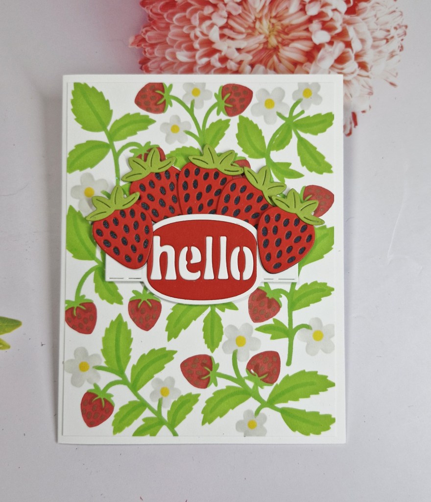
Hi there. It’s been a busy weekend, as I’ve been out to a classical Ibiza night at Chatsworth House – a fabulous night in an amazing setting, and then today I went out to a crafting event in Doncaster. I did find time to put together this card using products from Spellbinders:
I began by creating the background, which is a set of layering stencils, using Pinkfresh Studio inks, then cut that down slightly and adhered to a card base.
The strawberries were die cut and assembled, and the centre sentiment banner also die cut – with the fall-out letters of the word inlaid back into place.
A little bit of die cutting, but most of the time was spent doing the ink blending on the background.
I shall be entering the following challenges:
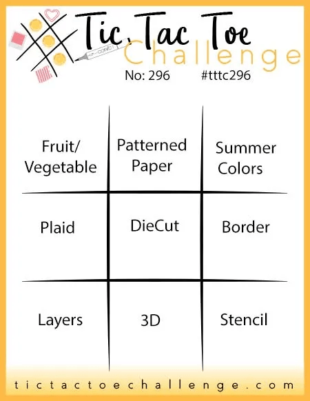
Tic Tac Toe – top left to bottom right diagonal – fruit/vegetable + die cut + stencil
Hello everyone. I was lucky enough to be the winner for previous challenge at 52 CCT, and as such took them up on their offer to be Guest Design team member.
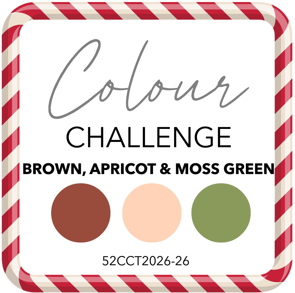
They have started a new challenge, and it’s a colour challenge – as long as you create a Christmas card using these colours (some neutrals are allowed) – you are good to go:
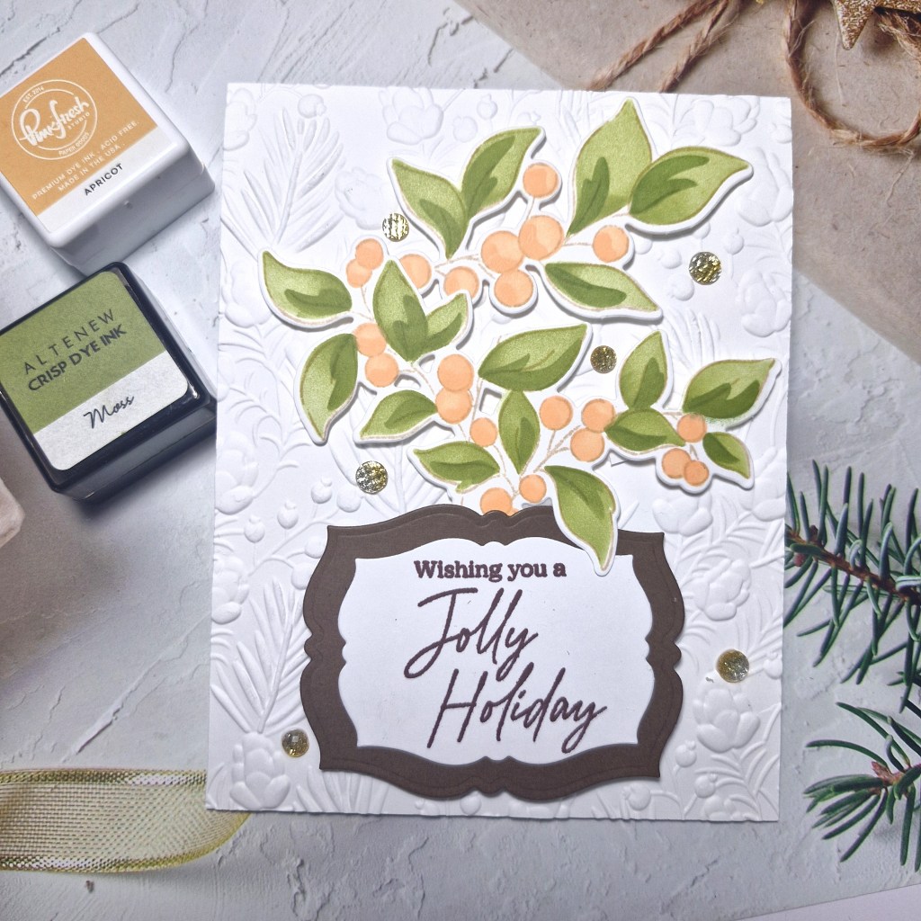
Here is my card:
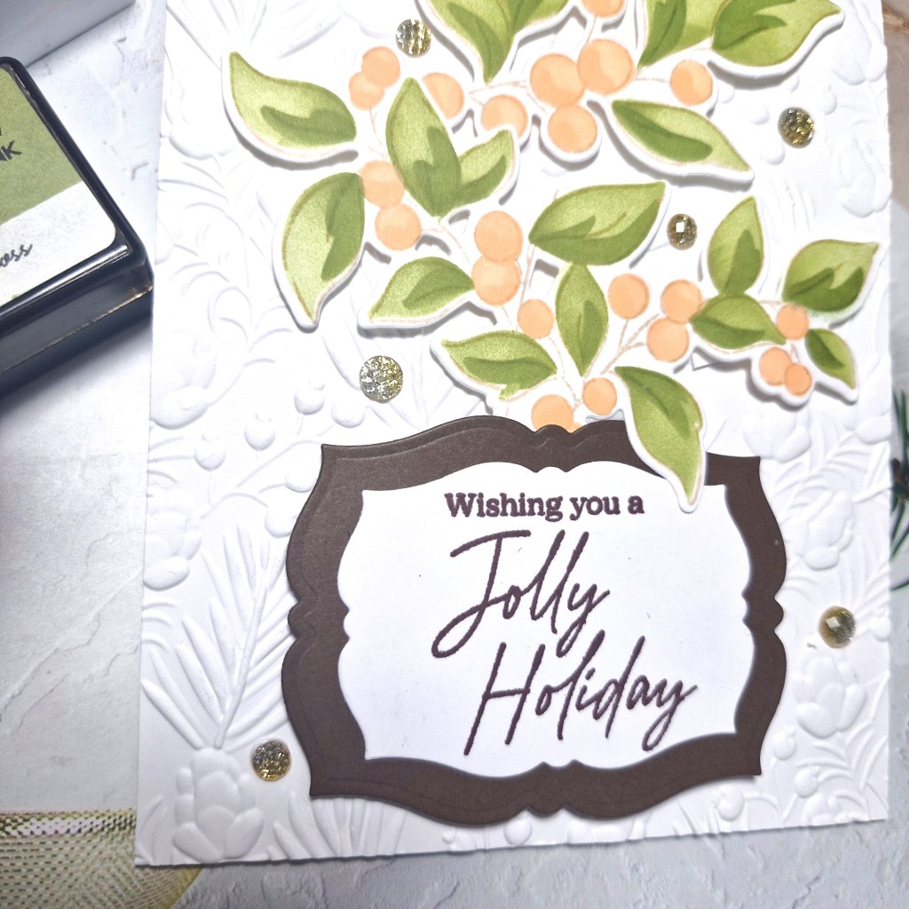
I used a stamp, die and stencil set from Pinkfresh Studio called ‘Berry Branch‘, stamping the image in a brown ink for a softer outline, then used the layering colouring stencils, then the matching dies.
The two inks I used you can see in the picture, making the first layer a lighter touch, and the second layer a darker touch of ink blending for the two colours.
The background panel was embossed using a Spellbinders embossing folder and attached to a card base.
I stamped the sentiment – from the same suite – in a dark brown ink, then die cut that piece and added a dark brown layer behind using a smaller Pinkfresh Studio ‘Fancy Labels Frames’ die set.
I did snip the branch a little so I could paly with the layout, and attached all the elements using 3D foam.
I couldn’t decide whether to use silver or gold gems, so I thought an ombre mix of the two would work. These are also from Pinkfresh Studio and some of my most used gems.
I hope you can come join the challenge, and I look forward to seeing what Christmas cards you create using these colours. xx
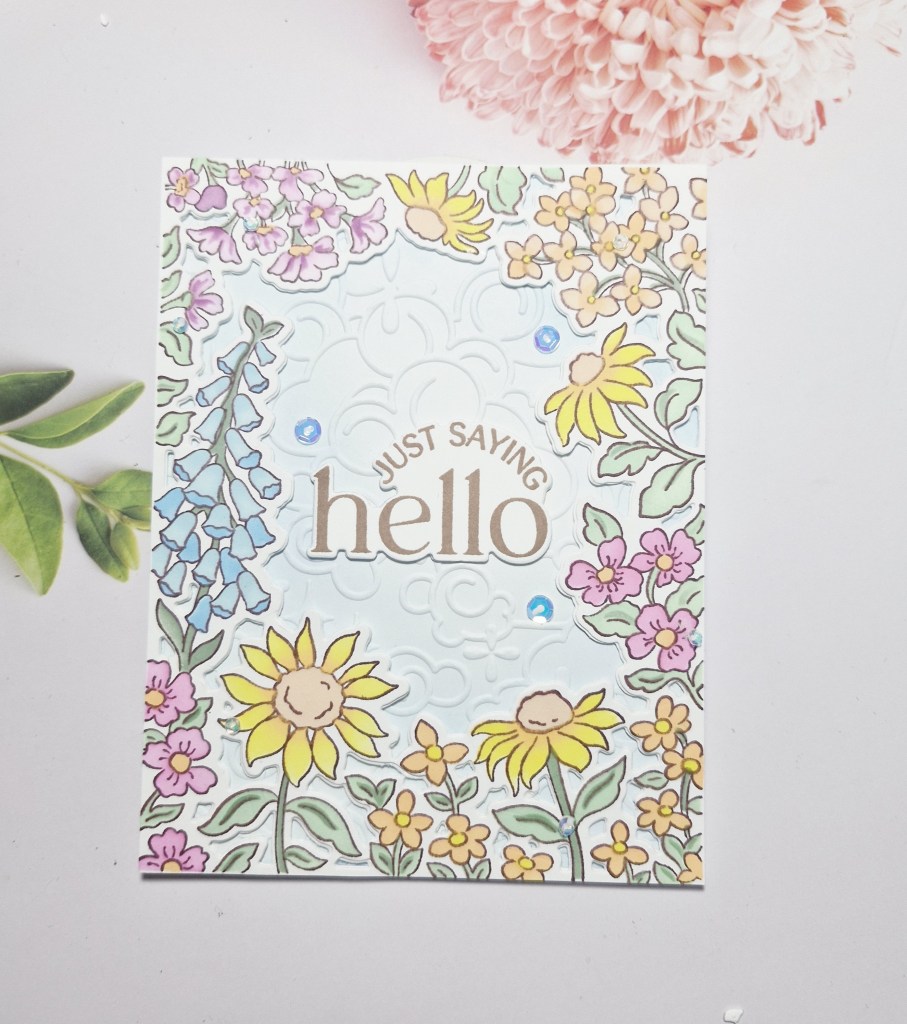
Hello again. A summery hello card to share with you today:
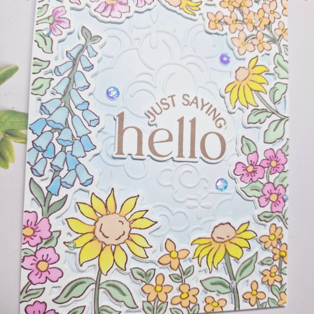
For this card I used the new Pinkfresh Studio stamp, die, and stencil set called ‘Sunlit Garden‘. I stamped the image with a brown to give a softer outline, then used all of the layering stencils to colour it in, adding some darker shading to the base of some of the flowers. This was then die cut and set aside.
For the background, I ink blended a white panel very lightly with blue, than used a Spellbinders embossing folder ‘Cloud Nine’, and attached that panel to the card base.
For the inked image, I die cut another two panels and layered together for more stability and then glued down.
The sentiment was stamped in a brown ink – another Pinkfresh Studio stamp set – die cut and layered three times, then glued into the centre of the opening.
The final touch was to add some iridescent sequins:
I shall be entering the following challenges:
CYHTP – embossing folder, option of purple not taken
Hello again. I have a card created to share with you:
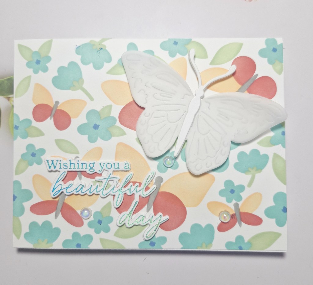
I wanted to use a layering stencil set from Waffle Flower. This background is the ‘Postage Collage Spring Breeze’ and has five layers to it. I chose the colours from Pinkfresh Studio inks and set to it.
Once the background was finished, I added it direct to a card base.
I then used the ‘Butterfly Focal’ die and cut it in white, then cut it in vellum, layering the two together, adding an extra body to the top so I was able to secure the vellum easily.
The sentiment is in blue foil, and from a Pinkfresh Studio product suite ‘Butterflies in a Cloche’, previously created when I had a foiling session. This was die cut with the matching dies, and a couple more layers added for stability.
I also added some irridescent gems for extra interest.
Hubby and I are out tonight with some friends to celebrate our 38th wedding anniversary – time sure does fly….
I shall be entering the following challenges:
Stencil Fun – stencils, option of butterflies taken
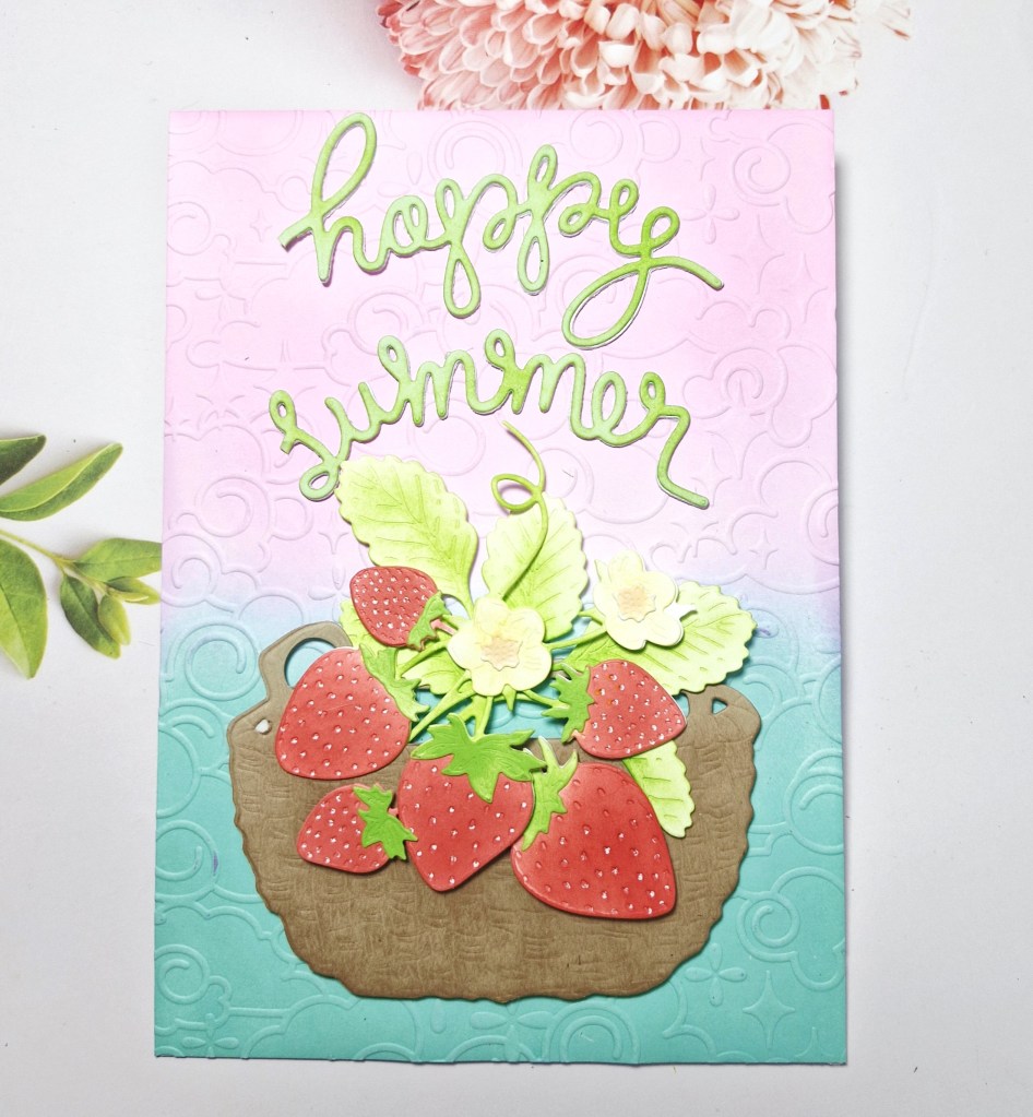
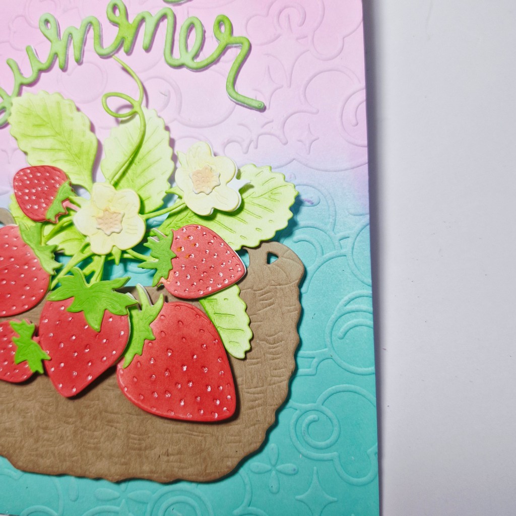
Hello again. More play time in my craft room, this time to create a card with fruity goodness and a summer feel to it:
I used the Honey Bee Stamps die set called ‘Lovely Layers: Strawberries‘ and die cut all of the images from white card stock. I then ink blended each of the die cuts in the appropriate colour, using Pinkfresh Studio inks. The die cuts were then layered as required, then arranged as I thought they would look good together. I also added some white gel pen to the strawberry ‘pips’ to make them stand out a little more.
Then to decide on a way to ground the bunch of strawberries, and I used a Spellbinders/Susan Tierney die set ‘Gathering Basket‘ and die cut it out of light brown card stock, the ink blended some darker brown onto it.
The sentiment is using The Greetery ‘Summer Silly Straw‘ die cutting out of white card stock, then chopping off the straw bottom to leave the two words, and ink blending with green. I also die cut this a couple more times and glued together, to add more stability to the words.
Then I found that an A2 card base would not be big enough to get everything on, so I used a 5×7 inch card base.
The background needed something – I ink blended a white panel, then ran that panel through with a Spellbinders embossing folder ‘Cloud Nine‘, and attached to the card base.
The strawberries and basket were adhered with 3D foam, then the two words were attached.
I wanted to share a card I made using an older stamp and die set from Mama Elephant:
I was searching for another Mama Elephant set, when I came across this, called ‘Cupcake Wishes‘, and decided to have a play.
I stamped the images and coloured with Copics, then used the matching dies to cut them out. The background was created using a stencil from Lawn Fawn, and colours which I though would work well with the image.
This panel was cut down slightly and adhered to the card base. The images attached with 3D foam, then the Spellbinders sentiment die cut, and also attached with 3D foam.
I have no idea why I chose the number 8 for the candle – just on a whim.