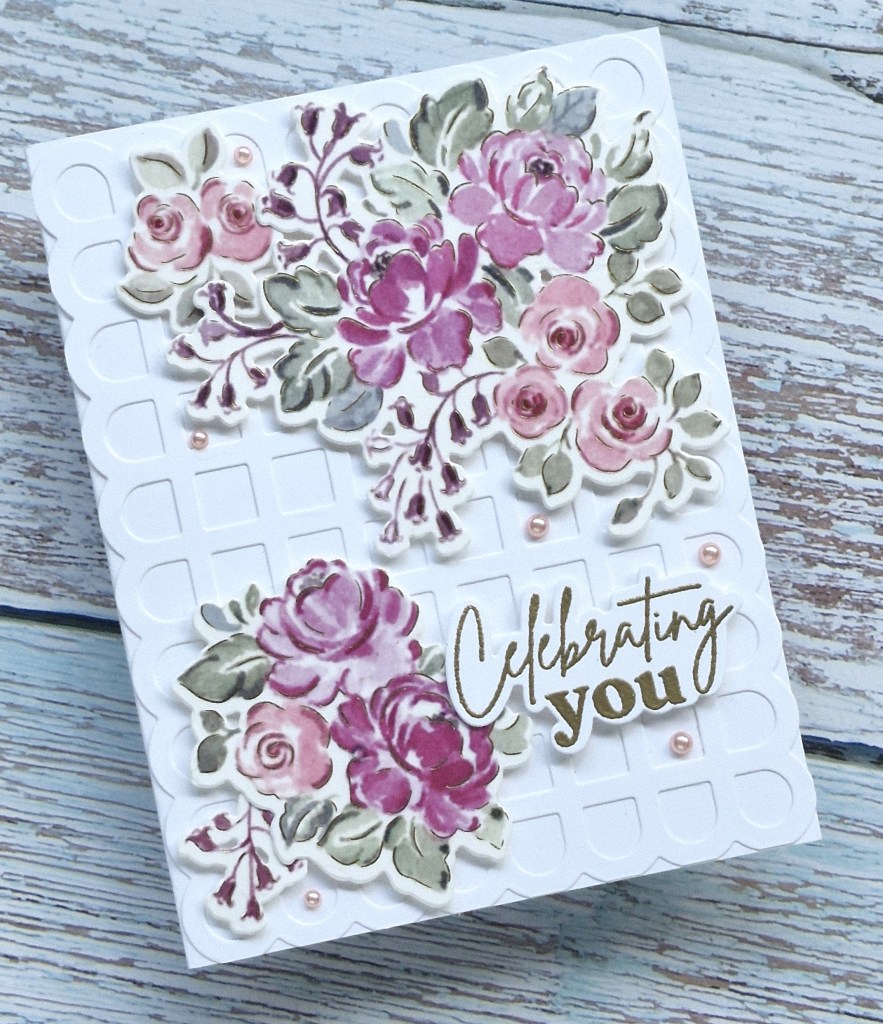
Hi – once again here with a card created using the Pinkfresh Studio ‘Pretty Blooms‘ washi suite – so many ways to use these products:
The background was created using a ‘Scalloped Grid’ cover plate die, and adhered directly onto a white card base.
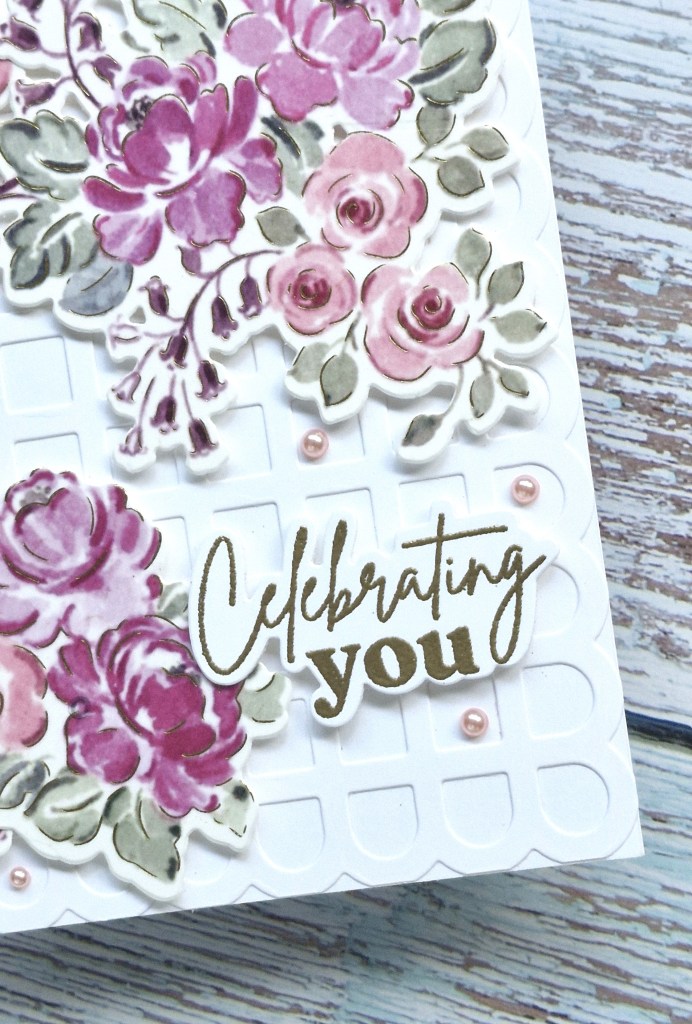
The two floral sprays were attached with 3D foam, the sentiment gold heat embossed and added with more 3D foam, them this time pink gems from Spellbinders were my final touch.
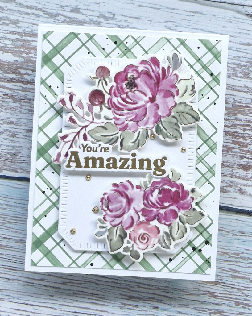
Hello again. Another card created using the Pinkfresh Studio ‘Pretty Blooms’ suite and the washi tape:
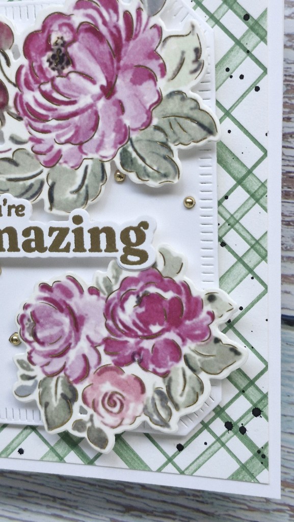
The background for this card was created using the Pinkfresh Studio letterpress plate ‘diagonal plaid‘ and a Pinkfresh Studio green ink, onto a Spellbinders cotton card panel. I then splattered with black acrylic paint and when dry, cut down slightly then glued onto a card base.
The shaped label was also a Pinkfresh Studio die set, attached with 3D foam, the two washi floral elements also added with 3D foam.
The sentiment was gold heat embossed, again added with 3D foam – and my usual final addition was some gold gems.
Hello there. I’ve been spending quite a bit of time in my exercise game on MetaQuest and also in the craft room – playing, just playing, as we have had to say goodbye to another of our cats. He was 20 years of age, and time just got away from us. That will be three cats in 6 months we have lost……to say we are heartbroken is putting it pretty mildly. Hence – the need to switch my mind to other things.
I have been spending some time with Pinkfresh Studio washi tape from the ‘Pretty Blooms’ collection. I created a couple of panels of the washi, die cut them, and made three cards – to begin with. Here is the first card:
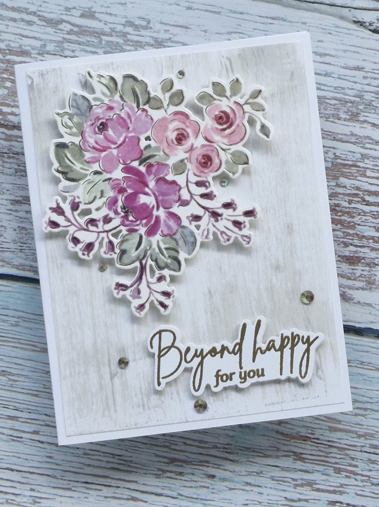
Taking inspiration from the current challenge at Tic Tac Toe, I created a background wood grain effect by swiping a light and slightly darker grey across the panel. I learned this from Gina K on one – if not several – of her videos.
This panel was cut down slightly and adhered to an A2 card base.
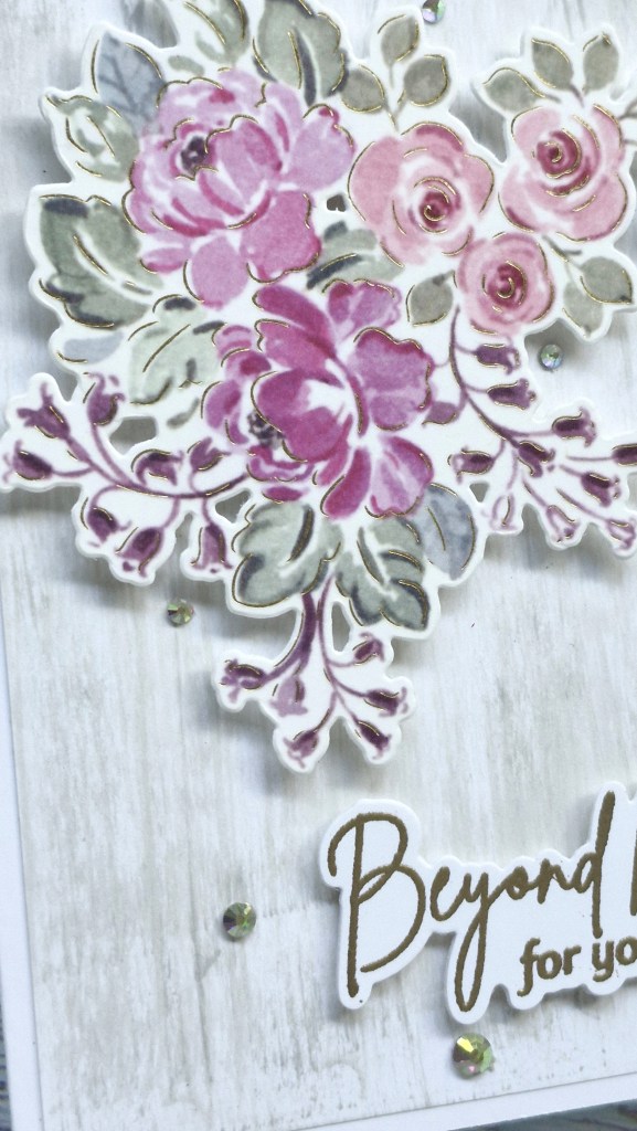
One of the floral washi bunches was added with 3D foam, then the sentiment, stamped and gold heat embossed, die cut, then added to the bottom corner.
The final touch – as per usual – was to add some Spellbinders gems.
A simple card – for me – with the bunch of florals being the centre of attention.
I shall be entering the following challenges:
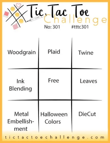
Tic Tac Toe – top left to bottom right diagonal – woodgrain/free/die cut
There is a brand new challenge starting from Heart’s Quest, and to show my support for the new challenge and the Design Team, I have created a card for it. The name of the challenge is ‘Heart’s Quest Pretty In Pink’ and the theme is to use mainly pink, with an optional pink washi/decorative tape for this month.
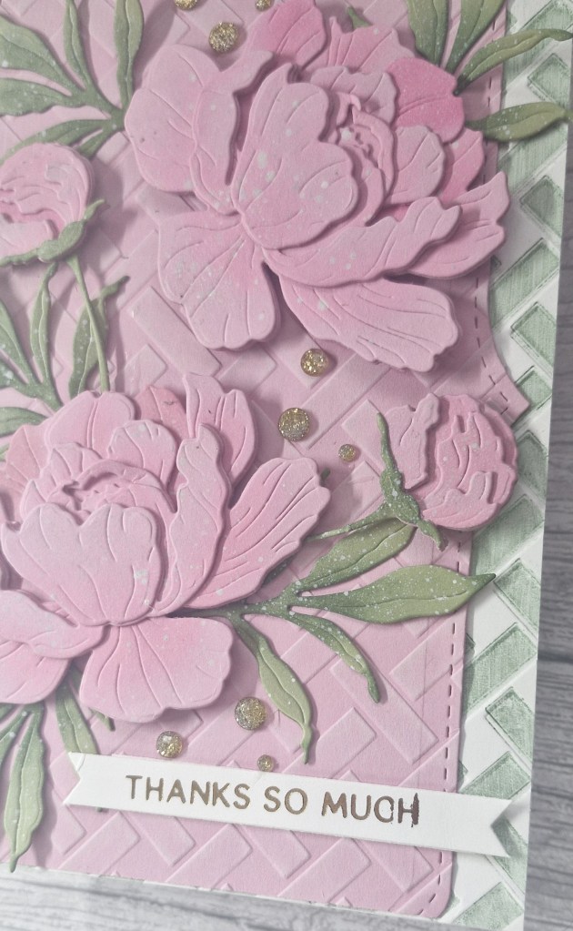
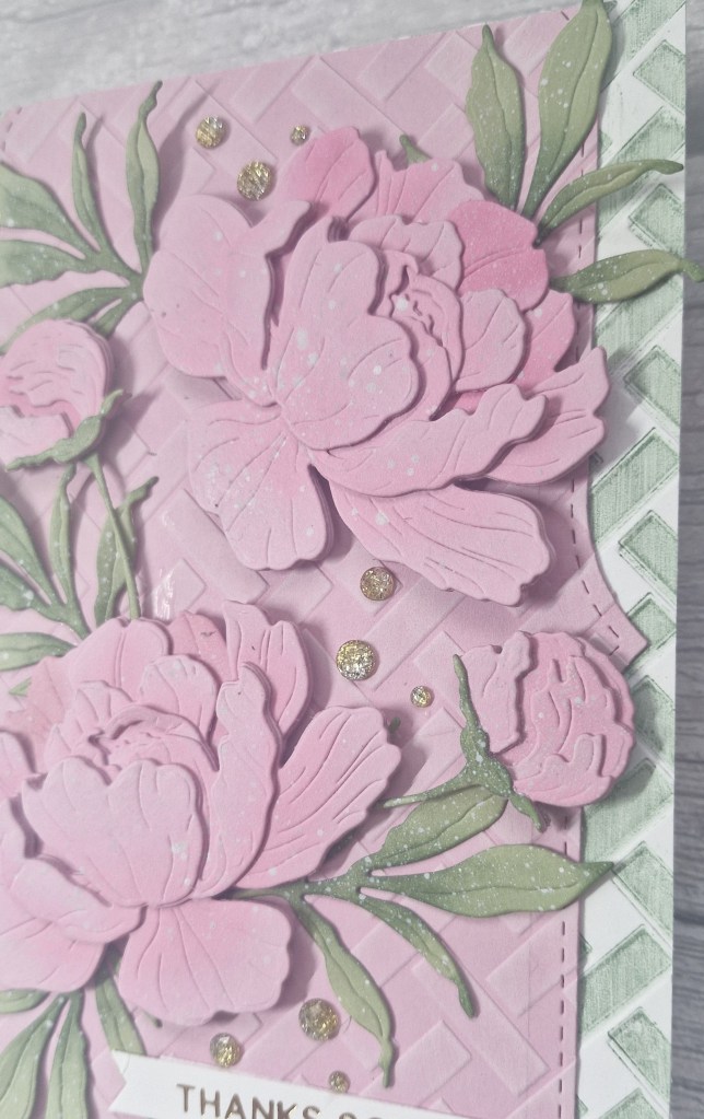
Here is my card:
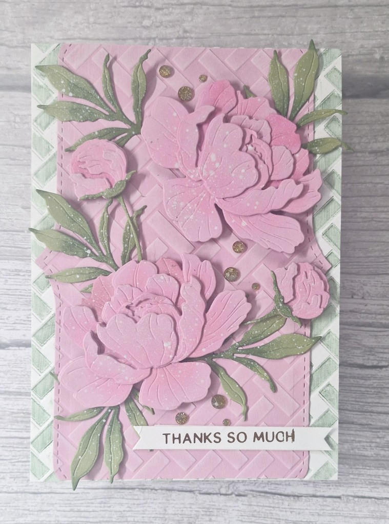
When I saw that the theme was pink – not my usual choice of the main colour – I thought of peonies. I searched through my CML app with that tag, and decided to use the Honey Bee Stamps ‘Lovely Layers: Peony‘ die set.
I started by die cutting all the floral layers in Concord & 9th card stock, then ink blending a darker pink in strategic areas. To make sure this ink blending was in the areas which would be seen, I placed the next upper layer on top, saw what would be seen, then ink blended. I did this trough all the layers.
The leaves and stems were die cut from a green card also form C9, and then ink blended also with a slightly darker green.
The layers were glued together, then I added some white acrylic splatter and set aside to dry.
I used a 5×7 inch card base – large enough to place all the elements rather than an A2 – and created the background white panel by using a Spellbinders embossing folder onto which I had pressed some green ink, creating this distressed looking basket weave pattern.
The central pink panel was cut to 5×7, but I used Pinkfresh Studio ‘Slim Edgers‘ die to create the stitch and pattern. This piece was then run through with the same Spellbinders embossing folder, and a white pigment ink pad over the top to catch the basket weave detail.
Once the inks and splatters were dry I attached each of the layers, adding the flowers with 3D foam, then gluing down and tucking in the leaves, foliage, and buds.
The final touches was a gold foiled sentiment then some Pinkfresh Studio ombre gems.
Hello. A late posting today as hubby and I have been out and about in the cooler weather. We visited a maize Maze near Ashbourne in Derbyshire. There’s quite a bit to do for the little ones – of which we certainly are not – but walking amongst the sunflowers and wildflowers as well as working our way through the maize maze took almost a couple of hours – with an ice cream at the end…..
This card was created yesterday, and fitted our little sojourn today:
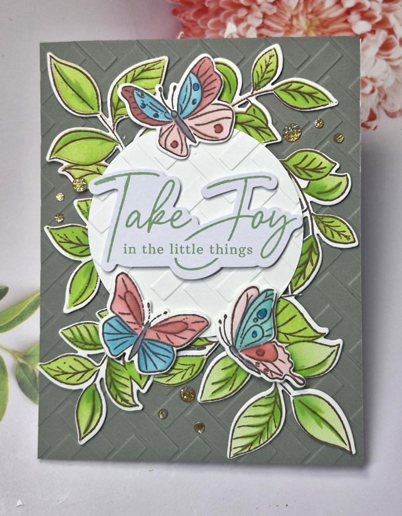
For the foliage and the butterflies I used a stamp, die and stencil set from Pinkfresh Studio ‘Fluttering Butterflies‘. I also have the washi which goes with the die set but used the other products this time round.
I stamped, ink blended then die cut the images. I did the foliage twice as I wanted plenty on this card.
The background panel was created using a grey card stock, then a Spellbinders embossing folder. I chose a darker colour to enable the colours of the foliage and butterflies to stand out more.
I ran a white circle die cut through with the grey panel and the embossing folder, to keep the pattern aligned – though I ended up covering most of the outside of the circle.
The circle was attached with 3D foam, then the foliage arranged by tucking underneath. I did have to cut some down, but managed to get them as full as I wanted.
Before adding the butterflies, I added the sentiment. This is a pre-printed sentiment, received as part of a virtual event I think, then the butterflies arranged around that. I did have to double-up small pieces of foam tape as my butterflies were half on, and half off the white circle, but this wasn’t hard to do.
The final step was to add some ombre glitter gems.
I shall be entering the following challenges:
CYHTP – embossing folder with option of ‘tie it up’ not taken
Hello everyone. I was lucky enough to be the winner for previous challenge at 52 CCT, and as such took them up on their offer to be Guest Design team member.
They have started a new challenge, and it’s a colour challenge – as long as you create a Christmas card using these colours (some neutrals are allowed) – you are good to go:
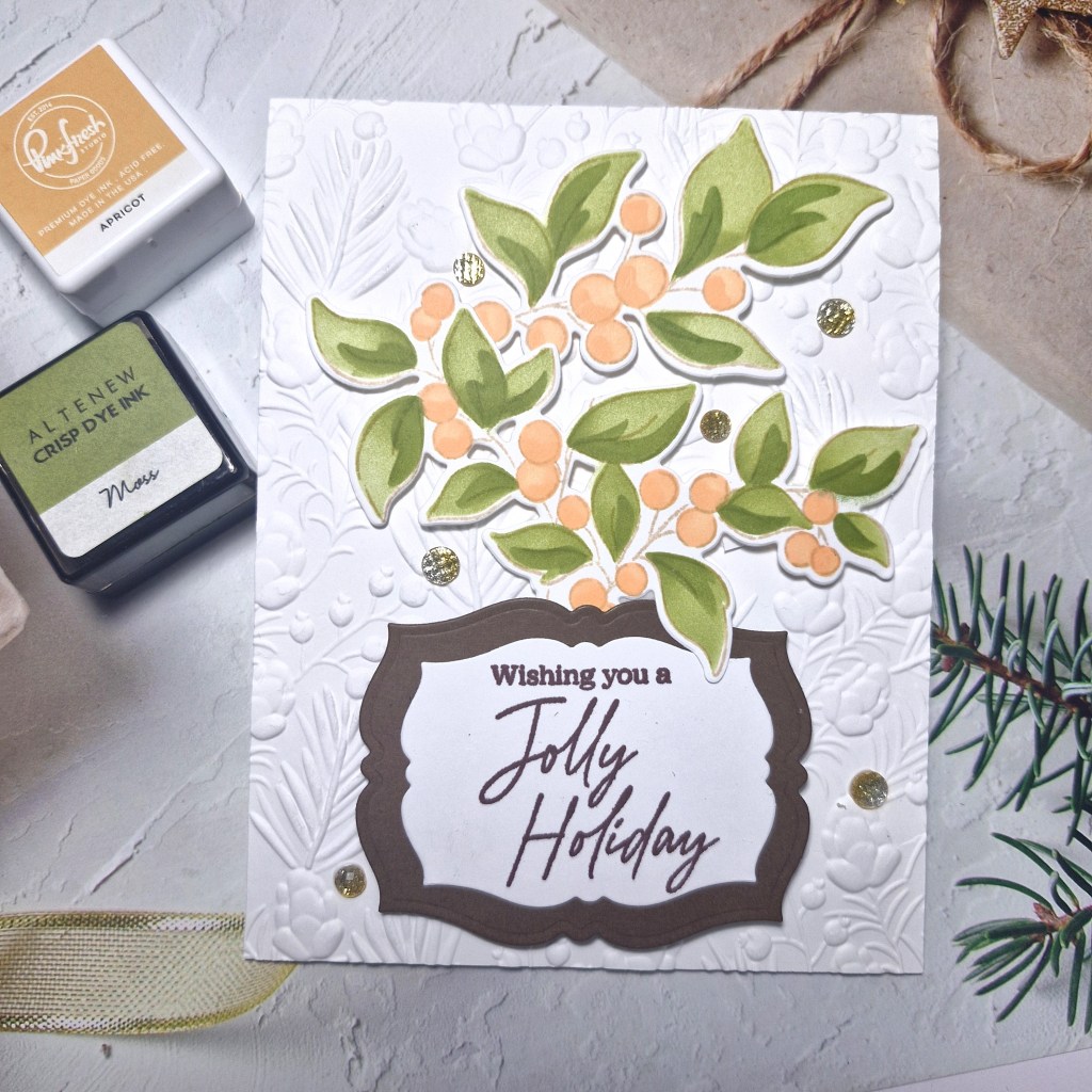
Here is my card:
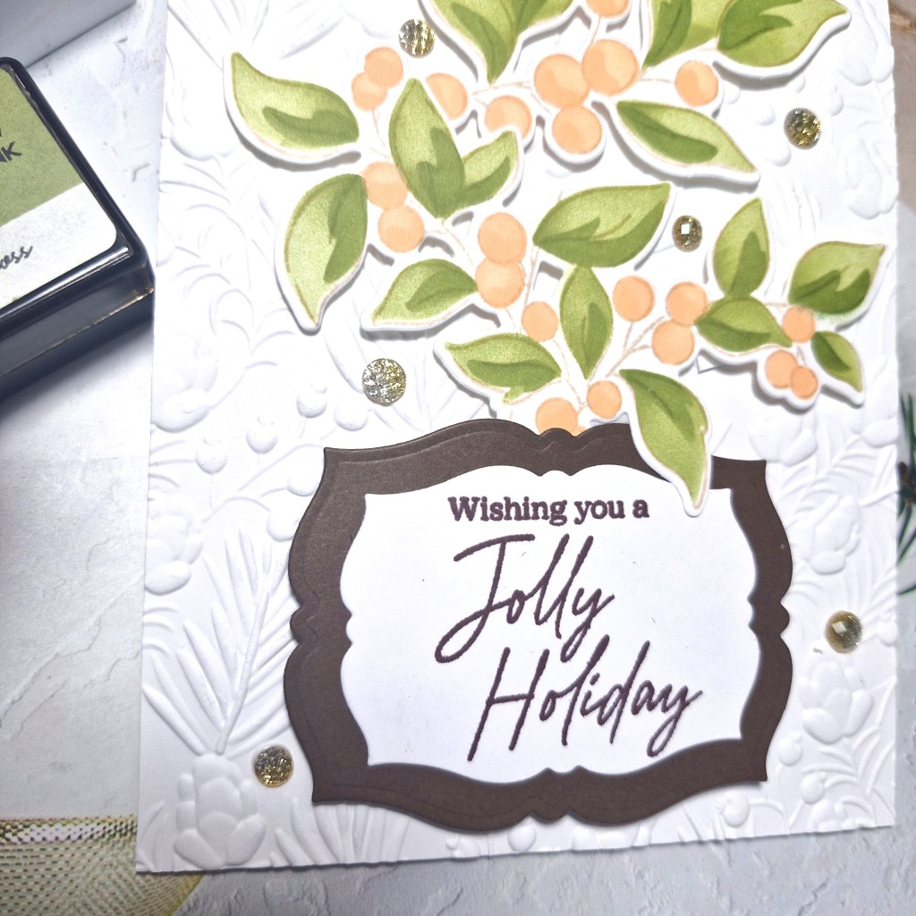
I used a stamp, die and stencil set from Pinkfresh Studio called ‘Berry Branch‘, stamping the image in a brown ink for a softer outline, then used the layering colouring stencils, then the matching dies.
The two inks I used you can see in the picture, making the first layer a lighter touch, and the second layer a darker touch of ink blending for the two colours.
The background panel was embossed using a Spellbinders embossing folder and attached to a card base.
I stamped the sentiment – from the same suite – in a dark brown ink, then die cut that piece and added a dark brown layer behind using a smaller Pinkfresh Studio ‘Fancy Labels Frames’ die set.
I did snip the branch a little so I could paly with the layout, and attached all the elements using 3D foam.
I couldn’t decide whether to use silver or gold gems, so I thought an ombre mix of the two would work. These are also from Pinkfresh Studio and some of my most used gems.
I hope you can come join the challenge, and I look forward to seeing what Christmas cards you create using these colours. xx
Hello there. After a little break from crafting – my mojo seems to have run away – I have a card to share for the new challenge at The Alphabet Challenge. Helen is hosting and has chosen the theme of:
E is for Embossing – wet or dry
Here is my card:
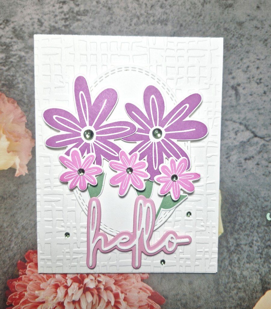
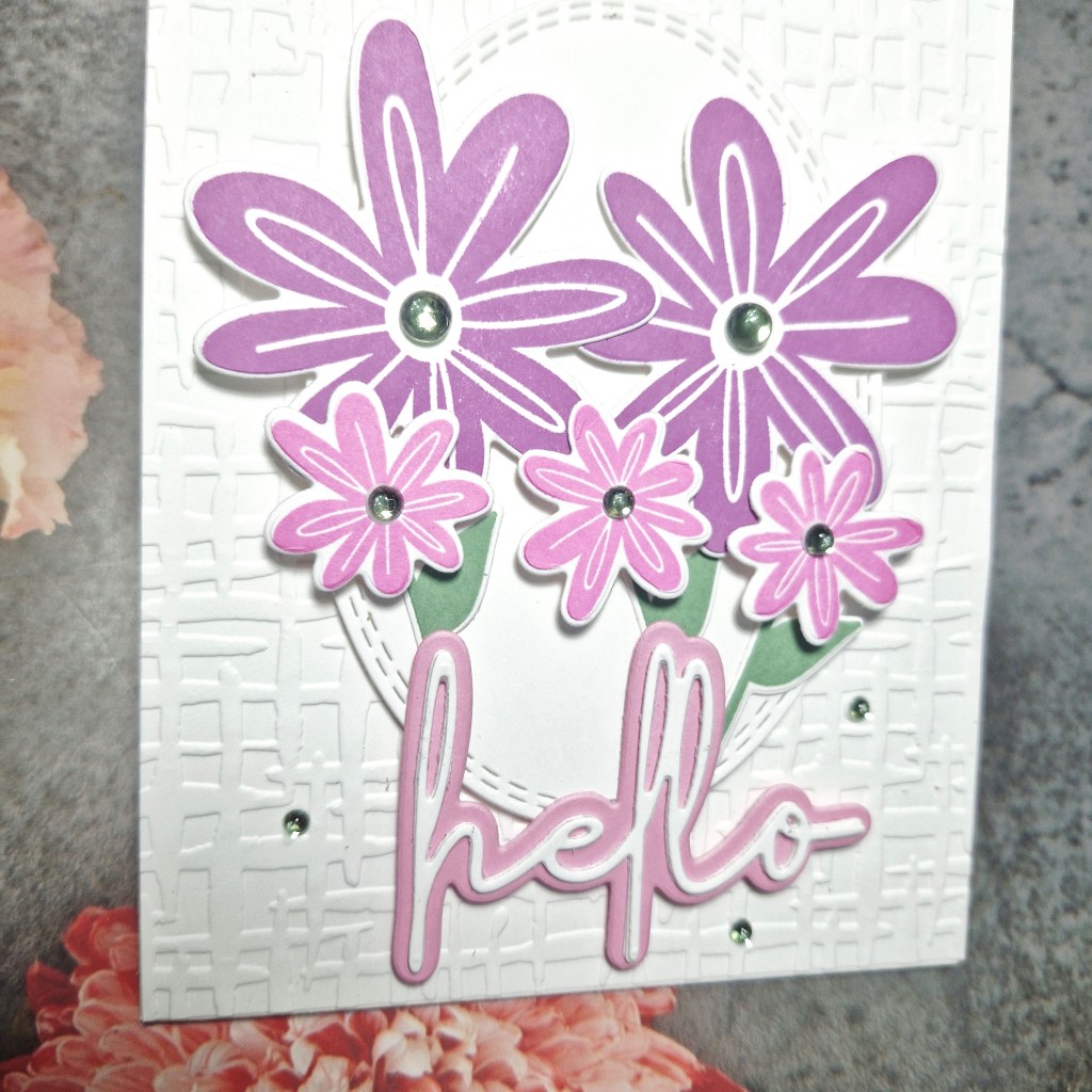
I chose to go with the option of dry embossing, and used a Spellbinders embossing folder for the background panel.
The florals are from Elle’s Studio, a stamp and die set from a a 2022 virtual event.
The florals were stamped with Pinkfresh Studio inks, then die cut, as was the sentiment.
The oval was die cut, I think it is a Pinkfresh Studio nesting die set, then the florals arranged, the sentiment added, and a few gems for further interest – for the centre of the flowers, and some smaller ones around the sentiment.
I hope you can come and join us with your creations using dry or heat embossing. xx
Hello there. The Alphabet Challenge has reached the letter ‘D’, and Melanie has chosen the theme of:
D is for Double – include 2 of the same thing
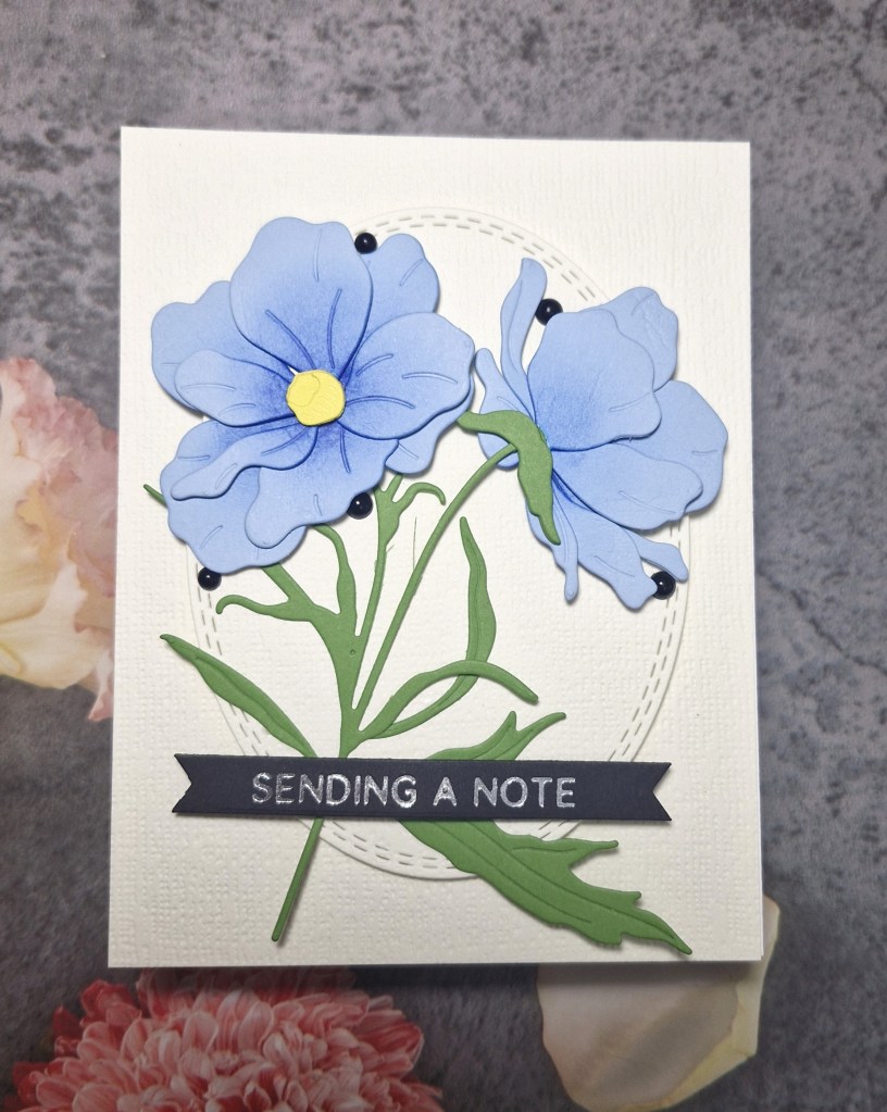
Here is my card, which has two flowers on it:
These flowers are from an Altenew die set called ‘Butterfly Ranunculus‘. I used a blue card stock to cut the petals, and added some darker blue ink blending to the middle of each layer. These were easy to put together due to the #keyhole system’ which Altenew uses. The stems were die cut, and placed to one side whilst I decided what I wanted to put on the background to show case these gorgeous flowers.
I decided to go with a cream textured card stock, placing one layer as the back panel on a card base, then die cut the stitched oval in the same card stock.
The oval was glued to the back panel, and the flowers arranged to my liking, added with 3D foam.
The silver foiled sentiment added, then some small black gems for added interest, and to bring in the black of the sentiment strip.
I hope you can come and join us with your creations following our theme. xx
Hello once again. I have a card to share inspired by the colours at Cupcake Inspirations:
For the cream part of the theme, I used Ivory card stock from Concord & 9th, and stencilled the florals on using a Kristina Werner stamp and stencil set ‘Aubrey Blooms‘. I didn’t use the stamp, just stencilled the florals using two peach tones from Pinkfresh Studio, adding slightly darker blending towards the centre of the flowers.
For the green, I initially used Sage from Pinkfresh, but decided it wasn’t dark enough on the ivory card, so I used the next green up in the family – Eucalyptus.
The panel comes out even larger, and you can get two A2 pieces pout of the blended panel, but I created a 5X7 inch card so I could get as much of the design on there as possible.
I layered a piece of card onto the card base, and to match the green on the design, I ink blended around the edge of a piece of white card, then matted the design onto the top of that.
The foiled sentiment was added, silver foil on black for a little drama, and then added three enamel dots, to include items in the current Festive Friday challenge.
Even though the background card stock is not smooth enough for perfect ink blending, I felt the outcome gave an almost vintage feel.
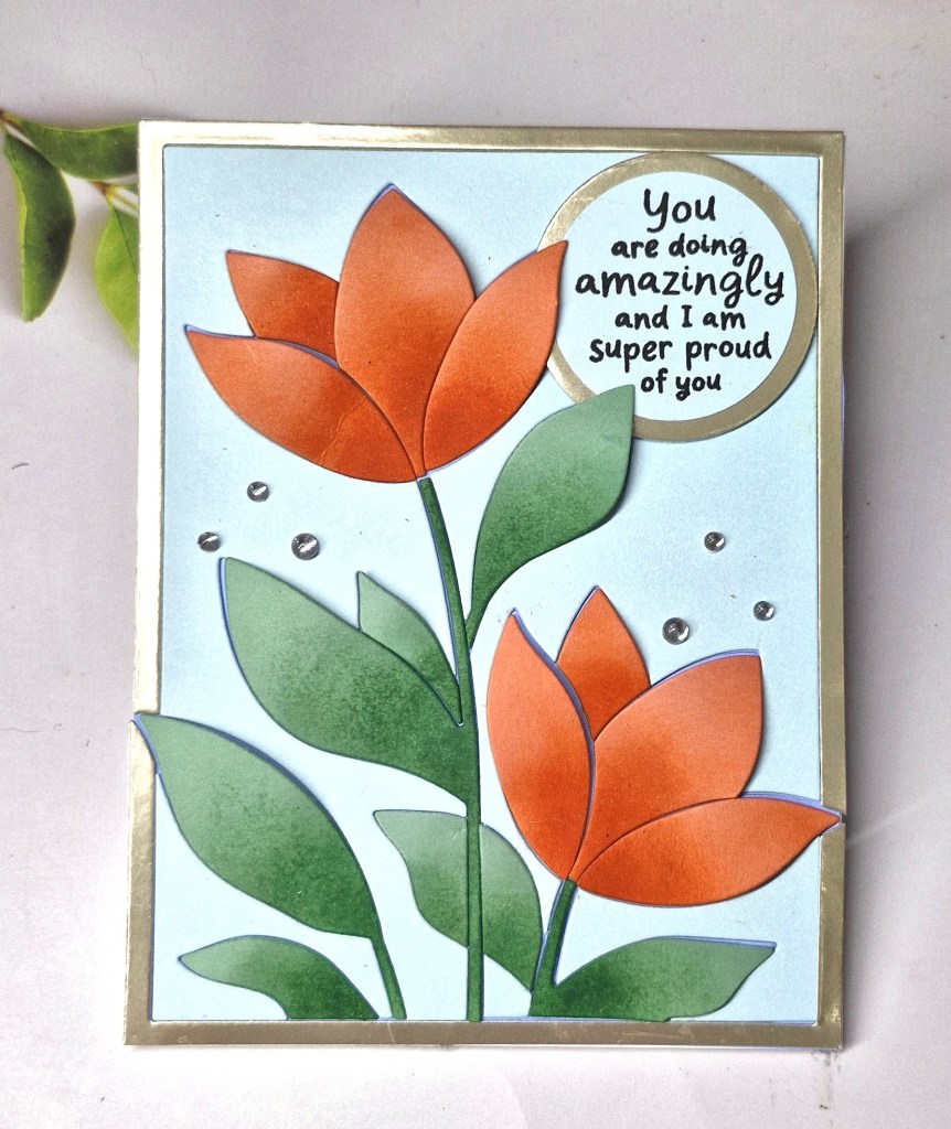
Hello again. I have been crafting a lot these past few days, mainly because it has been so hot in the UK, and my craft room has air con…..Here is a card created following inspiration from the colour board at AAA Colourful:
For this card I used a new product suite – to me, anyway – from Hero Arts. This couple of items includes a Letterpress Plate and ;layering stencil set.
I first used the press plate to dry emboss the image onto white card stock, then used the layering stencils and Pinkfresh Studio inks to ink blend.
This panel was then cut down slightly and adhered with 3D foam to a card base.
For the sentiment, I used a Time 4 Tea Designs die, the shadow being cut out of white, and the word die cut once I had used an ink pad to colour a piece of white card, as I wanted a blue from the same colour family as the two other blue tones used on the background.
This was adhered, then some blue gems added for interest.