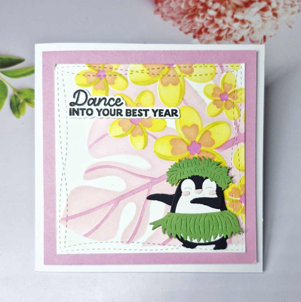
Welcome to my second post of the day, for the new challenge at Ally’s Angels. The theme is always ‘anything goes‘. Here is my card:
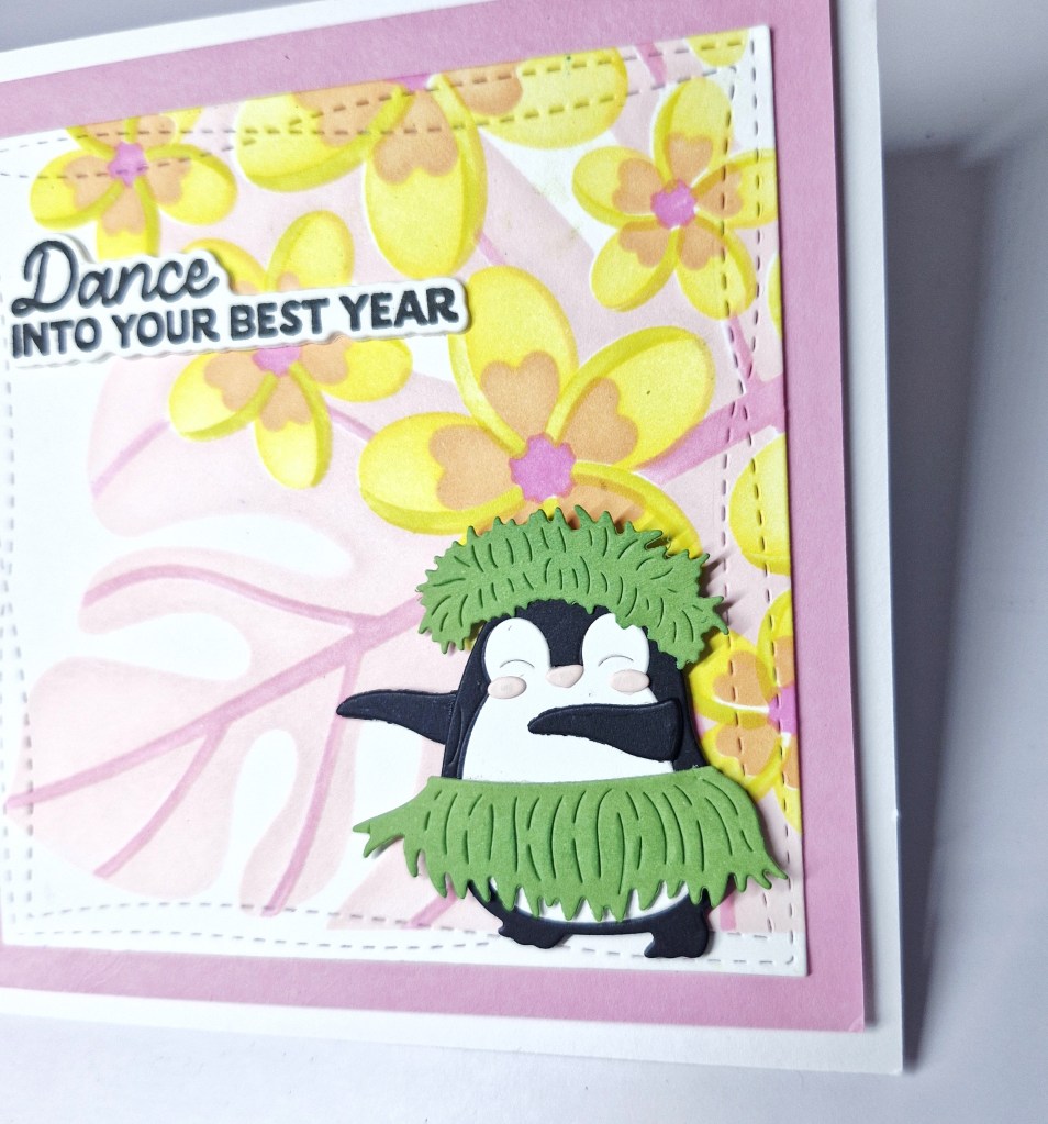
I wanted to use the cute little dancing penguin with her hula skirt on so I first die cut and created her.
The background is using a layering stencil – also from Spellbinders – to give an exotic feel to where she is dancing, cutting it down with an older wonky square die – I think from MFT. This was matted with another pink layer, then glued onto a white square card base.
The sentiment is also from Spellbinders, stamped then die cut, and layered a couple of times like I tend to do most of the time.
As this challenge is always ‘anything goes’ it really means you can let your creative juices flow and play. I hope you can join us and I look forward to seeing you in our gallery. xx
Hello once again. I have a card to share as Guest Designer for 52CCT. The new Christmas theme is:
Here is my card:
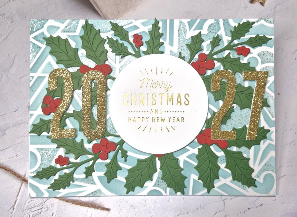
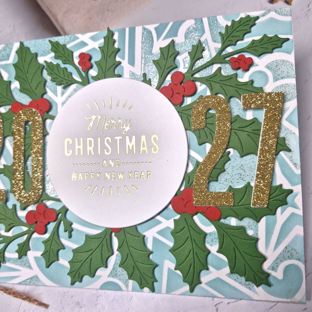
Now, this theme stumped me for a few days. How to get those numbers onto a Christmas card…….I tried a couple of ways, but finished with this one – I did have to check with the 52CCT design team if it was ok……..I obviously needed some reassurance….
I began by stenciling the background panel. This is from a layering stencil set by Kristina Werner called ‘Holiday Icons‘. I used the same light blue/teal colour for the different layers, not using all of them, and then on one layer I used Tim Holtz Distress sparkle paste.
This was set aside to dry, then I concentrated on die cutting the other elements.
The holly and Berry sprigs are from The Greetery, and the numbers are cut from gold glitter card using a Tim Holtz/Sizzix set, cut a couple more times out of white to layer them up.
Now to arrange…..I gold foiled the sentiment and used a circle die. This would enable me to arrange and tuck the holly sprigs. I stuck this down with a piece of 3D foam in the centre, and arranged the holly around it, adding glue to the bases, and then glued down the numbers.
I hope you can come and join the team for this theme – I am interested in how this is interpreted. xx
I shall be entering the following challenges:
Stencil Fun – use stencils, option of mainly yellow not taken
Hello again. Cardz 4 Galz has started a new challenge, and Sue J has chosen the theme of:
Kraft & Blue
Here is my card:
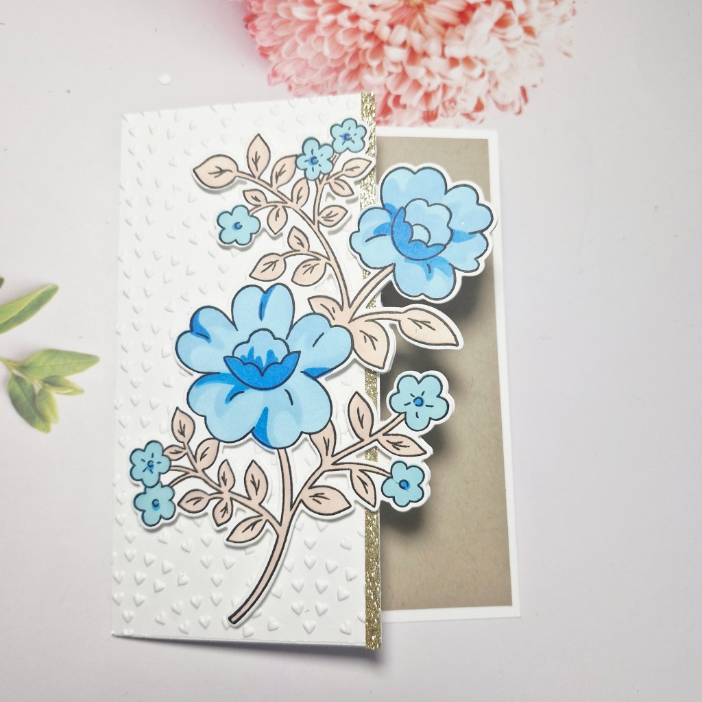
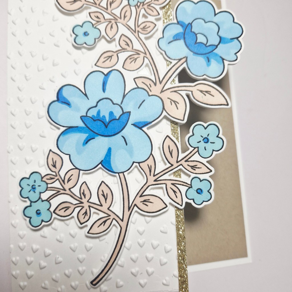
For my blue flowers, I used a Pinkfresh Studio stamp, die, and layering stencil set. The images were stamped, then coloured using the layering stencils, choosing Pinkfresh Studio inks, and three tones of blue for the florals, and a light brown for the leaves and stem.
I thought it would be fun to do a little partial die cutting on the front, so I laid the floral die onto a card base and only ran it through half way – the image was then hanging over that edge.
I added a piece to the front after running through with a Spellbinders embossing folder, added a thin gold glitter strip, then glued the floral die cut image onto the top.
The inside is layered a piece of Kraft card stock.
I hope you can come and join us with your creations following our theme. xx
Hello everyone. I was lucky enough to be the winner for previous challenge at 52 CCT, and as such took them up on their offer to be Guest Design team member.
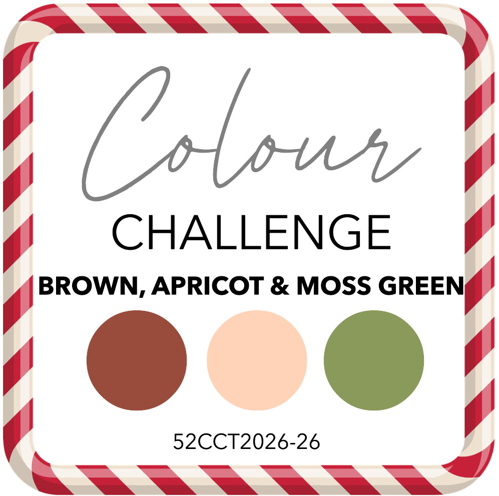
They have started a new challenge, and it’s a colour challenge – as long as you create a Christmas card using these colours (some neutrals are allowed) – you are good to go:
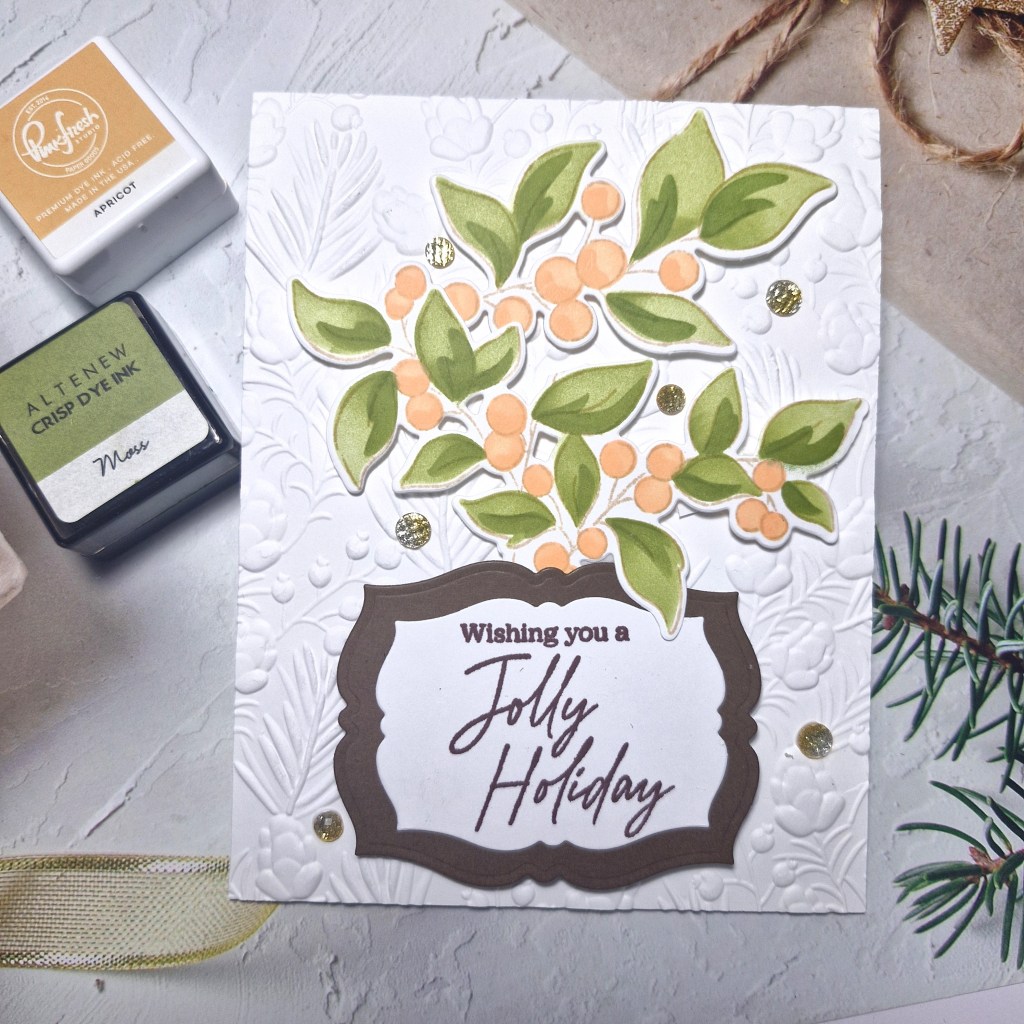
Here is my card:
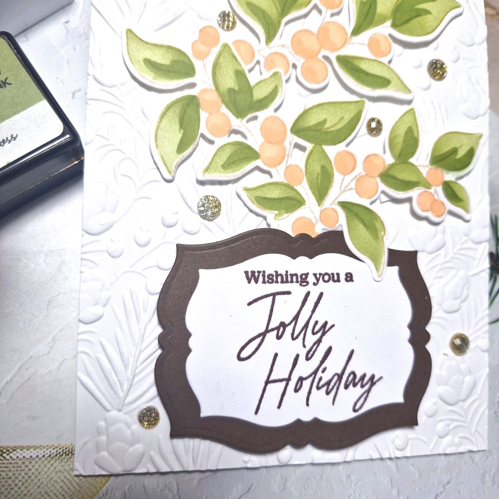
I used a stamp, die and stencil set from Pinkfresh Studio called ‘Berry Branch‘, stamping the image in a brown ink for a softer outline, then used the layering colouring stencils, then the matching dies.
The two inks I used you can see in the picture, making the first layer a lighter touch, and the second layer a darker touch of ink blending for the two colours.
The background panel was embossed using a Spellbinders embossing folder and attached to a card base.
I stamped the sentiment – from the same suite – in a dark brown ink, then die cut that piece and added a dark brown layer behind using a smaller Pinkfresh Studio ‘Fancy Labels Frames’ die set.
I did snip the branch a little so I could paly with the layout, and attached all the elements using 3D foam.
I couldn’t decide whether to use silver or gold gems, so I thought an ombre mix of the two would work. These are also from Pinkfresh Studio and some of my most used gems.
I hope you can come join the challenge, and I look forward to seeing what Christmas cards you create using these colours. xx
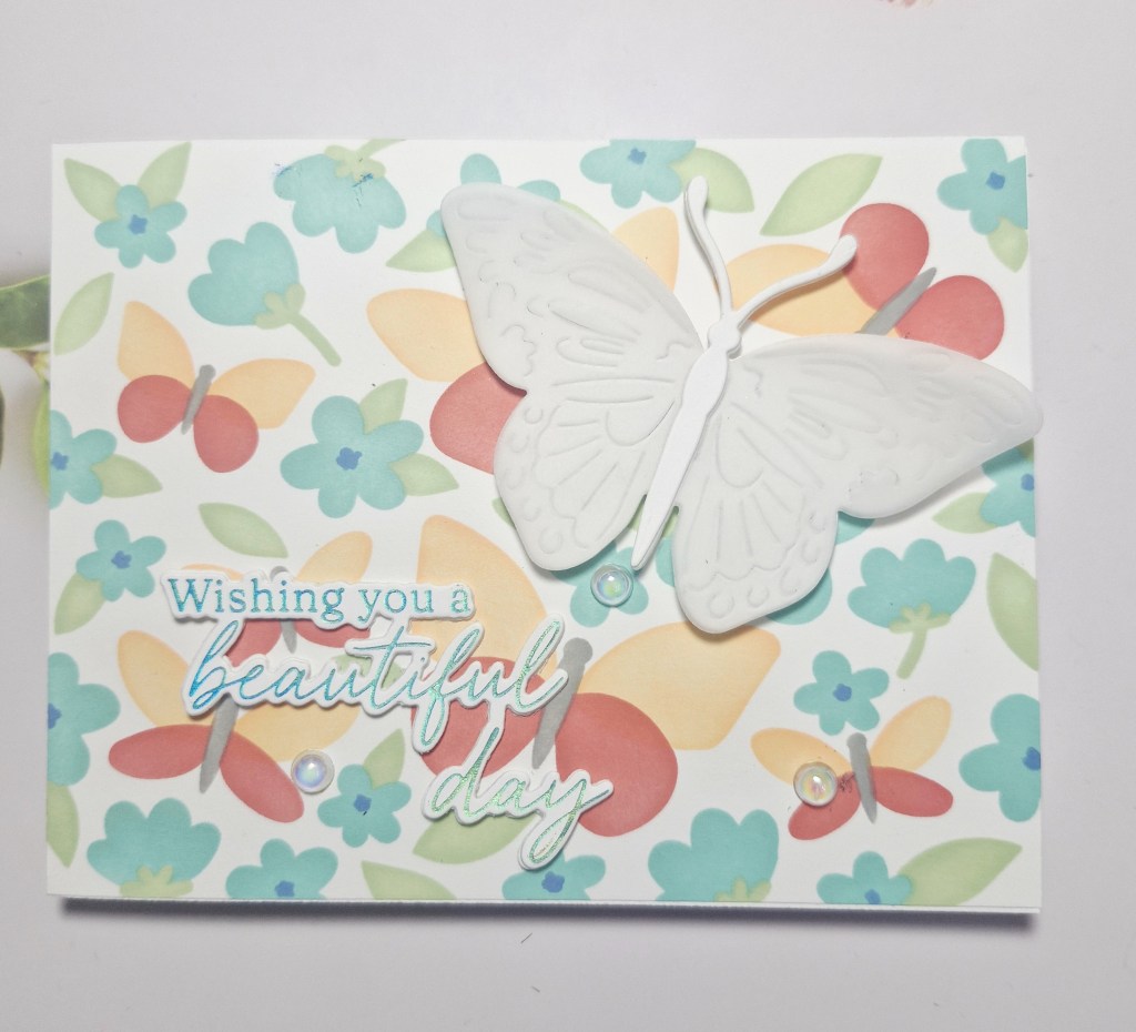
Hello again. I have a card created to share with you:
I wanted to use a layering stencil set from Waffle Flower. This background is the ‘Postage Collage Spring Breeze’ and has five layers to it. I chose the colours from Pinkfresh Studio inks and set to it.
Once the background was finished, I added it direct to a card base.
I then used the ‘Butterfly Focal’ die and cut it in white, then cut it in vellum, layering the two together, adding an extra body to the top so I was able to secure the vellum easily.
The sentiment is in blue foil, and from a Pinkfresh Studio product suite ‘Butterflies in a Cloche’, previously created when I had a foiling session. This was die cut with the matching dies, and a couple more layers added for stability.
I also added some irridescent gems for extra interest.
Hubby and I are out tonight with some friends to celebrate our 38th wedding anniversary – time sure does fly….
I shall be entering the following challenges:
Stencil Fun – stencils, option of butterflies taken
Hello once again. Craft time has produced the following card:
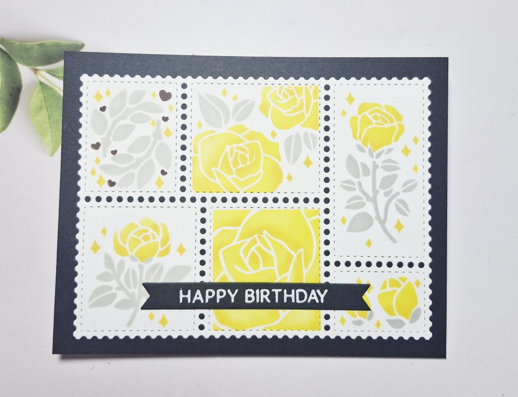
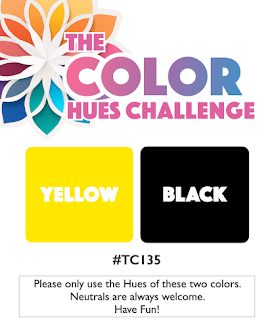
Following the current colours at Color Hues, I used Waffle Flower products.
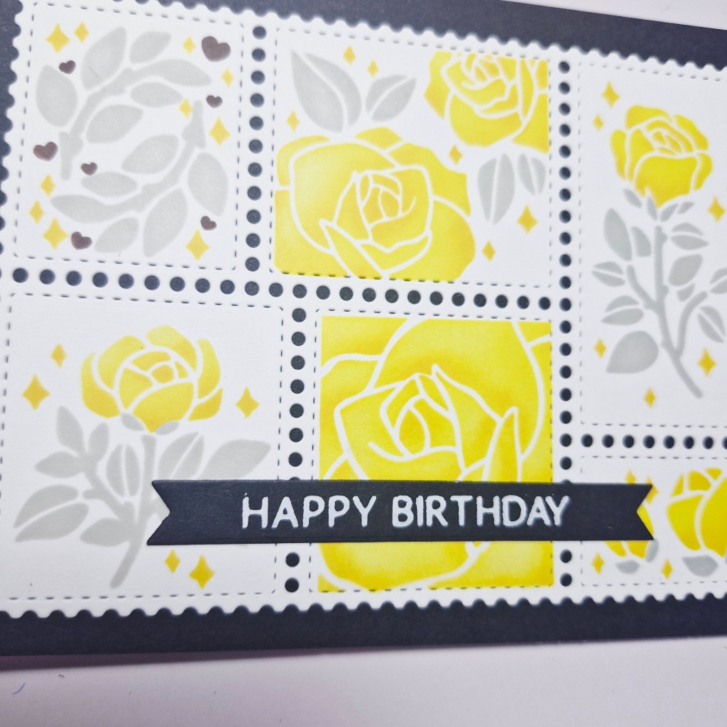
I first die cut the collage panel out of white, then used the layering stencils for the roses. I inked the florals themselves in a lighter yellow, then used a darker yellow in smaller areas to create some dimension.
The leaves were ink blended with a light grey. The sentiment is white foiling.
This panel was adhered to a black panel, then adhered to a card base.
I shall be entering the following challenges:
Color Hues – yellow and black – certain neutrals allowed
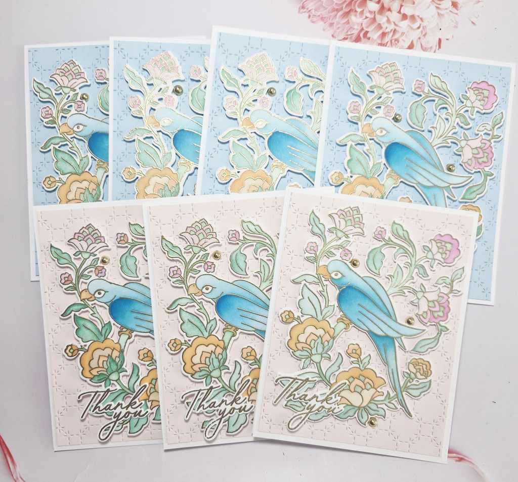
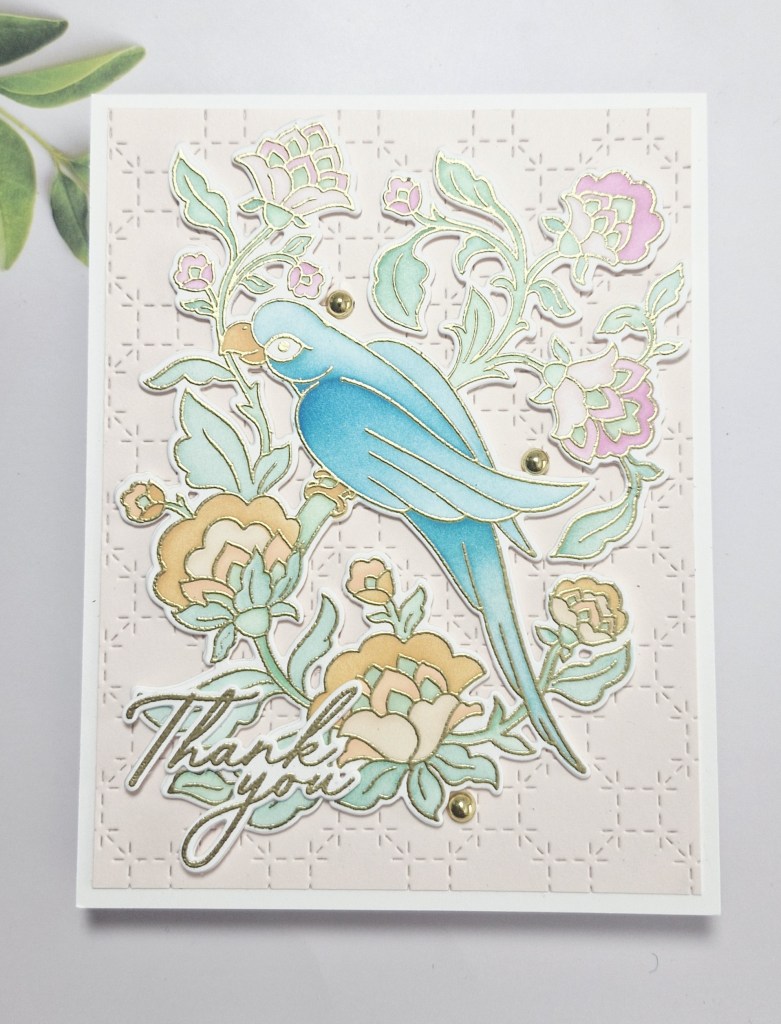
Hello there. I had the need for quite a few ‘thank you’ cards. Having recently retired from the NHS after over 40 years, I had a small leaving meal last Saturday. There was the nurse practitioner team I first started 26 years ago – now a team of 8 people. There were consultants there who I did clinics with up until my final day – who actually paid for the whole thing…….to say I was emotional is putting it lightly. Such a lovely gesture….
Anyhoo – I wanted to batch make some thank you cards for them, and decided to go down the route of complicated. These cards actually took me over 3 hours to make – why did I go with heat embossing and ink blending? Well – I enjoyed the process – but I don’t usually like to make the same card more than once. Here are the cards:
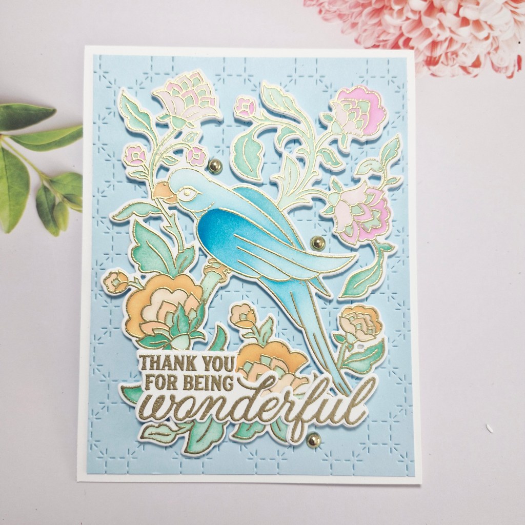
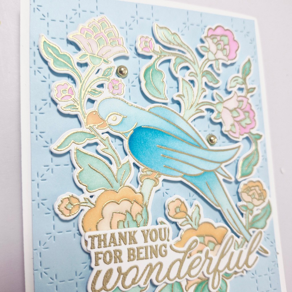
The stamp, die, and stencil set called ‘Chirpy Mithu‘, is from Pinkfresh Studio, and was part of their Create & Connect event in February this year. I hadn’t played with them yet, so I though it was time to bring them out.
I began by stamping and heat embossing the image in gold, then colouring with the provided layering stencils. Pinkfresh Studio inks were used for this. As there were seven images, and there were 6 stencil layers – this took quite a while, especially as I used different ink colours on some of the stencils.
Once coloured, I then used the die to cut them out, cutting out an extra white layer to make the image a little more sturdy.
I then used a couple of the sentiments from that same event, heat embossed those in gold, then die cut them, also adding an extra white layer.
For the background, I used a over plate to create the stitch details in two colours of card stock – just for a little variety.
The background was adhered directly onto the card base, after cutting down slightly to create a white edge. The image was added with 3D foam – another fiddly job of cutting pieces to fit – and then the sentiment was glued down.
The final touch was to add some gold gems.
I shall probably pop in and give them out one day this week.
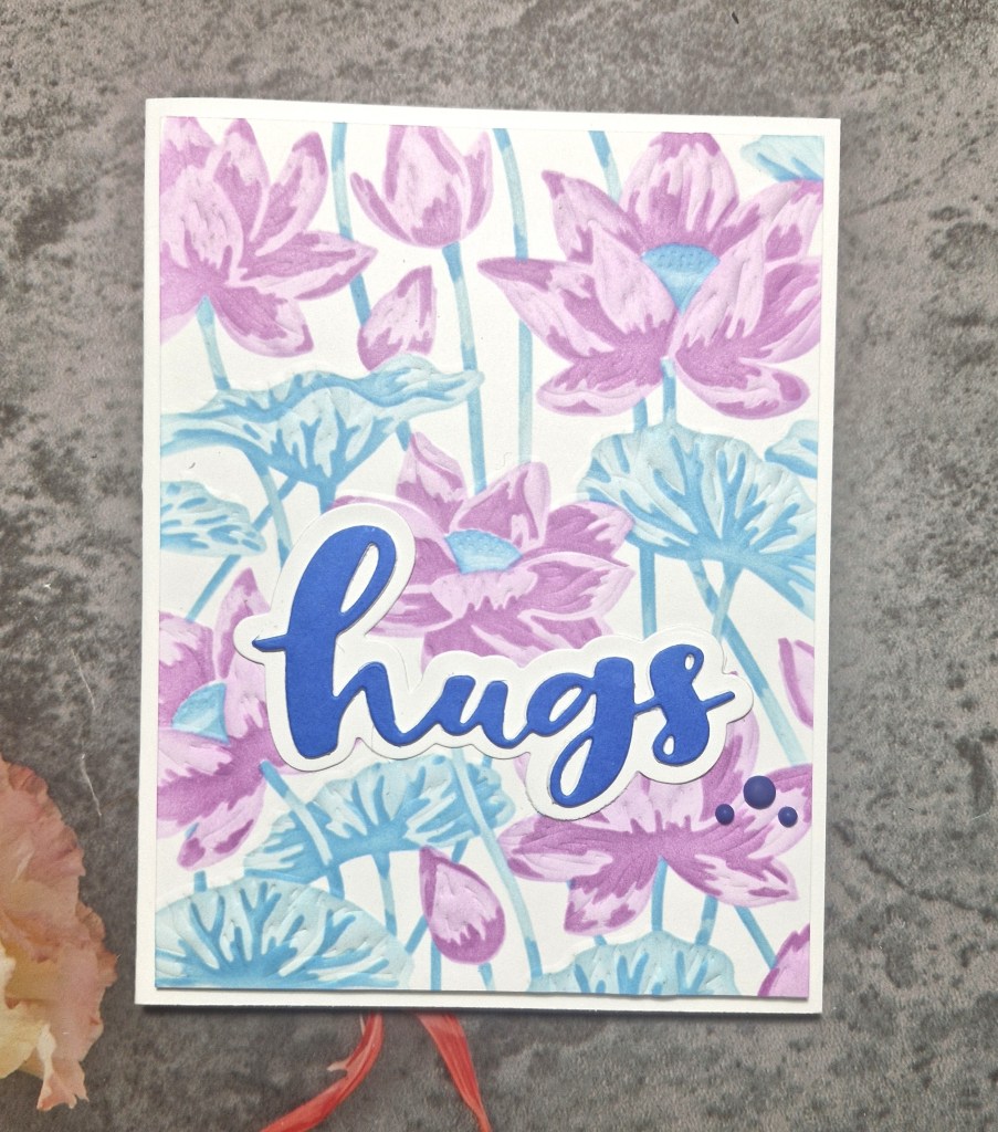
Hello again. I have been crafting a lot these past few days, mainly because it has been so hot in the UK, and my craft room has air con…..Here is a card created following inspiration from the colour board at AAA Colourful:
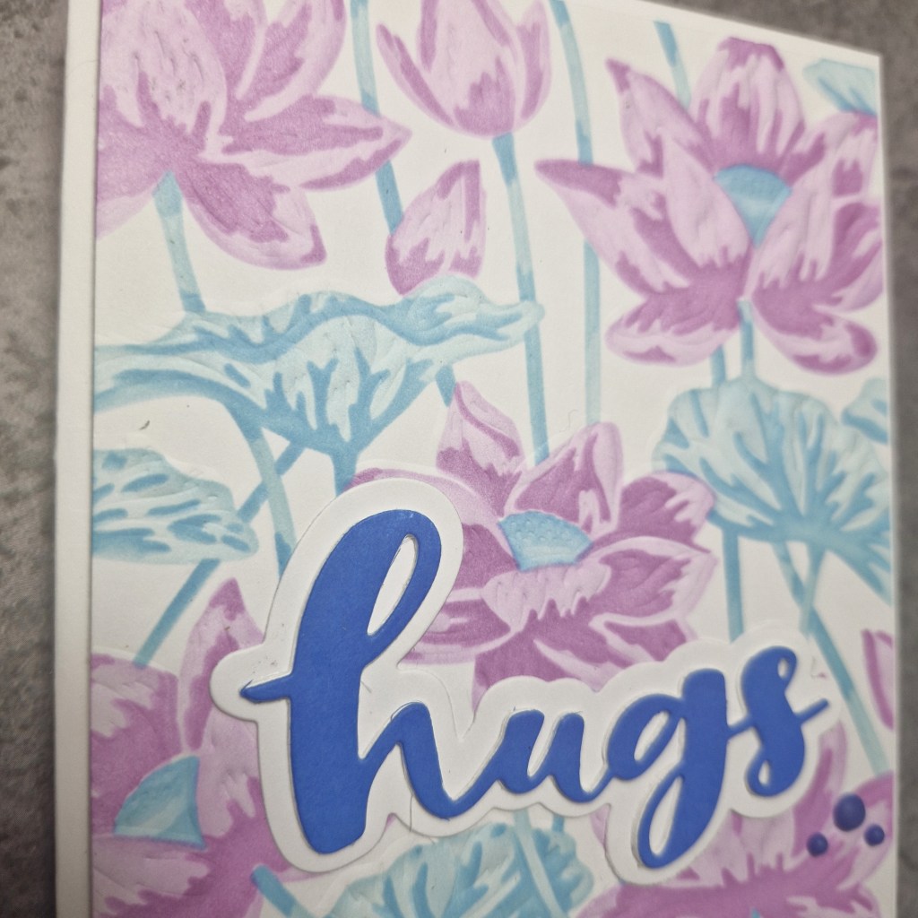
For this card I used a new product suite – to me, anyway – from Hero Arts. This couple of items includes a Letterpress Plate and ;layering stencil set.
I first used the press plate to dry emboss the image onto white card stock, then used the layering stencils and Pinkfresh Studio inks to ink blend.
This panel was then cut down slightly and adhered with 3D foam to a card base.
For the sentiment, I used a Time 4 Tea Designs die, the shadow being cut out of white, and the word die cut once I had used an ink pad to colour a piece of white card, as I wanted a blue from the same colour family as the two other blue tones used on the background.
This was adhered, then some blue gems added for interest.
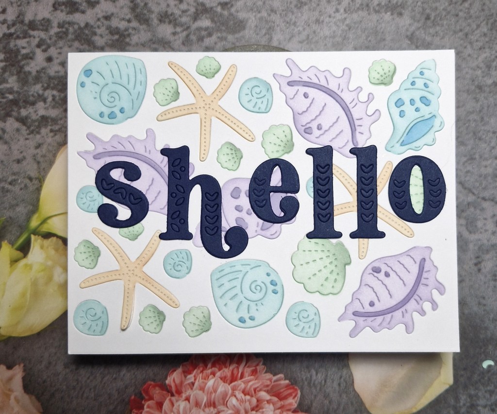
Hi everyone. I am here with a card to share following the inspiration theme from As You See It, and using some layering stencils to enter the Stencil Fun challenge:
The theme for As You See It is ‘Beach Combing‘, and I knew I had plenty of shell ‘stuff’ in my stash, so I searched through the CML app and found this background die from Waffle Flower. The die is called ‘Seashell Texture‘ and comes with a layering stencil to colour the images in.
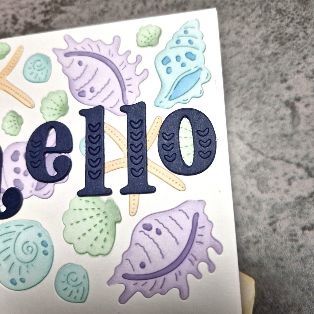
I used Neenah card stock, die cut the panel, then used Pinkfresh Studio inks in pastel or more muted colours for the shells. Some of the shells had layers with the stencils, but with the other smaller shells, I added my own bit of darker shading for a little dimension.
I searched again in the CML app for suitable sentiments – wanting a bigger and bolder look – but couldn’t find anything big enough. So – I used a Pinkfresh Studio alphabet die set ‘Kelly Alpha‘ and die cut the letters to create this word out of Concord & 9th ‘Blueberry‘ card stock.
The little hearts on each letter actually stayed in the die cut – so I left them there, and die cut each of the letters two more times and layered them together to create a make them thicker and more sturdy.
As the letters weren’t all the same height, and instead of placing them all on the same line – I went a little quirky and put the smaller three letters in the middle of the height of the larger letters.
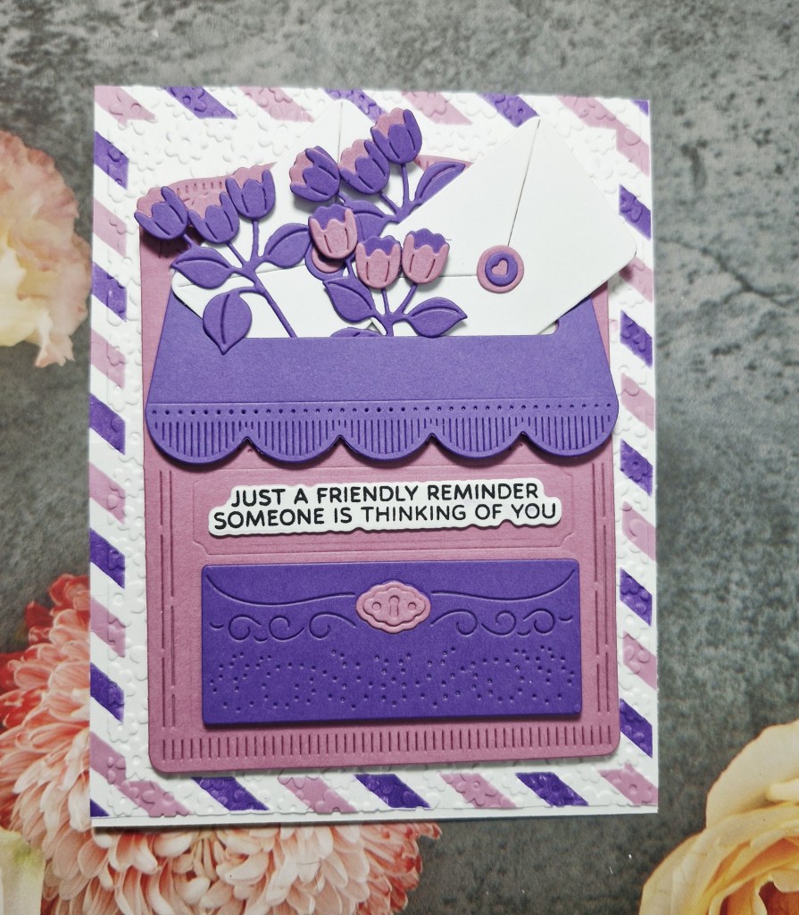
Hello. A little crafty playtime – and lots of die cutting – to create this card:
For some reason, I was obviously in a purple and pink mood today, using Concord & 9th card stock – Grape Soda & Briar Rose. It may be because Grape Soda is one of the colours they are retiring and it was on my mind.
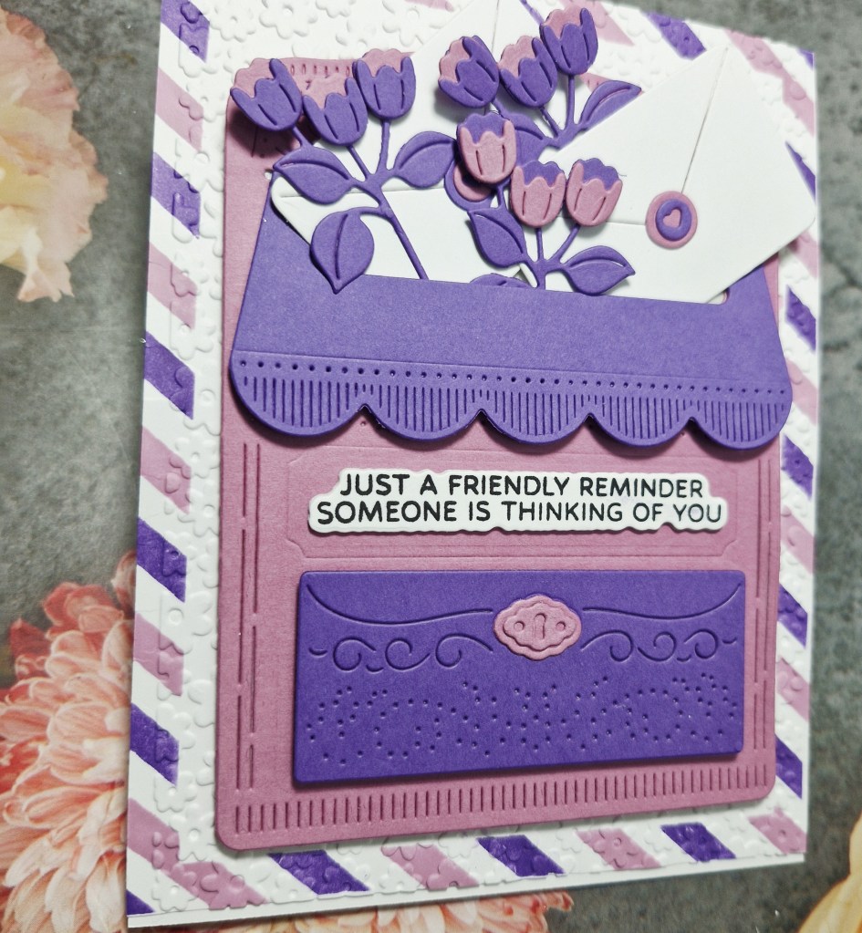
I die cut the [post box and all it’s layers, assembling together, then die cutting the floral elements and two white envelopes, choosing to keep to the two colours instead of adding any extra.
I used a Spellbinders stencil set to create the ‘air mail’ look around the outside of a white panel, and the matching inks to the card stock.
Once this panel was placed onto the ‘air mail’ panel, I thought it looked a little plain, so I used an old (very old) Darice embossing folder of small flowers to emboss it.
The sentiment was stamped then die cut with the matching die, layered with a couple more of the die cuts for dimension.
I shall be entering the following challenges:
Tic Tac Toe – middle column – die cut/punch & emboss wet or dry & layers