Hello everyone. I am pleased to have been asked to be a special Party Guest for the new challenge at Ellibelle’s Corner Garden Party, after being selected in the Top 3 for one of her challenges with this card here.
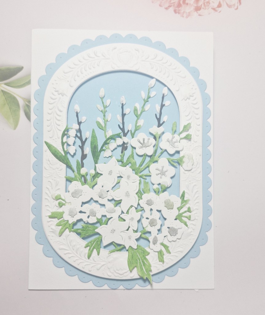
The theme for the new challenge is – anything in or from the garden. Here is my card:
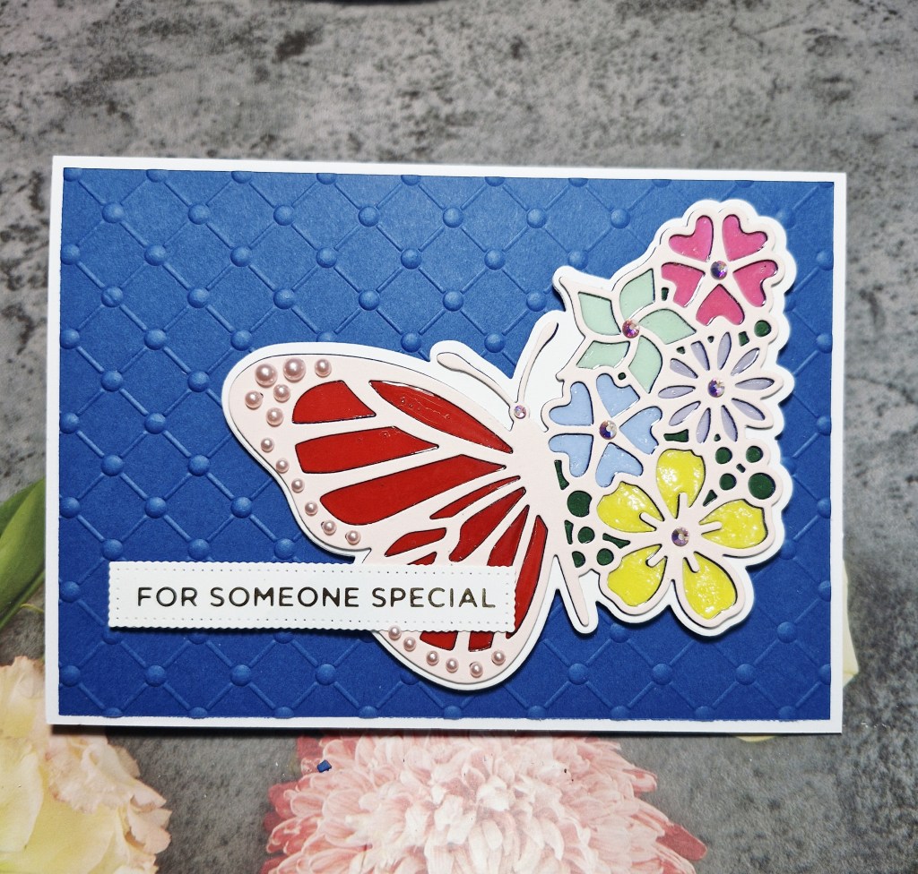
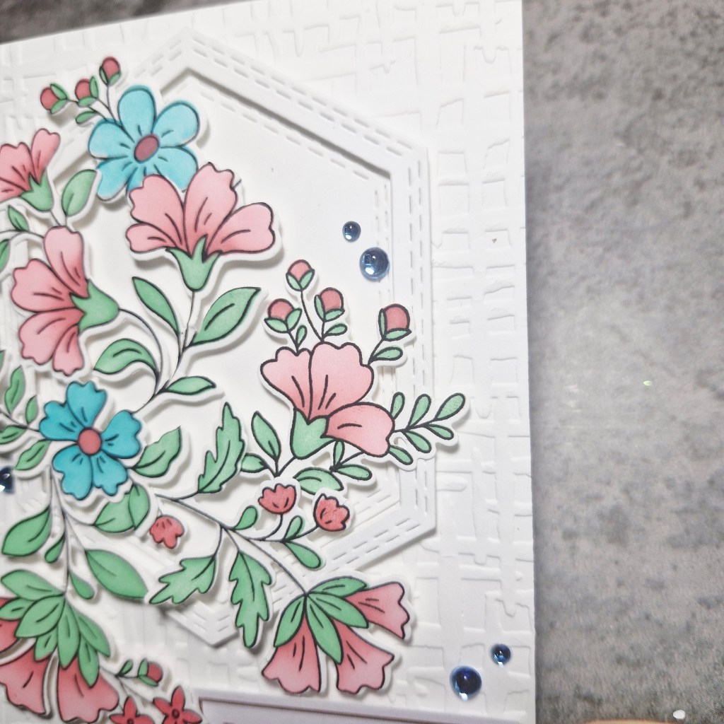
I must have been in a really fiddly and faffy mood to create this, as the butterfly – from A Pocket Full Of Happiness – takes a lot of die cutting in different colours, and then inlaying each itty bitty piece…….
I started by cutting the base outline, then the butterfly out of white card stock a couple of times, and glued it together.
The next steps was to gather colourful pieces of card for each flower, and the wings of the butterfly and set-to die cutting. Each colour was inlaid back into the butterfly, and then glossy accents applied to create a stained glass effect.
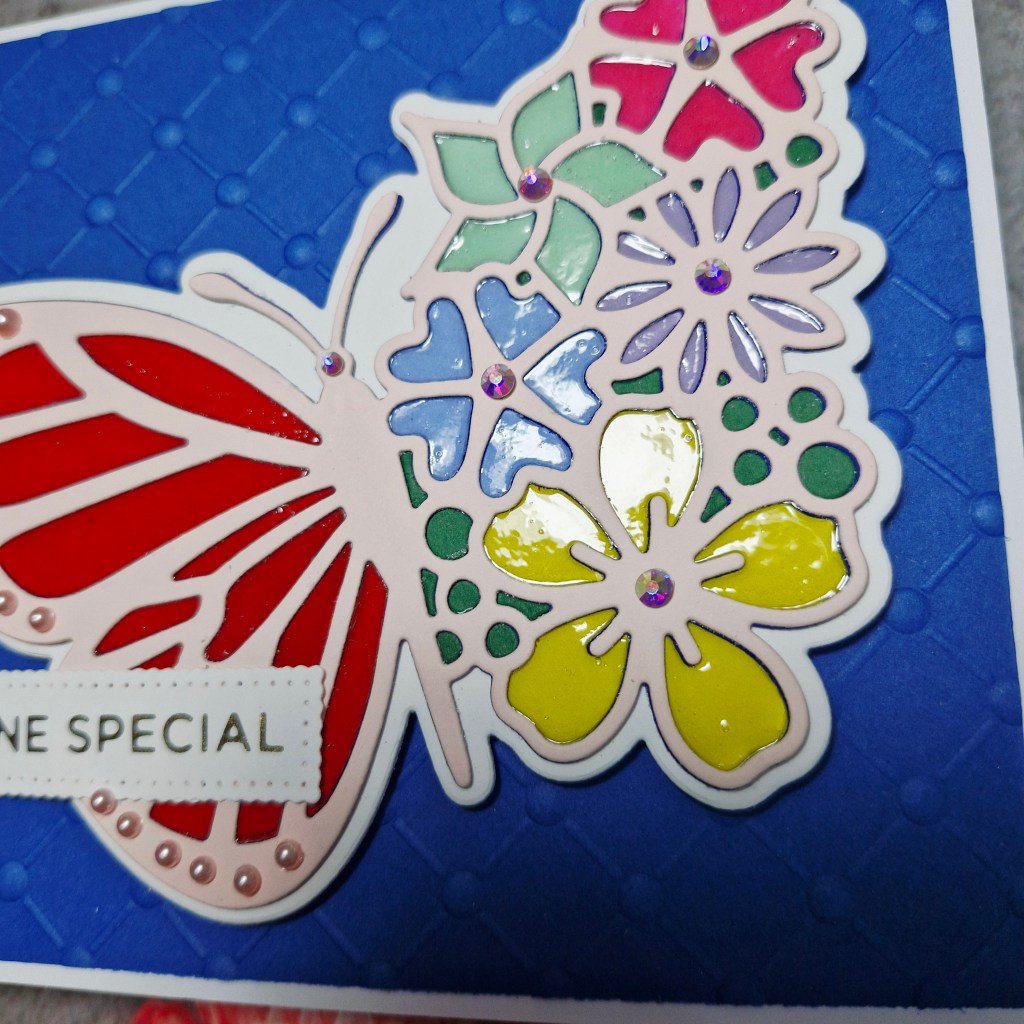
When that was dry, I added a top layer of the die cut butterfly, this time cut out of a blush card stock and laid that on top. This also covered any of the over-flowing glossy accents.
I wasn’t happy with those tiny areas on the edge of the butterfly wing, so I added small pink gems to each and every one of them – I told you I must have been in a fiddly and faffy mood.
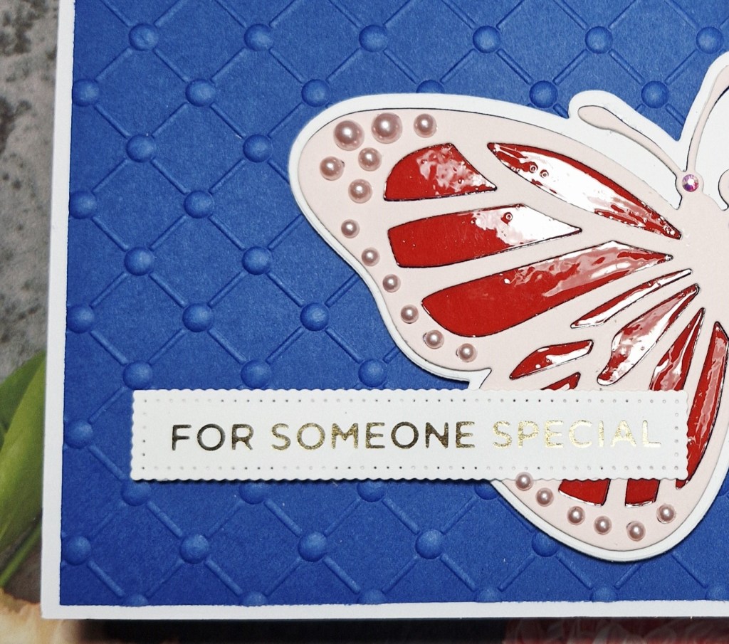
I wanted a bold background for the butterfly, so used some Concord & 9th card stock, trimmed it a little smaller than the card base, and used a Spellbinders embossing folder.
The butterfly was glued down, and then the foiled sentiment added.
I hope you can come and join us at Ellibelle’s Corner for her Garden Party. I hope to see you in the gallery. xx