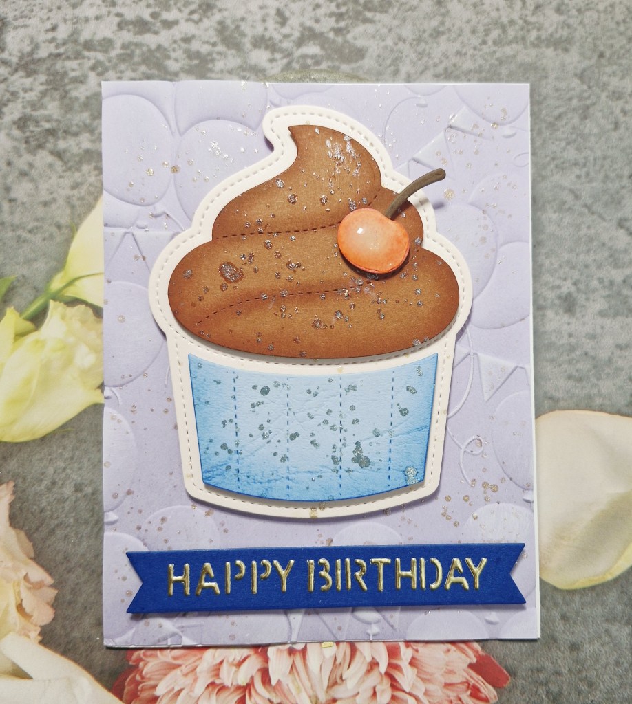
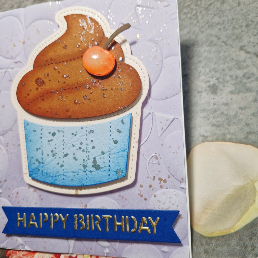
Hello again. I have a birthday card to share using some new products from Spellbinders:
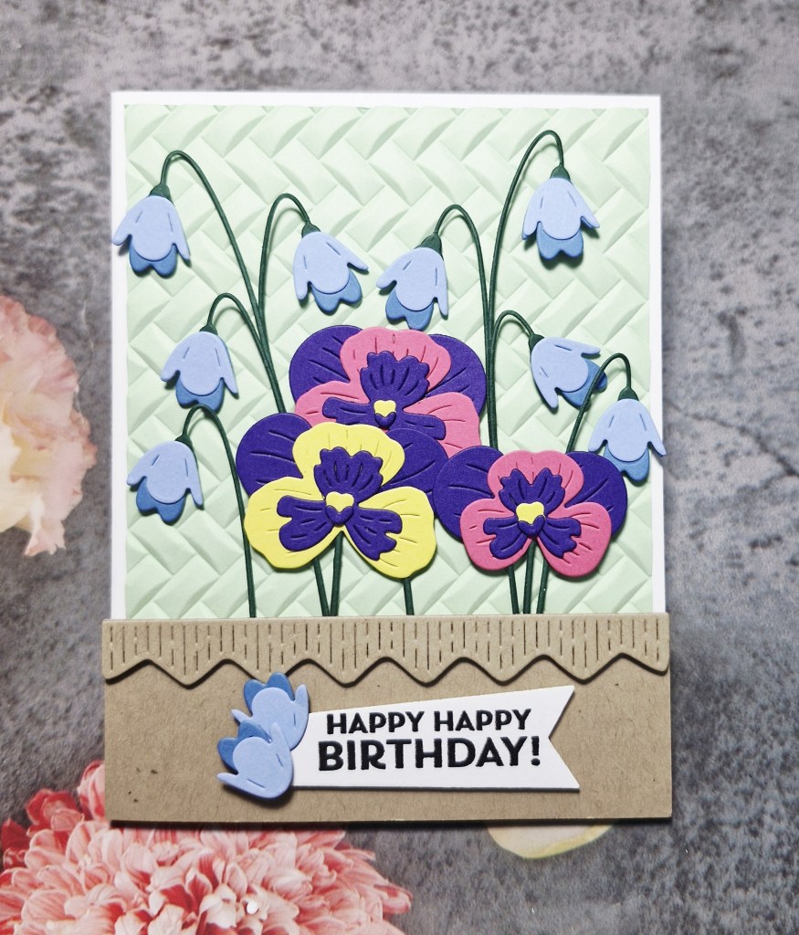
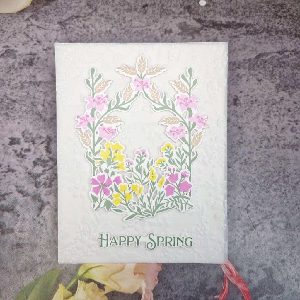
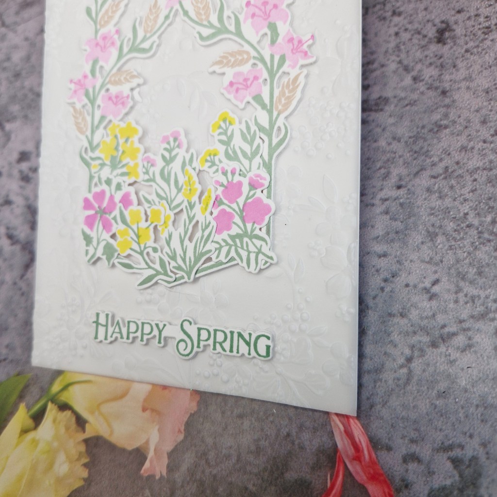
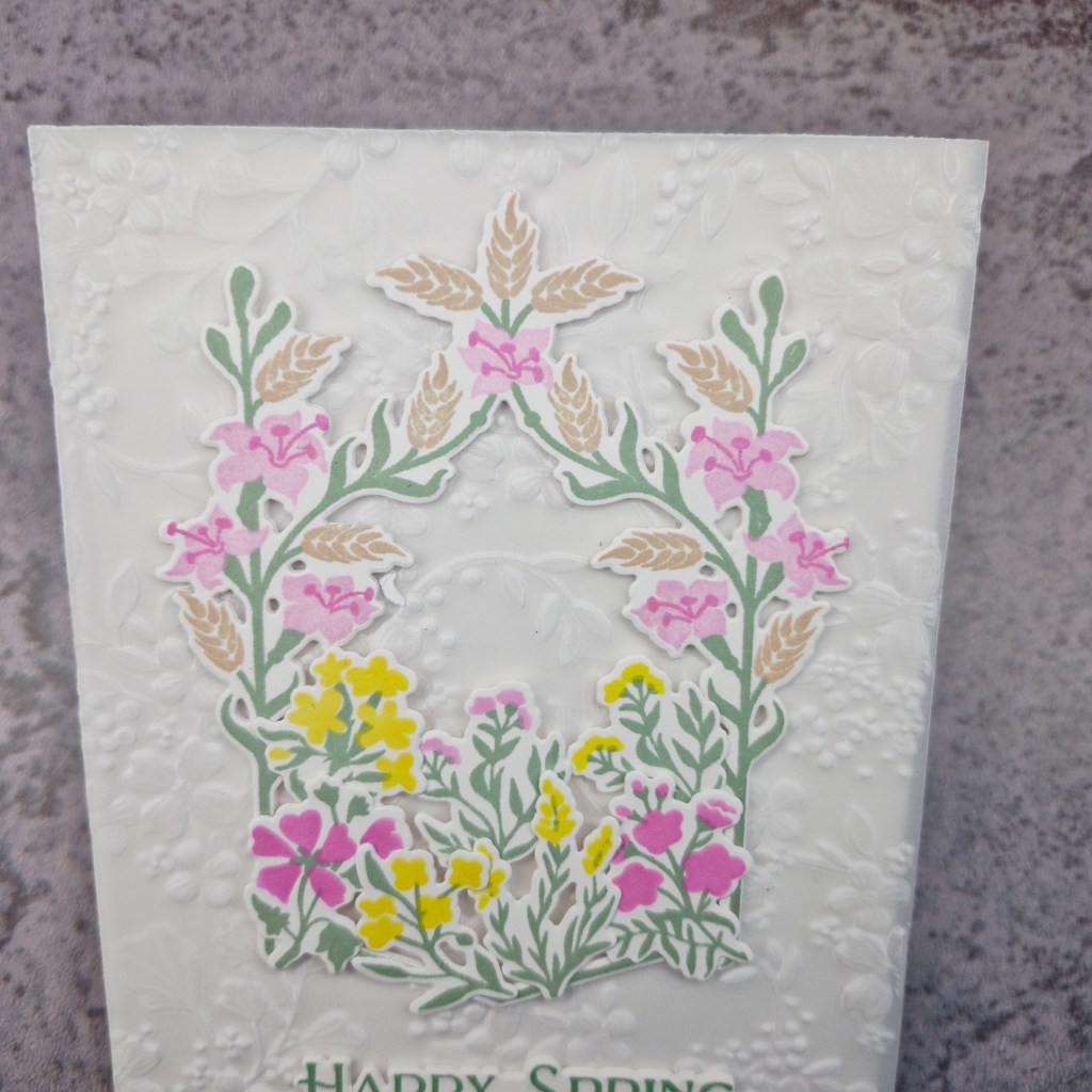
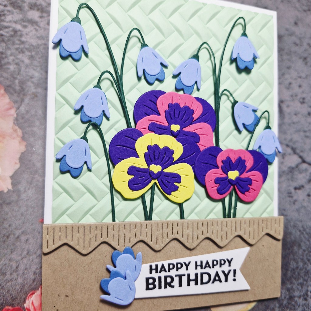
There are a couple of challenges calling for Spring themed cards, so I used the new dies from Spellbinders which included these bluebells and pansies, and some bright card stock off-cuts I have handy.
I first cut and layered the pansies, then the bluebells, adding the stalks. The bluebell stalks hold one flower, but I layered three together to create several which dangle from the same stem.
The background panel was created using an older SIzzix 3D embossing folder and trimmed down slightly.
The bottom light brown/Kraft section was cut, and then the border added so it looked like a window box.
The flowers were arranged, then stems tucked beneath the brown section, with 3D foam behind each flower head.
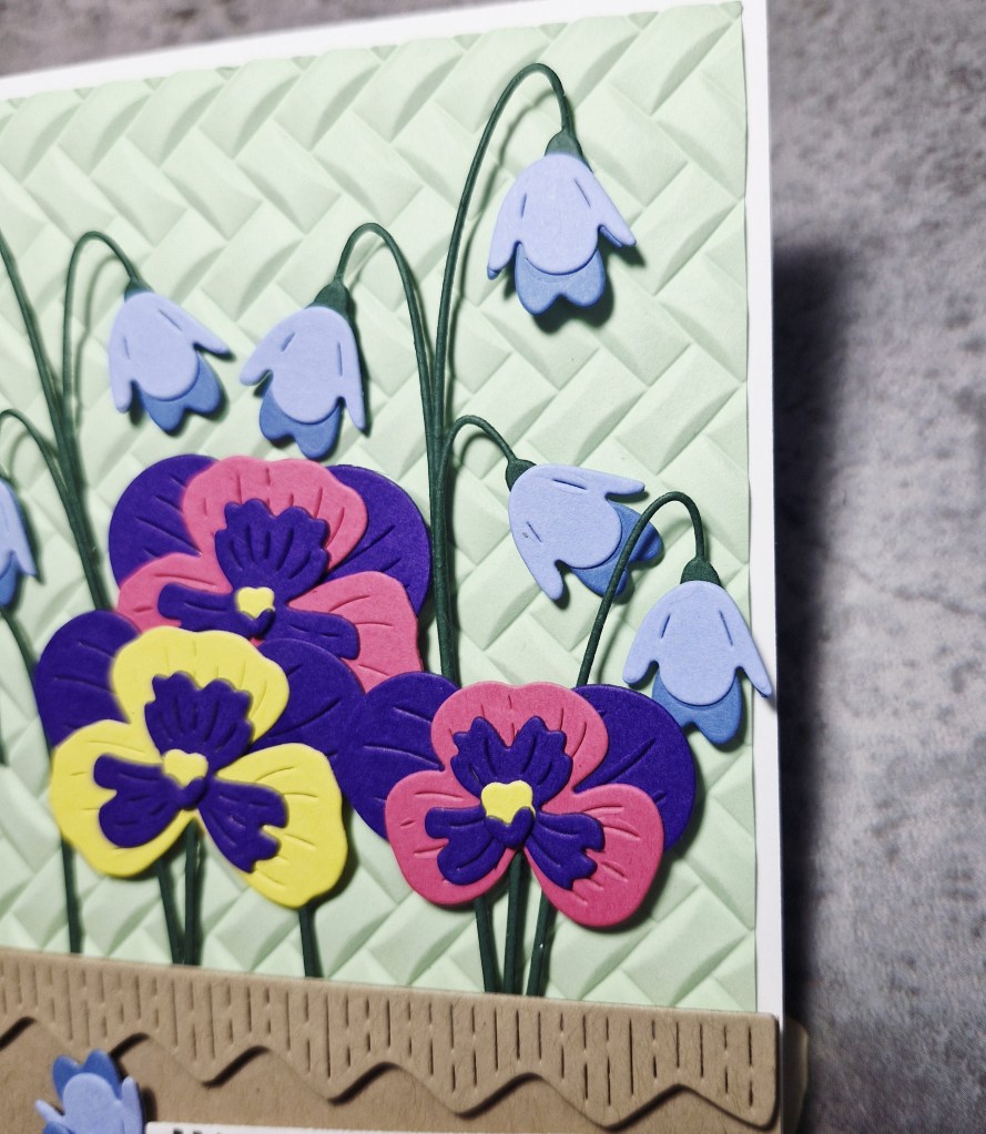
The sentiment is from Pinkfresh Studio – stamped then die cut – and two of the spare bluebell flowers attached to the side.
I shall be entering the following challenges:
Seize The Birthday – birthday and Spring Garden
CYHTP – embossing folder with option of blue on blue not taken
Cut It Up – die cuts and colours of Spring
Die Cut Divas – die cuts and birthday/anniversary