Hello again. I have one card for you today. This card took a bit of figuring out, but I managed without too much hassle – but there certainly was hassle!
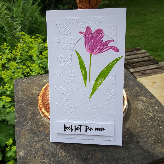
I used the current sketch from CAS(E) This Sketch, and started by die cutting the circle. Then I wanted a flower, and looked at all my layering flowers, and decided to go with this stamp set from The Ton – ‘Fresh Cut Tulips‘. Then the fun began…..
I wanted the flower to be on the outside of the circle, as well as the inside, and didn’t want to cut around it. I placed both pieces of card into my Misti, decided where I wanted to stamp, and began by stamping the flower and leaves onto the bottom piece. I then took the top piece and laid it down, removed the bottom piece, and stamped again.
I didn’t layer the leaves, I just stamped them in one colour green, but I did layer the tulip itself. I managed to keep each piece of card straight, no moving – this sometimes still happens with the Misti – and I liked how this turned out.
I then took the top piece of card and embossed it with a Spellbinders embossing folder, to add more interest. I didn’t want another colour, and the white looked too plain for me.
I then wanted a sentiment which matched the flower, and I thought this was ideal. This was stamped with Versafine black onyx and stuck down with 3D foam pads.
I shall be entering the following challenges:
CAS(E) This Sketch – sketch
Addicted To Stamps and More – anything goes