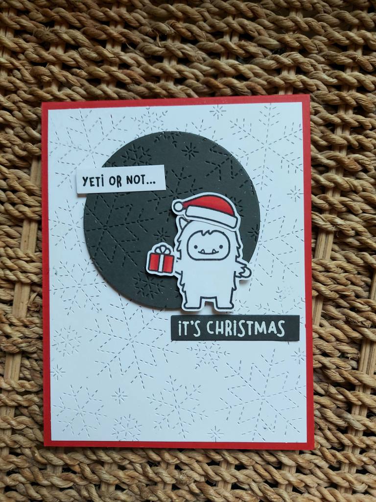
Hello once again. I created a card using an older stamp set and a new background panel from Lawn Fawn:
I chose a red card base using Heffy Doodle card stock, and then added the Lawn Fawn stitched snowflake backdrop – once I had cut it down slightly to leave a thin red edge.
The grey circle is die cut, then run through my machine with the same backdrop die, to add some stitched snowflakes as interest.
The yeti, hat and present were stamped, coloured with Copics, then die cut. The two sentiments were stamped and heat embossed – grey on white, and then white on grey.
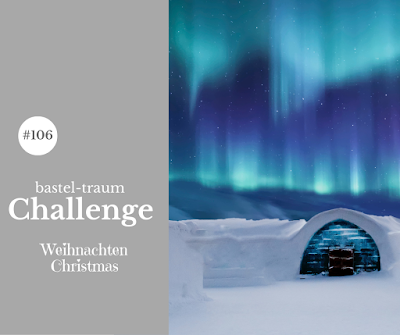
Hello, After a couple of days away. I have come home to finish this card:
I used a couple of Purple Onion Designs stamps. When I first saw that these stamps aren’t mounted – and being completely spoiled by mounted red rubber stamps – I hesitated getting some. However – I’m glad I did get them. All I did was add some low tack tape-runner to the back of the stamps so they stuck to my Misti – worked a treat.
I first stamped the snowman and critters, then fussy-cut a mask for them, then stamped the cabin. I also cut a mask for the cabin, and ink blended – Salvaged Patina Distress Ink – for the sky. Before removing the masks, I add some water splatters.
I chose Distress Ink on the Neenah 80lb card stock, as I didn’t want the full-on solid ink blending you get with Distress Oxides.
I coloured the images with Copics, adding a cool grey to the outline of the snowman, and created some snowy looking lines pn the rest of the white area.
I purposely didn’t colour the trees – I thought there was already enough turquoise, and I wanted to stick with the colours for the current Color Throwdown Challenge – which doesn’t include green!
I was going to cover them with some glitter……..but decided not to, because I would have had to add glitter virtually all over – and I wasn’t in a glitter mood! This way, I think the colouring and masking is effective enough…
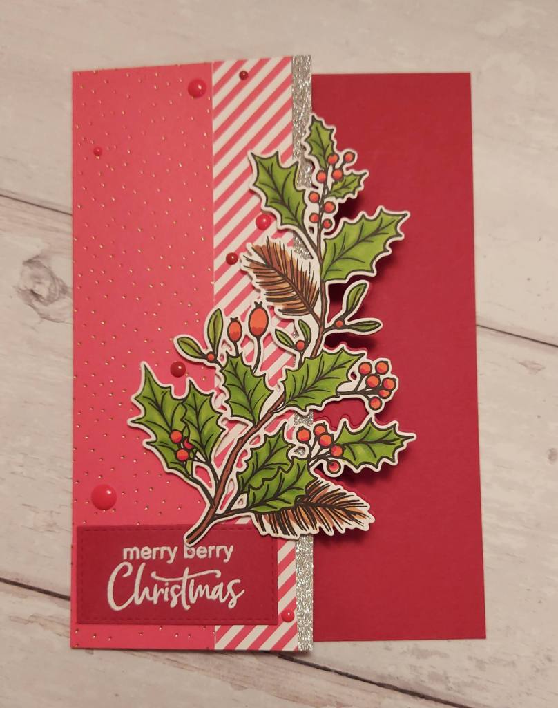
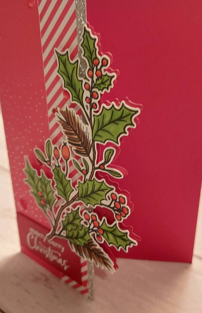
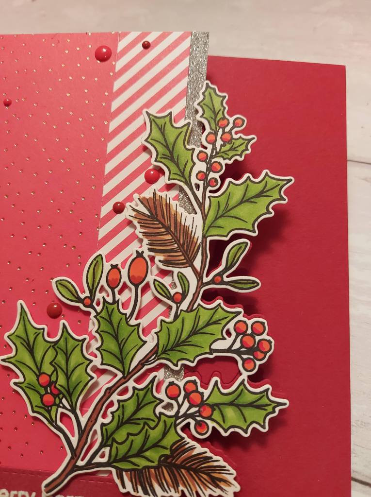
I thought I’d have a go at partial die-cutting with this gorgeous Hero Arts stamp and die set:
I stamped, coloured, the die cut the holly branch first. I then took a red card base, and partially die-cut the holly branch into the front, then used a craft knife to cut away thee top and bottom.
Before sticking the image down, I added a slim silver glitter strip, then some Lawn striped paper and dotty shiny paper.
My card base is 5 x 7 inches, so the 6 inch papers didn’t fit all the way, so I craftily joined them where you wouldn’t be able to see the join – under the sentiment and under the branch – soooo crafty…..!
The sentiment is white heat embossed onto the piece of red card stock I used for the base which I had cut off.
Hopefully you can come and join us in this challenge and get your Christmas card stash to grow by at least one more creation…… xx
After another playtime in my craft room, I have a card to share:
I have no idea why the card doesn’t look white on that photo, and no idea how to correct it, but here are some other photos:
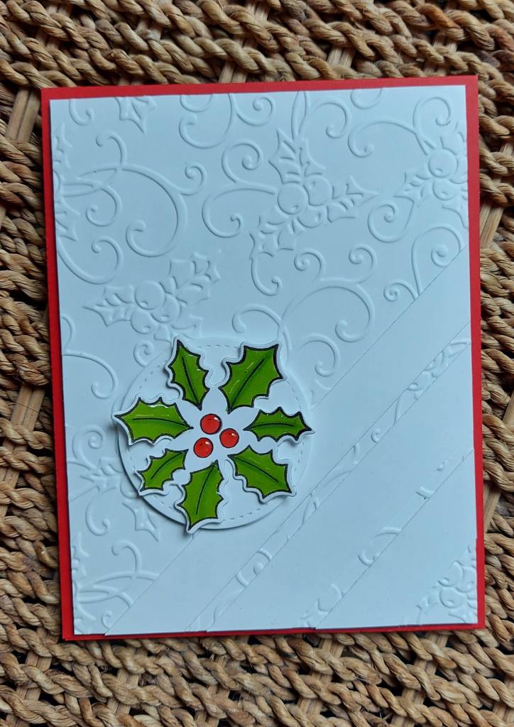
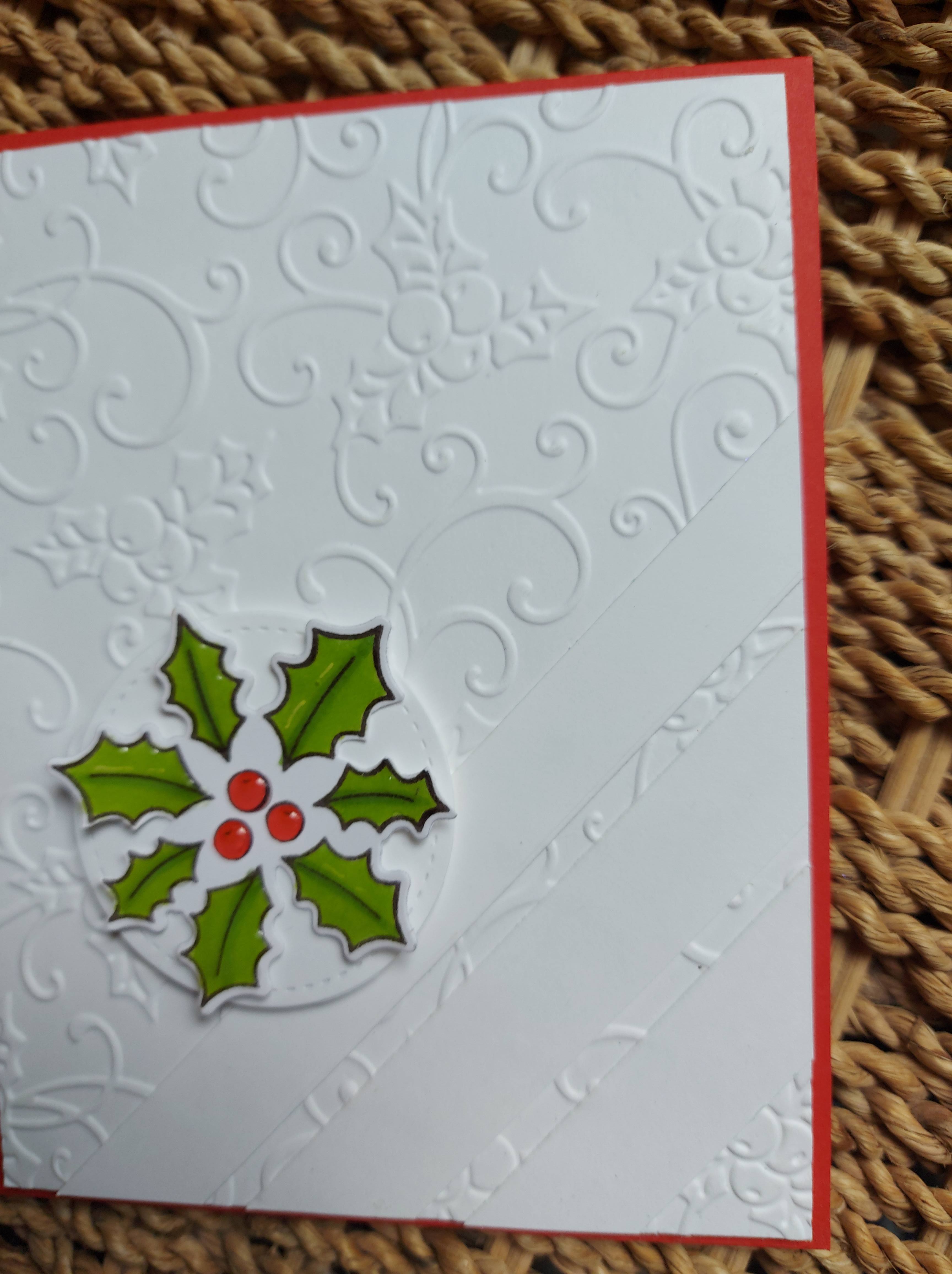
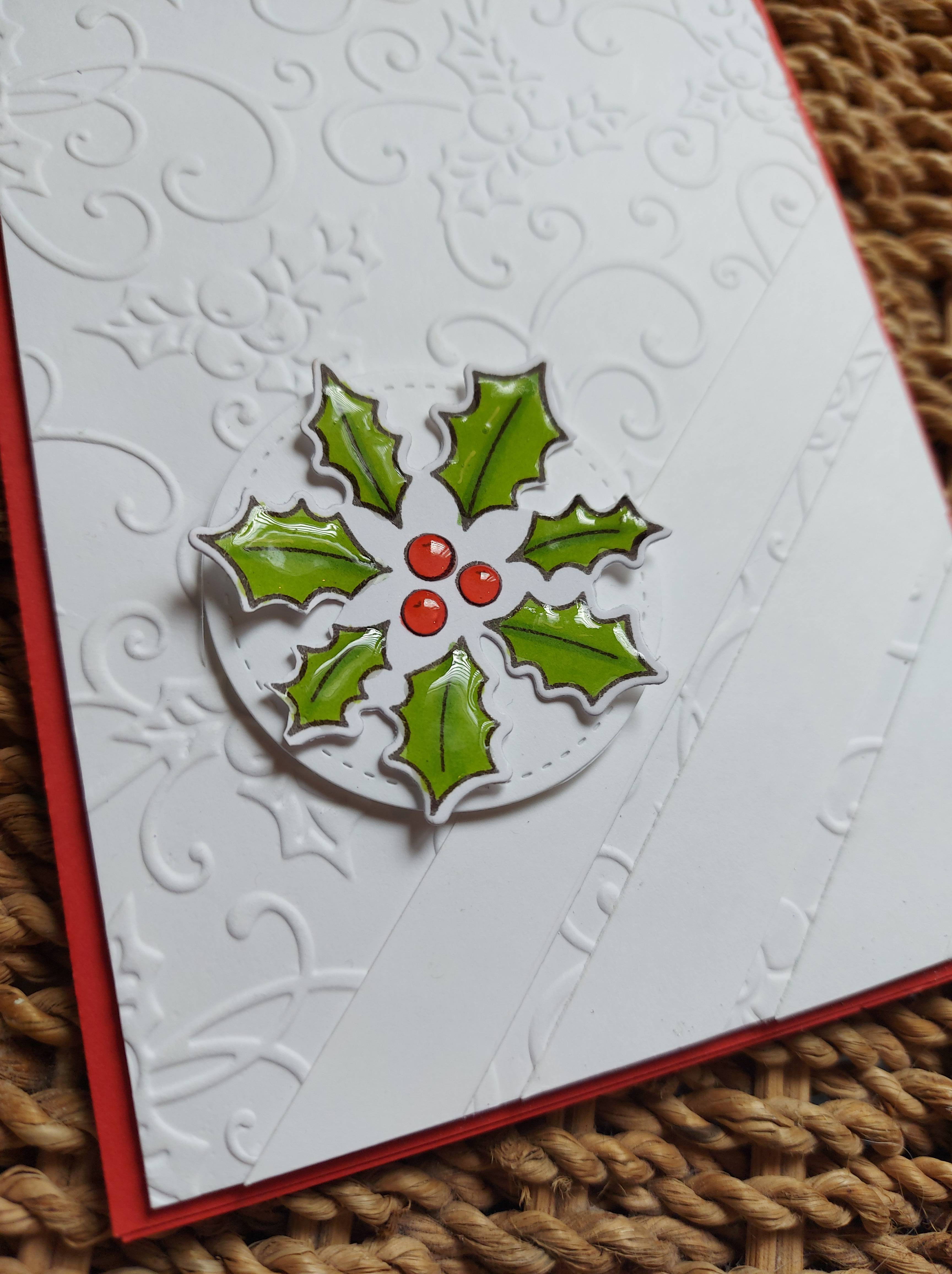
I actually went up to my craft room to get messy – ink smooshing etc – but then I changed my mind as this circular holly image was there drying from the previous day – so I decided to create a card using this first.
The image was stamped, coloured with Copics, die cut – then glossy accents added for some shine. This was then added to a small circle.
I used Heffy Doodle red card stock as the base, and added the white layer after dry embossing with a Sue Wilson embossing folder – one of my favourites and one of my oldest.
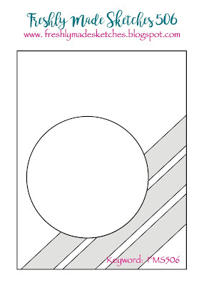
The layout of the card was to follow the current Freshly Made Sketches Challenge. I added plain white strips – something I wouldn’t have considered up until a few weeks ago……yep – another virtual craft session!
Sentiment-wise – I think I’ll put something on the inside, more of a verse sentiment, so the front stays clean.
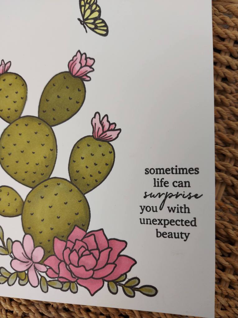
I just love that sentiment, and when coupled with the flowering cactus – I just had to buy the stamp and die set and play with it.
The set is from Memory Box, and I stamped the image onto a Neenah 110lbs card stock to reduce the amount of Copic bleed-through to the other side when I coloured it.
I kept the tones quite similar, using the colour scheme from a recent Hero Arts virtual class, and colours suggested by Daniel West.
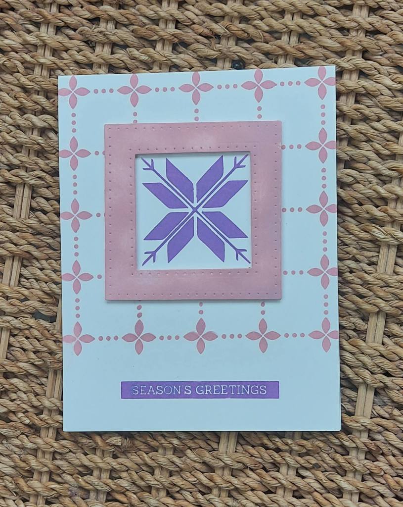
Hello. The ABC Christmas Challenge has reached the letters ‘S’ and ‘T’. Our prompts for these letters are S for Stencil, and T for Two. As long as they are Christmas creations and follow our theme, then you’re good. Here are my cards:
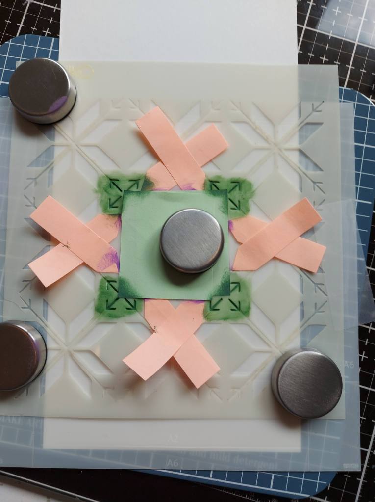
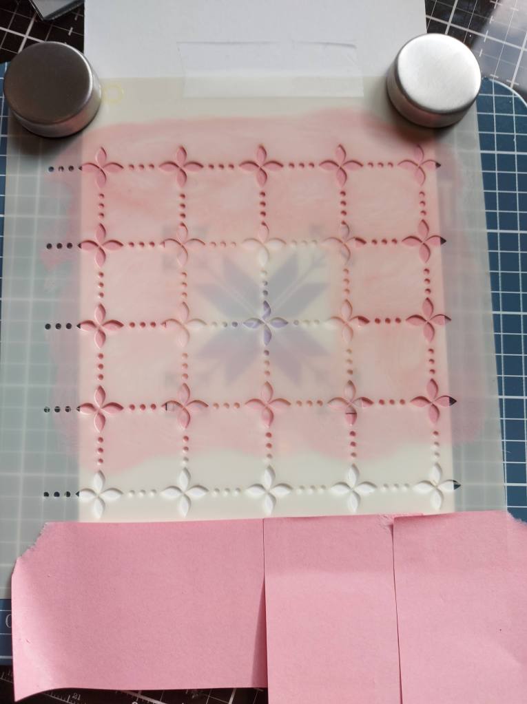
The first card is using several stencils actually. It didn’t start out that way, but that’s how it went. The central poinsettia image and the background image are stencils from Uniko. It involved a lot of masking – a lot! I also used a Hero Arts alignment stencil for part of the masking process too.
I first used the alignment tool to make the square on the card base, then added the poinsettia stencil. then masked around it, then used Distress Oxide to create the purple flower in the centre.
Some change of the masking, I then did the green – but when I finished the card I didn’t like the green – which is why there is a frame around the flower…..
All sorts of masking, using itty bitty pieces of post-it notes as these gave me the angles and the movement I needed. In the end I also stenciled the background, using the little square mask from the Hero Arts stencil set – and even more post-it notes for the bottom edge.
As I didn’t like the green, I created a frame using some stitched square dies, then ink blended the same pink oxide so it matched.
The second card has an ink blended background, splattered with water, then when it was dry I stamped the Hero Arts ‘Winter Swirls’ background stamp with white pigment ink.
The snowmen are from Hero Arts also – coloured with Copics, some white detail for the scarves, and placed as if they were in a blizzard……..
I hope you can come and join us for our Christmas themes this time round – I hope to see you in our gallery. xx
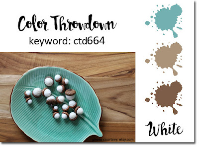
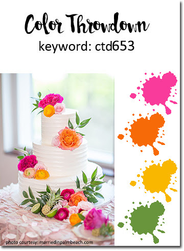
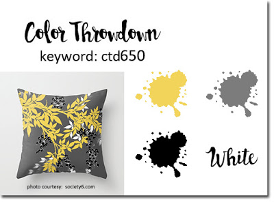
Hello there. I was lucky enough to be picked as random winner for The Color Throwdown recently, and was given the opportunity to be Guest Star Stamper. Well, of course I jumped at the chance. Here are the colours for the new challenge:
Pink, Orange, yellow, green
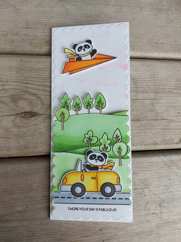
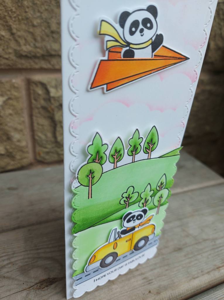
And here is my card:
I used a combination of Time For Tea Designs stamps and dies to create the scene.
The car, paper plane, and panda’s were stamped then coloured with Copics., and die cut with their matching dies. The little paper plane has a little slit in the middle so you can insert your critter.
The background has clouds stenciled with Kitsch Flamingo. The first sky I stenciled I was a little heavy handed with the ink, so I did that again with a lighter hand.
The hillside scene was stamped and then coloured with Copics. Colouring larger areas with Copics is a struggle for me – I never know when to stop with the darker shades – how much to do – but I went with it – just a little darker shade when the hills seem to merge, and a little darker in the centre of the trees.
I hope you manage to come and play this week with the bright and fun colours. As usual, the Color Throwdown Team has a variety of inspiration for you.
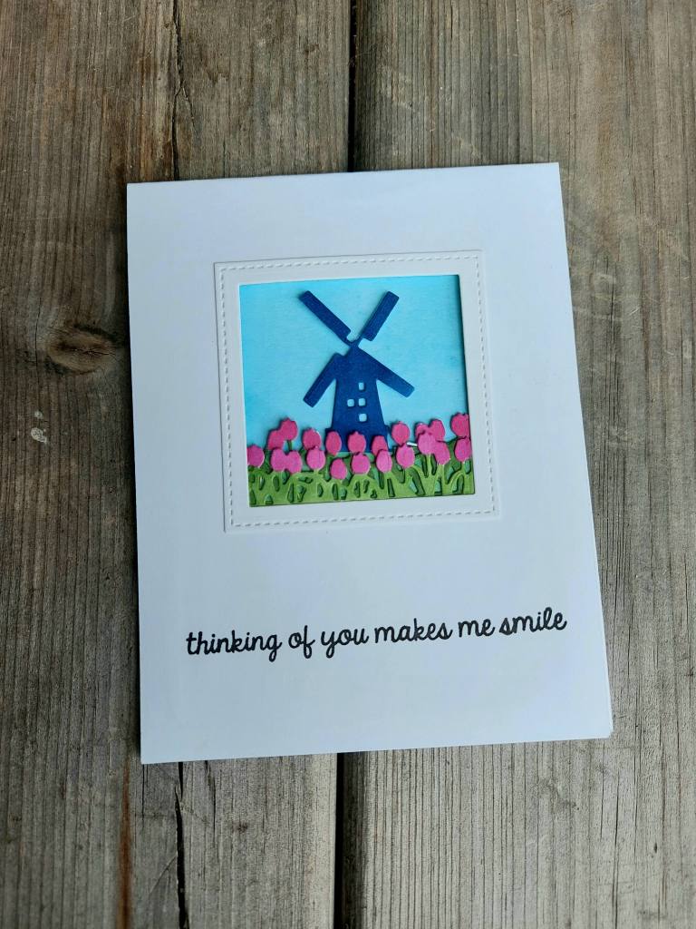
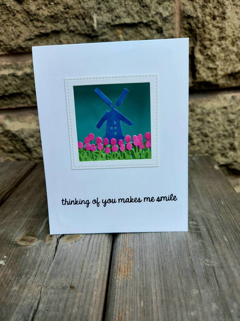
I have a card to share to day made with a new set of dies from Hero Arts:
I had to watch a couple of videos on their web site to get the hang of making this card, and it took a while to put it together – mainly because I wanted to add the frame around the outside and I had to fiddle with a knife and a couple of square dies because they just weren’t the right size. My Misti cut-align tool came in very handy for that…
The layers were all die cut out of white card, then coloured with Copics to match the current challenge colours at Color Throwdown.
The background is a water-colour piece of card I used Distress Inks on:
I have a couple of other ‘looking glass’ dies from Hero Arts, and now I think I’ve figured it out – I’ll go and have a play with them.
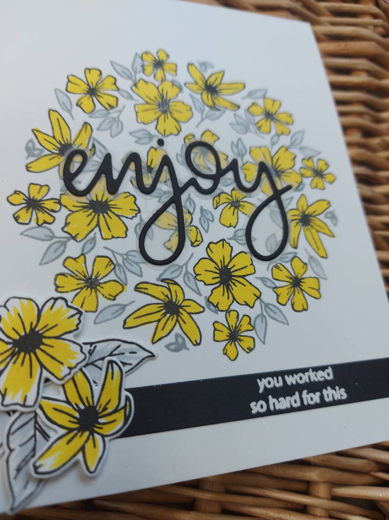
Hello. I have managed to play with another stamp and die set which was part of the Concord & 9th Summer Camp. This stamp set is a turnabout – with two turnabout stamps, and a matching die set.
Here is my card:
I was inspired to use the colours at the current Color Throwdown Challenge – and just started ‘turning’. I must say, the turnabout jig – also with the Summer Camp kit – is a brilliant tool to use – once Cathy Zielske showed us how to do it. I first stamped the flowers in Gina K amalgam ink as I knew I wanted to use a Copic to colour them. I did all four turns and then I stamped the leaves part of the turnabout.
Now – Cathy gave us a great tip…….when you have a two stamp turnabout – without taking your card off the jig – just flip the jig over, so you align the second turnabout stamp on the reverse side – close the door of your Misti, pick the stamp up, then flip the jig and the attached card over to the correct side. I mean – how ingenious is that?
I stamped the leaves in Concord & 9th ‘Dove‘ grey ink – I don’t think it’s Copic friendly but I wasn’t doing a great deal of colouring on the leaves, so it worked a treat.
The large sentiment die and the smaller sentiment on the strip is from the Gina K designs ‘Time To Coast‘ kit. The large sentiment comes with a shadow die, and I used vellum for that – a subtle addition which doesn’t cover the background, yet enables the sentiment to stand proud!
I had put the card together and figured I was finished – but then I decided to add the additional small flowers and leaves – same turnabout set – to the right of the sentiment strip.