I created this card yesterday, then forgot to photograph it and write the post – so here I am running just a tad later than planned:
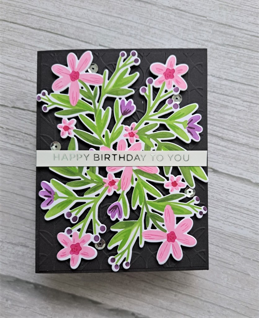
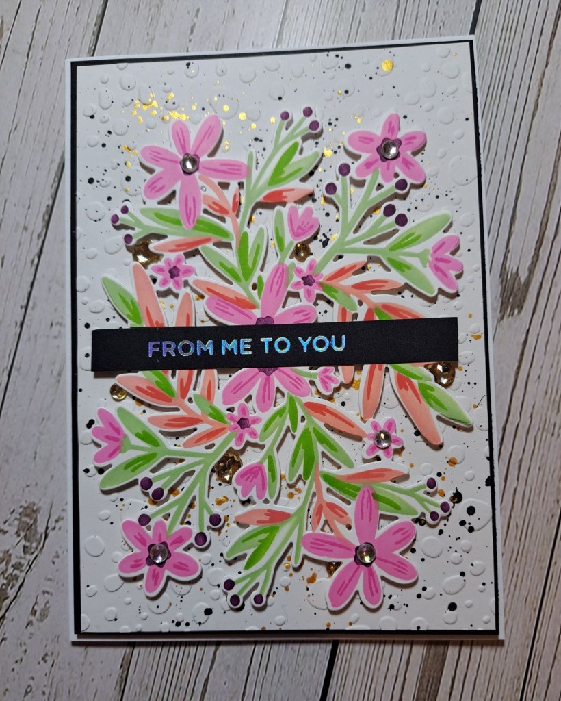
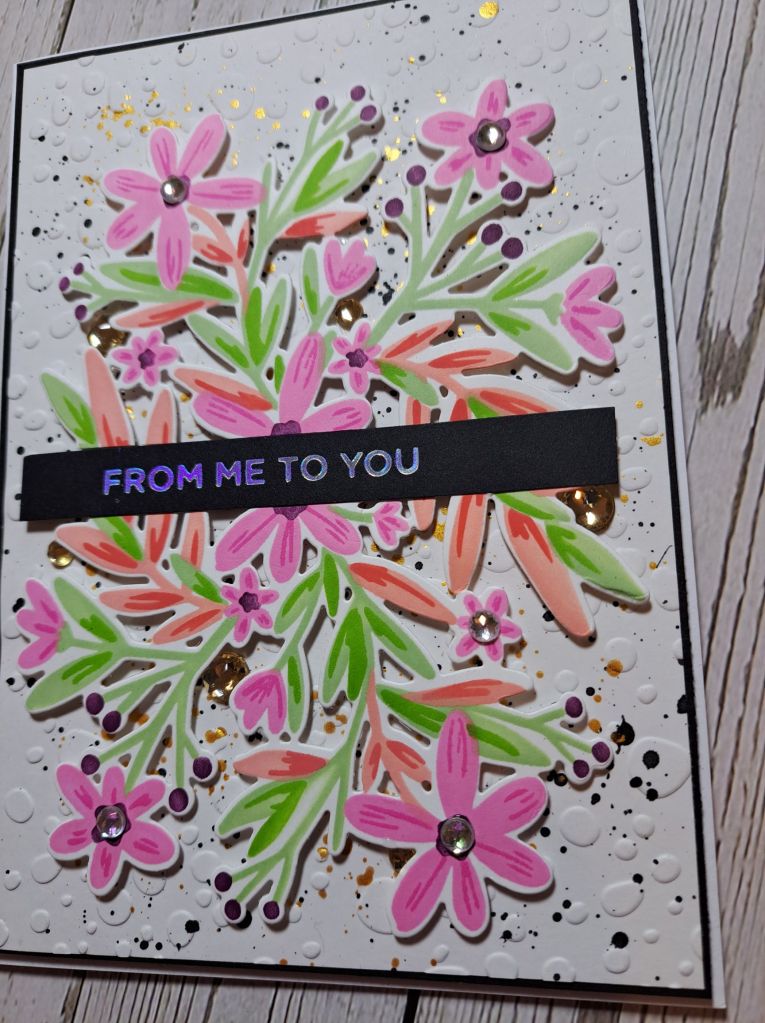
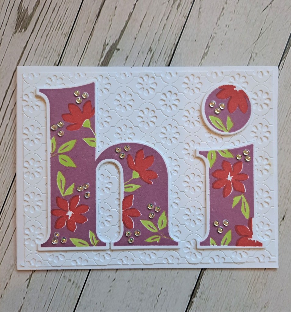
The floral image is a layering stencil set from The Greetery, and I used Pinkfresh Studio inks in two different pinks, purples, and greens. The green leaves are layered with the same colour each time, but going in a little more heavy-handed with the second layer.
I tried this image with a white background, but I thought I would go for the more dramatic look to allow the colours to stand out more…..
A black card base, with a black panel which had been dry embossed using s Spellbinders embossing folder – cut slightly smaller than the card base.
I added the floral image, then a foiled sentiment strip across the middle.
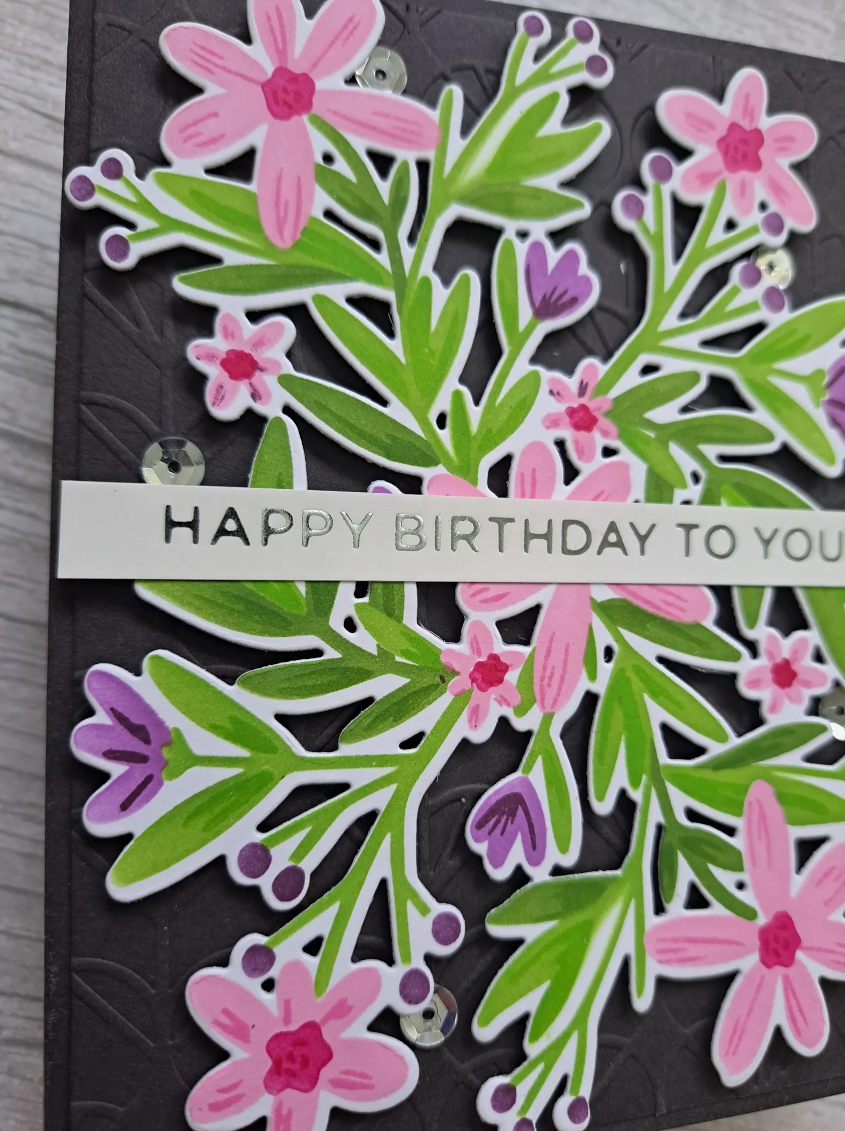
A finishing touch of a few silver sequins hidden here and there.
I shall be entering the following challenges:
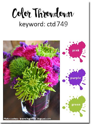
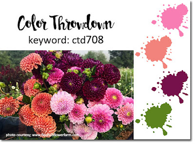
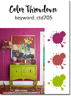
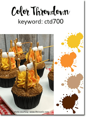
Color Throwdown – pink, purple, green
Simon Says Stamp Wednesday Challenge – anything goes
Krafty Chicks – anything goes
Addicted To Stamps and More – any occasion
Die Cut Divas – die cuts and birthday
Love To Craft – anything goes