Green Flowers

For today I have gone completely mad and opposite to my clean and simple card yesterday. You could say I have gone embossing and die cutting crazy. Embellishment crazy even.

I was inspired by several challenges to create this card, and it all seemed to work well by combining them. This is the sort of card I started to make back in the day. I loved die-cutting and embossing with a passion, and added everything to every card. I tend to do these kinds of cards for Christmas, adding loads of layers, loads of different die-cutting elements like deer, or trees, or angels. Love it.

For this card I was going very floral, and very monochrome! I used a 7 inch square base and put an embossed green and white layer on top. They are both embossed with a Crafters Companion Die’sire Embossalicious folder called ‘Floral Vine’, cut with a Sue Wilson Noble Frame die – as always.

The roses are, again, Sue Wilson – Finishing Touches Wild Rose – cut three times, and embossing after cutting. Such lovely detail on the rose, don’t you think? Sue Wilson’s ‘Trailing Ivy’ was also cut and embossed.

The main sentiment is from Paperartsy ‘Eclectica 3’, and stamped in black versamark, using my Misti. I tried to find an ink which matched the green, but decided on black as I wanted a bold statement and sentiment which would stand out from all the floral happenings on the card.

I used yet another Sue Wilson die set – Frames and Tags ‘Grace’ – for the sentiment, using the main scalloped outside layer and detailed inner layer, adding a green layer behind to highlight the design.

For the final added embellishment, I turned to my Tonic Nuvo drops, added them to the four corners, then added around the sentiment. I told you I was harnessing my inner multi-layering personality!

The challenges I will be entering are:

Aud Sentiments challengeflowers and a sentiment

The House that Stamps Builttic tac toe – (flowers, pearls, frames)

Brown Sugar challengeembossing

Craft for the Craicanything goes

Allsorts challengering a ring o’ roses

Crazy for Challengesuse green

Crafting with Dragonflieslots of flowers


Less is definitely more

Hi all, I hope everyone is having a good weekend. I’ve been having a little struggle with my mojo for the past few days, what with busy at work, being let down by a charity I was making cards for. Isn’t is amazing how things affect your creativity sometimes, and yet other times it doesn’t make any difference.

I was having a look through my recent challenge entries, and remembered I had made a major ‘boo boo’ with the last ‘Less is More’ challenge – I entered a card but entered too many other challenges. So – you know what – this card is only being entered ONLY into the challenge.

The theme for the current challenge is ‘one layer: spots/stripes’. I knew I had some small stamps somewhere by Catherine Pooler which had plenty of those on them – now to find them! Actually, it wasn’t too difficult as I have been trying to organise my stamps into makes, as opposed to themes and find that works better for me. I always seem to know I have stamps and dies, and usually who makes them so it works better.

I used some Crafters Companion Neenah Crest Solar White card, which is lovely and smooth, perfect for stamping on. I cut two pieces of A4 card down to make four cards, as I was planning on putting some together in a four-pack for notelets, varying the sentiment on each one, but the design staying the same.

I used Catherine Pooler inks, too, as I find these stamp extremely well, but being very careful as they stay a little wet for longer. Beautiful inks……but I still used my Misti just in case!

So, I am only entering the current ‘Less is More’ challenge, and hope I have read the rules correctly this time! :)


Trio of butterflies

20170511_184351

Hi everyone. I’ve gone a different route to the most recent cards. And – I’ve read the rules for the challenges more closely, after the last time! My advice – read, then read again, then read again!

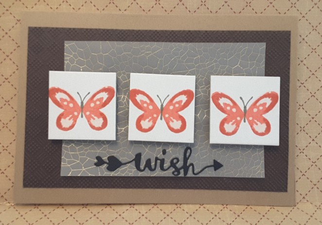
Anyhoo…….for this card I have used three ‘twinchies’ and stamped a layering butterfly from a Hunkydory set I have, using my Altenew inks. (You just knew there would be Altenew somewhere, didn’t you?)

The base card is Kraft card, with an embossed ‘pinprick’ design from Sue Wilson/ Creative Expressions as the first layer. I love those embossing folders, as they give really good dimension and texture when you use them. This one is called ‘Checkboard Pinpoint’, and gives a checkboard and dot effect.

After embossing that, I lay out my butterfly twinchies, but thought it looked a little boring. I had a hunt around my card and paper stash, not really looking for anything in particular, and came across this vellum with a bronze/brown/gold pattern on it.

I stuck that to the brown embossed card using glue which would be underneath the twinchies, therefore hiding it. I stuck the twinchies down with foam pads, and turned my thoughts to a sentiment.

I wanted a die cut sentiment and went to my Katie Skilton set, as I liked the look of the arrow, and that the sentiment could almost be suspended and flying – just like the butterflies…..well…..that’s what I thought, anyway.

I will be entering this card into the following challenges:

Simon Says Stamp Wednesday challenge – ‘going dotty’

Addicted to Stamps and More – ‘anything goes’

Cardz For Galz – ‘add texture’

Moving Along with the Times – ‘Butterflies’


Still Altenew

Hi everyone. I am still with the same stamp set, and now playing with different colours. I seem to have gained some confidence with layering stamps. I’ll let you look at the blue cards to spot some mistakes – I’ll tell you at the end!

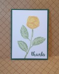
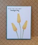
The inspiration for the yellow card is from the ‘Less is More’ challenge to use yellow and grey only, so I thought I’d have a play with the only flower from that set I hadn’t stamped yet. I did initially think of doing the sunflowers stamp set, but as I’m on a roll with this one, I decided to stay with it. Three layers for the flower, and two layers for the leaves at the base of the flower. This particular stamp actually fits together, and is quite easy to match-up – with the correct lighting, anyway.

I tried doing it and found that leaning over created a shadow and I couldn’t really see what I was doing, so in came a light I placed nearer and to the back of my craft table. That seemed to work very well.

I used colours from Altenew inks, so I didn’t even have to try and find colours that worked well and toned well together as it is already done for you with the ink sets.

So, onto the mistakes. Did you spot them?

On the top blue card I couldn’t figure out which way up the flower was supposed to be! So – it’s crooked. I think it was planted into alcohol!

For the second blue card I think I had a stutter with the stamping. I completely misjudged the darkest layer at the bottom of the bud. Well, take about artistic licence. So my blue cards are a drunken flower and a stuttering stamper…….some fun, at least.

I will be entering the yellow card into the following challenges:

Less is More‘yellow and grey’

Make My Monday‘May flowers’

Incy Wincy Designs – ‘Clean and Simple’

Crafting From The Heart‘anything goes’

Colour Crazy Challenge‘anything goes’

Crafty Calendar challenge – ‘flowers’

Altenew frenzy

Today was a day for a frenzy of activity. Why? Well, I have spent most of the day on the phone between two companies trying to get a brand new washing machine – which doesn’t work – changed. I have had it for two weeks, and it has taken that long for an engineer to come and say it is broken! Well – duh!! Anyway, after the saga I just had to go and craft.

I have certainly had a frenzy of stamping – as you can see! I have finally – yes finally – got to grips with multi-layer stamping. I think. Maybe. Sorta.

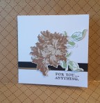
I have stuck to yellows and browns for the flowers, and green for the leaves. The colours worked well, so I stamped my way through my most recent Altenew acquisition ‘Budding Thanks’. All the yellow flowers are from that set. I am still working my way through the different flowers, and they are blinking gorgeous. So easy to line up…….and how about me going all ‘Clean and Simple’? Gotta say, lovin’ the simplicity.

A comment on a previous posting was absolutely right – it takes time to appreciate the simple after crafting so intricately for years, with layer upon layer of die-cutting.

The brown flowers were because I saw a posting from Yana Smakula on Pinterest, and she did her flowers in coffee colours. They were stunning. I had to give it a try. I am also liking that effect too.

As I haven’t posted for a few days, and was in frenzy mode, I have decided to choose some challenges using a different card from this posting for each one. I couldn’t decide what to do which would match the same challenges, and had some serious crafting mojo happening, I just went with it and kept going. I took one of my cats meowing at me constantly to realise how late it was and that I had been in my craft cave for a few hours!!

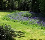
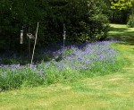
I did venture outside at some point today, and took a picture of the bluebells currently in bloom, almost at the end of their bloom actually. Still a stunning display, though.

I will be entering the following challenges:

Freshly Made Sketches – ‘Sketch’

Crafty Catz challenge – ‘anything goes’

Crafting when we can – ‘CAS’

Dies R Us challenge – ‘flowers – must have die cuts’

Artistic Inspirations – anything goes/optional brown and cream

Craftaholics R Us – ‘spring colours or flowers’

Come and get it challenge – ‘make it square’


Monochrome Friend

20170501_133854

Isn’t it true? A good friend does make everything ‘better’. Sometimes just being there, and sometimes not even being in front of you, but knowing they are at the end of the phone, makes everything ‘better’. Just sending ‘xx’ on a text – no words, just those two little kisses means someone is thinking of you, and wishing you well.

When I had done all my Gelato colouring and embossing yesterday, I decided to go for a more monochrome look. I have used a lot of colour recently, and wanted a change of pace, as it were.

Creative Knockouts has the challenge to produce a card for friendship, and so I decided to mix a few of my stamp sets up, and come up with a sentiment which is personal to me.

I used the sketch inspiration from Paper Play Sketches which I found to be very simple, and yet a great layout with so many different ways of interpreting it. I went with almost exactly what was given to us, as you can see….

I created my own background on a strip of black card, using the stamps from Altenew ‘Freeform Greenery’. I stamped and embossed them in white, haphazardly around that piece of card, and used the smaller stamps to fill in the gaps.

The sentiment is a mix-up from a couple of stamp sets. ‘to a wonderful friend’ is from Stampin Up’s ‘Dragonfly Dreams’, and ‘you make everything better’ is from Altenew ‘Halftone Everything’. I only used the outline of the word ‘everything’ as I liked how it actually looks bolder than the other words, and yet is not a solid stamp.

I shall be entering this card into the following challenges:

Paper Play Sketches – ‘sketch’

QKR Stampede – ‘Anything goes’

Creative Knockouts – ‘Friendship’

Morgan’s Art World – ‘Anything goes’


Graffiti card

20170501_133820

Hi there. I’ve been playing again! I was inspired by a graffiti challenge from Inkspirational, as I immediately thought of my Crafters Companion Textures embossing folder ‘Dry Stone Wall’. My first thoughts of graffiti was colour, words, and all painted onto a wall, which is why I went with this folder. I had no idea what to do to colour it, and what card base I wanted to start with, until I saw a Faber Castell show on Hochanda. I have some Gelatos, and – again – have never used them. Now was the perfect time.

I used a piece of Kraft card, and scribbled some Gelatos colour on it. I only have four colours, so I didn’t have many options. I scribbled, then wet the card, scribbled some more, rubbed with my fingers, scribbled some more, blended, even used a water brush at some point – it was very therapeutic…..

Once I was happy with the colour – it probably took about 15 minutes – I then stamped and embossed the letters. I have a stamp set full of capital letters and small letters and punctuation, no idea which company it was from, but I laid the letters out on my new Tim Holtz/Tonic stamping platform. I have only had this for a couple of days, but it came in very handy today when my card was more than 6 inches wide.

Once the letters were stamped and embossed, I then embossed the whole sheet. I find it easier to emboss afterwards, as stamping on an uneven background, even with a stamping tool, can be very awkward.

I tried to age the card by using a blending tool, but that started to rub off the embossed letters. So – I went in the my distress ink pad ‘Frayed Burlap’ and just rubbed the whole pad over the whole piece of card. It obviously caught the raised areas – such a great embossing folder – to add a darker colour.

A layer of black card, then all onto a base Kraft card.

I may have to try the Gelatos on some specific water-colour card for another project, after I have had a look at some YouTube videos, of course.

Challenges I will be entering:

Inkspirational‘Graffiti stamping’

Watercooler Wednesday – ‘masculine

Simon Says Stamp Wednesday challenge‘anything goes’

Brown Sugar challenge ‘no image, just a sentiment’

Colour Crazy Craft challenge‘anything goes’