Galaxy background

Now, I know I’m coming late to the party, but I have never done a galaxy background. It has never interested me, and the more people that did one – the more I stayed away. I’m funny like that – not really following trends until they are over. I have watched numerous videos about the galaxy backgrounds, but it wasn’t until I saw the Simon Says Stamps Monday challenge, and having just had my Uniko delivery, then I thought I would have a go.

Why inspired now? No clue. No idea………but having all the stamp sets from Uniko based around stars, and wanting to do a less than simple card – well, out came my Gansai Tambi, and distress inks, and I set to it.

I used the stamps from Uniko ‘Background Builders’ and mixed in MFT ‘Stars Above’, embossing onto water-colour card with white. I then created a mess with my Gansai Tambi water-colours, pastels, starry colours, Brusho’s – you name it, I seemed the throw everything at it! I didn’t know when to stop. I just know I had to have some bright colours in the background showing through when I covered the piece with distress ink Black Soot, splashed with water, then splashed with white…………Actually, I can’t remember half of what I did to it!

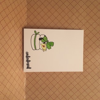
The sentiment is from MFT, and a coloured base card just to bring some of the colour together from the background.

I don’t know if I’ll be doing this frequently, but I had some fun. Maybe when I am in the mood not to think, but just play, I’ll have a go again.

The challenges I will be entering:

Simon Says Stamp Monday Challengeit’s written in the stars

QKR Stampedeanything goes

Colour Crazy Challengeanything goes


Happy Bee – day

Hi everyone. We had a little windy episode here in Derbyshire the other night, certainly nothing in comparison with the USA at the moment, but nevertheless, it led to one of our oak trees losing some branches onto a power line near our house. Thankfully, it didn’t cause the wires to touch, but our electricity provider was called, who said it needed sorting out then and there, which meant a tree surgeon has had to come and make the area safe – but cutting down most of the beautiful oak tree!

It’s not nice seeing all the branches on the ground, and the trunk bald and bare……and they are coming back to cut it down to ground level later in the week. I can’t believe how emotional I got seeing that poor tree……

20170916_165718

To take my mind off it, I escaped to my craft room, and made quite a few cards. Enough to enter a few challenges over the coming days. I was thinking of posting a few of them today, but decided to do quick posts each day, so there wasn’t too much to read at one go, and not too many pictures to download, either. If you are like me, we have quite a low internet speed, so some pictures take forever!

This card was inspired by the challenge from AAA Cards, Addicted to Stamps and More, and Less Is More.

I have used this stamp set from Hero Arts once before, and remembered how cute the little bees were, so had a little fun playing with the CAS look. I also had a delivery of a box of ready made and scored cards, varying sizes, and thought this smaller 4 inch square card suits this little bee and little sentiment.

I used Versafine black onyx again, and used my Misti, as I made several of each design, ready for little note cards. I only used a yellow colour on the bee, and no other colour at all. Zip. Zilch. Nada. (See how multi-lingual I am)

No smudges either, which is what I usually do when I do a one layer card, with a clean and simple design. Maybe it’s because I didn’t play around with the design too much, and not too many colours and different inks – who knows!

Challenges entered:

AAA CardsCreatures Great and Small

Addicted to Stamps and More Clean and Simple

Less is MoreTake flight


Wine talk…..

Hello there. I have a selection of cards using the same stamp set from ‘Stamps by Me’. These images lend themselves to water-colouring, and there are lots of flower stamps in her designs, layering flower stamps, for the water-colour effect. Simply stunning some of her creations. I have, however, chosen to stick with plain old stamping….

This card is for the Cards In Envy challenge of Cheers to you, and so I thought this set worked very well. I played with the colours of the wine, using inks from Catherine Pooler, then Altenew. I also put a pink wine for something a little different.

The sentiments in that stamp set are very versatile, and I have only used three of them here. I also liked using the ink ring stamp under the sentiment, as I thought it added something to the rest of the plain card. I have seen this used as an actual engagement ring instead of spilt wine ring, and it looks great – kinda grungy.

I also played with base card colours, as I had a range of cheaper card as a freebie from somewhere – memory issues! – and actually liked the variety and how they turned out. These are very simple cards to make, and would be great for batch-making for ‘just because’ cards, even though they are large.

I am sure we all have a range of sentiment s which suit being placed with wine glasses……I would love to know if you have any quirky sentiments that go with wine and cheers cards……

Challenge I am entering:

Cards In EnvyCheers to you

CAS colours

20170914_212407_001

Hi there. I have a card different to the ones I have posted recently. They have been a riot of colour, almost, so this is the opposite side of the coin. Just three colours.

I was inspired by three challenges with this card – CASology, Cupcake Inspirations, and Simon Says Stamp Wednesday challenge.

I used Altenew ‘Celebrations’ stamp set for the cake, and the sentiment below. Isn’t a piece of cake just absolute contentment? There is almost a deep sigh when I take the first bite of a piece, so I thought the sentiment fitted quite aptly. I think the sentiment is supposed to mean contentment with marriage, and celebrating happiness – but I like it how it is.

I stamped with Versafine black onyx, and coloured with my Zigs. The difficult part was deciding where on the card I wanted the cake and sentiment to go…….the cake moved several times until I settled with this placement.

The challenges I will be entering are:

CASologycake

Simon Says Stamp Wednesday Challengeclean and simple

Cupcake Inspirationspale yellow, red, green


Uniko delivery

Hi everyone. A quick posting today, as I had a delivery from Uniko – and I have played already! Just in time to join the current challenge at Time Out.

I used the Gerbera stamp on both cards, but using a different technique. The first one is actually the card on the right, stamping the background builder stars in rainbow colours and Catherine Pooler Inks, then stamping the flower outline and main flower. I didn’t really like how this came out, as you can see the stars behind the flower.

The second card, I stamped the flower – no outline – then masked it off and stamped the rows of stars. I liked this much better, and the Misti made lining them up so much easier. I just moved the card along, leaving the stamp where it was.

The sentiment is also from Uniko, a block sentiment, in Versafine black onyx.

I can see I will be playing with these stamps over the next few days as I order the new bundle at 5% off – it would be rude not to! – and added the Gerbera stamp and die set too. :)


Block water colour stamping and more…

I have the cards above for one challenge, and a card further below for the Color Throwdown challenge this week, but I am blaming ‘Just Us Girls Challenge’ for all the cards above. It is totally their fault. I am not to blame! I mean – setting a challenge like this. Really! I just couldn’t stop myself once I had started……I just kept going and going and going. If you haven’t tried this technique yet – go for it.

The challenge was to make a card using block water colour stamping – you probably guessed – and a link to Jennifer McGuire for hints and tips. I was immediately hooked, and gathered my inks, and my water-colour card, my blocks, and my spritzer, and off I went. My only limitation when I started yesterday was space to dry them, and how many heavy objects I had around to stand on them for 5 minutes!

I used distress inks, distress oxides, Altenew inks………all worked very well with this technique. Loved playing.

You can also see I used a larger rectangular block, a small round scalloped block, and three smaller blocks. One or two of them I let stand, and one or two I hit once or twice so the ink sprayed out the sides…….Jennifer has lots of hints on the video……

Then I had to decide what stamps to emboss onto the respective pieces…..

The two smaller butterflies with the sentiment in them is from Finnabair ‘Dream on’, and the rest are from  Visible Image. I decided to emboss most of them in black, but tried a white embossing for one flower, and quite liked it. Black is still my favourite as I like bold sentiments and images which stand out.

Whilst I was waiting for some of the pieces to dry, I also managed to make a card for Color throwdown this week:

Their challenge this week was to use red, white, and black. I thought of Christmas, and used my Catherine Pooler background stripe stamp, with her ‘Rockin’ Red’ ink, die cut Leonie Pujol ‘Entwined Christmas Tree Baubles’ (supposed to be entwined with the Christmas tree but I liked the look of it alone), in black glitter card from Stampin Up, added the die cut word ‘joy’ from Catherine Pooler, some black sparkly thingies in the corners, and there we have it.

Phew, need a coffee and feet up now. All that crating has fair worn me out…….

Learning and Education card

20170909_130607

Hi everyone. Please excuse the way I have photographed this card – it is windy and rainy today so I can’t go outside, and after the way my last card blew into the wet flowers – I just didn’t want to risk getting this card wet.

This simple black and white card is inspiration from CASology. This cue card is ‘Education’. I started with an idea for a mortar board cap – partially covering one of the corners, with a tassel hanging down, and a sentiment, but I couldn’t find a stamp which would suit………..I will keep looking though, as I still have that image in my head.

However, whilst looking through my stuff, I came across a Sheena Douglass stamp and die set I have had for a few months, never used (seems to be a trend for me) and took the book stamp and the sentiment and played with them for a while.

I started one of my ideas with stamping the books, and colouring them with distress inks, and whilst I liked this look, it just didn’t sit with clean and simple for me – looked a little too grungy. As the stamp is quite large, a normal 4 x 5.5 inch card meant there wouldn’t be that much open space, so I turned to a 6 inch square card. I like this look better.

Once I had decided on the layout, I then stamped directly onto the base card in Versafine black onyx – of course – and left it just the way you see it.

I will be using this set again, and making more colourful cards, now I have found it again, adding backgrounds with colour and embossing, but this is the card I am posting today for the CASology challenge.

Now, I’m off to my craft room to see if I can find something which resembles a mortar board tassel…….if I find something – I’ll let you know. :)


one layer, three colours

20170906_102047

Hi everyone. I have made a quick card today, as I am just about to go to work for the afternoon, and back reasonably late this evening. I wanted to play with the colours for the current challenge from CAS Colours and Sketches – Always Artichoke, Fresh Fig, and Tangerine Tango. I think those colours are absolutely gorgeous on their own, but when put together – love it.

I had a delivery from Stampin Up yesterday – well, I say delivery…….UPS sometimes struggle to find me, and I don’t realise I have a package until I check my tracking through my Stampin Up demonstrator to find they have tried 4 or 5 days……and still can’t find me. I mean – I live on the only road in the middle of a wood with 30 houses – how difficult can that be? Anyway, I had to go to the local depot to pick it up yesterday, so I just had to make time to play.

I liked the look of this stamp, but didn’t realise that the word is actually quite a solid image. I wanted to colour the word, but when I realised it was solid I decided to stamp it in Fresh Fig, quickly put some clear embossing powder on it, and then heat embossed. Even though I used water-colour card, I think it came out quite nicely.

I then coloured the roses in Tangerine Tango, and the leaves in Always Artichoke and there we have it. However, after I had photographed it – thank goodness afterwards – the card blew down into some wet leaves, and of course I swiped my fingers over it to clean the water…………..and I now have a nicely smudged water-colour image now!!!20170906_111231

I am sure I can still save the card, but will have to think about what I do with it. Trust me!!!! Well, as least you can see the Fresh Fig colour coming out of the words.


I shall be entering the original non-smudged card into the following challenges:

CAS Colours and SketchesAlways Artichoke, Fresh Fig, Tangerine Tango

CAS on SundayOne Layer Wonder

Simon Says Stamp Monday Challenge stamp it, no digital images


Colours and Sketch 238

20170904_190024 

Hi there. I’m posting this a little later than planned, as I had forgotten all about it. I only made it yesterday – how weird is that? I knew I wanted to use the sketch and colours from the double challenge above, and made the card, then wondered what sentiment to put on it – then completely forgot to finish it!

I got home from work, checked my emails, made us some tea, opened my challenge spreadsheet – to find this challenge highlighted in the yellow of ‘got to post it soon’. So, I photographed it – in between a little panic – and here we go.

I didn’t have all the correct colours, so I used Broken China distress ink, with Certainly Celery, and Powder Pink from Stampin Up. I used the new stamps from Catherine Pooler Stamp of Approval for the flowers, and even used the large die to cut the scalloped background.

The pink diagonal rows are from Altenew ‘Pattern Play ‘Hexagon’, which I stamped using my Misti as these are quite solid images.

CAS Colours and Sketchessketch and colours


Cat agenda

Hello again everyone. I have two cards to share with you today – cards which I am not exactly happy with, but took me ages to sort out. I don’t know whether my eye isn’t suited to seeing such clean cards, or I have made them too big – there is just something about them I am not liking……..

I started with the inspiration from CASology with the theme of ‘square’ and combined with the them from Aud Sentiments and As You Like it. I had in my head the ‘Little Cat Agenda‘ from Mama Elephant, as I am definitely a cat person, having two gorgeous big black cats, and that I wanted them to be on a square, and wanted to use the sentiment from Lawn Fawn, but I just couldn’t get the layout right.

Do I die cut a square on the card and inlay the cat? Do I stamp the cat flat to the card? How would I colour the cat? Such conundrums that I struggled with for ages. I ended up stamping the cat on water-colour card, colouring them with my Zigs, then die-cutting a small square from Lawn Fawn wonky squares.

The sentiment I die cut from black card which had double sided sticky sheet on the back, so it would be easier to adhere to the card base, but played with the layout time after time.

In the end, I went for a long and thin card, and used a white base card and a biscuit colour card, juts so I could see which one I preferred – and actually didn’t like either of them that much.

Maybe the card is too deep or too long……..

In any event, I am posting them and wonder of there are some hints and tips you could give me? Or maybe it’s just that I am not getting the Clean and Simple look right at the moment….please tell my mojo to come back!!

CASologysquare

Aud Sentimentsthinking of you

As You Like It fur or feathers and why