ABC Christmas Challenge – Y and Z

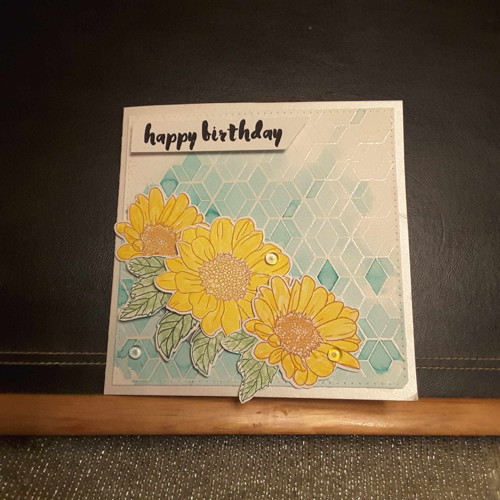
Hello. ABC Christmas Challenge has started their last challenge for this year. Having reached the letters ‘Y‘ and ‘Z‘ we want to see your Christmas creations using the theme of ‘Yummy’ and ‘Zigzags’. Here is my card:

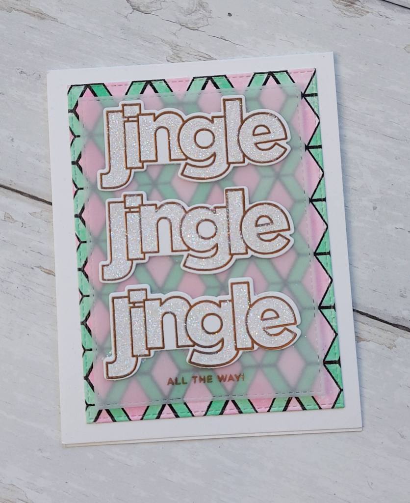
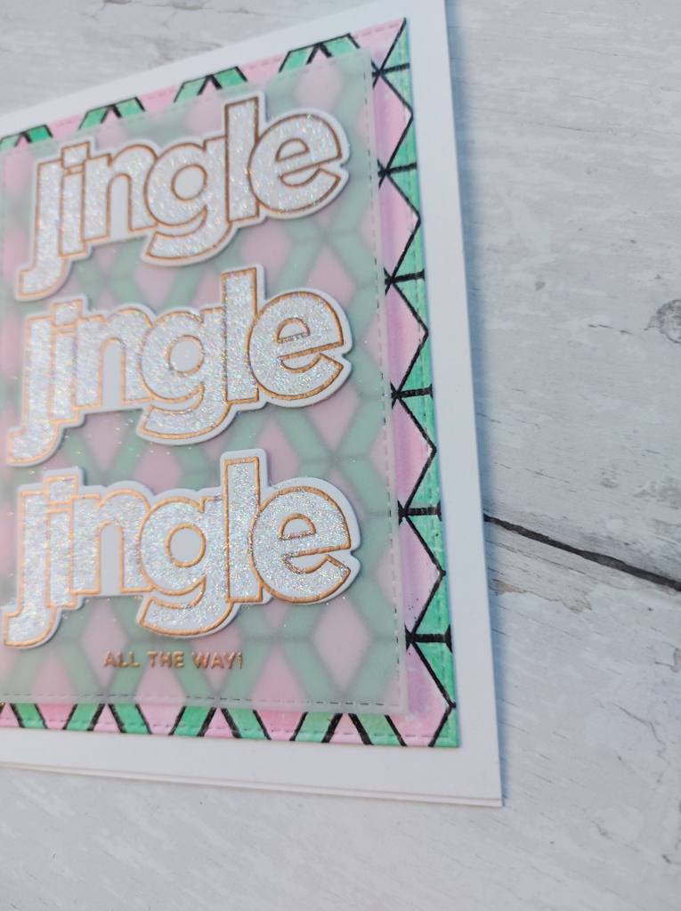
I chose to go with the zigzag theme – as you can probably tell – and used the Altenew ‘Pattern Play: Hexagon’ stamp set to create my zigzags. I stamped in black the clear heat embossed the lines onto watercolour card stock, then used a couple of Distress Inks to water colour the zigzags.

I went with a couple of less traditional colours, but I like the effect this created.

I then used a Simon Says Stamp/CZ Design set for the sentiments – heat embossing in gold the outline for the ‘jingle‘ words in a bronze colour. I then used some glue to fill-in the larger words, and added Lawn Fawn Prisma Glitter.

I felt the background was a little too bold for the words, so I added a small piece of vellum and stamped the smaller sentiment towards the bottom of that piece.

I hope you can come and join us for this challenge – please follow the themes to be in with a chance of winning the prize offered up by Samantha, who is hosting this challenge. xx

I shall be entering the following challenges:

Crafty Catz Weekly Challenge – atg Christmas option of non-traditional colours

Dragonfly DreamsChristmas/Winter

Crafty Hazelnuts Christmas Challenge atg Christmas

Lil Patch of Crafty Friends atg

Crafty Catz Challenge Blog Badge
Blog Badge
Please feel free to copy to your sidebar
Challenge Badge

Spring Daisy

20180414_212220

20180414_212139

Hi there. I have been playing with new techniques today. I finally – finally – got around to watching some of the Altenew Academy classes I bought over the past, well, months, if not years.

These two cards were an attempt from inspiration from Laura Bassen and the ‘Clean, Simple, and Colorful techniques‘. That lovely woman certainly knows how to inspire – and don’t you just love her chat? I am laughing, and giggling, and learning – all in one go. Her attempt at the New York accent? Had me in stitches – though it is probably much, much better than I could do. Love it.

I decided to try the water-colour resist technique. I think that’s what it’s called….

I took the three colours from the current challenge at Color Throwdown and set to creating. I first stamped and heat embossed with clear the Altenew ‘Pattern Play – Hexagon‘ onto water-colour card. I then took Catherine Pooler’s ‘Aquatini‘, smooshed it onto my brand new Tim Holtz Glass Mat ink area (Yippee! and Yay!), wet down the water-colour card and used a water brush to dot and spread and generally mess around colouring the panel.

I added some extra depth of colour in some places, and  I really liked how the ink worked in this way.

Whilst that was drying, I stamped the flowers using Altenew inks, not realising there are only two layers – the outline and one shading. I decided to go over the stamped and shaded flowers with another yellow from my Zigs, and it still kept some of the detail in the flowers, I did the same with the leaves.

I used 3D glue gel to stick them onto the card base, stamped and adhered the sentiment, added some clear dew drop thingies, and there we are.

I am sure tomorrow will be spent looking st some more of the classes I haven’t got around to, if this is where they lead me.

I will be entering the following challenges:

Color Throwdownyellow, aqua, green, white

Water Cooler Challenges Occasion

Aud Sentiments challengebirthday

Addicted to Stampsmake your mark

Time Out ChallengeSpring (option of one layer – not used)


Colours and Sketch 238

20170904_190024 

Hi there. I’m posting this a little later than planned, as I had forgotten all about it. I only made it yesterday – how weird is that? I knew I wanted to use the sketch and colours from the double challenge above, and made the card, then wondered what sentiment to put on it – then completely forgot to finish it!

I got home from work, checked my emails, made us some tea, opened my challenge spreadsheet – to find this challenge highlighted in the yellow of ‘got to post it soon’. So, I photographed it – in between a little panic – and here we go.

I didn’t have all the correct colours, so I used Broken China distress ink, with Certainly Celery, and Powder Pink from Stampin Up. I used the new stamps from Catherine Pooler Stamp of Approval for the flowers, and even used the large die to cut the scalloped background.

The pink diagonal rows are from Altenew ‘Pattern Play ‘Hexagon’, which I stamped using my Misti as these are quite solid images.

CAS Colours and Sketchessketch and colours


Magnolia Colours

20170726_213334

Hello everyone. I hope you are all well. It looks like a late evening posting for me today. I have been playing with colours and different stamps in my craft room, and forgot what time it was. Time flying and having fun comes to mind…..

This card is inspired by the colours from Color Throwdown – raspberry pink, yellow, and green. I wanted to use the Magnolia stamp set from Altenew, but didn’t know if magnolia’s come in these colours…..I did an internet search, and they do come in yellow, but I couldn’t find any with a raspberry heart or dark shading. So – I did it anyway! You know me, throwing away the rules…..

I stamped the flower in Versafine black onyx – as always – then stamped the base main magnolia layer in ‘Tiara’ from Catherine Pooler, adding some raspberry colour to the base, and slightly drawing it out with my watercolour brush. The green is ‘Grass Skirt’ from Catherine Pooler, drawing out the base green for a lighter touch, then adding directly to the image for the darker shading.

The branch is coloured with an Inktense brown pencil – one of the ‘allowed’ neutral colours – then used the matching dies to cut the image out.

I then stamped a third generation of the raspberry colour using the Altenew Hexagon stamp for a very, very light background, (I promise it is there and the raspberry colour)stuck my flower to it, then used my wonky rectangles from MFT.

The sentiment stamped in the same green, as opposed to my usual black, for a more muted look, so that it didn’t take away from the main image too much.

I shall be entering this card into the following challenges:

Color Throwdownraspberry pink, yellow, green

Crafty Sentiments Designsanything goes

Simon Says Stamp Wednesday Challengeanything goes