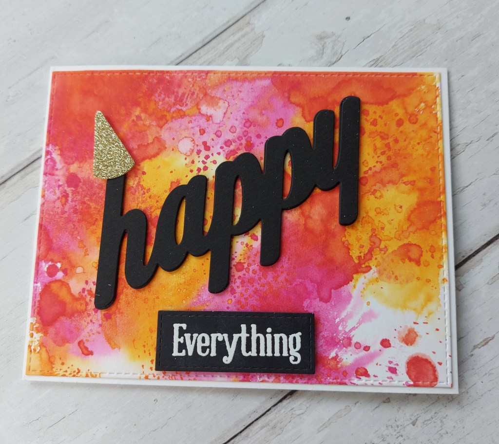
Hello once again. There is anew challenge started at The Alphabet Challenge. We have reached the letter ‘H’ and Debbie has chosen the theme of ‘use the word Happy in your sentiment‘. Here is my card:
Do you think the word is bold enough?
The background is ink smooshing onto Distress Heavy card stock – part of a bunch of these backgrounds I made whilst restricted a few weeks ago. Because this background is so vibrant, I decided the sentiment ought to be big and bold and black…….
The sentiments – the big word and the embossed word – are from Uniko, as is the little gold party hat added to the first letter……
I hope you can come and join us. I’m looking forward to seeing your ‘happy’ creations. xx
Hello. I am managing to spend a little time sitting ‘normally’ now so have been able to so some crafting. My foot is recovering nicely, but I still have to be careful how I walk – it’s a very funny sight, I can tell you. Think penguin crossed with a crab……….
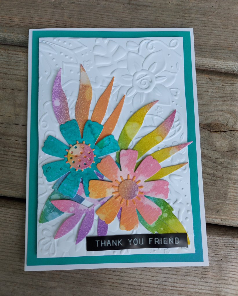
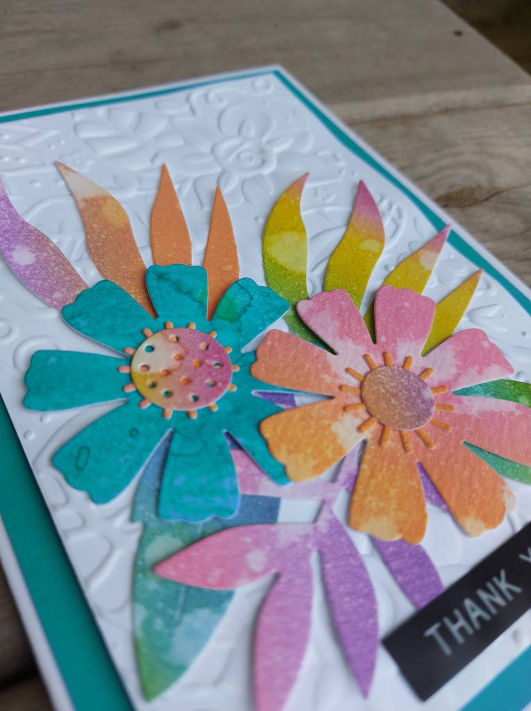
One of the cards I was able to make before my surgery was this card for the new challenge at Cardz 4 Galz:
The theme chosen by Shell is to ‘get inky’, so I played with my Distress inks and oxides, created some ink smooshing backgrounds, then die cut these leaves and flowers from a Sizzix die set.
The background is a 3D embossing folder – just on white card stock – to add some subtle interest.
The sentiment is a label sticker from Tim Holtz. In hindsight – I maybe should have put it onto a piece of card instead of sticking it directly down onto the textured background – but there we are………
I hope you can come and join us. This is the first ever challenge hosted by Shell (Bower) – so lets give her lots of choices for the top picks…….!
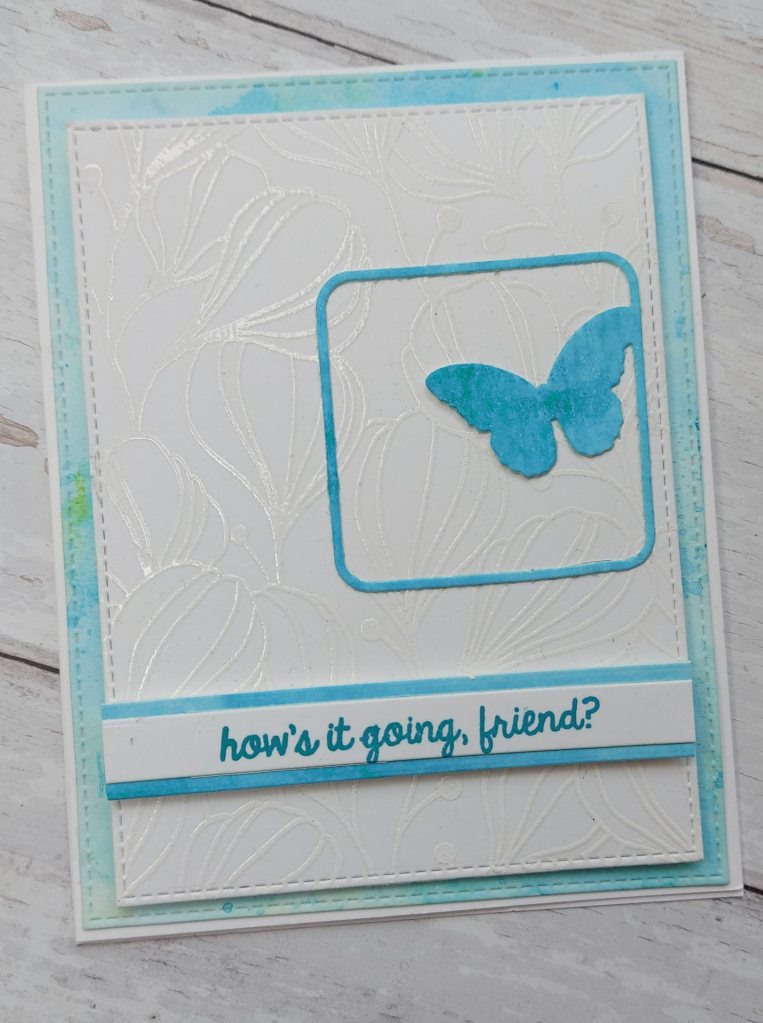
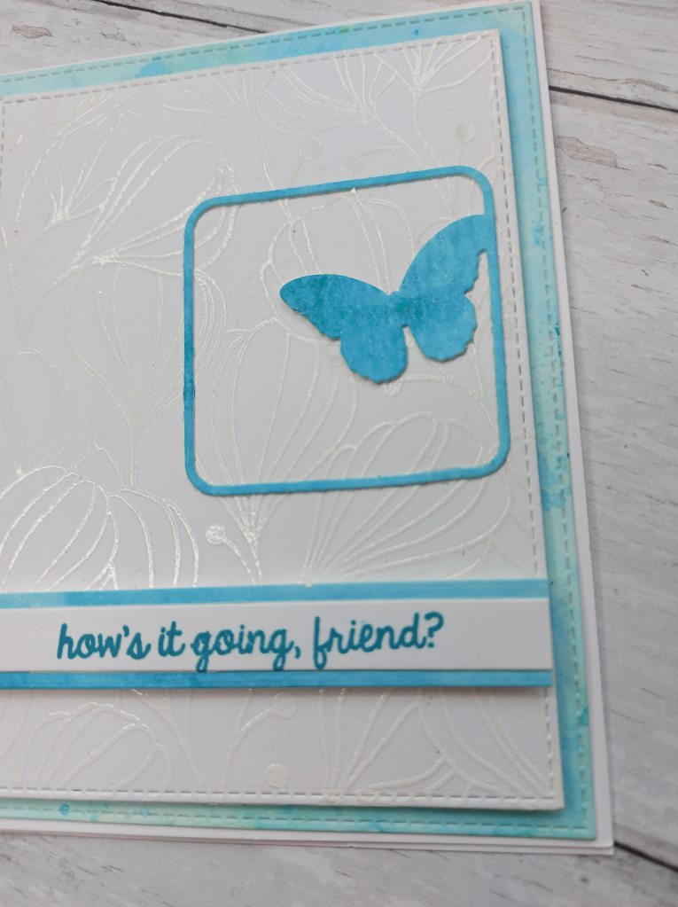
Hello there. I am hosting the new challenge at Cardz 4 Galz, and I chose the theme of ‘Things With Wings’. I chose a very broad subject matter, leaving the choice of what things with wings you wanted to use – as long as it’s towards the girlie genre – you’re good. Here is my card:
The blue background is a water-colour smooshing technique using Distress Inks. It seems to have got a little contaminated with yellow on the edge – but I think it adds a certain interest – and I liked the over-all colour so much I used it anyway.
The square blue butterfly is a die from Simon says stamp, which was cut out of the main panel – I gutted the base blue card, as they say, and the same goes for the blue under the sentiment.
The white card base is one from a previous virtual class, using a Simon Says Stamp red rubber background stamp, where we were heat embossing and then ink smooshing – but this panel was left without anything doing to it, so I used it here as the flowery base for the butterfly.
So – ink smooshed base layer, white heat embossed flower layer, and then the sentiment and butterfly for another layer – and yet it seems so CAS still to me.
I hope you can come and join us with our ‘Things With Wings’ challenge – I look forward to seeing where your creativity takes you. xx
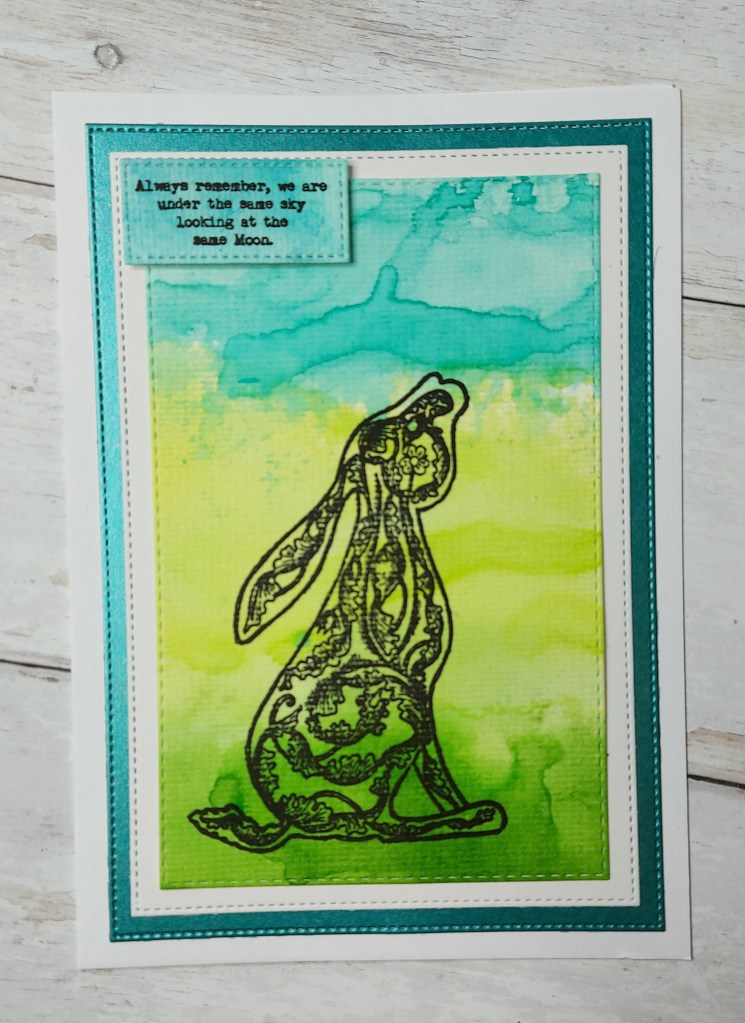
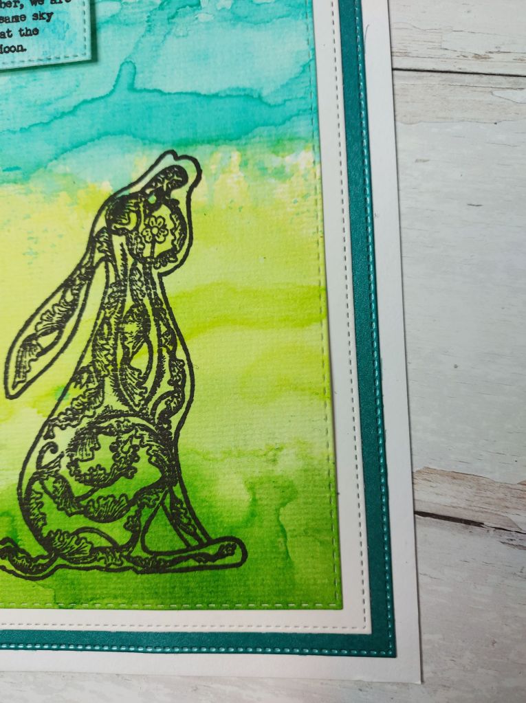
Hello once again. A new challenge is starting at The Alphabet Challenge. Meg is the host and she has chosen the theme of ‘Woodland Flora or Fauna‘ as we have reached the letter ‘W’. Here is my card:
It appears I’ve been in an inky and messy playing mood…..
The image of the hare from Indigo Blu was my first thought for the challenge theme, and I feel lends itself to a more fluid and colourful background as opposed to a clean and simple card.
I used Twisted Citron, Mowed Lawn, and Peacock Feathers in the Distress Ink line – and just went for it! Once the ink was on the glass mat, I added some water, smooshing that card down in there. Sometimes I added water to the card, and sometimes I used a piece of packaging and added to the card that way, so I could control – just a little – where the colour went.
I tried to create some lines within each colour, but tried not to mix the three colours together too much – going for a grass and sky background – if you squint a little I think it works! :)
Anyhoo, once I was happy with the background, and it had dried completely, I then stamped the hare image – using my Misti as I had used the textured side of the water-colour card – and stamped it probably about 3 or 4 times to get a crisp and complete image.
I managed to find some green/teal card with some shine for one of the layers, and stuck them all together as you see.
The sentiment – love this sentiment – is from the same stamp set, stamped onto another piece of water-colour ink smooshing card I didn’t like the look of originally – and added with some foam squares.
I hope you can come and join us, following our theme of course, and I hope to see you in our gallery. xx
Hi there. Boy – when the mojo comes back…..it comes back, doesn’t it? I think my mojo is knocking on my head repeatedly as I’ve got so many ideas in there…….it’s just finding the time to do it!
Before I go to create my card for my Guest Star Stamper for the Color Throwdown Challenge beginning on the 12th September, I wanted to post the cards I made this morning:
I took the colours from the current CAS Colours and Sketches, and made these two variations.
I do like a little inks smooshing, so I took the Night of Navy and my version of Gorgeous Grape – I don’t have that colour so used a Zig instead – and smooshed two panels. I die cut them using a Catherine Pooler die, which is a favourite of mine.
After I had stamped and heat embossed the flowers and leaves, I used the three colours to water-colour them, but left the prickly leaf without colour.
I had a play with the layout and that’s where the sketch from CAS(E) This Sketch came in.
I couldn’t decide which card I preferred so I am showing them both – does anyone have a preference?
The sentiment is from a Concord and 9th stamp set.
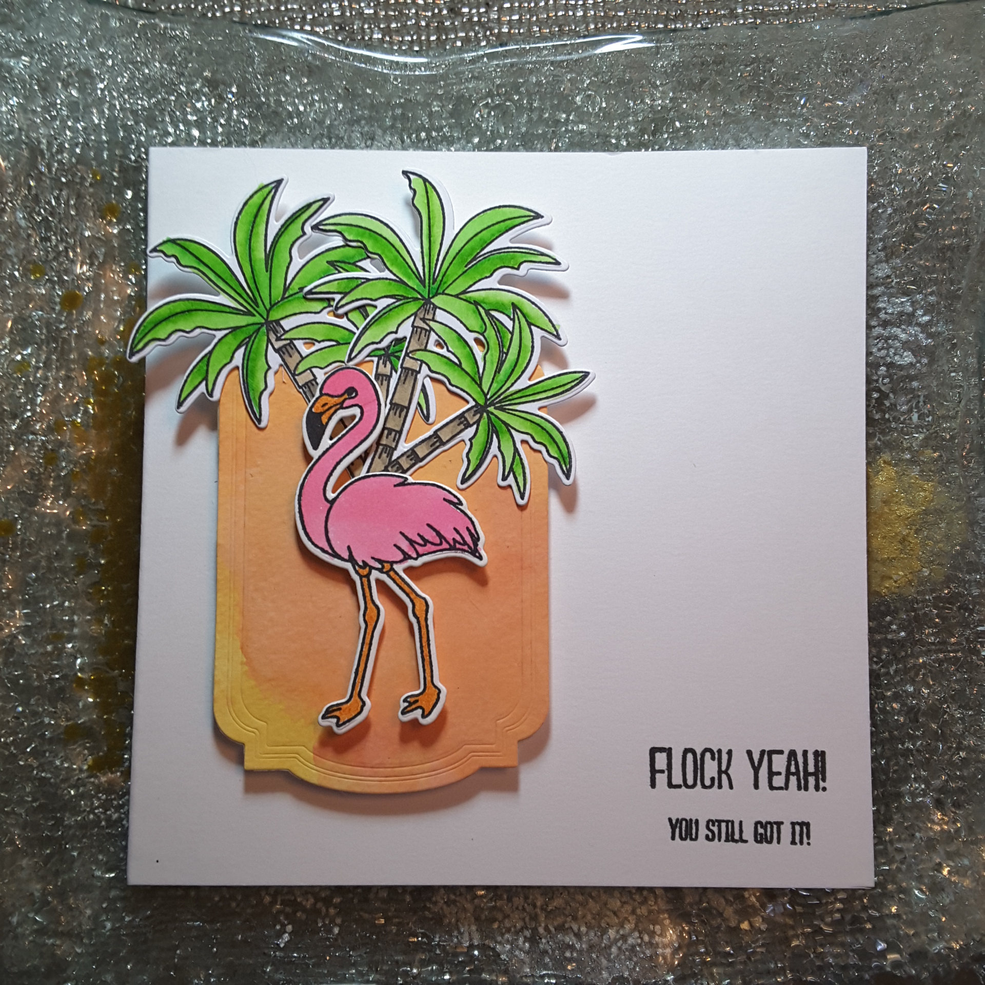
Hello there. As I am working tomorrow, and England has another football game tomorrow evening, I don’t think I’ll have time to craft – you never know. Here is a card I made to enter two challenges:
I took my Distress Oxides and ink smooshed and water-coloured a piece of water-colour card. I wanted to have colours which wouldn’t over-power the flamingo pink, nor the vibrant green of the palm trees.
I took the sketch inspiration from CAS(E) This Sketch and die cut the banner/tag using a Catherine Pooler die, took the flamingo and trees from W Plus 9 ‘Flock Yeah‘, water-coloured them with my zigs, and arranged as you see.
The sentiment is from the same stamp set.
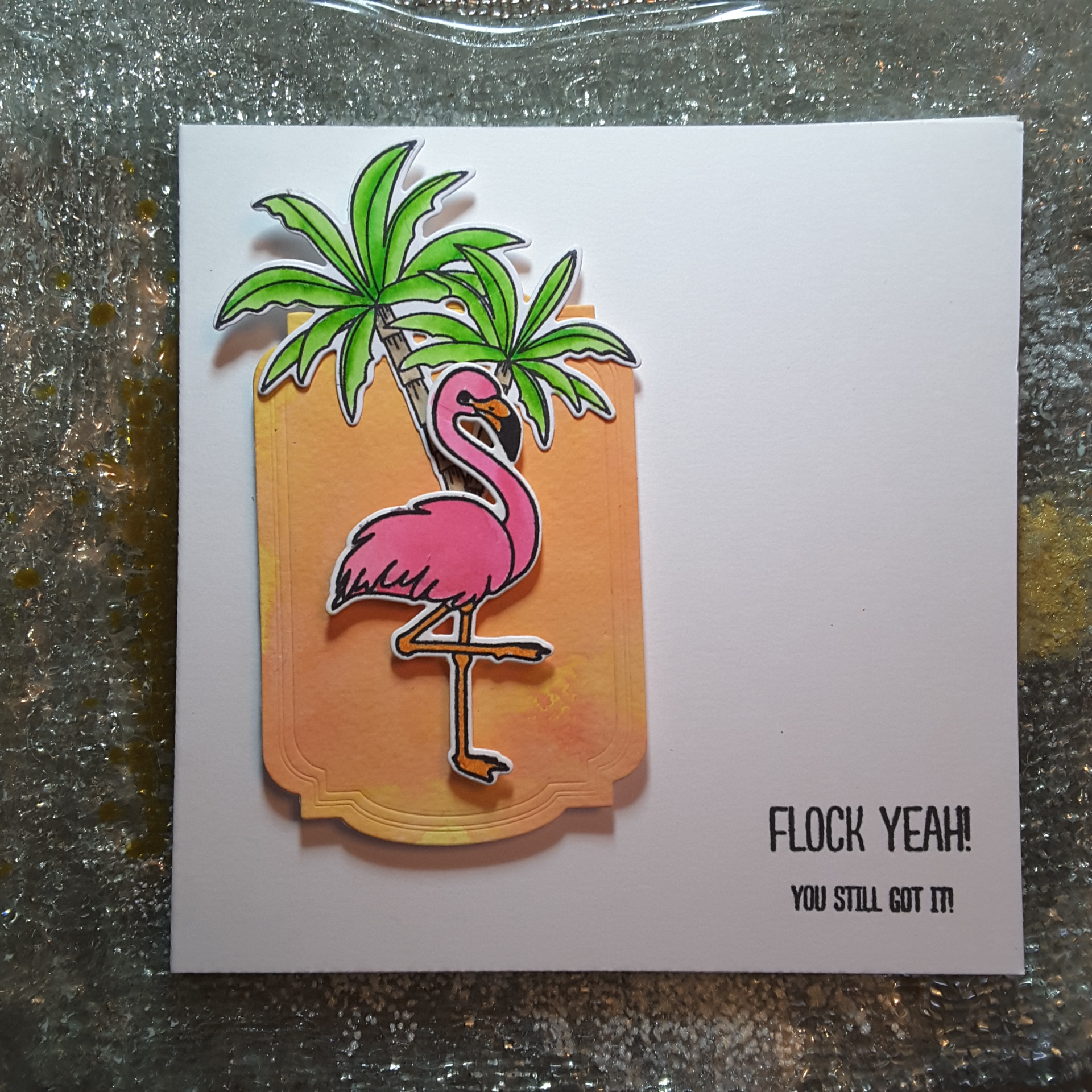
Here is another version:
I have mentioned before that I struggle with clean and simple cards, but I really think I’m growing in that department. I think the key is to take inspiration from other card makers and challenges – I still like to make a card that is ‘full-on’ – but am actually enjoying my clean and simple journey.
Hello again. I am posting this card early today, as I want to settle down and watch the build-up to ‘The Wedding’. I may not have time to craft until later, so I wanted to get in early.
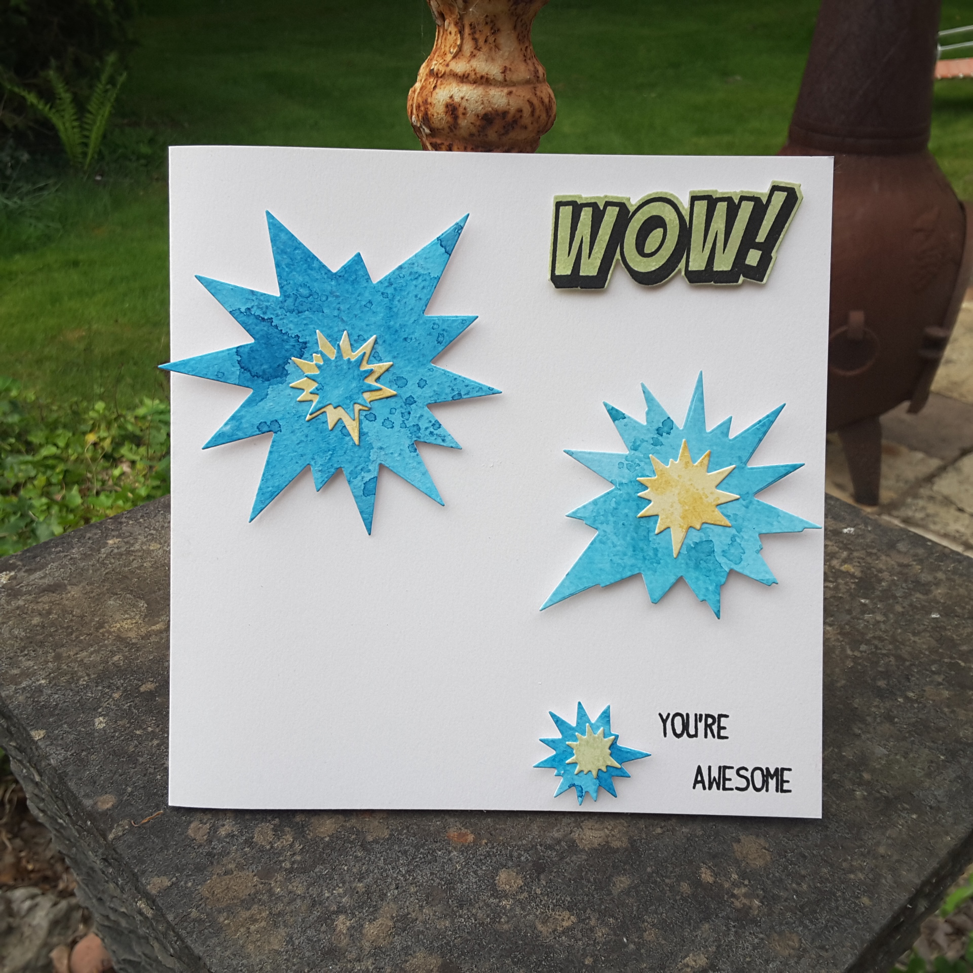
This card is inspired by the colours from CAS Colours and Sketches, and using my new purchase from Uniko. I have had this stamp set for a while, but Bev has just released the matching dies – so here we are.
I ink smooshed some ‘Pacific Point’ onto my Tim Holtz glass mat, and ran some water-colour card through it. I did this yesterday, whilst my hands were still mucky from the ink smooshing I did for the previous card – the Peony Dream 3D. I didn’t totally wet the card down, nor add too much water to the ink, as I wanted some of the card texture to come through.
I then ink smooshed some of the ‘So Saffron‘ and ‘Pear Pizzazz‘ so I could die cut the explosions out and layer them together.
The sentiments are from the same stamp set, also with the matching die around the ‘WOW’.
I seem to be making some encouragement cards recently, and aren’t they great to have in your stash? I think this card also looks quite masculine, which I struggle to make generally.
I shall also be entering the anything goes challenge with QKR Stampede.
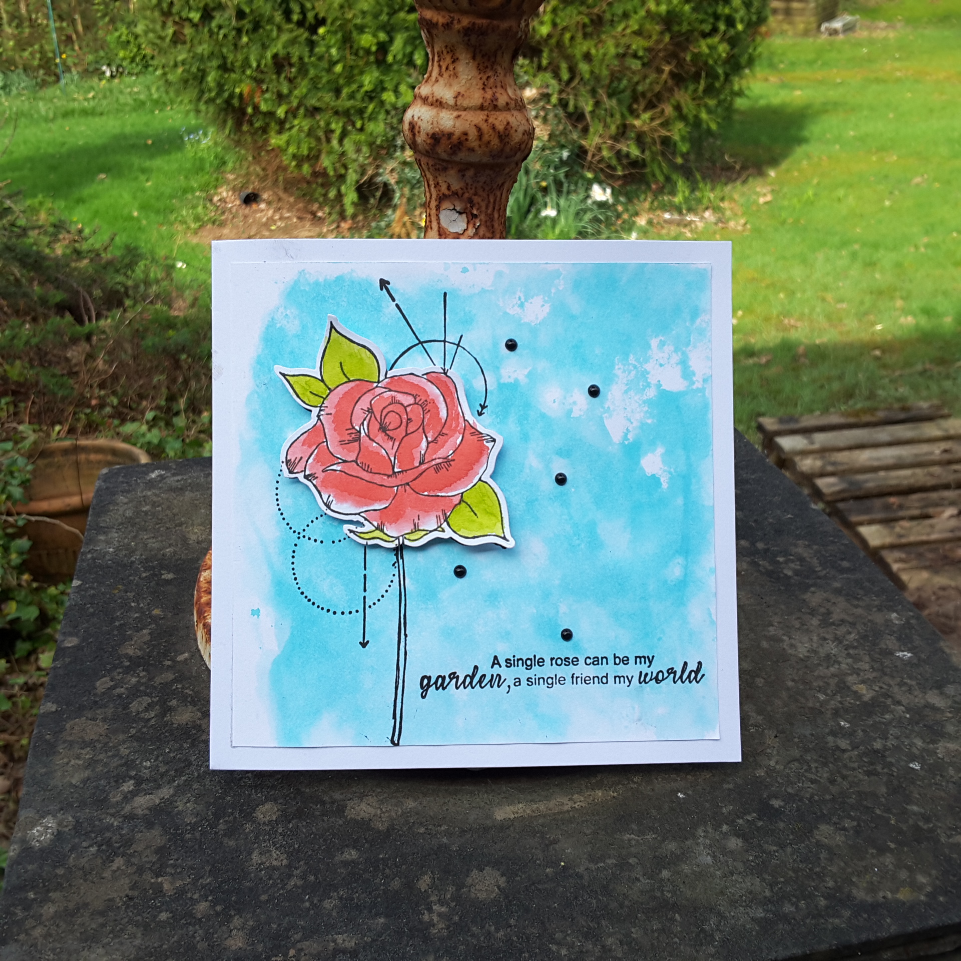
Hello all. I had a few days last week where my mojo left me, but then I had a delivery from Create and Craft of the latest Stamps By Me release – stamps and dies. So – my mojo arrived back – and boy did it arrive back……I created 5 – yes, 5!! – cards yesterday, and this is one of them. I didn’t want to overload the blog, so I will be posting the rest over the next few days.
They were all created taking inspiration from current challenges, and I started this card using the colours from Hand Stamped Sentiments, with the theme being Natures Beauty from Try It On Tuesday – which certainly matched all the new stamps and dies which arrived.
I began by using my Tim Holtz glass mat yet again, laying down some blue from Catherine Pooler (my Stampin Up Soft Sky has seen better days!), adding a spritz of water, and running some water-colour card through it.
Whilst that was drying, I stamped the rose, and water-coloured it with Flirty Flamingo and Lemon Lime Twist, letting one layer dry, before adding a second layer for some darker areas on the flower and rose.
After the blue background was dry, I stamped the main rose image, which has some drawings and circles with it, then added the die cut rose on top. A sentiment from the same stamp set, stuck onto a white base card, and some black Nuvo drops, and the card was done.