Hello – just nipping in to share a CAS card for a couple of challenges. I have been thinking about both of these for quite a few days – and whilst browsing through the CML app came across a couple of Clearly Besotted stamp sets I thought would work perfectly:
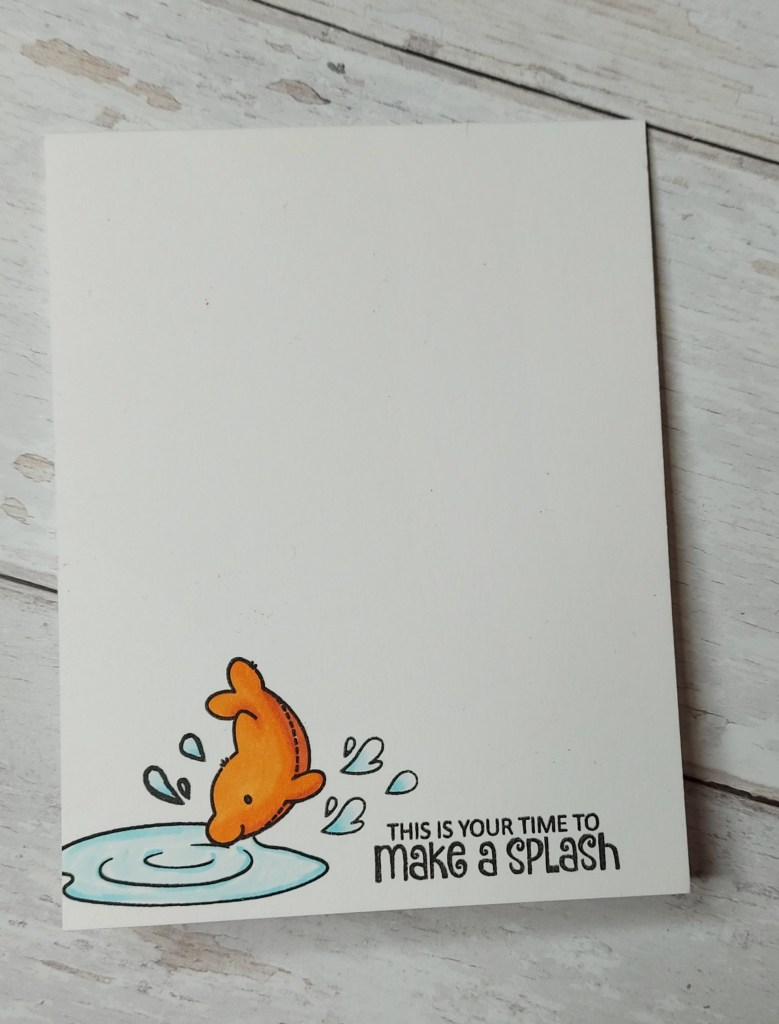
I wanted it to look like the dolphin wash diving into a pool of water, so as this needed just a tiny bit of masking, I stamped the dolphin first, masked the little nose off, then stamped the puddle.
The sentiment and little splashes were added, and all coloured with Copics to match the colour challenge.
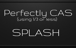
A CAS card for someone who has recently had promotion, and a little encouragement for them.
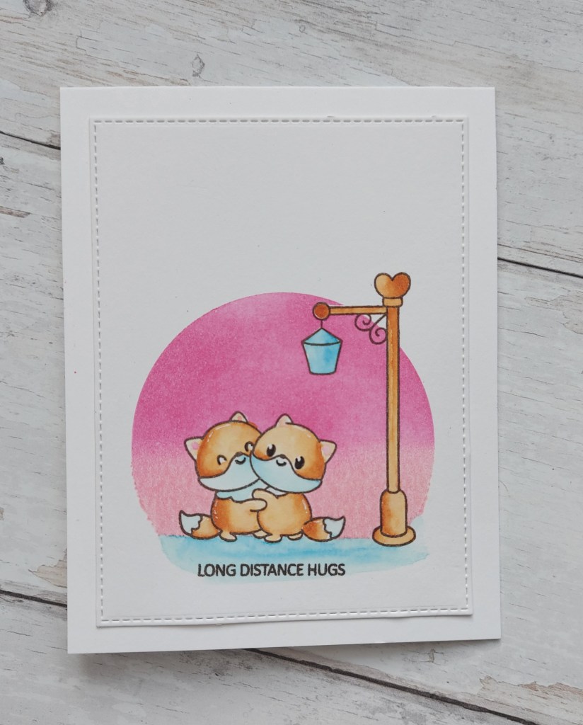
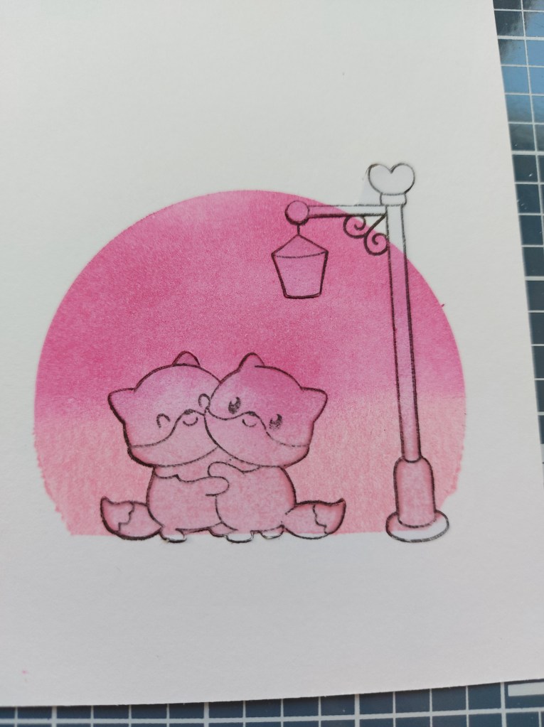
Hello there. I have a CAS card to share today using masking, water-colouring, ink blending, stamping:
It took me a while, and a lot of thinking, on how to create this card. I knew I wanted to use this stamp set, knew I wanted some ink blending, knew I would need to do some masking – but once I had decided what needed to be stamped and ink blended in which order – off I went.
I’ve tried a ‘gallery’ setting to demonstrate the process – does it work ok?
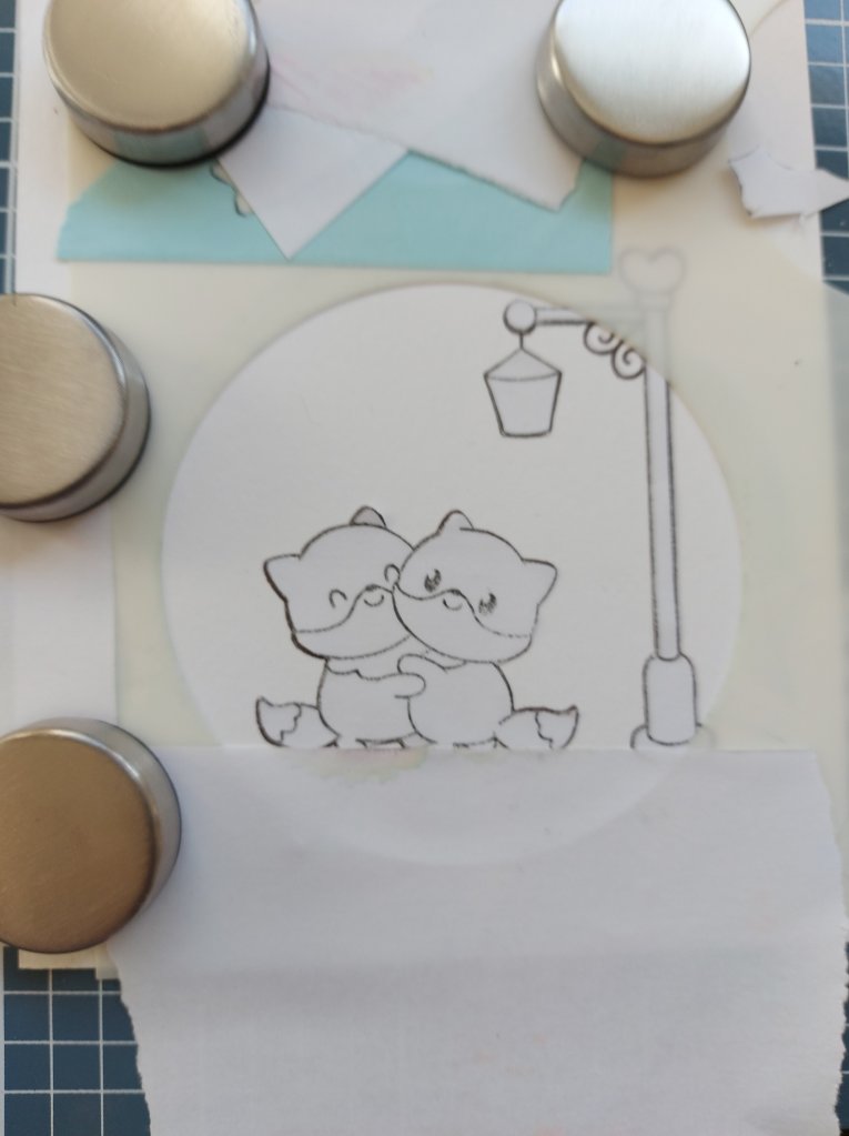
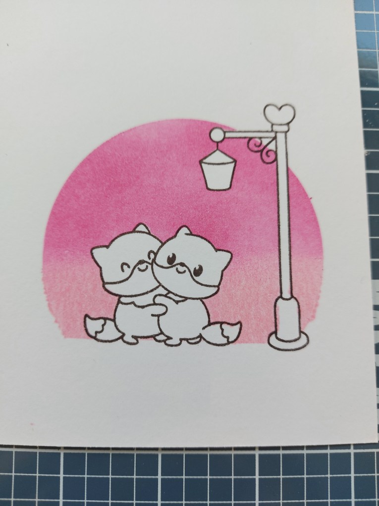
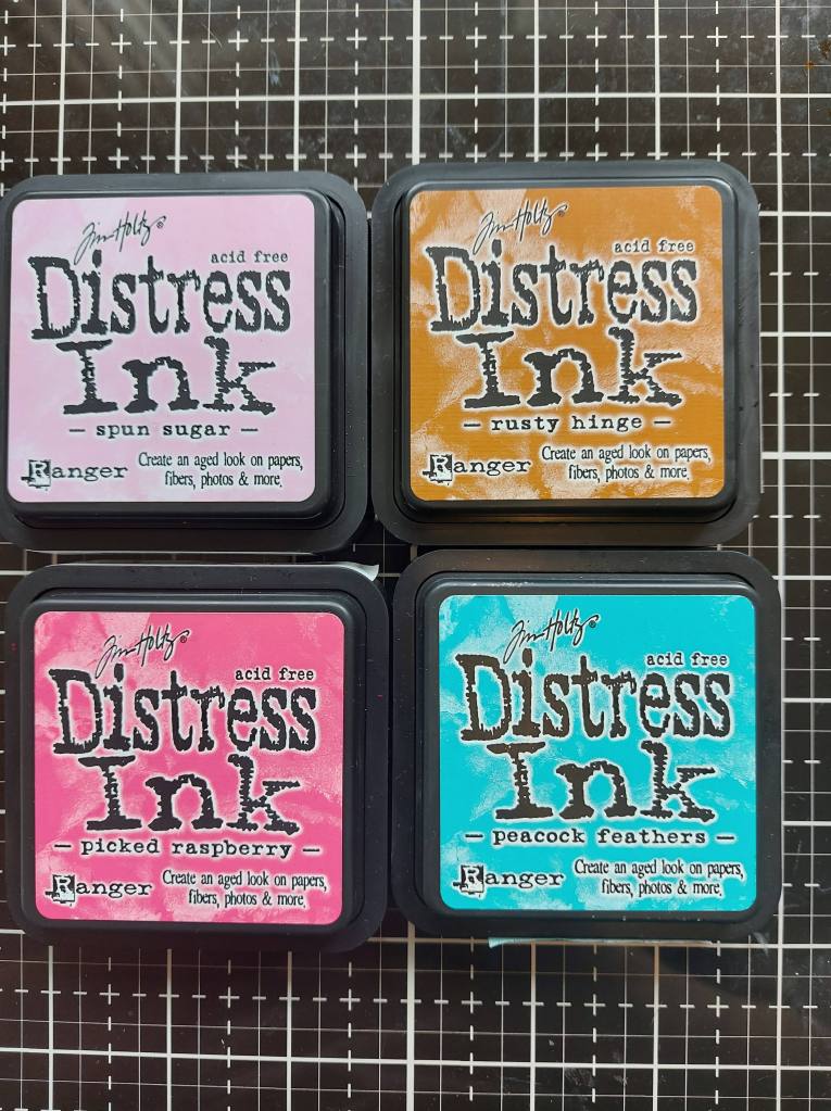
I first stamped the fox and light images onto Distress Water-color card stock – smooth side – using Gina K Amalgam ink, stamped again and created a mask for the images, Then a circle stencil added from Honey Bee Stamps, lots of masking tape so I didn’t go outside the circle, ink blended Spun Sugar then Picked Raspberry, and removed the masks to reveal the images again. I always love that part – especially when it works!
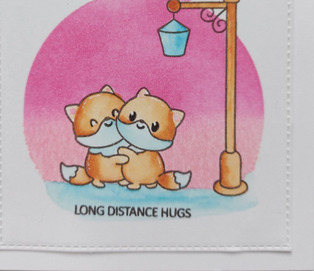
I dried that with the Ranger Heat Tool – I was ‘Jennabled’ by Jenn Shurkus after doing a few of her online classes. The use of Distress Inks again for colouring, and the use of the heat tool – well worth it. I can’t seem to stop using them. I then used the other two colours of Distress Ink to water-colour the images.
After drying the water-colouring again, I stamped the sentiment which comes in the same stamp set.
I currently like to send ‘just because’ cards, as we haven’t been able to meet our friends for quite a while. I have found that making these kinds of cards helps me to have a reason to create, and also sends just a little bit of love and best wishes.
Hello once again. The Alphabet Challenge has started a new challenge with a new theme. We have reached the letter ‘X’, and Debbie has chosen the theme as ‘Xtra Folds’. Here is my card:
This card took quite a lot of work to put together, but I am pleased with the outcome.
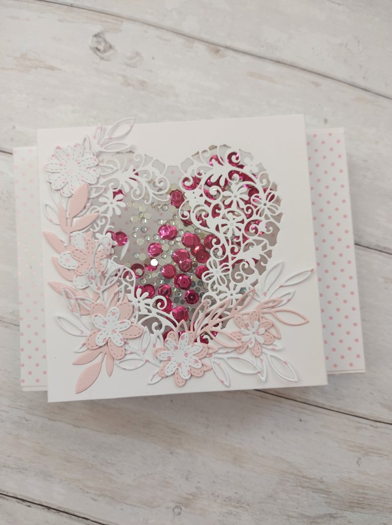
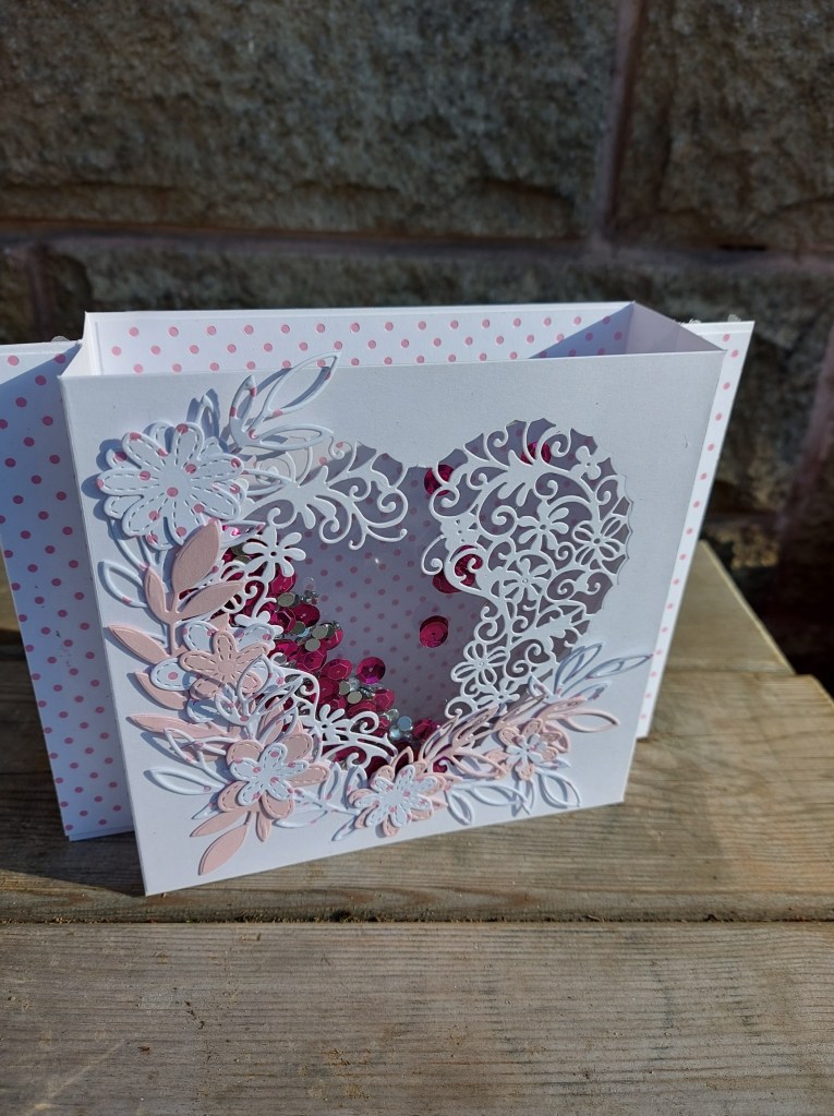
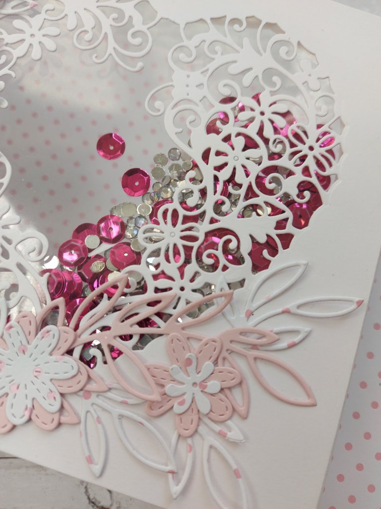
I used a diorama card base, and from the front panel I die cut a floral heart. This die set is from Crafters Companion I have had for absolutely ages, and ‘found’ it when I was once again sorting through some of my stash.
The leaves and flowers are from MFT, some die cut from the same pink floral dotty background card, and some from a light pink card stock from Concord & 9th.
I added some acetate to the back of the floral heart so they would be supported, and at this point I decided to make it into a shaker card – me, making a shaker card…………wonders never cease!
I used another of the layering heart dies form the same set, cut another piece of acetate, used Heffy Doodle foam tape, some pink and clear sparkly thingies, and there we have it – a diorama shaker card.
For the sentiment, I think I’ll add something to the back of the card – or maybe write something special for mum-in-law for Mother’s Day next month.
I hope you can come and join us for our ‘Xtra Folds’ challenge – I look forward to seeing what Xtra folds you create. xx
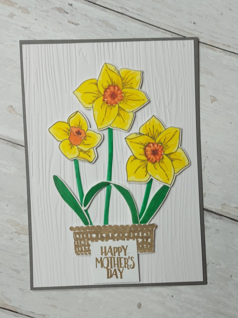
Hello there. I hope you are doing well. Cardz 4 Galz has started a new challenge, and the theme this time has been chosen by our esteemed leader – Caz – as ‘Mother’s Day (UK) or a card for a special lady‘. Here is my card:
Mother’s Day in the UK is 14th March this year, which is why I chose this theme. Mum’s birthday is also in March – but that card is already made.
Mum has always liked daffodils, they are her favourite flower – that yellow sunshine in the spring.
I used Altenew ‘Build-a-flower Daffodil’, Altenew inks, and layered them onto a wood grain effect piece of embossed card, once cut using the matching dies.
I went with the traditional daffodil colours – yellow with darker orange centres, and added a stamped and fussy-cut basket from Card-io stamps to ground them in. The sentiment is from a Catherine Pooler stamp set.
I hope you can join us with our chosen theme this time round – I look forward to seeing your creations. xx
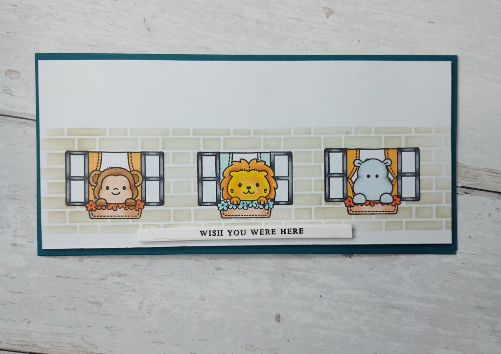
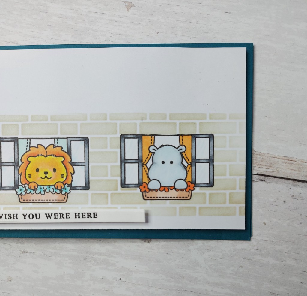
Hello there. I have another slimline card to share today, using a selection of Clearly Besotted stamps, a stencil, and some masking:
This card took a little planning and a little measuring before I even began adding the images. I picked the size of my card base, then measured the size of the window stamp to try and place this evenly across the bottom, marking with a pencil the outline of each window. I then stamped each of the jungle animals, created a mask for each of them, then stamped each window.
Before colouring, just in case I messed this part up, then masked each window off, and used a brick stencil to create a little wall scene.
I tried to keep the colours quite simple – varying between the flowers, the animal, and the curtains, to try and create some cohesiveness – the flowers being the same colour but slightly darker than the curtains, adding a strip sentiment once all was done.
I’m missing company, missing nipping round to someone’s house for a coffee and natter – and having them nip round to mine. Hopefully, we can start to do those things again in a few weeks – it’s the simple things like this which get to me more than actually going out and about…..
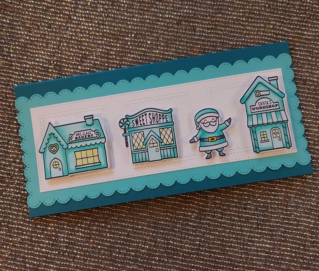
For this card, everything except the dark teal card base – and the colouring – is from Heffy Doodle. The images from ‘Santa’s Village‘. Even though I stamped most of the images in the set, these four were the one’s I chose for the card. Once coloured with Copics, and die-cut with the matching dies, I set them to one side to create the base card and layers.
Very simply, the scalloped layer is from Heffy Doodle ‘slimline pull tab’ die set, and the white layer is Heffy Doodle ‘stitched slimline trio’. The base card is pre-cut and scored, from Papermill Direct, and having the scalloped layer being at that exact size length-wise meant there was no border at the sides, but a good border top and bottom.
I quite like the look, which is why I chose a darker more obvious base-card – instead of trying to hide it – we have to use our stash, don’t we?
I decided to keep the square die-cuts inside each window – not even raising them up or even raising the frame – liking the clean look it gives with just that pattern around each square. No ink-blending, no splatters – just a clean almost monochromatic look.
I went searching for a suitable sentiment – the correct size etc – but decided not to put one on the front, and left it as you see.
I hope you can come and join us – anything goes Christmas/festive – and I look forward to seeing you in our gallery. xx
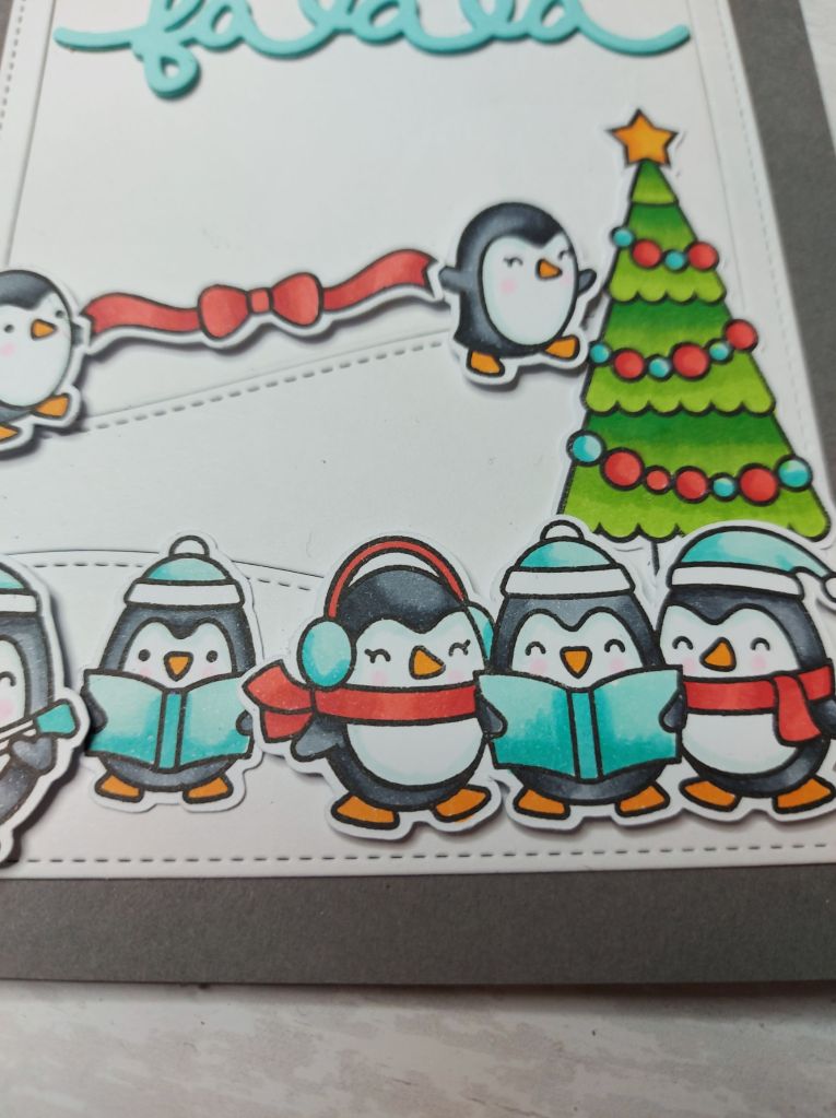
Hello. Once again there is a new challenge at ABC Christmas Challenge. We are at ‘C’ and ‘D’ and we want to see your Christmas creations with ‘Christmas Carols‘ and/or ‘Diamonds’ (diamond, diamante, diamond glitter etc). Here is my card – ‘C’ for Carols:
I decided to go with a scene this time, using a lot of penguins. Once stamped, coloured and die cut, the little penguins were put to one side whilst I thought about the scene. I also used a Christmas tree from another stamp set, and that little ribbon with the bow? It’s supposed to be over a mantle, but I decided to use it for the two penguins to carry between them, heading for the Christmas tree.
Don’t you love how a person’s mind can work sometimes?
Using Lawn Fawn ‘Stitched Hillside Backdrop’ I kept it all white, and added to a grey card base, then attached each element as you see.
The sentiment is layered three times – not stamped, just the die-cut.
I had fun putting this caroling scene together, sometimes the mojo just happens.
I hope you can come and join us, we’d like to see your Christmas projects following our two themes – or both themes if you wish – I look forward to seeing your creations. xx
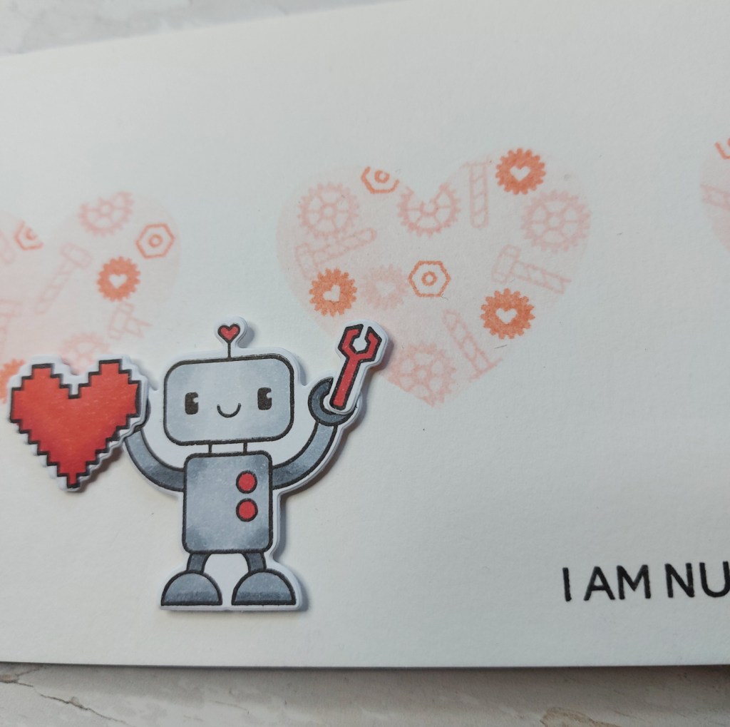
A new CAS Challenge has begun at Happy Little Stampers. The theme for this month is ‘Love is in the air‘. Here is my card:
Quite a bit of thought went into this card. I wanted to make a slimline card, and knew I wanted to use the ‘Bots of Love’ from Heffy Doodle – I even stamped all three robot images and coloured them, thinking I wanted to add all three. Instead, I made what you see here.
The white base card and hearts were created by using Lawn Fawn ‘Scalloped Slimline with Hearts’, but creating a mask of the the three hearts – I just die-cut the masking paper.
Then, I stamped quite a few of the little cog and bolts images from the stamp set in a couple of Concord & 9th inks, then ink blended the hearts for them to show a little more against the white background.
When I had stamped the sentiment, I was playing around with placement of the robots, but found they covered quite a lot of the hearts, so I used the one you see – adding a spanner and a heart to him.
I hope you can come and join us, and I look forward to seeing you in our gallery – the team has made quite a few ‘loving’ themed cards. xx
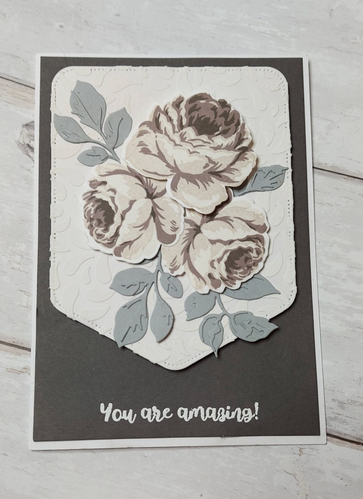
Hello, I have a floral monochrome card to share today, using one of my favourite layering stamp sets from Altenew:
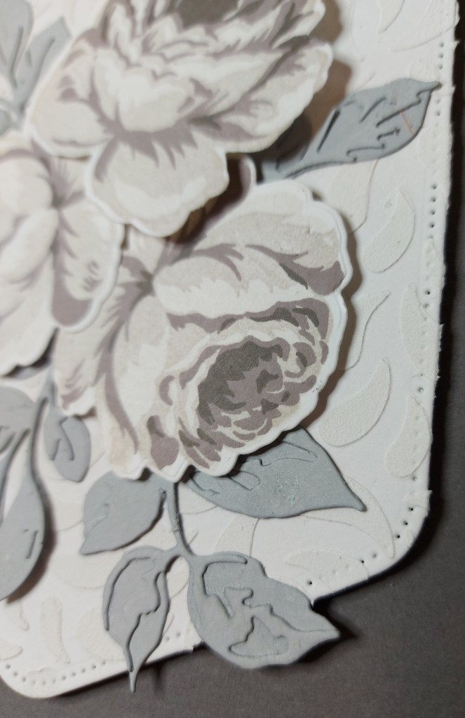
I stamped and layered the inks using a grey ink set from Altenew – actually I used two grey inks sets – not sure whether I wanted a completely grey/grey or a more warm grey – and looking at this photo, they look a little browny/grey………………hmmm…….yet on the close-up photo they look different again:
Anyhoo – once stamped and die cut, I set them aside to think about my base layers.
The base card is white, with a darker grey layer – ‘mushroom’ from Concord & 9th – then when adding the flowers I felt they got a little lost, so I used the ‘Pocket Banner‘ from Altenew, and added some interest to the white of that with a stencil and some Altenew embossing paste.
I did toy with the ide of adding some grey ink to the whit paste – but I like the white-on-white look for this banner, letting the roses stand out more.
Once this had dried I started to place the roses and stamped leaves down – I didn’t like the look of the stamped leaves, so I turned to Altenew ‘Garden Picks 3D die set’ for the layered leaves, and some ‘Dove’ card-stock from Concord & 9th.
Once again, I left the sentiment until last, but this time I remembered to do the stamping and embossing BEFORE I stuck everything down – something I usually forget!
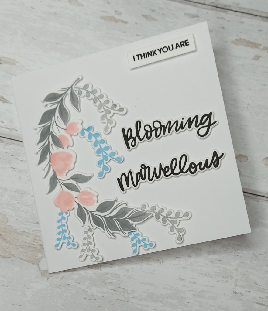
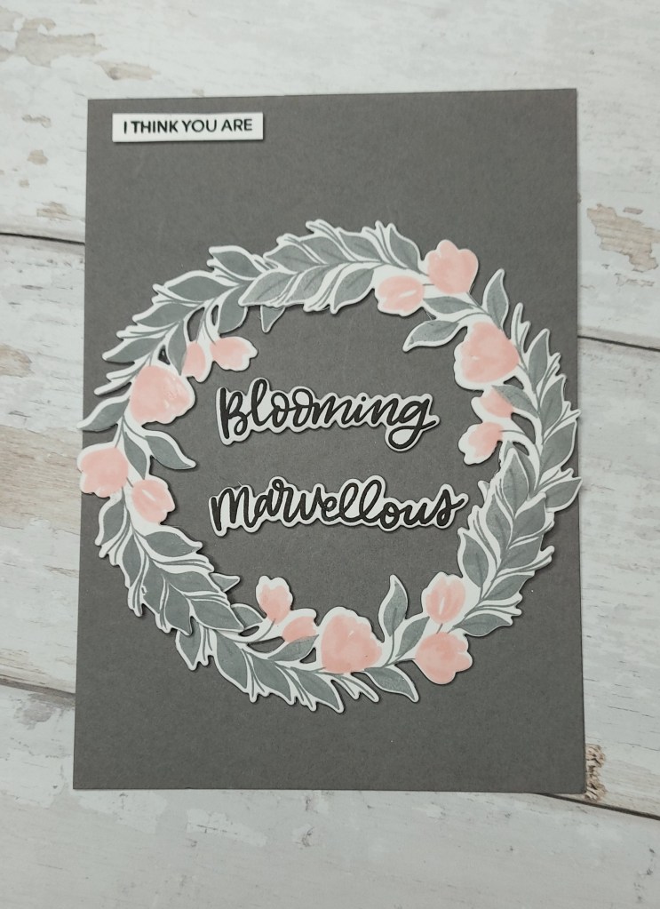
Hello once again. I have a couple of cards to share, made for a couple of friends who are blooming marvellous and achieved great things – even at this difficult time:
They have both been working full time and more, on the front-line, and have just both completed their Masters level to become Advance Nurse Practitioners – Whoop Whoop! They joined my team a couple of years ago, and to say they are an absolute breath of fresh air would be an understatement. Fabulous girls, both with such a positive attitude, they are a ray of light and it’s always a pleasure when I manage to see them.
I started with the grey card, and stamped the Pinkfresh Studio ‘Curvy Floral Vine‘ four times – I wasn’t sure how many of them I would need – and arranged three of them in a wreath. The vines themselves are stamped using Concord & 9th ink cubes – a grey for the vines – double stamping the centre of the vine to get a slightly darker grey, and the flowers were stamped with a light pink – double stamped for the flowers, then triple stamped the same colour to get the second layer of the flowers for some dimension.
The sentiment is from Heffy Doodle – big and bold – just so they get the message!
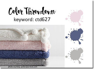
This was the card I was going to enter into the Color Throwdown challenge but I tried the light blue against the grey background with the vine – and it just didn’t seem to work – hence on to the white card base…….
The card with the white card base is using one of the floral vines, and I also added some light blue and light grey foliage from the same Heffy Doodle set which had the sentiment – again I went big and bold with it for dramatic effect.
I love when I have a good and positive reason to make cards for specific people – both the cards came together quite easily – maybe to mojo needs a reason to become active.