Starry Flowers

20180605_183301

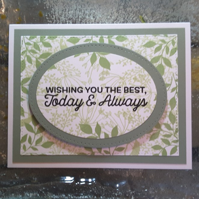
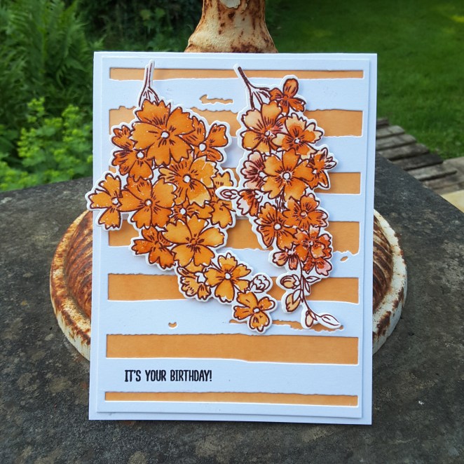
Hell again. I have been water-colouring and ink smooshing and die-cutting…..phew. Great day!

20180605_183312

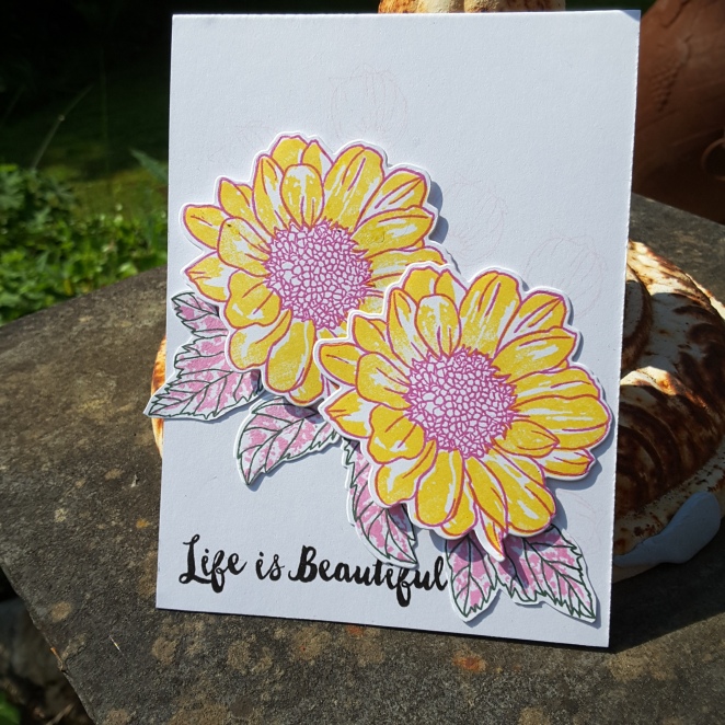
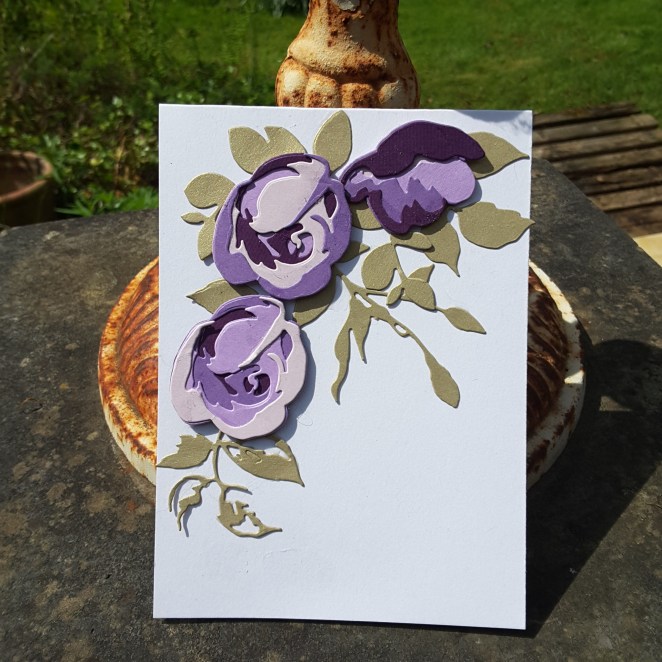
I used the Stampin Up ‘Peekaboo Peach‘ on some water-colour card. Well, I wet the card, put the ink on a large acrylic block, wet the block and just put it down on the wet card. I waited 5 minutes or so, then lifted the block up.

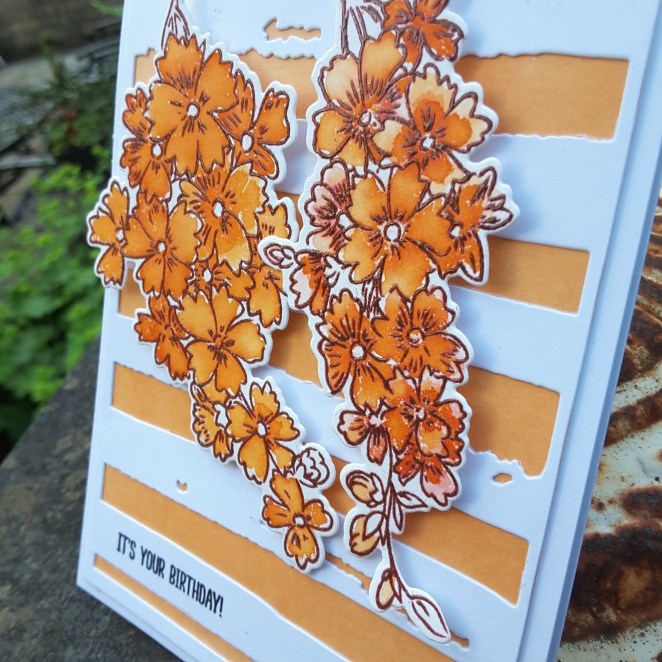
I was going for a more uneven look, but when I saw the ink was quite even – I liked the colour. I didn’t mess with it, just let it dry. Whilst it was drying, I stamped the flowers in Catherine Pooler ‘Peppermint Scrub‘ and heat embossed over that outline with a clear embossing powder. I didn’t want the ink to move outside each flower when I water-coloured it, and I didn’t want black for the outline – a more colourful outline was needed here.

I used the ‘Peekaboo Peach’ again for the water-colouring, adding one layer, letting it dry, then going in again for some darkness near the centre of each flower.

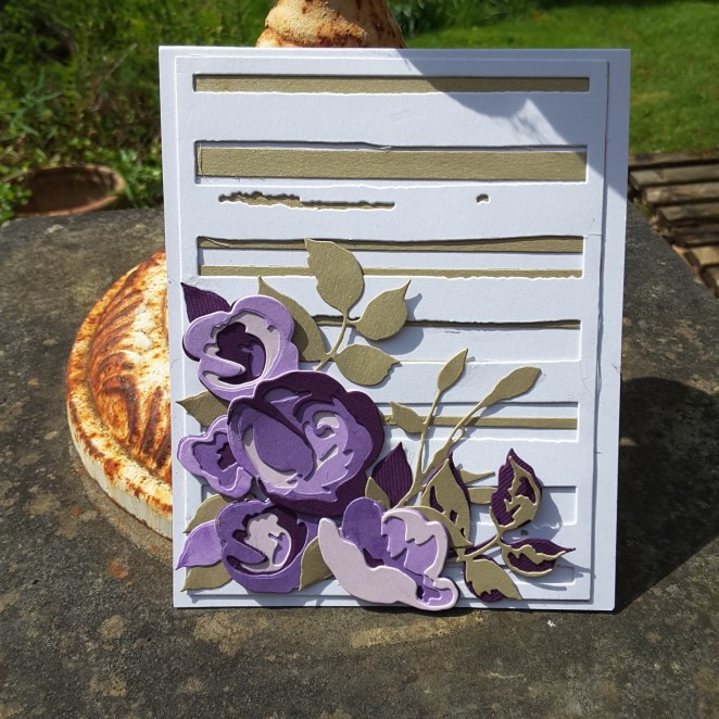
And whilst this was drying – I can be impatient so I need to do things – I die-cut the Altenew water-colour stripes cover die, and then set-to putting my card together. Well – I did wait a few hours so things dried well and naturally. I find that heat setting it tends to reduce the intensity of the ink. I had to find something to do….so I made tea. :)

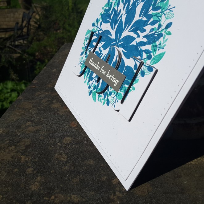
The sentiment is from my new purchase (Seven Hills Crafts – again) and I will be playing with that stamp set in the next few days. (‘Flock yeah‘ from W Plus 9)

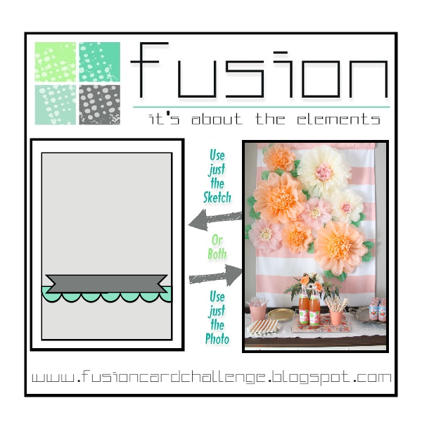
The layout of the card is inspired by the current Fusion Card Challenge, but I didn’t use the sketch this time, just the photo inspiration.

This card also ties in with the current challenge at As You Like it. This challenge is to say flora or fauna – and why….I do have some animal stamps, I play with them a little, but my choice is flowers – any day of the week. I find them so much more versatile, any colours can be used, in any format and layout – it just seems to work. Clean and simple, or more elaborate – flowers all the way! (and I have three cats, too)

One layer card

20180603_150608

Hi there. Despite going out this morning to a craft show in Doncaster – no, I didn’t really buy much! – I have had some time to craft.

I was inspired by the one layer card theme from Simply Less Is More, and the colours from Pinspirational.

I struggle with one layer cards. I like layers I can play around with, and I don’t really like masking – probably because I don’t always succeed with the masking. I still persevere, though, and watch numerous hints and tips on YouTube.

I either cut the mask too big, so there is white space between the flower and leaves, or I cut it too small, and the inks overlap – yep, despite having the matching dies as well. Who knew?

This flower is a recent purchase from Seven Hills Crafts, and I couldn’t wait to start stamping with it. I actually didn’t realise until I started, that there is actually seven layers to this flower. Seven – I repeat – seven!! The main flower image is four layers, and the layers I have stamped in blue are another three layers. Thank goodness for my Altenew inks…..!

There isn’t an outline layer for this flower, but I think it isn’t always necessary anyway, and gives a more muted look to the flower.

The green inks are – obviously – Altenew also, but the sentiment is from a Stamps By Me stamps set. I really like the sentiments that Toni puts on her stamp sets, as they are very versatile. The fonts are great, and stamp very well.

I’ll be opening up my purchases from today, and having a go with them later, so I am sure you will get to see what I purchased this morning.

The challenges I will be entering with this card:

Less Is Moreone layer card, thinking of you

Pinspirationalphoto inspiration

Layered Rose and Garden Silhouette

20180602_111723

Hello there. I have been doing some more die-cutting, finally utilising my 3D dies from Altenew. This set is the Layered Rose, and I teamed it up with a gold embossed background script stamp from Uniko.

The colours are inspired from the latest colour challenge from Color Throwdown. Here is a little close-up of it, where I tried to capture the embossing shine, and the shine from the gold card: (It’s a very murky and rainy day here at the moment)

20180602_111729

I shall be entering the following challenges with this card:

Color ThrowdownNavy, Burgundy, Gold

4 Crafty Chicksanything goes

Pause, Dream Enjoy ChallengesFlowers

The next couple of cards I used my new stamp set from Altenew – the Garden Silhouette:

20180602_101430

20180602_101445

This stamp set has quite a few images on it – not layering – but I am liking the patchy vase images.

I kept this card clean and simple, but used the colours and the sketch from the current challenge at CAS Colours and Sketches. I ink blended the Tangelo Twist and the Hello Honey for the background. I also heat embossed the grey vase with clear embossing powder twice, and heat embossed the flowers just the once.

20180602_101518

I shall be entering this second card into the following challenges:

CAS Colours and Sketchessketch and Hello Honey, Going Grey, Tangelo Twist

Addicted to Stamps and MoreClean and simple


Green background

20180530_194453

Hi there. I seem to be on somewhat of a roll at the moment. I had some time after work today, and was inspired to make this card. I took the photo inspiration from Inkspirational to create my own background, using some leaf and greenery stamps from MFT. The leaves are from two stamp sets – Exquisite Ocean and Sketchy Flowers, and stamped in two of the Altenew green inks.

I wanted to create a fullness in the card, with some dimension using the different greens, and I think I managed to do that.

Once I had stamped the whole card, I die cut the centre using a Sue Wilson oval die from a Christmas set, and a slightly larger oval from the same set in an almost olive green. I didn’t try to match the green completely, but also didn’t want to have a bright green. This green card was just sitting there when I looked through my stash.

The sentiment is also from MFT – a freebie from Seven Hills Crafts a while ago, and I turn to this stamp set all the time.

I’m sorry for the photo, but it is taken inside, and trying to capture this in the evening of a grey and murky day – despite using a lamp – wasn’t easy…..

I shall be entering the following challenges:

Inkspirationalphoto inspiration

Tuesday Throwdowncreate your own background

Watercooler Wednesday Challengesanything goes

Simon Says Stamp Wednesday Challengeanything goes

a couple of pictures of the stamp sets:


It’s been playtime….

Hello there. It’s been a few days since I last posted. It’s been Bank Holiday weekend here, and I took mum and dad to visit family in Bristol at the last minute. No crafting time when down there, so I have taken to my craft room today and created three very different cards, for different challenges.

This first card is for the current challenge at CAS on Sunday, and CASology:

20180529_154054

The theme for CAS on Sunday is CAS birthday card, and the theme for CASology is ‘squiggle’. SO, out came my new Catherine Pooler Stamp of Approval box, my Catherine Pooler inks, and this is what I created.

The second card is for the current Just Add Ink challenge:

20180529_154011

This was for the photo challenge, and I took the colours of teal and red/pink to create this card. I used the Altenew Doodled Lace Cover die, cut it out of white, then cut it again out of the teal, and again out of the pink. I then took my scissors and snipped parts of the coloured die cuts, and stuck them down onto the white die cut.

The background is a teal coloured Centura Pearl, and the sentiment is from an MFT stamp set.

The third card:

20180529_154037

was inspired from the current challenges at Just Us Girls photo inspiration, and Aud Sentimentssummer and a sentiment. I know the stamp is called Spring Daisy – but I still think it’s summer when they are around……..

I stamped the outline of the flowers in a pink colour, and the inside in yellow, whereas the leaves I reversed it, and stamped outline in green, and the inner parts of them in the pink colour. I wanted some more difference between the flowers and the background. I also stamped one of the smaller images in the background for an added ‘something’…….erm…….you can’t really tell I stamped them upside down, can you?! (Maybe I shouldn’t have said anything)

After a long weekend, I am back at work tomorrow, maybe some later days, but I will try and find time to do some crafting.

:)

Gilded butterfly

Hi there. I haven’t posted for a few days, but I now have several days off work, with very little planned, so I should be able to find time to craft. The past few days I have been crafting, but have you had a time when you have so many ideas going round your head that you can’t actually settle on one thing? That has been me.

I started one idea for one card, then something distracted me and I went onto another card – I had four cards on the go at once…..but I didn’t know how I was going to finish any of them off.

Here is one I completed today:

20180525_162721

A close up of the Butterfly:


20180525_162725

I took some double sided sticky sheet and added some gilding flakes, then die cut the butterfly. The white embossing is a tonic die – I seem to be embossing dies at the moment – and put onto a gold card to tie-in with the butterfly.

Actually quite a simple card – but it seemed to take me forever to get my head around it!

I shall be entering the following challenges:

Always Fun Challengesanything goes

4 crafty Chicksanything goes (not using the twist of masculine birthday)

Stamplorations CASthings with wings

Eclipse cards

Hello there. After watching the wedding yesterday, I did manage to find time to go and play in my craft room. I was inspired by the current challenge from Just Add Ink, which was to use the eclipse technique. Here is my first sample:

20180520_11393520180520_113944

I used the colours from Just Us Girls, and took my new Concord and 9th ‘Wreath Turnabout‘ stamp and set to it. I used the Catherine Pooler ‘Aquatini‘, and the Stampin Up ‘Pacific Point‘ for the blue colours, and the grey was the layers underneath the letters, as well as when I embossed the sentiment in white onto grey card.

I thought the colours kinda merged at first, but when I added the raised ‘eclipse’ part, it seemed to come together better. I also think it looks better when part of the ‘eclipse’ is on the white section, otherwise I think it’s too busy. Here is the second card I made, which kinda proves the point:

This was using the Concord and 9th  ‘Blooms fill-in‘ and the same colours, but I don’t think it stands out very much on such a busy background. I still like it – a surprise when someone actually picks it up to look at it – but my favourite is the first card I made.

I did have a look on YouTube for some hints and tips on making the eclipse cards, and actually really enjoyed all the stamping and die-cutting, and gluing…..it covered all my favourite ways of crafting. I hope you get a chance to try it. I do remember I made another eclipse card just before Christmas – Hidden Word – but now realise what this technique is called, and that this was an extremely busy card, which is probably why I didn’t make another – until now!


Wow!

20180518_164923

Hello again. I am posting this card early today, as I want to settle down and watch the build-up to ‘The Wedding’. I may not have time to craft until later, so I wanted to get in early.

This card is inspired by the colours from CAS Colours and Sketches, and using my new purchase from Uniko. I have had this stamp set for a while, but Bev has just released the matching dies – so here we are.

I ink smooshed some ‘Pacific Point’ onto my Tim Holtz glass mat, and ran some water-colour card through it. I did this yesterday, whilst my hands were still mucky from the ink smooshing I did for the previous card – the Peony Dream 3D. I didn’t totally wet the card down, nor add too much water to the ink, as I wanted some of the card texture to come through.

I then ink smooshed some of the ‘So Saffron‘ and ‘Pear Pizzazz‘ so I could die cut the explosions out and layer them together.

The sentiments are from the same stamp set, also with the matching die around the ‘WOW’.

I seem to be making some encouragement cards recently, and aren’t they great to have in your stash? I think this card also looks quite masculine, which I struggle to make generally.

I shall also be entering the anything goes challenge with QKR Stampede.

Aqua Peony Dream

20180518_115605

Hi there. I have been getting a little ink smooshy today, and also been doing a lot more die cutting.

After I enjoyed putting together the Altenew ‘Rose Flurries’ the other day, I took a set I haven’t used before – despite having for absolutely ages – and set to it!

The colours are Catherine Pooler ‘Aquatini‘ and ‘Lime Rickey‘ which I smooshed onto my Tim Holtz glass mat – one at a time – wet it, took some water-colour card, then smooshed it around. I did this 2 or 3 times between drying, to get a little layering action going on.

Once those cards had dried, I took the dies from the Altenew ‘Peony Dream 3D die‘ and cut the flower out of the Aquatini, and the leaves out of the Lime Rickey. When I first put them together, the flower layers seemed to get lost a little, so I went round each petal and just darkened the ends, so it would stand out a little more.

Then I turned to my background and layers…..

I embossed the Avery Elle ‘Polka Plate Die‘ (again!), and even though it is embossed, it seemed to need an edge around it…….so I took the Lime Rickey, and inked all around the edge of a layering piece of card. So that meant the edge matched the lime colour I had already used.

The sentiment I chose as the card is so bright and cheerful, I thought it needed a matching sentiment…..again from Avery Elle. Except – I stamped it after I had embossed the background…….I didn’t want another layer with a sentiment, so I used my Misti, with my fingers and toes crossed……

There you have it – die cutting and ink smooshing – my fingers are all aqua coloured now…….

I shall be entering the following challenges:

Color ThrowdownAqua, Lime Green, White

Craftaholics R Us anything goes

Addicted to Stamps and More Make your mark (ink smooshing water-colouring)

Alphabet Challenge – ‘D’ for dots

Altenew May Inspiration challengephoto inspiration – using aqua a lot


Purple Rose Flurries

Hello again. I have a couple of cards as variation on the current theme inspired by Inkspirational:

20180517_13563420180517_135728

The theme is to use purple and gold, and so I turned to my ‘Rose Flurries 3D die set‘ from Altenew. I had a little play with them when I first got them, but took the opportunity this time to really have a play.

There was a lot of die-cutting – and no stamping! I had four variations of colour of purple, as I had a pack from Creative Expressions. I cut all of the layers of the roses in all four colours, and placed them in a variety of ways – some with the dark colour on the bottom, some with the dark colour on the top, and then some more just putting them in any old order!

I then cut the leaves in Creative Expressions gold card, but I didn’t layer them up, as I liked the look of them as they were.

The first card is the flowers and leaves layered onto a plain white background, but I added some detail to the background on the second card. This time I took the Altenew ‘Gradient Stripes cover die’, and cut it out of the gold card, then cut the ‘Watercolour stripes cover die’, and placed that on top – that way I had some gold in the background – but not too much.

I must say I enjoyed the faffing and fiddling when doing all that die-cutting, and even enjoyed the gluing part of it – though at times the flowers were sticking more to my fingers than each other……

Here are the cards at a different angle:

I tried to show the glimmer on the gold card, but it is really difficult…..

:)