die cutting colours

20180204_114458

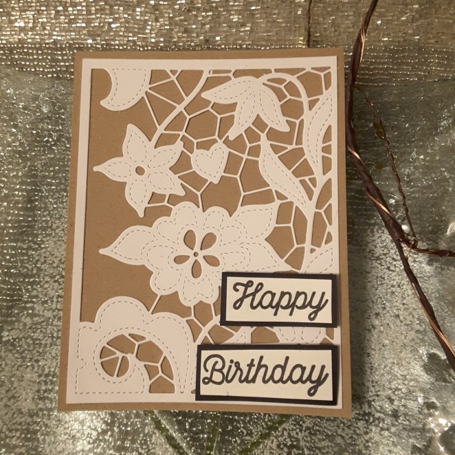
Hi everyone. It looks like today has been the day for lots of die cutting, embossing, paper piecing, and generally concocting a scene.

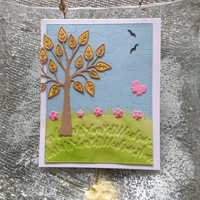
I was inspired by the colours from the current Color Throwdown challenge, to use hot pink, lime green, yellow, pale blue. I have also taken a picture of some of the dies I used, as I played with many sets!

20180204_114620
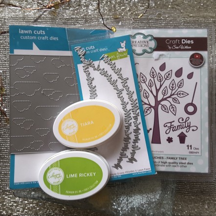
The blue card is from Creative Expressions, and you can see I used the Lawn Fawn ‘Stitched Cloud Backdrop’. The green card is actually white card I smooshed Catherine Pooler’s ‘Lime Rickey’ down, blended it a little, but as I wanted quite a rough blending for the grass, I wasn’t too bothered about marks.

I then die cut the two together using one of the Lawn Fawn ‘Simple Grassy Hillsides’. I stuck the two together on the back, placing the green inset into the blue, then ran the green part through again to emboss more grassy detail using the same die set. I then cut the two together with the Lawn Fawn stitched rectangles.

Once the base was done, I turned to my scene items. I die cut the tree from Kraft card, then turned to the leaves and flowers.

As I didn’t have any hot pink card stock, I took my Stampin Up ‘Melon Mambo’, smooshed it onto my craft mat, added water, and moved some water-colour paper through it. Once dry, I die cut the flowers and butterfly, ready to be put onto the scene.

For the yellow, I took the Catherine Pooler ‘Tiara‘ ink pad, and smooshed the same way, then once dry, I die cut the leaves of the tree. Then I had to stick each individual leaf down separately. Fine tip glue certainly comes in handy for that.

Once I had die cut the two black birds, I placed everything on the scene, moved things around until I was happy, then glued everything in place.

I kept the tree hanging off the edge, and cut off the overhang, and added some small pink pearls to the middle of the flowers, and used my clear glitter pen for the butterfly.

I must say this card took quite a bit of planning, and certainly took longer than a stamped card would do, but I really enjoyed playing. Scenes aren’t really my style, but with the colours from this challenge, I straight away pictured grass and blue sky, then searched through my stash to see what dies spoke to me!

As for a sentiment – well, I don’t really think it needs one. I thought about ‘just for you’ and ‘thinking of you’ but I kept it just the way it is. The inside of the card is certainly where thoughts and wishes can be written.

Challenges to be entered:

Color Throwdownhot pink, lime green, yellow, pale blue

Watercooler Wednesday challenge anything goes

Simon Says Stamp Wednesday challengeanything goes


Inspired by Love


20180201_202618

I have another card here which is romantic, and all lovey-dovey, and I am sure I have mentioned a couple of times I don’t ‘do’ Valentines Day…….yet I seem to be following that love theme recently…..I’m definitely having a change in personality happening at the moment.

I used a base card of green, then added a layer of pink card embossed with Spellbinders M’Bossabilities folder ‘Regal‘. I haven’t used this for as long time, and have forgotten how deep the embossing is with these.

The flowers and leaves are from MFT ‘More Rustic Flowers’ stamped in Altenew inks, and die cut with the matching dies.

I arranged them in the shape of a heart – lovey-dovey – with a cute little sentiment in the centre. I didn’t want a large sentiment, and I didn’t want to cover any of the heart up, and this fits perfectly in the centre. The sentiment is from the Stampin Up ‘Jar of Love’ which is still on my desk from the card a few days ago. (That’s why I only tidy away once in a while, as I can still use things unexpectedly)

I shall be entering the following challenges:

Inspired by all the little things

Watercooler Wednesday Challenge 155 – Anything Goes

Moving Along with the Timeslove 


Valentine sketch and colours

20180131_203848

Hello again. I have created a card today based on the current challenge for CAS Colours and Sketches. This week is a combination of a sketch, and also using three colours, as well as being able to use neutral colours.

I don’t usually make Valentines cards, as I have previously mentioned, but I seem to be inspired this year. I have no idea why – maybe getting maudlin’ in my old age!

The colours I used weren’t quite the same as the guideline colours,. but I feel they are a good match.

The main die cut on the base card is a new one I received with the latest Catherine Pooler Stamp of Approval box, and I can see I am going to be using this postage stamp die set a lot. Once die cut, I embossed it for added interest using one of my We R Memory Keepers Next Level embossing folders. These folders give an absolutely amazing 3D impression……

20180131_203900

I then turned my attention to the main stamp. As I have just booked for the next Uniko Stamping retreat in Stockton-On-Tees, I have my Uniko stamps in front of me. This way I can see what I’ve got, and then what I want to buy at the Retreat. :)

I used the ‘Explosions’ stamp set for the main image, and also used a small sentiment from that same stamp set. The heart die cut is from the same Sue Wilson fillable die I used previously, and the sentiment is die cut using one of the layers from the Catherine Pooler die set.

I shall be entering the following challenges:

CAS Colours and Sketchessketch and colours

Die Cuttin DivasAnything goes with die cut

Shopping Our Stasha card for valentines day

Simon Says Stamp Wednesday challenge anything goes


Mason Jars

Here is another card I made this weekend, and it caused a little bit of thinking. I had the background sorted, using an Altenew stamp ‘Wood Pallet background’, and used three different Altenew brown inks, haphazard inking of the background, to get a more washed and faded look.

Then I started thinking things through – a little too much maybe! Which style do I go for? single layers? Die-cutting and layering? Did I add some green to the background like the inspiration photo? You can see my decision there.

I took the mason jars from Stampin Up ‘Jar of Love’, did a couple of then jars – then the thinking again! Do I colour the water? Do I stamp the green stems – slightly faded – into the jar itself? Do I use the lids?

Well – I did colour some of the jars – didn’t like it at all! I also did some faded stems into the jars – liked it even less than colouring the jars!

So – after some internal debating I kept the jars white – no colour – just plain. And……I like the look as it seems to make them stand out more on the card. I added the little dew drops for a little interest, but basically kept them plain.

The flowers and stems were also from that same ‘Jar of Love’ stamp set, which I tried to attach to the card so they looked as though they were actually coming from the stems themselves…

As for a sentiment – I think I’ll wait until I actually want to use the card, as I feel it could be for men or women, and for many occasions……I always like to keep some cards behind ‘un-sentimented’ so I can use them at short notice.

I then finished the card off with a layer of Lawn Fawn ‘ground coffee’ card stock. (I did ‘gut’ the middle of the card for future use……) and attached to a white base card.

I shall be entering the following challenges:

The Card Conceptphoto inspiration

Addicted to Stamps and Moreanything goes


Sketchy colours

20180127_164259

Hello again. I will be spending some time in my craft room this weekend, and this is the first card I made today. It is using a range of different techniques – embossing, colouring, die cutting, stamping – but think I have kept it quite clean….

The rectangular card base has a layer of Lawn Fawn ‘Narwhal’ card (loving that grey card) then layered with white card which has been embossed using a Sweet poppy metallic stencil.

Now, I may have made a little mistake in using this stencil…… It is quite a large metal stencil, and when I took it out of my die cutting machine – it was a little bent! Well – not just a little! It was curved so much, I may not be able to use it as a stencil. I think the pressure and layers were too much. I straightened it a little, but I didn’t want to bend it too much, so I may be brave and run it through the opposite way – just to see if I can even it out a little more……I’ll let you know.

The Altenew ‘Hello Sunshine’ flowers were stamped and heat embossed, coloured with my Zigs, and die cut with the matching die set.  I arranged them underneath and on top of the banners, for a little dimension, but not too much.

The banners are from Sue Wilson, with the sentiment from ‘Hello Sunshine’ heat embossed with white onto the aqua card.

I shall be entering the following challenges:

Freshly Made Sketches sketch

Color Throwdownaqua, orange, grey

Simon Says Stamp Wednesday Challengelayer it up

Cardz 4 Galz anything but square


Somethings new, and old

20180123_215410

Hello there. I quick evening posting for this card, which I made yesterday. I had a delivery of the latest Catherine Pooler Stamp of Approval box, and I also ordered some more of her inks. I love her inks. Easy to use, stamp beautifully even on new stamps.

This stamp set is a new one from Uniko, paired with the new ink from Catherine Pooler ‘Royal Treatment’. A clean and simple design, using just the one ink colour on the white background.

The sentiment is from Tim Holtz/Stampers Anonymous and stamped in the same colour.

I shall be entering the following challenges:

CASology late

Unikosomething old, something new

QKR Stampedeanything goes

Stamplorations CAS challenge CAS without optional twist


Hug Me!

20180122_221422

Good evening everyone. I have a little card for you today which I have been thinking about for a couple of days, and just this evening have gotten down to doin’ it.

I was inspired by several challenges again. I die cut the main image in a post-it note, stuck it to the card base, placed the Stampin Up stencil over the top, and used the three red/pink colours from one of the challenges below. I then moved the stencil a little, and inked the same three colours again. I did this to create a kind of ombre look……

After stamping the main image, I coloured him in using my Faber Castell pencils, again in three different red/pink colours. I tried a little blending, but I don’t think the card base was that suitable for this technique – but it doesn’t look toooooo bad, I don’t think!

I then stamped three individual hearts along the right hand side, in the three different coloured inks I used. No reason why I did that, just thought I would as I saw them sitting there in the same stamp set.

As I was going down the clean and simple route again, I judged my card as finished at that point – it would have been so easy to add bits here and there.

Anyhoo – here are the challenges I will be entering:

Paper Craft Crew Challengedeep red, light pink, reddish pink, neutrals white and black

Moving Along With The Times Clean and Simple

Simply Less Is More Clean and Simple and cute, one layer card

Addicted to CASombre


Glimmer – clean and simple

20180120_183839

Hello everyone. I have gone with glimmer for this card, as you can see. I don’t usually do anything card-wise for Valentines day, but the current challenges I am entering made it actually quite hard to stay away form this theme….

I used a 6 inch square white card base, and added hearts from a Sue Wilson set I bought last year. This set of dies – Fluttering Heart fillable collection – has nesting layers which were ideal for the sketch challenge.

I then turned to my Stampin Up glimmer card, and sued the white and pink for the hearts, and plain white card for the smaller detailed heart.

The sentiment if from Altenew ‘Hello Sunshine’, which is still sat on my table from my card the other day, and die cut with a small border die from a Catherine Pooler die set.

Here is a close-up of the glimmer…..just in case you needed one20180120_183935The challenges I will be entering are:

Freshly Made Sketches sketch

CASologyglimmer

CAS on SundayCAS love/Valentines

Hand Stamped Sentimentsphoto inspiration


colours, sketch, birthday

Hi there. I have been creating a birthday card again, and really had fun with the colours and the die cutting.

I used the sketch from Sketch Saturday, but where the left hand side of the sketch looks like twine, I have done three embossed lines, well, debossed lines!

20180119_143238However, I soon realised that the more I added the flowers, then the more these lines would be covered….I hope it still counts…..

The flowers are from Altenew Hello Sunshine, which is one of my favourite stamp sets, but then anything from Altenew could be included in that list of favourite things!

I stamped the flowers using Tranquil Tide and Dapper Denim, then die cut them with the matching set, and then started to play with the layout and the base colours. I didn’t think I was going to lay the flowers all around the white rectangle – but it just happened, and I liked it.

I also thought about colouring the flowers with the same colours, but I tried on a couple of extra ones I had stamped, and didn’t like it. I like this effect – even though the card could be considered busy, I still think it’s quite clean, lots of open space. I find I am tending towards that genre more and more – though I also like to ‘chuck’ everything at a card every now and again.

Here are the challenges which inspired this card:

Sketch Saturdaysketch

The Paper PlayersDapper Denim, Lemon Lime Twist, Tranquil Tide + one other colour )white)

Try It On Tuesday my favourite things (Altenew stamp set)

Seize The Birthday Birthday – optional twist one layer (not used)

(Last but not least – a huge thanks and best wishes for Bev from UNIKO, who sent me a  ‘Hugs’ card after hearing I had one of my cats put to sleep last week. XXX)


Doodled Lace Cover Die

20180115_212607

Hello again, everyone. It’s been snowing around here, but not settled – just cold, and windy, but actually quite crisp and clear at the moment. I will be driving north up the M1 shortly, hopefully not coming across too much bad weather!

This selection of cards were made using a new die from Altenew – the Doodled Lace cover die. Now, I have quite simple here, using only three colours of card, but I changed each card – using the same three colours – into a different card each time. I changed where the sentiment went, and one card I cut off one edge of the die-cut to see how that looked.

I am going to be playing with this die a little more – colouring, paper-piecing etc – but these cards quite simple, quite easy – and dare I say – quite elegant?

I don’t think the lace detail comes out very well in the pictures, and I may add some gilding wax to the black die-cut…..

I shall be entering the following challenges:

Alphabet challenge blog – ‘U’ for use 3 of anything (3 colours)

A Gem of a ChallengeHappy anything

Brown Sugar Challenge Birthday