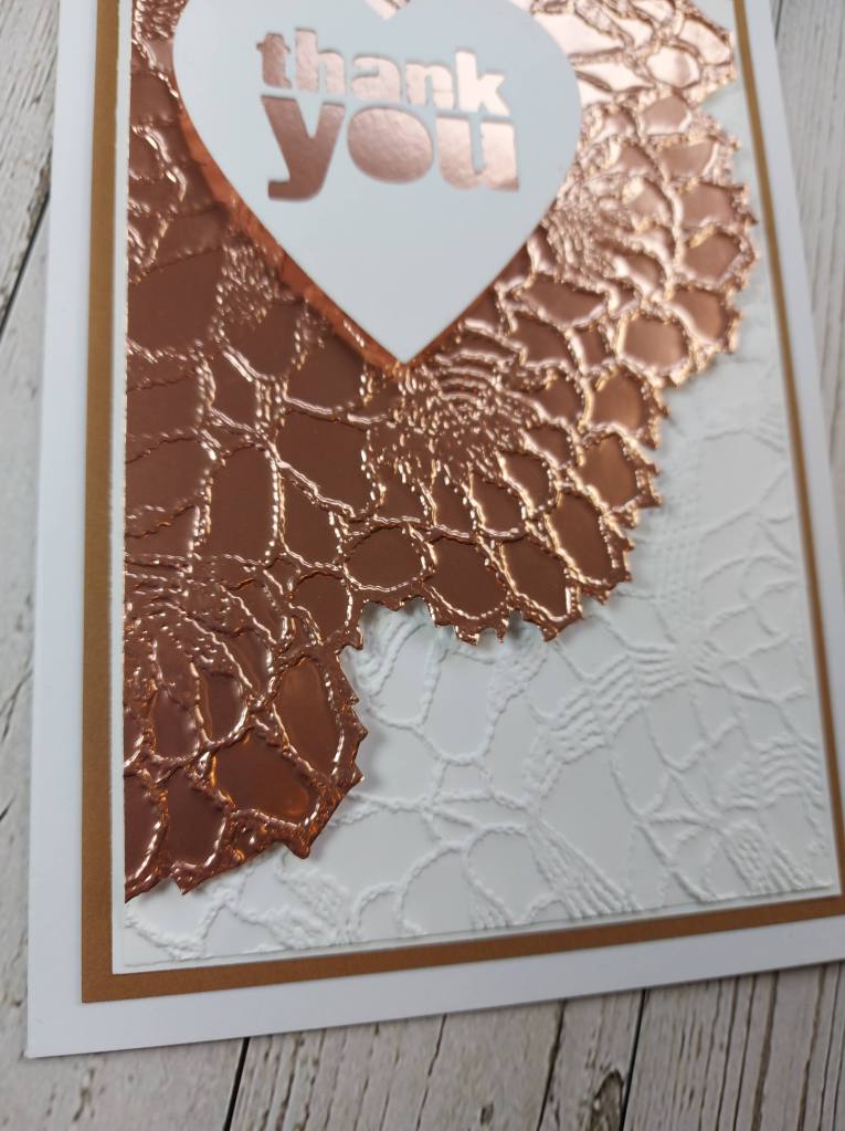
This gold sheet is from Sizzix, and is adhesive backed – I attached it to a piece of card, then used the ‘Doily’ 3D’ embossing folder to create this detailed and shiny piece, which I then fussy-cut around the edges.
I embossed it again onto a white piece of card, turned it arund, and placed it as you see.
The gold piece is attached using 3D foam to create some shadow and dimension.
The heart sentiment is from the ‘Crop and Create delivered’ class in October 2021, with an off-cut from the piece I had embossed placed behind to make it the smoother look rather then embossed.
These Sizzix sheets are fabulously shiny and easy to use -I can see I will be playing with them more in the future.
I shall be entering the following challenges:
CYHTP – embossing folder – option of ‘Spring’ not taken
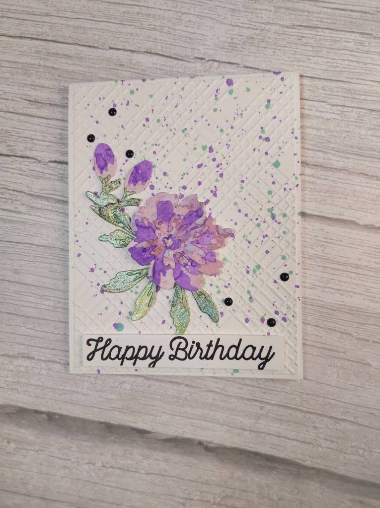
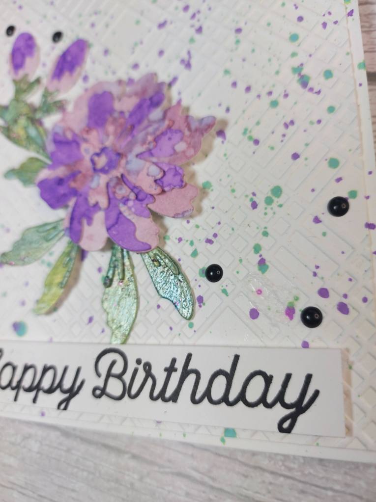
Having recently received a new die set from Altenew, I decided to play with it:
I die cut all the layers for the flower out of previously made Distress Ink smooshing pieces of card. The leaves were die cut from a panel I had created during a virtual mixed media class with Seth Apter, and I’ve been waiting for a time to be able to use that piece – lots of inks, even glitter paint, and texture paste which I think shows up on the second photo.
If I remember rightly, we also did a lot of scoring and scratching into that panel, used a few of his inks and pastes – and it created an overall shiny piece of card.
Onto a white card base I stuck down a panel embossed using a Spellbinders embossing folder recently received as part of the Maker Mania 5 weekend.
I then splattered Distress Oxide sprays onto it to match the colours of the flower.
I stuck together all the layers of the flower and leaves and created the spray as you see.
The sentiment is from an older MFT stamp set. As I had stamped the sentiment in black, I added some black enamel dots to the background to bring it all together.
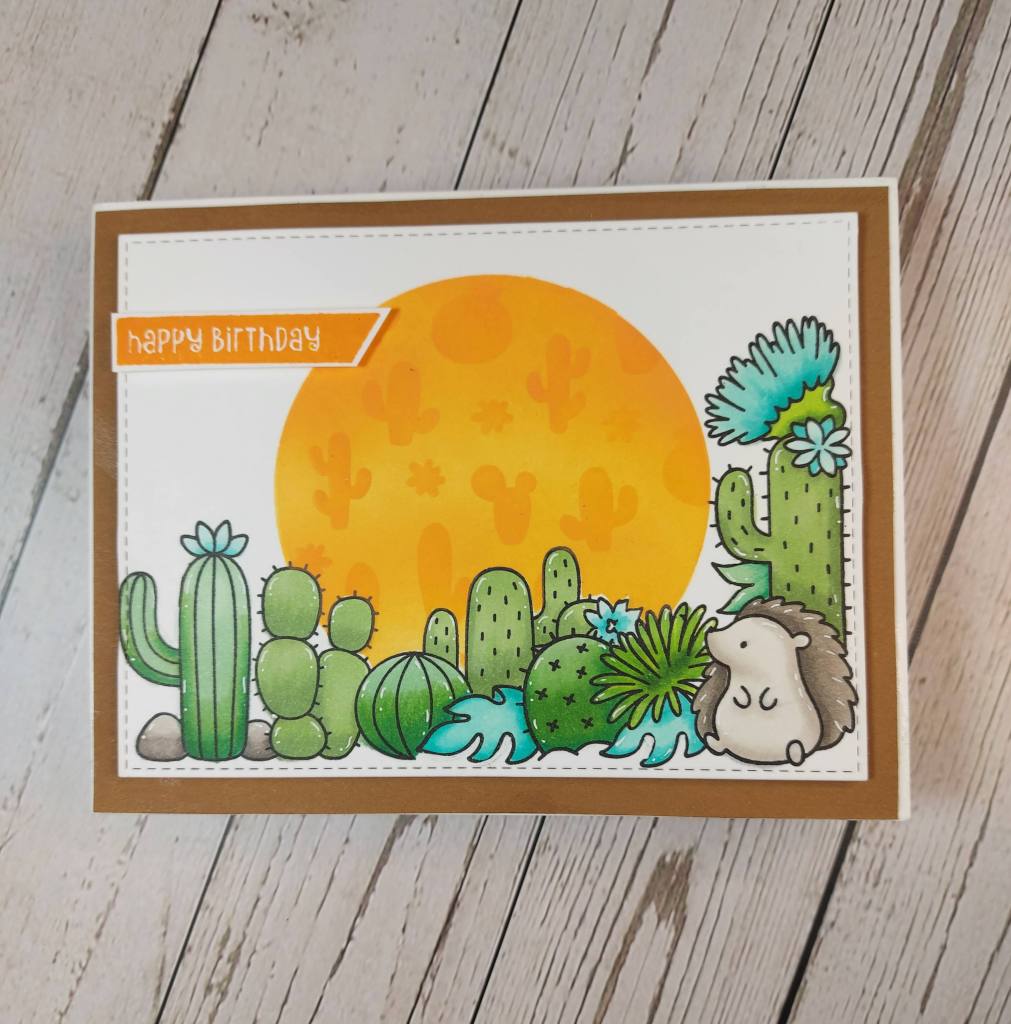
Hello. I created a bright and cheerful card today using some new products from Clearly Besotted:
The white layer was first stamped using the hedgehog corner on the right side, masked off, and then a row of cacti stamped along the bottom. This row was also masked off, and a circle stencil – die cut out of mylar – used to create the orange sky.
With both stamp masks, and the circle stencil in place, I then used yet another stencil on top of all that, to use a fun little cactus images stencil to blend again for a tone-on-tone effect.
I then coloured the images with Copics, and added white gel pen for some details.
The sentiment was stamped in the same Distress Oxide I blended the sky with and fussy-cut.
White layered onto Kraft, then layered onto a card base.
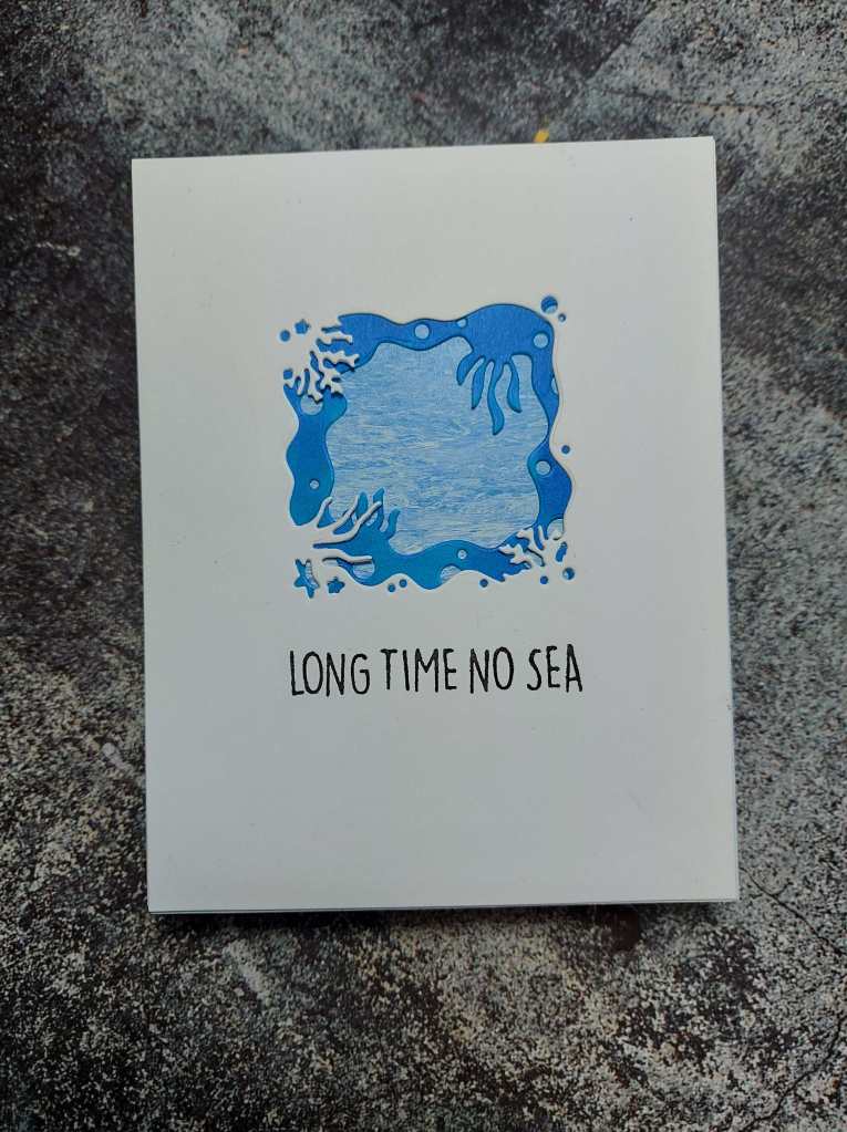
Happy Little Stampers CAS challenge has started a new CAS theme. This time we want to see you CAS creations themed ‘WATER’. Here is my card:
These Looking Glass dies from Hero Arts still confound me. Despite watching quite a few YouTube videos and using the ‘Alignment Tool’ I can really struggle putting them together.
The background is a patterned paper from my stash, and the middle layer cut with white card stock then coloured using a Copic blue, and of course the top layer die-cut from the card base.
The sentiment is from Heffy Doodle.
There’s a great selection of inspiration from the Design Team – I hope you can come and join us. xx
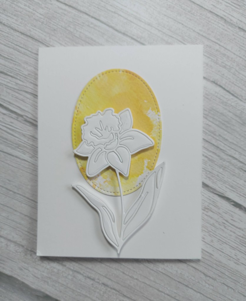
Hello. I’m here to share a card which again took some patience -maybe I’m learning that I have some patience after all….
I chose this daffodil die in memory of my mum – who recently passed – her favourite flower:
I die cut an oval from a previous yellow ink smooshing background panel – glued flat.
The daffodil is from Simon Says Stamp, and I die cut it out of white card stock – and then the complications began…..
I wanted all the pieces to stay in the stem – which they did – and then I decided to add some dimension. I was thinking 3D foam squares, then foam pieces, then layering die cuts together…..
In the end, I stuck white card onto some foam, then die cut……..and then some of the pieces fell out of the die cut and wouldn’t go back in neatly…
I persevered, and then die cut another flower form the white card and placed it on top of it all – so one die cut piece on foam, and then another die cut piece on top of it all…..
I am sure there is a simpler way of doing this! Maybe layering die cuts together would have been the way to go – maybe I’ll try that another time……
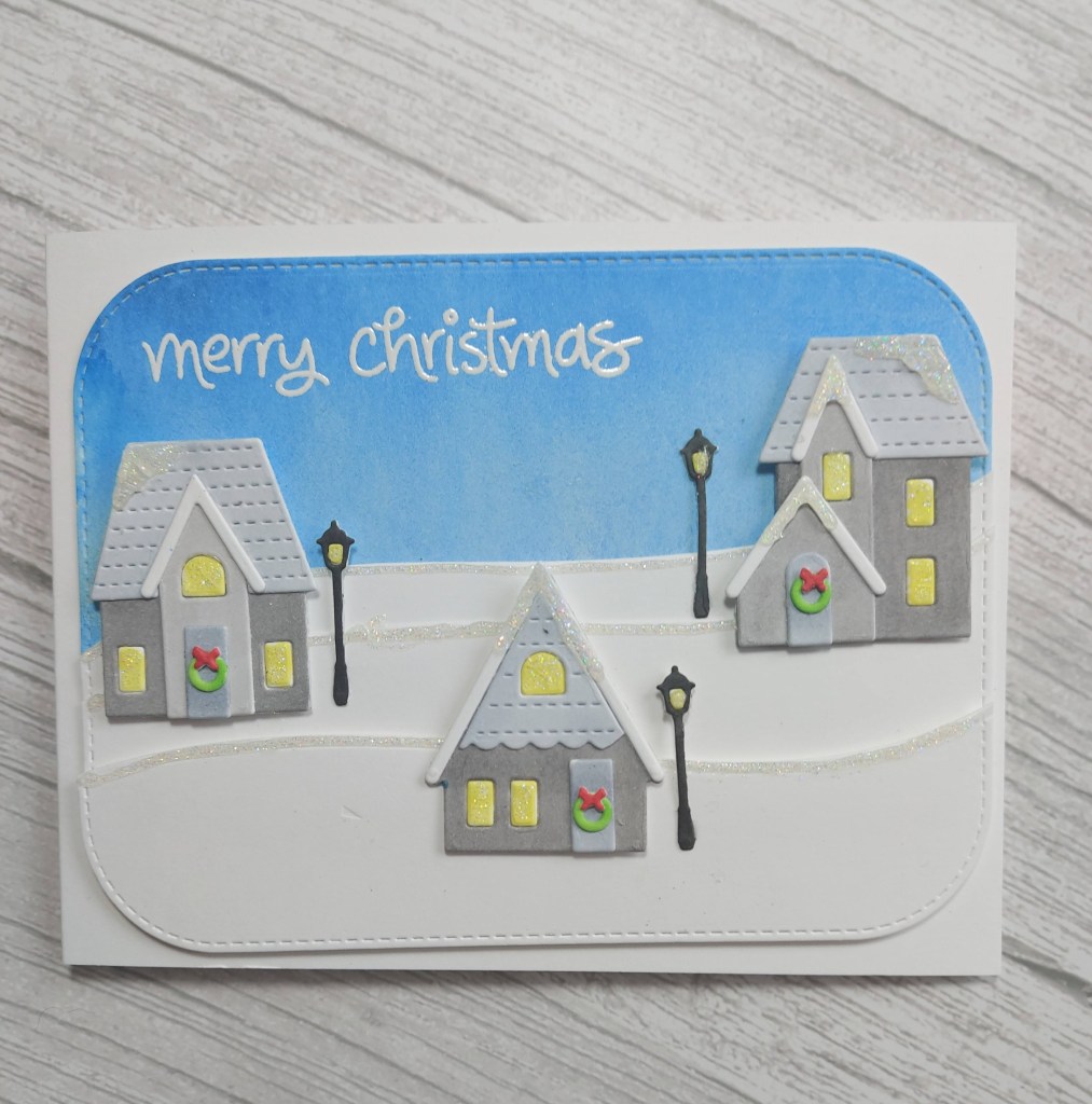
A post today to share a card I created over the past few days…..yep – past few days! This took some drying time for some elements, decisions about colours – and whether to use Copics, or coloured card stock. Here is my card:
It may not look like it, but this was a labour of love – I kept going, knowing it would get there eventually…….!
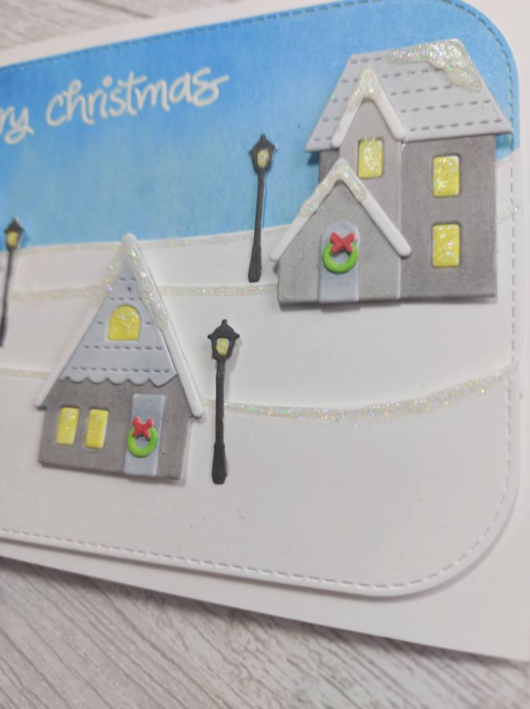
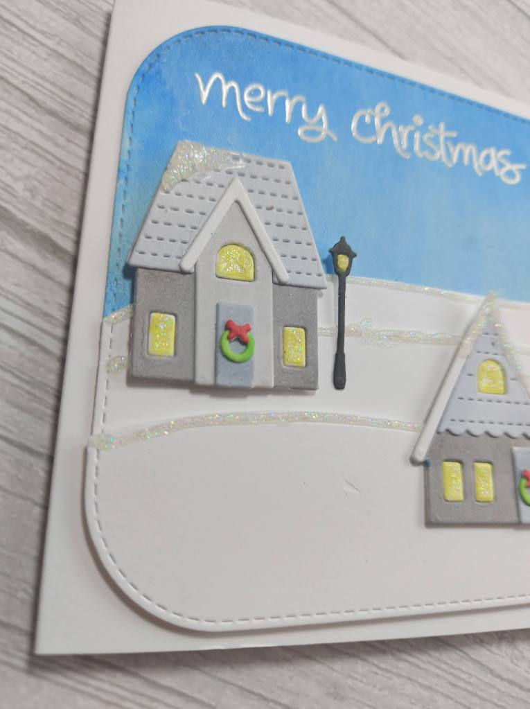
The background blue panel was using some Spellbinders ‘Silks‘ recently obtained as part of a virtual crafting kit. I’ll need to play with them more as they have a really clear shine – but I think I watered it down too much. Whilst this was drying I turned to the snowbanks.
I played with snowbank layers and levels to create the three hills. These were all stuck down onto the base card – the uppermost layer with 3D foam, and some Hero Arts ‘sparkle clear lacquer pen‘ used for the snowy tops – again something else to set aside and dry…..
I then took a Concord & 9th die set and die cut all the pieces from white Neenah, then eventually decided to colour all the houses with warn grey or cool grey Copic markers – varying shades – to come up with how they look here.
The pop of red and green for the door wreaths were also coloured with Copics, as were the three lamp-posts.
All windows and the light of the lamps were the bits that fall out of the die – stuck back in when coloured with yellow. There were a lot of very small, teeny-tiny pieces of sticky tape on the back of each to keep them in place.
Then I decided to add some of the sparkle glitter to each of those houses and windows -and something else to let dry……..
Patience is not my strong suit, so I left them overnight to dry – because I’m also a little clumsy and I feared there would be smudges etc if I worked with them too soon.
Once I had stuck everything down – I remembered the sentiment. Typical of me….last thing to stamp on a layered card……really? I used my Misti – minus the mat – and gingerly stamped and heat embossed the sentiment…….heart in mouth……I could always cover it with a banner……but it worked out thank goodness.
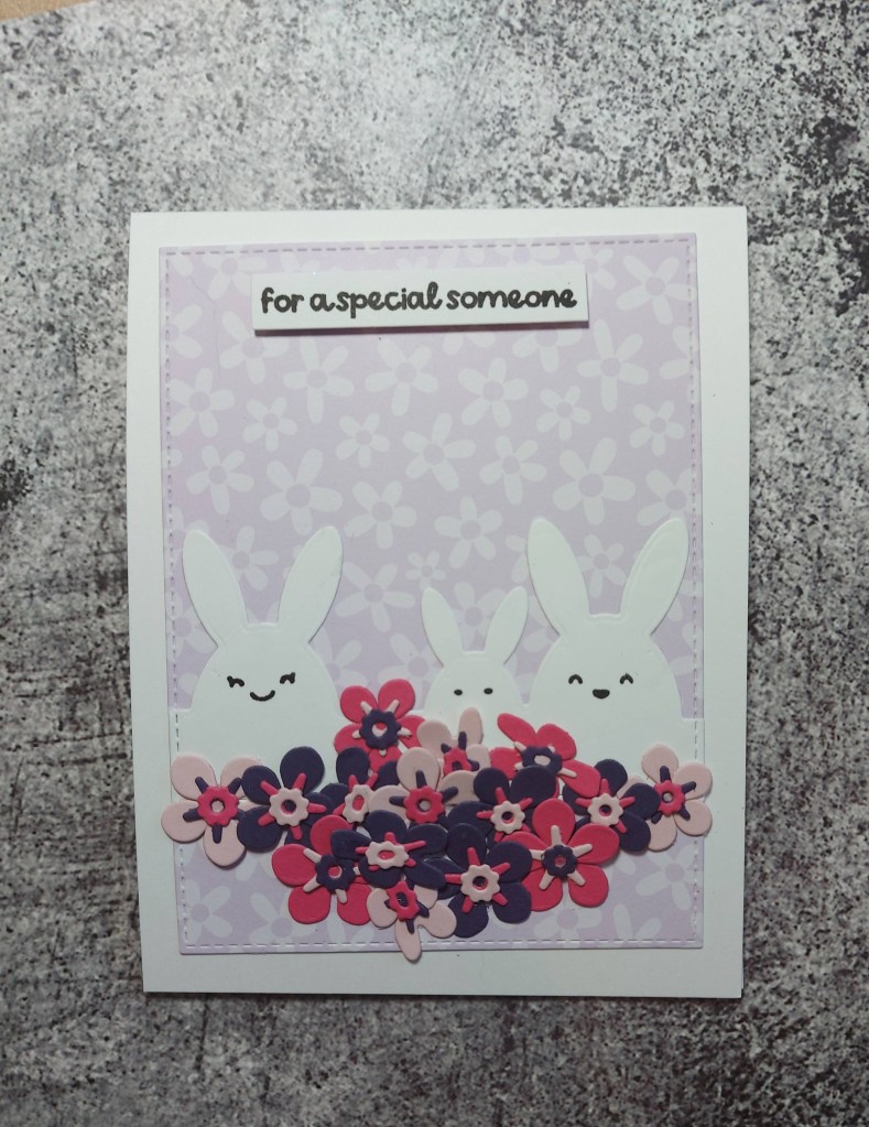
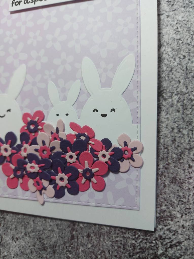
Hello there. Another time to play in my craft room whilst watching the Maker Mania 5 presentations – so many ideas and techniques to try later. Here is what I created whilst I was watching – multi-tasking in effect:
Onto a patterned paper background panel, I glued the row of rabbits, and used a little stamp from Lawn Fawn ‘All The Clouds‘ for the facial features. I did try drawing some on myself, but it looked like a hot mess – so I searched the CML app for face – and these popped up – just right for the bunnies.
The flowers are from The Greetery and die cut from Heffy Doodle and Concord & 9th card stock – a lot of die-cutting – a lot! And then layered and stuck down to create a positively cornucopia of flowers.
I have found that I shy away from small die-cutting and layering images like these small flowers, but actually I have had a lot of fun with this over the past few days. The hardest thing is which colour to go with which colour – but I manage……
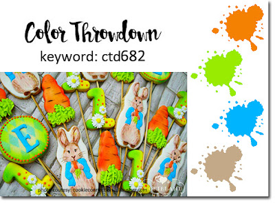
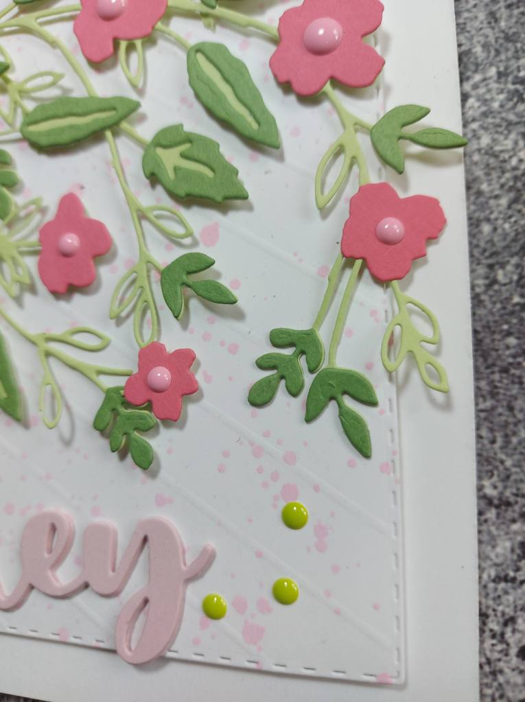
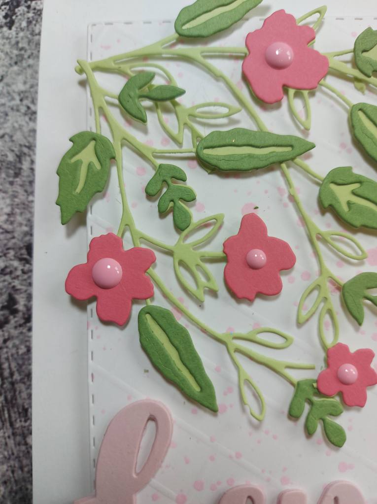
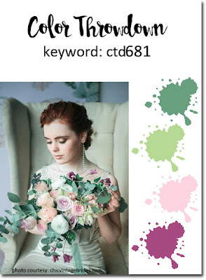
Hello once again. I have created a card using the current colours for Color Throwdown:
I used Concord & 9th card stock to die cut the blossoms branch – light green, dark green, and Honeysuckle – the nearest to a plum I have.
Before sticking this down – snipped at certain places to create the look you see – I took some white card stock and splattered some pink.
This panel was adhered to the card base, then the altered blossom branch, and then I added some light pink sticky dots to the centre of the flowers, and some green dots to the bottom. The sentiment is a die from Time For Tea Designs.
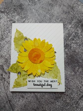
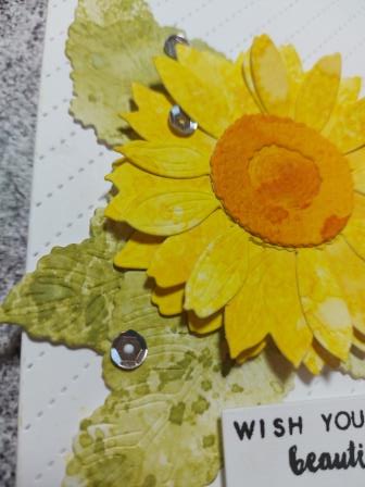
Hello there. The Alphabet Challenge has started a new challenge. Veronica is hosting this time round. I must say I had no clue what ‘Xanthic‘ meant initially – but it means ‘relating to yellow’. So – here is my card:
Here I played with ink smooshed card stock in yellow and green – inking, smooshing, splattering – all to have some fun and play.
Once those pieces had dried, I used the Honey Bee Stamps ‘Lovely Layers: Sunflower’ die set to cut out the leaves – layering several of the sunflower petals together – even cutting into the leaves a little for more movement and dimension.
The background is a stitched diagonal cover plater from Reverse Confetti, and the sentiment is from Altenew.
Some sequins added for something extra.
The Design team have a very varied take on the ‘Xanthic’ theme – it would be great if you were to check them out – and hopefully we’ll see you in our gallery. xx
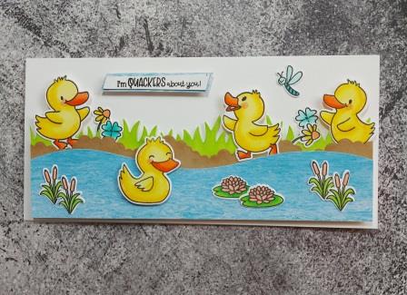
Hello there I am hosting the new challenge at Cardz 4 Galz. I have chosen the theme ‘Things With Wings’. I chose this theme as I know there are lots and lots of choices here – from birds, to dragons, to fairies – it can be real of fantasy – the choice is yours as long as there are wings.
Here is my card:
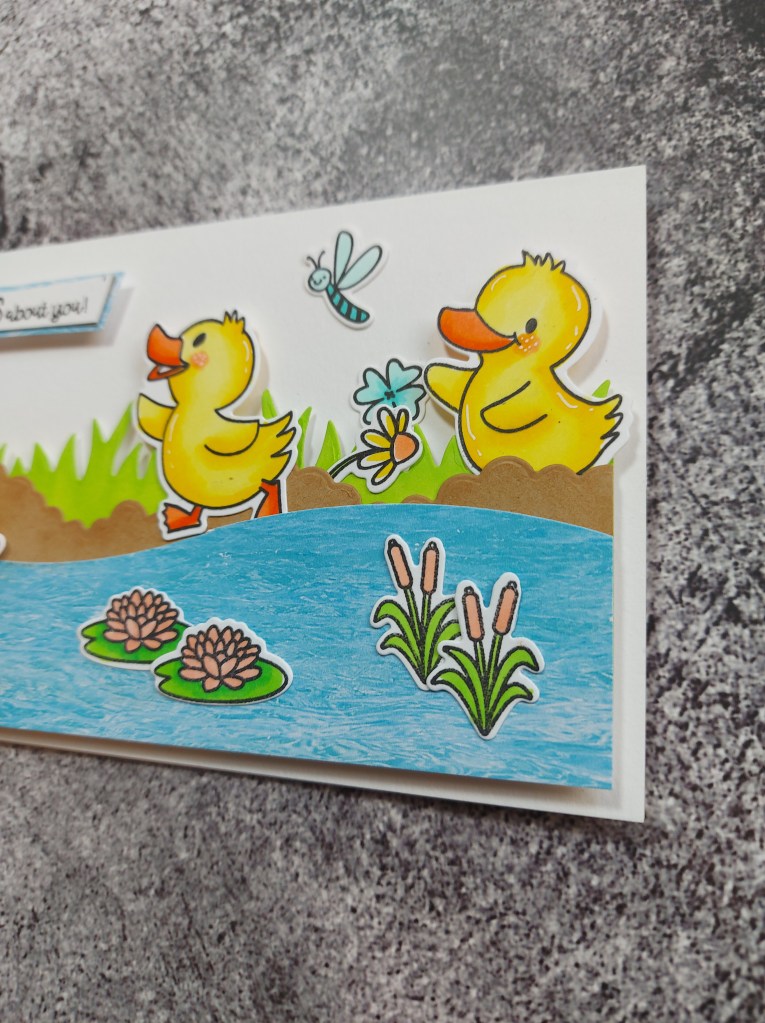
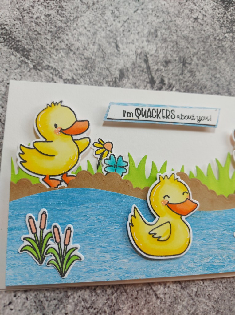
I wanted to use this cute duck stamp set from Time For Tea Designs, as I thought they were quirky and fun to use for the valentine’s day card for hubby.
Once the duck images were stamped, coloured, then die cut, I worked on the scene. The additional lily pads and pond grass are from a Sunny Studio stamp set.
The grass was cut from green card stock, and the edges blended with a green Distress Ink, the brown is supposed to represent the ground – die cut using a cloud die – and the edges of the brown card stock slightly inked with another Distress Ink.
The water is a patterned paper from my stash, and cut free-hand.
I used a small off-cut of the pond/water paper to put behind the sentiment to make it stand out a little more.
I hope you can come and join us with your ‘Things With Wings’ themed creations – I look forward to seeing what you come up with. xx