Hello everyone. There is a new challenge at The Holly and Ivy Christmas Challenge beginning today. The theme – anything goes as long as it’s Christmas. This includes cards, boxed, scrapbook pages….
Here is my card:
I took the Altenew ‘Peaceful Wreath‘ and stamped all the images using the Altenew ink set ‘Deep Blue Seas‘, but only stamped the first layer, than embossed with silver detail embossing powder the second layers.
There are, therefore, four colours of the individual holly leaves, each with silver embossing. I arranged the two half-wreaths, and filled in the gaps and added the individual leaves around the outside as you see.
The white embossed panel is from a Sue Wilson embossing folder, layered onto a blue shiny card. I ‘gutted’ the blue piece of card with the ‘peace’ word die, creating a five layered sentiment.
The Design Team have created some fabulous inspiration for this challenge, and I hope you can come and join us.
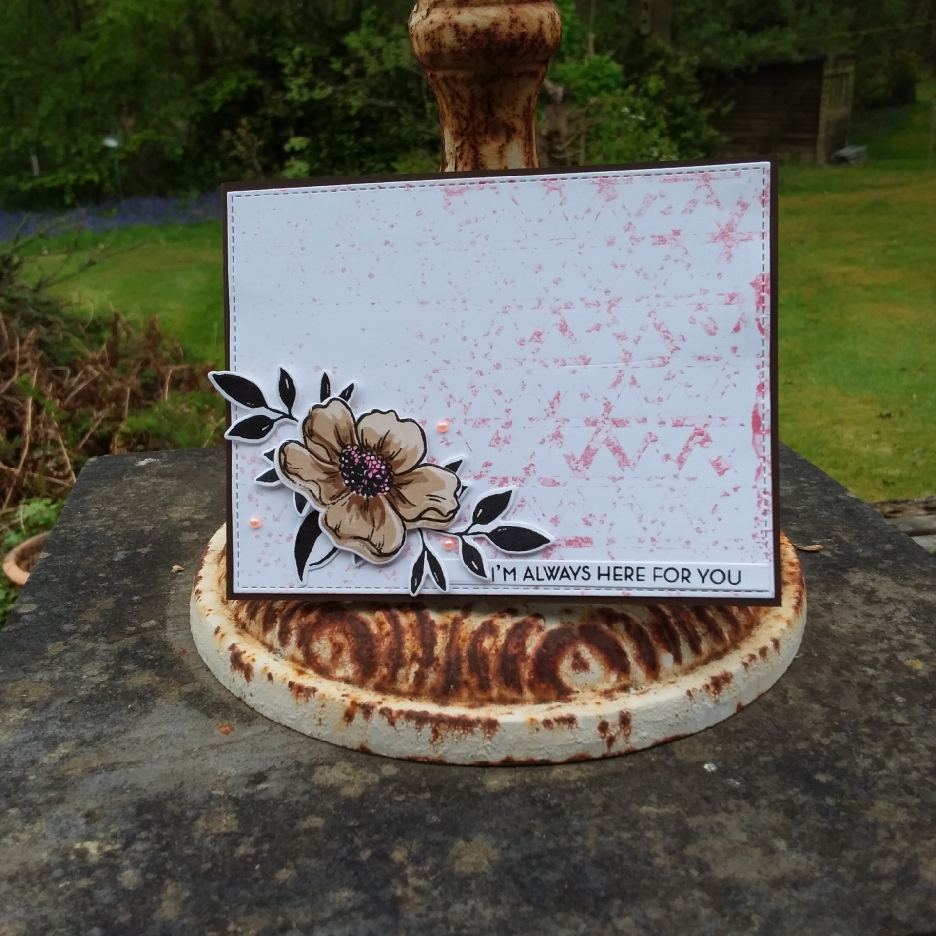
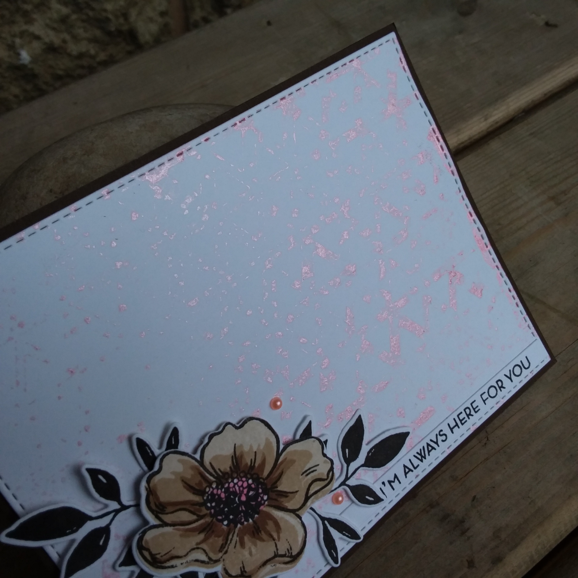
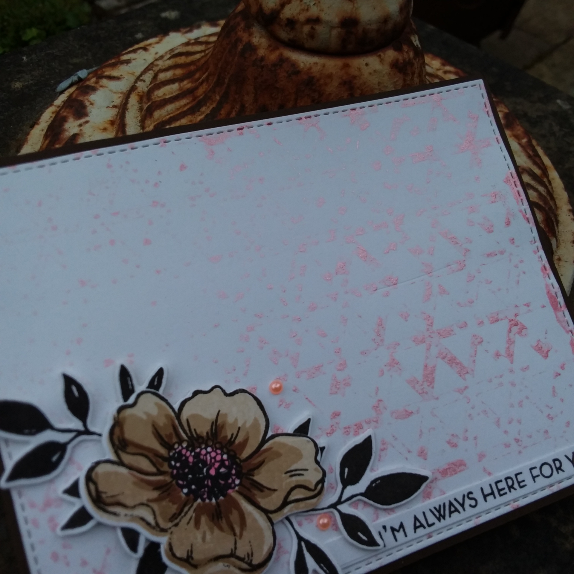
Hello again. I have a card to share today using several Altenew stamp and die sets: (no pheasants today, but you can still see the bluebells)
I used the Always There stamp and die set, and brown Altenew inks for the flower. The leaves are from another Altenew set, and the sentiment from yet another.
I didn’t stamp the outline at first, but when I was putting the card together, I decided that the black outline suited when I added the black leaves. Then I realised I hadn’t stamped the centre of the flowers, so I used the third middle stamp only, and added some pink with a Copic marker.
The background panel is actually the reverse impression of a Catherine Pooler stencil. I placed the stencil on some card, then spritz some Tonic Mica Mist onto the card through the stencil – and saw how much was actually on the top of the stencil – so I took another piece of card and laid that on top to get this reverse image. So – two backgrounds for the spraying of one….. frugal crafter!
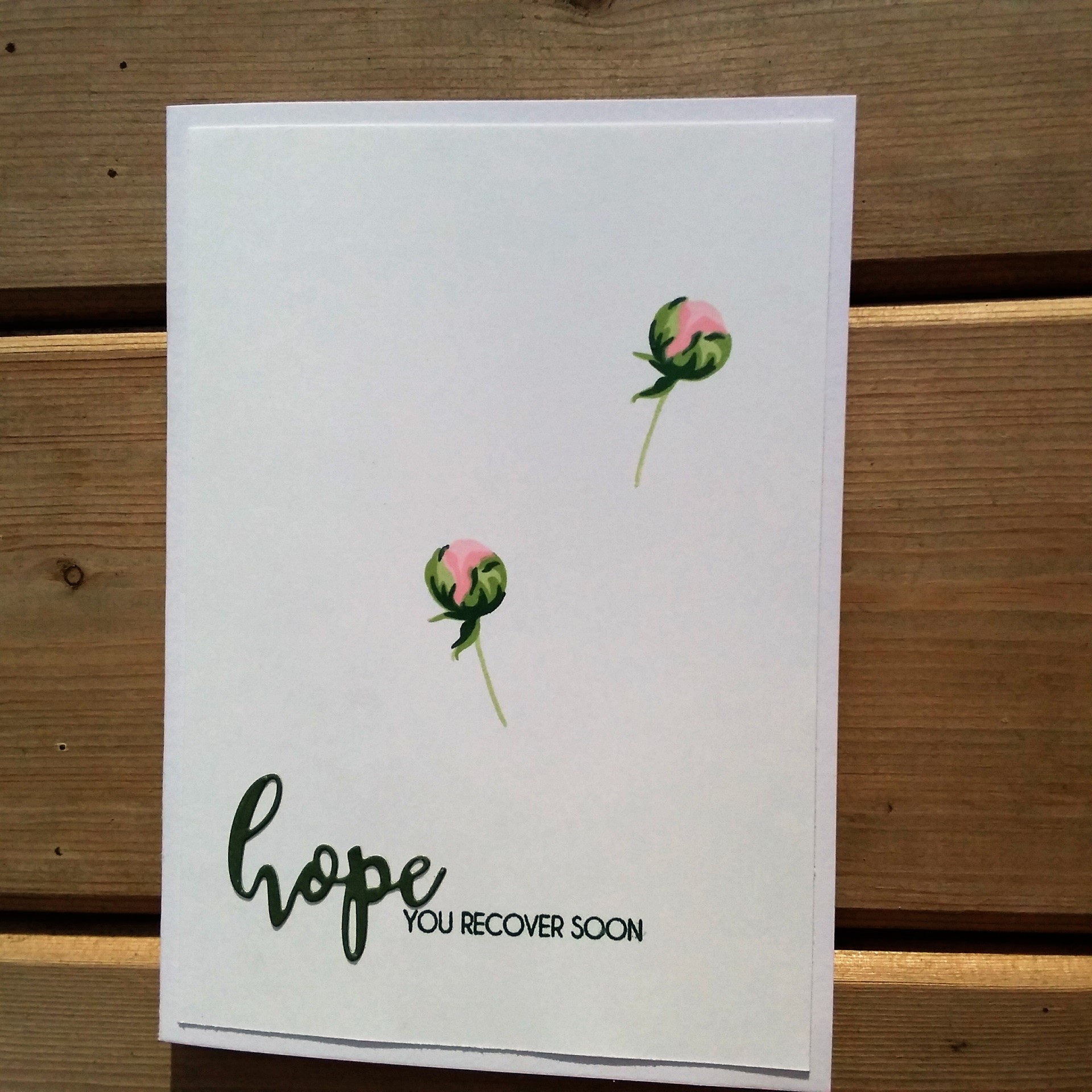
Hello again – I think my mojo is back! Back with a vengeance! This card – two cards actually – was inspired by several challenges:
I have had the sketch from CAS Colours and Sketches in my head all week. I knew I wanted to go CAS, but couldn’t really get my head around what images to use for this layout.
Then – the new challenge at Less Is More raised it’s head – bingo! I got my images, I had my layout, I knew I wanted CAS – so this is what happened.
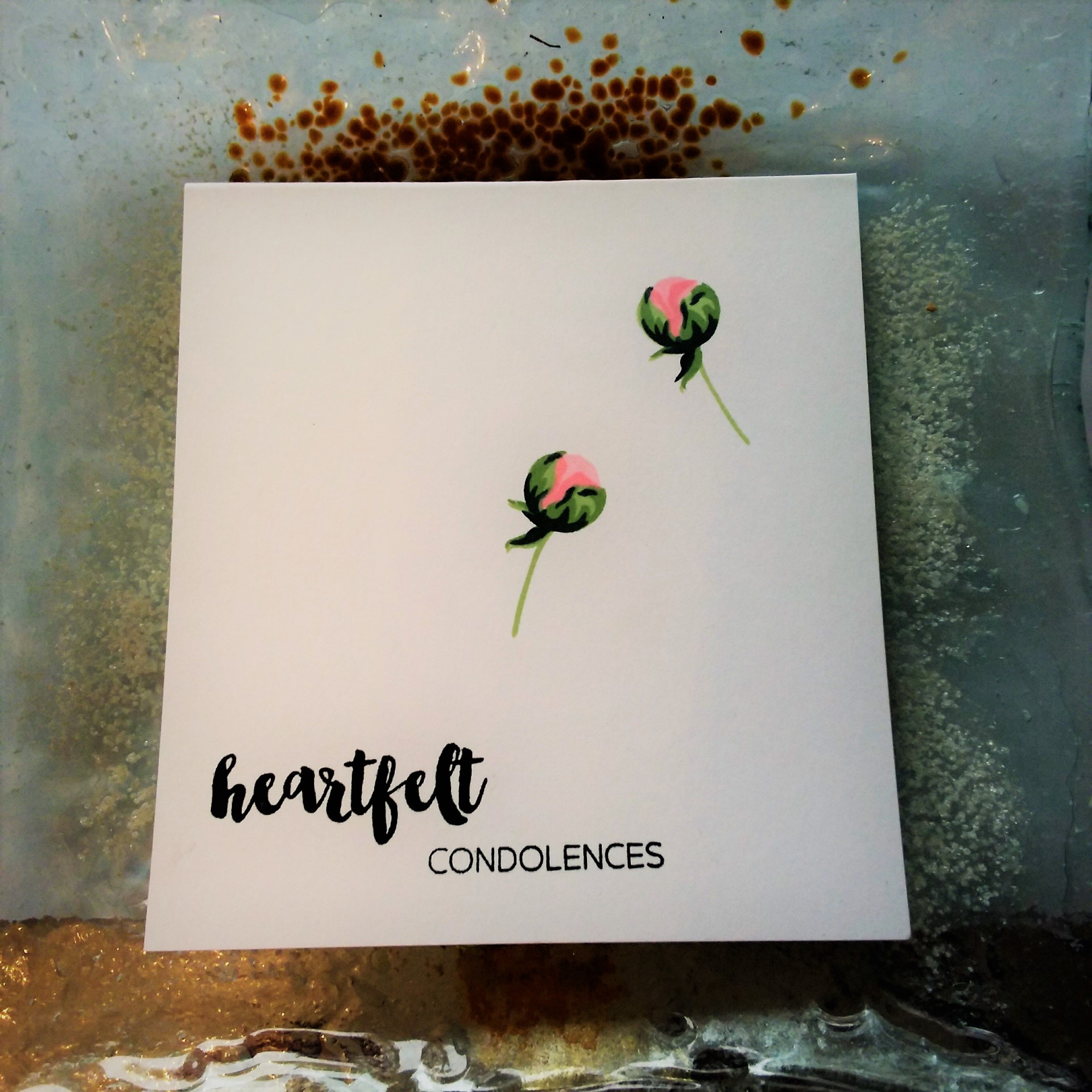
Then – I read again that the Less Is More Challenge was for a one layer card. Ooops. As you see above, this card isn’t one layer. So – what’s a crafter to do? I went back up to my craft room, and did another:
This is definitely one layer. I had to change the sentiment, because the ‘Hope’ in the first card is a die-cut. This sentiment is from another stamp set, but all stamps and all inks are from Altenew.
I hope you will forgive the poor lighting – but it’s quite dull here today, and even when the sun does come out – the wind is just too much to be able to take good photographs outside.
Hi there. I don’t know where time goes, but since I reduced my hours to three days a week, I seem to run out of time…………I have no clue what I spend my time doing, but it certainly isn’t crafting. Hopefully, this Easter weekend I can make some cards to share with you.
Here is a card based on the colours from the current challenge at Color Throwdown:
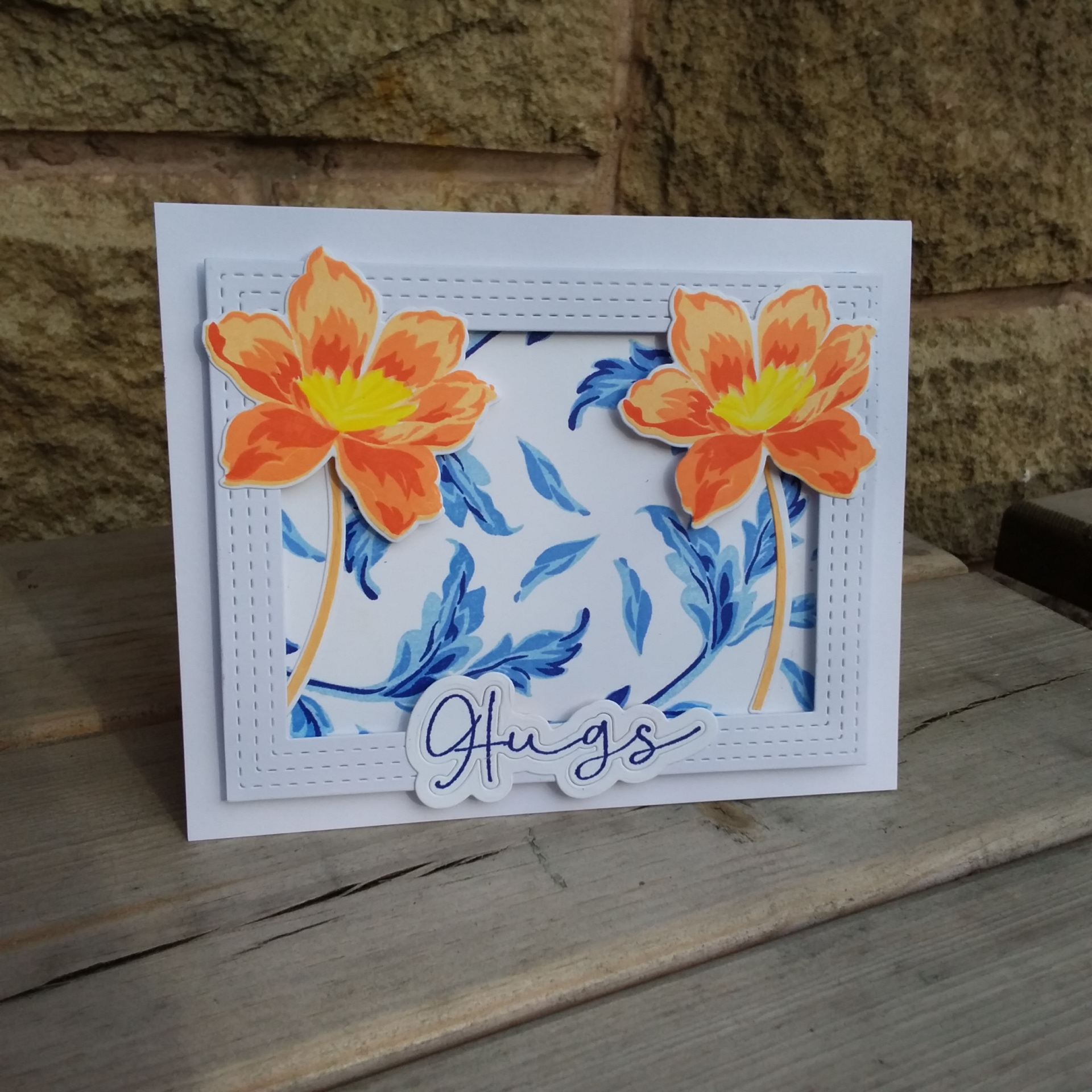
I took the Altenew ‘Angelique Motifs’ and stamped the leaves in blue inks onto some Crafters Companion Neenah card. The gaps I filled-in with the leaves also from that stamp set.
I took some orange inks for the flowers, and instead of stamping the centres, I coloured them with yellow Copics. I tried doing the flowers completely stamping, but always seemed to get the centre parts off-set – so out came the Copics.
The frame is from Reverse Confetti and raised with foam, and the flowers stuck both inside and outside of the frame just for added interest.
The sentiment is from the new stamps from Thirsty Brush and Co – stamped the word, and die cut with the matching dies. Now that sentiment die has an inner and an outer – thinking about belly buttons anyone? – but I kept the two layers together so the word stands out a little more.
I am certainly going to spend some time with this stamp collection, so I am afraid there will be some floral cards coming your way – it may be water-colouring, it may be Copic colouring – or even ink smooshing……maybe all of them!
I hope you have a great Easter weekend, and I hope to see you again soon. :)
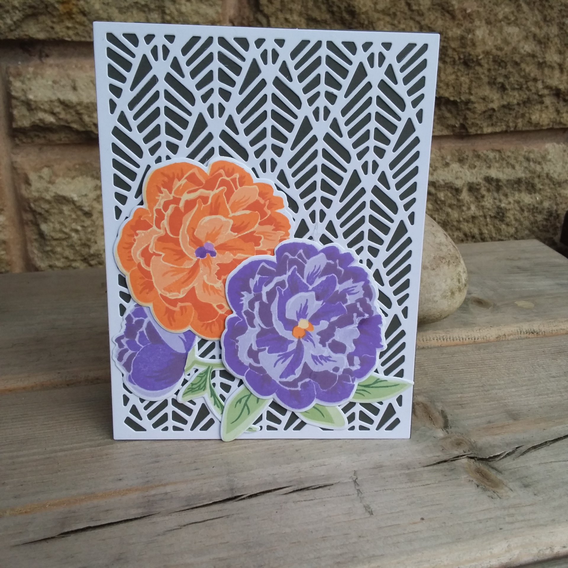
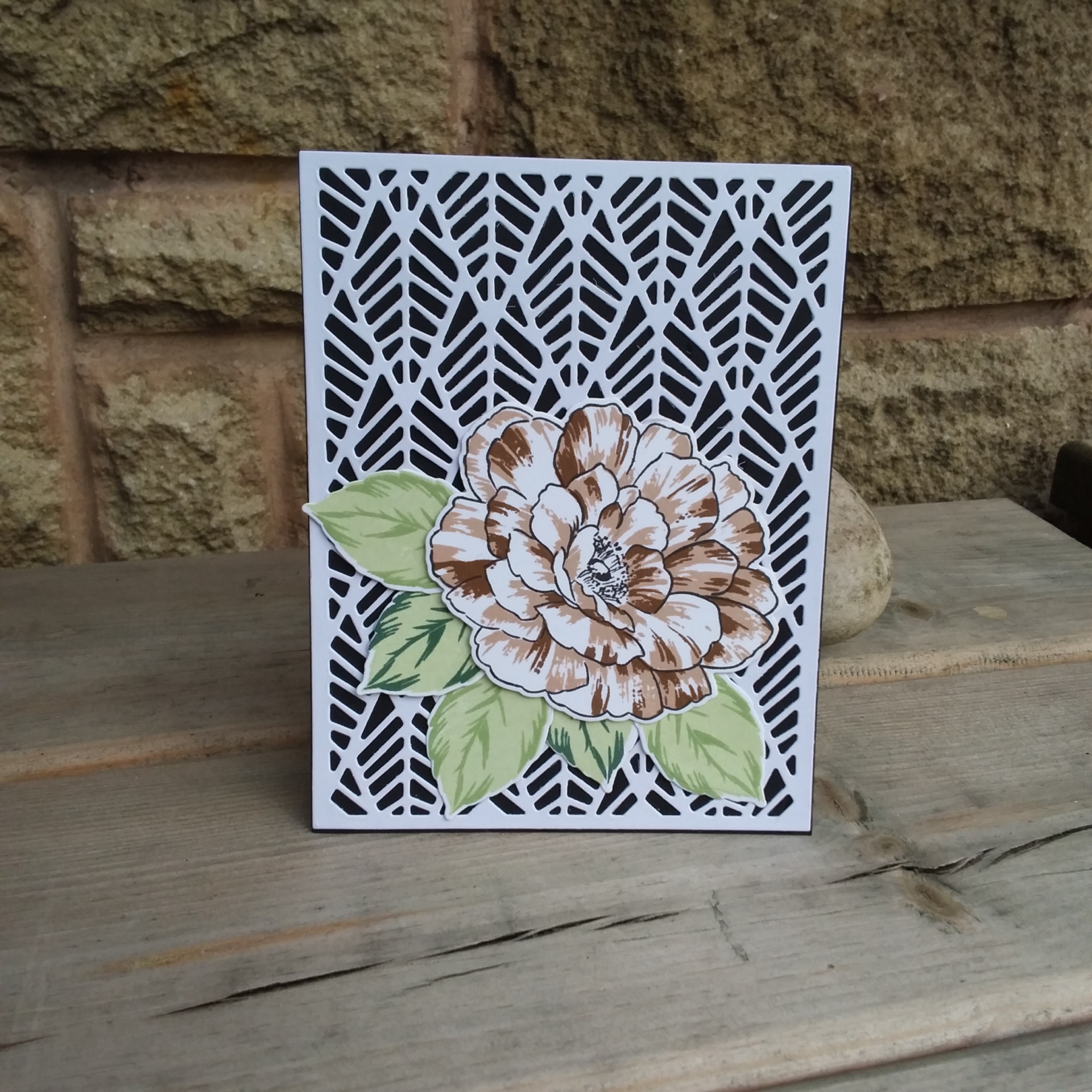
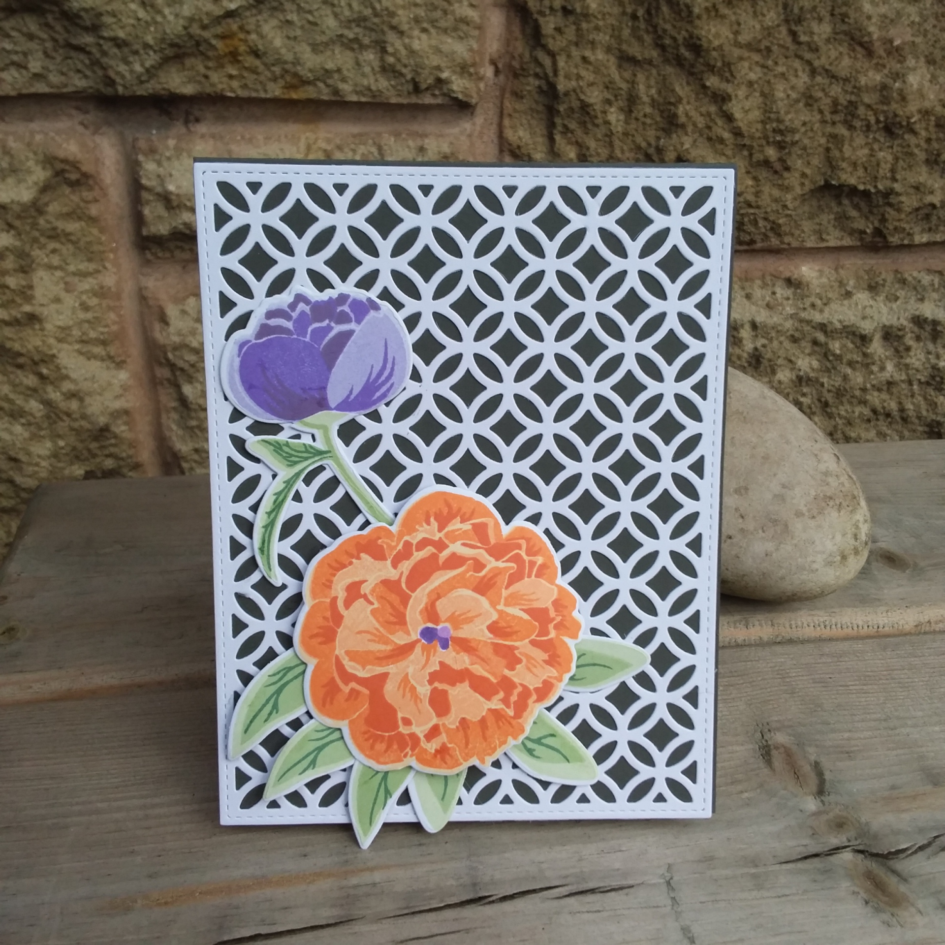
Hello again. I have a few cards to share today. I decide to move away from the die-cutting, and fancied a lot of stamping. Of course, there was some die-cutting too – but not too much. This first card is for the current challenge at CAS Colours and Sketches:The challenge was to use the colours Grapefruit Grove, Granny Apple Green, and Gorgeous Grape. I don’t have those Stampin Up colours, so I used some Altenew inks.
The background is the Lawn Fawn ‘Fancy Lattice Backdrop’, and the stamp set is Altenew ‘Bloom and Bud’. I went with a grey base card, to showcase and highlight the colours a little more.
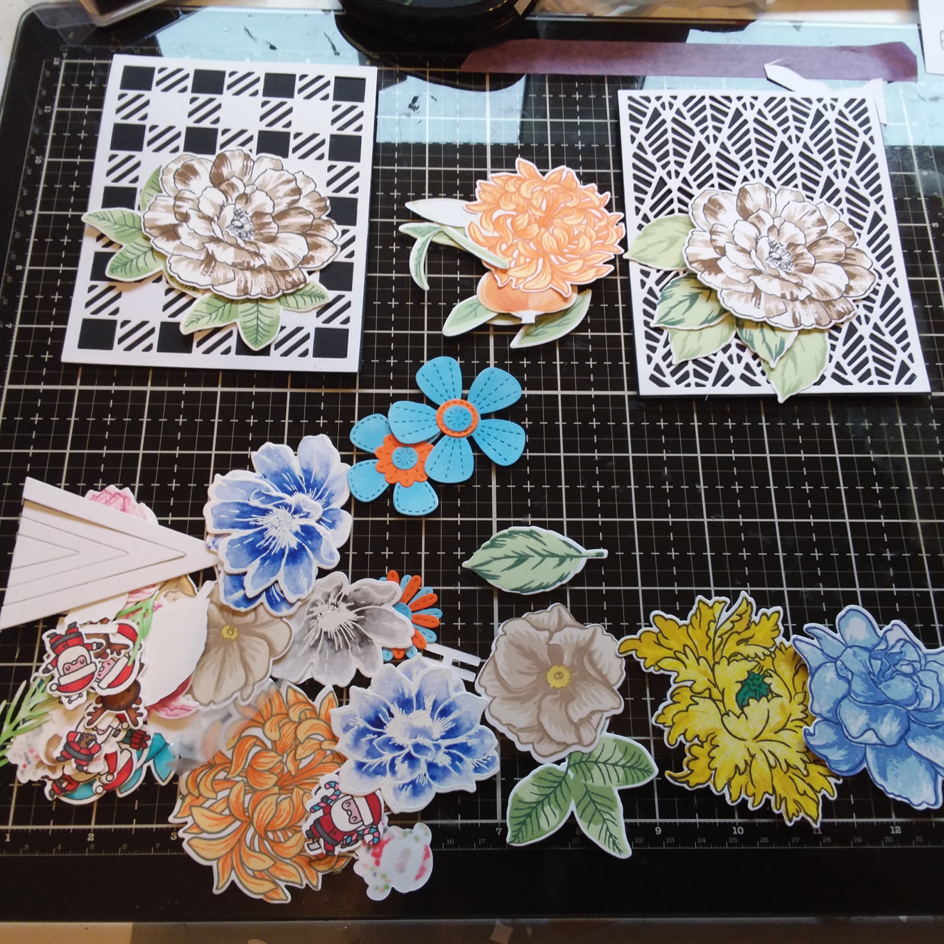
Now, I liked this flower and bud with a backdrop so much, – I did more cards. I just couldn’t stop myself. I took several backdrop dies – Lawn Fawn, Altenew, Catherine Pooler, and die cut them. Then I turned to my little stash box of coloured/stamped images to find some flowers and leaves, and created a variety of cards.
Here is the little stash I played with whilst thinking of more cards:
Of course – I didn’t use my Santa’s on these cards!
And my little ‘helpers’………!
One thing I have done recently – I haven’t put a sentiment on some cards I make. I take my cards into work for my colleagues, and sometimes they like the card, but want a different sentiment – so I can always add one, or they juts have the card and put their own sentiment etc on the inside.
If I think a card is really crying out for a particular sentiment, then I will add one – or if a challenge I am entering states a sentiment – but sometimes I leave it off. Does anyone have any comment to make about that? I would be interested in your views……….. :)
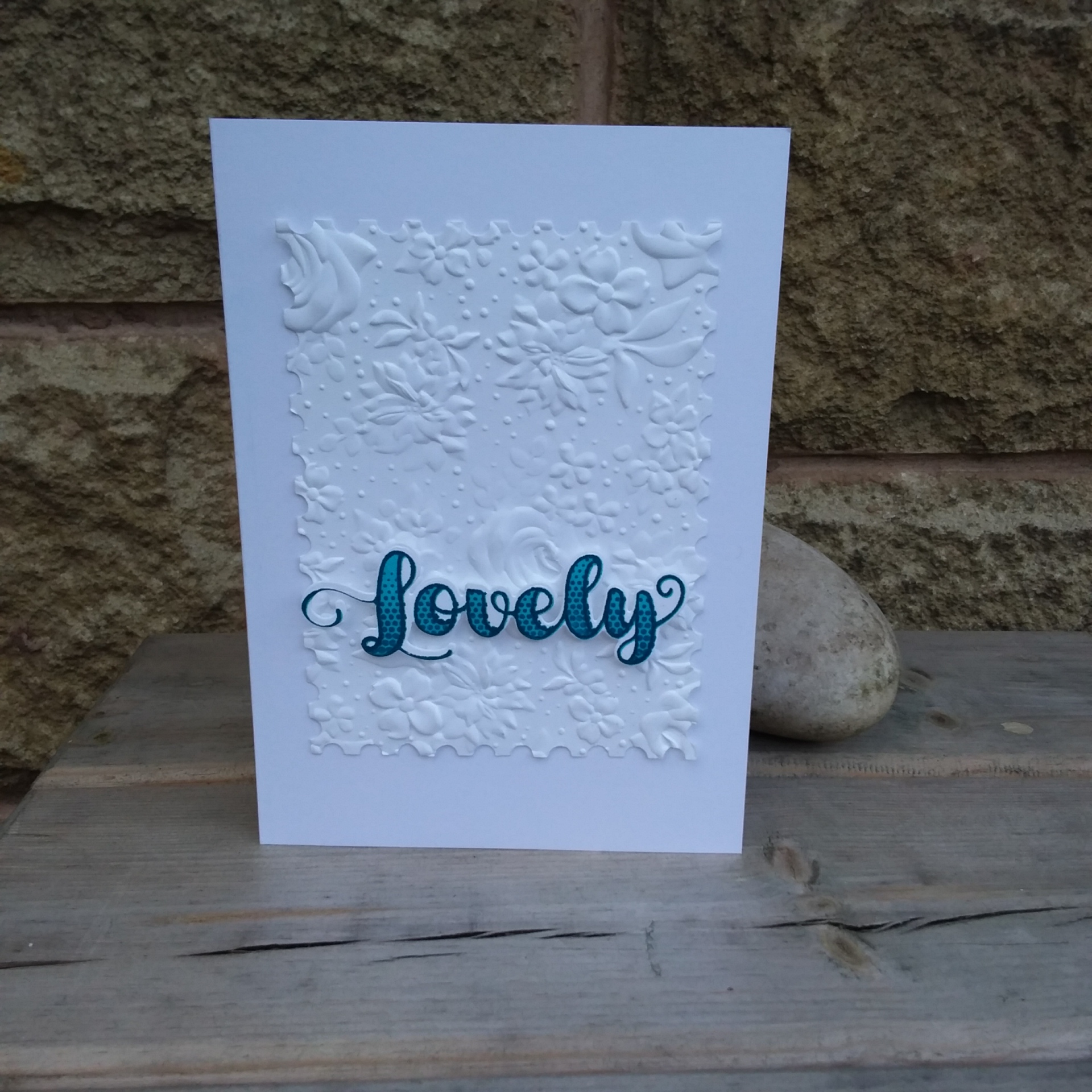
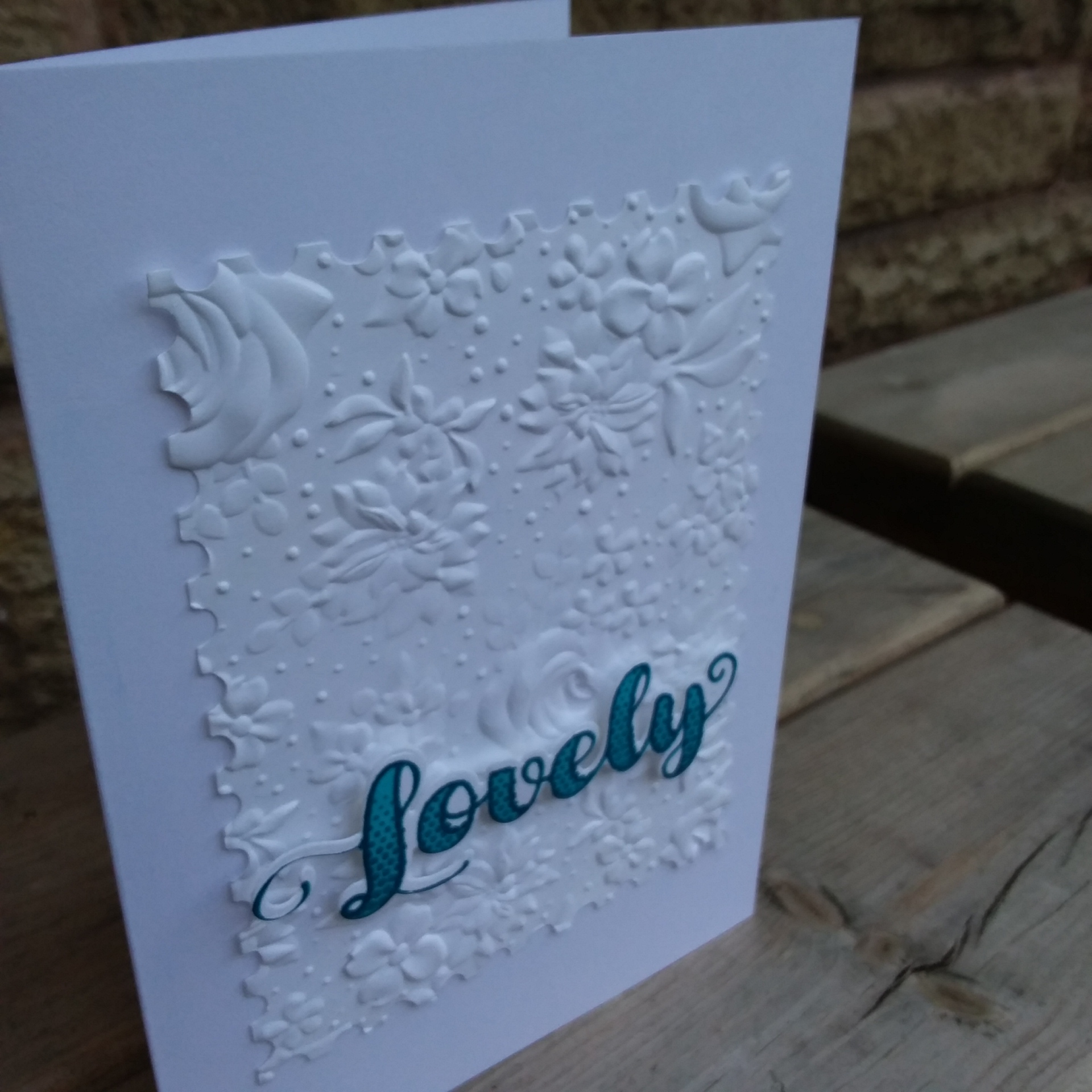
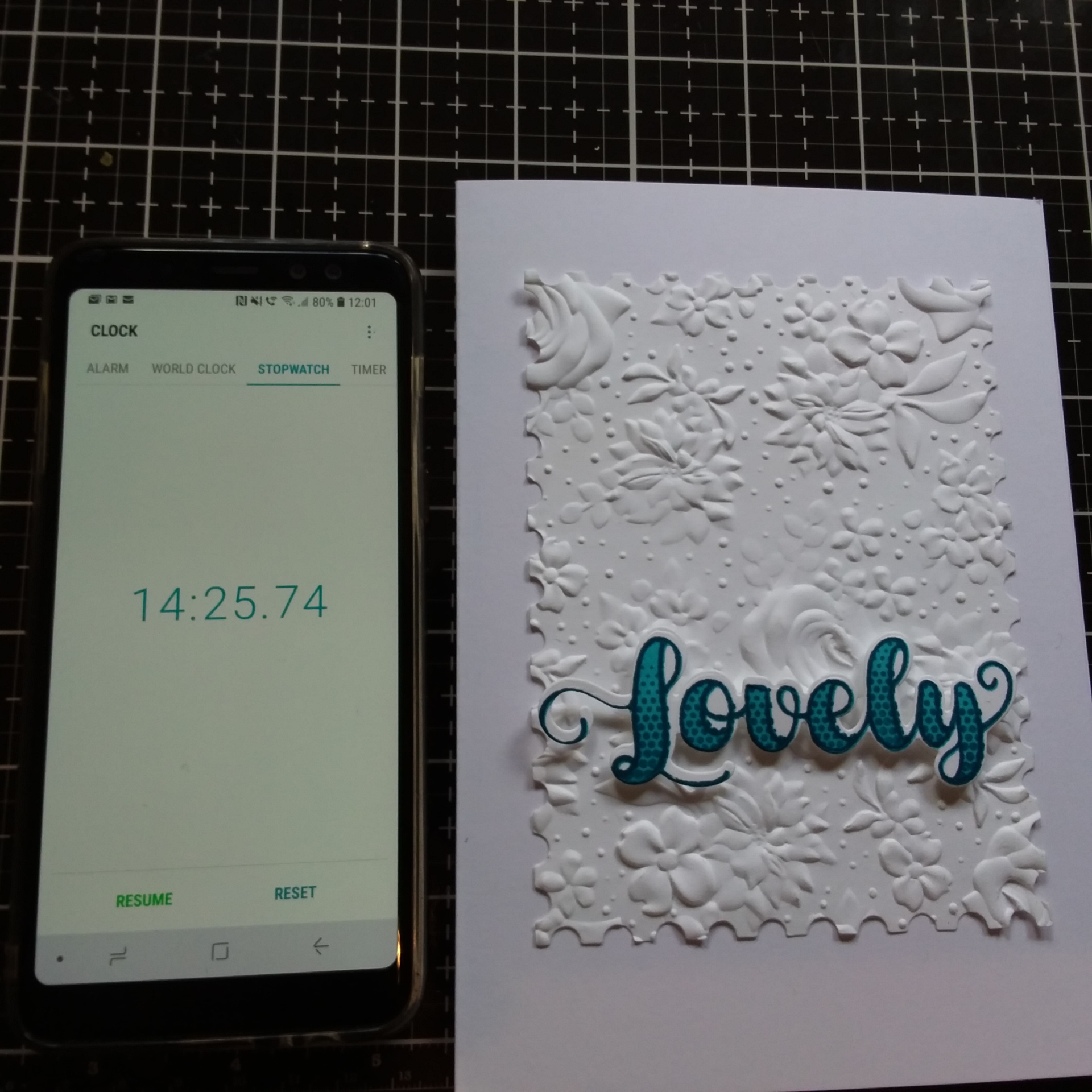
Hi there. I have a card to share inspired by a couple of challenges:
I mentioned the other day about a new delivery from Stampin Up, and this is the marvelous 3D embossing folder – plainly and simply embossed in white card, after die-cutting the rectangle with a Catherine Pooler die.
The sentiment is from the other new delivery I had the other day from Catherine Pooler – the colours chosen from my Altenew inks – as I used them for my ‘Ocean’ card the other day and they were still sat next to my craft mat.
The first challenge I will be entering, is from Just Us Girls – challenging you to use an embossing folder………
The second challenge is from AAA Cards, challenging you to make a CAS card in ‘minutes’, with the optional twist of dry embossing.
This card – I knew what I wanted to do – took me just under 15 minutes:
I thought I had everything out and ready – but spent a minute realising that my Gemini Junior wouldn’t take the embossing folder at all – and I fiddled for a while trying it, with different layers, but then resorted to my Big Shot Pro – because I knew that would take anything!
Another minute was wasted as I decided to add some stamped and die-cut hearts from the same Catherine Pooler stamp set – but then decided not to as I didn’t like how they turned out.
The key to speed like this is planning………… I think this is the quickest card I have put together – and I am really, really liking this embossing folder……..
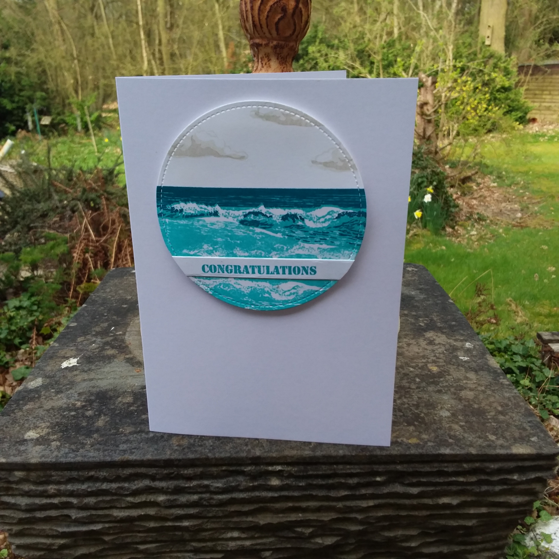
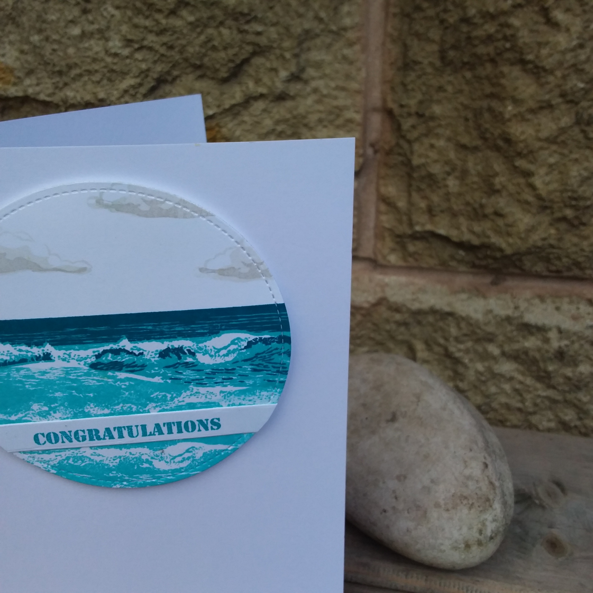
Hello there. I have a card for you today which is CAS – different to my recent cards:
I saw the theme for the current challenge at CASology – Ocean – and knew I had a layering stamp set somewhere, by someone, and it took me a few minutes to remember this was from The Ton – a golf course layering stamp set.
I had forgotten how to stamp and layer this, so I turned to YouTube – and found an amazing video from June 2018 – link HERE – where Effie from The Ton used the waves stamp several times, the technique for not getting any lines whilst mixing and merging the stamps – and basically you ended up with a beach scene. Just keep stamping the waves bottom layer again and again, in different places – and the effect produces a deeper and longer waves layer…..as above……
The initial stamps create the layer you see above with the darker waves, and the waves below that are just using the base stamp over and over again – varying the placement.
My first few attempts I got a few lines where I didn’t wipe the edges enough – but if you check the video out – it really is quite simple once you get the hang of it (she says – laughing – tongue in cheek!!)
Once I had the ocean stamped, I then used the current from the current challenge at CAS Colours and Sketches, die cut a circle – and placed as you see.
I also added some muted grey clouds from that same stamp set – two layer clouds, but in the lightest grey inks from Altenew.
Combining a theme, colours, and sketches really helps me to create a more balanced card. trying to put together colours fazes me sometimes – so many colours – so much choice, and where to stamp and put my die-cuts? That’s why I like to combine challenges.
Sometimes I start with a them, sometimes with the colours, but the sketch challenges certainly help me with the layout.
I seem to have lost my posting about this card, but have found it via a challenge link. Hopefully it works now……….and it hasn’t posted twice!! :(
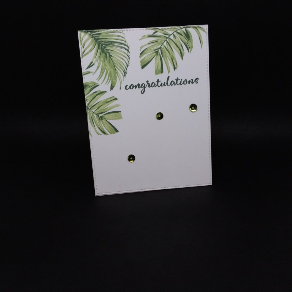
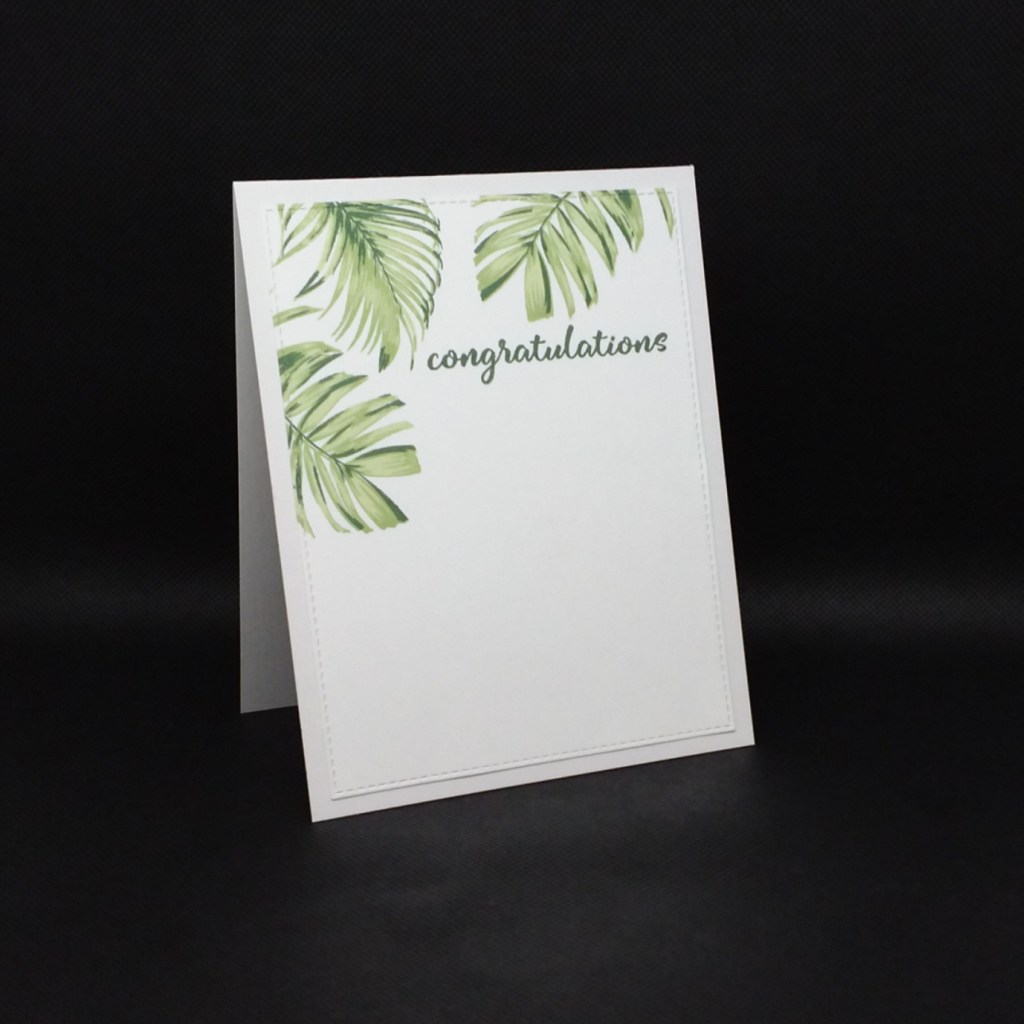
Hi again. I have a simple card to share today. I have spent the past couple of days playing with some intricate techniques and cards – see previous post – so today I wanted to go a little more clean……….
I actually made another with out the sequins, and matted and layered slightly differently:
The
idea behind these cards, was for a couple of guys at work who have just been
through some exams, and I wanted to give them a card which is not my usual more
feminine style – obviously – so these are what I came up with. A clean and
simple – yet effective – card.
Who
says a guy can’t have sequins on a card? Not me……….
I
used the Altenew ‘Wild Ferns’ stamp set and went with a simple stamped
image using three of the Altenew green inks.
This
layout is one I have used for a previous challenge where the idea was to use
just one third, or just the top part of the card. I find going back to previous
challenge sketch layouts gives me an idea about my design.
Good morning everyone. I have been a little remiss in my blog postings. I posted a couple of cards at the beginning of the week – Christmas cards – for a couple of challenges I am now Design Team for – ABC Christmas Challenge and The Holly and Ivy Christmas Challenge.
This means I will have a significant stash of Christmas cards by the end of the year, so I hope you will join us there.
I managed to get time in my craft room yesterday, and made three cards for separate challenges, so I hope you will bear with me for the bunch of photos, and as the lighting currently is quite poor – despite a light box – I did struggle with them, but I hope you can enough for what I was trying to achieve.
I used a stamp from Paper Artsy, and coloured with Copics. The sentiment is on two separate blocks to add to the ‘funky’ feel of the card, and the two outer strips are coloured with Copics, and cut to add as you see. I left quite a bit of the image white, so try to maintain a clean and simple look, as the image is quite a large one at six a a half inches tall.
This second card was inspired by The Color Throwdown Challenge, to use Grey, Purple, Lavender, and Kraft:
I turned to me Altenew 3D flowers for this, die-cutting them and then colouring with Copics. I did put the uppermost level as white initially, but then coloured it grey, which I prefer, but leaving the middle stamen white. Those leaves – my goodness – loving those leaves, I must say.
My third and final card for today:
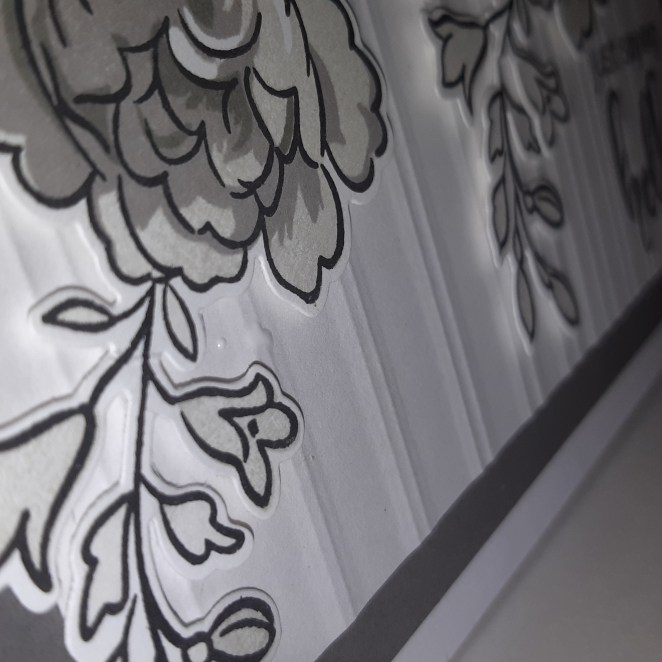
The colours were inspired by the photo inspiration at Pinspirational – the greys and whites, along with the stripes. An Altenew stamp and die set, and Altenew inks, and also dry embossing the Gradient Stripes Cover Die into the white background:
Once again, the lighting not brilliant, but I hope you see the stripes.
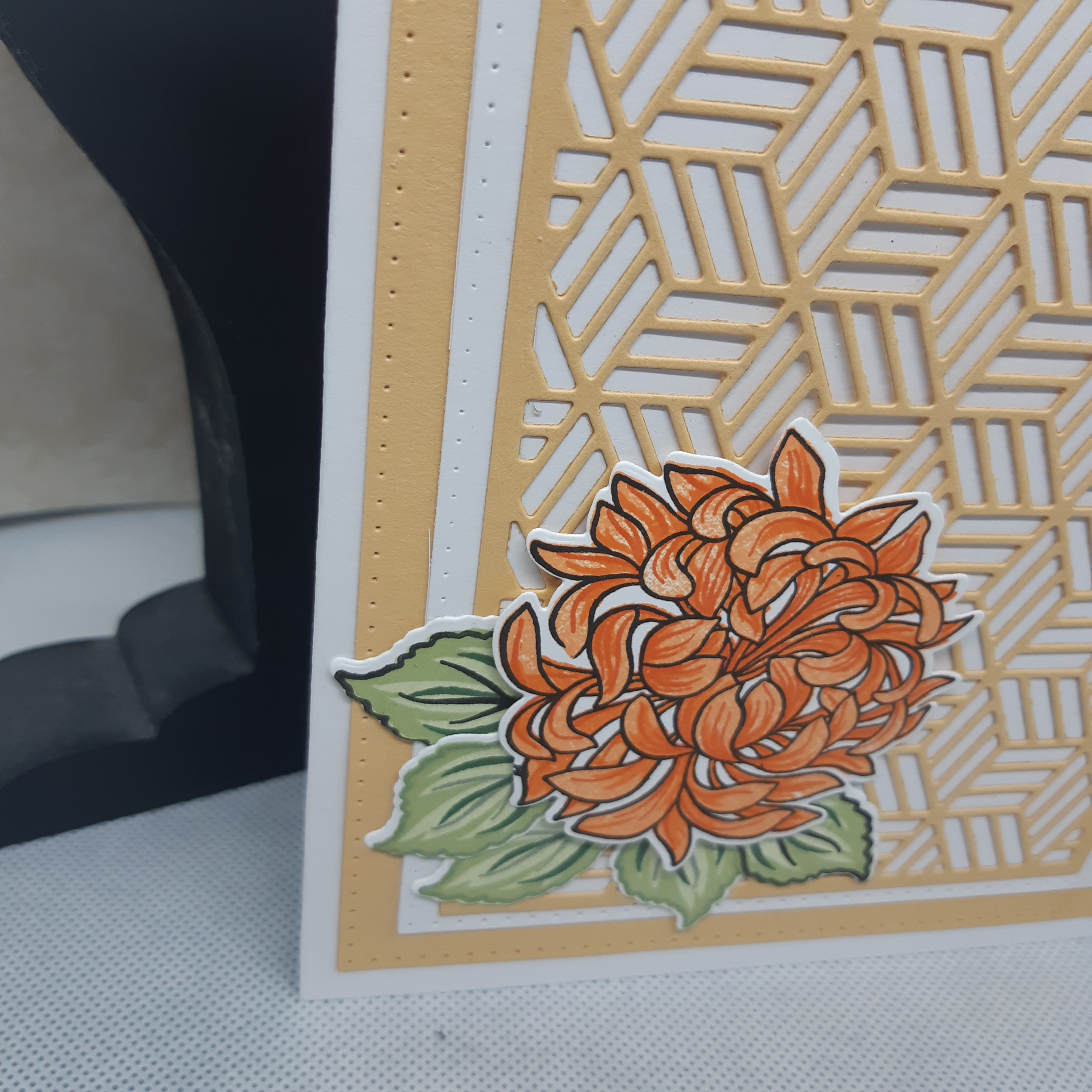
Hi there. I have a couple of cards to share with you today. The first is inspired by the current challenge at The Rainbow Card Challenge – I am more than stoked that I was the winner for the first challenge :) – with the theme this time being orange:
I used the orange range of inks from Altenew and their ‘Japanese Mum‘ stamp and die set. The green inks are also Altenew, and I am a fan and firm believer in their first green inks release,using them virtually 99% of the time.
The background die is from MFT, the ‘Star Grid Cover Up‘ using some orange card from my stock, and matted and layered as you see. I haven’t added a sentiment………I couldn’t actually think of one or find one that I could put onto this card, without spoiling the look of it…..so I’m going to put a little verse and words on the inside – when I find some I like!
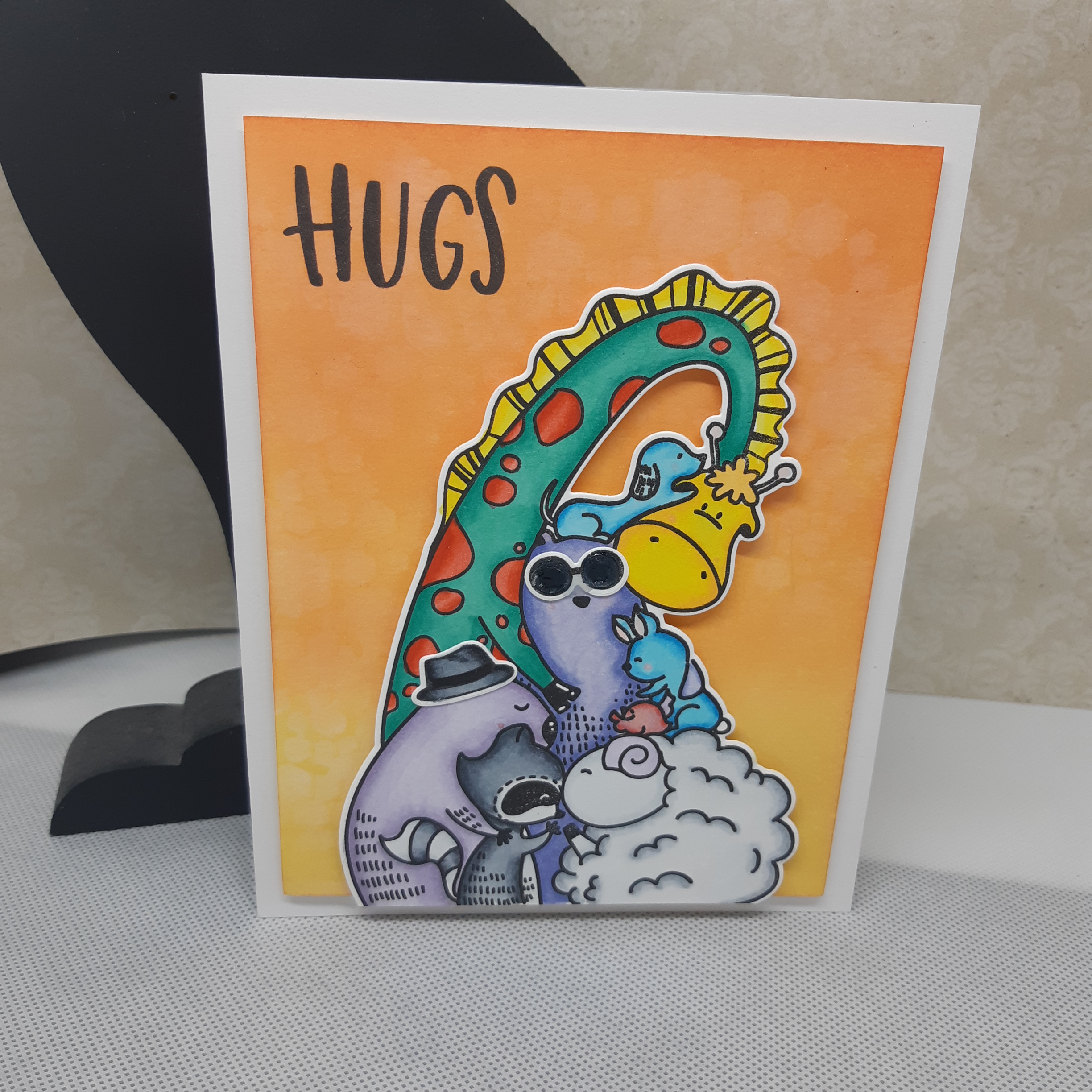
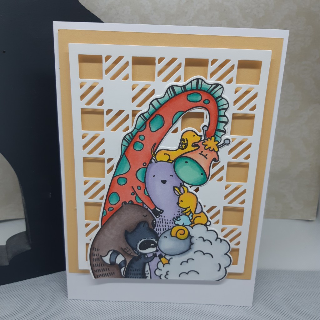
This second card is inspired from the current theme at Cardz 4 Guyz with their current theme being ‘wild animals’:
Well, actually, I made two cards:
As you can see – some wild animals having a group hug – which is what this Waffle Flower stamp set is called – ‘Group Hug‘. They may not look particularly wild to you and me – but I think they will fit into the theme nicely.
I added the hat and sun-glasses to the first image, so a little more masculine slant.
And – you may ask – why orange again? Well – I had just completed the first card above, and had the card stock out, and went a little ‘wild’ with the colours for the animals, and felt these backgrounds suited quite well. Vibrant and colourful – kinda what I was after.
I haven’t put a sentiment on this second card either……working on that one!
I enjoyed colouring this image – to a certain degree. I don’t find colouring particularly relaxing, I don’t enjoy spending oodles of time doing it. I get to a certain stage, then I find I am rushing to get it finished, then I make mistakes which I can’t correct, then get disheartened, then frustrated……….sheesh……walk away from the colouring, Lynda! Walk away!
It seems crafting is a school of learning, constantly learning new techniques, and also the psychology of crafting and card-making? Blinking Heck! I think there should be a degree course – at least – at University for studying that phenomenon!
I hope you’re having a good weekend – or middle of the week if you’re reading this later – and I’ll catch you later. HUGS :)


 The challenge was to use the colours Grapefruit Grove, Granny Apple Green, and Gorgeous Grape. I don’t have those Stampin Up colours, so I used some Altenew inks.