Three colours

20170525_181722

Hi there, despite it being 27 degrees today when I got home, I went to craft. I have a portable air-con unit which was ideal for this gorgeous weather! Cool as a cucumber – until I made some mistakes in this card. Took me several attempts for such a simple card, but here you go.

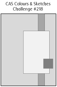
The colours I used are from the Colour Throwdown challenge, which I incorporated into a sketch from Clean and Simple Colours and Sketches. The colours were green, grey, and white.

I used a 6 inch square base card, to which I added a green strip embossed with a strip folder from Tattered Lace. The sentiment is from Concord and 9th, so is the ‘YOU’ part. They were obviously cut out of grey, and it was a Lawn Fawn Narwhal card I used for that.

The heart is from Stampin Up, a die set called ‘Sunshine wishes’.

What were the mistakes? Well – I forgot to cut the intricate dies with double sided sticky sheet on the back for one. So cut them again – and cut them the wrong way round, so when I came to stick them down – they were upside down. Start again.

I cut the ‘YOU’ letters, and put them into the middle of the heart in the wrong order! I spelt ‘YUO’. It took me a few minutes to realise what was wrong. I knew something was – but it took a while to realise.

Then – as I had stuck them down already, I had to cut another heart from another white piece of card, which I then inserted into the middle of the heart. Good grief! What a challenge! It was good that the air-con unit was working well.

Anyway, I will be entering this card into the following challenges:

CAS Colours and SketchesSketch

Color Throwdown green, grey, white

Tuesday Throwdownanything goes

The House That Stamps Builtanything goes

Still Triangle Turnabout

20170521_183003

This is the first attempt at using the Concord and 9th Triangle Turnabout stamp which turned out OK. For two of the layers, anyway. I don’t think you can imagine how long it has taken me to produce this little snippet of coloured card….I must have spent close to two hours yesterday trying to get it to work for me. I looked at half a dozen YouTube videos, created a template – or four – as recommended by them. It all went well for the first stamp and the first turn, and the next stamp – then all went to pot! I haven’t got a clue what happened. It all seemed to line up before I inked it, then it just didn’t work……

The small example above is just two stamps, with one turn. I was very tempted to try another turn, but decided I liked the look of it as it was, and I didn’t want to get it wrong yet again that same day.

Anyhoo, the card is made with the colours from CAS Colours and Sketches. The challenge was to use Rich Razzleberry, Sahara Sand, and Sweet Sugarplum. I only have the Rich Razzleberry ink, so used Crumb Cake instead of Sahara Sand, and used a piece of card which was Sweet Sugarplum.

As I was a little frustrated- just a little – I saw this sentiment from Tim Holtz and Stampers Anonymous (Phrases 2) and thought it certainly matched the kind of mood I was in. It actually uplifted me. I certainly have the courage to imagine……..I just couldn’t execute the idea. Don’t worry, I’ll keep trying until I do succeed. I am not a ‘giver upper’!

I shall be entering this card into the following challenges:

CAS Colours and Sketchescolour challenge

The House That Stamps Built –  colour palette

QKR Stampedeanything goes

Aud Sentiments challengeanything goes and a sentiment


3 colour triangle turnabout

I’m still playing with the Concord and 9th ‘Triangle Turnabout’, which is why I’ve posted again today – very excited I managed to get that far…… This time I managed to do three layers in the colours set out in the current Just Us Girls challenge – lime green, turquoise and navy. I did the design of the card to match the challenge from Freshly Made Sketches and the Fab ‘n’ Funky challenge for creating a background.

I must say, doing three of the four layers for this stamp was a little easier than before, but I did make sure my stamp was cleaned well between the colours so I could double-check before stamping.

The Navy and Turquoise are from Stampin Up, and the lime green is from Catherine Pooler ‘Lime Rickey’. I think the colours work well together, and I loved the combination. To match the sketch challenge, I cut a thin sliver out and separated the two, adding thinner foam pads to raise only slightly. I always add a little glue to each pad, as I find it then gives me some ‘wiggle time’ to make sure it is centred correctly.

The sentiment is from Altenew ‘Painted Inspiration’, which is a great stamp set with some lovely sayings on it. Quite motivational, which I think is the point of them. I used a Sue Wilson die to cut out the sentiment, and raised it with foam pads.

When I manage to get all four ‘turns’ from the stamp set – I’ll let you know.

Challenges I will be entering are:

Just Us Girlscolour challenge (lime green, navy, turquoise)

Freshly Made Sketches sketch

Fab ‘n’ Funkyuse a background stamp or create a background


Monochrome Friend

20170501_133854

Isn’t it true? A good friend does make everything ‘better’. Sometimes just being there, and sometimes not even being in front of you, but knowing they are at the end of the phone, makes everything ‘better’. Just sending ‘xx’ on a text – no words, just those two little kisses means someone is thinking of you, and wishing you well.

When I had done all my Gelato colouring and embossing yesterday, I decided to go for a more monochrome look. I have used a lot of colour recently, and wanted a change of pace, as it were.

Creative Knockouts has the challenge to produce a card for friendship, and so I decided to mix a few of my stamp sets up, and come up with a sentiment which is personal to me.

I used the sketch inspiration from Paper Play Sketches which I found to be very simple, and yet a great layout with so many different ways of interpreting it. I went with almost exactly what was given to us, as you can see….

I created my own background on a strip of black card, using the stamps from Altenew ‘Freeform Greenery’. I stamped and embossed them in white, haphazardly around that piece of card, and used the smaller stamps to fill in the gaps.

The sentiment is a mix-up from a couple of stamp sets. ‘to a wonderful friend’ is from Stampin Up’s ‘Dragonfly Dreams’, and ‘you make everything better’ is from Altenew ‘Halftone Everything’. I only used the outline of the word ‘everything’ as I liked how it actually looks bolder than the other words, and yet is not a solid stamp.

I shall be entering this card into the following challenges:

Paper Play Sketches – ‘sketch’

QKR Stampede – ‘Anything goes’

Creative Knockouts – ‘Friendship’

Morgan’s Art World – ‘Anything goes’


Graffiti card

20170501_133820

Hi there. I’ve been playing again! I was inspired by a graffiti challenge from Inkspirational, as I immediately thought of my Crafters Companion Textures embossing folder ‘Dry Stone Wall’. My first thoughts of graffiti was colour, words, and all painted onto a wall, which is why I went with this folder. I had no idea what to do to colour it, and what card base I wanted to start with, until I saw a Faber Castell show on Hochanda. I have some Gelatos, and – again – have never used them. Now was the perfect time.

I used a piece of Kraft card, and scribbled some Gelatos colour on it. I only have four colours, so I didn’t have many options. I scribbled, then wet the card, scribbled some more, rubbed with my fingers, scribbled some more, blended, even used a water brush at some point – it was very therapeutic…..

Once I was happy with the colour – it probably took about 15 minutes – I then stamped and embossed the letters. I have a stamp set full of capital letters and small letters and punctuation, no idea which company it was from, but I laid the letters out on my new Tim Holtz/Tonic stamping platform. I have only had this for a couple of days, but it came in very handy today when my card was more than 6 inches wide.

Once the letters were stamped and embossed, I then embossed the whole sheet. I find it easier to emboss afterwards, as stamping on an uneven background, even with a stamping tool, can be very awkward.

I tried to age the card by using a blending tool, but that started to rub off the embossed letters. So – I went in the my distress ink pad ‘Frayed Burlap’ and just rubbed the whole pad over the whole piece of card. It obviously caught the raised areas – such a great embossing folder – to add a darker colour.

A layer of black card, then all onto a base Kraft card.

I may have to try the Gelatos on some specific water-colour card for another project, after I have had a look at some YouTube videos, of course.

Challenges I will be entering:

Inkspirational‘Graffiti stamping’

Watercooler Wednesday – ‘masculine

Simon Says Stamp Wednesday challenge‘anything goes’

Brown Sugar challenge ‘no image, just a sentiment’

Colour Crazy Craft challenge‘anything goes’


Just a rainbow note…..

For today’s jaunt into crafting – as I only have a limited time today – I ventured into the clean and simple genre again.

The inspiration for this card was from Addicted to CAS, with the code word of ‘rainbow’. I may have gone a little too much the other way, compared to my multi-layered and embellished cards, but I like the simplicity of the design, and thought it would be ideal if I created some little note cards, sold by the charity in a set of four, for instance. I may try other little stamps in the corner, but have used stars and hearts from the Catherine Pooler stamp set ‘For Everything’. This stamp set was part of her Stamp of Approval collection and I hadn’t had a chance to use it yet.

The actual small little set comes with many stamps, for a variety of occasions, including sentiments, strips of dots, Christmas tree, kite, stars, a mug…..a wide variety.

I also used several of her inks, as I find them very vibrant, and stamp beautifully with a full and crisp image – I didn’t even use my Misti! The base card is Stampin Up, as is the layered part, as I find this very smooth card to be ideal for stamping.

I struggle to accept a clean and simple design and technique, as I have said before, but it does mean that the cards are quicker to make – once you have decided on the design and colours. Which is the hard part. Which is why I like to get inspiration from a challenge.

I shall be adding my latest card into:

Addicted to CAS – rainbow code word

Addicted to Stamps and More – theme of Clean and Simple


Sketch Inspiration

20170416_162224

A quick posting for the second card I made today, inspired from the sketch from Clean and Simple Colours and Sketches. As I mentioned before, I struggle with clean and simple, but took the rules for this site to heart – I think!

Rules: “Clean and Simple” is defined as “uncluttered, with white or open space, and minimal layers and embellishments”.

I always want to add more and more, but reigned myself in and did just what was asked from the sketch. I started off with an A4 piece of card folded in half. This particular card has a linen effect which is ideal for the more clean and simple cards, as it adds to the background without being too obtrusive – just a gentle hint of a little something.

I then took my Sizzix ‘Curly 2’ 12 inch die, which I’ve had for a loooooong time, and cut from a piece of plum/deep purple card stock I had spare, running the die cut through my Xyron 1.5 inch machine to enable me to stick it down easier than adding glue to all the swirls and curls.

I then stamped using my mini Carabelle Studio stamps ‘oeil maquille d’etoiles’ (eye make-up of stars – as per Google translate! ), and ‘Art’, stamping them in my Stampin Up ‘Rich Razzleberry’ ink – which I think matched nicely. I then die cut the sentiments using Sue Wilson noble stitched squares and rectangles, adding them to the base card with foam pads.


Time (butter)flies

20170416_142437

The inspiration for this card is from Time Out Challenges. There is a gorgeous picture of a clock and butterflies, which I have been thinking of for a few days. When I was in a panic buying mode in Crafters Companion store yesterday – looking for my water-colour card – I came across this stunning die from Memory Box, and thought it would be ideal for CASEing this inspiration picture. (Copy and share everything)

I initially thought that the die would cut the butterflies out of paper stock completely, but when I cut it in white – as per photo – I realised it actually cut the rectangle out, and part-cut the butterflies, leaving them in the card, attached by their middle section. I started off by thinking I would cut the die and have red underneath showing through each butterfly shape, but this wouldn’t work with how the die actually cut.

On to my next idea – I cut the die out of red sparkly card, and then cut each individual little butterfly out, snipping with my fine decoupage scissors. Yes – more than 50 little, tiny, butterflies. Then used my Stampin Up fine tip glue, and stuck each of the 50 little butterflies individually down on the white card base. Each one. Singly. Stuck down. Definitely had my patient head on when I did that! And, you know, it’s really, really difficult to not put them in straight lines, and make them haphazard…..

The clock was die cut out of Tim Holtz/Sizzix BIGZ die ‘Clock, Ornate and hands’, then embossed with Spellbinders M-Bossability ‘numbers’. The hands cut out of the same red sparkly card I had used for the butterflies. I was going the leave the card as it was, then decided to add a sentiment from Stampin Up ‘Special Reason’ stamp set – just a little one, in the bottom corner.

Yep – good idea – then smudged it! Again! Will I never learn? So I added yet another little red butterfly……………catastrophe averted. Kinda.


Fantasy Fairies


I have been playing with my Brusho’s again……I seem to create quite a mess – on the card and off of it! I was inspired by three challenges today – Cards In Envy, Fab N Funky Challenges, and Stamp with Sarah Kay. The first two challenges were to create fantasy cards, and the third challenge was for a water-colour background.

I started to get my Crafters Companion water-colour card – I had used the last of it! Now what do I do? How can I do a water-colour background without water-colour card? It won’t flow as well. I was in crisis mode! Luckily, their Chesterfield store is a mere 10 minutes drive away…………on with the make-up, did my hair, got in my car – and was back home within the hour. Of course, one has to look around the shop whilst there, doesn’t one? Guess what I found? These lovely, adorable fairies from Lavinia Stamps…..ideal for what I wanted to create. They are quite solid, but adorable. Out with the old idea, in with the new!

So – water-colour card cut square to fit my 7 inch square white card base. I used my Misti to stamp my two images facing each other, one higher, in Ranger Perfect medium. Misti because with the textured card I usually need to stamp twice. Added white embossing powder and heat set it. Then to the background. I thought the white embossing would resist the colours, so I just went on in there.

I wet down the card – both sides – taped it down, and sprinkled my chosen Brusho colours onto it. Turquoise at the top, Crimson in the middle, Lime Green at the bottom. A sort of sky and sunset and grass thingy going on here. Until they ran together! Blinking tape didn’t keep it flat! I mopped up extra colours, tried to stop the red running into the green, then the blue ran down – muddy colour in the middle! Wet it down again, kitchen towel to mop-up some colour, added one colour at a time, dried it, added the others. Don’t you just love kitchen towel??!!

I then used black Versafine to stamp some floral elements from Stampin Up ‘Flowering Fields’ stamp set. An older stamp set, but I like the little images – very versatile. I think it looks like the fairies are playing in a fantasy sunset field, dancing on the flowers – well – that was the look I was going for, anyway.

Attached the watercolour card to black, then added to base card. Of course, I added some glitter, and I think I’ve managed to catch this in the photo – Spectrum Noir clear sparkle pen. Pushed a little extra out and just flicked it onto the card.

I think I’m getting the hang of Brusho’s – I mean, you actually can’t plan very much where they are going to spread to. There may be a knack to them – but I’m enjoying exploring their capabilities…….


Smile in the rain


I have been having a play with a stamp set from Newton’s Nook, and the matching die set ‘Newton’s Rainy Day’. I have this for a few weeks now, and because I really, really struggle with cute animals and colouring, I have been holding-off playing with it. Today has been the day I have girded my loins and just got on with it.

I am not a colourist, I dabble – much like many of us, I am sure – and sometimes make mistakes, sometimes it works out right, but tend to (mostly) have fun playing.

This is my idea of playing. I stamped the main image four times – twice on Crafters Companion water-colour card, and twice on IndigoBlu stamping card. I coloured them all with my Zigs, and added Spectrum Noir sparkle to all of the umbrellas and water puddles at the end.

I found I didn’t know what colours to use except definitely wanted a yellow duck, and definitely wanted a blue puddle – the rest were experiments in colour. The cards with the purple cat and the red umbrella, and the brown cat and grey umbrella were in the IndigoBlu stamping card. I found that the zigs didn’t colour that well on this card, and left pen marks. The colour sank into the card very quickly, and I went over the imaged two of three times to try and even things out.

For the water-colour cards I wet down the area of card first, then went in with the colours, using my water-brush to spread the colour around a little, for a more uneven and water-coloured effect. I like the look of the texture of the water-colour card, so didn’t add too much depth.

The ‘Smile’ sentiment is from Altenew, which comes with a stamp and die set, but I only used the die. To get a full yellow effect, I wet down a piece of water-colour card, then ran my Stampin Up ‘Daffodil Delight’ ink pad across it. I used my water-brush to even the colour a little – but not too much – dry the card, then die cut the word out. The little sentiment is from the same Newton’s Nook ‘Rainy Day’ stamp set. I thought the two worked together quite well.

As I am trying for more clean and simple cards, I left them at that. No embellishments, no added sequins – just as they were.

I will be entering a card for the following challenges:

Addicted to Clean and Simple

Crazy for Challenges

Make My Monday Challenge

Addicted to stamps

Crafty Catz weekly challenge

Colour Crazy Challenge

Crafty Friends Challenge

I thought I’d give you an update about my late, late, late Christmas presents for my friend, and one week late on the birthday card and presents – all received very gratefully and graciously! Thank goodness.