Happy Birthday

20170411_211136


Despite all the cards I make, I am almost a week late with a card for one of my close friends. Even though we are based in the same hospital, and our office is next door to each other, it is very rare – not even weekly – when we see each other. She works two days a week, and I sometimes work at other sites. Needless to say – I am mortified!!!

We are going out for a meal on Thursday night, so I shall have to give her the card and presents then – but even five days is nothing compared to my still having her Christmas presents here. With me! Almost four months! How outrageous is that!!??

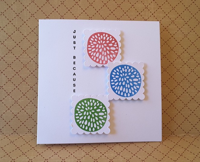
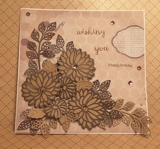
Anyway, to my card. Still a last minute thing, but I returned to my die cutting roots again. I put my purple card away yesterday, so you can there isn’t one drop of purple to be found. Brown. That is what we have – brown. With a little sparkle.

I started with a white 8 inch square card base, and added some patterned paper from Be Creative! I am  trying a new glue. I usually add most of the layers with double-sided sticky tape, but I had a craft clear-up and found quite a few bottle of Tonic glue, so thought I would try that. I’ll let you know how it stays stuck down………

I then die cut flowers from Stampin Up ‘Stylish Stems Framelits’  and layered Kraft card with a darker brown card for two tone effect. The dark brown card I ‘found’ in a pile I was saving for later, for something special. Why do we do that? Isn’t the card we are currently making that special card to use our stash on? I am sure I have items which I am ‘saving’……………

I then die cut some ferns and leaves with Sue Wilson ‘Finishing Touches – Mosaic Leaves’ and layered them altogether using Pinflair glue. The Pinflair glue allows me to move items around until I get the positioning right, and also allows things to be ‘shoved’ under each other.

I then stamped the sentiment using my Misti – despite me already having layered the die cuts (I know, I know!) from the Altenew ‘Wishing You’ stamp set.

I may have rambled a little and gone off on tangents, but that’s because I’m hoping you haven’t all stuck with my complete and utter tardiness with cards and presents for my friend….

I shall be entering this card into the following challenges:

Simon Says Stamp Wednesday Challenge

That’s Crafty Challenge Blog

Always Fun Challenges

Aud Sentiments Challenge


Three colours only

It’s been an absolutely gorgeous day here is Chesterfield, UK. Bright and sunny, so a little time spent in the garden throughout the day. It’s only when the sun went down, and it turned cooler, that my thoughts then turned to making a card. Well, I did want to make a card earlier, but the weather was just toooo nice.

I chose to make a bright and cheerful card again today, so my thoughts turned to the current challenge from CAS Colours and Sketches.

Their current challenge is to use three colours only, clean and simple card, but you could also use the basic white/grey/black/white/Kraft for sentiments and outlines. I managed to use two of the specific colours – Pear Pizzazz and So Saffron, but I didn’t have Wisteria Wonder. I had a look at the Stampin Up web site of my demonstrator (Shell Bower) to get an idea of the colour, then went hunting through my other inks. I came across my Ranger Archival Ink ‘Violet’ which seemed to match quite well with what I saw in t’old tinterweb.

So – now what to do? I had been meaning to use my little Card-io Majestix stamps for a while, so sat down and had a look through my stash. I decided on a mixture of sets, one with flowers, which I stamped in the Violet ink, leaves in Pear Pizzazz, and a flourish I stamped in So Saffron. They are cute little stamps, aren’t they? I do think they are expensive for what you get – but as long as they get used, right?

The purple layer of card matched the violet – from Creative Expressions, I think – and then a white base layer.

You may be asking what those little flourishes are doing at the top of the card? Well…..guess who smudged? Yet again! Don’t tell anyone – they’ll never notice. Just between you and me!

I found I actually have more of these little stamp sets than I thought, so I may have more of a play with them this week, and see what I come up with. There are a good selection of examples on t’old tinterweb, so perhaps I may play and post what I have done.


Fresh Sketch


20170408_104728


After doing some quite complicated techniques and dark colour schemes the past few posts, I just thought I’d throw a spanner into the works and do a clean and simple card based on the sketch challenge for Freshly Made Sketches.

I know it’s my second posting of the day, but I have had my crafting head on, and hubby has been golfing……..

I used a 6 inch square card base, with three little squares attached with 3D foam. Each square is cut using Crafters Companion Essentials Scalloped Squares, after stamping with one of the stamps from Altenew ‘Simple Flowers’ stamp set. I used Catherine Pooler inks – Rockin’ Red, Something Borrowed, and Grass Skirt.

I always wonder whether to stamp first and then cut, or cut first then stamp……this time I stamped then cut. Is there a supposedly correct way? Or do we do what we usually do – whatever works best for us?

The sentiment is from Stampin Up ‘Vertical greetings’, which is a great little stamp set with other vertical greetings, and topiary stamps. I stamped with Versafine Black Onyx, using my Misti.

I use the Misti a lot when stamping, especially when stamping directly onto the card base, as I never seem to get it quite right first time. I always seem to get the depth of colour wrong, or it doesn’t stamp correctly, and the Misti just help me to line things up, and double/triple stamp if needed. I then added the squares as per sketch pattern.

A quick card, as clean and simple as I think I can make it……


Clean and Simple Sketch

20170401_214152

A quick and easy blog post for today – working all week again, so not sure how much time I’ll have in the evenings – depends on what time I get home and what hubby wants for tea……..!

I’m having a go at the sketch challenges at the moment, and am struggling with keeping them clean and simple – and think I’ve been a little too clean and simple with this card. I thought I’d post it anyway, as I actually do like how it turned out. I like the simplicity of the flower and sentiment, and the contrasting colours of the two base layers.

This sketch was from CAS Colours and Sketches and I think I’ve achieved what was asked……we shall see.

The base card is from Create and Craft – a Topsy Turvy card I have a stock of, with the inside of the card being a lighter blue. The next layer is almost like a burnt orange, with a lighter reverse side, but that lighter side on this piece is a little ‘wishy washy’. I think it’s a pink – but quite bland. Anyway, didn’t use it so it doesn’t really matter.

The white card is from Stampin Up, and I stamped the ‘Best Thoughts’ flower in basic grey, also from Stampin Up. The sentiment was cut out of Lawn Fawn Narwhal card, after I had attached some double-sided sticky sheet to the back of it. I was thinking of using my Xyron again – but the sentiment is quite long – almost 6 inches, so thought it would be a waste. The double-sided sticky sheet worked very well.

I admit this is a very simple card, but I will probably do it again, using different colours for the base card, just to see what effects I can create – some pastel colours, some maybe black and white cards. I may even try colouring – you never know……


Up, Up, and Away

20170401_154412

I wanted to do quite a bright and cheerful card today, and didn’t want to get messy – for a change! The inspiration from this card came from The Colour Throwdown with the challenge to use the colours light yellow, blue, and green. I started thinking about water-colouring and a scenic card, but then also thought that I could use blue for the sky, and take the opportunity to use my Stampin Up ‘ Up and away’ thinlits dies. I have had them for a while, but not used them yet.

I took a 7 inch square white base card, and used my Sue Wilson ‘Ornate Pierced Squares’ to cut a layer slightly smaller. I then hunted through my embossing folders, as I thought I had one which had clouds on it. If I have – it is safely filed away somewhere – I couldn’t find it. So, I then took my Crafters Companion Textures Elements ‘Rain’ embossing folder, and ran the blue card through my Big Shot Pro.

I love the Big Shot Pro, as I can use all my A4 folders, my 12 inch square card/paper, and basically haven’t found any size of die out there on the market I can’t cut with it. I do, however, feel it is not so good when cutting smaller intricate dies – that’s what I have my Big Shot express for!

After embossing the blue card, I then took my ‘Up and Away’ thinlits and cut the intricate hot air balloon twice, then cut the different layers in green and yellow, and then used all those layers and stuck them behind with some detail glue. I then took the cloud shapes in the same die set, and cut several out of white card, and cut a smaller hot air balloon out of white card for my sentiment. The sentiment is from a set from Card-io called ‘Up, Up and Away’.

Card-io do a huge – and I mean huge – variety of smaller stamps ideal for creating your own background, for creating scenes by using each small stamp and building-up the project. They have tiny bugs, larger bugs, clouds, sentiments, trees, bushes, birds, alphabets…..the list is almost endless. Their web site has a lot of inspiration, ideas, and hints and tips. A great range of stamps…….mmmm….now I have found mine again I may have to have a go for another challenge!

Anyway, back to the card itself. The clouds were glued directly onto the blue card, but my balloons were attached with Stampin Up dimensionals.

This card actually didn’t take me very long. The longest time was spent deciding where I wanted everything to go, and which tone of blue and green worked well together. Compared to my last few cards I think this is quite a simple and clean card. I may have to do some more to take for the charity to sell.

I will also be entering this card into the Aud Sentiments Challenge, and 4 Crafty Chicks Challenge.


Coloured Rose

It’s been a couple of days since my last post, with the previous week being very productive for me. My husband is back from his travels, so today is the first day since his return I have been able to go to my craft room and play – he has gone golfing.

I went to Crafting Live in Doncaster yesterday and came away with quite a lot of goodies. I went there with mum, and we had a good time, a few laughs – and bought lots of stuff! That show is amazing. I tend to go in the summer, with mum and sister, and we always find what we are looking for, the stall staff are very friendly and helpful, even though it does tend to be very, very busy. I think we were there for over four hours, and sometimes go back for the second day, too – but the weather is gorgeous, I have time to play, and time to go into the garden – so decided not to this time.

This rose stamp is a new buy from Honey Doo crafts called ‘Roses are red’ and comes with a matching die. I decided not to do one card, or two, but four in total. I used my Crafters Companion water-colour card, and stamped and embossed the outline twice in detail black, and twice from white. I knew I wanted to add the colours from the CAS colours and sketches challenge, and wanted to play with different techniques. The colours are named from Stampin Up, and I do have the exact colours, so I didn’t have to think about which colours matched.

After embossing the outlines in white, for one card I used my water-colour brush and took ink from the lid of the ink casing, and coloured the flower for a muted look, and on the other white embossed card I used my Stampin Up markers of the same colours for a slightly more vibrant look – but still drew the ink out with my water-colour brush, adding a blue wash around the flower, before die-cutting the image and sticking to a 6 inch square white card.

For the images embossed in black, I coloured the image using the markers and drew the colour out slightly with my water brush, and for the other I coloured the image with the pens without drawing the colour out, for a more vibrant look.

I love how versatile this stamp is, and how the different techniques can give a totally different look. My favourite is the more vibrant look, and of the cards the two embossed in black seem to stand out more.

I shall also be entering one of these cards into the Crafty Challenge Calendar and Addicted to Stamps and More


Buttons for wheels

You may wonder why I seem to be posting quite a few cards this week……well, my hubby is away for a few days, so I can do as much crafting as I like, without having to worry about anyone else. I can please myself when I eat, what time I go to bed, and how long I can craft for………..all good. For a short time, anyway.

This card is a clean and simple card, as a complete opposite to my gold card from yesterday. I didn’t want to do much to the background, I didn’t want to add embellishments – I just wanted to play along with the challenge from 4 Crafty Chicks and have fun.

The theme for this time was to use buttons. I actually didn’t have to think for a long time as I immediately thought that buttons could be the wheels on this bicycle stamp from Stampin Up. I bought some buttons recently as I wanted to do a mixed media project with lots of buttons – not yet got down to doing it! – and one of the colours matched quite nicely, I thought.

On the Whisper White card from Stampin Up, I stamped the bicycle in Ranger Archival ‘Coffee’. I determined where I wanted the bike on the card by cutting out my Lawn Fawn ‘Road Border’ first, and moving it around the card. Did I want the bike straight across, did I want the bike going up or down one of the hills…? I decided I wanted the bike straight, with the connotation that for the hill coming up – I would pedal for a while….Almost soppy and sentimental, if you think about it.

I didn’t want harsh lines for this stamp, as I knew I was going to add a black road. The coffee colour was just the right shade for adding some colour to the bike frame and bars – with my Stampin Up pens ‘Pumpkin Pie’ and ‘Daffodil Delight’ – and also was the right colour to stamp the sentiment from the same stamp set. I only used a couple of colours purposefully, not wanting to add too much to take away from the sentiment. I did originally plan  to stamp the two sentiments more off-set from one to the other, but forgot!

The stamp set also comes with items you can put on the bike, including a basket, into which you can stamp some bread, some flowers, some hearts, but I didn’t want to determine  whether to card was for male or female. I didn’t want any addition to the plain and simple stamp, I just wanted simplicity. I didn’t emboss anything, I didn’t glitter anything. I know, right? I resisted……….

I added the buttons as the wheels of the bike, then added the road lastly, and adding the whole thing to some Stampin Up ‘Crumb Cake’ card stock.

I like using Stampin Up, and I have a great demonstrator, Shell Bower, who has been to my house a couple of times to have a crafting few hours with some of my friends. Quite a reasonable price for a few hours, and even the non-crafty friends enjoyed it. She is very helpful, and spent some time a year ago talking to me about being a demonstrator.

I did consider joining as demonstrator – but I have so much stuff from other companies – and you’re not supposed to sue anyone else’s products – that I refrained both this year and last year. I have too much Tim Holtz, Lawn Fawn, Altenew, IndigoBlu, MFT………..to consider not using them. I like to use a lot of different products when I craft, I don’t like to be restricted from what I want to do. If I want to use Tim Holtz with Stampin UP – then I can…..Oh dear. Did someone say control freak who doesn’t like to be told what to do? Who doesn’t like too many rules? You’re right. I work within a ‘rules’ orientated work-place (NHS Hospital) and so when I craft I don’t want rules. I want to spread my wings, as it were, and harness my inner artist. (That could almost be a sentiment, couldn’t it?)

Final word (for this post) –  having fun, loving crafting, some sunshine today (Derbyshire, UK)……….jolly good day for me.


Flowers and colour throwdown

I have quite a bit of time to play this weekend, and I am enjoying every minute of it. There are a few challenges about to close, so I thought I would combine two challenges with this card. The ‘Colour Throwdown’ and ‘Simon Says Stamp Monday challenge’.

The first challenge is to use the colours green, black and gold, and the second challenge was to use hand-made flowers. When I want to use gold, I see cards as being quite decadent, and sumptuous, and then thought how I could incorporate flowers and decadence.

I returned to my roots, by using quite a few of my Sue Wilson dies. I have a few of her flower sets, and wanted a solid flower for this card. I also spied my Corner Garden from Stampin Up – I haven’t used that for a while.

I started with a brown Kraft base card of 8” square, used my Sue Wilson stitched squares for the layers of black, green, then black again. I used my embossing buddy over the smallest square, and stamped the ‘Corner Garden’ stamp with my Ranger Perfect Medium, using a Cosmic Shimmer ‘Detail Gold’ and heat embossed the image. The image didn’t come all the way across the bottom of that square, so I decided to use my flowers to cover the blank area to the bottom left. I usually put my flowers on the bottom right corner, so this is a little change for me.

To get the flowers to match the gold of the embossing powder, I covered a piece of black card with ‘Be Creative’ double sided sticky tape, added the same gold embossing powder, and heat set it. I then cut out several sizes of the flowers from ‘Perfect Peony complete Petals’, so I could put several layers on the flowers. I curled the edges of the petals slightly, and layered them together to create three flowers. I like the way the embossing with this tape isn’t completely smooth, I think the added texture gives some more interesting detail to the flowers. I didn’t put anything in the middle of the flowers as I couldn’t think of anything which would work, so left them as is.

I then used the remainder of the gold embossed black card to cut out the leaves from the matching set ‘Perfect Peony Open Petals’. I didn’t want the leaves solid, as I felt it would cover too much of the base card, so only used the outline dies.

I added the flowers and the leaves to the card with Pinflair Glue gel, so I could manipulate their position, and insert the leaves where I wanted them. I did move them around that corner a few times until I was happy with the placement of them.

The sentiment is from ‘Paperartsy’ and is part of a guest designer collection. The set has a number not a name – ELB05 – is has 6 sentiments relating to flowers, some of the quotes from William Blake, and Henri Matisse. I chose the one I used as it fit the open space perfectly. I used my Perfect Medium again, and the same gold embossing powder.

I was nervous to stamp it, but I stamped it using my Misti, before I added the flowers – just in case. I find the Misti has made me use stamps more than I ever have as I can just go over the image again and again if it hasn’t stamped well.

I was tempted to use some dew drops, some other embellishments – but I restrained myself, and am overall liking what it came out like. I liked the clean lines of the card base and the layers, leaving the eye to be drawn to the flowers, stamp and sentiment.

It felt good to get back to my die-cutting roots with the Sue Wilson dies, and also incorporating some newer stamp sets from Stampin Up and Paperartsy. As always – loving embossing!


Frustration….

I was having a frustrating day crafting. I’ve been fighting with doing a slider card – like the ‘Octopi my heart’ card from a previous blog posting, and then trying some layered stamping. I couldn’t get anything right. For the slider card I was having trouble getting my bee (die cut shape from a stamp set) to slide around the hive. I tried a number of things to get it to slide – embossing buddy powder, original slider element from MFT, a penny – just wasn’t having any of it.

I moved onto a truck I stamped and cut out, from Stampin Up Tasty Trucks, same thing. truck too big, penny too small, wouldn’t move smoothly. Still sitting on my craft table – at least I didn’t bin it!

So, I moved onto to layered stamping ‘cos I thought I’d cracked the code previously – rubbish. Nothing matched. Nada. Zip. Zero. Zilch. Blinking heck was I getting frustrated……….! That almost went into the bin – but I counted to 30 (it took that long to calm down), placed it carefully on my craft table, went to make a cup of coffee, then returned to my craft room.

To cheer myself up, and to get back on the horse – as it were – I turned to my current favourite stamp set. I was sure it would cure my blues, my frustration, and my (almost) tears……and…..it did! Yay!

This stamp set is so easy to work with, items come together quickly, and I made a few variations. I mixed and matched colours from the range I have. Used patterned papers, though sparingly, and just stamped, die cut, stuck things down to my hearts content.

The two backgrounds are from a couple of stamps from Catherine Pooler. I love the candy stripe, and using my Misti, and Catherine’s gorgeous/superb/marvellous inks, it only took a couple of inking and stamping episodes for a perfectly stamped background.

The die cut on the birthday wishes card is one of Tim Holtz steel rule label dies, which I cut in half. I liked the look of the label, but it was too big, so I thought in half it matched the size of the lady well.

I am ending my day so much more happier and in a much better place than 3-4 hours earlier.

No challenges entered this time – just pure fun (in the end, anyway)


Some Beautiful You

This set of cards I’m not quite sure about………I don’t use a lot of patterned papers in my cards, usually only strips of pattern, and often find I am not happy with the results. I thought I would publish anyway, as I enjoyed making them – but I may make more without a lot of the pattern, sticking to my usual strips of colour/pattern and not layering the whole thing.

The stamp set is from Stampin Up ‘Beautiful You’, and there will be more cards coming up from this set. I find it very versatile, and easy to use, and have made quite a few which I will be giving to my charity to sell.

The lady was stamped onto water-colour card, and then used a technique new to me – reflection stamping. I got the idea – and the know-how – from Jan Brown, a Stampin Up demonstrator, who I follow on YouTube.

The three cards above have the three different outcomes of my first few tries. I really like how they turned out, from quite bold in the main picture, to quite muted in the last picture. The blurry one is because I moved when doing the reflection – but looks good in the water/puddle. Do you agree?

Basically, use a piece of acetate or packaging, stamp the image you want, then flip it and use that stamped image to stamp onto the card/paper. It could be reflected below, above, or either side. As I mentioned, the first image I moved slightly – that acetate is slippery! The second image I pressed down, and the third I really concentrated on keeping it still and pressing all over the inked image.

Once the ink was dry, I coloured with my watercolour brush, creating a puddle effect around the reflection, and added some sequins for some dimension.

I have a thought process of stamping reflection technique – two ladies, hand-in-hand -= another stamp from the same set – watch this space.

I’ll be entering this card into the challenge on Inkspirational. The word prompt is ‘connect’, and I thought that connecting the same stamp with the reflection stamping technique would be a quirky way of meeting the requirements.