Buttons for wheels

You may wonder why I seem to be posting quite a few cards this week……well, my hubby is away for a few days, so I can do as much crafting as I like, without having to worry about anyone else. I can please myself when I eat, what time I go to bed, and how long I can craft for………..all good. For a short time, anyway.

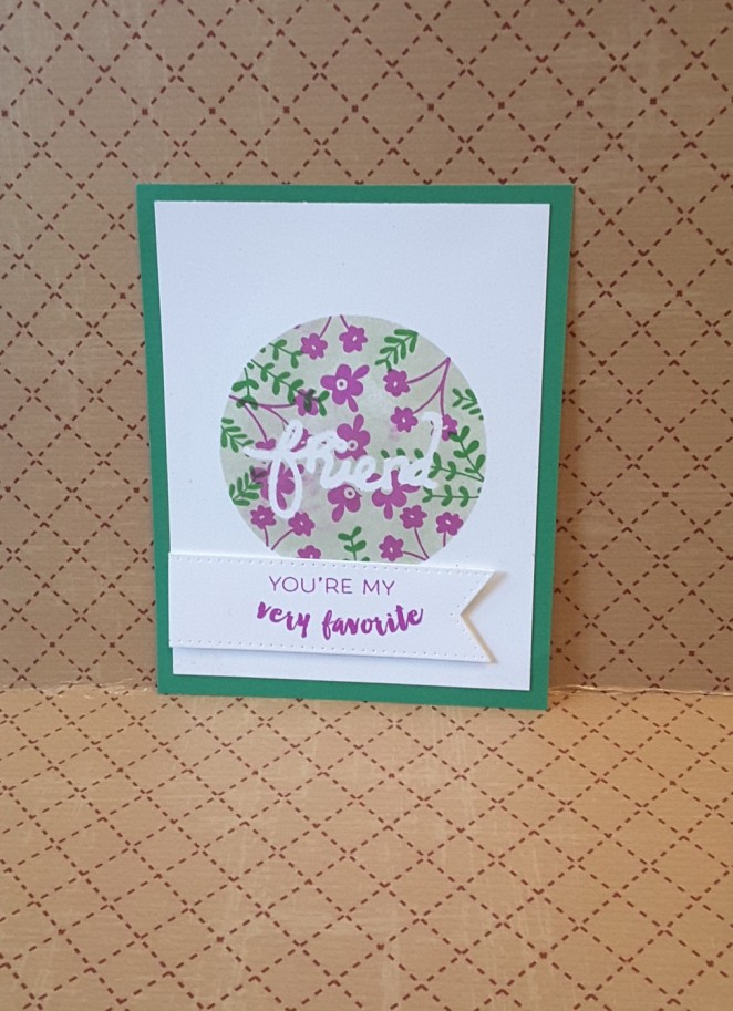
This card is a clean and simple card, as a complete opposite to my gold card from yesterday. I didn’t want to do much to the background, I didn’t want to add embellishments – I just wanted to play along with the challenge from 4 Crafty Chicks and have fun.

The theme for this time was to use buttons. I actually didn’t have to think for a long time as I immediately thought that buttons could be the wheels on this bicycle stamp from Stampin Up. I bought some buttons recently as I wanted to do a mixed media project with lots of buttons – not yet got down to doing it! – and one of the colours matched quite nicely, I thought.

On the Whisper White card from Stampin Up, I stamped the bicycle in Ranger Archival ‘Coffee’. I determined where I wanted the bike on the card by cutting out my Lawn Fawn ‘Road Border’ first, and moving it around the card. Did I want the bike straight across, did I want the bike going up or down one of the hills…? I decided I wanted the bike straight, with the connotation that for the hill coming up – I would pedal for a while….Almost soppy and sentimental, if you think about it.

I didn’t want harsh lines for this stamp, as I knew I was going to add a black road. The coffee colour was just the right shade for adding some colour to the bike frame and bars – with my Stampin Up pens ‘Pumpkin Pie’ and ‘Daffodil Delight’ – and also was the right colour to stamp the sentiment from the same stamp set. I only used a couple of colours purposefully, not wanting to add too much to take away from the sentiment. I did originally plan  to stamp the two sentiments more off-set from one to the other, but forgot!

The stamp set also comes with items you can put on the bike, including a basket, into which you can stamp some bread, some flowers, some hearts, but I didn’t want to determine  whether to card was for male or female. I didn’t want any addition to the plain and simple stamp, I just wanted simplicity. I didn’t emboss anything, I didn’t glitter anything. I know, right? I resisted……….

I added the buttons as the wheels of the bike, then added the road lastly, and adding the whole thing to some Stampin Up ‘Crumb Cake’ card stock.

I like using Stampin Up, and I have a great demonstrator, Shell Bower, who has been to my house a couple of times to have a crafting few hours with some of my friends. Quite a reasonable price for a few hours, and even the non-crafty friends enjoyed it. She is very helpful, and spent some time a year ago talking to me about being a demonstrator.

I did consider joining as demonstrator – but I have so much stuff from other companies – and you’re not supposed to sue anyone else’s products – that I refrained both this year and last year. I have too much Tim Holtz, Lawn Fawn, Altenew, IndigoBlu, MFT………..to consider not using them. I like to use a lot of different products when I craft, I don’t like to be restricted from what I want to do. If I want to use Tim Holtz with Stampin UP – then I can…..Oh dear. Did someone say control freak who doesn’t like to be told what to do? Who doesn’t like too many rules? You’re right. I work within a ‘rules’ orientated work-place (NHS Hospital) and so when I craft I don’t want rules. I want to spread my wings, as it were, and harness my inner artist. (That could almost be a sentiment, couldn’t it?)

Final word (for this post) –  having fun, loving crafting, some sunshine today (Derbyshire, UK)……….jolly good day for me.


Flowers and colour throwdown

I have quite a bit of time to play this weekend, and I am enjoying every minute of it. There are a few challenges about to close, so I thought I would combine two challenges with this card. The ‘Colour Throwdown’ and ‘Simon Says Stamp Monday challenge’.

The first challenge is to use the colours green, black and gold, and the second challenge was to use hand-made flowers. When I want to use gold, I see cards as being quite decadent, and sumptuous, and then thought how I could incorporate flowers and decadence.

I returned to my roots, by using quite a few of my Sue Wilson dies. I have a few of her flower sets, and wanted a solid flower for this card. I also spied my Corner Garden from Stampin Up – I haven’t used that for a while.

I started with a brown Kraft base card of 8” square, used my Sue Wilson stitched squares for the layers of black, green, then black again. I used my embossing buddy over the smallest square, and stamped the ‘Corner Garden’ stamp with my Ranger Perfect Medium, using a Cosmic Shimmer ‘Detail Gold’ and heat embossed the image. The image didn’t come all the way across the bottom of that square, so I decided to use my flowers to cover the blank area to the bottom left. I usually put my flowers on the bottom right corner, so this is a little change for me.

To get the flowers to match the gold of the embossing powder, I covered a piece of black card with ‘Be Creative’ double sided sticky tape, added the same gold embossing powder, and heat set it. I then cut out several sizes of the flowers from ‘Perfect Peony complete Petals’, so I could put several layers on the flowers. I curled the edges of the petals slightly, and layered them together to create three flowers. I like the way the embossing with this tape isn’t completely smooth, I think the added texture gives some more interesting detail to the flowers. I didn’t put anything in the middle of the flowers as I couldn’t think of anything which would work, so left them as is.

I then used the remainder of the gold embossed black card to cut out the leaves from the matching set ‘Perfect Peony Open Petals’. I didn’t want the leaves solid, as I felt it would cover too much of the base card, so only used the outline dies.

I added the flowers and the leaves to the card with Pinflair Glue gel, so I could manipulate their position, and insert the leaves where I wanted them. I did move them around that corner a few times until I was happy with the placement of them.

The sentiment is from ‘Paperartsy’ and is part of a guest designer collection. The set has a number not a name – ELB05 – is has 6 sentiments relating to flowers, some of the quotes from William Blake, and Henri Matisse. I chose the one I used as it fit the open space perfectly. I used my Perfect Medium again, and the same gold embossing powder.

I was nervous to stamp it, but I stamped it using my Misti, before I added the flowers – just in case. I find the Misti has made me use stamps more than I ever have as I can just go over the image again and again if it hasn’t stamped well.

I was tempted to use some dew drops, some other embellishments – but I restrained myself, and am overall liking what it came out like. I liked the clean lines of the card base and the layers, leaving the eye to be drawn to the flowers, stamp and sentiment.

It felt good to get back to my die-cutting roots with the Sue Wilson dies, and also incorporating some newer stamp sets from Stampin Up and Paperartsy. As always – loving embossing!


Simple sketch

20170318_074328

I made this card to enter the ‘Clean and Simple colours and sketch’ challenge. I try to do clean and simple frequently, but then always add more, then more, so this was certainly a challenge for me. I am not sure about the background to the circle on this one, but I feel even if we are unsure, or maybe not quite feeling the love from a card we have made, then still publish. I like discussions – often with myself! – about what could be changed or tried.

As I had recently joined a challenge using stencils – and found I had quite a few – I chose the Leonie Pujol ‘Friend’ stencil set. This set comes with varying sizes of the word ‘friend’ to act as a mask, and also comes with the stencil which has the same sizes of the word. She has a whole range of words which can be used quite easily.

I cut a circle out of some paper, and attached that to my card with Crafters Companion ‘Stick and Spray’, a repositionable adhesive – ideal for using masks and stencils. However, maybe I did something wrong, but I did have some adhesive left on my card in the word ‘friend’ and around the outside where I had stuck my outer mask – thankfully, my trusty Creative Expressions adhesive eraser came into play…..

After placing the stencil and mask down, I used Catherine Pooler ‘Lovely Notes’ and ‘Lovely Flowers’ stamp sets in the Catherine Pooler inks – Grass Skirt and Flirty Fuchsia. These little stamp sets are very versatile, and ideal for adding small details. There are lots of stamps in these small sets, with lost of small elements for filling in very small spaces. Hmmmmm – probably going to play more with those stamps today………..

Once the stamping had been done, I needed to create a background to the word ‘friend’, so it showed up more. There was too much white around the word and it didn’t show up very well. So – were the flowers I inked dry? Could I sponge over the top of them? Would they smudge? I didn’t know – so had a go…….

I used a heat tool anyway for a few seconds, just in case. Then I used Altenew ‘Frayed Leaf’ ink and started to blend into the circle. It started to smudge. So – I then decided to just blot into the circle with that same colour, with my Ranger ink blending tool – went quite well, I think. However, see my thought process below for how simple this could be to rectify.

I stamped a sentiment from the same ‘Lovely Flowers’ stamp set in the Flirty Fuchsia ink, mixing two of the wording options together, which I think worked well with the friend word inside the circle. I cut the sentiment out with my Sue Wilson banner die cut set, and raised that on foam pads. The only dimension I added – quite a feat for me – and added that to a green card base.

Some thoughts throughout the process:

The ‘stick and spray’ does leave residue behind, so don’t put your work upside down on your craft table until you have either washed the surface of your table, or have used an adhesive remover where the stencil has been. I’m going to have a look at their web site to see if I did something wrong, or if this is the way it is!

The Catherine Pooler inks are absolutely, stunningly gorgeous. They are vibrant, they cover the stamp beautifully – even big background stamps – and are a joy to work with. But – they do stay wet for a while……….if you are planning on blending over the top of inking – then wait…..and wait…..and wait….just to be sure. Alternatively – blend the background first. I know, you were saying that before. I didn’t hear you!!

The stencils are also very, very good. There are a lot of options with sizes in each pack, and I find they are good quality, and easily cleaned.

So – I have finished my thinking for this card and this post. If anyone has any hints and tips about using sticky stuff, feel free to contact me. I am always looking out for improvements and ideas…..


Using a stencil for vintage

I’ve just a fun and quick time making this card. The inspiration is from 2 challenge sites that I have entered this card into –  ‘Just Us Girls’ with a challenge to use stencils, and ‘Creates and Makes’ to have an optional vintage theme. My initial thoughts were that I had so many stencils, where do I start? I also have stencils I have never used before. I viewed the examples from the design teams, and the one made by Chris on ‘Just Us Girls’ caught me eye. It brought to mind my Tim Holtz stencils, as Chris had made some tags, and Tim is famous for his tags.

So I went to my stencil drawer, looked through my Tim Holtz stencils, and found the ‘Doily’ stencil. This is a lovely lacy/floral design, which I thought would add some great detail to the background. I was going to use a texture paste, but thought the design was so cute and floral that I just went with my distress inks.

I wanted to create a vintage and aged look so went through my stencil with Frayed Burlap and Walnut Stain, moving the stencil about three times around my 7×7 inch piece of card. I liked that you can’t see where I moved it each time, which shows how detailed and delicate the design is.

I wasn’t quite sure how I was going to put something on top. I was thinking some flowers, a sentiment, how would I matt and layer it without losing the stencil detail on the back. Again, looking around my craft table, (my table is never tidy and neat) and my eyes fell upon my IndigoBlu stamp set – Word Block #1 – and decided to use that set. My only decision here was which words to use out of the 6 available in the set.

I went with ‘Faith, Hope, Love, Thanks’ as you can see, leaving out ‘Celebrate’ and ‘Beauty’. For these, I stamped them in my Ranger Perfect Medium, and used a Cosmic Shimmer Dark Bronze Lustre embossing powder. Once they were embossed, I thought the colour wouldn’t really match, and was ready to try another colour, when I decided to shade the squares with the same two distress inks I had used on the background.

These two inks took away the glare of the white card and matched the background well, but I still inked the edge of these with the darker ink – Walnut stain – so they stood out as little more from the background. This meant I also didn’t have to use a piece of card as another layer.

Then how to add them so they were even and square in the card base…..I used a square Sue Wilson stitched edge die that was 6 inches square, stuck it to the background centrally, and then just stuck the squares in the corners…..talk about thinking outside the box!

I added this onto a brown/Kraft 8 inch square card, and liked the whole monochrome and vintage effect it gave. I was thinking of adding some embellishments of some sort, but decided to leave it as it was. To say the card quite quick and easy to make, I do like the overall effect it has given. Even using the brown inks doesn’t make it drab at all, and I have tried to take a photograph showing how shiny the embossing powder is.

JUGS Blinkie

Blog badge

Green and copper

For todays cards, I had a little play with my water-colour paints and tried out different ways of using them with a stamped image. The inspiration for these cards came from the Chocolate Baroque challenge, and one of their stamps I have recently purchased.

The stamp is ‘Rose Script’ and I loved the simplicity of the design, incorporating its own background with the script behind the rose, and the sentiments that come with the stamp set are going to be used a lot in my crafting – I can tell!

The challenge was a colour swatch of the greens, and one metallic element – copper. I realised that the only copper item I possessed was an embossing powder from Cosmic Shimmer, so I that’s where I started. Do I emboss the stamp? Do I emboss the sentiment? How about an embossed edging to the card? As I was in a conundrum – I decided to do them all….in conjunction with some water colouring.

I know, I just started to play with water colouring – and loving it. It may not be technically correct, it may not be what is taught in class rooms around the world – but in my little personal universe (I call it the Loopylooverse) – I’m enjoying playing and creating.

The darkest coloured card I started by embossing the stamped image in copper, wet down the whole piece of card, and just swept my water-colour greens across the image. I liked how some of the colours pooled within some parts of the embossed image, especially on the leaves, and decided to let it dry as it was.

Another piece of water-colour card and I embossed the stamp in clear embossing powder, and again swept the colours across the image. The embossing resisted the water-colours, highlighting the stamp. I added sentiment in the copper embossing powder, and also edged the piece in the ‘Be Creative’ double-sided sticky tape (again) added embossing powder, heat setting it, which created another dimension on the card.

The third card was a little mistake – but I actually like it. I wet the card, swept my colours over it, dried it with my heat tool, then stamped over that with my Ranger perfect Medium. I couldn’t see the stamp, so I wet the card again, and took most of the colour away, and it left the stamped image with an outline in the three different greens.

As I had used quite a bit of colour with those three cards, I decided to do a fourth (I had cut my A4 water colour card into four pieces) quite plain and simple. I stamped the image and embossed in copper. I used a small amount of each of the three green colours to a different part of the image, but I wanted most of it clean. The darkest green is on the stem, then the next two greens are on three of the leaves. That’s it. I put it down and refused to add any further detail, as occasionally I don’t know when to stop!

I used Crafters Companion water colour card, Gansai Tambi water colours, Chocolate Baroque stamp set – ‘Rose Script’, Cosmic Shimmer copper embossing powder.


Embossing background

Looking around today for inspiration for making a card, so went to the Paper Playful web site. This site lists a range of challenges for crafters. They post a list every day, so there are certainly quite a few to choose from.

The inspiration for this card came from two challenges – Simon Says Stamp and Cardz4galz. The challenge from Simon Says Stamp was to create a background, and the second challenge was to use embossing powder.

My idea on the background was to create a dimensional background. I used the MFT Fancy Flowers stamps and coordinating dies. First stamping the images with Ranger Perfect Medium clear stamp pad, and adding my ‘Wow’ embossing powder, heat setting it, then using the matching die set to cut them out. I wanted a tonal and quite monochromatic look to my card, with added bling with the ‘Wow’ embossing powder.

For the central element, I cut a square of the same card, and ran ‘Be Creative’ double sided sticky tape around the edges, added the same embossing powder, and again heat set it. This tape is my tape of choice for matting and layering my cards, as I find it quite strong, and the added bonus is that you can use embossing powders to it and heat it up. I don’t know if there are any other sticky tapes around that do that, but I find it helps to create cards which have the edging the same colour as other elements on the card.

The sentiment is from a ‘Chocolate Baroque’ stamp set called Rose Script, and I am sure I will be using the main stamps on that sheet in the very near future. The embossing powder for the sentiment is from Creative Expressions – detail silver, as I thought the Wow powder had a tint of silver and I wanted it to match. I did think of gold or bronze, but decided they would be too different to the rest of the card.

The way I put this card together was to use a base craft card 6 inches square, almost as though there is earth beneath the flowers. I wanted the flowers as the background, and to be dimensional, adding some flat with glue, some with one layer of foam pads, and some with two layers of foam pads. I wanted the flowers to look as though they were bursting from the base card, almost pushing the sentiment forward.

I know most backgrounds are quite flat when it comes to cards, and are mostly stamped images, but I thought I would make a quirky twist to the usual way of doing things.

I have used both of my favourite embossing powders for this card ‘Wow’ and ‘Creative Expressions’. The glittery embossing certainly adds the bling, and the detail the silver powder brings out – especially with words – is ideal.


Frustration….

I was having a frustrating day crafting. I’ve been fighting with doing a slider card – like the ‘Octopi my heart’ card from a previous blog posting, and then trying some layered stamping. I couldn’t get anything right. For the slider card I was having trouble getting my bee (die cut shape from a stamp set) to slide around the hive. I tried a number of things to get it to slide – embossing buddy powder, original slider element from MFT, a penny – just wasn’t having any of it.

I moved onto a truck I stamped and cut out, from Stampin Up Tasty Trucks, same thing. truck too big, penny too small, wouldn’t move smoothly. Still sitting on my craft table – at least I didn’t bin it!

So, I moved onto to layered stamping ‘cos I thought I’d cracked the code previously – rubbish. Nothing matched. Nada. Zip. Zero. Zilch. Blinking heck was I getting frustrated……….! That almost went into the bin – but I counted to 30 (it took that long to calm down), placed it carefully on my craft table, went to make a cup of coffee, then returned to my craft room.

To cheer myself up, and to get back on the horse – as it were – I turned to my current favourite stamp set. I was sure it would cure my blues, my frustration, and my (almost) tears……and…..it did! Yay!

This stamp set is so easy to work with, items come together quickly, and I made a few variations. I mixed and matched colours from the range I have. Used patterned papers, though sparingly, and just stamped, die cut, stuck things down to my hearts content.

The two backgrounds are from a couple of stamps from Catherine Pooler. I love the candy stripe, and using my Misti, and Catherine’s gorgeous/superb/marvellous inks, it only took a couple of inking and stamping episodes for a perfectly stamped background.

The die cut on the birthday wishes card is one of Tim Holtz steel rule label dies, which I cut in half. I liked the look of the label, but it was too big, so I thought in half it matched the size of the lady well.

I am ending my day so much more happier and in a much better place than 3-4 hours earlier.

No challenges entered this time – just pure fun (in the end, anyway)


Purple Layering Flowers

20170226_182049

I had another try with the layering flowers from Hunkydory. I love this stamp set and have used it a few times, in different ways.

With this one I used three layers, three different shades of purple, and used a masking technique to make it look like the leaves are behind the flowers. I even layered the leaves with the stamping – I may be getting the hang of it!! I don’t even think it matters when they don’t line up perfectly. The effect is just as striking, and gives the stamping a hand drawn/coloured and water colour effect.

Stamping in layers definitely depends on the colours, but even some contrasting colours seem to work well – orange with pink etc. I’ll be producing some more attempts at stamp layering using my other Altenew layering stamps if I play over the weekend. It is definitely worth playing around a little. I find the Altenew inks – which come in packs of four, tone on tone – work well.

The base card of purple is from my stash – no idea what make! Sorry! The white card is from Stampin Up. I like their Whisper White card as it stamps beautifully, it cuts beautifully, and even some watercolouring techniques work quite well.

I added a sentiment in one of the same colours of purple, and a trio of sequins – apparently there should be an odd number……in a triangle fashion…..some psychology there – but not sure what!

I will be entering this card into the Crafting With Dragonflies challenge this week, with a challenge of using purple.


Some Beautiful You

This set of cards I’m not quite sure about………I don’t use a lot of patterned papers in my cards, usually only strips of pattern, and often find I am not happy with the results. I thought I would publish anyway, as I enjoyed making them – but I may make more without a lot of the pattern, sticking to my usual strips of colour/pattern and not layering the whole thing.

The stamp set is from Stampin Up ‘Beautiful You’, and there will be more cards coming up from this set. I find it very versatile, and easy to use, and have made quite a few which I will be giving to my charity to sell.

The lady was stamped onto water-colour card, and then used a technique new to me – reflection stamping. I got the idea – and the know-how – from Jan Brown, a Stampin Up demonstrator, who I follow on YouTube.

The three cards above have the three different outcomes of my first few tries. I really like how they turned out, from quite bold in the main picture, to quite muted in the last picture. The blurry one is because I moved when doing the reflection – but looks good in the water/puddle. Do you agree?

Basically, use a piece of acetate or packaging, stamp the image you want, then flip it and use that stamped image to stamp onto the card/paper. It could be reflected below, above, or either side. As I mentioned, the first image I moved slightly – that acetate is slippery! The second image I pressed down, and the third I really concentrated on keeping it still and pressing all over the inked image.

Once the ink was dry, I coloured with my watercolour brush, creating a puddle effect around the reflection, and added some sequins for some dimension.

I have a thought process of stamping reflection technique – two ladies, hand-in-hand -= another stamp from the same set – watch this space.

I’ll be entering this card into the challenge on Inkspirational. The word prompt is ‘connect’, and I thought that connecting the same stamp with the reflection stamping technique would be a quirky way of meeting the requirements.

Adore you and smile

After a fairly decent day at work, I wanted to craft and play with some of my starry and shiny water colours.

Once again I have turned to the Altenew stamp set ‘I Adore you’ for a variation on a background. Again I stamped one image several times in Ranger Perfect Medium, and embossed the outline of the flowers with a copper embossing powder. I felt this particular flower had a lot of detail in it, and I liked the way it looked when stamped in different directions.

I also stamped some of the smaller flower/bud images in a couple of places where I felt it needed something extra, or there was too much white space. The flowers themselves I coloured in my Gansai Tambi starry colours to add some depth and sheen, using the white gold shade for  a lighter look which didn’t detract from the copper embossing on the flowers. I decided to change from colouring the background, and instead wanted the flowers themselves to be the centre of attention.

The sentiment is Altenew ‘Half Tone Smile’, stamped and embossed in copper, and cut out using the matching die, and added some sequins which seemed to match the colour tone, and one black jewel for the dot above the ‘i’.

I seem to be enjoying stamping and embossing at the moment, especially creating my own backgrounds, with a simple sentiment. Sometimes a card doesn’t have to say a lot to mean a lot. If you know what I mean.

I’ll be entering this card into the Simon Says Stamp Wednesday challenge, with a theme of Anything Goes.