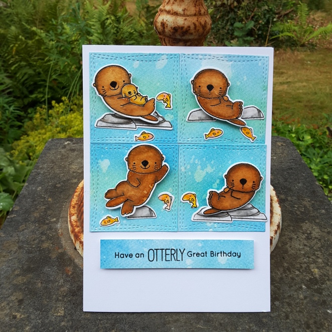
Otterly Great Birthday

20180720_163241

Hey there. I hope you are all doing well. I have had some time to try some new products, and to put together this card.

The first product I tried were the Spectrum Noir Sparkle Glitter pens. I have seen the fabulous Sheena Douglass use them as backgrounds so I thought I’d give it a go. What fun it was. These pens are vibrant, lots of colour, lots of sparkle.

I first used them onto dry water-colour card, then used them on my Tim Holtz glass mat and ink smooshed, and also put them onto my glass mat, added water, and used a wet brush. They worked well for all of the techniques I tried, though straight onto dry water-colour card is when you tend to use a lot of ink. I cut the strip to the left of the card from that piece, as I liked the uneven outcome to represent waves – kinda – but they certainly do give an even finish if you want one.

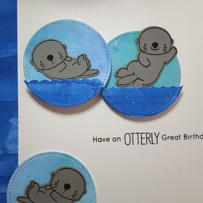
I took two colours of blue from one of the sets, created the backgrounds, and die cut the circles, then used a die from the  MFT ‘Otterly Love You‘ matching die set to create the darker blue waves. These waves are all raised on foam pads, as I wanted the otters to poke a little underneath them.

I did try stamping the otters, pencil colouring them and water-colouring them, but I preferred the way they came out when I stamped and heat embossed in black onto grey card. I thought it looked like too much water-colouring otherwise, and they blended even more into the blue. This way I think they stand out more.

A couple of close-ups:

20180720_163416_001

Gorgeous sparkle……

20180720_163440

……in both colours. Only two colours used, but I blended them together a little more in one of the circles.

This otter stamp and die set I have had for a while, and ‘found’ again when trying to sort my craft room out, and tidy with my previous Ikea purchases. This sorting is ongoing because I keep finding things I want to play with…..

I shall be entering the following challenges:

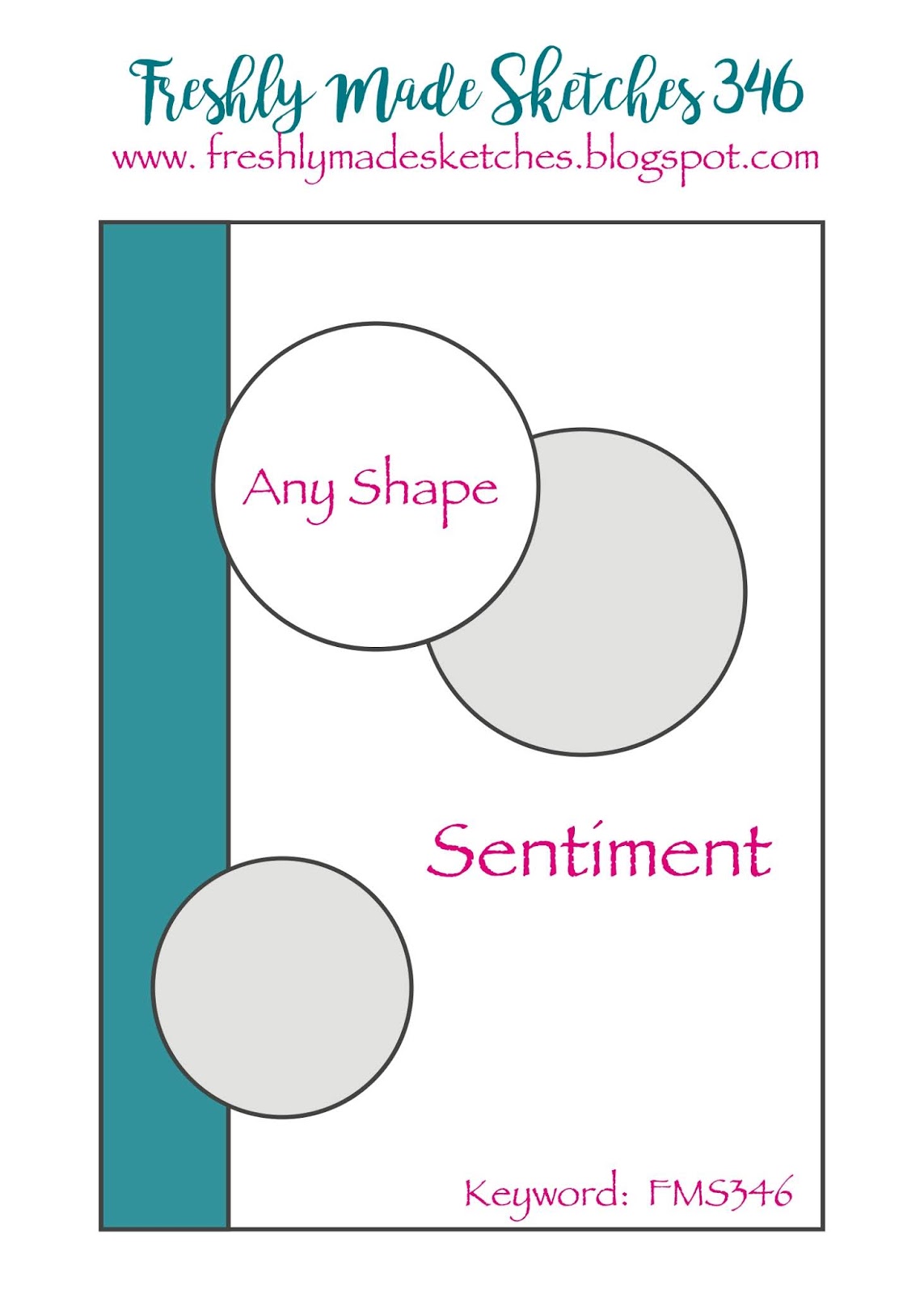
Freshly Made Sketchessketch

Color Throwdowncobalt blue, aqua, grey, white

Watercooler challengesmasculine

Simon Says Stamp Wednesday Challengeuse a die and/or punch


Gold and Blue birthday

Hi there. I have another floral card to share to day, but as I still had some black card-stock out from the card posted yesterday, I decided to keep going with the black and gold theme – but also added a few shades of blue.

20180717_145858

I stamped a Stamps By Me floral stamp onto water-colour card, and heat embossed in gold. Using my Zigs, and very little water, I coloured as you see, keeping the colours vibrant. The gold embossing resisted the colouring, and it also let me know the main places for the darker shades of blue.

I then used the matching die – one solid die, so quite difficult to place over the image centrally – maybe I;ll die cut first next time, or even emboss around first……hmmm – I think a little playing is coming on….. and then stuck this down onto some black card.

The frame is die cut using two sizes of Sue Wilson’s stitched rectangles. The sentiment is heat embossed in gold, and is from MFT.

20180717_145909

20180717_145924I tried to get some shine coming through in the photographs, but it has been quite dull here, even though warm.

I shall be entering the following challenges:

Watercooler Challengesmasculine

Allsorts Challengeflowers

Inkspirational birthday


Just add a ‘T’….

Hello again. I have been using one of my products bought at the Doncaster show last weekend. I say one product……..there will be more coming up!

This is from a stamp and die set from Stamps By Me:

20180717_145827

A completely different card to my most recent colourful cards – I think I channeled my monochrome inner-self.

The big letter ‘T’ is die cut, then heat embossed using Creative Expressions detail gold embossing powder. I then separately die cut and stamped the leaves, then yet another layer for the flower.

These sets are made so the flowers and leaves can be stamped and added to the letter separately, probably in floral colours……..but I stuck with black and gold.

I then took a piece of black card and embossed with a folder I haven’t seen for years – until I found it when sorting my craft stash out. It looks like a distressed stripey thingy background, and actually brings to mind the Altenew die and stamps.

Another black piece of card, and I stamped around the edge using a Tonic Nuvo clear embossing pad. I needed some more Ranger Perfect Medium, but thought I would buy this Tonic Nuvo pad. I am liking it – very juicy!

Once I had stamped around the edge of the card, I used the same gold embossing powder – to keep all the gold the same colour – so that I could use it as a layer.

20180717_145844

I also found some black foam dimensionals too – no idea where I got those – so from the side it doesn’t look too white and glaring with the layers.

I shall be entering the current challenge at Just Add Ink with the theme ‘add a ‘T”……do you think this ‘T’ is big and obvious enough?!


Ocean Pals – keep swimming

Hello once again. I have been playing with the MFT ‘Ocean Pals‘ stamp and die cutting set this weekend – in between going to the Doncaster Race Course ‘Crafting Live’ event.

20180715_155325

I smooshed and ink blended a few backgrounds with several blue Distress Oxides, adding several layers, air drying between layers. I then cut out a circle – cut the bottom off to match the current CAS Colours and Sketches Challenge – then die cut that circle with the MFT Horizontal Snow Drifts.

I placed those pieces back into a circle shape using 3D foam pads, but wanted some white to show between the layers, so I off-set them. The blue circle alone was too – well – blue!

I stamped the little fishies onto water-colour card, then coloured them with my Zigs. I used 2 or 3 of each colour to get some dimension in the fishies. After adding them, I took a sentiment from Hero Arts Colour Layering Gold fish, which I stamped, layered with another piece of blue, and splattered with some to stop it being so white.

As the sun is shining again, I took a photo to show the dimension I added when putting the card together.

20180715_155338

I shall be entering this card into the following challenges:

CAS Colours and Sketchessketch

Just Us GirlsWater-colour background


Altenew Perfectly Perfect stamp set

Hello again everyone. I have been making a card to enter a colour challenge and a sketch challenge:

20180712_17290520180712_172911

I knew I wanted to use the colours from Color Throwdown and use flowers, and I knew I wanted to base the layout on the current sketch from Freshly Made Sketches – but which flower stamp set just kept me thinking and over-thinking…..I couldn’t decide.

Then – Mr Postie arrived…..with a delivery from Seven Hills Crafts…..this stamp set was inside the package……. I just had to use it straight away.

I stamped the images onto water-colour card, in a grey from Stampin Up, then stamped again with an embossing pad and heat set with clear. I then coloured with my Zigs using a couple of yellows, and a couple of greys  to tie-in with the colours from the Color Throwdown challenge.

I die-cut the rectangle out of Kraft card with my stitched wonky rectangle from MFT, stuck that onto a white card base, and glued my flowers and leaves down with 3D glue. I only put the glue in the centre of each flower, as I was playing with the sentiment and leaves to decide where I wanted them to go, so no pads near the edges gave me more lee-way. I like to put leaves and flowers on top and underneath other flowers, as I think it adds more interest and dimension.

The sentiment is from the same stamp set, white heat embossed, and glued in a jaunty angle to match the sketch. I think it’s quite ironic that the stamp set is called ‘Perfectly Perfect‘ and the sentiment is wonky. (Maybe it’s my sense of humour! :)

As mentioned, I shall be entering into:

Color Throwdown – grey, yellow, kraft, white

Freshly Made Sketches – sketch

water-coloured layered floral

Hello there. I have a card to share which actually took me several days to think about and put together:

20180710_212257

I took the opportunity to do some ink smooshing with my Distress Oxides, concentrating on the yellow and green colours for one sheet, and the pinks for another sheet. After splattering with water, I cut each layer of the Altenew ‘Layered Floral Cover die’s‘  into he separate colours. I layered the two together, snipped the images apart, and added to some green card, cutting around the main images.

I also paper-pieced some of the die-cut pieces from the original cards onto the leaves, as you can see.

I then took a piece of water-colour paper and ink smooshed only with the yellows, let it dry, and splattered with pinks and yellows.

The two separate pieces of the layered die were stuck down onto the yellow base, and again onto a black card base. I couldn’t find a sentiment liked to go with this card, so I left it blank.

20180710_212303

I shall be entering the following challenges:

Daring Cardmakersmood board – yellows, greens, pinks, flowers….

Crafty Cardmakers use 2 dies or punches – layered floral die x 2, Sue Wilson stitched rectangles


Flamingo and sketch

Hello there. As I am working tomorrow, and England has another football game tomorrow evening, I don’t think I’ll have time to craft – you never know. Here is a card I made to enter two challenges:

20180710_212241

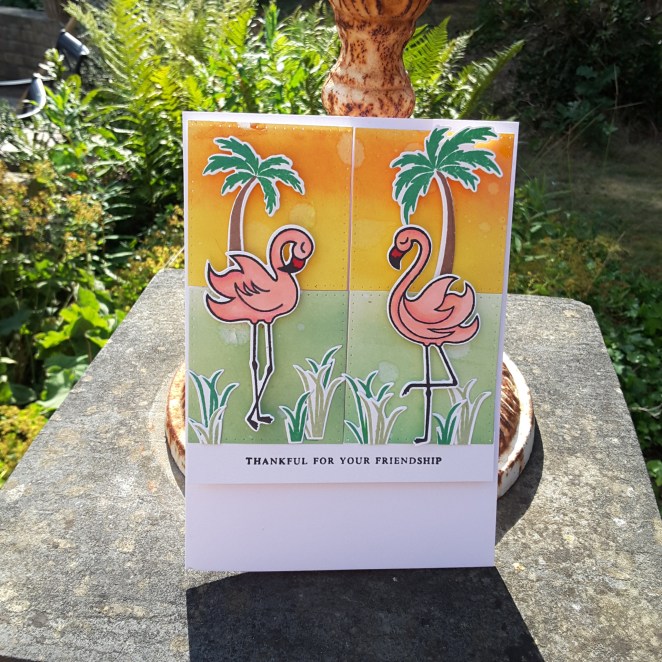
I took my Distress Oxides and ink smooshed and water-coloured a piece of water-colour card. I wanted to have colours which wouldn’t over-power the flamingo pink, nor the vibrant green of the palm trees.

I took the sketch inspiration from CAS(E) This Sketch and die cut the banner/tag using a Catherine Pooler die, took the flamingo and trees from W Plus 9 ‘Flock Yeah‘, water-coloured them with my zigs, and arranged as you see.

The sentiment is from the same stamp set.

Here is another version:

20180710_212230

I have mentioned before that I struggle with clean and simple cards, but I really think I’m growing in that department. I think the key is to take inspiration from other card makers and challenges – I still like to make a card that is ‘full-on’ – but am actually enjoying my clean and simple journey.

I shall be entering the following challenges:

CAS(E) This Sketchsketch

CAS On Sunday CAS water-colour


Your time to shine….

Hello again. I have been using my Concord and 9th ‘Shine on‘ stamp and die set to enter the current colour challenge at Less Is More. Olive and tangerine….

20180708_160554

and one from the side:

20180708_160654

After die cutting the main sentiment outline, I then stamped the shadow thingies (Where are my words today?) in Catherine Pooler ‘Green Tea’ ink, which has an ‘olive’ feel to me. The reason to do it this way? The sentiment outline is a solid die, you can’t see where you are putting it if you stamp first. Guess how I figured that out????

I then took the Catherine Pooler ‘Orange Twist‘ (I think) and swiped it across a piece of card.  Hey presto, an orange piece of card. I then die cut the ‘shine’ word. A double-sided sticky sheet on the back made it easy to stick down onto the solid and stamped sentiment shadow thingy.

The black sentiment is from the same stamp set, yet again using the ‘midnight‘ ink from CP.

The sun die cut, using more of the hand-made orange card, and double-sided sticky sheet, was paper pieced through the original card it was cut from, just so I could get a precise and even ray distribution. I left the half circle sun part out of it.

I really like these colours together, and I may try something else with this colour combination……….

:)

2 new techniques

Hell there. I have been trying two new techniques – well – new to me. I have never used alcohol markers to colour and image, and I have never used the ‘spotlight‘ technique. So I combined the two together.

20180708_12145820180708_121503

This flower is the not yet released ‘Beautiful Heart’ from Altenew. It was given to all of us who attended the Daventry day recently, and so were the four blue alcohol markers.

I watched some You Tube videos on alcohol marker colouring, and set to it. I coloured the whole flower – I didn’t realise how long this type of colouring takes. You really have to take your time and blend, don’t you?

I did this small flower in three separate stages, as I didn’t have the patience to do it all in one go. Maybe in the future – when I finally get my full set from Altenew from my sister – I’ll make sure to plan ahead with the colouring, and make more time. I am more of an instant kinda girl……

I stamped the flower onto a white base card using Versafine black onyx, then masked part of it so I could stamp some leaves. Then I die cut the centre of the coloured flower, and stuck it down – trying very hard to match the lines etc.

I also did it again after I had stamped the flower properly using all the layers and a yellow and orange ink from Catherine Pooler:

20180708_121441

So those are my two new techniques. Alcohol marker colouring, and spotlight stamping.

Whilst I had the stamp set out, and the masks cut to size, I decided to keep going and created some more birthday cards:

20180708_121607

I didn’t stamp all the layers of the leaves, but I am liking this orange and yellow combination.

The first blue card will be entered into the current challenge at Back To Basics and Beyond Challenges to use the spotlight technique, and the current Altenew July challenge.

The second birthday card will be entered into:

4 Crafty Chicksbirthday challenge

Seize the Birthday birthday +/- sequins (no sequins)

Altenew Folksy Florals

20180706_161725

Hello there. I have a bright and cheerful one layer, clean and simple card for you today. I was playing with this new stamp set from Altenew – ‘Folksy Florals’ – and decided that these stamps are just crying out for bright and vibrant colours.

As some off the stamps are solid, I turned to my Catherine Pooler inks, as they give great coverage from the get-go.

I played around with the colours, and just swapped and changed for each flower, leaves, and stem. The sentiment is also from the same stamp set, just mixing around the multitude of words and phrases you are supplied with. Who says you can’t have blue, purple and orange leaves?

I didn’t actually follow their guide for stamping and adding the different bits to each flower, and just went with the flow. It was actually quite hard to stop myself, so much so that I carried on and created some backgrounds with this set – I just kept stamping and stamping.

I shall be entering the current challenge at Addicted To Stamps, with the theme of ‘clean and simple‘.

Have a great day, and I’ll catch up with you soon – but not until I have watched the England match this afternoon!