Orange Wild rose

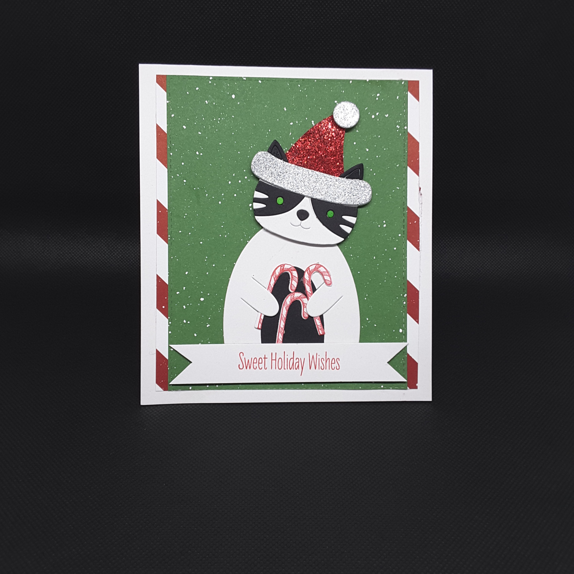
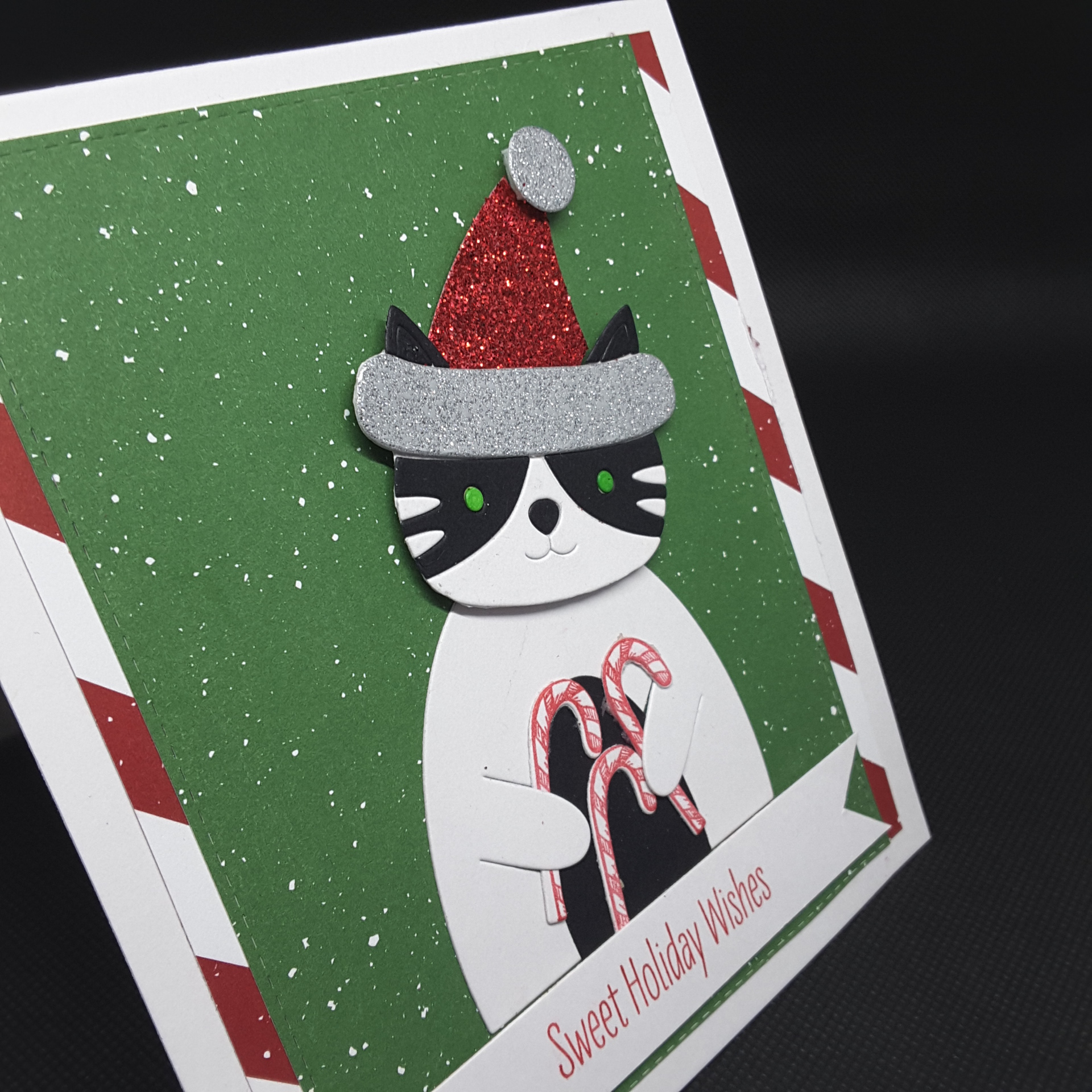
Hello again everyone. I have spent a lot of time in my craft room today, as an escape and a ‘take your mind off’ kinda day. I mentioned I had a poorly cat a couple of weeks ago – Spike – well overnight I took him to the vets, and had to make the decision to let him go. :(

He has been with us for almost 15 years, a humongous black cat, but the time was right. We lost his brother last year, after a short illness, so at least we can put them both together when we get dear Spike back. We do have two other cats, which we bought to keep Spike company last year, so they are getting really, really spoiled today!

Crafting for me has always been a release, an escape, and a time for me to relax and concentrate on what I am doing at that point. I use crafting as a stress reliever, and sometimes just going and splashing some water-colour down on some card, colouring a little small image, adding some double-sided sticky sheet to some card ready for when I might need it again, is all it takes.

These cards are made using Brusho crystals on water-colour card, and die cutting the Altenew ‘3D Wild Rose‘ die set – once it had dried, of course:

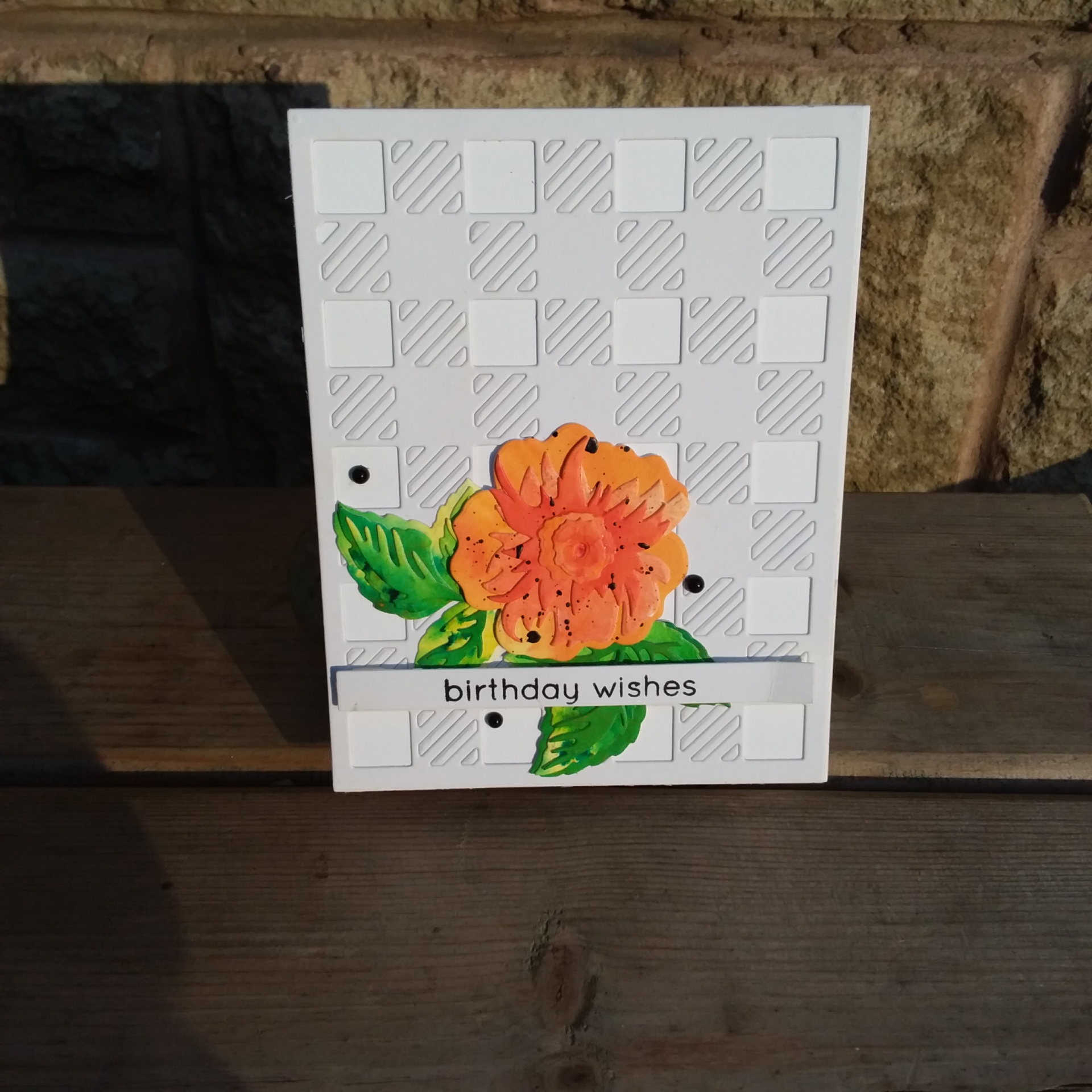
Before I stuck the layers together, I splashed a little Winsor and Newton black water-colour onto them. I have splashed in the past, but this time I wanted actual ‘blackness’, not too watered-down. I also added some black Nuvo drops too.

The background is the Altnew ‘Cozy Flannel Cover Die‘, removing the larger white squares, but leaving the smaller pieces in the die cut. This was a little easier than thought it was going to be…….

The sentiment is also from an Altenew stamp set, and kept on a plain white strip so it doesn’t take away from the rose and leaves too much.

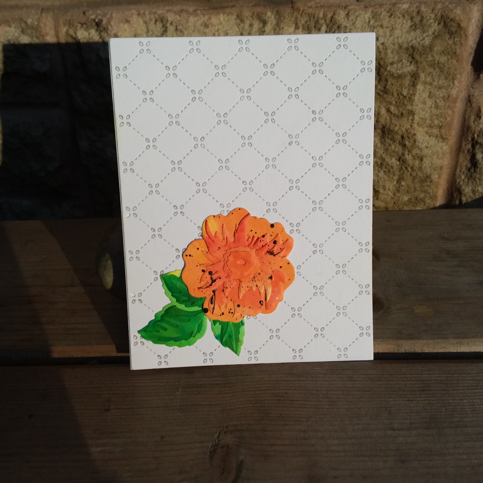
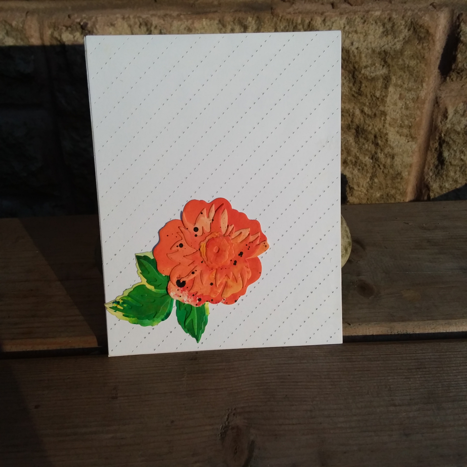
Here are the other versions:

and two waiting for me to add a sentiment:

I shall be entering one of these cards into the following challenges:

Watercooler Challengesall about occasions

Altenew February Challengepicture inspiration – inspired by a single flower

Angelique Happy Day

Hi everyone. I have a card to share which looks simple, but took me quite a while to decide on my design:

I combined a couple of challenges for inspiration. The colour scheme is from the current challenge at Less Is More, to use navy and yellow, and the also the current Flower Challenge, to use my latest stamps and dies.

I bought this Altenew Angelique Motifs stamp and die set from Seven Hills Crafts, and stamped all the images, which included the flowers, stems, and separate leaves. I was going to use the most gorgeous stems for this card, but went with the flower itself, and added some of the individual leaves as you see here.

The yellow stripes are a cut down piece of card using Concord and 9th Sketched Stripes Background stamp, and Catherine Pooler Limoncello ink. I am sure I will be using this stamp set again in the near future, and like how the blues came out with this flower.

The sentiment is from a Uniko stamp set, and I like how this sentiment can be used for many different occasions, especially when you need a card for no special reason in particular – a just because card.

I was looking through my Uniko stash, as Bev has some fabulous sentiments and stamp sets, and currently has a brand new release going on for the company’s 7th birthday.

And – yes – I bought it all! Couldn’t resist! Her design team really have come up with some brilliant cards………..

Now, I know this is an early posting, and not a scheduled posting either – just up early, getting ready for work, and decided to put this together now instead of later today.

Isn’t crafting fabulous that way? Any time, any place, anywhere……!!

:) :)

Birthday Raccoon

Hi there. I have a confession to make – I think I’m addicted to raccoons……

I don’t suppose it’s a really, really bad addiction, but this is the second card in as many days I’ve posted with a raccoon as the main image.

This is for the Seize The Birthday Challenge, with the theme of birthday with the optional twist of black and white:

I recently received this die set from MFT called ‘Raccoon Cutie’ – and isn’t it named appropriately? I actually made two raccoons – as I cut everything from white, then everything from black, and stuck everything together – but I did have to go to MFT web site to figure each piece out!

The sentiment is also from an MFT stamp set, and I wanted a big and bold sentiment go go with the big and bold raccoon. And – you guessed it – I stamped and heat embossed the sentiment on top of the embossed background, which was the Lawn Fawn ‘Quilted Backdrop‘.

Oh well – it certainly adds a certain something – just not sure what! I did think of doing a banner strip, but it just didn’t look right, so I left it as it was.

The other addition – googly eyes. I have had these for a while and just never got around to using them – here was my chance……..you can see on the white raccoon version where I put the eyes in a different place to what is outlined on the actual die – but I didn’t see that until I took the photo – who knew? :)

Friendly Raccoons

Hi again. Another weekend ahead for me to look forward to. I made a card today to enter some challenges:

I wanted this card to be quite simple, but the actually design took some figuring out. I tried colouring some of the hills, ink blending some of the hills, but in the end went with a clean look leaving the background white. I did emboss the little piece which came out – again – but otherwise the only colour is on the little images themselves.

I used MFT ‘Friendly Raccoon‘, coloured simply with Copics. I don’t have the exact colours for the CAS Colours and Sketches Challenge, but I tried to match my Copics to what was wanted. I used Lawn Fawn ‘Stitched Backdrop‘ die as you see, with the little heart being from Concord and 9th ‘Triple Step Thank You‘, and the sentiment from a stamp set sat on my desk, but I’ve no idea who it’s from!

I recently received this stamp and die set, and a whole bunch of goodies, from Justine Hovey. She was selling some of her stock off, and took the opportunity to grab some goodies. The postage was only a little extra to come all the way to the UK, and it only took one week to get here.

When I opened the package I was absolutely gob-smacked with the amount of stuff she had put in there. Blinking heck! Concord and 9th, MFT, Spellbinders, Gina K, Gerda Steiner……….and I have not got a single one of them already. Even one of my cats was impressed:

I shall be entering the following challenges:

Always Fun Challengesanything goes

CAS Colours and Sketcheslovely lipstick, gray granite, powder pink

Watercooler Challenges anything goes feminine

Addicted To Stamps make your mark

Santa Kitty and Candy Canes

Hello again everyone. Welcome to this posting and the second challenge for my Design Team position at ABC Christmas Challenge. This month, the alphabet runs to ‘C’ for Candy, and/or ‘D’ for Decorations.

Here is my card:

and another view:

I took the opportunity over Christmas and New Year to order from Simon Says Stamp, when they were having quite a sale on their products, as I have liked the look of these Picture Book dies for ages…….

This cat is black and white because my cats are black and white. I thought this would stand out from the coloured background too, and show the Candy Canes in his hands. I decided to put the head on the body with a little tilt – looks like a cheeky chap to me.

Those candy canes are from a Tim Holtz set – never used before.

The background green and red striped DSP from Stampin Up, and the glitter on the hat is from Crafters Companion.

I enjoyed the die cutting, but I must admit to checking out some You Tube videos for hints and tips – those little pieces do get away from you, let me tell that now!

It’s a good job I have plenty of scraps of card, as these little scraps were ideal for all the die cut pieces. Placing them and gluing them were a challenge – but I like how this turned out.

The body is a die cut from the same group of dies, and I like how the arms have a cut part to them so you can put things in them, as though the cat was holding them – hence the candy canes.

If you enter this challenge, you are in with a chance to win some stamps, dies and washi tape from this months host Wilma, and the rest of the Design team have some amazing projects to share with you – A-maz-ing! We all seem to have different styles of cards to share, but all great inspiration, so I hope you can join us…….. :) :)

CASology Bouquet

Hello everyone. I have a card for you today that is for the Guest Designer position this week at CASology: (little jumpy dance!)

The cue word is ‘BOUQUET’, and let me tell you – I actually struggling with a stamp set and design for this card………..

I hunted through my stash and took out several stamps to consider, but as you can see – I finally settled on Altenew ‘Celebrations‘ stamp set and this little bouquet image, along with a sentiment from the same stamp set.

I stamped it on a separate piece of card first and tried several variations of colour with my Copics, then decided on this layout, and these colours. The stamp itself is quite sketchy – so I went that way with the colouring too – no shading, and not quite filling in the leaves and flowers.

It ended up being a one layer card – very, very unusual for me – but I am really pleased with how this looks.

I hope you can play along this week, and I look forward to seeing what you can create. :)

Love and Best Wishes

Hello again. It seems crafting is a good distraction for me today, and I have been able to create a couple of cards. My puddy tat is still doing alright, and in fact seems a little better with moving around as he is on an anti-inflammatory…….he even jumped onto my craft desk this afternoon. He’s not been up there for weeks!

Here is the card he interrupted, so it took me much of the afternoon:

The scribble is a Tim Holtz die and the tags are from MFT. The card stock is Stampin Up. The little stamps are from Uniko, a set I have had for a while, and like to use when I am trying to fill some space, and there are lots of little stamps in these sets.

The layout AND the colours are the double trouble (!!) challenge at CAS Colours and Sketches this week. I shall also be entering this into the current challenge at Crafty Gals Corner, asking for a CAS card, and Just Us Girls – asking for a card with the word prompt being ‘Love’.

This second card:

is based on the colours from Color Throwdown, to use Aqua, saffron, brown, and yellow; the layout sketch is from Freshly Made Sketches.

The stamp set is a new one from Altenew – courtesy of Seven Hills Crafts (again!!). I buy most of my American stamp and dies sets from there, as the price is always good, and the delivery is 99% within a 48 hours time frame. (I think I need to take shares in that company………..!!)

Anyhoo – I used the set of brown Altenew inks for the Primrose – why?, I hear you ask – well, because I could, and because I like brown flowers…..I was in a floral mood today, but not a bright flowery colourful floral mood, but I am definitely going more vibrant with these flowers in the very, very near future – the detail is a good as one has come to expect from Altenew, and I can’t wait to see these flowers in the purples and the reds and the pinks and the yellows and the……well, you get my drift.

The first layer of the leaves was stamped in yellow, the second layer in Saffron, and the third layer in one of the browns – who knew that would work as good as this for leaves?

The aqua you can see, is Aquatini from Catherine Pooler, blended onto the base rectangle, and the sentiment strips are from a Sue Wilson die set and stuck down after putting them through my Xyron.

I hope you are getting some crafting done yourself – have a good one, and I’ll catch you again real soon. :)

Bronze Thanks

Hi there. I have a CAS card to share with you today:

I took refuge in my craft room, as I may have to put one of my puddy tats to sleep this next week, and sought some challenges I could mix together. I have just received my Concord and 9th Turnabout Toolkit too, so I thought I would combine all things, play around a little and see what came up.

I used two green inks and two brown inks for the turnabout stamp – masking off the top and bottom – keeping the card quite neutral.

The sentiment is stacked four times with white card stock, with the uppermost letters being embossed with a bronze embossing powder to create some dimension and shine, which I think shows better in the first picture.

I do have to get my head around a couple of other things – I continue to be on the Design Team for ABC Christmas Challenge, and the new challenge starts next week, and I am also the Guest designer for CASology this coming week. What a roller-coaster I am having at the moment!

I shall be entering this card into the following challenges:

AAA Cardsuse up to one third, optional masking

Watercooler challengesanything goes

Addicted to stampsanything goes

Simon Says Stamp Wednesday Challenge – anything goes

Beautiful inside and out…

I have a card to share I started yesterday, but struggled with a sentiment. I finished it after work today, and am quite pleased how it turned out:

I stamped the Altenew ‘Extra Special‘ sprig and used Altenew inks for the layers, going with the darker reds, then die cut them with the matching dies.

The two background rectangles are – again – Reverse Confetti ‘Diagonal Stitches cover panel‘. I had some red card in my stash which matched the reds I had used, and used as you see.

The sentiment took hunting through my stash and finding the Ultimate Crafts ‘You are beautiful inside‘ stamp set, stamped in one of the reds, and stuck down onto the framelits dies from Stampin Up.

The two sprigs were positioned like this as I wanted some of the red at the top right edge to break the whiteness up there.

I shall be entering this into the following challenges:

CAS Colours and Sketchessketch

Rainbow Card Challengemonochrome red romance

Swing by anytime….

Hello again. My crafty mojo seems to be with me after a week away on holiday. I have another card to share with you – and this one took a little planing:

I haven’t used this stamp set before, despite having it in my stash for a while, but it came to mind when I was thinking about a few challenges.

I stamped the images you see, and coloured them with Copics. I wanted a vibrant dragon, with matching little people. I then took some Distress Oxides and smooshed a panel, using colours which I felt were vibrant, but also didn’t interfere with the main images.

Using the ‘Tall Triangles‘ Reverse confetti die to cut the white card, I re-inserted one of the cut triangles in the smaller end, so it matches the sketch I am following, and stuck that down onto the inked panel.

I was toying with the idea of the dragon blowing smoke and flames etc – which are included in the stamp set – but I didn’t want him scaring the little people away……just as he is dropping by for a visit.

The sentiment is from Heffy Doodle and I thought matched perfectly, so it meant the dragon was actually a friendly one! What a story I had going on in my mind at the time – thinking about Puff The Magic Dragon – but not the sad part! (Showing my age, now!)

Guess what? I did what I normally do – and try not to – I forgot about the sentiment until I had already put the card together……and stamped it using my Misti just hoping and praying I didn’t mess it up…..I must learn to plan ahead more!

I shall be entering the following challenges:

Simply Less Is Moresketch

Addicted to CAS Friends

Crafty Friends Challengeanimals/birds

The Library Craft ChallengeThe Girl with the Dragon Tattoo