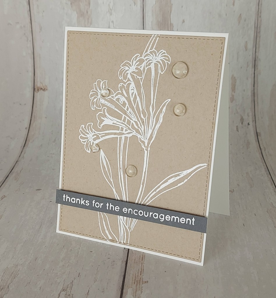
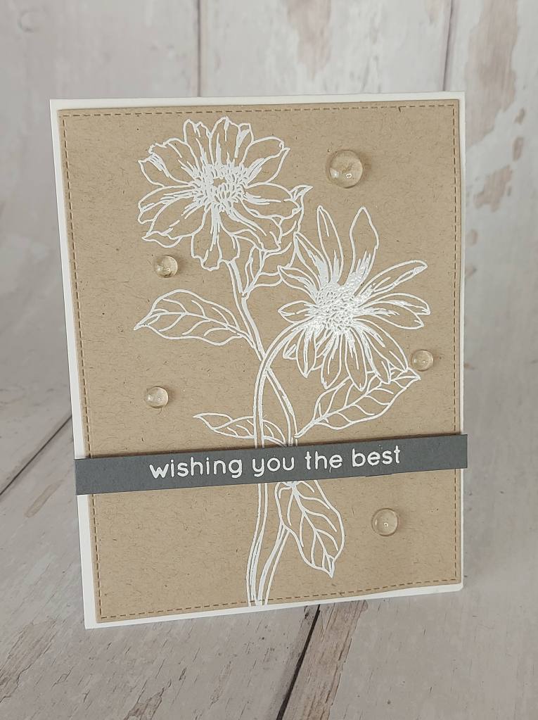
Hello. Having enjoyed some playing in my craft room, trying out new techniques, revisiting old techniques, I have a couple of cards to share today. Both are a CAS design, but the white embossing on the Kraft card really makes the images pop, I think so anyway. Here are my cards:
I took the images from Altenew ‘Wild Flora‘ stamp set, and stamped then white heat embossed. I die cut the panel down with Lawn Fawn stitched rectangles, then added to a card base.
The sentiments were also heat embossed but this time onto grey card stock, and added as you see.
I added some clear drops for some added interest, but also these don’t detract from the simplicity of the design – I don’t think.
Hello. ABC Christmas Challenge has reached the letters above and we want to see your Christmas makes with the following themes:
P for Plump – think Father Christmas, Robin, Pudding
Q for Quality Street chocolates – using the chocolates or the colours
R for Ribbon
Here are my cards with P and Q:
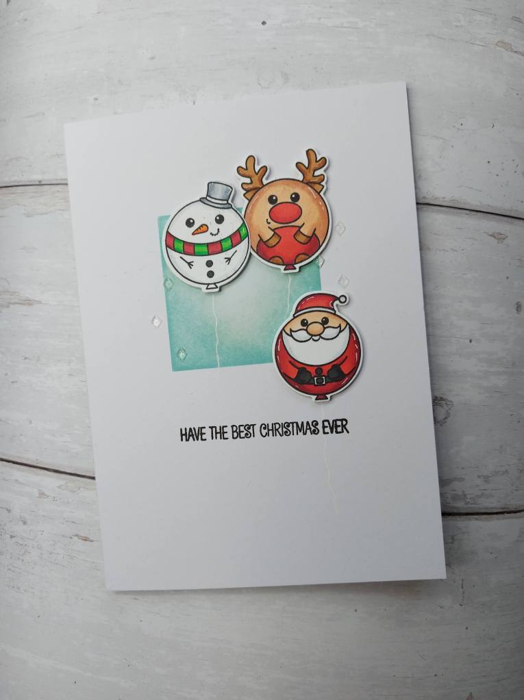
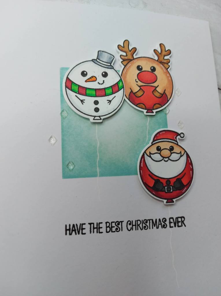
P for Plump:
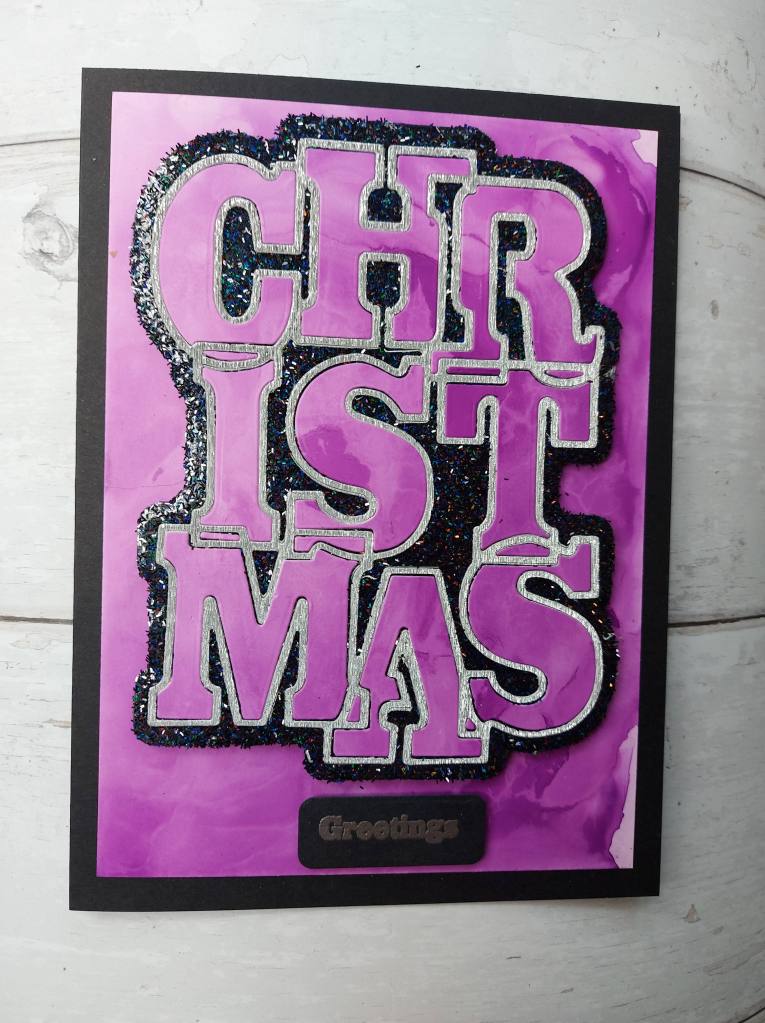
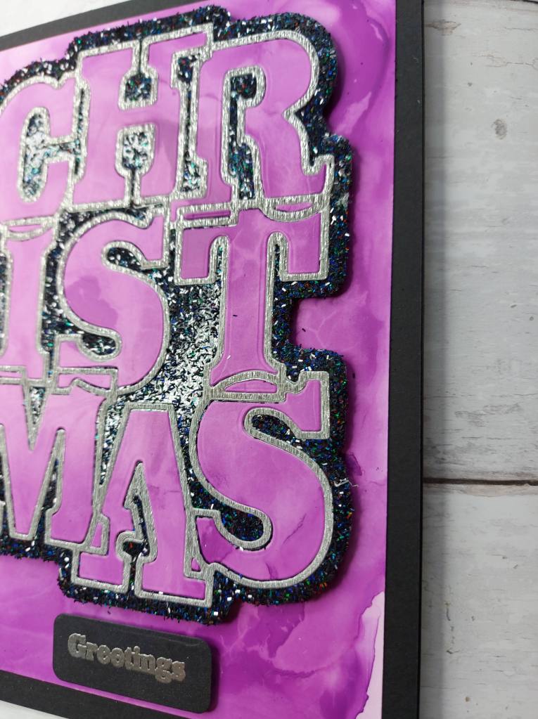
Q for Quality Street:
For the first card, I used the Hero Arts Alignment tool to ink blend a square in the card base. I then stamped, coloured with Copics, and die cut the balloon images from Clearly Besotted, and drew some white gel pen on for the balloon strings.
I also received some little gem sticky thingies from my Stampin Up Demonstrator that day – so I added those too…..
For the second card I’ve gone a completely different route – not so much CAS, is it?
The purple background is alcohol ink on Yupo paper. That purple panel was die cut using a Sue Wilson Big Bold Words die – saving the negative space and each individual little piece which came out – then put the sentiment, it’s outline, and all those little pieces onto a piece of black card which was backed by a double sided sticky sheet. To the part of the base outline which was left, I sprinkled some Creative Expressions black glitter, then placed the sentiment piece back onto the purple Yupo paper.
There’s a lot of colour and inspiration from the Design team – I hope you get time to check them out and join us for our challenge xx
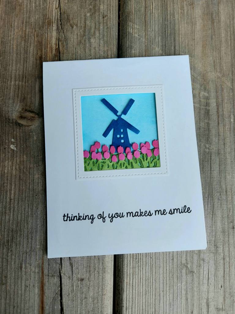
I used a Creative Expressions Paper Cuts die and backed that with a Twisted Citron ink blended piece of card from my stash.
I chose the sentiment as a friend and work colleague of mine is going through some ‘stuff’ at the moment, and I thought this would be suitable to send to her.
I hope you can come and join us in this CAS challenge, the theme as above – I look forward to seeing you there.
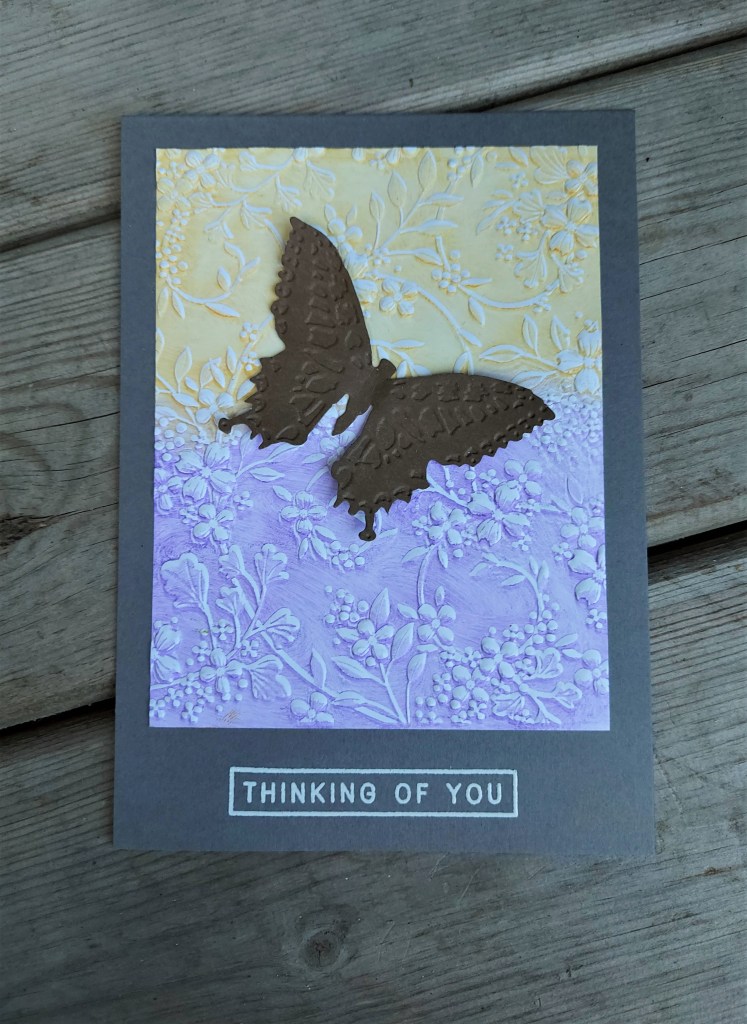
The Alphabet Challenge has started a new challenge. Having reached the letter ‘I’, Dawn has chosen the theme of Insects on your creations. Here is my card:
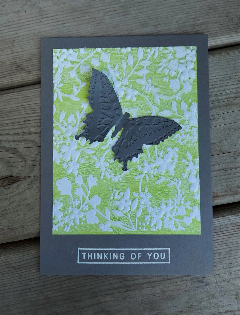
Having been successful with using ink on an embossing folder for the first time, I decided to have another go using a couple of colours:
The embossing folder is from Simon Says Stamp, and I used Distress Inks on the inside, before running it through my die cutting machine. I haven’t had much success with this technique in the past – but for some reason it worked this time – no idea why……
The butterfly is from Tim Holtz, a Bigz die, which also comes with an embossing folder for the two butterflies. I added a simple sentiment and stuck down onto the card base. I didn’t stick the butterfly down completely, I like the wings to be a little raised, some movement.
I hope you can come and join us and show us what you can create using insects in your projects. xx
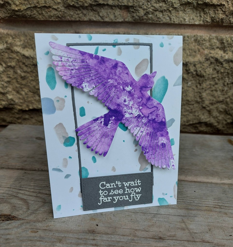
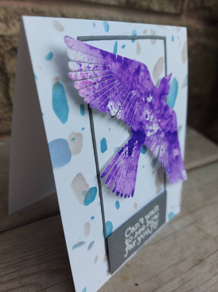
Cardz 4 Galz has started a new challenge, and this time the theme has been chosen by Helen, who wants to see you use dies or punches in your girlie creations. Here is my card:
Having received a few new orders with Altenew products, I decided to use some of them for this card. I stenciled the card base using Altenew ‘Terrazzo Tile’ stencil – these are layering stencils, and you don’t have to be particularly precise with this one – just place them as you want them.
The bird is die cut out some ink smooshing with Distress Inks – Wilted Violet I think – and I gave some dimension to the feathers, some movement, as it were.
The thin grey frame was attached, and the sentiment heat embossed in white.
I hope you can come and join us this time round – I look forward to seeing what you create following our theme. xx
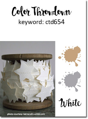
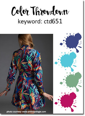
Hello there. I was lucky enough to be picked as random winner for The Color Throwdown recently, and was given the opportunity to be Guest Star Stamper. Well, of course I jumped at the chance. Here are the colours for the new challenge:
Pink, Orange, yellow, green
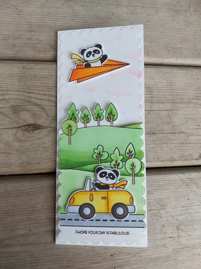
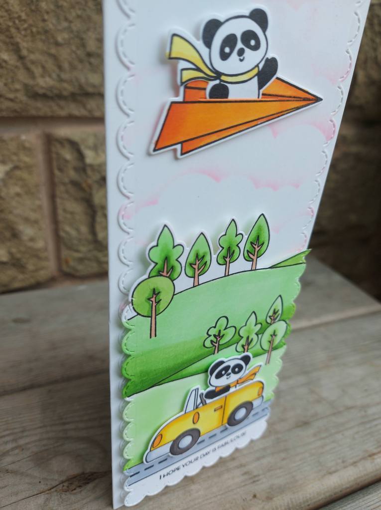
And here is my card:
I used a combination of Time For Tea Designs stamps and dies to create the scene.
The car, paper plane, and panda’s were stamped then coloured with Copics., and die cut with their matching dies. The little paper plane has a little slit in the middle so you can insert your critter.
The background has clouds stenciled with Kitsch Flamingo. The first sky I stenciled I was a little heavy handed with the ink, so I did that again with a lighter hand.
The hillside scene was stamped and then coloured with Copics. Colouring larger areas with Copics is a struggle for me – I never know when to stop with the darker shades – how much to do – but I went with it – just a little darker shade when the hills seem to merge, and a little darker in the centre of the trees.
I hope you manage to come and play this week with the bright and fun colours. As usual, the Color Throwdown Team has a variety of inspiration for you.
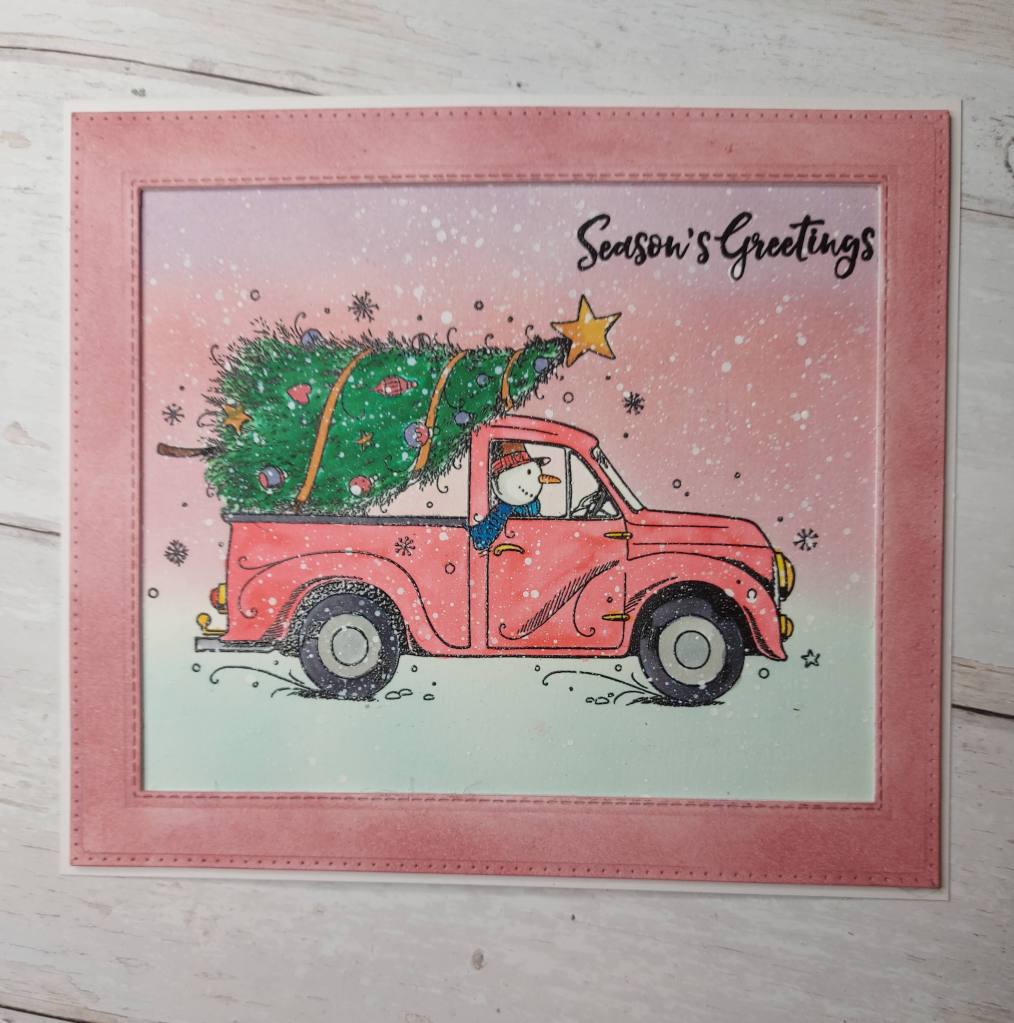
This stamp is from Pink Ink – and is quite large……so the card ended up being a substantial size – but fun to make.
I stamped then heat embossed the image, then stamped another to make a mask for the top portion – the tree and top of the card.
I then ink blended the background with Distress Inks, before water-colouring my image. Some of the smaller details I coloured with Copics. Once it had all dried, I splattered some Copic Opaque White all over – I mean all over – to get a blizzard effect – the snowman is still taking this tree home despite the weather!
I decided it needed a frame, so I used die-cut a frame using some stithced rectangle dies, then ink blended with Distress Inks to match the background.
I quite enjoyed using the variety of medium to create this card and will definitely have a play again.
I hope you can come and join us in our challenge – I look forward to seeing you there. xx
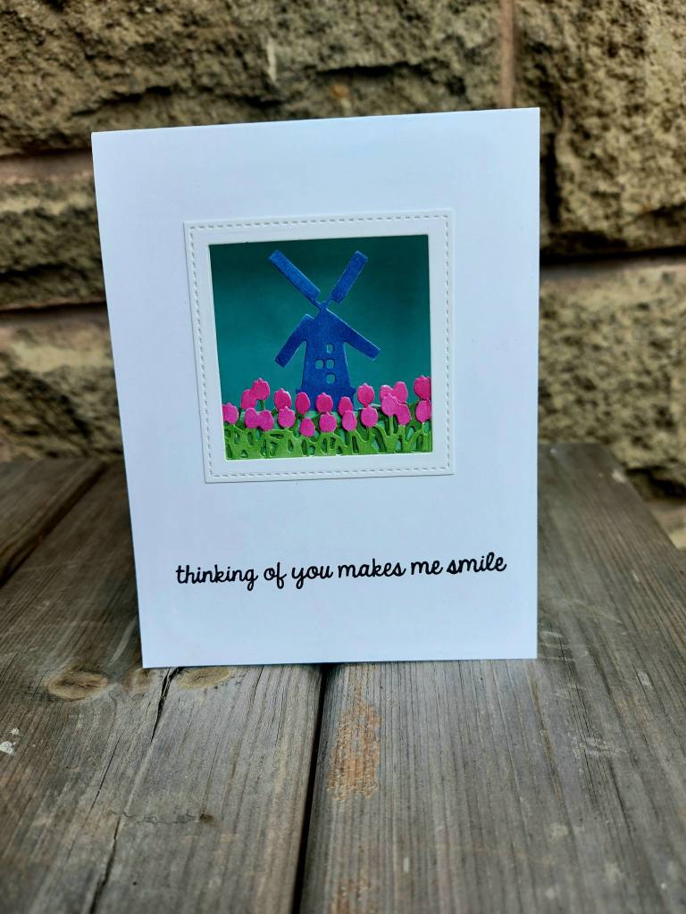
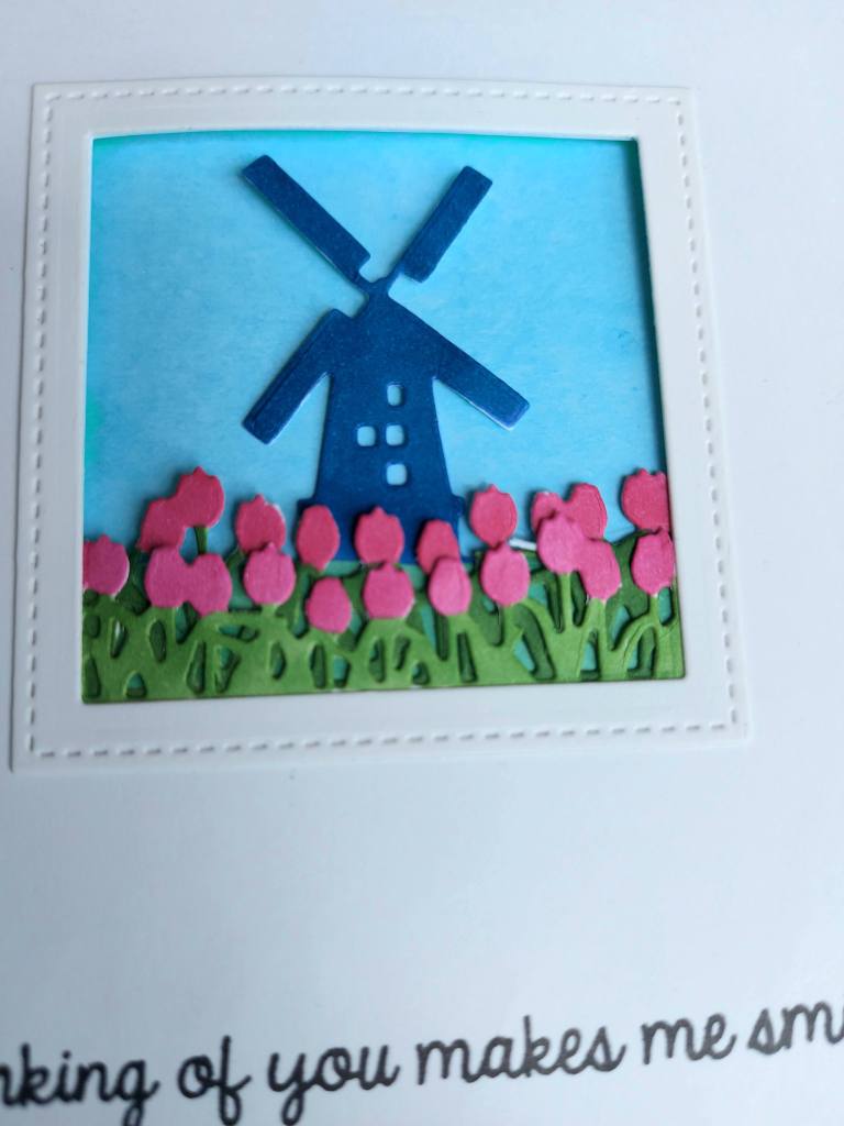
I have a card to share to day made with a new set of dies from Hero Arts:
I had to watch a couple of videos on their web site to get the hang of making this card, and it took a while to put it together – mainly because I wanted to add the frame around the outside and I had to fiddle with a knife and a couple of square dies because they just weren’t the right size. My Misti cut-align tool came in very handy for that…
The layers were all die cut out of white card, then coloured with Copics to match the current challenge colours at Color Throwdown.
The background is a water-colour piece of card I used Distress Inks on:
I have a couple of other ‘looking glass’ dies from Hero Arts, and now I think I’ve figured it out – I’ll go and have a play with them.
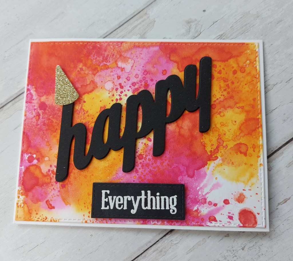
Hello once again. There is anew challenge started at The Alphabet Challenge. We have reached the letter ‘H’ and Debbie has chosen the theme of ‘use the word Happy in your sentiment‘. Here is my card:
Do you think the word is bold enough?
The background is ink smooshing onto Distress Heavy card stock – part of a bunch of these backgrounds I made whilst restricted a few weeks ago. Because this background is so vibrant, I decided the sentiment ought to be big and bold and black…….
The sentiments – the big word and the embossed word – are from Uniko, as is the little gold party hat added to the first letter……
I hope you can come and join us. I’m looking forward to seeing your ‘happy’ creations. xx
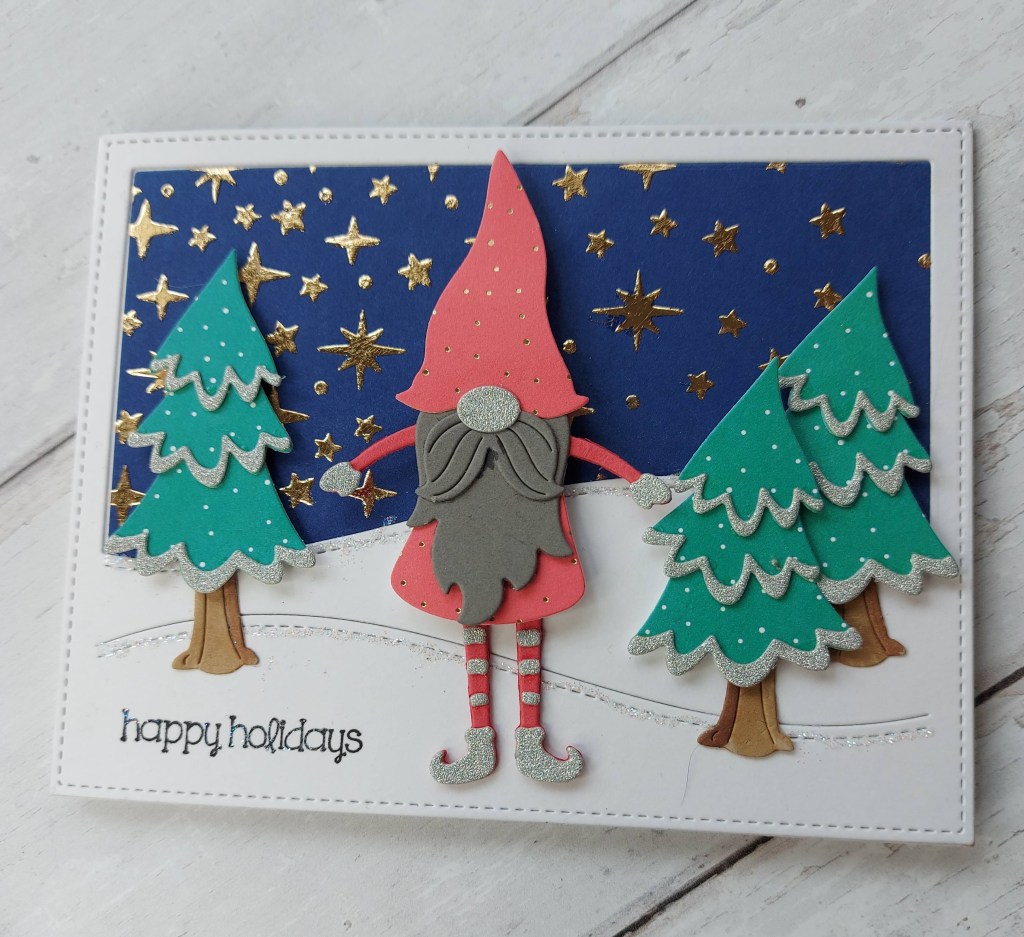
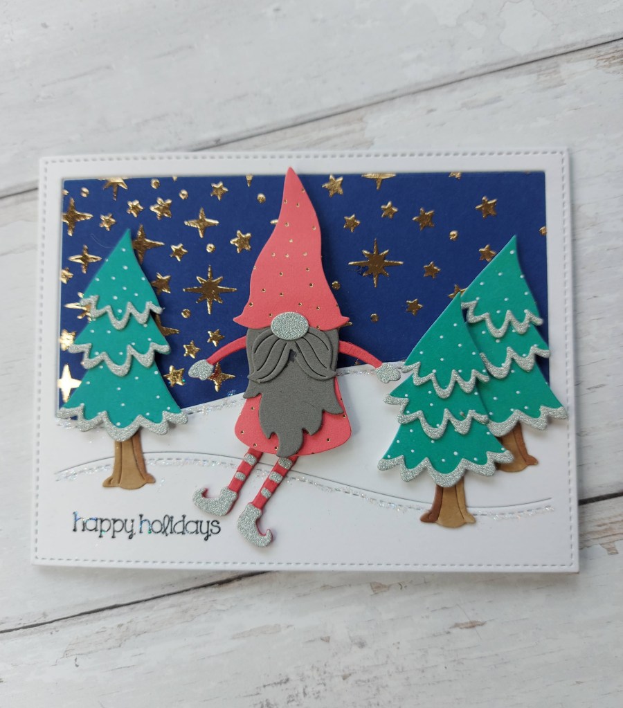
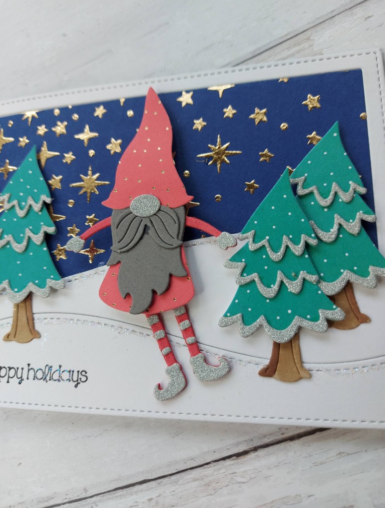
Hello there. A new challenge has started at Cardz 4 Galz, and this time the theme is ‘Christmas In July’. Here is my card:
The background with gold foil stars was created using Thermoweb Duo Gel, a star stencil, and then running through my die-cutting machine with Decofoil.
I used the Lawn Fawn backdrop for the white, and then die-cut the blue foiled star panel to get the evening sky. The hills were glittered using Lawn Fawn Prisma Glitter.
The trees and gnome are from Spellbinders, a little Copic shading on the tree stumps, and the trees themselves cut out of Lawn Fawn paper with little dots on – just to mimic some snow…….maybe…..and the edges of the tree layers die cut out of some white glitter card.
The gnome – now his legs move – rocking from side-to-side:
It was quite fun creating this little scene – I did have to watch a couple of videos on how to piece the gnome together – so many little pieces. I usually don’t like little fiddly die-cutting and assembling – but this was fun.
I hope you can come and join us with your creations matching our current them – I look forward to seeing what you create. xx