Butterfly and flowers

Hello again. I’ve had a busy few days……mum has decided not to craft again :( and so she wants me to sell all her stuff on Ebay. When I say all her stuff…..I mean absolutely everything. There is a lot of stuff, and many of them haven’t even been opened or used. It reminds me to use my own stash!

Over 500 photos later, and I still haven’t scratched the surface…..guess what I’m going to be doing for the next few months….

I did manage to find time to craft today, and even played around a little.

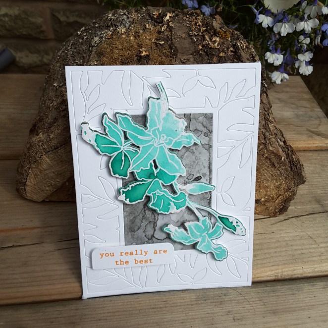
This first card is for the current challenge at Color Throwdown, to use the colours aqua, peach, light grey, and white:
20180817_144354.jpg

I played around with these colours for a few stamping moments. I tried several variations on the theme, but still using the same Altenew ‘Build a flower: Cattleya‘ stamp and die set.

This card was doing a sort of fast water-colouring – as per Jennifer McGuire – using Catherine Pooler ‘Aquatini‘ ink – one of my all-time favourite colours, after heat embossing with clear embossing powder on white water-colour card.

I then took a piece of water-colour card and added some Altenew grey ink –  I forget which one – and did a smooshing technique – wet water-colour card onto the wet ink. I did the smooshing several times, drying between each layer – I didn’t know until I tried this that the Altenew inks layer quite nicely.

I then used the Altenew ‘Leaf Frame Cover Die‘, die cut it, but left all the pieces in. I didn’t mean to do this, but when I took the die off the card, they all stayed put – so I went with it instead of pressing each piece out.

I stuck and layered as you see, and the sentiment is stamped in Stampin Up ‘Peekaboo Peach‘ – though it actually looks quite orange to me here…..supposed to be peach!

I had a play making some other variations:


The first image is using the three colours and the layering stamps – grey for the base, then the peach, then the Aquatini – kinda liking that look and effect. The top right is using the Peekaboo Peach for each layer, giving a little dimension, and the third card I used my Altenew Artist Markers to add more definition once stamped.

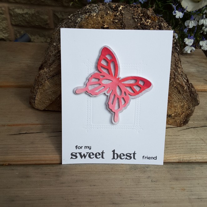
This second card is for the current challenge at CAS on Friday with the theme of butterflies, and also the current challenge at AAA Cards, with the theme of friendship.
20180817_144328.jpg

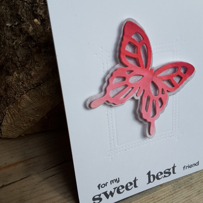
I used Altenew Artist Markers and scribbled onto some Neenah card, then die-cut the butterfly itself, then took a spare piece of the grey water-colour card and die cut the butterfly outline. I only stuck down the middle of the butterfly, so the wings have dimension:
20180817_144332.jpg

I then embossed the MFT ‘Rectangle Peekaboo Window’ die onto the card base – not cutting, just embossing – and stuck my butterfly down. Hey presto! Sounds easy…..but it took me a while to figure out what to do!

The sentiment is cobbled together from Altenew ‘Folksy Florals’ stamp set. There is a great variety of sentiments with that stamp set, and you can make virtually any kind of sentiment for anyone.

Phew – this turned out to be a longer post than I planned – you let me waffle on a bit – so I did!

Have a good one – catch you later.

:)

Floral and Sweet

Hi there. I managed to create a couple of cards over the past couple of days, completing them last night. The first is for the current challenge at Time Out Challenges with the theme of food and drink with the option of one layer:

20180814_072044

I went for one layer, and used the Altenew ‘Hand Made Tags’ stamp set to stamp images in a Catherine Pooler ink. As I created a background card using tropical leaves last time and loads of different colours, this time I stuck to one colour for the multitude of images, and then Altenew inks for the three layer stamping chocolate cookie thingy…..I’m not sure what these are called, but ‘chocolate thingies‘ works for me!

The sentiment is from Altenew ‘Way Too Sweet‘, highlighting the one chocolate thingy that is made to stand out.

I usually get a lot of smudging when I try to make a one layer card, but I am pleased to say I didn’t on this card – yay!

The second card is completely different, well – cards really:

20180814_07210220180814_072116

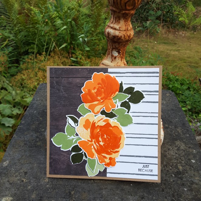
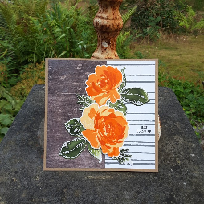
I used the inspiration and layout from the current challenge at Fusion Card Challenge. The flowers are Altenew ‘Floral Fantasy‘, stamped using Altenew inks, then die cut. The leaves on the first card are from the same stamp set using a variety of green inks, and the leaves from the second a card are from another stamp set I messy water-coloured as a contrast with the bright flowers.

The wood grain is from a piece of Stampin Up DSP I have had for absolutely ages, and found again recently, and the striped card is stamped from Concord and 9th ‘Sketched Stripes Background’.

I decided to go with a small and unobtrusive sentiment, as the card itself has bold colours and large bright images.

I made two cards, as I stamp more than I need so I can play with layouts side-by-side, and usually vary them slightly.

Have a good day, and I’ll speak again soon. :)


Jungle inspired background

20180812_164607

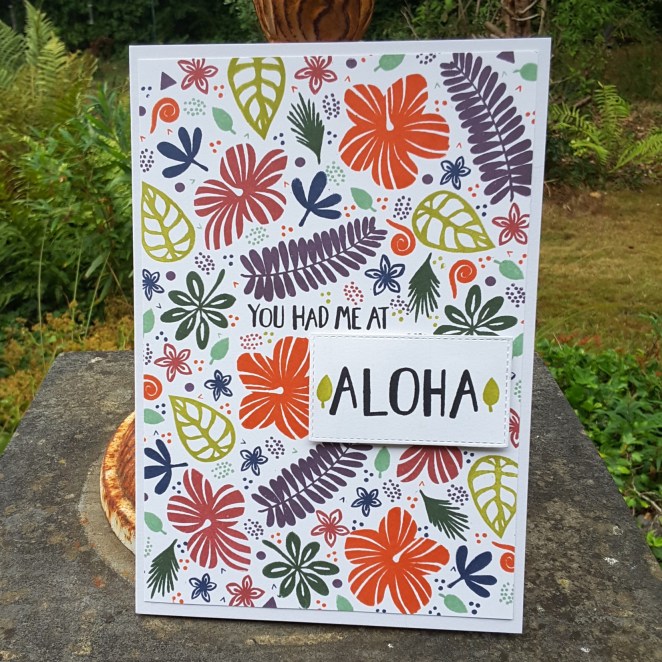
Hello again. I have been creating a background using some of the stamps from the latest Catherine Pooler Stamp of Approval box, and using some of her Spa inks.

The inspiration for this came from several challenges and meant I could stamp and ink and stamp and ink for ages…..

I tried to keep the larger stamps in odd numbers – I’ve heard somewhere that is more pleasing to the eye, but a lot of the smaller stamps – and there are many – I just stamped to fill the gaps.

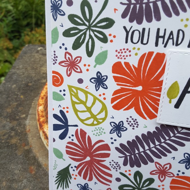
These stamps sets have lots and lots of smaller images I could have used, and I had to restrain myself a little – not that you can tell! Here is a close-up of some of the stamps and inks used:

20180812_164618

I shall be entering the following challenges:

CAS-usual Fridaysstamp a pattern

QKR Stampede – anything goes

Cards In Envyflat and use something new (the stamps are new to me)

The Library Craft ChallengeThe Jungle Book


Basket and floral hugs

20180808_135151

Hi there. I have a card here for the current challenge at Daring Cardmakers, and their inspiration picture. The challenge is to choose three elements.

I chose the basket effect, flowers, and glass containers – the blue glass to also match the Bombay Sapphire bottle……love that drink!

The stamp set is from Altenew – Garden Silhouette – as I wanted solid flowers, which didn’t require any layering. I did make it a little more difficult for myself, as I stamped the images in two colours, masking off the flower to stamp the stem and leaves in green, and masking the stem to stamp the colours of the flowers. I don’t know why I bothered, really, as I covered the stems anyway…….behind the glass…..oh well. Lesson learned.

The glass containers were stamped off, then stamped again as the original colour would have been too bright for my taste.

20180808_135156

These embossing folders really do give a fabulous 3D effect, don’t you think?

I chose a smaller sentiment in the corner, as opposed to a larger one so it didn’t detract from the card, but also added a little something extra.

I feel some more crafting and card making coming on for the weekend, and I am not at work all next week…….can’t wait to try my Altenew Artist Markers a little more…

:)


Feel Better Hugs

20180805_085413

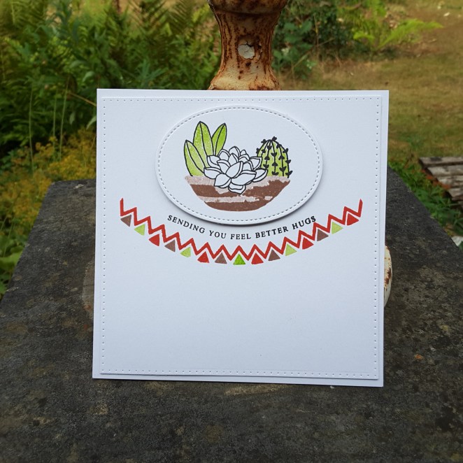
Hello again. I managed to find time to craft last night and this morning – still going to spend quite a bit of today crafting I hope – and made this card incorporating a sketch and colours theme, and going for a more feminine feel, without covering the card in flowers.

I took a zigzag stamp from the latest Catherine Pooler Stamp Of Approval, and curved it. I like the way these clear stamps can be manipulated this way, and opens up more ways if utilising them.

I then took a little triangle from the same collection and used the challenge colours to alternate as you see. As I didn’t have the exact colours, I used Watermelon Wonder from Stampin Up, and Over Coffee and Lime Rickey from Catherine Pooler. A lot of the stamp sets from Catherine Pooler include many, many small stamps for in-fills and creating your own patterns. So versatile.

After I had stamped this I had a little laugh at where I had placed my magnets:

20180805_081438

I am sure there is another card in there somewhere – a big robot/monster card….hmmmm!

Anyhoo – I then took the image from Altenew Indoor Garden, and die cut with a stitched oval, and added it as you see.

The sentiment I also curved to try and match the banner part – maybe I was slightly off, but rather than binning the whole thing – I stuck with it. I did this partly because I don’t think it is hugely wrong, and doesn’t look too out of place, but also because I am cutting myself some slack here. (see comments below)

These colours work very well together, I think, making a bright but clean and simple card.

I shall be entering the following challenges:

CAS Colours and Sketchescolours and sketch

Watercooler Challengesfeminine

Aud Sentiments for the girls

Now for a little ‘chat’ – I have been watching the most recent You Tube videos from Kristina Werner and have been a little upset for her…..have you seen the latest videos? The first was some hints and tips about to improve your card making. Loved that – great tips. The second was to try to explain and address comments some people have left……..quite a bit of negativity commented on the first video, but I have to say that I wholeheartedly support her and what she and other ‘famous’ members of the crafting community are trying to achieve.

I wouldn’t be anywhere near as challenged, I wouldn’t have anywhere near as much confidence, nor would I have anywhere as near as many ideas and skills without the advice/help/tips and good old ‘give it a go’ attitude that many people have like Kristina.

Thumbs up and support for Kristina and any other crafters like her who put themselves out there for us………..

https://www.youtube.com/user/starofmay/featured


Otters and Christmas and Colours

Hello there. I am afraid I have been crafting…..and have produced several cards for several different challenges. There is a lot of inspiration out there at the moment, and whilst I have time to craft, I am enjoying using the themes and colours for these challenges.

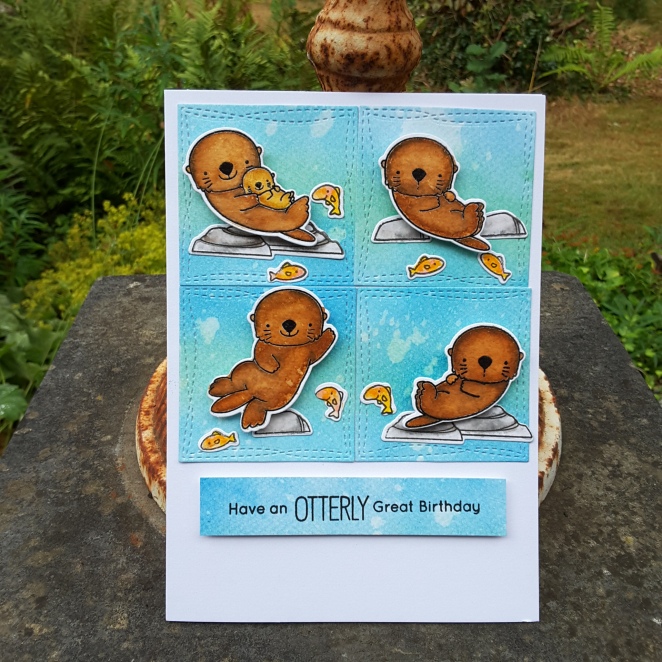
The first card is using the MFT ‘Otterly Love You‘ set – again – as it was still out on my desk, and I thought I would get inky and messy, water-colouring and distressing.

20180721_103622

The layout is taken from the current MFT Sketch Challenge, and other than the Distress Oxides and the Zigs – a completely MFT card. I always want to do scenes but struggle with the organisation of the products, so a sketch like this is ideal – I can do little mini-scenes in each square.

20180721_103629

As you see, completely different to the card from yesterday, as I water-coloured the otters in several brown colours, then went back in with a clean water brush to remove part of the colour in the centre of each otter. The rocks and fish also come with that stamp and die set.

This card will also be entered into the current challenge at Moving Along With The Times, with the theme of wild animals.

This second card is completely different:

A simple card – sorry it’s black and gold again (last one, I promise) – and using the Altenew ‘Poinsettia and Pine‘ stamp and die set. The poinsettia stamped and heat embossed in gold, some gold embossing powder added to the gold layer below it to make it match, and the die cuts used were from Catherine Pooler.

This card will be entered into the current challenge at CAS Christmas Card Challenge poinsettia as a theme – and the current challenge at CAS on SundayCAS Christmas in July. 

My third and final card is an homage to Bev at Uniko. She has lost a fur baby recently, so it can’t be an easy time for her and her family, so a little support is appreciated, I’m sure.

Today she is hosting her third stamping retreat – a very busy lady! I have been to the previous two retreats and not able to make this one, but as I am using the colours from CAS Colours and Sketches – Bev and Uniko came straight to mind…….

20180721_103610

I use the challenge colours of Powder Pink for the Concord and 9th Sketched Stripes Background, the Lemon Lime Twist for the little leafy stamps you see, and as I don’t have Coastal Cabana, I used the Catherine Pooler Aquatini instead.

This is another kind of card I struggle with – one layer card. Why did I test myself again? The current challenge at Less Is More is for a one layer card and using stripes……they don’t make it easy, do they? :)

I hope you all have a great weekend……….I feel some more crafting coming on…..I hope hubby doesn’t want any tea today………

Your time to shine….

Hello again. I have been using my Concord and 9th ‘Shine on‘ stamp and die set to enter the current colour challenge at Less Is More. Olive and tangerine….

20180708_160554

and one from the side:

20180708_160654

After die cutting the main sentiment outline, I then stamped the shadow thingies (Where are my words today?) in Catherine Pooler ‘Green Tea’ ink, which has an ‘olive’ feel to me. The reason to do it this way? The sentiment outline is a solid die, you can’t see where you are putting it if you stamp first. Guess how I figured that out????

I then took the Catherine Pooler ‘Orange Twist‘ (I think) and swiped it across a piece of card.  Hey presto, an orange piece of card. I then die cut the ‘shine’ word. A double-sided sticky sheet on the back made it easy to stick down onto the solid and stamped sentiment shadow thingy.

The black sentiment is from the same stamp set, yet again using the ‘midnight‘ ink from CP.

The sun die cut, using more of the hand-made orange card, and double-sided sticky sheet, was paper pieced through the original card it was cut from, just so I could get a precise and even ray distribution. I left the half circle sun part out of it.

I really like these colours together, and I may try something else with this colour combination……….

:)

2 new techniques

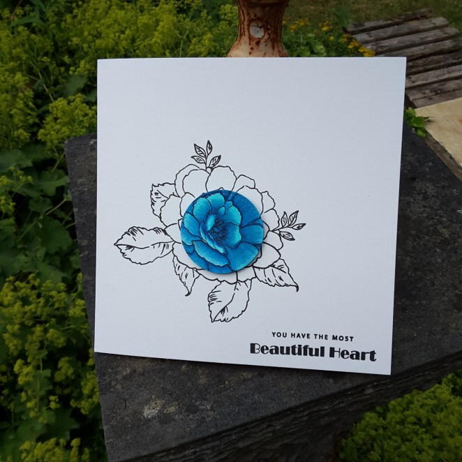
Hell there. I have been trying two new techniques – well – new to me. I have never used alcohol markers to colour and image, and I have never used the ‘spotlight‘ technique. So I combined the two together.

20180708_12145820180708_121503

This flower is the not yet released ‘Beautiful Heart’ from Altenew. It was given to all of us who attended the Daventry day recently, and so were the four blue alcohol markers.

I watched some You Tube videos on alcohol marker colouring, and set to it. I coloured the whole flower – I didn’t realise how long this type of colouring takes. You really have to take your time and blend, don’t you?

I did this small flower in three separate stages, as I didn’t have the patience to do it all in one go. Maybe in the future – when I finally get my full set from Altenew from my sister – I’ll make sure to plan ahead with the colouring, and make more time. I am more of an instant kinda girl……

I stamped the flower onto a white base card using Versafine black onyx, then masked part of it so I could stamp some leaves. Then I die cut the centre of the coloured flower, and stuck it down – trying very hard to match the lines etc.

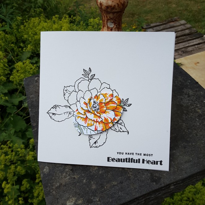
I also did it again after I had stamped the flower properly using all the layers and a yellow and orange ink from Catherine Pooler:

20180708_121441

So those are my two new techniques. Alcohol marker colouring, and spotlight stamping.

Whilst I had the stamp set out, and the masks cut to size, I decided to keep going and created some more birthday cards:

20180708_121607

I didn’t stamp all the layers of the leaves, but I am liking this orange and yellow combination.

The first blue card will be entered into the current challenge at Back To Basics and Beyond Challenges to use the spotlight technique, and the current Altenew July challenge.

The second birthday card will be entered into:

4 Crafty Chicksbirthday challenge

Seize the Birthday birthday +/- sequins (no sequins)

Altenew Folksy Florals

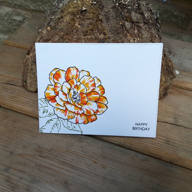
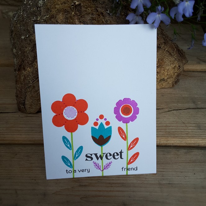
20180706_161725

Hello there. I have a bright and cheerful one layer, clean and simple card for you today. I was playing with this new stamp set from Altenew – ‘Folksy Florals’ – and decided that these stamps are just crying out for bright and vibrant colours.

As some off the stamps are solid, I turned to my Catherine Pooler inks, as they give great coverage from the get-go.

I played around with the colours, and just swapped and changed for each flower, leaves, and stem. The sentiment is also from the same stamp set, just mixing around the multitude of words and phrases you are supplied with. Who says you can’t have blue, purple and orange leaves?

I didn’t actually follow their guide for stamping and adding the different bits to each flower, and just went with the flow. It was actually quite hard to stop myself, so much so that I carried on and created some backgrounds with this set – I just kept stamping and stamping.

I shall be entering the current challenge at Addicted To Stamps, with the theme of ‘clean and simple‘.

Have a great day, and I’ll catch up with you soon – but not until I have watched the England match this afternoon!

Hello Lovely…

20180619_202221

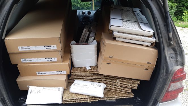
Hello everyone. I have one card to share with you today – and at the end of the post a photograph of my car boot after an Ikea shopping trip……!!!!!!

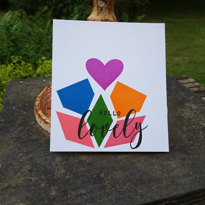
This card is the first one layer card I created without any smudges, without trying to get it done at least twice, so I just had to post it.

I used Altenew ‘Simple Shapes XL‘ stamp set, and Catherine Pooler inks. These stamps are quite large solid images, and Catherine Pooler inks just make life so much easier for this kind of stamping. I didn’t stamp any of the shapes more than once – and I hadn’t even used most of them before, so they were brand new. I have had them for ages, but never used them!

I did use my Misti – just in case – which again makes life easier, and just played with the different shapes. I didn’t have a plan for them, I just knew I wanted a rainbow effect with the colours. I arranged the inks around my mat, started with the pink at the bottom left, and just went with it.

As the colours are bold, I used a bold and black sentiment from The Ton ‘Peony Notes‘ as that was on my desk from the other day. A large sentiment, and I used Catherine Pooler ‘Midnight‘ ink to get a dark black and crisp image. I did need to stamp that a couple of times with my Misti, but I think it’s because I didn’t let the other inks dry enough.

I shall be entering the following challenges:

AAA cardsCAS geometric

Addicted to CASCAS rainbow

Now – for the Ikea shop. Ikea opened in Sheffield last year, and this is the first time I’ve been. I’m trying to organise and sort out my craft room. It’s a fairly small room, and at the moment there is stuff everywhere – in boxes, disorganised on shelves…….this shopping trip should help!!! :) Thank goodness it all fit. I don’t think I’ve put the back seats down before. Maybe I should have taken the Transit van……but perhaps that would have too dangerous! (not that this wasn’t bad enough!) I’ll let you know what hubby says…….

IMG-20180620-WA0000