Sketch Inspiration

20170416_162224

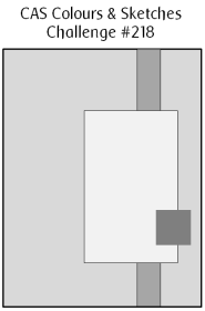
A quick posting for the second card I made today, inspired from the sketch from Clean and Simple Colours and Sketches. As I mentioned before, I struggle with clean and simple, but took the rules for this site to heart – I think!

Rules: “Clean and Simple” is defined as “uncluttered, with white or open space, and minimal layers and embellishments”.

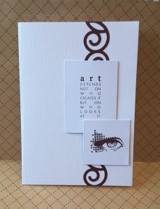
I always want to add more and more, but reigned myself in and did just what was asked from the sketch. I started off with an A4 piece of card folded in half. This particular card has a linen effect which is ideal for the more clean and simple cards, as it adds to the background without being too obtrusive – just a gentle hint of a little something.

I then took my Sizzix ‘Curly 2’ 12 inch die, which I’ve had for a loooooong time, and cut from a piece of plum/deep purple card stock I had spare, running the die cut through my Xyron 1.5 inch machine to enable me to stick it down easier than adding glue to all the swirls and curls.

I then stamped using my mini Carabelle Studio stamps ‘oeil maquille d’etoiles’ (eye make-up of stars – as per Google translate! ), and ‘Art’, stamping them in my Stampin Up ‘Rich Razzleberry’ ink – which I think matched nicely. I then die cut the sentiments using Sue Wilson noble stitched squares and rectangles, adding them to the base card with foam pads.


Time (butter)flies

20170416_142437

The inspiration for this card is from Time Out Challenges. There is a gorgeous picture of a clock and butterflies, which I have been thinking of for a few days. When I was in a panic buying mode in Crafters Companion store yesterday – looking for my water-colour card – I came across this stunning die from Memory Box, and thought it would be ideal for CASEing this inspiration picture. (Copy and share everything)

I initially thought that the die would cut the butterflies out of paper stock completely, but when I cut it in white – as per photo – I realised it actually cut the rectangle out, and part-cut the butterflies, leaving them in the card, attached by their middle section. I started off by thinking I would cut the die and have red underneath showing through each butterfly shape, but this wouldn’t work with how the die actually cut.

On to my next idea – I cut the die out of red sparkly card, and then cut each individual little butterfly out, snipping with my fine decoupage scissors. Yes – more than 50 little, tiny, butterflies. Then used my Stampin Up fine tip glue, and stuck each of the 50 little butterflies individually down on the white card base. Each one. Singly. Stuck down. Definitely had my patient head on when I did that! And, you know, it’s really, really difficult to not put them in straight lines, and make them haphazard…..

The clock was die cut out of Tim Holtz/Sizzix BIGZ die ‘Clock, Ornate and hands’, then embossed with Spellbinders M-Bossability ‘numbers’. The hands cut out of the same red sparkly card I had used for the butterflies. I was going the leave the card as it was, then decided to add a sentiment from Stampin Up ‘Special Reason’ stamp set – just a little one, in the bottom corner.

Yep – good idea – then smudged it! Again! Will I never learn? So I added yet another little red butterfly……………catastrophe averted. Kinda.


Fantasy Fairies


I have been playing with my Brusho’s again……I seem to create quite a mess – on the card and off of it! I was inspired by three challenges today – Cards In Envy, Fab N Funky Challenges, and Stamp with Sarah Kay. The first two challenges were to create fantasy cards, and the third challenge was for a water-colour background.

I started to get my Crafters Companion water-colour card – I had used the last of it! Now what do I do? How can I do a water-colour background without water-colour card? It won’t flow as well. I was in crisis mode! Luckily, their Chesterfield store is a mere 10 minutes drive away…………on with the make-up, did my hair, got in my car – and was back home within the hour. Of course, one has to look around the shop whilst there, doesn’t one? Guess what I found? These lovely, adorable fairies from Lavinia Stamps…..ideal for what I wanted to create. They are quite solid, but adorable. Out with the old idea, in with the new!

So – water-colour card cut square to fit my 7 inch square white card base. I used my Misti to stamp my two images facing each other, one higher, in Ranger Perfect medium. Misti because with the textured card I usually need to stamp twice. Added white embossing powder and heat set it. Then to the background. I thought the white embossing would resist the colours, so I just went on in there.

I wet down the card – both sides – taped it down, and sprinkled my chosen Brusho colours onto it. Turquoise at the top, Crimson in the middle, Lime Green at the bottom. A sort of sky and sunset and grass thingy going on here. Until they ran together! Blinking tape didn’t keep it flat! I mopped up extra colours, tried to stop the red running into the green, then the blue ran down – muddy colour in the middle! Wet it down again, kitchen towel to mop-up some colour, added one colour at a time, dried it, added the others. Don’t you just love kitchen towel??!!

I then used black Versafine to stamp some floral elements from Stampin Up ‘Flowering Fields’ stamp set. An older stamp set, but I like the little images – very versatile. I think it looks like the fairies are playing in a fantasy sunset field, dancing on the flowers – well – that was the look I was going for, anyway.

Attached the watercolour card to black, then added to base card. Of course, I added some glitter, and I think I’ve managed to catch this in the photo – Spectrum Noir clear sparkle pen. Pushed a little extra out and just flicked it onto the card.

I think I’m getting the hang of Brusho’s – I mean, you actually can’t plan very much where they are going to spread to. There may be a knack to them – but I’m enjoying exploring their capabilities…….


Smile in the rain


I have been having a play with a stamp set from Newton’s Nook, and the matching die set ‘Newton’s Rainy Day’. I have this for a few weeks now, and because I really, really struggle with cute animals and colouring, I have been holding-off playing with it. Today has been the day I have girded my loins and just got on with it.

I am not a colourist, I dabble – much like many of us, I am sure – and sometimes make mistakes, sometimes it works out right, but tend to (mostly) have fun playing.

This is my idea of playing. I stamped the main image four times – twice on Crafters Companion water-colour card, and twice on IndigoBlu stamping card. I coloured them all with my Zigs, and added Spectrum Noir sparkle to all of the umbrellas and water puddles at the end.

I found I didn’t know what colours to use except definitely wanted a yellow duck, and definitely wanted a blue puddle – the rest were experiments in colour. The cards with the purple cat and the red umbrella, and the brown cat and grey umbrella were in the IndigoBlu stamping card. I found that the zigs didn’t colour that well on this card, and left pen marks. The colour sank into the card very quickly, and I went over the imaged two of three times to try and even things out.

For the water-colour cards I wet down the area of card first, then went in with the colours, using my water-brush to spread the colour around a little, for a more uneven and water-coloured effect. I like the look of the texture of the water-colour card, so didn’t add too much depth.

The ‘Smile’ sentiment is from Altenew, which comes with a stamp and die set, but I only used the die. To get a full yellow effect, I wet down a piece of water-colour card, then ran my Stampin Up ‘Daffodil Delight’ ink pad across it. I used my water-brush to even the colour a little – but not too much – dry the card, then die cut the word out. The little sentiment is from the same Newton’s Nook ‘Rainy Day’ stamp set. I thought the two worked together quite well.

As I am trying for more clean and simple cards, I left them at that. No embellishments, no added sequins – just as they were.

I will be entering a card for the following challenges:

Addicted to Clean and Simple

Crazy for Challenges

Make My Monday Challenge

Addicted to stamps

Crafty Catz weekly challenge

Colour Crazy Challenge

Crafty Friends Challenge

I thought I’d give you an update about my late, late, late Christmas presents for my friend, and one week late on the birthday card and presents – all received very gratefully and graciously! Thank goodness.


Happy Birthday

20170411_211136


Despite all the cards I make, I am almost a week late with a card for one of my close friends. Even though we are based in the same hospital, and our office is next door to each other, it is very rare – not even weekly – when we see each other. She works two days a week, and I sometimes work at other sites. Needless to say – I am mortified!!!

We are going out for a meal on Thursday night, so I shall have to give her the card and presents then – but even five days is nothing compared to my still having her Christmas presents here. With me! Almost four months! How outrageous is that!!??

Anyway, to my card. Still a last minute thing, but I returned to my die cutting roots again. I put my purple card away yesterday, so you can there isn’t one drop of purple to be found. Brown. That is what we have – brown. With a little sparkle.

I started with a white 8 inch square card base, and added some patterned paper from Be Creative! I am  trying a new glue. I usually add most of the layers with double-sided sticky tape, but I had a craft clear-up and found quite a few bottle of Tonic glue, so thought I would try that. I’ll let you know how it stays stuck down………

I then die cut flowers from Stampin Up ‘Stylish Stems Framelits’  and layered Kraft card with a darker brown card for two tone effect. The dark brown card I ‘found’ in a pile I was saving for later, for something special. Why do we do that? Isn’t the card we are currently making that special card to use our stash on? I am sure I have items which I am ‘saving’……………

I then die cut some ferns and leaves with Sue Wilson ‘Finishing Touches – Mosaic Leaves’ and layered them altogether using Pinflair glue. The Pinflair glue allows me to move items around until I get the positioning right, and also allows things to be ‘shoved’ under each other.

I then stamped the sentiment using my Misti – despite me already having layered the die cuts (I know, I know!) from the Altenew ‘Wishing You’ stamp set.

I may have rambled a little and gone off on tangents, but that’s because I’m hoping you haven’t all stuck with my complete and utter tardiness with cards and presents for my friend….

I shall be entering this card into the following challenges:

Simon Says Stamp Wednesday Challenge

That’s Crafty Challenge Blog

Always Fun Challenges

Aud Sentiments Challenge


Starry Sketch

20170410_213834

I seem to be having a purple passion moment or two. Both yesterday and today I have made cards with purple. I think I’ll have to move my purple card stock away from me for a while……….Until then, here is a small little card inspired by Watercooler Wednesday and Time Out Challenges. Both of these challenges I have been thinking about for quite a few days, and finally – as hubby is watching the golf catch-up – I have sat down to create this card.

I started with a light pink card base then matted this with a black layer and purple layer. On the purple layer, I die cut three strips from Crafters Companion Die’sire ‘Simple Stitched Edges’ dies. These strips are actually 12 inches long, and you could cut several make a couple of cards at the same time.

The two circles are cut from my ever favourite, and so aptly named MFT – ‘Zigzag stitched circle’ dies. I stamped and embossed the large star from MFT ‘Stars Above’ die set, using my sparkly Wow powder ‘Grape Crush’, then die cut the star with the matching die.

The sentiment is from that same stamp set, stamped with Versafine black onyx, another of my favourites.

I added a black layer as I wanted the sentiment to be in black, and thought a black layer under the purple would bring it together, and also make the stitched and crossed stripes stand out a little more.

The addition of the sequins added an extra something, and for once – they weren’t added because I smudged! I just wanted them there! Talk about pressure for stamping again and not smudging. I think I’ll have a little bet with myself how many I can stamp in a row without smudging…….


Three colours only

It’s been an absolutely gorgeous day here is Chesterfield, UK. Bright and sunny, so a little time spent in the garden throughout the day. It’s only when the sun went down, and it turned cooler, that my thoughts then turned to making a card. Well, I did want to make a card earlier, but the weather was just toooo nice.

I chose to make a bright and cheerful card again today, so my thoughts turned to the current challenge from CAS Colours and Sketches.

Their current challenge is to use three colours only, clean and simple card, but you could also use the basic white/grey/black/white/Kraft for sentiments and outlines. I managed to use two of the specific colours – Pear Pizzazz and So Saffron, but I didn’t have Wisteria Wonder. I had a look at the Stampin Up web site of my demonstrator (Shell Bower) to get an idea of the colour, then went hunting through my other inks. I came across my Ranger Archival Ink ‘Violet’ which seemed to match quite well with what I saw in t’old tinterweb.

So – now what to do? I had been meaning to use my little Card-io Majestix stamps for a while, so sat down and had a look through my stash. I decided on a mixture of sets, one with flowers, which I stamped in the Violet ink, leaves in Pear Pizzazz, and a flourish I stamped in So Saffron. They are cute little stamps, aren’t they? I do think they are expensive for what you get – but as long as they get used, right?

The purple layer of card matched the violet – from Creative Expressions, I think – and then a white base layer.

You may be asking what those little flourishes are doing at the top of the card? Well…..guess who smudged? Yet again! Don’t tell anyone – they’ll never notice. Just between you and me!

I found I actually have more of these little stamp sets than I thought, so I may have more of a play with them this week, and see what I come up with. There are a good selection of examples on t’old tinterweb, so perhaps I may play and post what I have done.


Fresh Sketch


20170408_104728


After doing some quite complicated techniques and dark colour schemes the past few posts, I just thought I’d throw a spanner into the works and do a clean and simple card based on the sketch challenge for Freshly Made Sketches.

I know it’s my second posting of the day, but I have had my crafting head on, and hubby has been golfing……..

I used a 6 inch square card base, with three little squares attached with 3D foam. Each square is cut using Crafters Companion Essentials Scalloped Squares, after stamping with one of the stamps from Altenew ‘Simple Flowers’ stamp set. I used Catherine Pooler inks – Rockin’ Red, Something Borrowed, and Grass Skirt.

I always wonder whether to stamp first and then cut, or cut first then stamp……this time I stamped then cut. Is there a supposedly correct way? Or do we do what we usually do – whatever works best for us?

The sentiment is from Stampin Up ‘Vertical greetings’, which is a great little stamp set with other vertical greetings, and topiary stamps. I stamped with Versafine Black Onyx, using my Misti.

I use the Misti a lot when stamping, especially when stamping directly onto the card base, as I never seem to get it quite right first time. I always seem to get the depth of colour wrong, or it doesn’t stamp correctly, and the Misti just help me to line things up, and double/triple stamp if needed. I then added the squares as per sketch pattern.

A quick card, as clean and simple as I think I can make it……


Mojo Sketch

This card was inspired by Mojo Monday Sketch challenge. I have turned the sketch around 90 degrees but you can still see the inspiration sketch in there.

It seems I am staying with my darker vintage look for today, completely different to the cards I made several posts ago. I don’t know why I am going that way currently – the sun is shining, the birds are singing, the pheasants are making a blinking racket(!!) – all a good thing, though.

For this card, I used an 8 inch square Kraft base card, and cut a smaller square in a deep purple colour which I think matched the tone of the rest of the card. I embossed this smaller square with the Tattered Lace ‘Autumn Leaf’ embossing folder, which has a gorgeous imprint of different leaves, and attached that to the base card.

The layers are from a patterned paper pad from Be Creative. The second layer had a couple of birds on each edge, so I just took the middle out of the paper and stuck them down together so it looked like they were still connected. The circle is stamped with a Tim Holtz/Stampers Anonymous set ‘Phrases 2’, and cut using my MFT ZIgZag Stitched Circle die set. This circle I raised with 3D foam, but the rest of the layers are flat to the card.

I don’t very often used patterned paper, and yet I have stacks of pads and collections I absolutely MUST get around to using. Maybe this is the start of a patterned paper thing. You never know. I don’t think I can be predictable with my crafting – it is all in what inspires me for the day. I may set off doing one thing, then get completely turned-around and go onto another thing.

Does anyone else have a stack of toppers they have made, and yet aren’t attached to cards yet? I am sure it isn’t just me. I know my sister in Canada has the same sort of collection. We see it as cards yet to be made, but can easily be grabbed for emergencies. (Not sure what those emergencies will be, though!

The more I set out my items to make this card, I realised how versatile and it could be, for any occasions, and so I shall also be entering this card into the Addicted to Stamps and More challenge with the theme of ‘Anything Goes’, and Moving Along With The Times, with the theme of ‘Into the Woods’.

Inspiration from photo

20170407_200020

This evening I have been having a play with some of my more vintage or shabby stamps and papers. I was looking for something to make for the Inkspirational challenge, and decided I wanted to go away from my colourful recent posts, and concentrate on more of a monochrome look.

I began by thinking of Tim Holtz dies and stamps, and remembered the ‘Mixed Media’ dies I bought a while a go and never used. I am sure you will have bought things ‘just in case’…..well now I have a reason to use them.

I started with an 8 inch square Kraft card base, and added a piece of patterned paper from a Be Creative paper pad – also that I have had for quite a while. I cut the corner die from the paper, for a diamond effect, and stuck this to the base card. I also didn’t want the paper to be the same size, and cut off a couple of inches to leave a Kraft border. Once I had stuck the paper to the card, I curled and rolled the top right corner, and slightly curled the bottom right corner, to create more interest.

The sentiment is from an IndigoBlu set ‘Take The Time’, and the large clock is from Tim Holtz collection from Stampers Anonymous ‘Vintage Things Blueprint’. I used the Versafine black ink, and then distressed the paper with Frayed Burlap and Old Paper to create a more vintage feel.

The small clock was stamped using Frayed Burlap and came from another Tim Holtz Stampers Anonymous set called ‘Little Things’, whilst the tree/vein effect came from an IndigoBlu set ‘Nature 1’ again stamped with Frayed Burlap.

I then distressed the side panel and main paper panel again with the inks.

I played and experimented a little with this card, using quite a few stamps from different sets, when I usually stick to one or two sets at most – maybe main image with a sentiment from another set.

I will have time over the weekend to have crafty playing, so I am sure I will be showing you what I have done.