Green and gold

20170322_102139

Whilst I am at home today as my car is being serviced, once again I look for inspiration for making a card from a couple of challenges. The first challenge is from Daring Card Makers with the theme of green with gold, and the second is from the Colour Crazy Craft Challenge with the theme of anything goes.

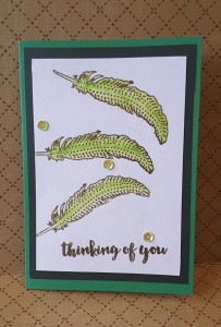
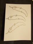
I took the opportunity to use my stamp set from Altenew ‘Faithful Feather’ and also tried again for a clean and simple card. I have attached the photos of my crafting progress, which I haven’t done before, so thought I would give it a try. I was going to give this to my friend today, as she was nipping round for coffee, but unfortunately she is unable to make it. So – she will have to look and admire it on this blog before she receives it!

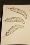
I stated with Crafters Companion water-colour card, as I didn’t know if I was going to water colour, or just stamp, and as the card has some texture, I used my Misti to ensure good coverage of the stamp outline. I stamped and embossed the feather outline using my Ranger Perfect Medium, and Detail Gold embossing powder from Cosmic Shimmer.

Once I had the outline embossed, I moved onto the inner part of the stamp, and again stamped and embossed this detail. I wanted the outline and detail to stand out which is why I embossed both layers. In this stamp set there are several other layers which can be used, and I may try them out soon – seeing as how the set is on my craft table currently – but wanted this card to be simpler.

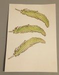
I then moved onto the colouring. I knew I wanted green, but didn’t know which green to use. I have several different pens, distress inks, Zig brushes……then – again – my eyes fell upon a recent purchase I had made through Hochanda craft channel……my brand new Derwent Inktense Pencils. Ideal opportunity to see how they worked.

I have the 12 pencil set, which came as a bundle with some water-colour paper, water brush, and set of 5 line painters. The lady who demonstrated during the shows for this product was absolutely inspiring. She made it seem that anyone could achieve the results she had….we shall see!

I tried three of the pencils on some spare water-colour card and they all blended absolutely smoothly, which made me be brave to add straight to the stamped feathers. I used Apple Green, only the one colour, and drew straight down the middle of the feather, using my water brush to blend out from the centre each side. I purposefully didn’t blend the whole of the ink as I wanted a darker line down the middle of the feather.

During this process – I smudged. Blinking Heck!!!. Just beneath the middle feather…..but decided to carry on and think of some way to disguise the area. No-one will know. I won’t tell anyone. It never happened…..

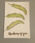
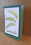
I stamped and embossed the sentiment from the same stamp set, then tried to decided what colour card base to use. I decided on a darker green just beneath the water-colour card, and a ‘Topsy Turvy’ card from Create and Craft channel – darker green on the outside and lighter green on the inside which I have tried to show in the final photograph.

Now onto the mistake I didn’t make! I made the decision to add three sequins, in a colour which seemed to match the green, and also had a hint of gold in them. Bingo! Sorted!

Well – in hindsight I wouldn’t have added them, but there we are.


‘L’ for Lady

So what on earth is a girl to do when home from long day at work, hubby still away? Yep – make another card!. I had a look through the Paper Playful challenge web site, and came across three I could enter with the same card.

The first inspiration was from Just Add Ink, with the theme of using an element which began with the letter ‘L’. The second was from Seize the Birthday with the theme of black and white, and the third from Cards in Envy with the theme of black and white and one other colour.

The use of black and white to me, was to create a silhouette, and what better die set to use than that of the Tonic ‘Chepstow Bonnet’ die set. This die set has a couple of bonnets with the lady die, including a fascinator hat, but I liked the look the bonnet gave with the lace around the head.

I used an 8 inch square white card base, and added a slightly smaller layer black layer, cutting it with my Sue Wilson pierced squares die, and then cutting one slightly smaller in white card. Even though the white card had some pattern to it anyway, I embossed it with the Crafters Companion background script embossing folder for extra interest.

I die cut the lady and bonnet in black adding her to the card with one layer of mounting foam, and added the bonnet on top of her head. The sentiment is from another set of Crafters Companion dies, cut in black, and attached with the Stick and Stay spray – also from Crafters Companion.

I thought I had finished there, then remembered that I had to add one colour for the Cards In Envy challenge, but I didn’t want too much colour. I hunted through my ‘bling’ drawer, which has brads, and sequins, and gems, and came across these. They are red, but such a deep red, they almost shine black. I thought they would be a good addition to the card, and also thought they would enhance the bottom right corner – which seemed a little empty.

That’s it. Card done. Today’s playtime over………but there is always tomorrow!!


Buttons for wheels

You may wonder why I seem to be posting quite a few cards this week……well, my hubby is away for a few days, so I can do as much crafting as I like, without having to worry about anyone else. I can please myself when I eat, what time I go to bed, and how long I can craft for………..all good. For a short time, anyway.

This card is a clean and simple card, as a complete opposite to my gold card from yesterday. I didn’t want to do much to the background, I didn’t want to add embellishments – I just wanted to play along with the challenge from 4 Crafty Chicks and have fun.

The theme for this time was to use buttons. I actually didn’t have to think for a long time as I immediately thought that buttons could be the wheels on this bicycle stamp from Stampin Up. I bought some buttons recently as I wanted to do a mixed media project with lots of buttons – not yet got down to doing it! – and one of the colours matched quite nicely, I thought.

On the Whisper White card from Stampin Up, I stamped the bicycle in Ranger Archival ‘Coffee’. I determined where I wanted the bike on the card by cutting out my Lawn Fawn ‘Road Border’ first, and moving it around the card. Did I want the bike straight across, did I want the bike going up or down one of the hills…? I decided I wanted the bike straight, with the connotation that for the hill coming up – I would pedal for a while….Almost soppy and sentimental, if you think about it.

I didn’t want harsh lines for this stamp, as I knew I was going to add a black road. The coffee colour was just the right shade for adding some colour to the bike frame and bars – with my Stampin Up pens ‘Pumpkin Pie’ and ‘Daffodil Delight’ – and also was the right colour to stamp the sentiment from the same stamp set. I only used a couple of colours purposefully, not wanting to add too much to take away from the sentiment. I did originally plan  to stamp the two sentiments more off-set from one to the other, but forgot!

The stamp set also comes with items you can put on the bike, including a basket, into which you can stamp some bread, some flowers, some hearts, but I didn’t want to determine  whether to card was for male or female. I didn’t want any addition to the plain and simple stamp, I just wanted simplicity. I didn’t emboss anything, I didn’t glitter anything. I know, right? I resisted……….

I added the buttons as the wheels of the bike, then added the road lastly, and adding the whole thing to some Stampin Up ‘Crumb Cake’ card stock.

I like using Stampin Up, and I have a great demonstrator, Shell Bower, who has been to my house a couple of times to have a crafting few hours with some of my friends. Quite a reasonable price for a few hours, and even the non-crafty friends enjoyed it. She is very helpful, and spent some time a year ago talking to me about being a demonstrator.

I did consider joining as demonstrator – but I have so much stuff from other companies – and you’re not supposed to sue anyone else’s products – that I refrained both this year and last year. I have too much Tim Holtz, Lawn Fawn, Altenew, IndigoBlu, MFT………..to consider not using them. I like to use a lot of different products when I craft, I don’t like to be restricted from what I want to do. If I want to use Tim Holtz with Stampin UP – then I can…..Oh dear. Did someone say control freak who doesn’t like to be told what to do? Who doesn’t like too many rules? You’re right. I work within a ‘rules’ orientated work-place (NHS Hospital) and so when I craft I don’t want rules. I want to spread my wings, as it were, and harness my inner artist. (That could almost be a sentiment, couldn’t it?)

Final word (for this post) –  having fun, loving crafting, some sunshine today (Derbyshire, UK)……….jolly good day for me.


Flowers and colour throwdown

I have quite a bit of time to play this weekend, and I am enjoying every minute of it. There are a few challenges about to close, so I thought I would combine two challenges with this card. The ‘Colour Throwdown’ and ‘Simon Says Stamp Monday challenge’.

The first challenge is to use the colours green, black and gold, and the second challenge was to use hand-made flowers. When I want to use gold, I see cards as being quite decadent, and sumptuous, and then thought how I could incorporate flowers and decadence.

I returned to my roots, by using quite a few of my Sue Wilson dies. I have a few of her flower sets, and wanted a solid flower for this card. I also spied my Corner Garden from Stampin Up – I haven’t used that for a while.

I started with a brown Kraft base card of 8” square, used my Sue Wilson stitched squares for the layers of black, green, then black again. I used my embossing buddy over the smallest square, and stamped the ‘Corner Garden’ stamp with my Ranger Perfect Medium, using a Cosmic Shimmer ‘Detail Gold’ and heat embossed the image. The image didn’t come all the way across the bottom of that square, so I decided to use my flowers to cover the blank area to the bottom left. I usually put my flowers on the bottom right corner, so this is a little change for me.

To get the flowers to match the gold of the embossing powder, I covered a piece of black card with ‘Be Creative’ double sided sticky tape, added the same gold embossing powder, and heat set it. I then cut out several sizes of the flowers from ‘Perfect Peony complete Petals’, so I could put several layers on the flowers. I curled the edges of the petals slightly, and layered them together to create three flowers. I like the way the embossing with this tape isn’t completely smooth, I think the added texture gives some more interesting detail to the flowers. I didn’t put anything in the middle of the flowers as I couldn’t think of anything which would work, so left them as is.

I then used the remainder of the gold embossed black card to cut out the leaves from the matching set ‘Perfect Peony Open Petals’. I didn’t want the leaves solid, as I felt it would cover too much of the base card, so only used the outline dies.

I added the flowers and the leaves to the card with Pinflair Glue gel, so I could manipulate their position, and insert the leaves where I wanted them. I did move them around that corner a few times until I was happy with the placement of them.

The sentiment is from ‘Paperartsy’ and is part of a guest designer collection. The set has a number not a name – ELB05 – is has 6 sentiments relating to flowers, some of the quotes from William Blake, and Henri Matisse. I chose the one I used as it fit the open space perfectly. I used my Perfect Medium again, and the same gold embossing powder.

I was nervous to stamp it, but I stamped it using my Misti, before I added the flowers – just in case. I find the Misti has made me use stamps more than I ever have as I can just go over the image again and again if it hasn’t stamped well.

I was tempted to use some dew drops, some other embellishments – but I restrained myself, and am overall liking what it came out like. I liked the clean lines of the card base and the layers, leaving the eye to be drawn to the flowers, stamp and sentiment.

It felt good to get back to my die-cutting roots with the Sue Wilson dies, and also incorporating some newer stamp sets from Stampin Up and Paperartsy. As always – loving embossing!


Simple sketch

20170318_074328

I made this card to enter the ‘Clean and Simple colours and sketch’ challenge. I try to do clean and simple frequently, but then always add more, then more, so this was certainly a challenge for me. I am not sure about the background to the circle on this one, but I feel even if we are unsure, or maybe not quite feeling the love from a card we have made, then still publish. I like discussions – often with myself! – about what could be changed or tried.

As I had recently joined a challenge using stencils – and found I had quite a few – I chose the Leonie Pujol ‘Friend’ stencil set. This set comes with varying sizes of the word ‘friend’ to act as a mask, and also comes with the stencil which has the same sizes of the word. She has a whole range of words which can be used quite easily.

I cut a circle out of some paper, and attached that to my card with Crafters Companion ‘Stick and Spray’, a repositionable adhesive – ideal for using masks and stencils. However, maybe I did something wrong, but I did have some adhesive left on my card in the word ‘friend’ and around the outside where I had stuck my outer mask – thankfully, my trusty Creative Expressions adhesive eraser came into play…..

After placing the stencil and mask down, I used Catherine Pooler ‘Lovely Notes’ and ‘Lovely Flowers’ stamp sets in the Catherine Pooler inks – Grass Skirt and Flirty Fuchsia. These little stamp sets are very versatile, and ideal for adding small details. There are lots of stamps in these small sets, with lost of small elements for filling in very small spaces. Hmmmmm – probably going to play more with those stamps today………..

Once the stamping had been done, I needed to create a background to the word ‘friend’, so it showed up more. There was too much white around the word and it didn’t show up very well. So – were the flowers I inked dry? Could I sponge over the top of them? Would they smudge? I didn’t know – so had a go…….

I used a heat tool anyway for a few seconds, just in case. Then I used Altenew ‘Frayed Leaf’ ink and started to blend into the circle. It started to smudge. So – I then decided to just blot into the circle with that same colour, with my Ranger ink blending tool – went quite well, I think. However, see my thought process below for how simple this could be to rectify.

I stamped a sentiment from the same ‘Lovely Flowers’ stamp set in the Flirty Fuchsia ink, mixing two of the wording options together, which I think worked well with the friend word inside the circle. I cut the sentiment out with my Sue Wilson banner die cut set, and raised that on foam pads. The only dimension I added – quite a feat for me – and added that to a green card base.

Some thoughts throughout the process:

The ‘stick and spray’ does leave residue behind, so don’t put your work upside down on your craft table until you have either washed the surface of your table, or have used an adhesive remover where the stencil has been. I’m going to have a look at their web site to see if I did something wrong, or if this is the way it is!

The Catherine Pooler inks are absolutely, stunningly gorgeous. They are vibrant, they cover the stamp beautifully – even big background stamps – and are a joy to work with. But – they do stay wet for a while……….if you are planning on blending over the top of inking – then wait…..and wait…..and wait….just to be sure. Alternatively – blend the background first. I know, you were saying that before. I didn’t hear you!!

The stencils are also very, very good. There are a lot of options with sizes in each pack, and I find they are good quality, and easily cleaned.

So – I have finished my thinking for this card and this post. If anyone has any hints and tips about using sticky stuff, feel free to contact me. I am always looking out for improvements and ideas…..


Using a stencil for vintage

I’ve just a fun and quick time making this card. The inspiration is from 2 challenge sites that I have entered this card into –  ‘Just Us Girls’ with a challenge to use stencils, and ‘Creates and Makes’ to have an optional vintage theme. My initial thoughts were that I had so many stencils, where do I start? I also have stencils I have never used before. I viewed the examples from the design teams, and the one made by Chris on ‘Just Us Girls’ caught me eye. It brought to mind my Tim Holtz stencils, as Chris had made some tags, and Tim is famous for his tags.

So I went to my stencil drawer, looked through my Tim Holtz stencils, and found the ‘Doily’ stencil. This is a lovely lacy/floral design, which I thought would add some great detail to the background. I was going to use a texture paste, but thought the design was so cute and floral that I just went with my distress inks.

I wanted to create a vintage and aged look so went through my stencil with Frayed Burlap and Walnut Stain, moving the stencil about three times around my 7×7 inch piece of card. I liked that you can’t see where I moved it each time, which shows how detailed and delicate the design is.

I wasn’t quite sure how I was going to put something on top. I was thinking some flowers, a sentiment, how would I matt and layer it without losing the stencil detail on the back. Again, looking around my craft table, (my table is never tidy and neat) and my eyes fell upon my IndigoBlu stamp set – Word Block #1 – and decided to use that set. My only decision here was which words to use out of the 6 available in the set.

I went with ‘Faith, Hope, Love, Thanks’ as you can see, leaving out ‘Celebrate’ and ‘Beauty’. For these, I stamped them in my Ranger Perfect Medium, and used a Cosmic Shimmer Dark Bronze Lustre embossing powder. Once they were embossed, I thought the colour wouldn’t really match, and was ready to try another colour, when I decided to shade the squares with the same two distress inks I had used on the background.

These two inks took away the glare of the white card and matched the background well, but I still inked the edge of these with the darker ink – Walnut stain – so they stood out as little more from the background. This meant I also didn’t have to use a piece of card as another layer.

Then how to add them so they were even and square in the card base…..I used a square Sue Wilson stitched edge die that was 6 inches square, stuck it to the background centrally, and then just stuck the squares in the corners…..talk about thinking outside the box!

I added this onto a brown/Kraft 8 inch square card, and liked the whole monochrome and vintage effect it gave. I was thinking of adding some embellishments of some sort, but decided to leave it as it was. To say the card quite quick and easy to make, I do like the overall effect it has given. Even using the brown inks doesn’t make it drab at all, and I have tried to take a photograph showing how shiny the embossing powder is.

JUGS Blinkie

Blog badge

Ink and sketch


I have waited a few weeks to play with the new additions to my crafty stash. I like Lawn Fawn, and I also like the way a lot of their dies co-ordinate with each other – the same curves, same width of die, and the possibilities for using them individually or together.

My usual crafting style has changed – I don’t have a ‘usual’ style now. I’ll have a go at anything – as you can see from my previous posts.

On this particular card, I saw the sketch from ‘Just add ink’ and immediately thought of my Lawn Fawn sets which included the houses and the road. I was going to add some trees behind the houses, but decided against it.

I used a base of the water colour card from Crafters Companion, and inked my sky and my grass. I added some water to the card to make the ink spread a little easier – I don’t have the patience to wait and wait and ink and ink. I found adding just a little water made the inks spread easier and faster. I used Tim Holtz distress inks – three blues, and three greens for the grass from Altenew. Both of those inks are an absolute pleasure to work with – whatever the crafting you are doing. They blend well, and are very forgiving. I splashed some water onto the background for a more mottle defect, but found the water colour card had a texture to it which I also liked, so left it possible to see that texture through the inks.

The houses were from Lawn fawn ‘Little Town Border’ and the road was a ‘Road Border’ lawn cut. This die has the middle holes cut into it, and I added some yellow card hind it from the accompanying die to create a more dimensional road with a middle line. Thinking on it now – why did I use yellow? Our middle lines are white…….oh well! Creative license!

The sentiment was stamped combining two sentiments from Altenew ‘Birch Land’ stamp set, curving it slightly as I didn’t want any straight lines. I inked that piece up with some distress inks, but in hindsight, I’m not sure it that works or not……

I added the water colour card to a green layer, then a white top folding base card.


Green and copper

For todays cards, I had a little play with my water-colour paints and tried out different ways of using them with a stamped image. The inspiration for these cards came from the Chocolate Baroque challenge, and one of their stamps I have recently purchased.

The stamp is ‘Rose Script’ and I loved the simplicity of the design, incorporating its own background with the script behind the rose, and the sentiments that come with the stamp set are going to be used a lot in my crafting – I can tell!

The challenge was a colour swatch of the greens, and one metallic element – copper. I realised that the only copper item I possessed was an embossing powder from Cosmic Shimmer, so I that’s where I started. Do I emboss the stamp? Do I emboss the sentiment? How about an embossed edging to the card? As I was in a conundrum – I decided to do them all….in conjunction with some water colouring.

I know, I just started to play with water colouring – and loving it. It may not be technically correct, it may not be what is taught in class rooms around the world – but in my little personal universe (I call it the Loopylooverse) – I’m enjoying playing and creating.

The darkest coloured card I started by embossing the stamped image in copper, wet down the whole piece of card, and just swept my water-colour greens across the image. I liked how some of the colours pooled within some parts of the embossed image, especially on the leaves, and decided to let it dry as it was.

Another piece of water-colour card and I embossed the stamp in clear embossing powder, and again swept the colours across the image. The embossing resisted the water-colours, highlighting the stamp. I added sentiment in the copper embossing powder, and also edged the piece in the ‘Be Creative’ double-sided sticky tape (again) added embossing powder, heat setting it, which created another dimension on the card.

The third card was a little mistake – but I actually like it. I wet the card, swept my colours over it, dried it with my heat tool, then stamped over that with my Ranger perfect Medium. I couldn’t see the stamp, so I wet the card again, and took most of the colour away, and it left the stamped image with an outline in the three different greens.

As I had used quite a bit of colour with those three cards, I decided to do a fourth (I had cut my A4 water colour card into four pieces) quite plain and simple. I stamped the image and embossed in copper. I used a small amount of each of the three green colours to a different part of the image, but I wanted most of it clean. The darkest green is on the stem, then the next two greens are on three of the leaves. That’s it. I put it down and refused to add any further detail, as occasionally I don’t know when to stop!

I used Crafters Companion water colour card, Gansai Tambi water colours, Chocolate Baroque stamp set – ‘Rose Script’, Cosmic Shimmer copper embossing powder.


Embossing background

Looking around today for inspiration for making a card, so went to the Paper Playful web site. This site lists a range of challenges for crafters. They post a list every day, so there are certainly quite a few to choose from.

The inspiration for this card came from two challenges – Simon Says Stamp and Cardz4galz. The challenge from Simon Says Stamp was to create a background, and the second challenge was to use embossing powder.

My idea on the background was to create a dimensional background. I used the MFT Fancy Flowers stamps and coordinating dies. First stamping the images with Ranger Perfect Medium clear stamp pad, and adding my ‘Wow’ embossing powder, heat setting it, then using the matching die set to cut them out. I wanted a tonal and quite monochromatic look to my card, with added bling with the ‘Wow’ embossing powder.

For the central element, I cut a square of the same card, and ran ‘Be Creative’ double sided sticky tape around the edges, added the same embossing powder, and again heat set it. This tape is my tape of choice for matting and layering my cards, as I find it quite strong, and the added bonus is that you can use embossing powders to it and heat it up. I don’t know if there are any other sticky tapes around that do that, but I find it helps to create cards which have the edging the same colour as other elements on the card.

The sentiment is from a ‘Chocolate Baroque’ stamp set called Rose Script, and I am sure I will be using the main stamps on that sheet in the very near future. The embossing powder for the sentiment is from Creative Expressions – detail silver, as I thought the Wow powder had a tint of silver and I wanted it to match. I did think of gold or bronze, but decided they would be too different to the rest of the card.

The way I put this card together was to use a base craft card 6 inches square, almost as though there is earth beneath the flowers. I wanted the flowers as the background, and to be dimensional, adding some flat with glue, some with one layer of foam pads, and some with two layers of foam pads. I wanted the flowers to look as though they were bursting from the base card, almost pushing the sentiment forward.

I know most backgrounds are quite flat when it comes to cards, and are mostly stamped images, but I thought I would make a quirky twist to the usual way of doing things.

I have used both of my favourite embossing powders for this card ‘Wow’ and ‘Creative Expressions’. The glittery embossing certainly adds the bling, and the detail the silver powder brings out – especially with words – is ideal.


Lotus layering

20170308_180601

On arriving home from work I thought I would have a little focused play with a set of layering dies. I have used them before, but decided to play a little more. The inspiration for this card came from another challenge – Make my Monday weekly craft challenge.  The challenge is to use at least three of the colours of the rainbow listed – red, orange, yellow, green, blue indigo, violet.

I decided to go with blue flowers, and only used two layers of the lotus stamps, along with green for the leaves. I wanted them to hang over the edge of the white card, as some flowers do seem to go wild (not lotus flowers, I know, but here is my creative license). I was wondering what to do with the other colours, as I didn’t want to create a lot to go with the flowers, and was considering stamping the sentiment in one of the other colours, then my eyes fell upon a little bee that I had stamped and coloured for another project. I thought the little bee could add the yellow, and add a little quirkiness to the card. Therefore, I have used blue, green and yellow. Hey presto. Sorted.

Then to decide what sentiment, in what colour. Should I try another of the colours? How do I tie it all in? Again – as I don’t really clear my crafting desk away completely (who does?) –  I saw this sentiment from the Altenew set of the same name. I decided to use it as the challenge had inspired me to create the card, and decided to stamp it in blue. The blue I used was actually a mix of two blues, both from Catherine pooler – Something Borrowed and Fiesta Blue. Each of them didn’t work alone, but when I inked with one, then the other it seemed to tie in quite nicely, I thought. Then a blue base card.

Compared to my previous couple of days crafting with mixed media, very little adrenaline, no fear, just all seemed to work.