Guest Designer Colours (V2)


20170812_215745

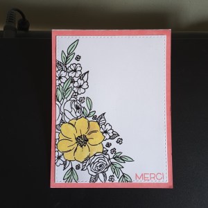
Hi everyone. This is my third card as guest designer for CAS Colors and Sketches, and the second colour themed card. The challenge is to make a card using the colours Crushed Curry, Bermuda Bay, and Calypso Coral. As you know, I am currently away in Quebec City visiting my sister, and I don’t have the exact colours to hand.

After a little look through her crafting goodies, I found some Distress Oxides which seem to run a good match. I used Fossilized Amber, Worn Lipstick, and Cracked Pistachio. I haven’t tried the distress oxides before, but I am loving them. So good at blending, so good at using as a water colour – will definitely invest when I get back to UK.

I started this card using  a stamp from Penny Black – ‘Flower Cascade’. A gorgeous stamp which I stamped in Versafine Black Onyx, then heat embossed with clear embossing powder. I then coloured using the Distress Oxides.

To use them as a water colouring effect, I smudged each colour onto an acrylic block, then used a water brush to colour in the yellow flower, and the Cracked Pistachio. I didn’t want too much colour on the card, trying to keep it clean and simple, so I decided not colour any more than the main flower and some of the leaves.

I used the Worn Lipstick pad and ran it around the edge of a white base card – fabulous coverage again – then attached the stamped part flat.

The sentiment stamp reflected I am currently completely out of my comfort zone in Quebec – a please and thank you are basically the limits of my foreign language attempts – and stamped ‘Merci’ in Worn Lipstick, a small stamp from Lawn Fawn.

I hope you like my take on the colour scheme, with an addition of some muted colours, and look forward to seeing what you create to play along.

I shall be entering this card into the following challenges:

Tuesday Throwdownanything goes

Try it on Tuesdayin my garden

Through the Craft Room Dooranything goes


CAS Safari

20170814_145816

Bonjour from Quebec City everyone. (That’s about the limit of my French, so don’t worry that I’m going to try more!)

I have been raiding my sister’s crafting stash again, for an idea to enter the CASology challenge for this week. The cue card is above. I see there are already lots of great cards on the challenge site, and wondered what to do. Then my sister showed me her Heroarts monthly stamp set. Have you seen this set? Absolutely amazing. So many images – animals, trees, grass, birds, hillocks – you name it, this stamp set has it.

As soon as I saw this cute little giraffe I was hooked. And then I saw there was a grass stamp…….sorted. Well, so I thought. Talk about trying to position a straight stamp along the bottom of a piece of card. That took me a little while, then placing the little giraffe ‘just so’…….huh. Definitely not the ‘simple’ of clean and simple, let me tell you.

The colours are basic – green for the grass, (Stampin Up), and black for the giraffe (Versafine Black Onyx) and sentiment, so I added the piece of white card directly onto a black base card.

Tomorrow’s posting will be the colour challenge from CAS Colours and Sketches, my third post as guest designer this month. I hope the colours chosen inspire you to create a card to join in the challenge.


Travelling and challenge entry

20170813_135315

Hello everyone. Have you noticed I have been a little quiet this week? Well – I am currently in Quebec City visiting my sister! I know, trans-atlantic travelling. I love this city, and have been here several times before.

I arrived from London on Friday evening – after 2 hour delay from Heathrow – flew into Montreal, then flew up to Quebec. Not so bad, actually, as Air Canada transfers all your luggage for internal flights anyway.

Yesterday was spent doing a little food shopping, a little craft shopping – I know, first day! – and chilling. Then – raided her craft stash.

We both make cards, our styles are quite different, but she has LOADS of stuff I can play with.

This card is using the Altenew ‘Doodle Blooms’ stamp set, then colouring in Cracked Pistachio Distress oxide, then die cut with matching dies.

The embossing folder is from Spellbinders ‘Garden Delight`M-Bossability, and I used the curved die from Simon Says Stamp `Stitched Slopes and Hills’. The sentiment from a Stampin Up set ‘Les deux font la paire’ – thought I`d stay with the French language seeing as how I am in Quebec.

I shall be entering this card into the following challenges:

Fusion Challengesketch

Crafting with Dragonfliesembossing wet or dry


Guest Designer sketch

Hello again everyone. This card is based on the sketch for the second challenge I am guest designer for as CAS Colours and Sketches. For some reason my mind turned to Christmas. I have no idea why, but that’s the way I went.

I wanted a shape hanging over the edge of the card, as per the sketch, and looked at my dies for snowflakes and baubles. I went with snowflakes from Stampin Up ‘Starlight Thinlits’, and cut the shape out of glimmer card, also from Stampin Up.

I used a dark blue card from Creative expressions as a base card, and a second layer which I embossed with my Sue Wilson ‘Twinkle Twinkle’ embossing folder. I did toy with the idea of insetting the snowflake, but decided to stick it on top, so I then had to cut another one out with some double sided sticky tape on the back as I didn’t want glue everywhere.

Once attached, I looked at what dies I had for a Christmas sentiment, and again used a Stampin Up set ‘Christmas Stocking’ thinlits, the same glimmer card, and cutting down the original die cut to leave just the word.

I tried to photograph the background of the stars, which I think came out well, but I just couldn’t get the picture right for the glimmer card. This really is a twinkly card, and the photograph just doesn’t do it justice.

I hope you can play along, and I look forward to seeing what you create with this wonderfully simple sketch. :)

I shall also be entering this card into the Crafty Friends ChallengeChristmas in July.


Juicy

Hi everyone. It’s been a couple of days since I posted – I actually had some social events over the weekend. I had a great night out at hubby’s golf club last night – nice meal, great company, some Prosecco was drunk – and some dancing. 50’s music – even though I wasn’t born until the 60’s……great music from the 50’s. Isn’t it surprising how many songs we know from that time?

I made this card to be part of CASology this week. The cue card was:

I have said in the past that I struggle with clean and simple, I struggle with open space, but I do keep trying. This is my take for the challenge. I had to do some lateral thinking, as I don’t have any stamps of fruits. I did think about some juicy and luscious lips, but didn’t have anything which would work.

I had a search through my stash, and found the above circle and lines in  a Stampin Up set – ‘Balloon Celebration’. I decided it looks like a section of fruit, even though it isn’t symmetrical.

I then looked for some stamps which could be seen as drops or rain, anything which could be seen as dropping from the fake fruit, and came across a stamp set from Craftwork Cards – ‘Celebrations’ – which was again about balloons, but these little circles seemed to work well when I tried them out on a scrap piece of paper. I did have some rain drops from another stamp set, but they seemed a little too big.

Once stamped in Versafine black onyx, I coloured with Catherine Pooler ‘Tutti Frutti’ ink. A luscious, gorgeous bright orange – don’t you think? I then waited for that to dry and added some glossy accents for a more shiny look. Even though the ink is gorgeous, I thought adding the glossy accents would make it shine even better.

I struggled a little with the photo to try and show this, but I hope you can see what I did.

On Tuesday I shall be posting my second card of the month as guest designer for CAS Colors and Sketches – I hope you can play along…… :)


Wild Flowers

20170804_194304

Hi everyone. I wanted to post a quick card this evening, so I attacked my Catherine Pooler stamps, inks, and matching dies. I wanted to use the colours from the Color Throwdown challenge, and as the challenge was to use green, Kraft, and white, I wanted the green to be a bright and vivid green against the other two colours.

‘Grass Skirt’ from Catherine Pooler fits the bill nicely, showing against the Kraft really well, and I am pleased how this turned out.

I stamped the ‘Wild Flower’  stamps in the green, die cut them, and added them to a Kraft piece of card cut with my wonky rectangles. This particular Kraft card is a little textured, certainly not smooth. So this added a very muted feature and detail to the base of the card.

I added that to a white base card, and stopped there. I didn’t add a sentiment, and I am quite liking cards with no sentiments at the moment. They can either be added later, or these cards would be ideal to write a little note inside for any reason at all…….

I shall be entering this card into the following challenges:

Color ThrowdownGreen, Kraft, White

Aud Sentiments challengeno sentiment on front

Craftaholics R Us die cuts

House Of Cards challengefloral images and/or colours (floral)


Guest Designer – three colours

Hi everyone. I have been invited to guest design for CAS Colours and Sketches for four challenges during August, and here is the first card I have made for the first colour challenge. The challenge was to create a card using the Stampin Up colours Blushing Bride, Cajun Craze, and Tempting Turquoise. My first thought ran to a flower card, but wondered which flowers I could use artistic license on for the three colours mentioned above.

I looked through me collection of stamps, and came across the set from Altenew ‘Under the Cherry Blossom Tree’. I couldn’t find any images of blue cherry blossoms – so did it anyway! I think I am getting more like that when I craft. It doesn’t matter if it imitates nature or not, if it looks good – do it anyway!

I didn’t have the ink pads for the three colours, but I did have my markers. This made stamping a little more challenging, as I had to cover the stamp carefully using the marker at an angle to ensure it was covered, but as the stamps are quite small anyway, it came together nicely.

I stamped the outline of the branch and flowers twice using Cajun Craze, then used Tempting Turquoise for the flowers. One stamped directly onto the layer added to the card base, and one I die-cut using the matching dies. This one I stuck down hanging off the top of the card, and cut down.

The first bird layer was stamped using Blushing Bird, and the second layer with Cajun Craze. When I stamped him, I set him too high, so had to go in and add a branch for him to sit on with my marker….

The sentiment is from the same set stamped in Cajun Craze, with another smaller detail stamped randomly around with Blushing Bride. So I then thought – why are the petals around the sentiment a different colour to the petals on the branches? Well – because they are! Maybe another tree is alongside this one with Blushing Bride petals………..

I hope you play along with us using these colours, and I am looking forward to seeing what everyone creates. :)

06/08/17 – Here is a close-up of the little birdie as requested by a lady who commented:

close up

Congrats

20170731_100055

Hi everyone. Quite a colourful card for today. I am working with someone this afternoon who will be expecting a new addition to their family in the New Year. I don’t make baby cards, and I have absolutely nothing in my stash which is specifically for this type of occasion, so I went with the flow and created this.

I took inspiration from several challenges regarding colour and theme. The first thing I did was to stamp my Concord and 9th ‘Stripe Builder’ stamp set. I used my Tim Holtz stamping platform, as this is one huge stamp, and used Catherine Pooler ‘Lime Rickey’ and Stampin Up ‘Tempting Turquoise’.

Now I tried stamping this several times, and it just wouldn’t cover all of the card. I re-stamped, stamped again, then decided to leave it as it was, as the photo inspiration from Inkspirational has greeny slats, and also one white slat, which all look quite weathered. So – the distressed stamping look it was. I quite like this effect. What do they say about mistakes – there aren’t any, just happy accidents? Well, there we are.

I then took my Sue Wilson ‘Noble Pierced Squares’ and cut a piece to cover the background, then die cut my Tim Holtz ‘Mixed Media’ in two corners, so the colours would show through.

After sticking these down, I die cut the ‘Congrats’ from Stampin Up ‘Sunshine Wishes’ in white card with double sided sticky sheet on the back, and cut that four times stacking them up, then die cut one from another piece I had stamped originally and didn’t like the look of. (Happy accident again)

I really like the colours on this card, and it goes with either boy or girl, I think…..do you agree?

I shall be entering this card into the following challenges:

Inkspirationalphoto inspiration

City Crafter Challenge something beginning with ‘S’ – (Sunshine Wishes dies)

House Of Cards challengestripes

Less is Morepiercing (Sue Wilson pierced squares)


Red flowers

Happy Sunday everyone. Craft day again – well, hubby is golfing, so I am playing too.

This card was composed from the background called ‘Squared Off Cover Panel’ from Reverse Confetti. This is a new buy from Seven Hills Crafts – ordered one day, and delivered the next. Always fabulous service.

Anyway, I knew I wanted to use this cover panel, and cut it twice – once in white, and once in a browny/goldy card from Creative Expressions. I then placed a piece of double sided sticky sheet on the back of the white panel, and placed the browny squares back into the white die cut. I stuck this down onto a plain white card base.

Now to the flowers – back to my old favourite from Altenew, the ‘Adore You’ stamp and die set. Love ’em, love ’em! I took some Crafters Companion satin red and satin green card, stamped using my Ranger Perfect Medium, and embossed with detail bright gold embossing powder. Now, you have to be quick with this embossing, as I have found the coating on this particular card isn’t exactly heat proof! (Trust me, I found out the hard way) So, I heat embossed from the back of the card……wish I’d thought of that first!

Anyhoo, I then cut out the flowers and leaves, and arranged them around the cover plate, took a photo so I could place them back again, and glued down with Pinflair glue gel. This gel gives some time to move things around a little, and you can then even stick the leaves underneath.

The sentiment is from that same stamp set.

I shall be entering this into the following challenges:

Altenew July 2017 inspirationphoto inspiration (colours and flowers)

Time Out ChallengesInspirational words

Just Us Girlssomething old +/- something new

Allsorts Challengephoto inspiration (colours and flowers)


Happy Birthday

20170729_141006


Hi everyone. I hope everyone is enjoying their weekend. I have been spending some time crafting today. Why is that the more clean and simple a card turns out to be, then it’s usually the longest time I take to make? Does anyone else find that? The more you put on a card, the easier I find it. Is it about the placement of the details? Is it the colours that will be used – let me have your thoughts on it.

The cue card from CASology is ‘Balloon’. Does that mean a single balloon? Can you add more? Well, I did think of a speech balloon, but couldn’t find anything in my stash I could use, and I didn’t want to free-hand too much, so I kept looking for ideas.

I found my Altenew ‘Hug Me’ stamp set, and used the smallest image, stamped in Versafine black onyx – not sure if I was going to be colouring him – stamped the sentiment, then went looking for a balloon…..

This one is from Craftwork cards, a small stamp set I have never used ‘Celebrations’, so grabbed and stamped the balloon with Catherine Pooler ‘Flirty Fuchsia’. I drew in the balloon line with a black gel pen – very brave of me on a nearly finished card – and decided not to colour the little guy. Left him plain.

I shall be entering the following challenges:

Double D challenges – black and white with pop of colour

CASology – balloon

Tuesday Throwdown challenges – black and white and one other colour