Ornamental Flower

20180425_191239

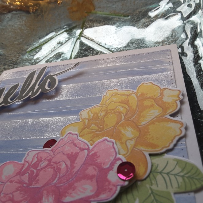
Hello again. I must ask – has anyone seen this stamp set from Altenew yet? The Ornamental Flower? OMG! Good grief! Hubba hubba! (and all other statements of wow!)

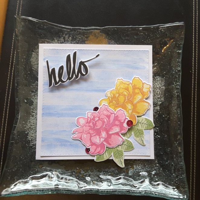
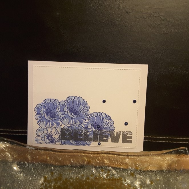
I received a delivery from Seven Hills Crafts, forgetting this was in it, and when I saw it – I played straight away. I am so loving this flower, and I want to stamp it in all my colours. The first sets of colours are as you see here, as I wanted purples for the Just Us Girls challenge, a mixture of purples and pinks for the current Altenew challenge, and decided to use the sketch from Crazy 4 Challenges. All-in-all I am pleased how this turned out.

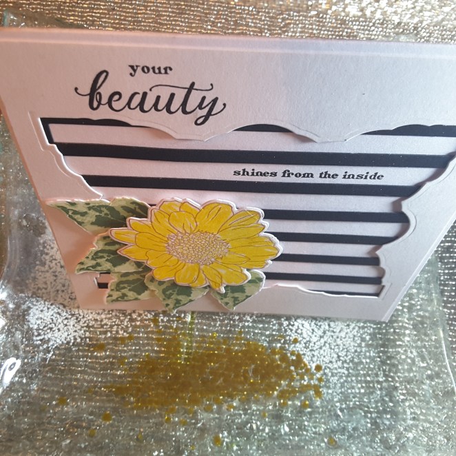
I cut my Altenew Watercolour Stripes Cover Die out of black card stock, and cut it into the shape of the sketch. I then stamped some of the leaves from the Ornamental Flower stamp set in the lightest purple Altenew ink on the remaining white space.

Then it was the flowers…….I just can’t say any more than I have already….. The leaves I stamped using my new set of Green Meadows inks from Altenew (turning into an Altenew card, innit?) Now these greens are GREEN! They are definitely for the more vivid and colourful cards you put together.

20180425_191244

I’m off to use more colours for this flower now, and to see where that takes me.

I will be entering the following challenges:

Just Us Girlsprominently purple

Crazy 4 Challengessketch

Altenew April Inspiration Challengephoto inspiration

Simon Says Stamp Monday Challengeflower power

Fusion Inspiration Challenge

20180422_101245

Hello again. Here is another card I started at the weekend, and finished tonight to enter the Fusion Card Challenge.

Here is the inspiration – sketch and/or photo:

I decided to use both the sketch and the photo as inspiration for this card.
The flowers are Altenew Gardenia and stamped with the grey inks, but one of them using the darker colours, and the other two with the lighter three inks. The leaves were also using Altenew inks and I went for the more teal as opposed to green.
I die cut the Avery Elle Polka Plate die twice out of grey card stock, and trimmed it to fit the card width underneath the circle die cut.
The circle was half embossed with another die from Crafters Companion – I didn’t want it too obvious, but did it because I thought the white circle would otherwise have been too plain. The sentiment is from Stamps By Me.
This card is the last of my weekend card making marathon, and I really enjoyed sharing them with you. Here’s to continuing mojo…….

Little candles, big sentiment

20180422_101011

Hi there. A short and quick posting of just one card today, to enter the current CAS Colours and Sketches challenge to use Daffodil Delight, Pool Party, and Flirty Flamingo.

I used a Uniko stamp set for the candles, and a different set for the yellow ‘bursts’. I think these are meant for the centre of a flower, but I thought they looked like fireworks going off in the sky. I may try these with a dark background and possibly embossed at some point in the future.

I had to use a Catherine Pooler ink for the blue, as my Pool Party has dried up, but I did use the appropriate colours for the others.

Have a great day. :)


You are awesome

20180422_183503

Good evening everyone. I couldn’t resist posting this card today. I couldn’t wait until tomorrow, as it is for the current challenge at Color Throwdown, and it finishes tomorrow, but I have a long day at work and may not have time to post.

The challenge colours are red, green, and white – I think I managed to stick to those colours……

I began by stamping the outline flower from Altenew ‘Beautiful Day‘ all over an 8 inch square panel, in a red Altenew ink. I then took some of the smaller leaf images from that same stamp set and filled in the gaps with a green ink. I wanted a veritable feast of flowers on this card, but not solid flowers. I trimmed it down slightly and put onto a white card base.

I then took the same stamp set, and used Altnew inks to stamp all four layers of the flower but this time I stamped the outline in black, as I wanted it to stand out from the background when I added it. I also did some of the leaves with three layers of the green inks. This is one of the stamp sets I don’t have the matching dies for – virtually unknown for me! – so I cut them out by hand. :(

I then took the sentiment from Altenew ‘Super Script’ and cut that out four times in black card, and added the stamped and die cut sentiment on the top. This way it is a bold and dimensional sentiment.

As the card is so busy, I didn’t add any other embellishments – not even Nuvo drops!

Another thing I tried with this card that I learned from an Altenew online class – putting a piece of 3D foam under the outermost leaf when sliding the inner part under the main flower. I thought I’d try it:

20180422_183514

It looks better in real life…..

As mentioned previously, this card is to enter into the current Color Throwdown Challenge – using Red, Green, White


A single rose

20180422_101146

Hello all. I had a few days last week where my mojo left me, but then I had a delivery from Create and Craft of the latest Stamps By Me release – stamps and dies. So – my mojo arrived back – and boy did it arrive back……I created 5 – yes, 5!! – cards yesterday, and this is one of them. I didn’t want to overload the blog, so I will be posting the rest over the next few days.

They were all created taking inspiration from current challenges, and I started this card using the colours from Hand Stamped Sentiments, with the theme being Natures Beauty from Try It On Tuesday – which certainly matched all the new stamps and dies which arrived.

I began by using my Tim Holtz glass mat yet again, laying down some blue from Catherine Pooler (my Stampin Up Soft Sky has seen better days!), adding a spritz of water, and running some water-colour card through it.

Whilst that was drying, I stamped the rose, and water-coloured it with Flirty Flamingo and Lemon Lime Twist, letting one layer dry, before adding a second layer for some darker areas on the flower and rose.

After the blue background was dry, I stamped the main rose image, which has some drawings and circles with it, then added the die cut rose on top. A sentiment from the same stamp set, stuck onto a white base card, and some black Nuvo drops, and the card was done.

I shall be entering the following challenges:

Hand Stamped Sentiments Flirty Flamingo, Soft Sky, Lemon Lime Twist

Try It On TuesdayNatures Beauty

QKR Stampedeanything goes

stripes and beauty

20180416_213431

Hello again everyone. I have a fairly simple card which came about completely unexpectedly. I went to try another technique from my Altenew class, and kinda got swept away with making this card.

20180416_213445

I took a piece of white card and die cut a large tag shape from Sue Wilson’s ‘Alexandra’ die set. After die cutting the Reverse Confetti ‘Vertical Stripes‘ out of black card – now horizontal stripes(!!) – I stuck it down on the back of the tag die cut piece, and stuck them both down onto a white base card.

I took a spare Altenew ‘Spring Daisy‘ that was just sitting there on my table, and matched that with the three layer leaves from Altenew ‘Perennial Beauty‘. I did want to use the Perennial Beauty flower, but it doesn’t matter what card I use, or what inks I use, it always comes out a hot mess. It looks nothing like a flower to me, but as the words and sentiments in that stamp set are fabulous – I’m going to keep it. I may try a colouring technique with it, as I think stamping the flower is a little too, well, messy, for me, but if I colour it, I may like to define things a little more.

I took the sentiments from Perennial Beauty and stamped in Versafine black onyx. No sequins, no Nuvo drops, no other additions – just the card as it is.

I shall be entering the following challenges:

QKR Stampede – anything goes

Just Us Girls – use black and white stripes


Stripes water-coloured

20180415_163429

Hi there. I have had a go at the embossing and water-colouring again. I am still inspired from Laura Bassen and her Altenew class…..

This time, I took inspiration from the current challenge at The Card Concept. I used the pinks and yellows for the flowers, the stripes for the background, but I did that in blue – as you see – to tie in some of the blue you can see in the picture. I thought the pink flower was enough pink,  – for me, anyway.

The background is using the Concord and 9th ‘Stripe Builder’ stamp. this is a large square stamp – hence the card being square. I have used this in the past, and it is notoriously difficult to stamp a solid image from, especially without using a stamping tool. So, knowing this, I used it on a piece of card with Ranger Perfect Medium, not really taking great care to stamp it properly, and heat embossed in clear. I then added one of the narrower wavy lines in the middle of each large stripe.

20180415_163518

I wanted a distressed stripey background and I think I achieved that look.

20180415_163526

I then took some Gansai Tambi light blue and – using the Tim Holtz mat again(!) – brushed the blue over the background. Again, I wasn’t too careful, and I knew the embossing would resist, but because the embossing wasn’t solid, I got some of the blue in the stripes too. A plan and coming together is the phrase in my mind at the moment.

The flowers are Altenew ‘Gardenias‘ from the stamp  and die bundle of the same name, and inked using Altnew inks. They were glued to the background with 3D glue – again allowing positioning – and the leaves slotted underneath.

Three pink sequins, and again taking a hint and tip from the class video, I slid them slightly under the flowers. The phrase is also Altenew, and in a dramatic black to highlight how delicate and pretty the rest of the card is – I think!

I also didn’t worry about leaves hanging over, as I can make my own envelopes to fit anyway. I have made cards in the past where this happens, and it just means another day sitting and getting the envelopes together, or even boxes in some instances.

I may move away from the embossed and water-coloured backgrounds tomorrow….depending on what the classes show to me today!

Challenges I shall be entering:

The Card Conceptinspiration photo

Allsorts Challengespring flowers (or showers)

Time Out ChallengesSpring


Spring Daisy

20180414_212220

20180414_212139

Hi there. I have been playing with new techniques today. I finally – finally – got around to watching some of the Altenew Academy classes I bought over the past, well, months, if not years.

These two cards were an attempt from inspiration from Laura Bassen and the ‘Clean, Simple, and Colorful techniques‘. That lovely woman certainly knows how to inspire – and don’t you just love her chat? I am laughing, and giggling, and learning – all in one go. Her attempt at the New York accent? Had me in stitches – though it is probably much, much better than I could do. Love it.

I decided to try the water-colour resist technique. I think that’s what it’s called….

I took the three colours from the current challenge at Color Throwdown and set to creating. I first stamped and heat embossed with clear the Altenew ‘Pattern Play – Hexagon‘ onto water-colour card. I then took Catherine Pooler’s ‘Aquatini‘, smooshed it onto my brand new Tim Holtz Glass Mat ink area (Yippee! and Yay!), wet down the water-colour card and used a water brush to dot and spread and generally mess around colouring the panel.

I added some extra depth of colour in some places, and  I really liked how the ink worked in this way.

Whilst that was drying, I stamped the flowers using Altenew inks, not realising there are only two layers – the outline and one shading. I decided to go over the stamped and shaded flowers with another yellow from my Zigs, and it still kept some of the detail in the flowers, I did the same with the leaves.

I used 3D glue gel to stick them onto the card base, stamped and adhered the sentiment, added some clear dew drop thingies, and there we are.

I am sure tomorrow will be spent looking st some more of the classes I haven’t got around to, if this is where they lead me.

I will be entering the following challenges:

Color Throwdownyellow, aqua, green, white

Water Cooler Challenges Occasion

Aud Sentiments challengebirthday

Addicted to Stampsmake your mark

Time Out ChallengeSpring (option of one layer – not used)


Umbrellas and rain drops


Hello again. Here is a card which appears a little darker than my usual, but it is actually quite sparkly if you turn it a little. I’ve tried to capture the effect, but it does look better in ‘real life’.

20180413_165701_00120180413_165737

I used a Clearly Besotted stamp set, and heat embossed onto black card with silver detail embossing powder. I then used my Polychromos to colour the images in, using 2-3 reds and 2-3 yellows. The black rain drops are from the matching dies for the stamp set, which are cut from Stampin Up black glimmer card, and individually stuck down.

I heat embossed the sentiments from the same stamp set, and added the whole thing to a white base card.

To try and get the glimmer from the rain drops, I had to prop the card against one of my perfume bottle – only because it had a nice image on the lid. Can you tell which perfume it is?

I shall be entering the following challenges:

4 Crafty Chicks anything goes with twist raining cats and dogs

Inkspirationalphoto inspiration

Pinspirationalanything goes


Believe CASE card

20180412_193028

20180412_193051

Hi everyone. I have a card – with additional variation on the theme later in the posting – for the current challenges at Simple Less Is More and CASology.

I used a layering stamp set from Just Rite for the flowers, along with a little masking, and Altenew inks. I must say that I watched a You tube video last week – can’t remember who from – and they said to let the ink dry between layers to achieve a crisper effect. I tried this – and it works! I do love when a plan comes together.

The sentiment is from Stamps By Me and heat embossed in silver detail powder. I chose this sentiment to go with the CASology challenge, but also because I like the way the word kinda fades out at the top. Even though it is bold, it also doesn’t seem to cover much of the main image.

Some Tonic Nuvo drops were added for interest, and then this piece attached to a white base card.

I have a whole stack of 300 gsm white card for base cards. I use this as it doesn’t take inks well, it doesn’t like blending inks, and it doesn’t like being coloured with anything! So, white sturdy base cards for quite a while!

Here is a version with some Clearly Besotted stamps:

I got carried away with the blue and silver combination…..

Challenges I will be entering:

Less Is MoreCASE the card

CASology Believe