Oh My Stars!

20180619_202236

Hi there. A quick card for you today, without any die cutting. I know – after the past couple of postings, I was kinda all die cut out……so I made this card with stamping only. I was going for a clean and simple look – which I believe I achieved.

I used the small three star stamp from Concord and 9th ‘Shine On‘ stamp set, stamping the outline in Catherine Pooler ‘Midnight’ ink, then filling-in with an Altenew orange ink.

The sentiment is from a Uniko stamp set, again stamped in ‘Midnight’ ink.

There’s not much more to say about the card, so I’ll leave it at that – except to say I will be entering the following challenges:

CAS(E) This Sketchsketch

Inkspirational Challengesuse small stamps

Addicted to Stamps Challengeblack and white and one colour

Our banner for your blog

The Ton purchases

Hello everyone. I have a couple of cards to share with you today. Both of these cards are from new purchases which arrived yesterday – and I couldn’t wait to get stamping. This first card is using the ‘Holly Branch‘ stamp set:

20180617_14002020180617_140030

I took the layout from CAS Colours and Sketches and created a simple Christmas card, using the stamps and sentiment from this set. I also added some red glitter card to the top and bottom, and die cut the main piece with a Catherine Pooler die.

I shall be entering the following challenges with this card:

CAS Colours and Sketchessketch

Watercooler ChallengesOccasions

Time Out ChallengesHolidays

This second card:20180617_140048

is using the colours from Color Throwdown and the newly purchased ‘Peony Notes‘ from The Ton. I also used a Catherine Pooler background stamp for the lines as a back-drop to my flowers. To make the pieces fit together, as opposed to putting one on top of the other, I just turned the die around. Almost like a paper piecing kind of thing.

These flowers are stunning, and I tried them in different colours – and probably made smudges and mistakes on most of them!!

This card will be entered into the following challenges:

Color ThrowdownCoral, Aqua, Yellow Green

4 Craft Chicks anything goes

Daring Cardmakersanything but white

Here is one of those smudgy mistakes – I’m still trying to figure out how I can save it! You see the green smudges on the yellow flower? How do I fix that? I may just have to bin this one and start again………….

20180617_140101


Totally Tropical

20180614_175353

Hello everyone. I don’t think this card can in any way be called clean and simple….It combines ink blending, stamping, die-cutting, splattering – yet not embossing.

I put this together for the current challenge at Daring Cardmakers. I liked the idea to use bold and bright colours and took my Altenew ‘Totally Tropical‘ stamp and die set. I arranged all my Catherine Pooler inks at the side of me, and stamped like crazy. I then took my Distress oxides and blended like crazy, too.

For the background, I blended, then splashed with water, then splashed with the Gansai Tambi Pearl colours. Whilst that was drying, I stamped most of the flower images, playing with the combination of colours for each flower. I stamped the leaves using different green inks, and then die cut the whole bunch of them.

The sentiment is a die from the same stamp set, which I die-cut four times using black card and double-sided sticky sheets, so I could layer that up for dimension.

Now the background was dry, I played with the layout, wanting some sense and uniformity – yet not too much…..using my 3D glue – to give me movement and placement time – I then stuck them to the blended and splattered ink panel. I wanted the sentiment to be framed by the flowers, and still stand out from all the colour.

Here is a close-up of the shimmer:

thumbnail


Starry Flowers

20180605_183301

Hell again. I have been water-colouring and ink smooshing and die-cutting…..phew. Great day!

20180605_183312

I used the Stampin Up ‘Peekaboo Peach‘ on some water-colour card. Well, I wet the card, put the ink on a large acrylic block, wet the block and just put it down on the wet card. I waited 5 minutes or so, then lifted the block up.

I was going for a more uneven look, but when I saw the ink was quite even – I liked the colour. I didn’t mess with it, just let it dry. Whilst it was drying, I stamped the flowers in Catherine Pooler ‘Peppermint Scrub‘ and heat embossed over that outline with a clear embossing powder. I didn’t want the ink to move outside each flower when I water-coloured it, and I didn’t want black for the outline – a more colourful outline was needed here.

I used the ‘Peekaboo Peach’ again for the water-colouring, adding one layer, letting it dry, then going in again for some darkness near the centre of each flower.

And whilst this was drying – I can be impatient so I need to do things – I die-cut the Altenew water-colour stripes cover die, and then set-to putting my card together. Well – I did wait a few hours so things dried well and naturally. I find that heat setting it tends to reduce the intensity of the ink. I had to find something to do….so I made tea. :)

The sentiment is from my new purchase (Seven Hills Crafts – again) and I will be playing with that stamp set in the next few days. (‘Flock yeah‘ from W Plus 9)

The layout of the card is inspired by the current Fusion Card Challenge, but I didn’t use the sketch this time, just the photo inspiration.

This card also ties in with the current challenge at As You Like it. This challenge is to say flora or fauna – and why….I do have some animal stamps, I play with them a little, but my choice is flowers – any day of the week. I find them so much more versatile, any colours can be used, in any format and layout – it just seems to work. Clean and simple, or more elaborate – flowers all the way! (and I have three cats, too)

It’s been playtime….

Hello there. It’s been a few days since I last posted. It’s been Bank Holiday weekend here, and I took mum and dad to visit family in Bristol at the last minute. No crafting time when down there, so I have taken to my craft room today and created three very different cards, for different challenges.

This first card is for the current challenge at CAS on Sunday, and CASology:

20180529_154054

The theme for CAS on Sunday is CAS birthday card, and the theme for CASology is ‘squiggle’. SO, out came my new Catherine Pooler Stamp of Approval box, my Catherine Pooler inks, and this is what I created.

The second card is for the current Just Add Ink challenge:

20180529_154011

This was for the photo challenge, and I took the colours of teal and red/pink to create this card. I used the Altenew Doodled Lace Cover die, cut it out of white, then cut it again out of the teal, and again out of the pink. I then took my scissors and snipped parts of the coloured die cuts, and stuck them down onto the white die cut.

The background is a teal coloured Centura Pearl, and the sentiment is from an MFT stamp set.

The third card:

20180529_154037

was inspired from the current challenges at Just Us Girls photo inspiration, and Aud Sentimentssummer and a sentiment. I know the stamp is called Spring Daisy – but I still think it’s summer when they are around……..

I stamped the outline of the flowers in a pink colour, and the inside in yellow, whereas the leaves I reversed it, and stamped outline in green, and the inner parts of them in the pink colour. I wanted some more difference between the flowers and the background. I also stamped one of the smaller images in the background for an added ‘something’…….erm…….you can’t really tell I stamped them upside down, can you?! (Maybe I shouldn’t have said anything)

After a long weekend, I am back at work tomorrow, maybe some later days, but I will try and find time to do some crafting.

:)

Eclipse cards

Hello there. After watching the wedding yesterday, I did manage to find time to go and play in my craft room. I was inspired by the current challenge from Just Add Ink, which was to use the eclipse technique. Here is my first sample:

20180520_11393520180520_113944

I used the colours from Just Us Girls, and took my new Concord and 9th ‘Wreath Turnabout‘ stamp and set to it. I used the Catherine Pooler ‘Aquatini‘, and the Stampin Up ‘Pacific Point‘ for the blue colours, and the grey was the layers underneath the letters, as well as when I embossed the sentiment in white onto grey card.

I thought the colours kinda merged at first, but when I added the raised ‘eclipse’ part, it seemed to come together better. I also think it looks better when part of the ‘eclipse’ is on the white section, otherwise I think it’s too busy. Here is the second card I made, which kinda proves the point:

This was using the Concord and 9th  ‘Blooms fill-in‘ and the same colours, but I don’t think it stands out very much on such a busy background. I still like it – a surprise when someone actually picks it up to look at it – but my favourite is the first card I made.

I did have a look on YouTube for some hints and tips on making the eclipse cards, and actually really enjoyed all the stamping and die-cutting, and gluing…..it covered all my favourite ways of crafting. I hope you get a chance to try it. I do remember I made another eclipse card just before Christmas – Hidden Word – but now realise what this technique is called, and that this was an extremely busy card, which is probably why I didn’t make another – until now!


Aqua Peony Dream

20180518_115605

Hi there. I have been getting a little ink smooshy today, and also been doing a lot more die cutting.

After I enjoyed putting together the Altenew ‘Rose Flurries’ the other day, I took a set I haven’t used before – despite having for absolutely ages – and set to it!

The colours are Catherine Pooler ‘Aquatini‘ and ‘Lime Rickey‘ which I smooshed onto my Tim Holtz glass mat – one at a time – wet it, took some water-colour card, then smooshed it around. I did this 2 or 3 times between drying, to get a little layering action going on.

Once those cards had dried, I took the dies from the Altenew ‘Peony Dream 3D die‘ and cut the flower out of the Aquatini, and the leaves out of the Lime Rickey. When I first put them together, the flower layers seemed to get lost a little, so I went round each petal and just darkened the ends, so it would stand out a little more.

Then I turned to my background and layers…..

I embossed the Avery Elle ‘Polka Plate Die‘ (again!), and even though it is embossed, it seemed to need an edge around it…….so I took the Lime Rickey, and inked all around the edge of a layering piece of card. So that meant the edge matched the lime colour I had already used.

The sentiment I chose as the card is so bright and cheerful, I thought it needed a matching sentiment…..again from Avery Elle. Except – I stamped it after I had embossed the background…….I didn’t want another layer with a sentiment, so I used my Misti, with my fingers and toes crossed……

There you have it – die cutting and ink smooshing – my fingers are all aqua coloured now…….

I shall be entering the following challenges:

Color ThrowdownAqua, Lime Green, White

Craftaholics R Us anything goes

Addicted to Stamps and More Make your mark (ink smooshing water-colouring)

Alphabet Challenge – ‘D’ for dots

Altenew May Inspiration challengephoto inspiration – using aqua a lot


Little candles, big sentiment

20180422_101011

Hi there. A short and quick posting of just one card today, to enter the current CAS Colours and Sketches challenge to use Daffodil Delight, Pool Party, and Flirty Flamingo.

I used a Uniko stamp set for the candles, and a different set for the yellow ‘bursts’. I think these are meant for the centre of a flower, but I thought they looked like fireworks going off in the sky. I may try these with a dark background and possibly embossed at some point in the future.

I had to use a Catherine Pooler ink for the blue, as my Pool Party has dried up, but I did use the appropriate colours for the others.

Have a great day. :)


A single rose

20180422_101146

Hello all. I had a few days last week where my mojo left me, but then I had a delivery from Create and Craft of the latest Stamps By Me release – stamps and dies. So – my mojo arrived back – and boy did it arrive back……I created 5 – yes, 5!! – cards yesterday, and this is one of them. I didn’t want to overload the blog, so I will be posting the rest over the next few days.

They were all created taking inspiration from current challenges, and I started this card using the colours from Hand Stamped Sentiments, with the theme being Natures Beauty from Try It On Tuesday – which certainly matched all the new stamps and dies which arrived.

I began by using my Tim Holtz glass mat yet again, laying down some blue from Catherine Pooler (my Stampin Up Soft Sky has seen better days!), adding a spritz of water, and running some water-colour card through it.

Whilst that was drying, I stamped the rose, and water-coloured it with Flirty Flamingo and Lemon Lime Twist, letting one layer dry, before adding a second layer for some darker areas on the flower and rose.

After the blue background was dry, I stamped the main rose image, which has some drawings and circles with it, then added the die cut rose on top. A sentiment from the same stamp set, stuck onto a white base card, and some black Nuvo drops, and the card was done.

I shall be entering the following challenges:

Hand Stamped Sentiments Flirty Flamingo, Soft Sky, Lemon Lime Twist

Try It On TuesdayNatures Beauty

QKR Stampedeanything goes

Spring Daisy

20180414_212220

20180414_212139

Hi there. I have been playing with new techniques today. I finally – finally – got around to watching some of the Altenew Academy classes I bought over the past, well, months, if not years.

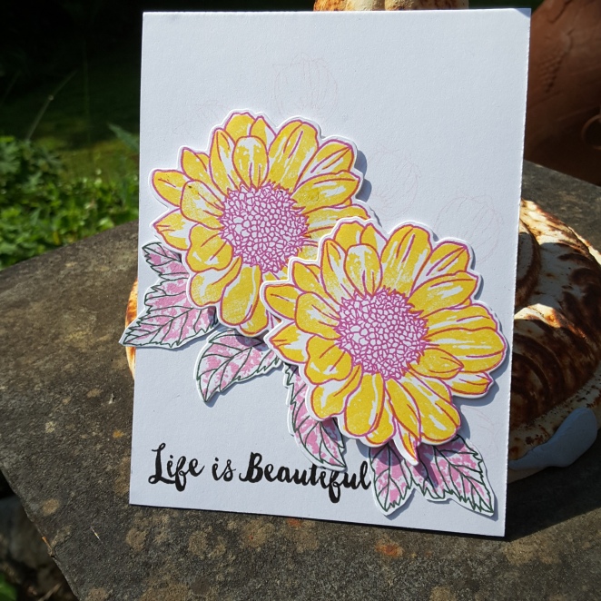
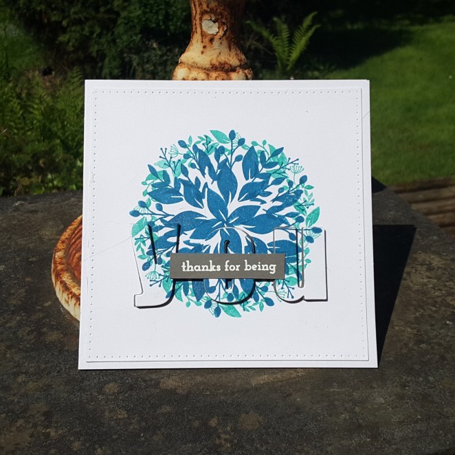
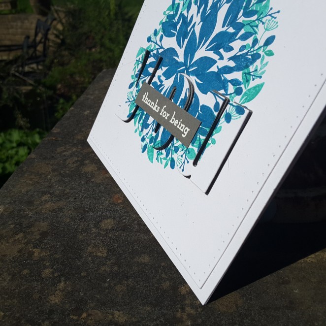
These two cards were an attempt from inspiration from Laura Bassen and the ‘Clean, Simple, and Colorful techniques‘. That lovely woman certainly knows how to inspire – and don’t you just love her chat? I am laughing, and giggling, and learning – all in one go. Her attempt at the New York accent? Had me in stitches – though it is probably much, much better than I could do. Love it.

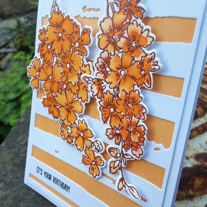
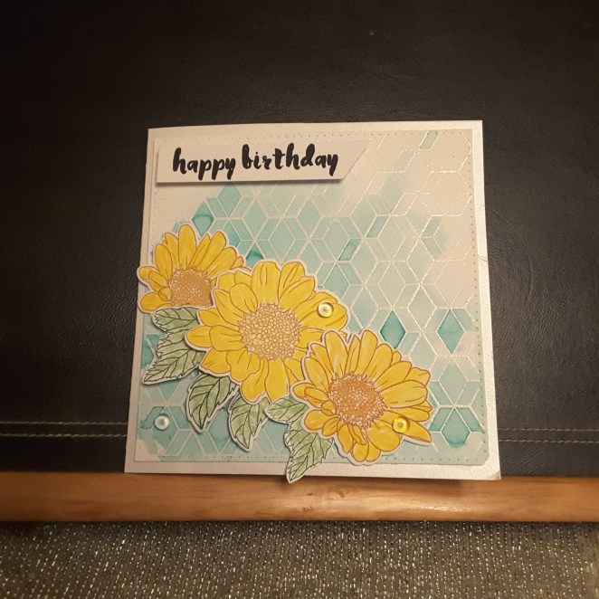
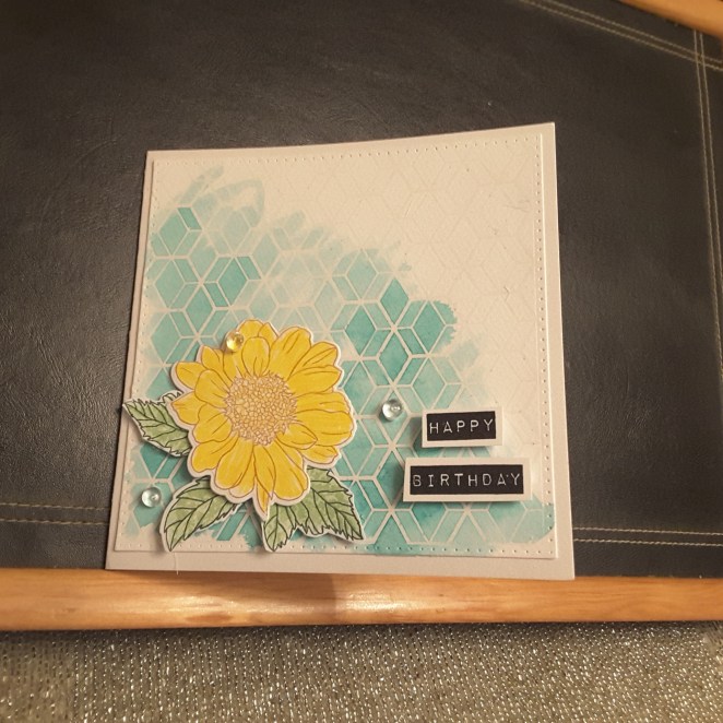
I decided to try the water-colour resist technique. I think that’s what it’s called….

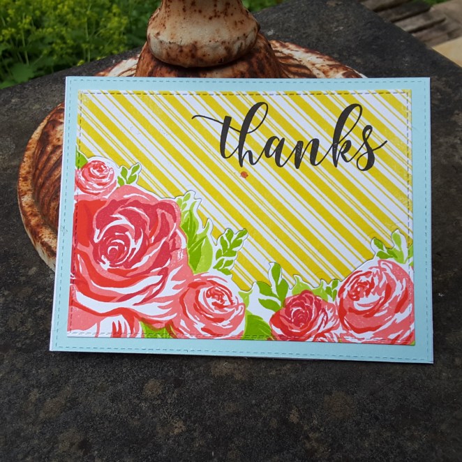
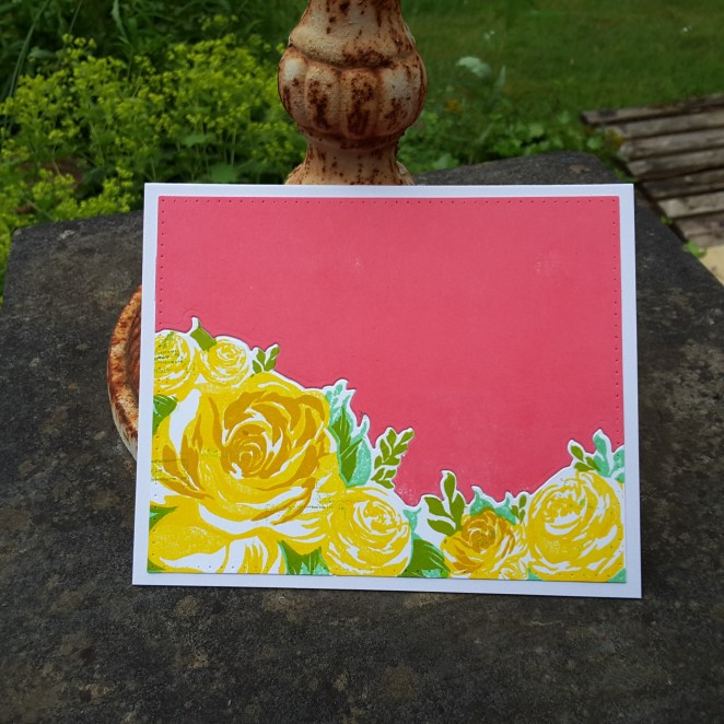
I took the three colours from the current challenge at Color Throwdown and set to creating. I first stamped and heat embossed with clear the Altenew ‘Pattern Play – Hexagon‘ onto water-colour card. I then took Catherine Pooler’s ‘Aquatini‘, smooshed it onto my brand new Tim Holtz Glass Mat ink area (Yippee! and Yay!), wet down the water-colour card and used a water brush to dot and spread and generally mess around colouring the panel.

I added some extra depth of colour in some places, and  I really liked how the ink worked in this way.

Whilst that was drying, I stamped the flowers using Altenew inks, not realising there are only two layers – the outline and one shading. I decided to go over the stamped and shaded flowers with another yellow from my Zigs, and it still kept some of the detail in the flowers, I did the same with the leaves.

I used 3D glue gel to stick them onto the card base, stamped and adhered the sentiment, added some clear dew drop thingies, and there we are.

I am sure tomorrow will be spent looking st some more of the classes I haven’t got around to, if this is where they lead me.

I will be entering the following challenges:

Color Throwdownyellow, aqua, green, white

Water Cooler Challenges Occasion

Aud Sentiments challengebirthday

Addicted to Stampsmake your mark

Time Out ChallengeSpring (option of one layer – not used)