Brusho and butterflies


I’ve had a little play with my Brusho’s! I don’t know if this is what you are supposed to do with them, and I don’t know if this is the effect one hopes to achieve – but I like it! Such a little burst of colour. Like magic when added to water.

The inspiration for playing with my Brusho’s came from the Addicted to Stamps and More site. There is an inspiration photo which immediately brought to mind the small set of Brusho’s that I have. I haven’t really experimented with them, but thought I would give it a go.

I tried three techniques, and actually like them all, for different reasons. The first thing I did was to cut some of my Crafters Companion water-colour A4 card into 4 pieces. That way I could experiment with four different methods at the same time, rather than try one, and complete the card, then another etc. I like to look at the different outcomes all at once, then decide what I want to do with them.

First technique: wet the water-colour card front and back, then drop my Turquoise Brusho onto it very gently, slowly, miniscule fleck by miniscule fleck – it still burst all over my card! Then my card started to buckle, then the colour was running to the edges…..so I took my piercing tool – which I use to poke out the bits from intricate dies – and pushed the middle down, to keep it as flat as possible. I wanted the colour in the centre of the card, not the edges. This is the piece of card I used to cut my Tim Holtz Butterfly Duo out of, and embossed those same two butterflies with the matching embossing folder. I then added those butterflies to a piece of white card, and drew the antennae on with a black gel pen. I will think about adding a sentiment, but actually quite like them as they are.

Second technique: I dropped flecks of Turquoise Brusho onto dry water-colour card, then sprayed water onto it. Only a few drops of water at a time, again very sparingly, so I could try to determine where the colour and water was going to go. It didn’t quite work out that way, as the burst of colour really is very dramatic, but I liked the effect anyway. I kept some of the areas drier than others, as I like the effect of the Brusho grains when they are not completely saturated by water. I then used the same Tim Holtz Butterfly Duo die and embossing folder but with white card, and adhered the butterflies plainly and simply onto the spattered blue card.

The third technique was to stamp and emboss a butterfly and floral element from an IndigoBlu stamp set called ‘Nature 1’. This is a lovely stamp set, which has clouds, and grass, edge of a tree, and a gorgeous sentiment. The butterfly from this is quite solid – what I wanted – so I stamped the butterfly and the flower/thistle/weed (don’t know what it is!) with my Ranger Perfect Medium, embossed it with detail white embossing powder from Cosmic Shimmer, then wet the card and dropped my turquoise Brusho onto it. This time, I wanted a more ‘washed’ effect behind the butterfly and flower, and saturated the grains very well, let them run all over the embossed images, just so the image would be highlighted by the background colour, as the embossing resisted the colour of the Brusho, as expected. (Was that a really long sentence? Did I waffle on a bit?)

I then added some Tonic Crystal Drops in Midnight Blue to three of the edges, stamped a sentiment from the Altenew stamp set ‘Birch Land’ and adhered that with foam pads.

I have four other colours of Brusho’s and I feel I may be making similar cards with similar effects in the very near future. However, I may also have to do an internet and YouTube search for hints and tips when using these – but still going to have fun experimenting with them.

I shall also be entering one of these cards into the following challenges:

Just add ink

Crafty Friends Challenge Blog


Clean and Simple Sketch

20170401_214152

A quick and easy blog post for today – working all week again, so not sure how much time I’ll have in the evenings – depends on what time I get home and what hubby wants for tea……..!

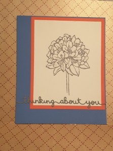
I’m having a go at the sketch challenges at the moment, and am struggling with keeping them clean and simple – and think I’ve been a little too clean and simple with this card. I thought I’d post it anyway, as I actually do like how it turned out. I like the simplicity of the flower and sentiment, and the contrasting colours of the two base layers.

This sketch was from CAS Colours and Sketches and I think I’ve achieved what was asked……we shall see.

The base card is from Create and Craft – a Topsy Turvy card I have a stock of, with the inside of the card being a lighter blue. The next layer is almost like a burnt orange, with a lighter reverse side, but that lighter side on this piece is a little ‘wishy washy’. I think it’s a pink – but quite bland. Anyway, didn’t use it so it doesn’t really matter.

The white card is from Stampin Up, and I stamped the ‘Best Thoughts’ flower in basic grey, also from Stampin Up. The sentiment was cut out of Lawn Fawn Narwhal card, after I had attached some double-sided sticky sheet to the back of it. I was thinking of using my Xyron again – but the sentiment is quite long – almost 6 inches, so thought it would be a waste. The double-sided sticky sheet worked very well.

I admit this is a very simple card, but I will probably do it again, using different colours for the base card, just to see what effects I can create – some pastel colours, some maybe black and white cards. I may even try colouring – you never know……


Cute Sketch card


20170401_204528

It seems I am having a cute and colourful card making weekend. After yesterday, I was thinking of all my card stock which was bright and colourful – and I have a lot. I am trying lots of new styles and techniques at the moment, and as well as messy crafting or mixed media, I am starting to use some dies and stamps which are more cute and fun, which means I can use any colour card I want to represent anything at all.

Today, I have taken inspiration from a sketch challenge from Atlantic Hearts Sketch Challenge, and had a play with coloured card. I recently purchased a set of dies from Hochanda, a UK craft channel. I believe it can be watched around the world, but really not sure.

This bundle is designed by Katie Skilton for Sizzix, and includes the dies I have used for this card. This set is called ‘Under the Sea’ – I am sure you can see why! I have also used the sentiments which came in the bundle ‘Tribal Words’.

The base card is 7 inches square, and again used my Sue Wilson Noble Stitched Squares to cut a slightly smaller square out of light blue. I again embossed this with the ‘Rain’ embossing folder from Crafters Companion. I think the rain could represent anything, and this time, for me, it represents bubbles in the sea.

I die cut the whales out of some Create and Craft card stock, which has a toning colour on the opposite side, so I could match the colours without thinking too much about it, and added several other elements from the same die set – the fish and the heart.

The circles, as per the sketch, I used the Lawn fawn ‘Slide on over’ circles. These were designed for slider cards, as the dies cut the circle itself, and cuts out the channel which makes the slider card. This is how I managed to get circles which matched each other, and outer circle rim shapes for the other components required to meet the sketch challenge.

The two solid circles I also embossed with the same embossing folder. I layered the outer circles flat to the card, but raised the other elements on Stampin Up dimensionals. I die cut the sentiments and ran them through my Xyron sticker maker so I didn’t have to fiddle with glue on all the letters. This little machine is great for sentiments and other fiddly elements as it is only 1.5 inches wide, whilst the bigger 5 inch and 9 inch machines are good for the more intricate and elaborate dies for layering.

Deciding where to put each element was a challenge but I like the fun and vibrant end result.

I will also be entering this card into the Just Us Girls challenge with the theme ‘Sea’, and Catch the Bug challenge blog ‘Anything goes’.

Up, Up, and Away

20170401_154412

I wanted to do quite a bright and cheerful card today, and didn’t want to get messy – for a change! The inspiration from this card came from The Colour Throwdown with the challenge to use the colours light yellow, blue, and green. I started thinking about water-colouring and a scenic card, but then also thought that I could use blue for the sky, and take the opportunity to use my Stampin Up ‘ Up and away’ thinlits dies. I have had them for a while, but not used them yet.

I took a 7 inch square white base card, and used my Sue Wilson ‘Ornate Pierced Squares’ to cut a layer slightly smaller. I then hunted through my embossing folders, as I thought I had one which had clouds on it. If I have – it is safely filed away somewhere – I couldn’t find it. So, I then took my Crafters Companion Textures Elements ‘Rain’ embossing folder, and ran the blue card through my Big Shot Pro.

I love the Big Shot Pro, as I can use all my A4 folders, my 12 inch square card/paper, and basically haven’t found any size of die out there on the market I can’t cut with it. I do, however, feel it is not so good when cutting smaller intricate dies – that’s what I have my Big Shot express for!

After embossing the blue card, I then took my ‘Up and Away’ thinlits and cut the intricate hot air balloon twice, then cut the different layers in green and yellow, and then used all those layers and stuck them behind with some detail glue. I then took the cloud shapes in the same die set, and cut several out of white card, and cut a smaller hot air balloon out of white card for my sentiment. The sentiment is from a set from Card-io called ‘Up, Up and Away’.

Card-io do a huge – and I mean huge – variety of smaller stamps ideal for creating your own background, for creating scenes by using each small stamp and building-up the project. They have tiny bugs, larger bugs, clouds, sentiments, trees, bushes, birds, alphabets…..the list is almost endless. Their web site has a lot of inspiration, ideas, and hints and tips. A great range of stamps…….mmmm….now I have found mine again I may have to have a go for another challenge!

Anyway, back to the card itself. The clouds were glued directly onto the blue card, but my balloons were attached with Stampin Up dimensionals.

This card actually didn’t take me very long. The longest time was spent deciding where I wanted everything to go, and which tone of blue and green worked well together. Compared to my last few cards I think this is quite a simple and clean card. I may have to do some more to take for the charity to sell.

I will also be entering this card into the Aud Sentiments Challenge, and 4 Crafty Chicks Challenge.


Quirky Owls

Having had a long week at work, like many of us I am sure, I turned my head to card making this evening. I was looking through Paper Playful challenge site and two challenges took my fancy. The first was from Double D challenges, with the theme of things that fly, and the second was from Simon Says Stamp Monday challenge, with the theme of things with wings.

I had bought a quirky stamp set from ‘Hampton Art – Laugh Out Loud’ stamps either last year or maybe even the year before, but haven’t had a chance to add the sentiments to a card. The sentiments on the stamp sets are quite different, and I am sure they couldn’t be used on everyday cards, and certainly not on the cards I make for charity.

I decided I would use one of the sentiments along with one of the images from this stamp set from Stamp Addicts ‘Owl Be Yours’. I went with the three owls which seem to be saying ‘speak no evil, see no evil, hear no evil’ as it reminded me of when my two close friends and I go away together. We would have so much fun, and I am sure at points during the days away, one of us would be covering our eyes, one of us would be pretending not to see, and one of us would be pretending not to hear. Aaaahhhh – the memories!

I started by stamping the three owls with Ranger Perfect Medium, and embossing in detail black from Cosmic Shimmer. I new I was going to colour, but was not sure whether to water-colour or just normal colouring. I stamped images several times so I could play……

The colourful owls I spent some time with my Zig markers, not using any water, just blending two tones of the colours together. I wanted vibrant – and I think I got vibrant. I didn’t know what I was going to do with the colourful images, but they are ready for something in the future.

My entry into the two challenges was quite simple. I stamped and embossed in black, and gave a water-colour wash as the background using my Aquatints. I did make a mistake – again – and coloured the background in a yellowish colour, then went below the owls with green – so far so good, then I went above the owls with blue. So – what do you get when you mix blue and yellow? Yep – green! I therefore had a totally green background. So – wet the background down, removed most of the colour from the top half, then added a washed-down blue. Sorted.

I didn’t want the owls the same colour as the background, but didn’t want to colour them, so I used good old kitchen towel, wet it, and removed the colour from the owls, and slightly around the outside of them. A sort of bleach effect – but not totally removing the colour. It almost gives the impression of a halo, I think.

Final touch was adding the sentiment from the Laugh Out Loud set, stamping in black Versafine, and layering on the bottom of the card.

A good bit of playing to conclude the weekday…….

Tulips

I suddenly realised today how close we are to the end of March – hasn’t time flown? It only seems yesterday that we were celebrating the New Year, and we are now celebrating the appearance (probably) of Spring. I love the flowers which are now starting to appear – the daffodils in full bloom, then we have the Bluebells to look forward to. We have loads of bluebells covering the gardens around here, and a carpet of blue is definitely something worth seeing.

For this card, I have used inspiration from the Altenew challenge for March with the gorgeous inspiration photo full of colour, the Simon Says Stamp Wednesday Challenge of ‘Anything Goes’, and Make My Monday Challenge with the theme of ‘white embossing’.

When I looked at the inspiration photo, I thought of my Tulip stamp and die set, but I didn’t quite know where I was going with it. I stamped approximately 16 full tulip heads in black Versafine, and embossed with clear embossing powder. I didn’t want a thick outer line, which is why I used the Versafine, but just something to outline the flowers and differentiate them from the background. I also stamped and embossed the stems, all of the variety in the stamp set, just in case I wanted them.

I wanted to water-colour again, so took my Derwent Inktense pencils and had a play. I did some flowers all in one colour, then added a darker colour, merging the colours together. I know that tulips are usually a single colour, but my  variety of tulips are a mixture of two, if not three colours! I used the three coloured pencils in the photo above – Tangerine, Sun Yellow, and Poppy Red. The pencils certainly do pack a whole load of ink and I really, really enjoyed playing with them.

I then cut out the whole bunch of flower heads with the matching die set. I must admit, it took a bit of manoeuvring to get the dies to sit just right around the flower heads – some cut off to one side, but I think I finally got the hang of it.

Once I had the flower heads and stems, I started with put them onto a 7 inch square card base. I started laying the flowers down, added the stems, removed the stems, re-arranged the flowers – this process took me approximately 20 minutes, until I was happy. I decided not to use the stems, and arranged the flowers into a shape which slightly resembles a heart. Can you see it? Is it just my imagination?

For the background, I wanted to add some interest, so used my Sue Wilson A4 embossing folder ‘Checkboard’. This is a dimensional embossing folder, called a ‘PinPoint’ embossing folder, and gives an impression of a trellis. I know that tulips don’t climb trellis’s – but artistic license is certainly used whilst making this card. I embossed white card, and added straight to the card base, re-arranging my flowers yet again, and sticking them down using foam pads.

Now for the sentiment. I didn’t have a whole row to place a long sentiment, so used two of the ones provided in the tulip stamp set, and cut them out with my Stampin Up ‘Bunch of Banners’ framelits, putting one on the top left, and the other part on the bottom right. That way I thought the eye would be drawn across the whole card.

Quite a simple card, but it took a lot of fiddling around – colouring, die cutting, arranging. All good fun.


Simple layering

The card I have made today is to enter the Simon Says Stamp Wednesday challenge, theme being using more than one die cut or punch and Clean and Simple on Sunday with the theme of using a sentiment, but no image. I decided to go back to my wonderful Birch Press ‘Sevilla’ layering dies, and added a sentiment I have had for a few years – the lovely ‘Thank You Extravaganza’ from Memory Box. Such a wonderfully ornate sentiment die.

I started by putting some ‘Wonder Sheet’ double sided sticky paper (Be Creative) on the back of three white pieces of card. I then cut the three layers from the Birch Press die out, and stacked them on top of each other. I still think the best way to add these layers is by using double sided sticky sheets, as I found that the Crafters Companion sticky spray wasn’t – sticky, that is. It didn’t stay stuck down on previous cards, and was so disappointing.

I then put some double sided sticky sheet on another piece of card the same size as the die cuts, and – once I added the base die cut to it – sprinkled on some Cosmic Shimmer sparkles. I am not sure whether the Sevilla die is supposed to be flowers or stars, but feel that in this case they are stars – and need a little sparkle. Just a touch…….

I then die cut the sentiment twice from black card which also had the double sided sticky tape on it – the best way to layer……but watch out for it sticking in the wrong place to the wrong thing! I did one sample and it stuck completely cock-eyed.

I wanted the sentiment to be quite bold, and for it to stand out from the layered base, which is why I cut it out in black. I didn’t think a colour would be as vivid, and didn’t want to cover the background with a tag that size. I added some glue in strategic places, to support the lacy sentiment.

Even though there are several layers, I still feel the look of the card is quite simple, and it didn’t take long to make it at all. A little bit of fun after my workday.


Pink, Purple, yellow

20170326_165025

For this card, I was inspired by two challenges. The first was Paper Play Sketches with the theme of yellow, purple, and pink, and the second was from Cardz 4 Galz with the theme of pink. I decided to go back my roots and use a lot of die cutting and embossing.

The base card is 8 inches square, with a slightly smaller purple layer, cut with my Sue Wilson stitched square dies, and embossed with Tattered Lace ‘Lily Spray’ embossing folder. The purple and pink card is from Creative Expressions, but the yellow is a textured card from my stash – no clue where I got that from!

I used the Sue Wilson Noble Dies ‘Ornate Pierced Design’ to cut the pink portion of the card, in-laying the lacy layer for interest. On top I used the next embossing layer, and cut the smallest die from that set for my sentiment, which I decided to do in yellow, to match the flowers.

I was trying to decide which flowers I wanted to use, so turned to Sue Wilson yet again. I used the Finishing Touches ‘Delightful Daisies’ cut all four of them out, and then added them to my card. The photgraph was taken with sunshine streaming through the sindow, but it does show the embossing and flower dimesnion quite nicely, I think.

As I didn’t want to add ribbon to an already ornate card, I then used the embossing strip folder from the same tattered Lace pack and placed my flowers underneath that strip. I left the flowers unstuck at the top, so they add some movement to the card.

The sentiment is from Heartfelt Creations ‘Timeless Sentiments’ which I stamped in Catherine Pooler ‘Flirty Fuchsia’.

I did enjoy doing a virtually completely die cut and embossed card, and used the tattered Lace folders for the first time – even though I’ve probably had them for a couple of years! The embossing folder set has an 8 inch folder, two strip folders which are 2 inches wide, and a corner folder. It also comes with matching stamps and dies for the flowers and other elements,

Before I became more comfortable with stamping – and before I had my Misti – I very rarely did any stamping. I found I couldn’t really get the hang of it, something always went wrong – whether that was a blurry image, an incomplete image, or I smudged everything. The main thing I learnt was that I had to use the correct inks for the correct card, and the technique of actaully stamping was then easier.

As for die-cutting, I am sure I am not alone in saying I have more than one machine. I have several. Well – at least five. All different, and bought for different reasons over the years. The main machine I use is the Big Shot Express which is on my desk. I use this all the time, my main machine. As it is electronic, it is so easy to use. I tend to send my dies one way then bring them back – I don’t have to stand up, then!

As this is only for dies which are 6 inches or less, I also have my Big Shot Pro. The Beast. He is sitting on a table my sister altered to make it ‘shabby chic’ for me at Christmas. He is the one I use to cut anything bigger than 6 inches, and to emboss with my A4 embossing folders. He is heavy, and huge – but love it. So gald I now have a table for him, as he was taking far too much room up on my desk.

I enjoy particpating in challenges, as I use them for inspiration. that isnpiration also leads me to try different techniques, but still I am able to use a lot of the products I have bought over the years, and sometimes even mix and match together. The cards I make go to my firends, but mainly go to the charity for them to sell. So – any excuse to make cards, right?


Coloured Rose

It’s been a couple of days since my last post, with the previous week being very productive for me. My husband is back from his travels, so today is the first day since his return I have been able to go to my craft room and play – he has gone golfing.

I went to Crafting Live in Doncaster yesterday and came away with quite a lot of goodies. I went there with mum, and we had a good time, a few laughs – and bought lots of stuff! That show is amazing. I tend to go in the summer, with mum and sister, and we always find what we are looking for, the stall staff are very friendly and helpful, even though it does tend to be very, very busy. I think we were there for over four hours, and sometimes go back for the second day, too – but the weather is gorgeous, I have time to play, and time to go into the garden – so decided not to this time.

This rose stamp is a new buy from Honey Doo crafts called ‘Roses are red’ and comes with a matching die. I decided not to do one card, or two, but four in total. I used my Crafters Companion water-colour card, and stamped and embossed the outline twice in detail black, and twice from white. I knew I wanted to add the colours from the CAS colours and sketches challenge, and wanted to play with different techniques. The colours are named from Stampin Up, and I do have the exact colours, so I didn’t have to think about which colours matched.

After embossing the outlines in white, for one card I used my water-colour brush and took ink from the lid of the ink casing, and coloured the flower for a muted look, and on the other white embossed card I used my Stampin Up markers of the same colours for a slightly more vibrant look – but still drew the ink out with my water-colour brush, adding a blue wash around the flower, before die-cutting the image and sticking to a 6 inch square white card.

For the images embossed in black, I coloured the image using the markers and drew the colour out slightly with my water brush, and for the other I coloured the image with the pens without drawing the colour out, for a more vibrant look.

I love how versatile this stamp is, and how the different techniques can give a totally different look. My favourite is the more vibrant look, and of the cards the two embossed in black seem to stand out more.

I shall also be entering one of these cards into the Crafty Challenge Calendar and Addicted to Stamps and More


Colour challenge

I was beginning to panic yesterday, as I saw one of the challenges I wanted to enter was closing – and I hadn’t even started my card! The challenge is from ‘Just US Girls’ and has the theme of using three colours – pink, purple, and grey. I had an idea in my head, and just didn’t get round to doing it. Until yesterday.

I was using a grey ‘Narwhal’ card from Lawn Fawn, which I had bought from Sevens Hills Crafts, and thought that would be a good base for my card. I was going to use the unicorns from the Avery Elle stamp and matching die set ‘Pegasus Duo’, and I wanted to make a shaker card. I haven’t had much luck with shaker cards, but I still keep persevering, and having a go. I look at quite a few videos on YouTube – and usually still get it wrong!

This time, I stamped the unicorns, embossed the outline in black, coloured them in with my Zig pens, die cut them, and then planned to have them on the outside of the shaker shape, with clouds and stars from the same set – then I changed my mind. As always!

I cut a heart-shaped aperture in white card with my Sue Wilson fillable die ‘Fluttering Hearts’, added a piece of acetate then added two layers of white foam, raising the white card enough to add sequins and glass beads. This is where I usually go wrong – I forget the acetate. This time, I kept concentration enough to remember. Yay!

Once I layered them together, I searched my sequin and bead stash for colours of sequins with the purple and pink theme. I found a few, but they were mixed with other sequins. How much time did it take me to get enough out of the pile that I wanted? You don’t really want to know….honest.

I placed them in the aperture behind the acetate – then how do you add the base card so it is square, and the beads don’t fall out whilst doing it? I guessed! I tried adding the base grey card with no glue and felt how close to the edge it was, added the glue, then went for it. It worked….!

This is where I decided not to use the unicorns and to stamp the three little stars around the aperture instead. I can hear you now – what if it goes wrong? What if the stars don’t stamp correctly, what if I make a mess of it? I know, I know. But I did it anyway.

You could probably hear my squeal of delight across the whole of Chesterfield.

I wanted a sentiment, and I wanted it in purple, as I had just realised that the purple I was going to add was on my unicorns – and I wasn’t using them. I used my purple Zig on the sentiment stamp, and stamped it a couple of times with my Misti, on a spare piece of card, as I wasn’t brave enough to stamp it directly onto the card. (I can hear you all again, breathing a sigh of relief) I also wanted to have a grey layer underneath the white sentiment strip.

The white sentiment and grey layer were cut out using my Sue Wilson ‘Frames and Tags’ die set, as they layer together quite nicely, and have a stitched inner part. I did consider making the banner slightly raised and wavy, but kept it flat to the card, feeling that the shaker element added enough interest.

I am very, very pleased with the way this shaker card turned out. There are a few tweeks I want to make to future attempts, but all-in-all I had fun. Isn’t that the name of the game? I’m having LOADSA fun playing with it.