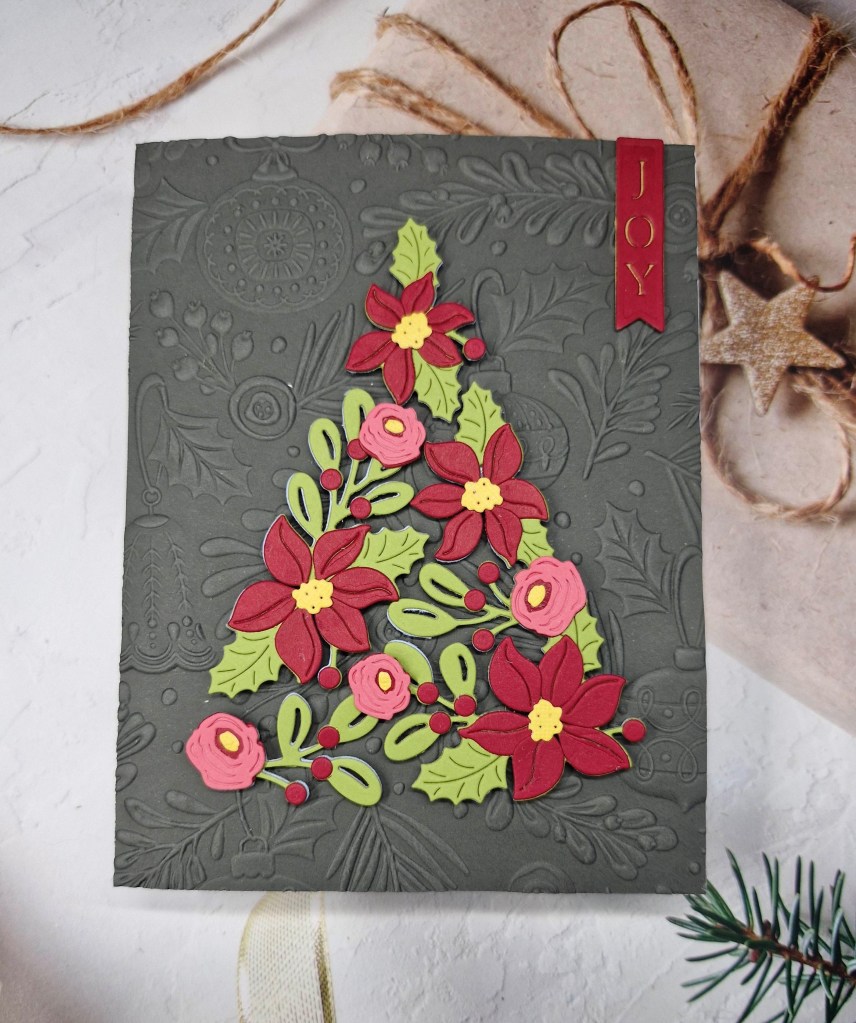
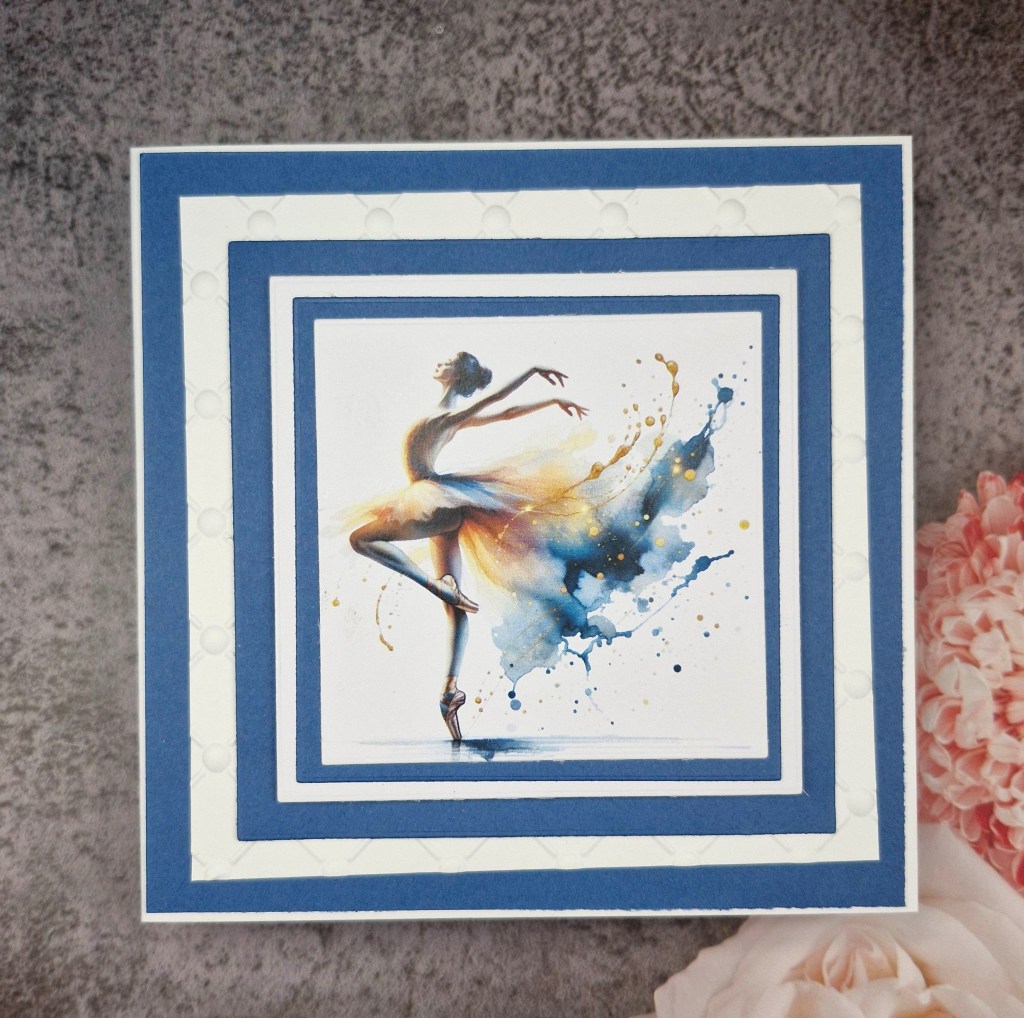
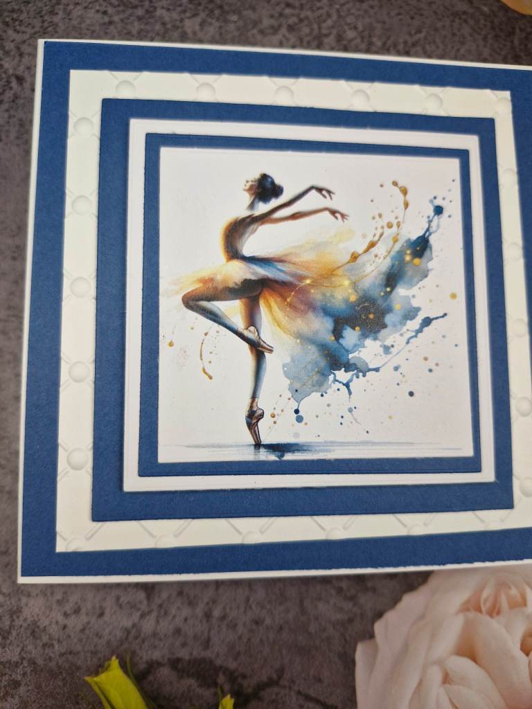
Hello once again. Cardz 4 Galz has started a new challenge. Dawn W has chosen the theme of ‘heels and handbags’. Here is my card:
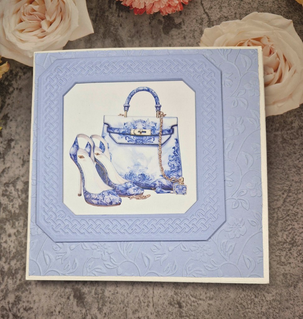
This was challenge to me as I couldn’t find anything in my stash which would fit the theme. Once again – I took to searching for digital images, and came up with this one from Etsy – StylishFantazy – there are some absolutely gorgeous images on there……I was certainly stuck for choice.
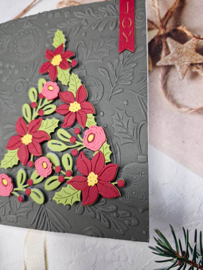
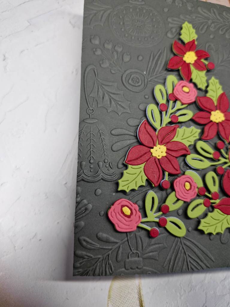
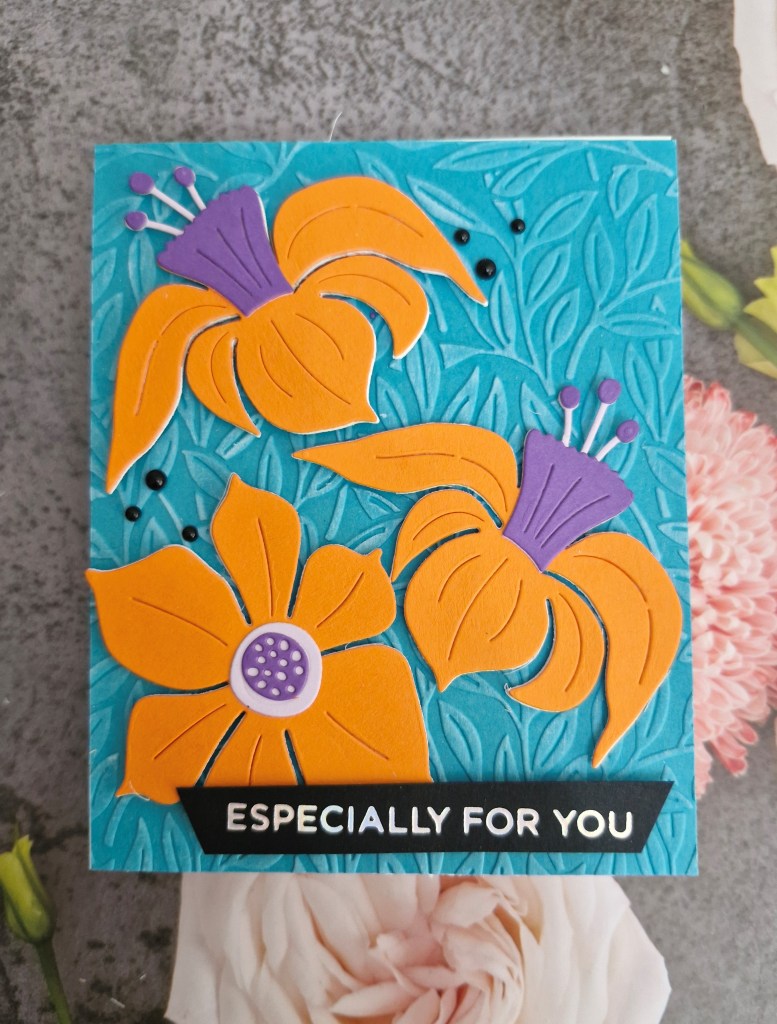
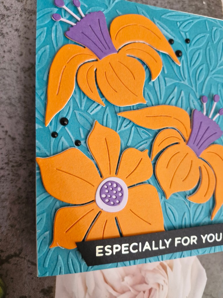
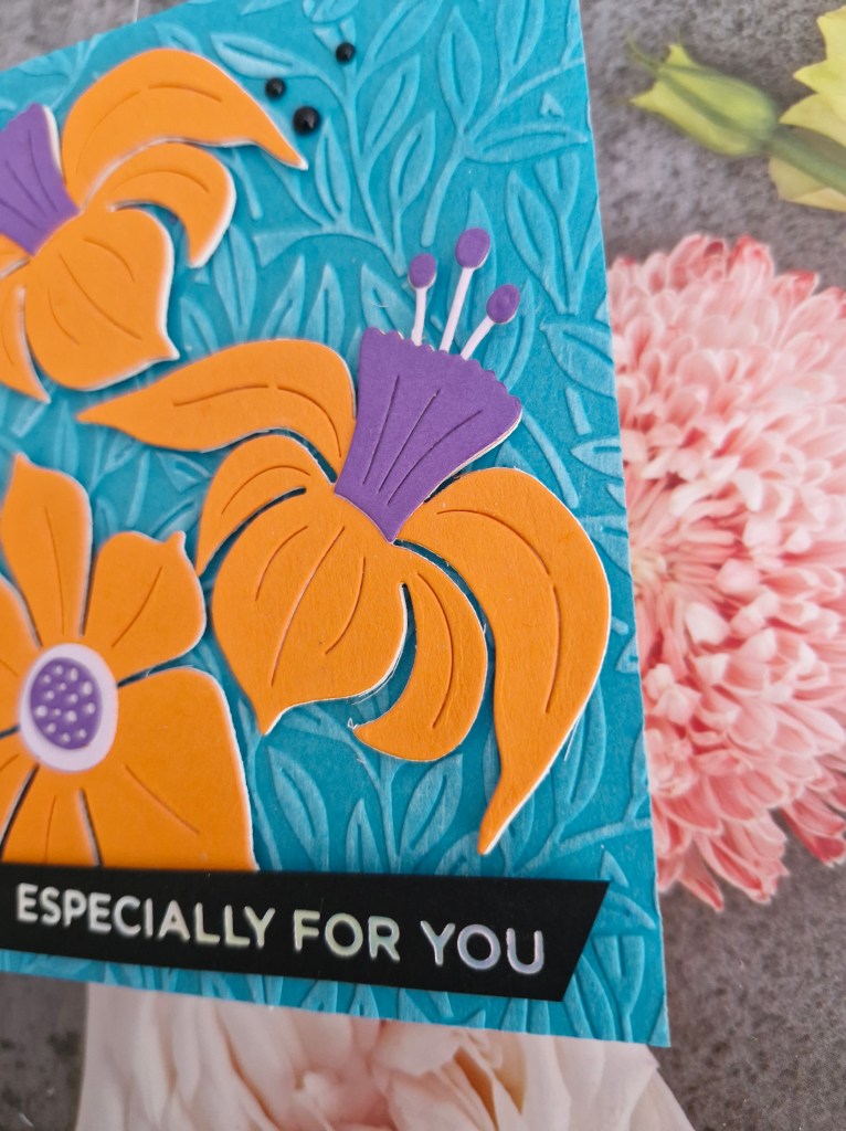
I used a square card base, and some Creative Expressions card stock which I have had for ages. The background panel was dry embossed using an older Sue Wilson/Creative Expressions A4 embossing folder, and I also used some Sue Wilson die sets to create the panel and aperture.
I also decided to off-set the main image panel, and I didn’t add a sentiment this time round.
I hope you can come and join us for the heels and handbags theme. xx