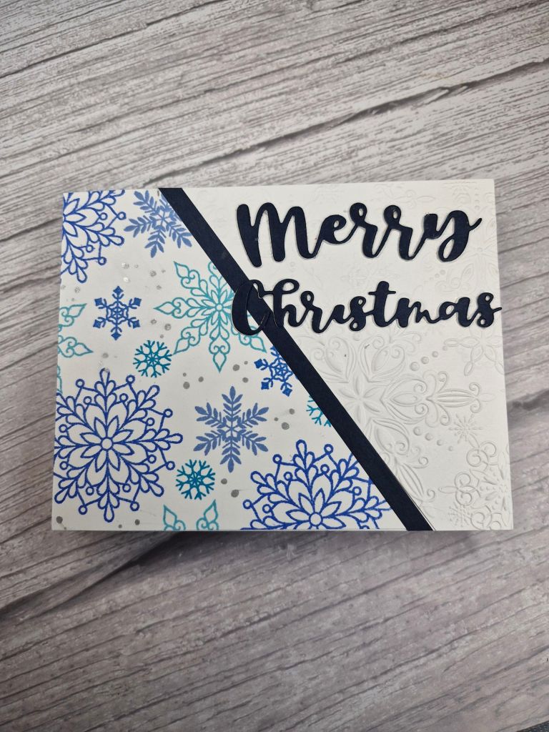
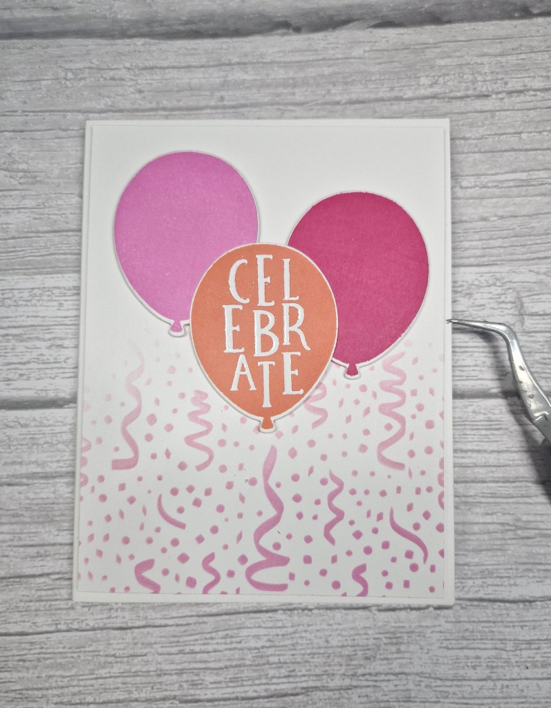
Hello everyone. A new challenge has started at Cardz 4 Galz, Pamela has chosen the theme of ‘celebration’. I believe there is Mother’s Day coming up in the USA, also think graduation, babies, weddings etc…. Here is my card:
Please excuse the angled tweezers, but they are holding the card closed to photograph as the inside is a pop-up:
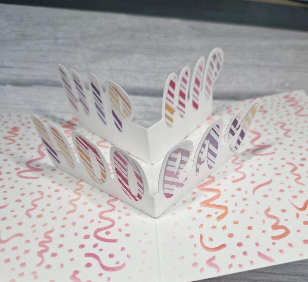
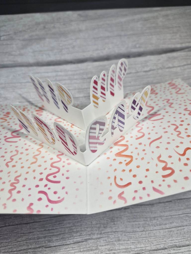
The inside was so very difficult to photograph, here are my other attempts:

The pop-up dies are from Concord & 9th and a virtual event from 2022. I did have to go back to the videos to see how it was put together, but thankfully they will be available indefinitely.
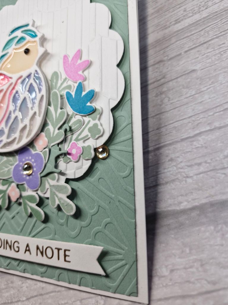
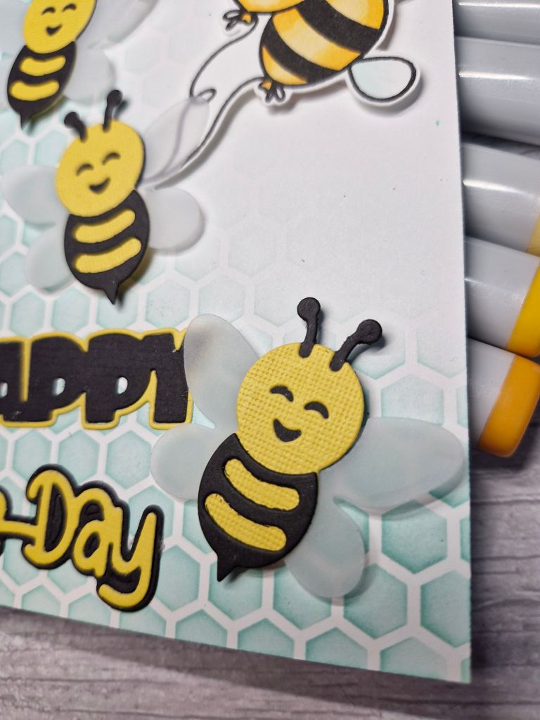
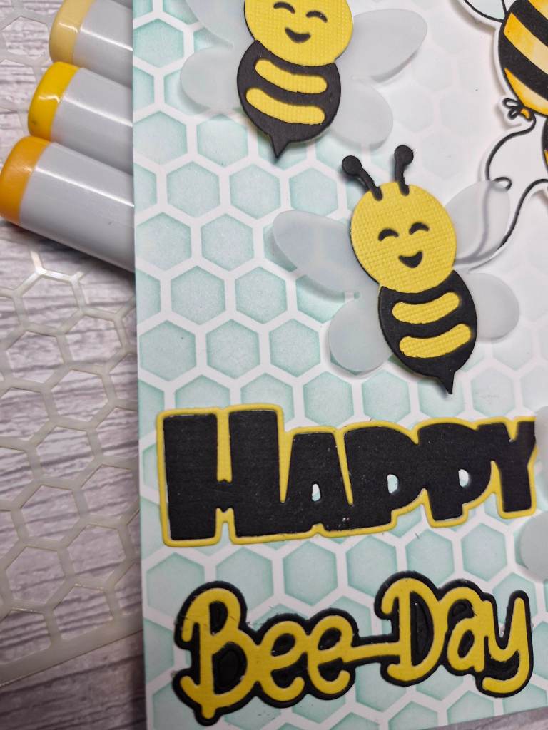
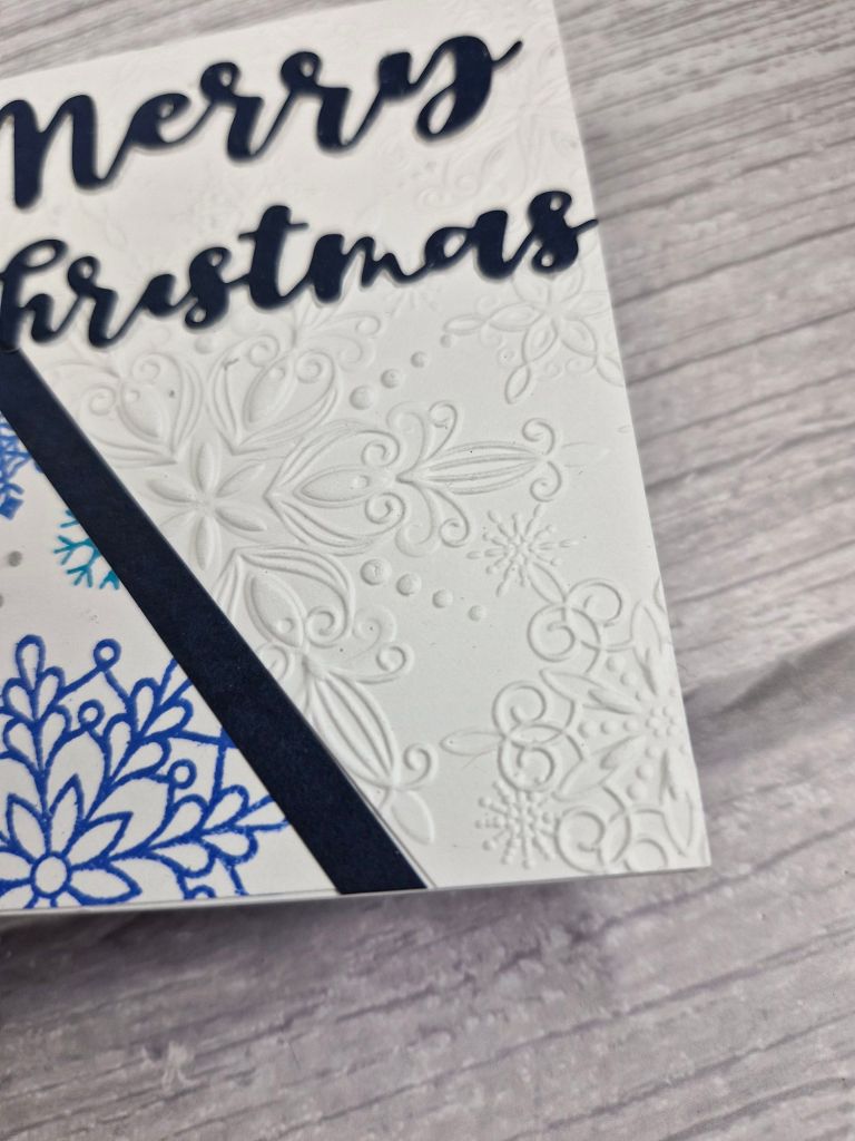
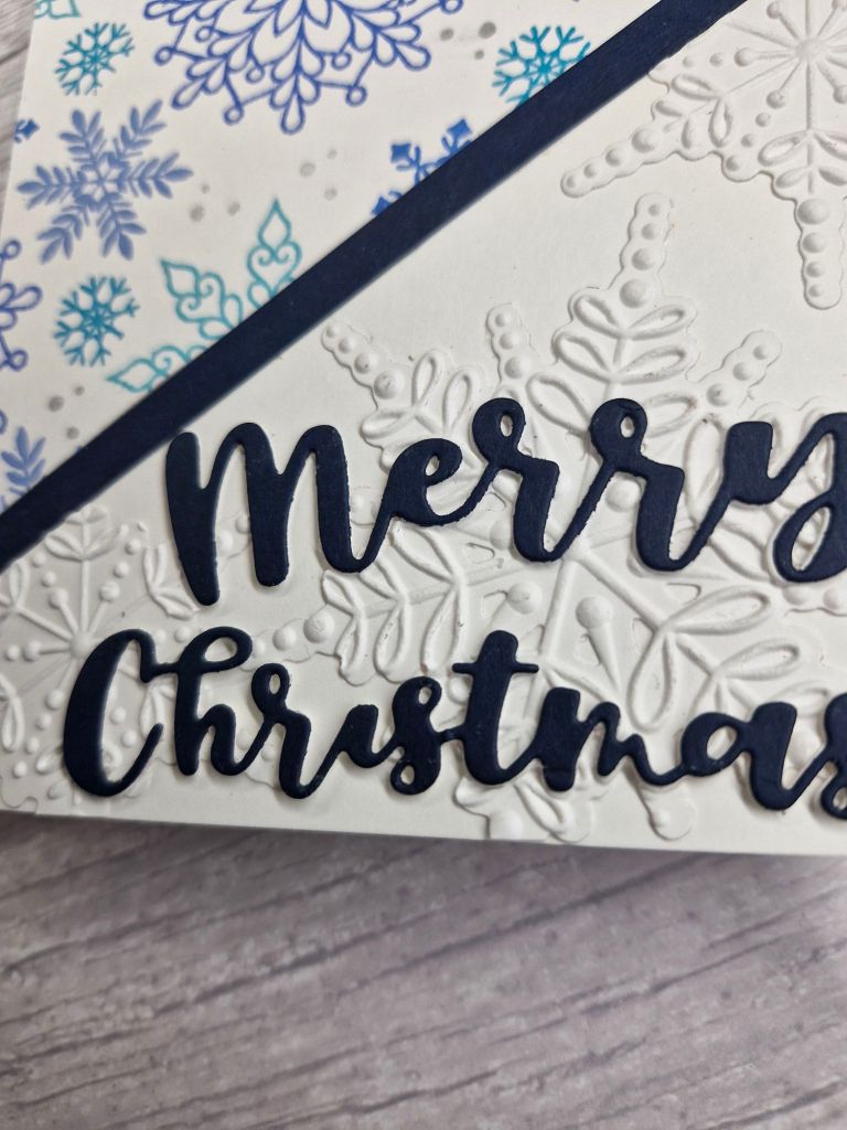
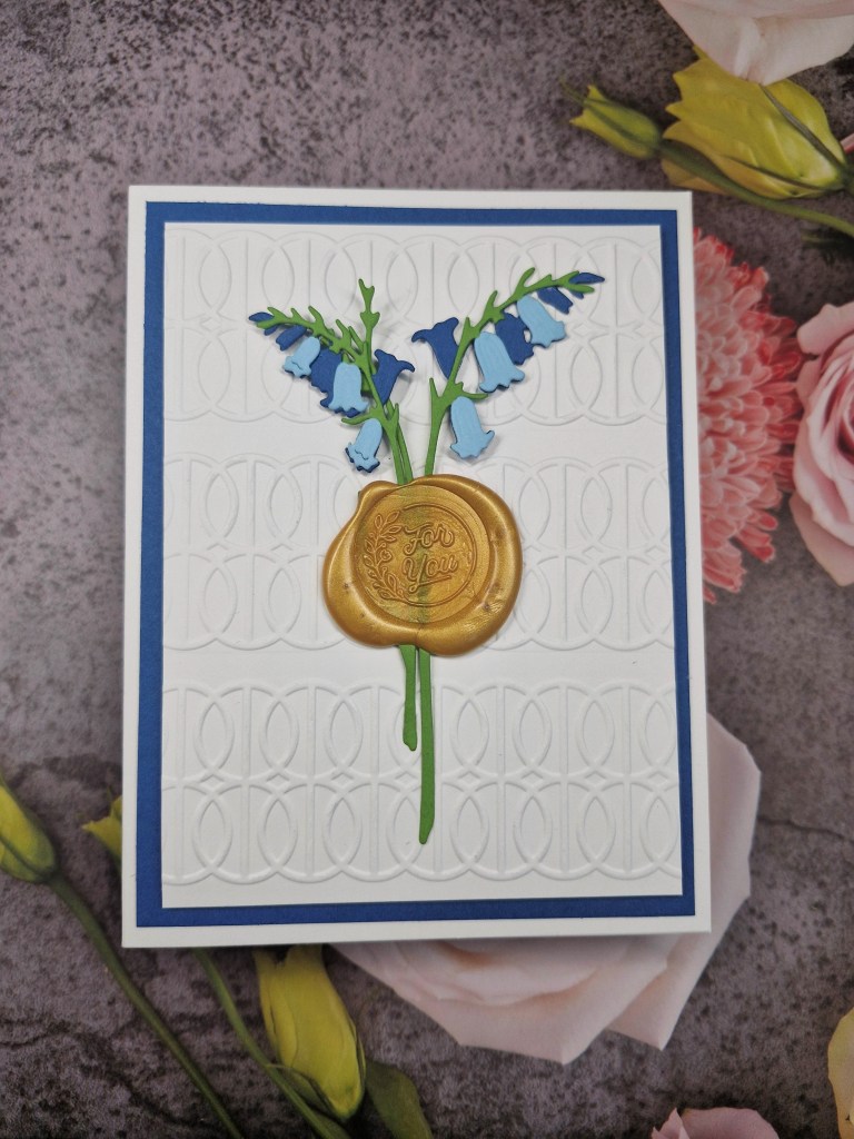
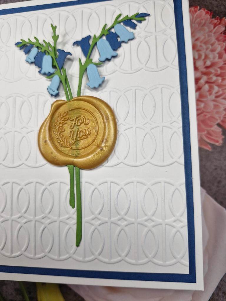
I first created the background panel for the front of the card by ink blending through a stencil. I then stamped the balloons, heat embossed the sentiment in white, then used the matching dies to cut them out.
Then turning to the inside of the card and the pop-up element, I used the same stencil and all three ink colours to cover the whole of the inside, die cut the letters from some striped rainbow card stock, die cut the pop-up pieces, adhered the letters, then assembled the pop-up as instructed in the videos.
I hope you can come and join us with your creations following our theme. xx
I shall be entering the following challenges:
Avenue 613 Create – anything goes -option of splash of colour/colourful
Simon Says Stamp Monday Challenge – feminine
Crafty Gals Corner – anything goes
Lil Patch Of Crafty Friends – anything goes
Ally’s Angels – anything goes