Colours and Sketch 238

20170904_190024 

Hi there. I’m posting this a little later than planned, as I had forgotten all about it. I only made it yesterday – how weird is that? I knew I wanted to use the sketch and colours from the double challenge above, and made the card, then wondered what sentiment to put on it – then completely forgot to finish it!

I got home from work, checked my emails, made us some tea, opened my challenge spreadsheet – to find this challenge highlighted in the yellow of ‘got to post it soon’. So, I photographed it – in between a little panic – and here we go.

I didn’t have all the correct colours, so I used Broken China distress ink, with Certainly Celery, and Powder Pink from Stampin Up. I used the new stamps from Catherine Pooler Stamp of Approval for the flowers, and even used the large die to cut the scalloped background.

The pink diagonal rows are from Altenew ‘Pattern Play ‘Hexagon’, which I stamped using my Misti as these are quite solid images.

CAS Colours and Sketchessketch and colours


Kibble Kits

Good day everyone. I have quite cute for this card – very unlike me! I saw some challenges out there and took the opportunity to combine some with the same card.

I stamped the IndigoBlu ‘Kibble Kits’ stamp in Versafine black onyx, then cut this down with my wonky rectangles. This was stuck onto a panel I had created using Lawn Fawn ‘Stitched Woodgrain Backdrop’, then onto a base card using a lighter blue.

The circle was die cut using Stampin Up stitched circles, and the banner cut using the smaller wonky rectangles again. (I don’t seem to be able to resist using these rectangles)

The small blue cat is actually a button, as you can see from the little collection I have there. Bought at a craft show somewhere, I have never used any of them. This was attached to the circle with Pinflair 3D glue.

The sentiment is from Altenew ‘Painted Greetings’.

This card was actually quite simple to make, and came together quite quickly, once I had decided on the colours and layout. Even that was easier than normal as I was guided by the sketch challenge and by the colour challenge.

It may be a little too busy for the Less is More challenge, but as that particular challenge gave me the inspiration to use my cat button, I will enter anyway………..

Less Is Moreuse a real object

CAS(E) this sketchsketch

Dragonfly Dreamsanimals

Cardz 4 Galzcats/kittens or both

Shopping Our Stashwood or wood grain


Sprinkle Turnabout

20170826_180246

Hello there. I hope you’re having a good weekend. It’s Bank Holiday weekend here in the UK, so three days off.

I have been trying my hand at the Concord and 9th Turnabout stamps again. This one is the ‘Sprinkles Turnabout’, and I am liking the effect the stamp gives. I also like the fact that the sprinkles are more concentrated in the centre, and less so on the outside – but it does create a challenge when thinking about where to place a sentiment……I went with the bottom, and also went off to one side, as I don’t tend to do symmetry!

The colours I have chosen are from the Color Throwdown challenge for this week – pink, yellow, and grey – and I think they all work very well together.

All of the stamps used on this card are from that stamp set – the background, cupcakes, the matching layers, and the sentiment. All stamped sticking to the three colours. I used Stampin Up colours – Daffodil Delight, Basic Grey, and Powder Pink. Once I had decided to use this set, I have made a batch of them in the same colours, and will be trying different colours, utilising the different sentiments at some point.

I shall also be entering this card into the challenge from The House that Stamps Built, with the theme of ‘anything goes’.

Altenew Blissful Bud

Hello everyone. I’m back home in UK, and I’m struggling a little with the time difference coming this way. Very unusual. I usually struggle going the other way….it’s taken me a couple of days to get my crafting head back on. I really enjoyed searching through my sister’s stash, so many things I haven’t got, but now I am back I can concentrate on my own things.

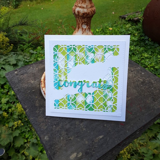
These cards are mainly from Altenew ‘Blissful Bud’, and I haven’t had time to play with them until today. It just happens I am playing with them when the cue card from CASology this week is:

So, out came my Altenew inks, and I set to playing. I used the blues and yellows, as I know that I can layer them well, but with some other colours I still struggle. I played with the position of the bud itself, putting it in different areas of the card, and even angled the stem in different ways so it wasn’t straight all the time.

The sentiments from that stamp set are also lovely, and I chose the ‘warm hello’ to enter the card challenge, but used a few others, too. I used my wonky rectangles to cut the main piece of card out, then added different colour card bases for some variety.

I also played with the Stampin Up ‘Tranquil Tulips’ stamp set, which had been waiting for me when I got home from Canada. A hostess stamp set, which was a lovely surprise from my chosen demonstrator. (Shell Bower)

This set has images which give a water-colour effect when stamped, and has a few flower images as well as tulips. You can see one example in the photos above – the Happy Birthday card – but I also played with the layout of another one I stamped:

I stamped the tulip, then die cut that piece of card using Reverse Confetti ‘Vertical Stripes Cover Panel’, stuck down the surrounding part of the die cut flat, then raised each individual stripe with 3D foam………I may be trying that with some of my other cover plate dies, as I like the effect.

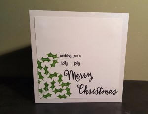
As well as the CASology challenge, I shall also be entering the ‘best bud’ card into the current challenge from Addicted to CAS, with the theme of ‘friends’.

Prickly

20170816_055603

Hi everyone. Another Christmas card for today. I saw the cue card from CASology initially thought of a cactus, then thought of a prickly rose, but was looking through my sister’s stash (yes, still in Quebec) and saw this cute little stamp set from Technique Tuesday  “Twinkle On”,  and the little holly stamps, so I went with that one.

I stamped the holly using a green from Stampin Up, concentrating on one corner, then used a sentiment cobbled together from Hero Arts ”Christmas Trimmings stamp and cut”.

The base card has a little shimmer to it, and I cut the main piece down slightly to leave a little border around it.

I’m now off to google an exhibition currently going on in Quebec, all about Tintin…….and there is also an exhibition on about the Brain…..what a mixture of a day that will be when we go there!


CAS Safari

20170814_145816

Bonjour from Quebec City everyone. (That’s about the limit of my French, so don’t worry that I’m going to try more!)

I have been raiding my sister’s crafting stash again, for an idea to enter the CASology challenge for this week. The cue card is above. I see there are already lots of great cards on the challenge site, and wondered what to do. Then my sister showed me her Heroarts monthly stamp set. Have you seen this set? Absolutely amazing. So many images – animals, trees, grass, birds, hillocks – you name it, this stamp set has it.

As soon as I saw this cute little giraffe I was hooked. And then I saw there was a grass stamp…….sorted. Well, so I thought. Talk about trying to position a straight stamp along the bottom of a piece of card. That took me a little while, then placing the little giraffe ‘just so’…….huh. Definitely not the ‘simple’ of clean and simple, let me tell you.

The colours are basic – green for the grass, (Stampin Up), and black for the giraffe (Versafine Black Onyx) and sentiment, so I added the piece of white card directly onto a black base card.

Tomorrow’s posting will be the colour challenge from CAS Colours and Sketches, my third post as guest designer this month. I hope the colours chosen inspire you to create a card to join in the challenge.


Guest Designer sketch

Hello again everyone. This card is based on the sketch for the second challenge I am guest designer for as CAS Colours and Sketches. For some reason my mind turned to Christmas. I have no idea why, but that’s the way I went.

I wanted a shape hanging over the edge of the card, as per the sketch, and looked at my dies for snowflakes and baubles. I went with snowflakes from Stampin Up ‘Starlight Thinlits’, and cut the shape out of glimmer card, also from Stampin Up.

I used a dark blue card from Creative expressions as a base card, and a second layer which I embossed with my Sue Wilson ‘Twinkle Twinkle’ embossing folder. I did toy with the idea of insetting the snowflake, but decided to stick it on top, so I then had to cut another one out with some double sided sticky tape on the back as I didn’t want glue everywhere.

Once attached, I looked at what dies I had for a Christmas sentiment, and again used a Stampin Up set ‘Christmas Stocking’ thinlits, the same glimmer card, and cutting down the original die cut to leave just the word.

I tried to photograph the background of the stars, which I think came out well, but I just couldn’t get the picture right for the glimmer card. This really is a twinkly card, and the photograph just doesn’t do it justice.

I hope you can play along, and I look forward to seeing what you create with this wonderfully simple sketch. :)

I shall also be entering this card into the Crafty Friends ChallengeChristmas in July.


Juicy

Hi everyone. It’s been a couple of days since I posted – I actually had some social events over the weekend. I had a great night out at hubby’s golf club last night – nice meal, great company, some Prosecco was drunk – and some dancing. 50’s music – even though I wasn’t born until the 60’s……great music from the 50’s. Isn’t it surprising how many songs we know from that time?

I made this card to be part of CASology this week. The cue card was:

I have said in the past that I struggle with clean and simple, I struggle with open space, but I do keep trying. This is my take for the challenge. I had to do some lateral thinking, as I don’t have any stamps of fruits. I did think about some juicy and luscious lips, but didn’t have anything which would work.

I had a search through my stash, and found the above circle and lines in  a Stampin Up set – ‘Balloon Celebration’. I decided it looks like a section of fruit, even though it isn’t symmetrical.

I then looked for some stamps which could be seen as drops or rain, anything which could be seen as dropping from the fake fruit, and came across a stamp set from Craftwork Cards – ‘Celebrations’ – which was again about balloons, but these little circles seemed to work well when I tried them out on a scrap piece of paper. I did have some rain drops from another stamp set, but they seemed a little too big.

Once stamped in Versafine black onyx, I coloured with Catherine Pooler ‘Tutti Frutti’ ink. A luscious, gorgeous bright orange – don’t you think? I then waited for that to dry and added some glossy accents for a more shiny look. Even though the ink is gorgeous, I thought adding the glossy accents would make it shine even better.

I struggled a little with the photo to try and show this, but I hope you can see what I did.

On Tuesday I shall be posting my second card of the month as guest designer for CAS Colors and Sketches – I hope you can play along…… :)


Guest Designer – three colours

Hi everyone. I have been invited to guest design for CAS Colours and Sketches for four challenges during August, and here is the first card I have made for the first colour challenge. The challenge was to create a card using the Stampin Up colours Blushing Bride, Cajun Craze, and Tempting Turquoise. My first thought ran to a flower card, but wondered which flowers I could use artistic license on for the three colours mentioned above.

I looked through me collection of stamps, and came across the set from Altenew ‘Under the Cherry Blossom Tree’. I couldn’t find any images of blue cherry blossoms – so did it anyway! I think I am getting more like that when I craft. It doesn’t matter if it imitates nature or not, if it looks good – do it anyway!

I didn’t have the ink pads for the three colours, but I did have my markers. This made stamping a little more challenging, as I had to cover the stamp carefully using the marker at an angle to ensure it was covered, but as the stamps are quite small anyway, it came together nicely.

I stamped the outline of the branch and flowers twice using Cajun Craze, then used Tempting Turquoise for the flowers. One stamped directly onto the layer added to the card base, and one I die-cut using the matching dies. This one I stuck down hanging off the top of the card, and cut down.

The first bird layer was stamped using Blushing Bird, and the second layer with Cajun Craze. When I stamped him, I set him too high, so had to go in and add a branch for him to sit on with my marker….

The sentiment is from the same set stamped in Cajun Craze, with another smaller detail stamped randomly around with Blushing Bride. So I then thought – why are the petals around the sentiment a different colour to the petals on the branches? Well – because they are! Maybe another tree is alongside this one with Blushing Bride petals………..

I hope you play along with us using these colours, and I am looking forward to seeing what everyone creates. :)

06/08/17 – Here is a close-up of the little birdie as requested by a lady who commented:

close up

Congrats

20170731_100055

Hi everyone. Quite a colourful card for today. I am working with someone this afternoon who will be expecting a new addition to their family in the New Year. I don’t make baby cards, and I have absolutely nothing in my stash which is specifically for this type of occasion, so I went with the flow and created this.

I took inspiration from several challenges regarding colour and theme. The first thing I did was to stamp my Concord and 9th ‘Stripe Builder’ stamp set. I used my Tim Holtz stamping platform, as this is one huge stamp, and used Catherine Pooler ‘Lime Rickey’ and Stampin Up ‘Tempting Turquoise’.

Now I tried stamping this several times, and it just wouldn’t cover all of the card. I re-stamped, stamped again, then decided to leave it as it was, as the photo inspiration from Inkspirational has greeny slats, and also one white slat, which all look quite weathered. So – the distressed stamping look it was. I quite like this effect. What do they say about mistakes – there aren’t any, just happy accidents? Well, there we are.

I then took my Sue Wilson ‘Noble Pierced Squares’ and cut a piece to cover the background, then die cut my Tim Holtz ‘Mixed Media’ in two corners, so the colours would show through.

After sticking these down, I die cut the ‘Congrats’ from Stampin Up ‘Sunshine Wishes’ in white card with double sided sticky sheet on the back, and cut that four times stacking them up, then die cut one from another piece I had stamped originally and didn’t like the look of. (Happy accident again)

I really like the colours on this card, and it goes with either boy or girl, I think…..do you agree?

I shall be entering this card into the following challenges:

Inkspirationalphoto inspiration

City Crafter Challenge something beginning with ‘S’ – (Sunshine Wishes dies)

House Of Cards challengestripes

Less is Morepiercing (Sue Wilson pierced squares)