Butterfly and flowers

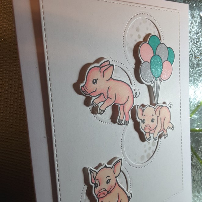
Hello again. I’ve had a busy few days……mum has decided not to craft again :( and so she wants me to sell all her stuff on Ebay. When I say all her stuff…..I mean absolutely everything. There is a lot of stuff, and many of them haven’t even been opened or used. It reminds me to use my own stash!

Over 500 photos later, and I still haven’t scratched the surface…..guess what I’m going to be doing for the next few months….

I did manage to find time to craft today, and even played around a little.

This first card is for the current challenge at Color Throwdown, to use the colours aqua, peach, light grey, and white:

20180817_144354.jpg

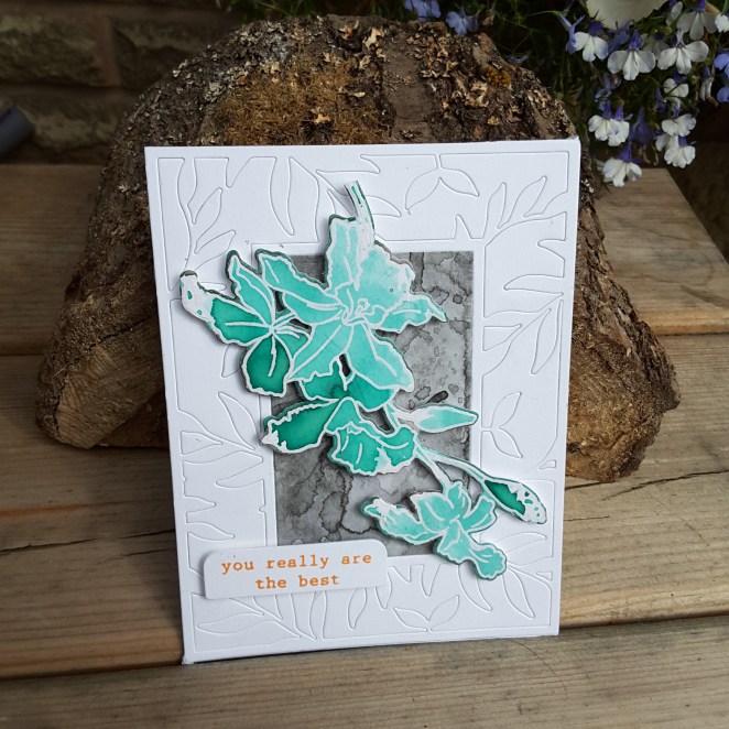
I played around with these colours for a few stamping moments. I tried several variations on the theme, but still using the same Altenew ‘Build a flower: Cattleya‘ stamp and die set.

This card was doing a sort of fast water-colouring – as per Jennifer McGuire – using Catherine Pooler ‘Aquatini‘ ink – one of my all-time favourite colours, after heat embossing with clear embossing powder on white water-colour card.

I then took a piece of water-colour card and added some Altenew grey ink –  I forget which one – and did a smooshing technique – wet water-colour card onto the wet ink. I did the smooshing several times, drying between each layer – I didn’t know until I tried this that the Altenew inks layer quite nicely.

I then used the Altenew ‘Leaf Frame Cover Die‘, die cut it, but left all the pieces in. I didn’t mean to do this, but when I took the die off the card, they all stayed put – so I went with it instead of pressing each piece out.

I stuck and layered as you see, and the sentiment is stamped in Stampin Up ‘Peekaboo Peach‘ – though it actually looks quite orange to me here…..supposed to be peach!

I had a play making some other variations:


The first image is using the three colours and the layering stamps – grey for the base, then the peach, then the Aquatini – kinda liking that look and effect. The top right is using the Peekaboo Peach for each layer, giving a little dimension, and the third card I used my Altenew Artist Markers to add more definition once stamped.

This second card is for the current challenge at CAS on Friday with the theme of butterflies, and also the current challenge at AAA Cards, with the theme of friendship.

20180817_144328.jpg

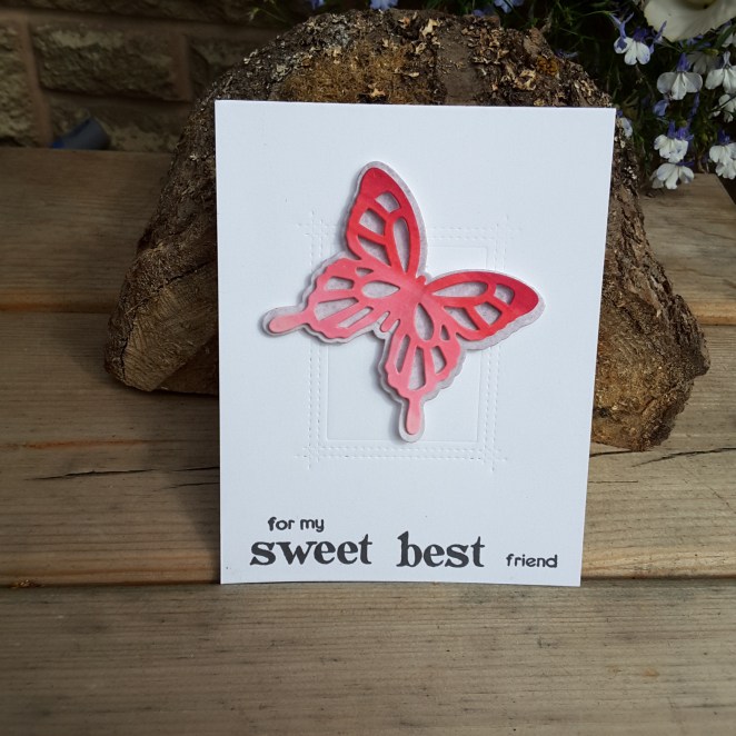
I used Altenew Artist Markers and scribbled onto some Neenah card, then die-cut the butterfly itself, then took a spare piece of the grey water-colour card and die cut the butterfly outline. I only stuck down the middle of the butterfly, so the wings have dimension:

20180817_144332.jpg

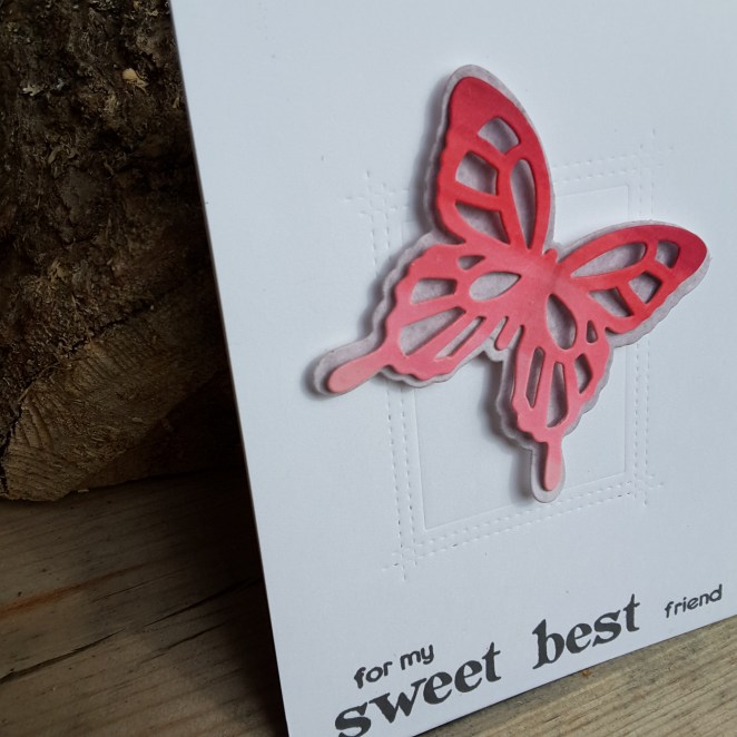
I then embossed the MFT ‘Rectangle Peekaboo Window’ die onto the card base – not cutting, just embossing – and stuck my butterfly down. Hey presto! Sounds easy…..but it took me a while to figure out what to do!

The sentiment is cobbled together from Altenew ‘Folksy Florals’ stamp set. There is a great variety of sentiments with that stamp set, and you can make virtually any kind of sentiment for anyone.

Phew – this turned out to be a longer post than I planned – you let me waffle on a bit – so I did!

Have a good one – catch you later.

:)

Floral and Sweet

Hi there. I managed to create a couple of cards over the past couple of days, completing them last night. The first is for the current challenge at Time Out Challenges with the theme of food and drink with the option of one layer:

20180814_072044

I went for one layer, and used the Altenew ‘Hand Made Tags’ stamp set to stamp images in a Catherine Pooler ink. As I created a background card using tropical leaves last time and loads of different colours, this time I stuck to one colour for the multitude of images, and then Altenew inks for the three layer stamping chocolate cookie thingy…..I’m not sure what these are called, but ‘chocolate thingies‘ works for me!

The sentiment is from Altenew ‘Way Too Sweet‘, highlighting the one chocolate thingy that is made to stand out.

I usually get a lot of smudging when I try to make a one layer card, but I am pleased to say I didn’t on this card – yay!

The second card is completely different, well – cards really:

20180814_07210220180814_072116

I used the inspiration and layout from the current challenge at Fusion Card Challenge. The flowers are Altenew ‘Floral Fantasy‘, stamped using Altenew inks, then die cut. The leaves on the first card are from the same stamp set using a variety of green inks, and the leaves from the second a card are from another stamp set I messy water-coloured as a contrast with the bright flowers.

The wood grain is from a piece of Stampin Up DSP I have had for absolutely ages, and found again recently, and the striped card is stamped from Concord and 9th ‘Sketched Stripes Background’.

I decided to go with a small and unobtrusive sentiment, as the card itself has bold colours and large bright images.

I made two cards, as I stamp more than I need so I can play with layouts side-by-side, and usually vary them slightly.

Have a good day, and I’ll speak again soon. :)


Jungle inspired background

20180812_164607

Hello again. I have been creating a background using some of the stamps from the latest Catherine Pooler Stamp of Approval box, and using some of her Spa inks.

The inspiration for this came from several challenges and meant I could stamp and ink and stamp and ink for ages…..

I tried to keep the larger stamps in odd numbers – I’ve heard somewhere that is more pleasing to the eye, but a lot of the smaller stamps – and there are many – I just stamped to fill the gaps.

These stamps sets have lots and lots of smaller images I could have used, and I had to restrain myself a little – not that you can tell! Here is a close-up of some of the stamps and inks used:

20180812_164618

I shall be entering the following challenges:

CAS-usual Fridaysstamp a pattern

QKR Stampede – anything goes

Cards In Envyflat and use something new (the stamps are new to me)

The Library Craft ChallengeThe Jungle Book


Card for hubby’s birthday

Hello everyone. I have made this card for hubby’s birthday, which is today – and just given it to him five minutes before his mates came for him to go out…..so he still has three hours left to celebrate……Does anyone else do things like that? When the card is for a particular family member, I go by the skin of my teeth!

20180811_203430 (2)

As it’s so late here in the UK, I had to take the photo inside, with a little lamp at the side. So I apologise for the lighting, but I went with what I had…..

I recently received this stamp set from Seven Hills Crafts – Hero Arts ‘Country Fair Pig’ – and knew it would fit in perfectly for hubby’s birthday. I also used the colours from the current challenge at Color Throwdown – pink, teal, grey.

I also used my Altenew Artist Markers to colour the piggies and tried to concentrate on the shading on each of them.

The background circles is a die from Avery Elle, and behind the circles I added some grey ink through a stencil from The Crafters Workshop – ‘Mini Microbial‘. The sentiment is from Concord and 9th ‘Laurel Frame‘ stamp set.

My thought on the balloon piggie – the balloons are carrying him away from his circle! Just a little added fun.

I also added some clear sparkle pen to the balloons:

20180811_203440

I shall be entering the following challenges:

Color Throwdowngrey, teal, pink

The Male Room Challengemale birthday

Addicted to CAS CAS masculine

Addicted to Stamps and More CAS


Basket and floral hugs

20180808_135151

Hi there. I have a card here for the current challenge at Daring Cardmakers, and their inspiration picture. The challenge is to choose three elements.

I chose the basket effect, flowers, and glass containers – the blue glass to also match the Bombay Sapphire bottle……love that drink!

The stamp set is from Altenew – Garden Silhouette – as I wanted solid flowers, which didn’t require any layering. I did make it a little more difficult for myself, as I stamped the images in two colours, masking off the flower to stamp the stem and leaves in green, and masking the stem to stamp the colours of the flowers. I don’t know why I bothered, really, as I covered the stems anyway…….behind the glass…..oh well. Lesson learned.

The glass containers were stamped off, then stamped again as the original colour would have been too bright for my taste.

20180808_135156

These embossing folders really do give a fabulous 3D effect, don’t you think?

I chose a smaller sentiment in the corner, as opposed to a larger one so it didn’t detract from the card, but also added a little something extra.

I feel some more crafting and card making coming on for the weekend, and I am not at work all next week…….can’t wait to try my Altenew Artist Markers a little more…

:)


Here Comes The Sun

20180808_114542

Hello there. I have a card here for the current challenge at CASology. The theme word/cue card is ‘sunbeam’. I was struggling a little initially, but then had delivery of my Catherine Pooler Stamp of Approval box last week – see previous flamingo card for other products – and right there in the middle of the biggest stamp set is this little sun, and alongside it was the sentiment.

I set to stamping the sun using Distress Oxides – no blending, just stamping – and used a yellow, then an orange on top, then the yellow again. I didn’t want such vivid and isolated colours, which is why a mixed it up a little. This way, there is a little of both colours in each of the stamped areas.

I then took a previously ink smooshed piece of water-colour paper and die cut it to create a border. I fussed with this a little – do I do it straight, just one side, both sides…..so I went with this quirky layout.

20180808_114549

Just as I went to take a photograph – the sun went in! Typical! A sunny card, nevertheless, but no sun shining on it.

My sister is coming over later so there may be more crafting……… :)

Tropical Friendship

20180805_165600

Hi again. I have been playing with my newest Catherine Pooler ‘Stamp of Approval’ box. I took the opportunity to use the Altenew Artist Markers, too, as I have recently received them. I used three colours for the flamingos, after first stamping the outline with black ink.

The trees and grass are also from that same Catherine Pooler box, and stamped using the same greens as I used to  blend the background, with the brown trunk on the trees a Catherine Pooler ink.

I did find stamping the tree tops, then die-cutting, then stamping the trunks made it easier to ensure correct placement and angle as the tree and trunk comes in one die. It could be possible to stamp at the wrong angle, but I found this way easy.

I shall be entering the following challenges:

Freshly Made Sketchessketch

Give a Crafter a Cookie –  photo inspiration

Crafty Gals CornerTropical Colours


Feel Better Hugs

20180805_085413

Hello again. I managed to find time to craft last night and this morning – still going to spend quite a bit of today crafting I hope – and made this card incorporating a sketch and colours theme, and going for a more feminine feel, without covering the card in flowers.

I took a zigzag stamp from the latest Catherine Pooler Stamp Of Approval, and curved it. I like the way these clear stamps can be manipulated this way, and opens up more ways if utilising them.

I then took a little triangle from the same collection and used the challenge colours to alternate as you see. As I didn’t have the exact colours, I used Watermelon Wonder from Stampin Up, and Over Coffee and Lime Rickey from Catherine Pooler. A lot of the stamp sets from Catherine Pooler include many, many small stamps for in-fills and creating your own patterns. So versatile.

After I had stamped this I had a little laugh at where I had placed my magnets:

20180805_081438

I am sure there is another card in there somewhere – a big robot/monster card….hmmmm!

Anyhoo – I then took the image from Altenew Indoor Garden, and die cut with a stitched oval, and added it as you see.

The sentiment I also curved to try and match the banner part – maybe I was slightly off, but rather than binning the whole thing – I stuck with it. I did this partly because I don’t think it is hugely wrong, and doesn’t look too out of place, but also because I am cutting myself some slack here. (see comments below)

These colours work very well together, I think, making a bright but clean and simple card.

I shall be entering the following challenges:

CAS Colours and Sketchescolours and sketch

Watercooler Challengesfeminine

Aud Sentiments for the girls

Now for a little ‘chat’ – I have been watching the most recent You Tube videos from Kristina Werner and have been a little upset for her…..have you seen the latest videos? The first was some hints and tips about to improve your card making. Loved that – great tips. The second was to try to explain and address comments some people have left……..quite a bit of negativity commented on the first video, but I have to say that I wholeheartedly support her and what she and other ‘famous’ members of the crafting community are trying to achieve.

I wouldn’t be anywhere near as challenged, I wouldn’t have anywhere near as much confidence, nor would I have anywhere as near as many ideas and skills without the advice/help/tips and good old ‘give it a go’ attitude that many people have like Kristina.

Thumbs up and support for Kristina and any other crafters like her who put themselves out there for us………..

https://www.youtube.com/user/starofmay/featured


Rainbow hello and colours

Hi everyone. It’s been a few days since I last made a card – never mind posted anything to my blog or Instagram. It has been busy at work, and we have had painters in doing my downstairs rooms – still ongoing – but they have stored many things upstairs. Even in my craft room!! Well – that had to change quickly……

I made a couple of cards yesterday, which I had been thinking about for a few days. The first is for the current challenge at AAA Cards – rainbow theme, and Inkspirational – make a card in less than 10 minutes.

Here is the card:

20180803_170022

My sister came over from Canada with my Altenew markers earlier this week – I picked her up from London and arrived home at 3.30 am!! – but I made the colours of this sentiment with the markers. In my head I was singing…..wait for it…..red and yellow and pink and green and orange and purple and blue…..so that’s the order I did the colours.

I put them down on a piece of card, backed the card with double sided sticky tape, die cut the sentiment  and adhered it to the card base. The added small sentiment stamped straight onto the card base.

All-in-all, this card took me 7 minutes and 40 seconds to make, so quite a quick card. All the thinking about what to do was made beforehand and I made sure I had everything ready and nearby.

I’m going to try and colour properly with these markers over the weekend – I’ll let you know how it goes. I am a complete novice when it comes to using alcohol markers, so I am excited to be able to play with them.

The second card is made using the colours from Color Throwdownblack, white, copper – and also using die cutting as the theme for the current challenge at Die Cutting Divas:

20180803_170036

I used black card and die cut the Reverse Confetti ‘Striped Circles die‘, but tried to leave a few of the bits in. I put double sided sticky tape over the back of the areas left inside the die cut, then stuck that down to a white card base.

I then took some white card, put down some double-sided sticky tape, added copper embossing powder, and heat set it. I die cut some of the new Catherine Pooler leaf dies from this, and once those were die cut, I put them through a little floral embossing folder to give them some pattern and dimension.

20180803_170053

I then took the capital ‘H’ from the Altenew ‘Mega alphabet dies‘, and the ‘I’ from another alphabet die set, cut it from another piece of copper heat embossed card, and stuck down as you see.

As I have been out of the loop for a few days, I’m looking forward to crafting more. My sister is also a card maker, and whilst she is here in the UK, I think she wants to try my Catherine Pooler inks……and I’ve recently acquired even more colours……I can’t wait to try them. I am thinking at least a colour swatch…..that’ll be fun too.

:)

A Tweet note

Here I have a one layer very clean and simple card following the colours and sketch layout of a couple of challenges:

20180724_200828

I used the MFT ‘A Tweet Hello’ stamp set and three of the little birdy images, stamped directly onto the card base, and coloured with my Zigs. I don’t have the exact Stampin Up colours named on the challenge, but I tried to match as best I could. The sentiment is from the same stamp set. (And…………no smudges. Yay!)

I had this set in mind as I have a colleague going through some exam issues at the moment, and I liked the sentiments.

The colours of the birds are from the current challenge at Just Add Ink, and the layout from the current sketch challenge at CASE(E) This Sketch.

Trying to photograph this card in the fading light was a challenge, but I had a little help:

20180724_200822

20180724_200631

This is Rosie, otherwise known as Girly Girl or Fluffy One. It all depends on what we feel like calling her, and whether she is in an affectionate mood – or not! Having lost one of our two cats at 14 years of age earlier this year, we decided to obtain not one cat as companion for our main big boy – Spike – but two more cats. She has a brother Jim – …..Rosie and Jim. 12 years old from the Cat Protection League. I am sure he’ll appear in a card photo in the future……

:)