three toning colours

20170712_211559

Hi everyone. Another later posting for today.

This very simple one layer card is inspired by the colours from The Paper Players – Sweet Sugarplum, Berry Burst, Rich Razzleberry – and the challenge of a one layer card from Tuesday Throwdown.

I used some stamps from Catherine Pooler Foundations box, and stamped away…..the only time I used my Misti was for the solid sentiment stamp, but other than that – just stamped. I also used some smaller flower variations to fill in the gaps after stamping the larger images.

The smaller sentiment was masked off with a post-it note to stamp some of the flowers around it – getting the practise in – and kept the flowers on the left hand side, as you can see. I quite like the effect of stamping on one side, or the top or bottom, and I may have more plays with that in the future, when I batch make cards.

I shall be entering the challenges named above with this card.


Hello Sunshine Flowers

Hi everyone. A later posting today, as it took me so long to sort out the placement of this flower and leaves. I had an idea in my head, but just couldn’t get it right. It seems to be a running theme with me these days – taking ages to plan my layout…..

This card has been inspired by the colours from Just Add Ink, and the sketch from CAS(E) this Sketch.

I used my Altenew stamp and die set ‘Hello Sunshine’, stamping the flower in black on some Whisper White cardstock, but the leaves in a softer grey. I don’t have the Smokey Slate from Stampin Up, so used Evening Grey from Altenew. I thought the leaves would be too stark if stamped in black, and I wanted a softer look for them.

The flower I stamped in black, and coloured all of them in Lemon Lime Twist, using my water brush on the ink pad casing. I must say, this is now one of my favourite colours. I love it. It comes a very close second to the Catherine Pooler ‘Lime Rickey’ ink – love them both.

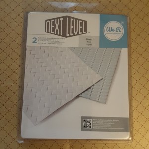
The sentiment is from Altenew – Wood Pallet Background. I was going to use the wood pallet, but I used my We R Memory Keepers next level embossing folder instead, to give a trellis look. (I need to move away from the trellis look, I think!)

I stamped the banner in Crumb Cake, as well as the sentiment, and cut it out. And – no die cut for this! All my own snappy scissor work……. :)

The base card is Crumb Cake, layered with the Whisper White embossed layer, the sentiment added with 3D glue gel, and the flower and leaves stuck behind this.

So – Whisper white is used for the stamping and the embossed layer, Lemon Lime Twist for the colouring, Crumb Cake for the base card, and Evening Grey instead of Smoky Slate for the outline of the leaves.

Challenges I will be entering:

CAS(E) This Sketchsketch

Just Add Inkcolour combination

QKR Stampedeanything goes


Poinsettia

Hi everyone. Today’s card is a mixture of colours and sketch and Christmas. I have been waiting to use my Altenew ‘Poinsettia and Pine’ stamp and die set, but couldn’t get my head around a layout – until I saw the sketch from Freshly Made Sketches. I then had something to work with.

I used that sketch as a layout, and the colours from CAS Colours and Sketches – Lemon Lime Twist, Berry Burst, and Island Indigo. I have just had a Stampin Up delivery, so I had my first two colours, but I didn’t have Island Indigo. I turned to my paper stash, and found a sample of what I think is Island Indigo, and used a strip of designer series paper to complete the sketch and colours theme. I used this side of the paper as I think it looks icy and wintery.

The poinsettia is stamped and heat embossed, then coloured with Berry Burst using my water colour brush, straight from the lid of the ink pad, the same with the two leaves using Lemon Lime Twist. I die cut them with the matching die set, and then thought about the layout – where to put the leaves and twigs.

Once decided, I stuck the flower down with 3D glue, then ‘shoved’ the leaves and twigs underneath after putting some Cosmic Shimmer glue on the tips. I did add some Crafters Companion glittery pen to the flower, but I couldn’t photograph that to show you – you’ll have to pretend you can see the glimmer.

The three stars are from Stampin Up ‘Birthday Blast’ in Berry Burst and Catherine Pooler ‘Aquatini’ – which I think is a pretty good match.

I shall be entering this card into the following challenges:

Freshly Made Sketchessketch

CAS Colours and Sketches three colours

Christmas Card Challengesanything goes Christmas

Crafty Hazelnuts Christmas Challengeanything goes Christmas


?Pizza

I’m having a little titter to myself as I post this card. I can’t believe I’m actually posting it, but it’s brought me some giggles. I am sure from the title of the post that you can see what the theme of the challenge is that I made this card for……..

The cue card is from Casology – ‘Pizza. So, I don’t have any pizza stamps or dies, I don’t have anything I could turn my mind to for a real pizza, or anything I could turn use to even come close to representing a pizza. I have been thinking about this for a couple of days now, and was at a total loss.

Until I was driving to work yesterday, was stopped at some traffic lights in Sheffield – outside a Dominoes Pizza place.

I immediately started giggling. I am sure the car in front must have thought I was a complete nutter! Then I thought – why not? It is following the theme of the challenge, Dominoes Pizza is international……….so here you are.

The actual domino took more thought……eventually I die cut two squares using my Stampin Up ‘Stitched Shapes Framelits’, then wondered how I was going to do the dots. I looked at my hole punch – not quite right. I looked at my Crop-a-dile – too small. I looked at my punches from Stampin Up – nothing seemed quite right.

So, while I kept thinking, I decided to tidy my craft table, and to put some things away. I always seem to have lots of stamps and dies just sitting there……anyone else do that? So – putting some of my stuff away, I came across a stamp set from Altenew ‘Simple Flowers’. Guess what – there are a couple of small round dots in that set.

Here we go – I took one of the dots, stamped it in my Ranger Perfect Medium, heat embossed with white opaque powder – and ended up with what you see above. I stuck both the squares down flat with some of my Tombow glue…….

I’m still giggling. We are supposed to have fun when we craft, aren’t we? I think this takes it to another level, though!

What do you think? Outside the box or what? (Pizza box, of course)


Red, white, and blue sketch

20170705_213629

Hi there. I’m still in quite a patriotic mood today. I made an earlier blog posting with colours of England, and decided to make another card with the colours from the good old Union Jack. I am aware there are lots and lots of countries with red, white, and blue on their flag, so instead of going down the St George Cross route, I followed the sketch from CAS(E) this Sketch.

The three colours were die cut from Lawn Fawn ‘Road Border’ and stuck down to a smaller card than usual, keeping a wider bit to the left, and narrowing down to the right – all set at a nice jaunty angle – as per the sketch. The strips were only 6 inches long, and I was putting them at an angle, so I had to go with the smaller size card.

The sentiment is from a Catherine Pooler set from the Foundations box, and I angled each word slightly on my block to give a more rounded look to them so they looked like they were following the shape of the strips. Actually, that bit took longer than the rest!

I only had a short time to play tonight, as one of my puddy tats has hurt his leg, and I had to take him to the vets – thank goodness not serious. As he is almost 7kgs (Yep!!), he has probably strained his shoulder jumping down from somewhere. You can see a picture if him on a previous blog post – Spring Flowers + failed feline photo bomb from April 19th. He also has a brother just as gorgeous – I may be biased!

I shall also be entering this card into the following challenges:

Cards In Envypatriotic – red, white, blue

Createalicious challengeanything goes with option for red, white, blue

Addicted to Stamps and MoreClean And Simple


‘A’ for Avant Garden

Hi everyone. Today’s card was inspired by several challenges, including the colour and the theme.

The first challenge was from Color Throwdown and the challenge to use three colours – orange, green, and brown, the second challenge was from Just Add Ink with the challenge to just add ‘A’, and the third was from Inkspirational with the theme of ‘rural’.

Looking at the colours to use, I must admit I followed many of the inspirations already on the challenge from the other entrants, and thought of flowers. As I hadn’t used the ‘Avant Garden’ stamp set from Stampin Up for a while, I thought this water colour effect from the stamps would suit the orange colour, and of course the title of the stamp set begins with ‘A’.

As for Inkspirational – I was guest designer on the last challenge, and just had to try and enter this challenge also. Such a great theme – rural, and a fabulous card from the current guest designer.  I felt the Avant garden stamp set and the colours would suit just fine.

I used colours from my Stampin Up stash – Tengelo Twist, Old Olive, and Crumb Cake. I started with the three flowers, then used a masking technique to stamp some of the leaves. Now my masking technique does need a little work…..and my mask itself is a sticky note! I just placed it where I thought it needed to go, tore it if it didn’t need a 90 degree angle – and hey presto! And I didn’t use my Misti!

The sentiment is from IndigoBlu, a lovely set called ‘Nature 1’. I love the images on this set and have used them previously. Stamping the sentiment in brown instead of black really lends to a more muted effect, don’t you think?

clean and simple butterfly

Hello everyone. Sunday here is turning out to be a glorious warm and sunny day – and yet I have been making this card. Well, with my wedding anniversary today, and hubby off golfing – what’s a girl to do?

This card was inspired initially by the current Casology challenge – the cue card being ‘fly’. So, how many items do I have that could be used for this card? I am sure we all have butterflies, and birds, and feathers, and loads more stuff. I initially thought about the Tim Holtz ‘crazy birds’, then went to my Altenew ‘feathers’, then went to some butterfly stamps – then – found this Brusho piece of card from when I was playing with my new colours a few weeks ago. Just laying there on my desk, calling me, asking me to use it for this card………..

Immediately, I went to my butterfly die from Sue Wilson – ‘Majestic Monarch’. This is such a gorgeous die, very delicate, so it wouldn’t take over too much from the background, but quite large. Therefore, I went to a 6 inch square card as a base.

I placed my die cut butterfly on the card, and tried several positions until I was happy, then looked for a sentiment. This sentiment actually comes from the Altenew ‘Faithful Feather’ stamp set, and I love the script, and also that it fit just perfectly rightly in the bottom right of the card.

I used my Misti to stamp the sentiment a couple of times with my Versafine Black Onyx, then stuck down the butterfly using the body only, as I wanted the wings to move around a little, to give some movement to the card.

I hope you are all having a fabulous day, and will be crafting at some point……

I shall be entering this card into the following challenges:

Casologyfly

Simon Says Stamp Wednesday challengeanything goes

Crafting with Dragonfliespunches or dies

Colour Crazy Craft Challengeanything goes

Red and White

The first of July already. Good grief. And my 29th wedding anniversary tomorrow! Where does the time go? The weather here in Chesterfield has turned a little warmer than earlier in the week, and the rain has stopped. Finally.

For today’s card I have gone clean, but only simple once I had worked out what I was doing. It took a little thought and playing around to get the final product. I tried die cutting some simple strips, but I couldn’t get them to merge together correctly. I tried stamping onto a larger base card, but in the end went for this smaller version.

The inspiration came from three challenges. The first challenge was a sketch from CAS Colours and Sketches, which was the challenge regarding the lay out. The second challenge was from Less is More, with the theme of using the colours of your country’s flags. I stuck to the colours of the St George Cross, instead of going for the red, white, and blue of the Union Jack, and the third challenge was from Clean and Simple on Sunday, the theme being to use flowers.

The base card is just over 4 inches by 5.5 inches, with a layer of plain white card onto which I stamped a chevron from Catherine Pooler’s Stamp Of Approval Foundation box. I used my Misti because I wanted to be precise with the placing of the stamp. I also used a Catherine Pooler ink – ‘Rockin’ Red’.

I then stamped a larger flower from Altenew ‘Bamboo Rose’ and two smaller flowers from Altenew ‘Hello Sunshine’, and die cut them with the matching dies.

The sketch challenge was set by Jane, and she said she was ‘looking for one element larger than the other two, but they don’t have to be circles‘, so I thought the three flowers fitted perfectly.

I stuck them down with some foam pads, and then thought about the sentiment. This again came from the same Catherine Pooler stamp set, and fitted ‘just so’ into the space under the chevron I had stamped – again I used my Misti for placement, as I was stamping it onto the base layer.

So, even though it looks ‘Clean and Simple’ – it did take a little thinking and organising of my elements.

I hope you all have a great weekend, and I look forward to seeing what everyone else adds to these challenges.


White on White

I am so ready for the weekend…………It’s been a busy week at work, some later nights than expected, and now I can look forward to spending some time crafting. The joys of free time!

This card is inspired by the challenges from Cards In Envy and Addicted to CAS. Both themes are for white on white card. I have done some white on white card previously and found it quite challenging, but thought I’d have another go for these two challenges.

I stated with a ‘Next Level’ embossing folder from We R memory keepers. These embossing folders are the bees knees. I mean – how deep are those impressions? I shone a light at the card from above so you could see the detail which comes from this folder and just a plain piece of white card. This particular folder is called ‘woven’ and there are two folders in the package. I am sure I will be using the other folder sometime soon!

20170630_210740

After embossing the 6 inch square piece of card, I then die-cut three butterflies from Tim Holtz/Sizzix Bigz die ‘Butterfly Duo’, which also comes with a matching embossing folder. I must say, the hardest part was making sure the two die cut butterflies didn’t move when matched to the embossing folder. If you tape them, then the tape is also embossed onto the butterflies – so carefully does it. Don’t let them slip!

I added them to the base embossed card in a random fashion, as though they were climbing a trellis – again, this is ‘Loopyloo world’ so anything is possible!

The sentiment is a die cut from – I think – Hero Arts. I have lost the main package, so am not really sure. I think the detail and depth of the background also allows the sentiment to show with the shadows.

I shall also be entering this card into he following challenges:

4 Crafty Chicksanything goes

Monochrome Magicmonochrome with twist of butterflies


Watery sketch

Hi there. I’ve been playing a little this evening, and have been inspired by a couple of challenges for this card. I have been thinking about the sketch from Less is More and the theme of any form of water from Crazy 4 challenges and came up with this card. Well, two cards actually, as I didn’t want to waste any of the blue stamped part.

I knew I wanted the waves background stamp from Hero Arts to be the focus of the water, and used my new Catherine Pooler ink and my Misti – just in case. I needn’t have worried – those inks stamp well first time on a brand new stamp. Amazing inks!

Once I had stamped it, I then looked to create the curved part of the sketch, and found my Avery Elle ‘Snow Caps’ die set. In this set comes with a nicely curved edge, which I used to cut into the blue stamped background, then cut again nearer the bottom. This way, I ended up with three pieces of card.

Two of them I attached to a white base card and left a white strip in the middle, the other piece I also attached to a white base card, but attached somewhere in the middle. Again – waste not, want not!

I then grabbed my Color Layering Goldfish, used Altenew inks ‘Coffee Break’ set, and stamped the fish directly onto the card. Without my Misti! Brave of me, don’t you think? It turned out very well, if I must say – but do you think he’s upside down? Is there a right and wrong way?

I did stamp another fish, and fussy cut it out, ready to add to the other card, but decided to leave him off that card, and felt only a sentiment looked better. The sentiment from the same goldfish stamp set, in the same blue as the waves background stamp. On one card on a separate piece and attached with foam pads, the other card stamped directly onto the card base!!! Again – without my Misti! (I think I’m getting braver and braver in my old age!

I shall be entering this card into the challenges named above, and hope you find the time to play too.