Onto a white card base I matted a shiny red card. The white layer is matted, after using a layering stencil from Pinkfresh Studio and there recent online class – simple blending for me.
The sentiment is from Hero Arts, and die cut using new-to-me red glitter foam from Spellbinders. Once glued down, and matted onto the red layer, I added some iridescent sequins – you can’t have too much glitter and sparkle on a Christmas card in my opinion.
I hope you can come and join us – add you Christmas Creations to our gallery – it would be great to see you there. xx
Hello. After playing in my craft room I created this card. So very different to my recent posts – but the kind of many layers card I used to create back in the day. I had forgotten how much card stock this takes – and I must admit I ‘gutted’ a few of the layers. The dies used are from Sue Wilson – stitched squares, holly octagon – and are many years old:
I created a white card base to be slightly over the size of the first layer – and two layers of green, two layers of a brushed gold were matted – with one gold layer dry embossed – also a Sue Wilson embossing folder. The two smaller gold and green layers were die cut from the two larger layers – no waste, and you can’t see that I did that – don’t tell anyone!
Aligning the snowflakes on the gold layer took a minute or two – straight lines all over the place on that background.
The holly berry octagon was die cut in the green, and the other additional holly layers either green or gold – depending on how it all fit together.
I decided not to add a sentiment, but I’ll certainly add something to the inside instead of the front.
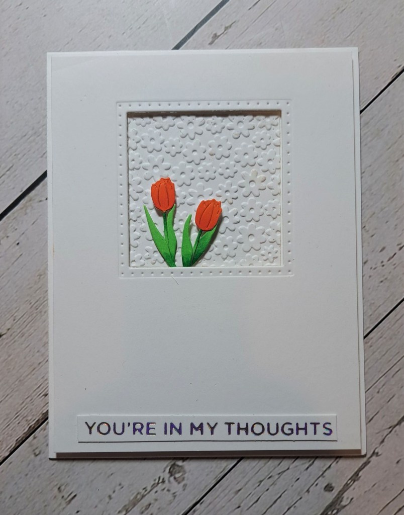
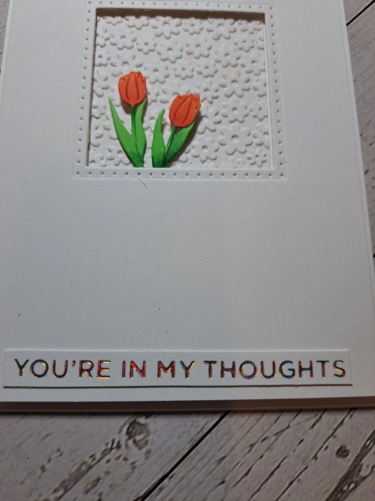
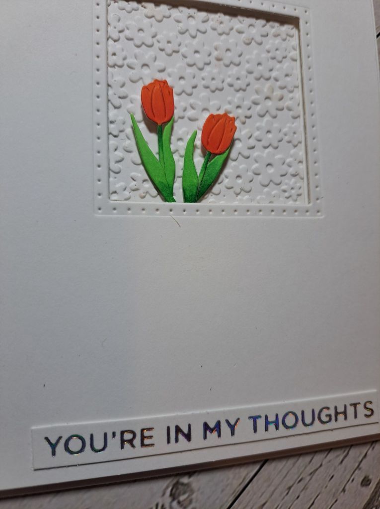
I found time to play with a new little die set and created a CAS card to share:
I used a very old double stitched square from a piece of card stock – trying to centre side-to-side but nearer the top. I wanted stitching outside the square to give some interest for the aperture. This panel was trimmed a little then layered onto a white card base using 3D foam.
The square that came out of that panel, I then dry embossed with a little floral embossing folder and placed that back in the aperture as a background – glued flat to the card base.
The tulips were die cut in white, then the flower heads coloured in orange, the leaves and stems coloured in green and light green with Copics.
Leaves were glued to the stems, and the flowers inserted into the aperture, with the flower heads raised slightly on tiny itty bitty pieces of 3D foam. The sentiment is a previously foiled sentiment strip.
ABC Christmas Challenge has reached the letters ‘W’ and ‘X‘. The themes for the Christmas creations should be ‘White’ and/or ‘Xtra Special‘. Here are my cards:
As you can see – I had a ‘white’ moment for both cards. I think white on white gives a touch of elegance,especially with a pop of gold.
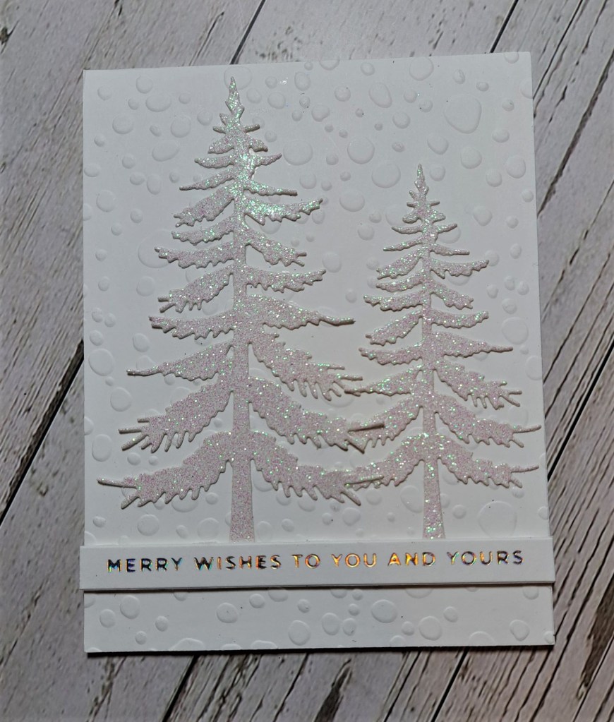
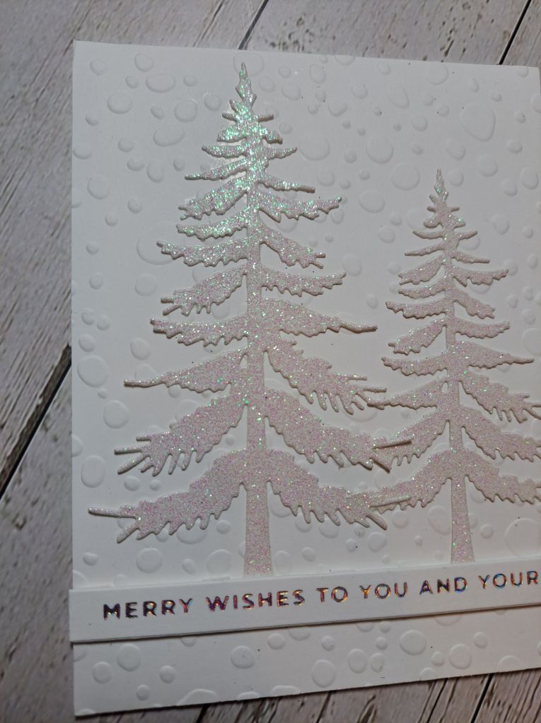
For the trees card, I dry embossed a dotty pattern onto a white panel – I think it should be rain drops – but also looks like snow to me……
The trees from Elizabeth Craft Designs were die cut out of white glitter card stock, and the sentiment is from a previous foiling session.
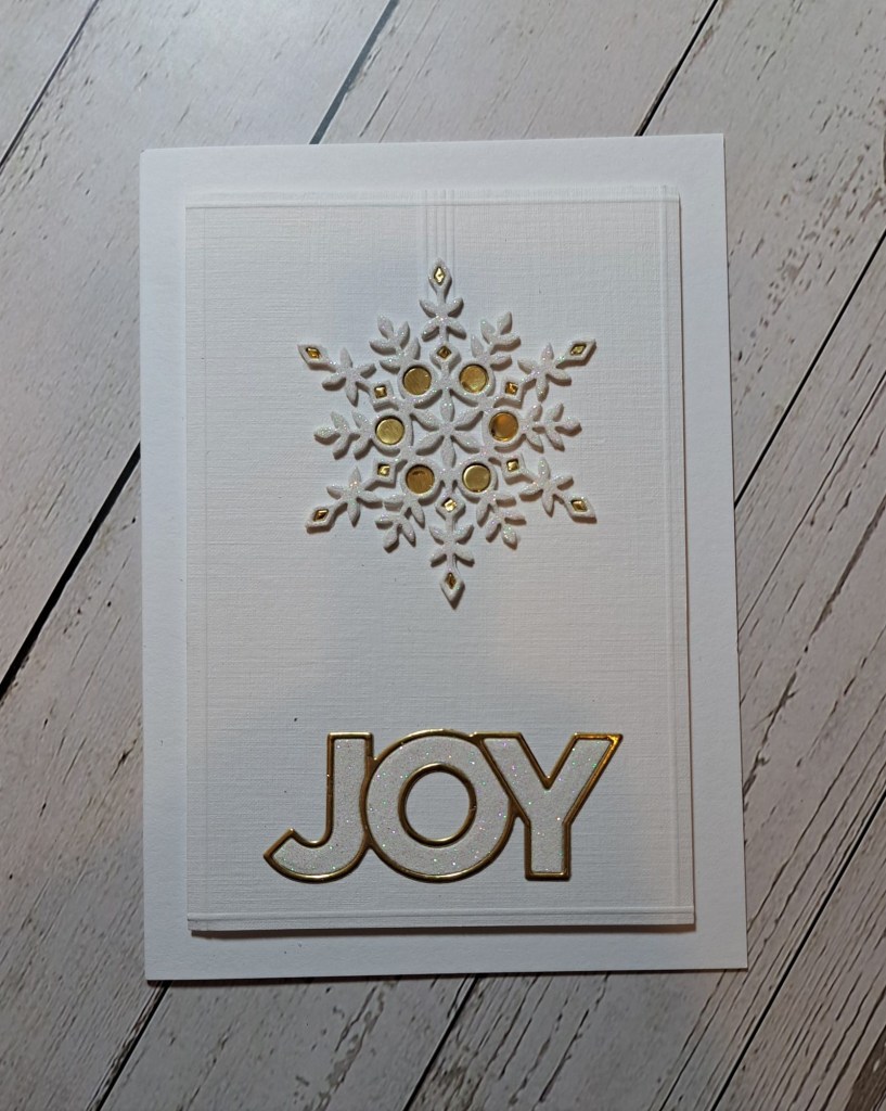
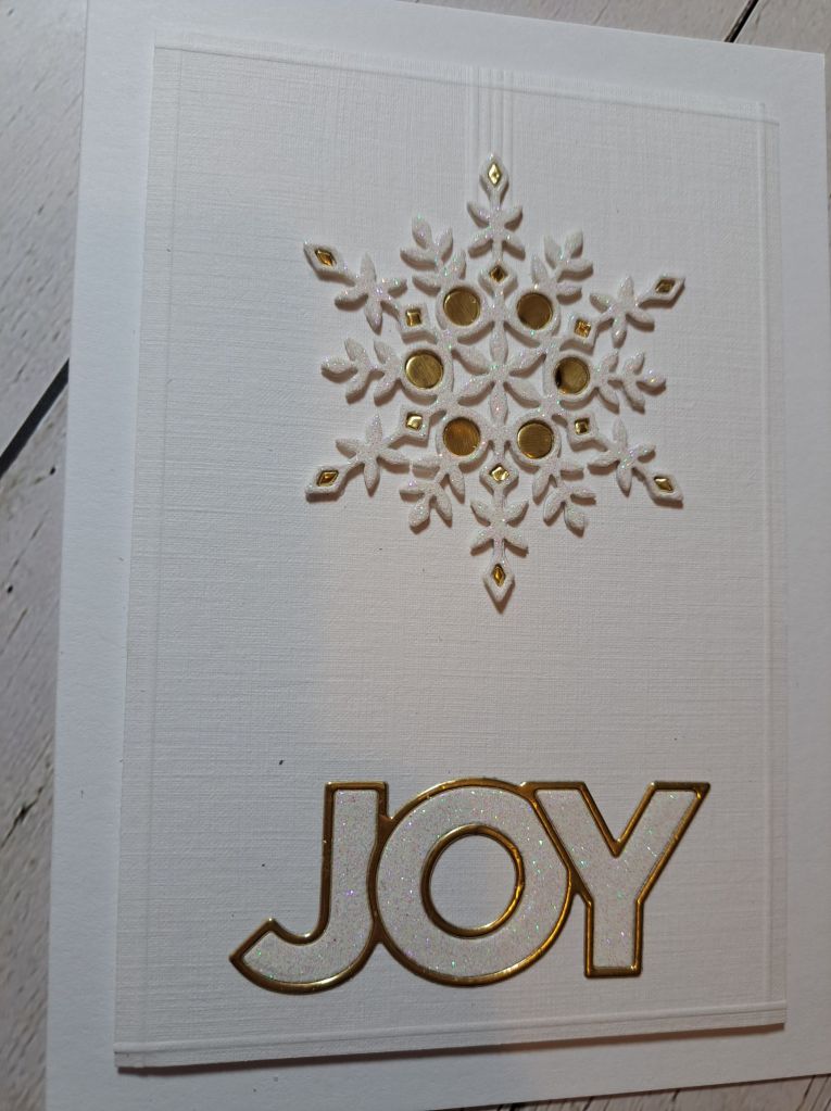
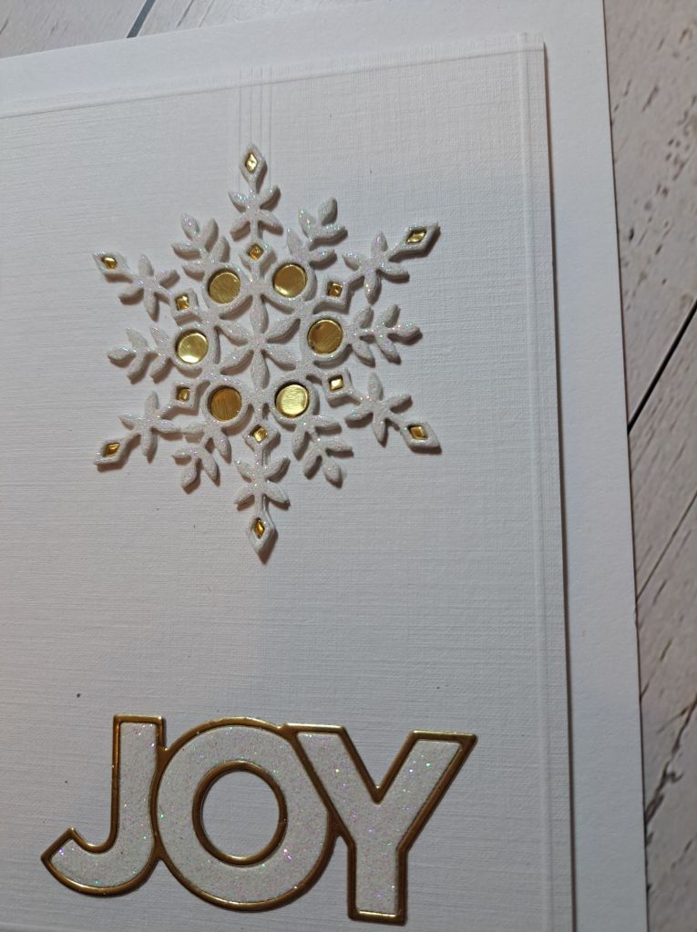
For the more involved snowflake card, I created a panel of white linen card smaller than the base, then used my bone folder and scoreboard to create a frame around the edge, and a few lines at the top of the ornament- almost a hanging thread or string.
The snowflake was die cut from white card stock and white glitter card – a new card for me from Pink Frog Crafts here in the UK – and adhered to the bottom of the dry embossed lines.
The sentiment is also from Simon Says Stamp – the outline in Spellbinders gold cardstock and the inner parts of the words from the same glitter card stock. I didn’t use the shadow layer.
As I had used gold for the outline of the words, I had the ‘bright’ idea of inlaying some gold back into the snowflake. I say ‘bright’ ‘cos that was fiddly as fiddly as could be – but I’m glad I didn’t give up as I like the result.
I hope you can come and jpoin with your Christmas/Festive creations following our theme – I look forward to seeing a White and Xtra Special gallery. xx
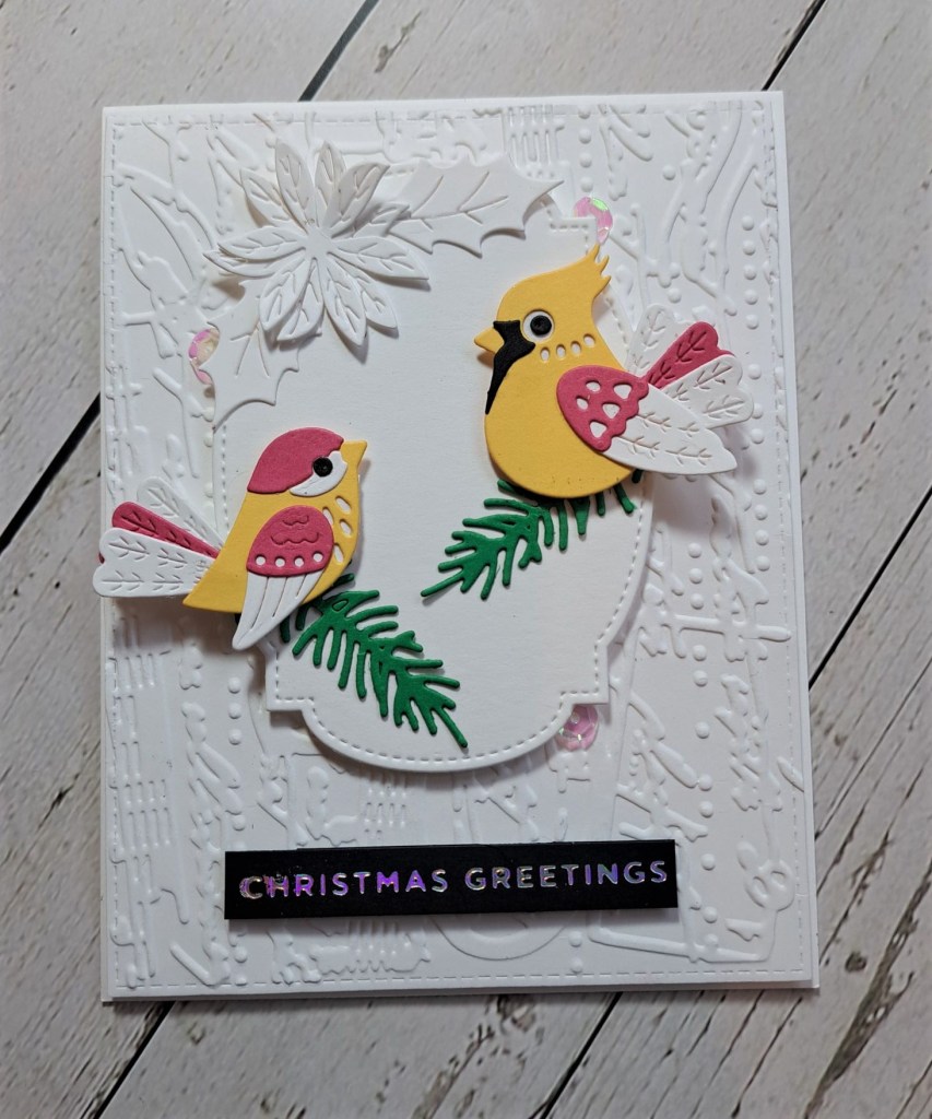
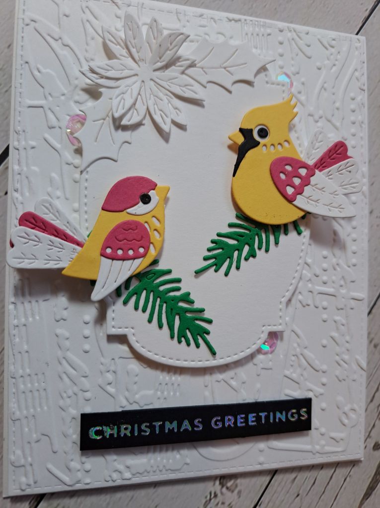
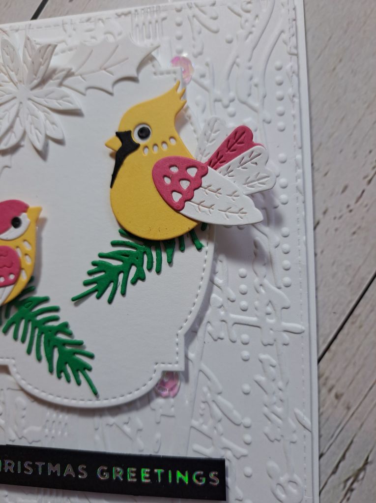
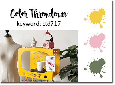
Hello. I have a card to share inspired by the current colours at Color Throwdown:
I decided to make a Christmas card with those colours, and used a few Spellbinders die sets I have.
The background is embossed using an older embossing folder from Sizzix – not a Christmas design by any means, but I liked that it add some interest.
The central die is from Gina K designs and one of her Master Layouts, raised and adhered with foam.
The birds were put together using all the layers in each die set, but for the bird which is supposed to be a cardinal, I changed his/her tail feathers to the smaller ones from the other bird.
The floral elements and ferns are also from Spellbinders.
I played with the layout a little, stuck the elements down when I was happy with a mixture of 3D foam and glue, then added some sequins – I restrained myself to only adding three – and found that the sequins actually shine a little pink – so matches the colours perfectly.
I added the previously foiled sentiment for a total contrast so there is no mistake that this is a Christmas card……! Despit the colours…..!
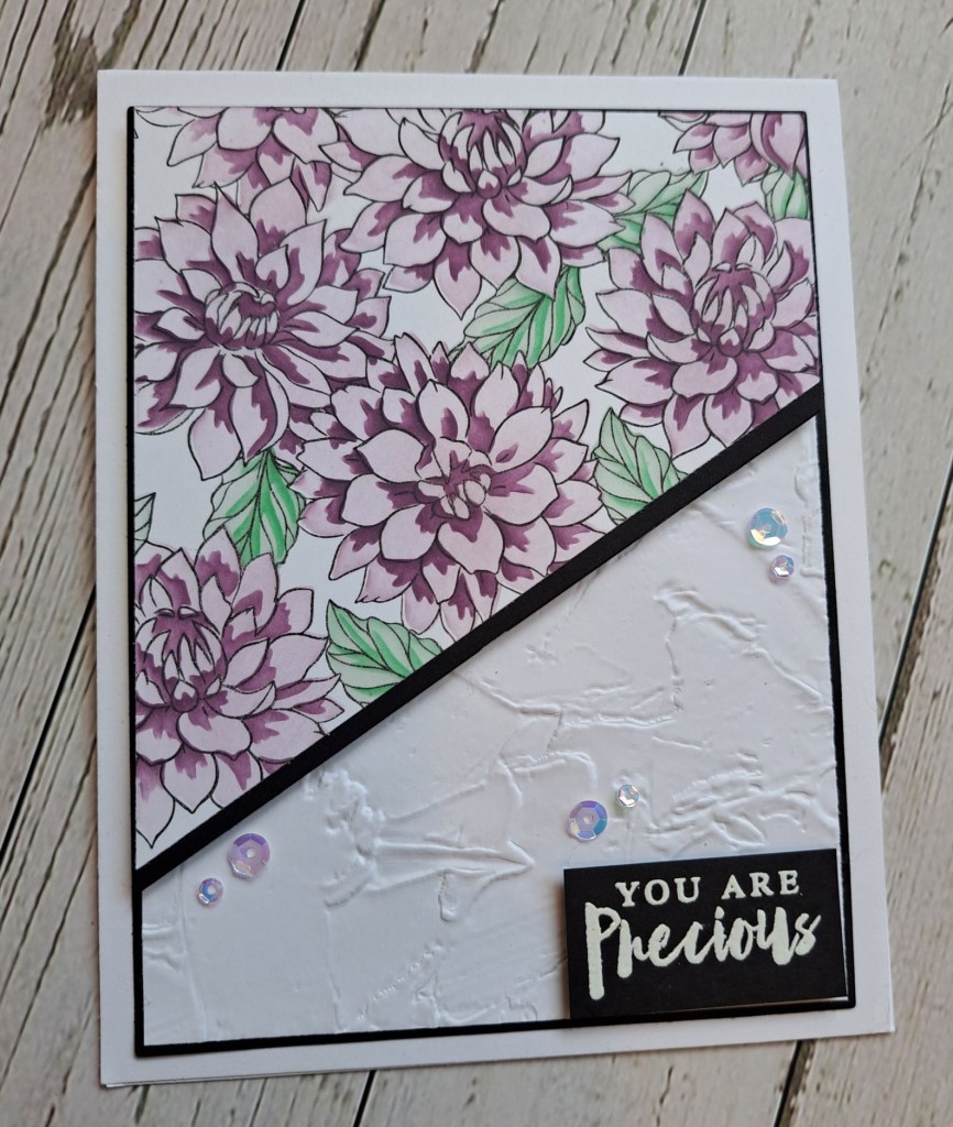
The Alphabet Challenge has gone live with the next challenge, and having reached the letter ‘P’, Deborah has chosen the theme of ‘Precious’. Here is my card:
I dry embossed a white panel, layered it with a black layer, and adhered to my card base.
The flower images are a layering stencil, and I used two colours for the flowers, and two colours for the leaves. The stencil pack also comes with one to colour the background, but I left that white – I felt the flowers were more dramatic that way……
I then cut this panel at an angle, added a black strip for contrast and adhered the the dry embossed panel.
I found this sentiment in an Altenew set, and I white heat embossed it onto a black piece of card. Some blingy sequins and then it was done.
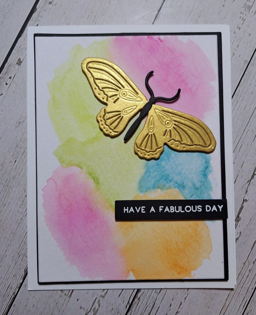
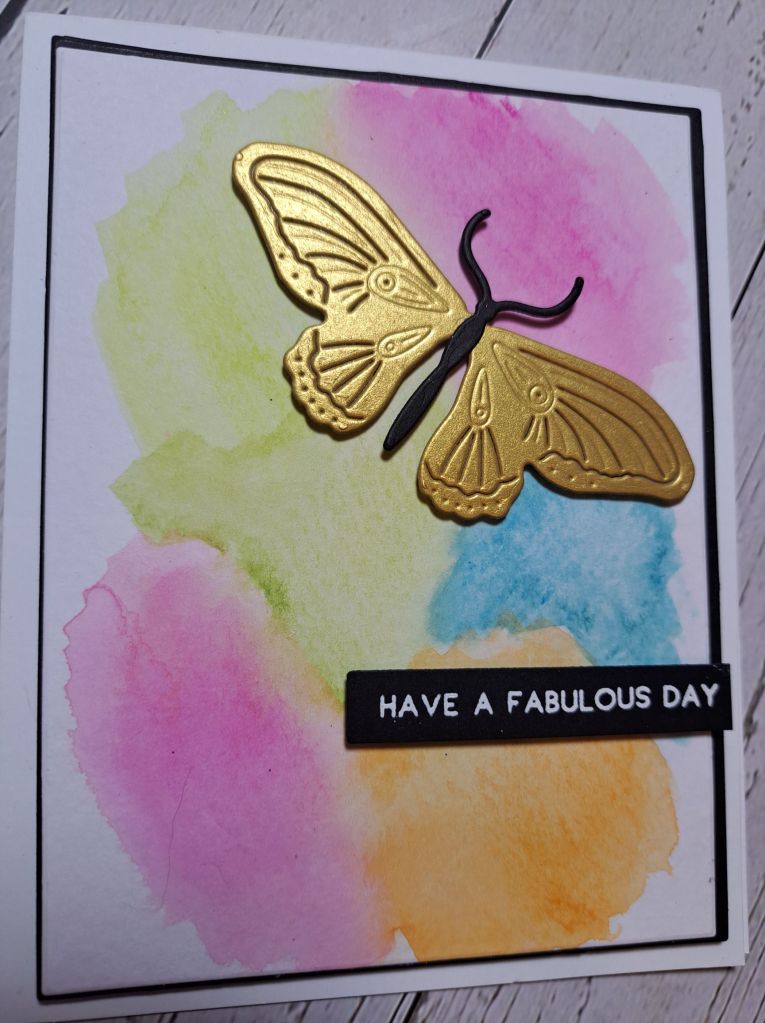
A new challenge has started at Cardz 4 Galz. Billie A has chosen the theme of ‘water color – background, or image – or both’. Here is my card:
As you can see, I went with the watercolour background. I wanted a messy background, and tried to achieve a kinda rainbow messiness………….I think the colours need to run together a little more, but I like the colours I used. Once dry, I matted that with black onto a white card base using Gina K Designs master layouts.
On top of this I die cut a butterfly from The Greetery in Spellbinders gold card stock, the centre portion out of black, and adhered as you see.
I chose a more generic sentiment – white heat embossed.
I hope you can come and join us with your water colouring creations – I look forward to seeing you in our gallery. xx
The background panel was created by splattering some Liquitex metallic acrylic paint in gold and black onto a white panel. When this was dry, I created the black layer and then die cut the white panel using Gina K Designs Master Layouts.
The feathers – also Gina K Designs – were die cut from some previously created ink smooshed and mica sprayed panels. After they were arranged onto the card base, I added a die cut ‘happy’ along with it’s shadow layer, stamped ‘birthday’ matted that with black, then added some gold faceted gems.
I hope you can come and join us with your birthday creations. xx
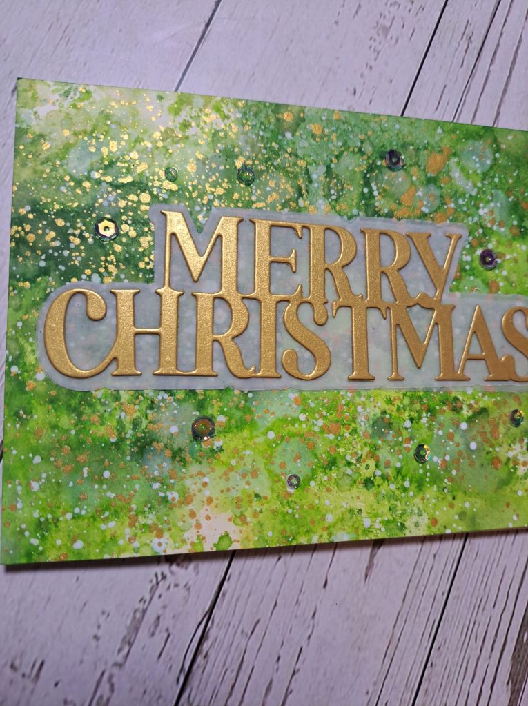
The background is an ink smooshed creation – lots of different green Distress Inks – multiple layers – so much fun to create.
Once that had dried, I splattered Liquitex acrylic metallic ink in gold and white and let that dry.
The sentiment is from Hero Arts, the shadow in vellum, and the main words in Spellbinders matt gold card stock. If the shimmer on the background wasn’t enough – I also dotted some iridescent sequins around.
This is certainly a very shimmery card and so much fun to create. I feel another ‘messy’ play coming on to create more backgrounds – even though I have plenty – but I just love to play and ink smoosh instead of always feeling I have to create a card.