Hello everyone. A new challenge was due to start at The Holly and Ivy Christmas Challenge – anything goes Christmas is our theme – as always, but our leader has been unwell, so there won’t be a challenge for this next two weeks.
I have decided to still post my card for some challenges:

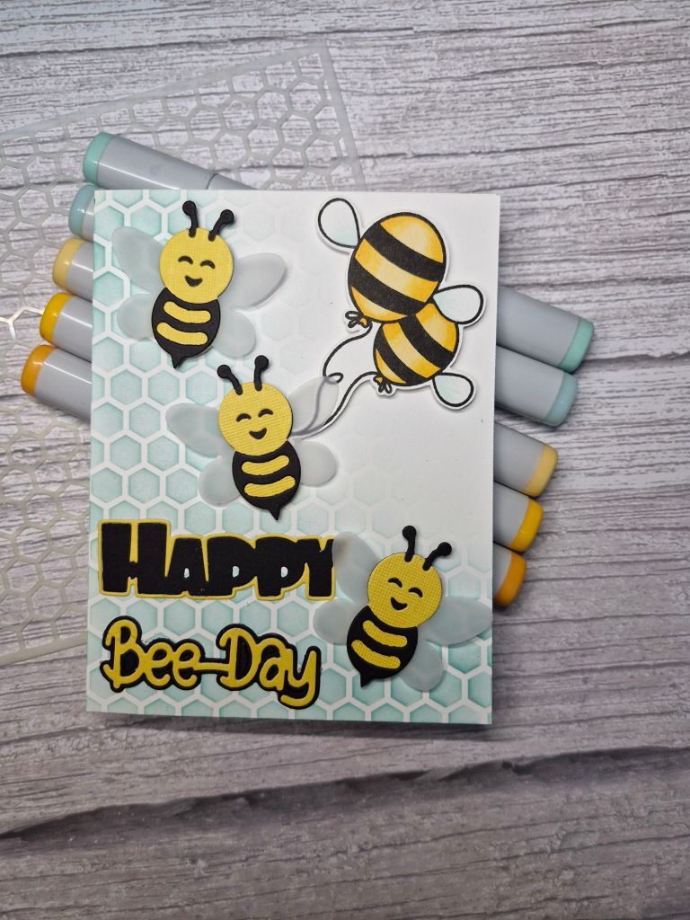
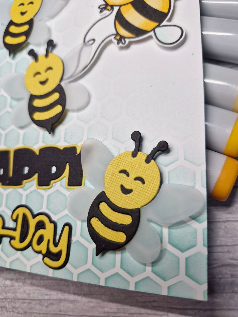
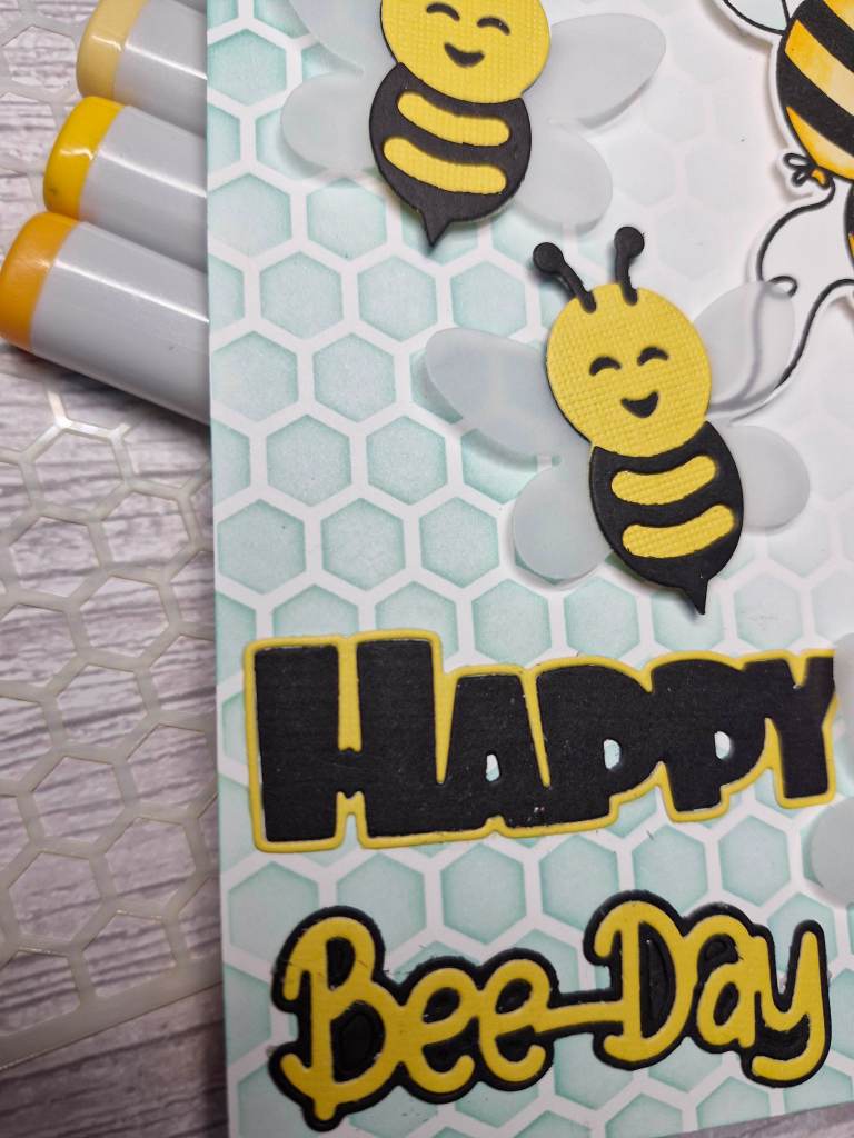
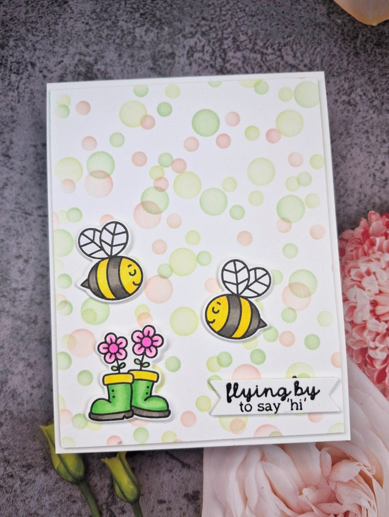
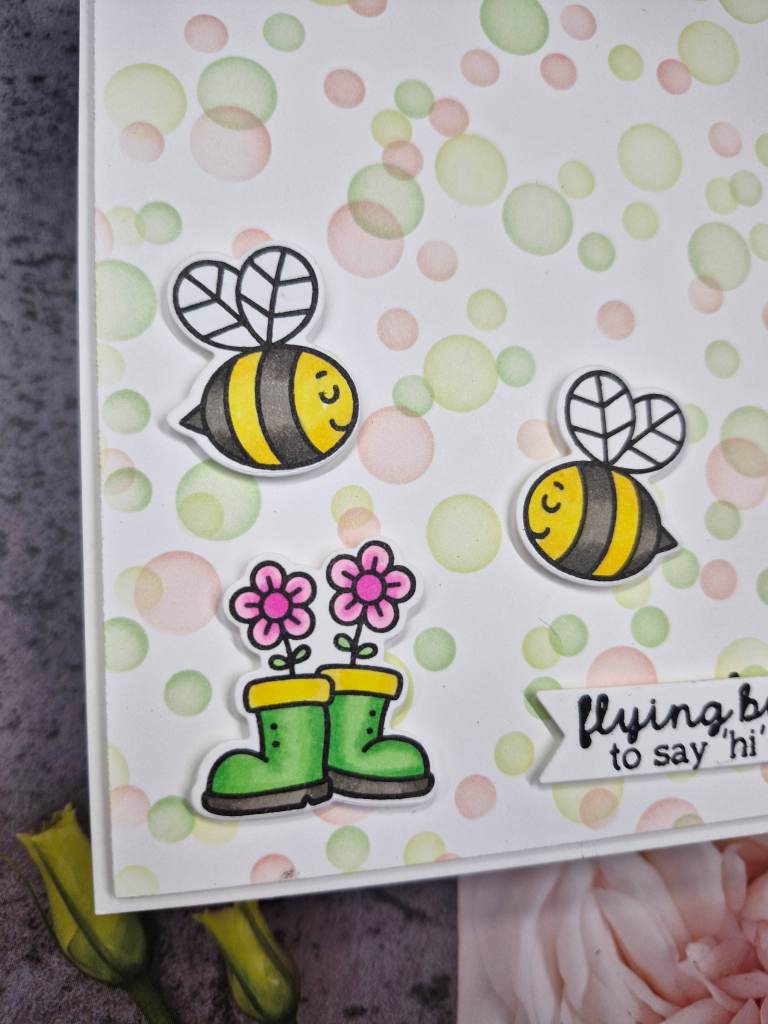
This bauble was created using a Spellbinders die set. There are two baubles in the set, but I chose to use just one of them for this card.
The background is embossed using a Spellbinders embossing folder and blue card stock, then a blue ink blended around the outside to create an almost glowing centre.

The bauble and all the elements were die cut out of red, navy, blue, and silver glitter card stock, then all placed on the main background piece as you see. And – yes – all those itty bitty silver hearts were inlaid back too……a little fiddly, but I think worth it.
I adhered the background panel to a card base, then added the bauble with 3D foam, also adding some silver twine behind the top of it- I failed doing a bow soooo many times, that I decided the twine was good as it looks here.
I shall be entering the following challenges:
Simon Says Stamp Wednesday Challenge – anything goes
Cut It Up – die cuts – something starting with B (bauble)
Creative Fingers – anything goes
CYHTP – embossing folder, option feminine not taken
Ally’s Angels – anything goes