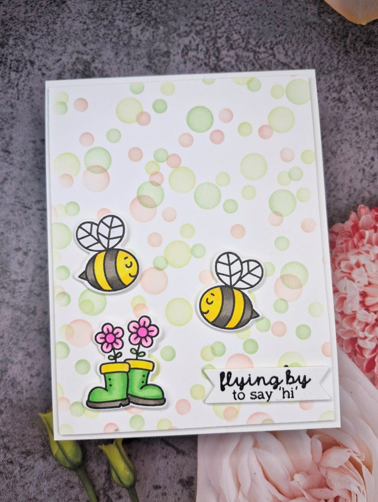
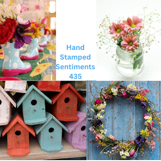
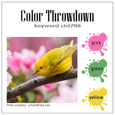
Hello. I was inspired by several challenges to use the new products received as part of ‘Let’s Stamp Together’ from Scrapbook and cards today – this time the featured company was Taylored Expressions.
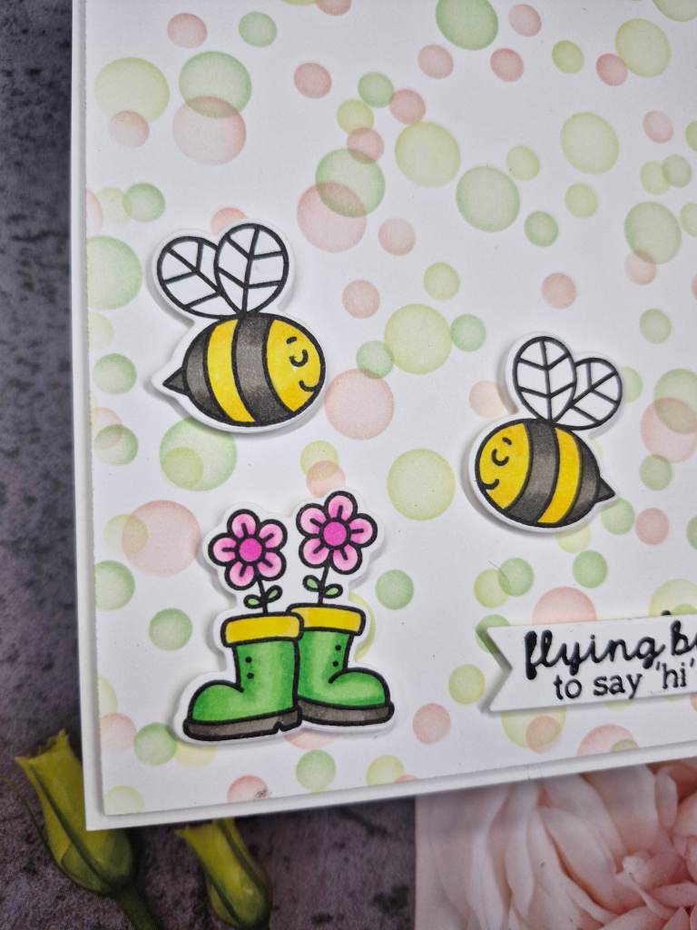
I first stamped the images in Gina K amalgam ink so I knew I would be save using Copics to colour. Once coloured, I used the matching die cuts.
The background was created using similar colours and using the stencil which also came with the kit – this is a stencil you can rotate to cover more of the background. I rotated it three times, and used green on one rotation, yellow on the second, and then pink for the third time.
I trimmed this down slightly smaller than an A2 card base, and adhered with 3D foam.
The sentiment was stamped and cut out, attached with 3D foam, as were the three images.
Hello. This time I created a CAS card for several challenges using a left-over piece of the Pinkfresh Studio Washi tape from a couple of days ago when I entered the speed card challenge.
I ink blended some blue in the bottom left corner – only what was left on my blue blending brush, then adhered the bouquet with glue.
The foiled sentiment was added to overlap the bottom of the bouquet.
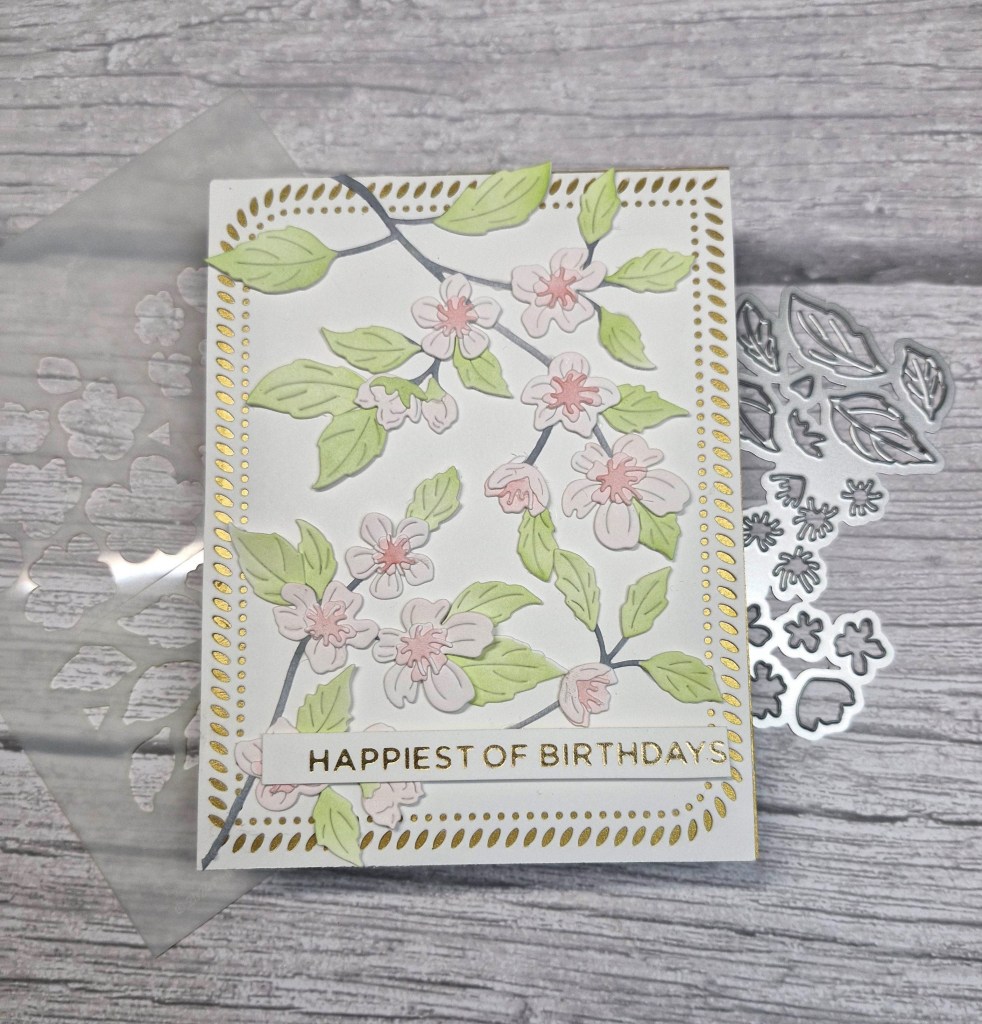
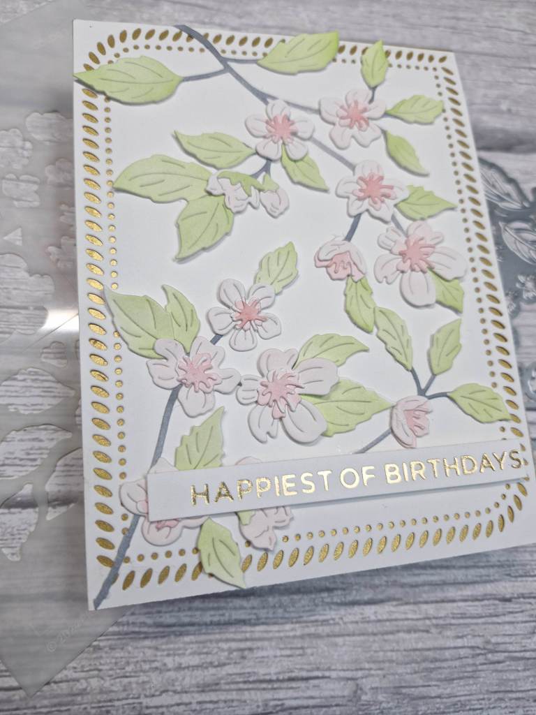
Hello there. I have another floral card today, created by using some layering dies from Pinkfresh Studio:
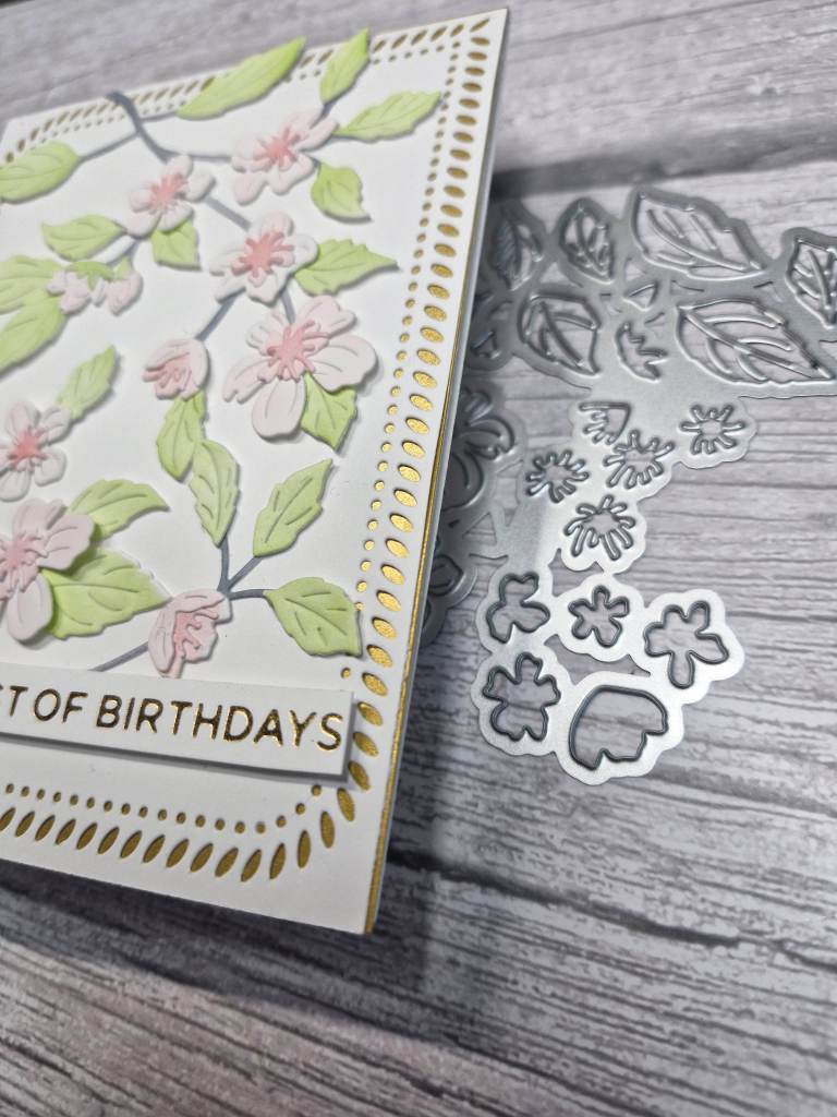
This set consists of layering stencils and dies. All the flowers and leaves are on one stencil with the different layers labeled and segmented. The die is one piece to cut the whole of the images out.
I used some pink and green inks, with grey for the branch. After die cutting the panel, I decided to do another so I had more images to play with and cover the card panel.
The background is a die cut with matt gold layered behind.
Once the flowers were arranged, I snipped any that were hanging over the edge, and added them also into some more open areas.
The sentiment was added – a previously prepared foiled strip.
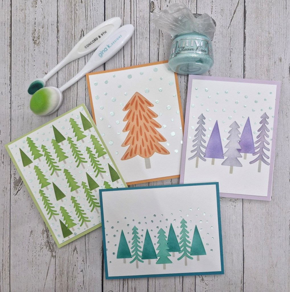
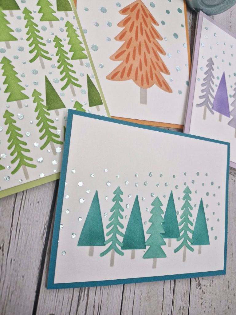
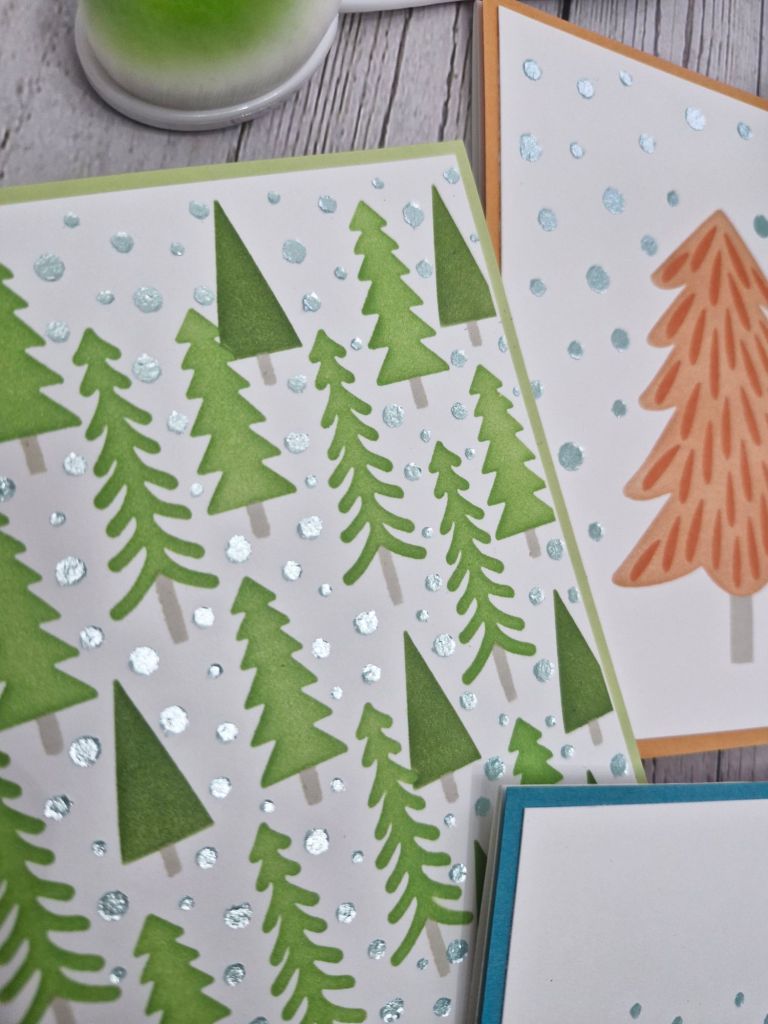
I wanted to try the Taylored Expressions ‘Create in Quads’ stencils, and used this Christmas tree stencil. Even though each stencil can be inked with the same colour, I decided to make it a little more interesting and created each of the quarters in different colours – swapping and changing the inks and blending brushes as needed.
The final stencil is for the snow effect, and I used some Tonic Nuvo Glacier paste on all four of the quads:
Once the paste was dry, I quartered the sheet, cut down each of the panels just slightly, and to create the matching border around each of the card base, I swiped one of the ink pads around the edges. This ensured that the edge matched at least one of the tones of the colours I had used for each quarter.
I hope you can come and join us with your Christmas creations. xx
Hello again. I have a card to share using some of the products from the recent Pinkfresh Studio ‘Create and Connect Event’:
This floral arrangement is from the ‘Lantern Botanicals’ stamp set, now on general release, but was provided as part of our event kit.
I stamped the floral images four times – minus the lantern at the top of the stamp – in a light ink, onto textured cream/linen card stock. The stamp was left in the Misti so I could stamp again with a darker brown ink after ink blending.
I then used the three layering stencils to colour the leaves and flowers, wondering if I had made an error using the textured card. I did stamp on the smooth side, but as you can see some of the texture came through with the ink blending. I think this gives and almost vintage feel to the images, so I carried on blending all four of them.
Once coloured, I then placed each piece back in the Misti, ensured it matched, then stamped again with a darker brown ink.
These were all then die cut, and extra layers cut and adhered together to create more stability and depth to them.
I used another A2 piece of the linen card, played with arranging the images, then glued them down – snipping the ones that hung over the edge, and adding little pieces if there were any large spaces.
The sentiment was stamped in the same dark brown ink, die cut, extra layers added, then attached to the card:
I added some iridescent gems in spaces. I like how these gems pick up the light, but also the colour of anything around them.
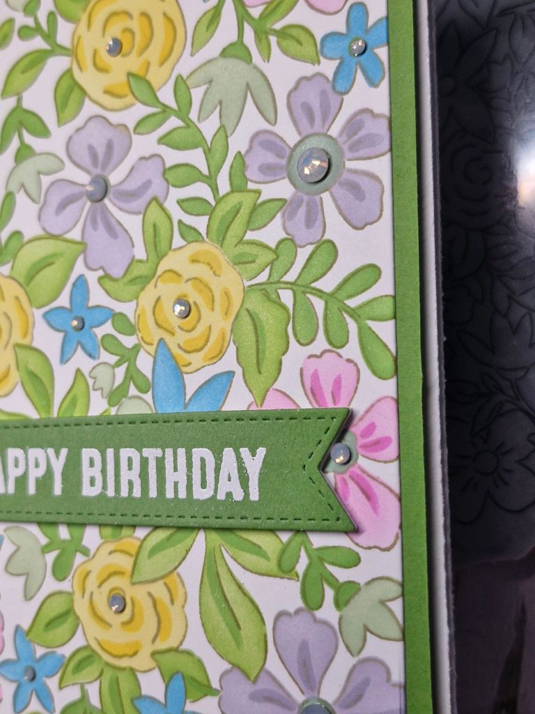
Hello once again. Billie A is hosting the new challenge at Cardz 4 Galz, and she has chosen the theme of ‘use some green‘. Here is my card:
I stamped this image from Pinkfresh Studio using a lighter brown ink so it had a soft outline. Once this was dry, I then used all the layering stencils and ink blending to colour the images.
I then die cut this panel to allow for a green layer on the white card base.
Once layered, I added some iridescent gems to the centre of the flowers, and a white heat embossed sentiment.
I hope you can come and join us with your projects which include green. xx
Hello there. I have been absent for a few days as I was trying to catch up with some virtual events I had over the past few weeks. All card making and crafting of course. One of the stamp, stencil and die sets I have used for this card is from the Pinkfresh Studio Create and Connect event:
I first stamped the A2 floral image with a light grey ink using my Misti, and kept the stamp on the lid. I then ink blended using the current colours from Color Throwdown, and the three inks you see in the picture.
The layering stencils – of which there are five for this image – were all used, but I did use different colours on one layer of some of the stencils. I also tried to create some dimension on the same image with the same ink – heavy handed to one side, and lighter hand to the other.
Once ink blended, I replaced the panel back into the Misti, then stamped the image again with a darker colour a browny grey – I thought black would be too stark. Lessoned learned from the Pinkfresh event – stamping again after you ink blended……it is a heart-stopping moment, and I have made mistakes in the past – but trust the Misti, and ensure your panel is in the corner each time you stamp.
The whole panel was die cut with the matching die – which cuts all the elements out in one pass through the die cutting machine.
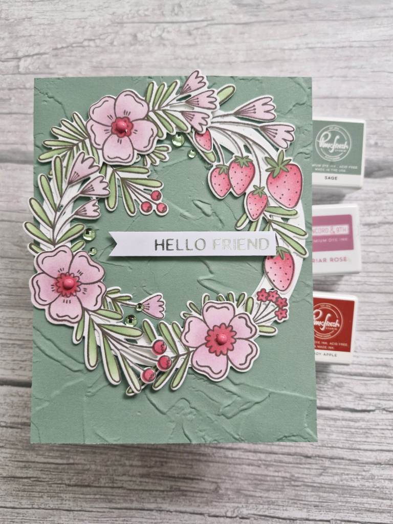
The background is a piece of Sage card stock from Spellbinders, dry embossed using an older embossing folder from Stampin’ Up, then glued flat to the white card base.
I then used the Fancy Circles die set – also from Pinkfresh Studio – and die cut the large circle three times, die cut the centre out with another of the circles, then layered them together for a more substantial circular base for my wreath. I could have used any nesting circles, but at this point I wasn’t sure if any of the circle would be showing until I had arranged my elements.
The circle was glued to the embossed panel, and the images arranged, adhered with glue, and the smaller pieces tucked in where I thought they were needed.
The sentiment is heat foiled and added as you see, and some green gems glued around.
I do like to attend the virtual events from several companies in the United States, and even though there are added customs charges to some of them, I find the event itself, the instructors, and the way they are organised is something I will keep doing. I have ‘rationalised’ the events I attend though………..kinda……!
Hello there. I seem to be on a roll using products I have previously bought, but never used. I think I’m a collector – buy things ‘just in case’. I do eventually use them, but it might take me a while…….
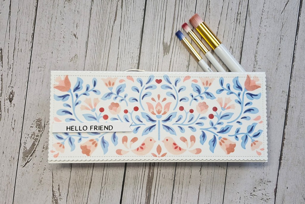
Here is a card using a layering stencil from Pinkfresh Studio I have had for a little while:
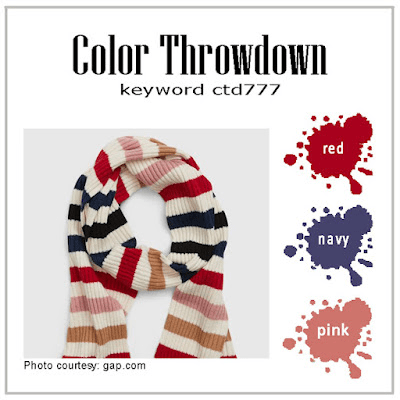
I took the opportunity to use this set of stencils with the current colours for the Color Throwdown Challenge.
I had a piece of Vicki Boutin Foundation Paper I had taken out of the pad ready for a Distress Spray class yesterday, but never used, so I thought I would have a go and see how this card stock works with ink blending.
I used all the layers of the stencil, but I did use different tones of each colour on the same stencil. I would never have thought of doing that until I attended some Taylored Expressions and Pinkfresh Studio virtual events. Now I wonder why on earth I would think you have to use just the one colour on each layer is beyond me – but there you go…..we live and learn.
I used Pinkfresh inks as I have several colour families, and just inked it up. I am a little heavy handed when it comes to ink blending, so I made sure to dry each layer before moving on to the next stencil – another lesson learned…..
Once the panel was created, I used an older Mama Elephant slimline die to cut it out with a scallop and stitched edge, then adhered it to a Neenah card base.
The sentiment was chosen as it wouldn’t cover too much of the design, and I didn’t even add gems or sequins – that design really does stand for itself.
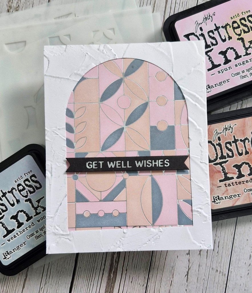
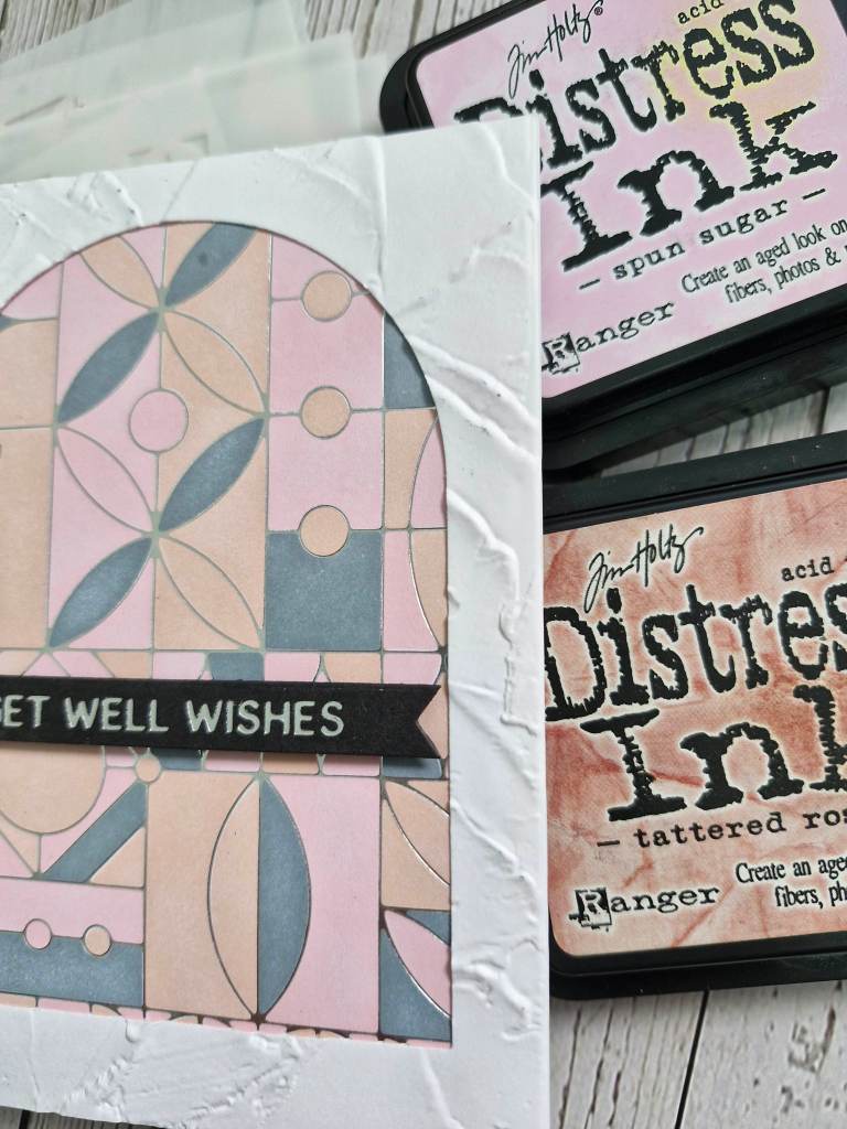
Hello everyone. I created this card and finally managed to use the matching stencils for this background I had in my stash from a previous foiling session:
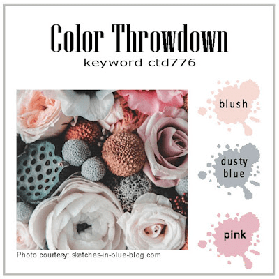
I have this foil plate and matching stencils for a while, and had foiled the panel quite a few months ago, but hadn’t got around to using it. I used the opportunity with the current colours for The Color Throwdown.
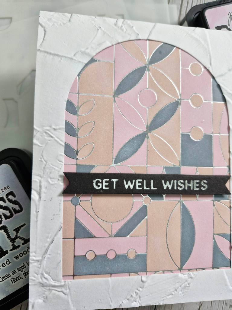
Onto the silver foiled panel, I used all the layering stencils, and the three Distress Ink pads you see in the photo. I set this aside and die cut the arch from another white panel, then used a Stampin’ Up embossing folder to create the texture on it.
I wanted it to be almost like a stained glass window.
I then adhered the ink blended panel behind the arch aperture, using 3D foam to stick them to a card base.
The sentiment is also from a previous foiling session.
The ink blending took most of the time creating this card, but the choosing of the colours to use was easier as I have just finished swatching all my Distress Inks and Distress Oxides, so I can easily flip through the swatches to choose the colours.
I also realised there are 3 colours of Distress Inks I don’t currently have – that will be amended in the next couple of days….!
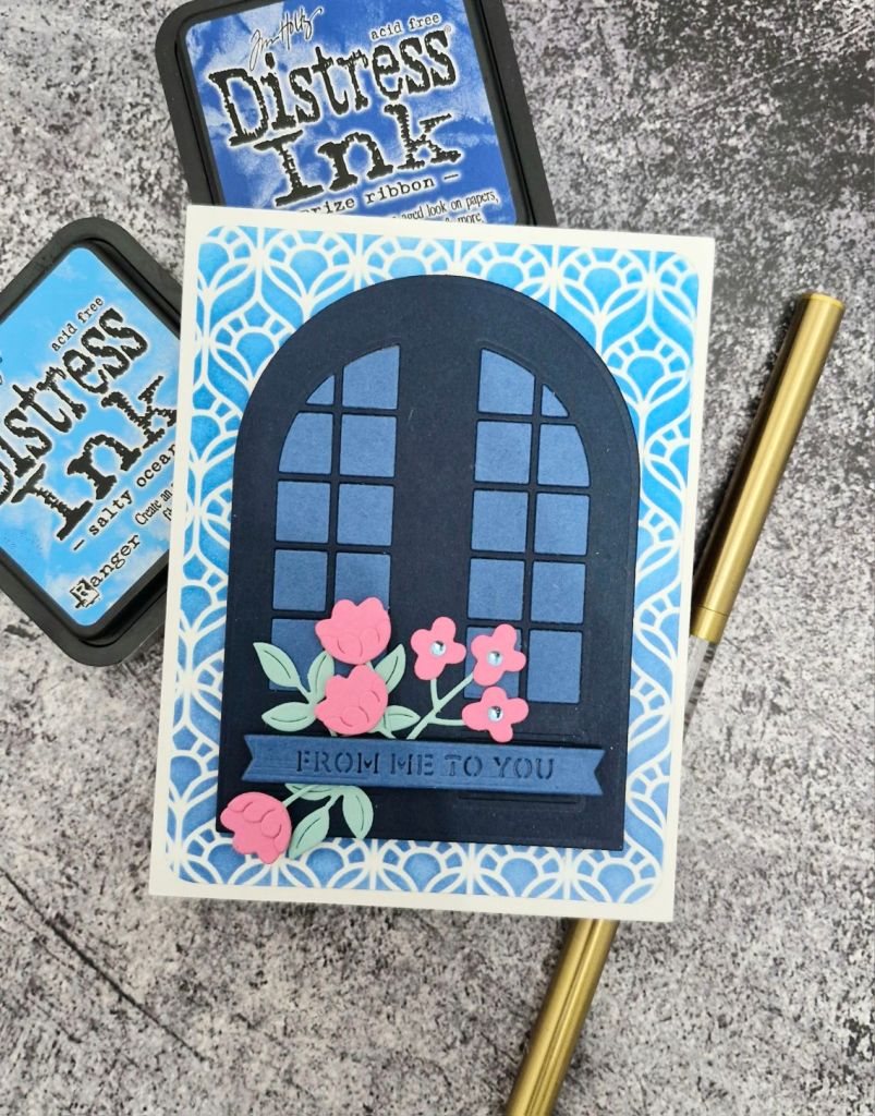
Hello again. I have created a card I would like to share with you:
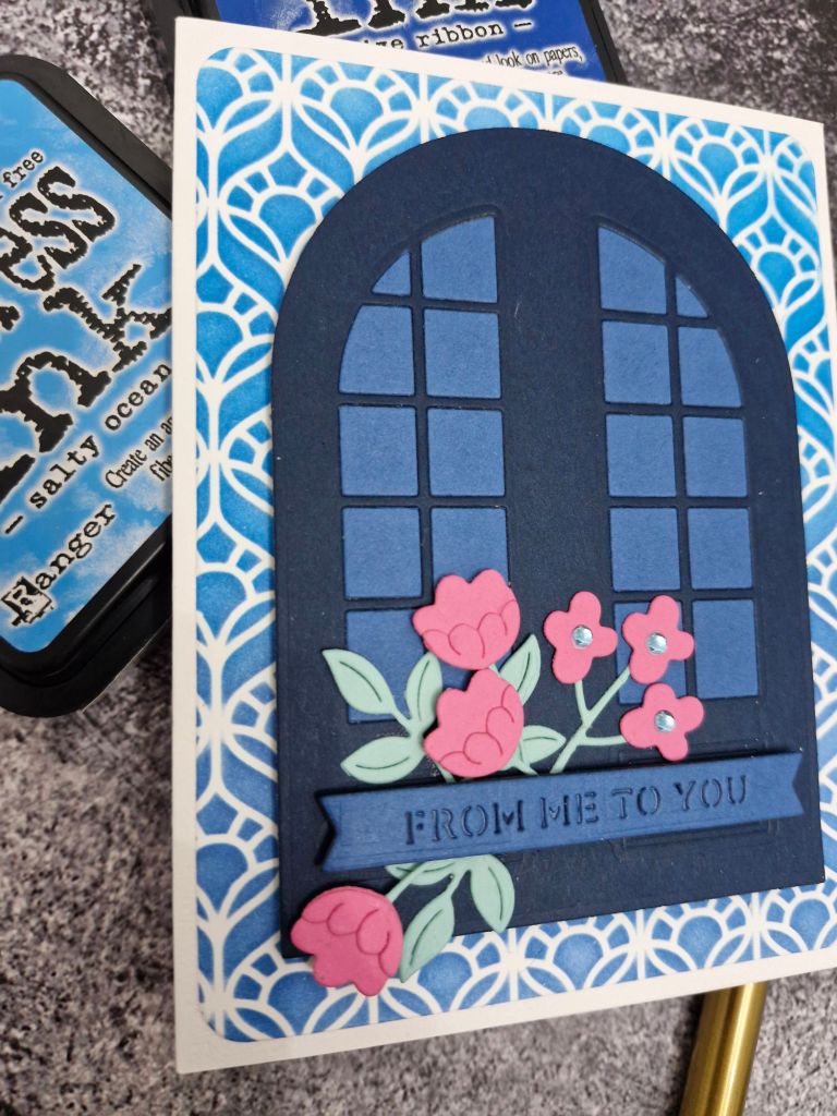
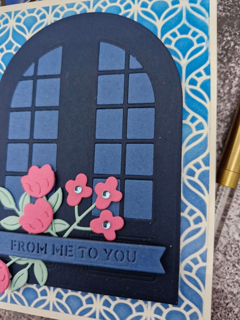
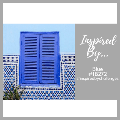
I was inspired by the blue and the window/shutters of the Inspired By challenge, and used the arch window die from The Greetery. I wanted the window pane section to be separate from the arch itself, so I first die cut the arch using a Simon Says Stamp arch die set, then die cut the window panes inside that. I then die cut the panes again in a lighter blue and pieced them back in. All the card stock is from Concord & 9th.
The background was created using a Spellbinders stencil and ink blending the two Distress Inks you see in the photo, keeping the darker blue towards the bottom.
Once this was adhered to the card base, I added the window with 3D foam, die cut the flowers, and added them for a pop of colour.
The flowers and sentiment strip are both from Spellbinders.
I also added some glittery gems from Pinkfresh Studio to the centre of the smaller cluster of flowers.